Hello, here from queue. I messed up and didn't update the difficulties, so I did not look at your more recent updates. Hope this helps!
no worries, I only made small edits, so your mod was still very useful![General]
Not sure why you have touhou twice in the tags but okay.
cuz touhou is awesome fixed[Lunatic]
00:31:343 (3,5) – You might be able to get these to blanket by rotating 00:30:927 (1,2,3,4) – counterclockwise a bit, or just curve 5 more.
didn't blanket, but made 00:31:343 (3,5) - more symmetric00:36:343 (2,5,1) – These overlaps and blankets looks like they could be cleaned up in some way. Try moving (3,4) to be more horizontal, say to 168, 272 to give a little more room, then you can move all of 00:36:343 (2,3,4,5,1) – to the left and down more so it stays on the grid. Then make the blanket at 00:37:177 (5,1) – have a DS that is half of the DS between 00:36:760 (4,5) - . Also, rotating (1) a little more is a little easier on the flow:
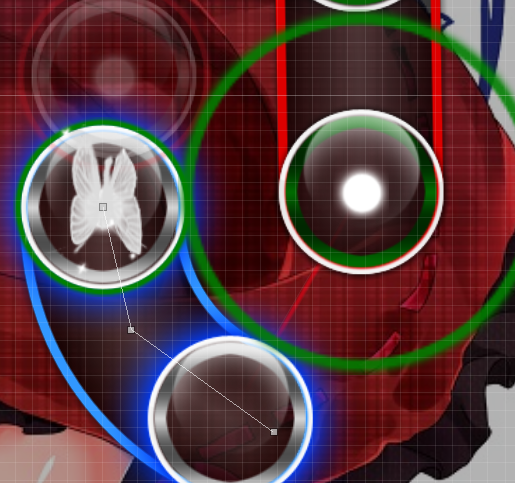
http://puu.sh/mZlA2/b3f8a2d65c.jpg overlap is fine since the notes are far enough apart from time. I've tried blanketing before, but it made the slider feel too curved. I adjusted the slider though so it looks more symmetric with (5) though.01:02:177 (5,2) – I'm not a fan of this overlap. It's hard to change it while retaining the intended DS and flow, but here is a close alternative. Make a rotation on the sliders to get:
http://puu.sh/mZlJc/f8b7016d57.jpg yeah, I've tried many ways to get rid of the overlap while keeping the flow and couldn't find a way. i'd rather not rotate the sliders that much to keep the up/down flow, so leave for now until I figure out a better way to fix it01:07:593 (1) – Consider in the future making your kiai's have a slightly higher SV than the base SV of the song to give it a little more emphasis (say 1.10x).
hmm, yes. I had considered this while I was making this diff, but I felt more comfortable as a mapper changing DS than SV. I will definitely experiment more with SV in the future though 00:54:677 – I think this could be mapped instead of having a break. Using long sliders and rests in the rhythm can provide a slow, low intensity part of the map the transitions into the build up at 01:00:927 (1) - a little nicer, imo
just my preference. I want players to enjoy the calm vocals here and not worry about clicking circles lol02:14:260 (1) – Compare this to the above. Yeah, the instruments are here now and doing there thing, but these two sections have the same function within the song of slowing down the song to lead into the build of the chorus. You should obviously make this more intense than what 00:54:677 – is, but not to the point where it is the same intensity as the actual build up and chorus. Try decreasing the density of the rhythm here, and maybe reduce the SV to give a nerf to the spacing too.
idk, I interpret this part to be much more intense than the other section since the guitars are now used to emphasize every vocal and the drums have been added. I will consider reducing the spacing though.02:00:927 (1,2) – The flow into (2) has a little too much anti-flow of the (1) slider. I think it would fit the start of the new measure to be a little smoother and have the flow go more like:
http://puu.sh/mZmaI/34db2d04fa.jpg yes, you are right. fixed03:16:135 (2) – I like the idea of this, but I think the spacing is a little bit too much. Try scaling it down to DS of ~1.75x
keep since I use DS ~2.0x pretty consistently in this section. The note density is already very low, so I would like to keep a high DS so that the intensity doesn't drop off too much.[Hard]
00:33:010 (2,4) – This could be blanketed better if you're into that by rotating (4) 1 degree clockwise by selection center.
fixed00:37:177 (2,2,3,4) – You could give these a little more space so the visually look a little less cramped by moving (1) to the left more.
moved a little00:46:760 (3,4) – This kind of flow is one that rebels against itself highly. It works best when (4) is very emphasized in the music. I do not think it has enough emphasis in this song to make this kind of flow work here. I realize I'm asking to make the flow a little more “boring,” but I think that's what this part of the song calls for.
If I was modding this, I would make the same suggestion, but I feel the slider leniency makes this work. Leave for now, but I will probably change this according to your suggestion later if someone else mentions this01:20:927 (1) – This overlaps the HUD. Please move it more down and a little more left.
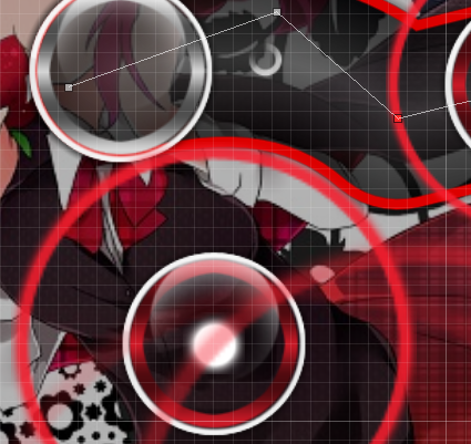
ok, fixed02:08:635 (3,3) – I'd prefer these to not overlap if possible. Consider going with more of a this kind of flow?
http://puu.sh/mZnFR/d3b44bc965.jpg players won't see the overlap since they're far enough apart in time02:16:552 (3,1) – The overlap is really weak here, so it looks a lot less pleasant than other stronger ones. Try giving these a little space by moving (1 a little to the left?)
oh yes, not intentional. fixed02:21:343 (2,3) – and 02:23:218 (3,4) – These distances are a little too inconsistent. Nerf the distance into (4) or increase the distance into the first (3).
err, the DS here is identical. If you meant 02:20:927 (1,2,3) - the reason for this is that sliders in the is configuration are easy to play so the DS helps give it similar intensity complared to the later notes02:37:802 (2,3) – I really appreciate this design, so it makes me quite upset to make this suggestion, but the note at 02:38:218 – is kind of strong, and for you to not make it clickable makes it feel a little weak and inconsistent with what you have.
the stronger beat is at 02:38:427 - so I'd rather leave it this way. I could break up into a 1/2 slider + note, but since 02:35:718 (4,1,2,3,4,5,6) - is pretty difficult for hard, I wanted to give players a little break. I will get more opinions on this though.03:08:843 (4,1) – This spacing is a little too big for a relatively calm section of the song imo. Try nerfing it a little
03:10:510 (4,1) -
lowered the spacing for the first one. second one keep since the song intensity is rising here03:17:593 (1) – You've slowed down the intensity of this section with the spacing/rhythm of 03:15:718 (1,2,3,4,5) - , so the high spacing into this is a little too high for me. See if you can nerf it slightly.
a previous modder suggested the same thing, so I will lower the spacing[Normal]
01:10:927 (1) – You're cutting it close to being overlapping the Life bar. If possible, a little space would be appreciated.
fix01:32:802 (5) – This is overlapping the HUD. Also, it might be nicer if the DS between 01:31:760 (3,6) – was also 1.0x. Rotating 01:31:343 (2,3) – by 15 degrees should give you some more room.
fixed HUD problem,
no change for DS between 01:31:760 (3,6) since that doesn't flow as well
01:47:593 (1,2) – Nice
:D, i'm so bad at sliderart so this took forever to make01:54:260 (1,3) – Making these not overlap would be nice
far enough apart in time that players don't see it02:31:760 (2) – This feels a little cramped by being in the corner, which is a general awkward spot to put notes. Try putting it on the right of (1) and maybe make a triangle with 02:30:510 (6) – if possible
eh, I think it looks okRan out of time, but the rest looks good.
Really nice and well-structured maps overall. Good luck!
thx for modding! you gave a lot of nice big-picture suggestions, so I will spend some more time thinking about those before making changes


 ) and I didn't really want to nitpick so I mainly gave suggestions.
 )
)
 I'll go back to adding repeats on both for now...