Nevo wrote:
bad m4m sorry
hard
00:28:242 (1) - maybe make this one the same distance away from the note its overlapping like the others its fine overlap
instead of what it currently is
01:12:117 (4) - the flow from 01:11:839 (3) - back to 4 and then down to 01:12:673 (5) - just doesn't feel all the good imo fixed
01:24:339 (1) - perhaps blanket this to 01:23:784 (2) - or make it symmetrical to 01:24:062 (3) - its fine
tbh all the diffs seem completely fine

thank u for mod !Mitkoff wrote:
Hello,..
hmm actually i want to map this song by myself but find this set Orz... and it's pretty good...
i hope You willn't mind if i leave some thoughts about it?
i will be a bit picky, since i like song, don't be mad about it pls
[Easy][Normal]
- 00:47:610 (1,1) - If it's not supose to be similar shape sliders, so mb make a bit more calm visual flow like https://puu.sh/w4QLI.jpg the slider 1 almost faded when the other one apeared i dont see a problem
- 01:14:339 (1,2) - could be more even blanket ... fixed
- 01:17:673 (1,2) - why these have different shape and 01:19:339 (2,1) - same? imo make 01:17:673 (1,1) - same visually better cause of geometric mirror... Also less curved wave looks better when placed on horizontal line. Hmm maybe 01:17:673 (1,2) - swap shapes or make all 3 of them equal? each one take different direction they should be fine tho
- 01:21:006 (1,2,3,1) - it could be more symetry structured pattern by 01:21:006 (1,2) - 01:24:339 (1) - placed 2 this lines with same curve arounnd 01:22:672 (2,3) - 01:24:339 - triangle. Something like https://puu.sh/w4RDD.jpg . I thought about it because now your last slider looks like wanna go out from this map Xp, centralize it before spinner looks more neat imo okay fixed
[Advanced]
- 00:03:869 (1,2,3) - i feel like visual spacing could be a bit cleaner, like 00:04:708 (3) - spaced from 2 a bit more then from 1 idk what u mean exactly but fixed little spacing
- 00:13:099 (5,1) - imo just ctrl-j for 00:13:099 (5) - is enough since it's make clear follow way https://puu.sh/w4Tvj.jpg like -10 rotated (5) sure
- 00:31:610 (2,3,4) - i belive You can make more clear visual spacing as You did before. (4 degree rotate for 00:33:295 (4) - https://puu.sh/w4U2E.jpg) they look fine there nothing much i cant with ds snap xd
Also 00:32:452 (3) - blanket a bit off as You can see on SS- 00:51:779 (3) - might be make more sharp shape on this slider? For example: https://puu.sh/w4V77.jpg Right now it looks like You have lack of place and because of it You made 00:51:498 (2,3,4) - uneven visual flow, also You somewhy used sharp (with red anchors i mean) sliders only once at the beggining i dont see the problem here xd
- 00:24:873 (3,4) - and once at the end 01:19:339 (5) - , i think You may give them one more chance to show themself in place where it fits well . It's only my opinion orz (adress to 00:53:463 (6) - too) i still dont get the issue its just way of mapping a style there isnt really a problem with the sliders or the flow
- 00:59:339 (4,5,6) - Why did You ctrl-g rhythm here? 00:57:673 (1,2,3) - this part make emphasis in vocal plan in same way like next part, i think will be more intuitive to repeat rhythm to still folow vocal as You did in other diffs. i think both way can expressed same its just little variation wont hurt i guess
- 01:13:506 (6) - i think less curved slider like 01:16:006 (4) - looks nicer here. https://puu.sh/w4WE5.jpg (also same side curved sliders make more neat pattern and more clear flow imo) i intentionaly want that different flow direction between 6 and 1 because new section new combo new pattern
[Hard]
- 00:10:862 - i guess there is no beat... orz, or its too calm to make it clicable... but i can clearly hear 00:11:701 - beat wich is much stronger but still unclicable. i think https://puu.sh/w4XRU.jpg rhythm might work much better tbh there is clear piano i am following
- 00:29:645 - i think it should be clicable since there is no vocals and beat here really strong, i can suggesst smthing like https://puu.sh/w4ZhE.jpg for emphasis stretched sounds 00:29:084 - 00:29:645 - . imo it works pretty well the suggesting u gave me will make the drum sound on upbeat not clickable and idont want that also that piano sound is expressed nicely with slider hold and taill since this an advanced i see no wrong i like how its mapped
- 00:29:926 (4,5,6,1) - i think spacing between these 4 objects can be cleaner(like equal visual spacing from 1 or 00:29:926 (4,5) - 00:30:487 (6,1) - parallel lines) they look fine
- 00:45:645 (3,4,5,1) - i belive these blankets could be a bit cleaner (https://puu.sh/w4YlW.jpg instead of https://puu.sh/w4Ynp.jpg) fixed
tbh i have no idea how your flow and patterns should works here...All for now.
- 00:04:708 (4,5,6) - 00:05:827 (6,7,8) - might create equel angle fixed
- 00:07:505 (2,2,4) - changing angle ( not 00:08:064 (1,2,3) - not 00:07:785 (3,1,3) - not 00:07:225 (1,2,3) - not even 00:06:386 (9,1,2) - ) just randomly new one it's just randomly change direction... why? because the music
- 00:38:347 (1,2,3,4) - also your choosing angles is pretty questionable for me. 00:37:505 (1,2,3) - maybe 00:38:347 (1,2,3) - make them equal cause now they are not. Also 00:36:663 (7,1,2,3,1) - might be more symmetric
- 00:29:084 (4) - this flow changing also looks pretty sharp since don't even use 00:26:558 (6,1,2) - angle for being at least a bit consistency... yeah in this way You can emphasize strong sounds by create sharp flow, but it should be consistent i guess and be used for sounds like 00:30:768 (1) - also...
It looks like You are using strong geometric flow without strong geometric sence... it's prety wierd orz
And about mechanics:
i give most simple example: For sliders like 00:50:937 (1) - i should follow from start slider to middle, hold a bit (for pass it) and back to head. Same for 00:55:147 (4) - , but then i see 01:01:006 (1) - and actually the most simple way to follow it just don't come back to head (because next circle placed oposite cursor move and also ds somewhy increases which force me to do something different) and hold in middle more and after it continue move to next note..., so it's just different mechanics to pass this section, it feels pretty wierd since it's not high star technical map...
So, this map need more thought maybe, because your idea looks unclear, at least for me...idk how i reply these type of mods ill just sum up things i chose different directions to emphasise different music and sounds thats all i can say and for this 01:01:006 (1) - i want express the tensity of the vocals with music so i took that path
I stop now since here 4 am and i need to wake up at 6.
gottagof4ast wrote:
NM from my queue
Might be a bad mod as I normally prefer to mod higher diffs but as I have to learn how to mod everything I am giving this a shotGeneral
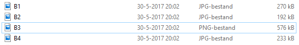
For some reason B3 (background 3?) is .png so you might want to make it into .jpg to reduce filesize https://imgur-archive.ppy.sh/ciUj96x.png, B3 is also 1920x1200 instead of 1920x1080
I have no clue how you got the audio's filesize to 170kbps but you probably already know thisHard
00:08:903 (4,5,6) - I like that 00:09:463 (5) - has a larger jump to it for the louder piano sound but then 00:09:743 (6) - is just spaced like you would with other normal notes although it also has that same volume piano because the emphasise with put on 00:09:463 (5) - if i also space the other
5 will lose its emphasise
00:14:778 (2,3) - just my opinion but this just looks weird as you had this 00:13:938 (1,2) - flow very well into eachother but then suddenly you just make a 90 degree angle to get to the next object and then again to follow the slider i dont see pproblem since the music felt stable when i put the 90 degree and then it back to the other flow if u know what i mean
00:20:663 (1) - could use some more spacing, very important downbeat with loud vocal and piano fixed
00:21:505 (4,5) - ^^ ok
00:29:926 (5,6,7,1,2,3) - idk about this pattern, if it was your intention to use a wide angle to emphsise 00:30:768 (1) - then that may be a good idea but it just doesn't stand out enough beacause you are repeating the shape at 00:29:926 (5,6,7) - which doesn't have any important sounds (atleast not ones that are more way more important than the otehrs)
Maybe something like 00:37:505 (1,2,3,1,2,3) - where 00:38:347 (1) - really stands out would be better but they take differnt direction and flow even tho they look same
01:16:006 (3,4,5,1,2,3) - I really like this pattern thxno reply is ezek part
00:10:022 (4,1) - the way these overlap now is just not so nice, maybe try and fit it better inside of the slider?
00:16:456 (2,3,4,1) - this feels so out of place as it's the only spot where the 1/2 gaps are stacked like this, I would just keep going with those jumps like at 00:14:498 (2,3,4,5) - but maybe a bit smaller as they are quieter
00:18:137 (2,1,2) - I know it fits nicely as a blanket but 00:18:979 (1) - has low spacing for an important vocal+ instrumental sound and then you have the larger spacing for 00:19:259 (2) - which barely has an instrumental sound. It flows nicely but it doesn't fit the music imo okay i ctrl g 1 and 2
00:21:505 (4) - The sound of the piano is way different than the others but it's just mapped as another not in the pattern that doesn't stand out in any way, you made piano sounds stand out at 00:22:347 (1) - /00:24:031 (1) - /00:27:400 (1) - with larger spacing so why not here but they are expressed same wy xd
01:21:839 (3,4,5) - These have very slightly different spacing fixed
The only thing thats weird is this diff spike in the kiai 01:02:673 (1,2,3,4,5,6) -, Diff spike seems way too large. It's like "Ok, I'm mapping this song with like 2.5x ds max" and then suddenly you place 6 consecutive almost 3.5x ds jumps. But thats probably just me as 01:09:339 (1,2,3,4,5,6) - feels fine to me (probably beacause of a better builup in spacing and the shape continues as expected)
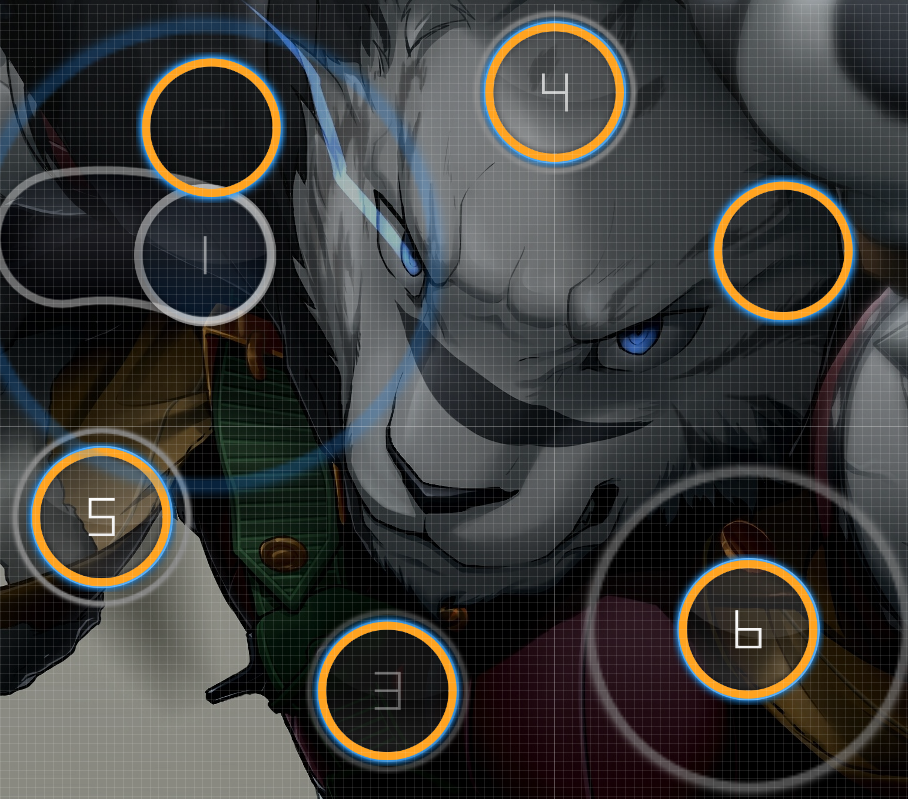
Also I don't know how geometrically correct you want this hexagon shape to be but it's pretty off https://imgur-archive.ppy.sh/6LLIvs8.png
Gl with the map
no reply for ezek part[ L u k a s ] wrote:
short mod, modding only last diff since others were p good
ezekyanna
00:03:869 (1) - Why so big spacing? It doesn't have that much of an emphasizing in the song.
00:07:225 (1) - ^
00:11:980 (3) - ^
00:25:716 (1) - Why NC and why the change of flow? Ctrl+G nc because consistent and change of flow because emphasise piano
00:27:400 (1) - Very big spacing, why
00:32:452 (1) - Why NC?
01:02:673 (1,2,3,4,5,6) - This song is overall very calm and slow so the big jumps aren't really reflecting any of the song, no sudden change in intensity or something, it's not even pp xd
nothing else to say about this map really, it's p good and the final diff still doesn't feel right cause of the song's intensity and stuff but you can change that if you want. I just thought it would reflect the song better if you used less spacing.
That was it, sorry for short mod
thank u for mod everyone
