sketched with my bamboo tablet:

forum
Post your osu! fan art!
posted
Total Posts
2,108
we are entering a dark place
SPOILER
Kana_chan wrote:
gnah...
>.< it's a fail scetch.. pls don't kill me Q_Q
http://puu.sh/r4dX
READY ART v
Omg, Awesome work.
dat fan art..
almost made me nosebleed, or did I just caught a cold..?
almost made me nosebleed, or did I just caught a cold..?
darkmiz wrote:
Fixed the hair and other stuff but still uncolored:
ah this looks so great x3
wich Programm did you used for coloring?
a new scetch >o< i really like the hairdesign from Pippi <3
SPOILER
and one another art xD" i'm sorry, but i really proud!
http://murderdollpunika.deviantart.com/ ... -298698337
and one another art xD" i'm sorry, but i really proud!
http://murderdollpunika.deviantart.com/ ... -298698337
These sketches are awesome, just so you know
i rofld maxawp wrote:
we are entering a dark place
Hmm welp I better start a pippi ( Runs off to steal a base from a reference book)...
hnnngggggA i s h a wrote:
Getting there, Got most of the preliminary BG components and props done.
Hoping im not gonna flop this one XD...
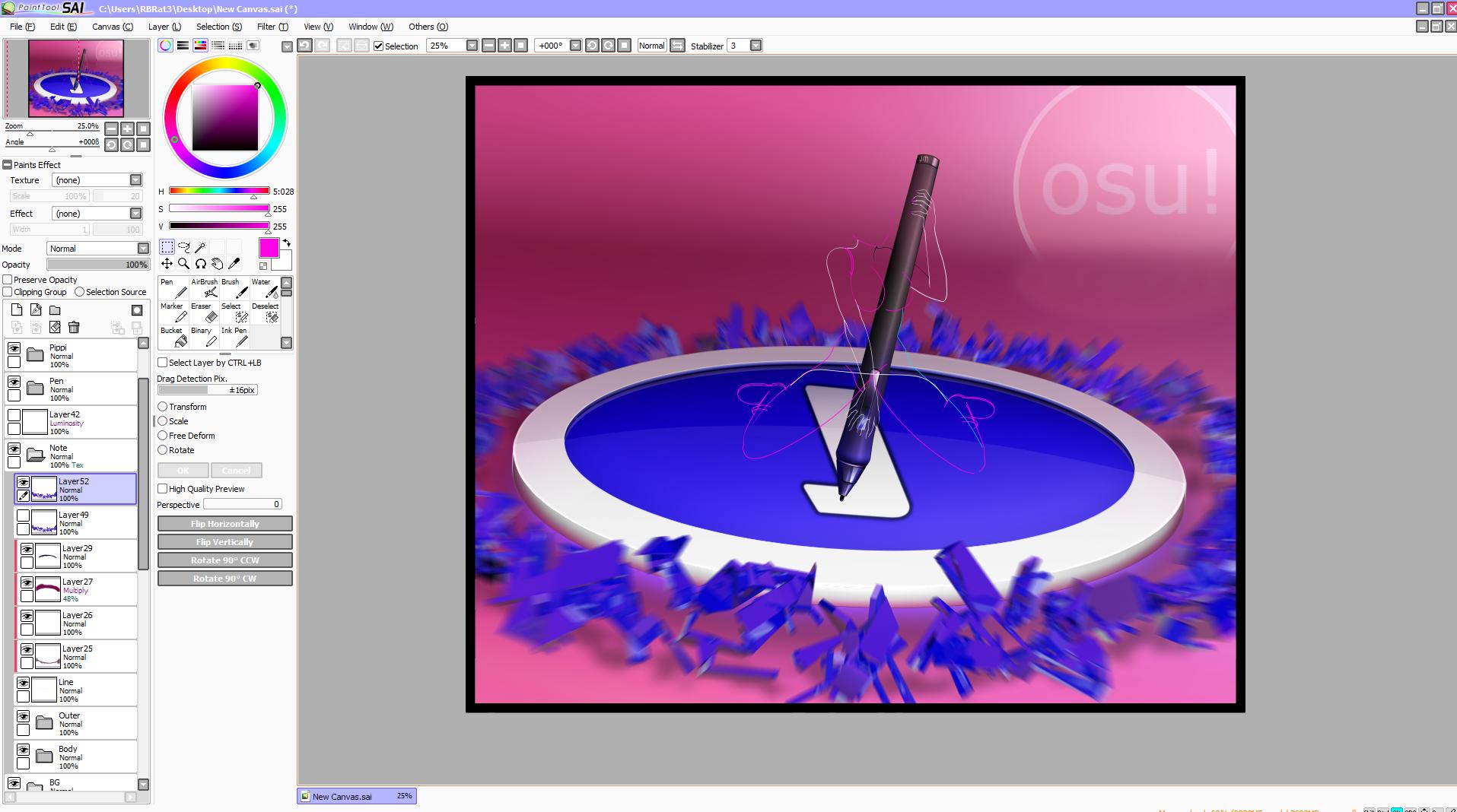
So far the App rackup is...
3ds Max for approach circle shatter
PS for blurs
SAI for everything else
Hoping im not gonna flop this one XD...
So far the App rackup is...
3ds Max for approach circle shatter
PS for blurs
SAI for everything else
Nice so far but why is the number 1 on the hit circle upside down and backwards? lolRBRat3 wrote:
Getting there, Got most of the preliminary BG components and props done.
Hoping im not gonna flop this one XD...
So far the App rackup is...
3ds Max for approach circle shatter
PS for blurs
SAI for everything else
Because from her perspective its right side up but you are right its reversed XD, No biggie but that was a nice start to flop it.
*Fixed

*Fixed

Holy crap you guys
These are WIPs and they already look breathtaking
These are WIPs and they already look breathtaking
I should take another crack at this~
Her hair... so feathery and soft-looking :O I really like that. Also, I like the more realistic eyes rather than huge blobby moe-moe eyes. I'll be looking forward to this after more progress is done.Nekoroll wrote:
Derp in progress here as well:
Ok this is buggin me not that im gonna change it but what the hell is around pippi's neck Is it a scarf or dew rag, or what?
Reason I ask is because all of the game graphics I seen for her they never show a tail of a scarf to indicate that it is one its just daru's image that has it as a scarf from what ive seen XD
Reason I ask is because all of the game graphics I seen for her they never show a tail of a scarf to indicate that it is one its just daru's image that has it as a scarf from what ive seen XD
Thanks guys for the motivation. I need to continue working on it. @.@

I've drawn it as a scarf in one of my last drawings but I think it's actually maybe a handkerchief. Everyone has their own spin on her. Draw her however you think she looks best.RBRat3 wrote:
Ok this is buggin me not that im gonna change it but what the hell is around pippi's neck Is it a scarf or dew rag, or what?
Reason I ask is because all of the game graphics I seen for her they never show a tail of a scarf to indicate that it is one its just daru's image that has it as a scarf from what ive seen XD

Yes, it's a kerchief. But yes, you can also swap it out for things like a scarf, or a necklace, or whatever you darn well please
I always forget to draw her scarf/neckware. :/
"Okay, I'm done! ... wait."
"Okay, I'm done! ... wait."
I'll just go neutral on this and call it a "Thing" XD
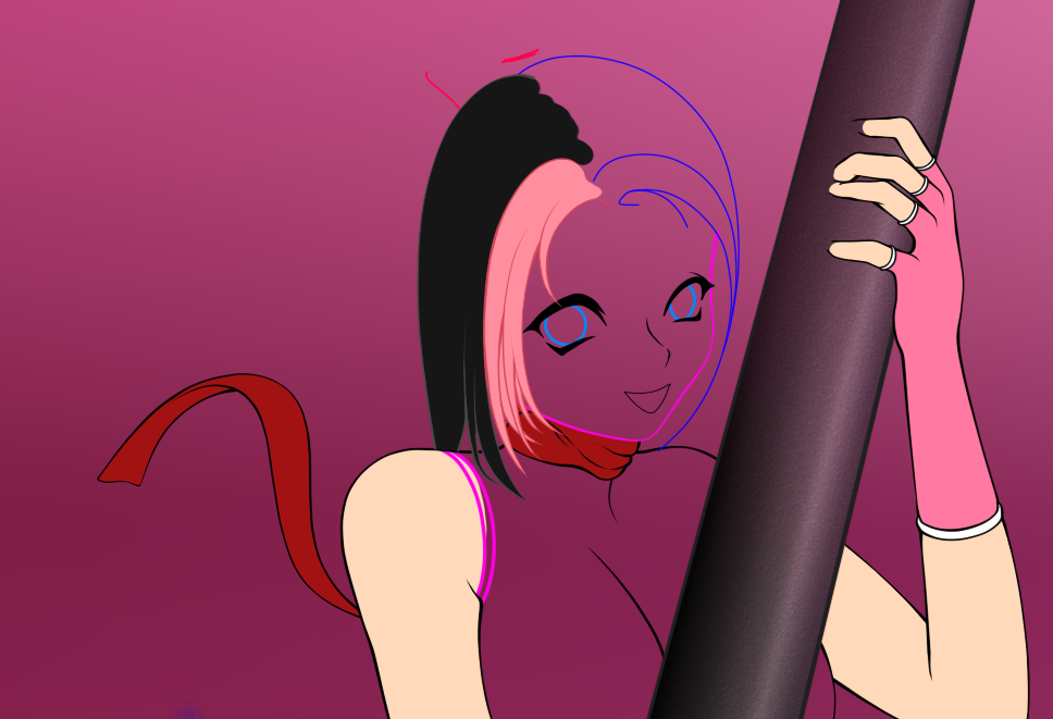
We will call it "The Steve" and it will become a meme of biblical proportions! (yeah random obscure references)
That looks like a ribbon, except it's really not. I can't decide what it looks like- so confused
That looks like a ribbon, except it's really not. I can't decide what it looks like- so confused
Meh like I said its a thing, I'll probably move it, focal blur it or just get rid of it not too sure yet. Need to wait till I get her lined and base colored before I tool it
I think you should just add the other scarf tail coming out from behind and make it a scarf. Right now, it kind of looks like... a red snake or something? Good drawing anyways xD
We'll see after I throw more lines at her, Was going to get all lazy and put a choker on her which I might still do, And thanks even tho its not a literal drawing more like "Good line plotting" XDMinty Gum wrote:
I think you should just add the other scarf tail coming out from behind and make it a scarf. Right now, it kind of looks like... a red snake or something? Good drawing anyways xD
But I can do line plotting and have a machine do the drawing bit

Yea I own a roland 24-GX, Dad bought it but never used it so now its mine. I use it to do small things for small businesses and acquaintances. Its just an expensive toy really, got bored one day and said hell I bet I can make that thing draw and shade me a miku so I threw pencils & blenders in it and loaded up illustrator.
Ohh and if you were curious how that all turned out it came out like shit XD, What had happened was during final lining the charcoal pencil tip broke put big ol' fat lines over it all. It would have turned out ok if I just settled on a dark graphite pencil instead of charcoal but overall it was a fun experiment and a fast way to kill 4 hours.
Ohh and if you were curious how that all turned out it came out like shit XD, What had happened was during final lining the charcoal pencil tip broke put big ol' fat lines over it all. It would have turned out ok if I just settled on a dark graphite pencil instead of charcoal but overall it was a fun experiment and a fast way to kill 4 hours.
it looks like a ribbon in that shot, which is coolRBRat3 wrote:
Meh like I said its a thing, I'll probably move it, focal blur it or just get rid of it not too sure yet. Need to wait till I get her lined and base colored before I tool it
Architects: Hey, let's use this plotter to make high quality blueprints. Ah, fudge. Let's just use it to draw Hatsune Mikus all over the place.RBRat3 wrote:
Yea I own a roland 24-GX, Dad bought it but never used it so now its mine. I use it to do small things for small businesses and acquaintances. Its just an expensive toy really, got bored one day and said hell I bet I can make that thing draw and shade me a miku so I threw pencils & blenders in it and loaded up illustrator.
Ohh and if you were curious how that all turned out it came out like shit XD, What had happened was during final lining the charcoal pencil tip broke put big ol' fat lines over it all. It would have turned out ok if I just settled on a dark graphite pencil instead of charcoal but overall it was a fun experiment and a fast way to kill 4 hours.
That is seriously super cool though. I would love to have an expensive toy like that for my own usage.
Not that devilishly expensive, you could get a cute 12" if you were interested (I think just plotters are cheaper than actual cutters). Making it spit out Miku's was the height of the stupidity done on it sadly, Suppose the next big step would be to shove a giant miku decal on the side of my car XDNekoroll wrote:
Architects: Hey, let's use this plotter to make high quality blueprints. Ah, fudge. Let's just use it to draw Hatsune Mikus all over the place.
That is seriously super cool though. I would love to have an expensive toy like that for my own usage.
BTW I thought Id ask, Who was responsible for this?
awp wrote:
Sarumaru inked it and I coloured itRBRat3 wrote:
BTW I thought Id ask, Who was responsible for this?
Ahh Ha, Stumbled on to their DA page now things make more sense. Thx
Edit: Been bored so I made a osu logo in max, Haven't a clue what to do with it so I just been fragmenting crap all over it. ( Images aren't useful just having fun any ideas let me know)
And


hahhaa...osu..osu...[color=#BF00FF]
@RBRat3: I demand more! That looks epic. Can you make a high res version of the white one which isn't clipped at the bottom?
I can do anything you want to it as long as its in the confines of my ram usage XDpeppy wrote:
@RBRat3: I demand more! That looks epic. Can you make a high res version of the white one which isn't clipped at the bottom?
What res do you want it? I wouldn't go any higher 10k WxH otherwise you might get the render next day.
That would be much higher than I'd need, but sure  .
.
 .
.1.
Preview
Full res at 5000x5000px PNG w/alpha 13.7mb
http://i.minus.com/dRF15Key3pyV1.png
2.
Preview
Full res at 5000x5000px PNG w/alpha 26.7mb
http://i.minus.com/dJSF91w2oex6W.png
3.
Preview
Full res at 5000x5000px PNG w/alpha 22.10mb
http://i.minus.com/dbn4ZDfXRieNEZ.png
Preview
Full res at 5000x5000px PNG w/alpha 13.7mb
http://i.minus.com/dRF15Key3pyV1.png
2.
Preview
Full res at 5000x5000px PNG w/alpha 26.7mb
http://i.minus.com/dJSF91w2oex6W.png
3.
Preview
Full res at 5000x5000px PNG w/alpha 22.10mb
http://i.minus.com/dbn4ZDfXRieNEZ.png
That is great stuff  . Make sure to keep the original 3ds files; I might ask for a custom render of this in the future for a specific use case.
 . Make sure to keep the original 3ds files; I might ask for a custom render of this in the future for a specific use case.
I made this for my current wallpaper: http://puu.sh/wb3B
friendok53
i love youpeppy wrote:
I made this for my current wallpaper: http://puu.sh/wb3B
Nice!!, I wanted to glow it but the filter interacted on the glass too much turning the scene into a giant light bulb. Figured it was better off being applied by an external program.peppy wrote:
I made this for my current wallpaper: http://puu.sh/wb3B
Works out great by itself XD
SPOILER
Damn I need to realign all that crap :<
Damn I need to realign all that crap :<
Yes it is o.Opeppy wrote:
That is great stuff
You got some rly nice stuff there RBRat3 (reeeeeeeeeaally nice)
my new wallpaper <3RBRat3 wrote:
Sliderbreaking is incredibly well explained by your drawing IMO
So much it should be in the FAQ
But wait, there's no sliderbreaking in Taiko! Well there kinda is if you fsck up the rhythm on the sliders but it doesn't actually break your combo.
So much it should be in the FAQ
But wait, there's no sliderbreaking in Taiko! Well there kinda is if you fsck up the rhythm on the sliders but it doesn't actually break your combo.
Oh my god that is amazing.
Wow, awesome.
Btw, what happened with Fanart section? :~
Btw, what happened with Fanart section? :~
I love your and also wallpaper RBRat13. That is amazing...friendok53 wrote:
i love youpeppy wrote:
I made this for my current wallpaper: http://puu.sh/wb3B
Huh didn't expect 45min to be well received... anyways Thank You!!!
The time it took is not always relevant to the outcome, nor quality of a piece, sir.RBRat3 wrote:
Huh didn't expect 45min to be well received... anyways Thank You!!!
A fully rendered piece is not necessarily better then something speedpainted, for instance. If the result is good, then who cares about how long it took, what came out of the time spent is what mattress.
Time is always relevant to the outcome, Its what you do within time that determines the outcome.
If I took it an hour or more I would have vectored all the cel shades that way I could push out its real resolution but no the primary goal of it was just to simply get it lined and all I did was bullshit shades in with the pen with a few gradient fades XD
Also if I took the extra 30 secs I would have dropped layers to get rid of color banding artifacts.
All in all it was just a quickie to make with the line plot that was constructed and physics simulation render which originally was gonna be pippi's hopping bunny pantsu but thats another story XD
RBRat3 wrote:
Time is always relevant to the outcome, Its what you do within time that determines the outcome.
Spending more time on a piece doesn't necessarily make it a better piece of art. That of course, within logical boundaries, in the matter of how much work you're actually able to pull off within said time. An unrendered painting isn't necessarily worse then a fully rendered and processed one, irregardless of that the latter took a load more time. Unless you judge "art" based off the artists abilities, which is quite stupid, at the very least in my book.boat wrote:
what came out of the time spent is what mattress.
Well in my case thats what it practically translates into on how my work aesthetically appeals to myself (always garbage). As for how its received its not a major concern to me since everything I do is never final until I take it into some sort of production phase such as heat transfers, decals, sublimation, large format printing... Basically anything physical is where I consider it permanent since its no longer in an actively editable medium.boat wrote:
Spending more time on a piece doesn't necessarily make it a better piece of art.
As long as I get my instant gratification of producing something nothing really matters, In the above case it was just the linework from ingame refrence (which I think sux still) XD
Just need to figure what use to put it to... ( If I had any pink I would rock that on the hood of my car
 )
)So we got Andy and Bob. They are both digital artists, they both have great skill and knowledge within digital painting. Andy, he likes to do photostudies, so he paints one, using this one photo of a car as a reference. He spends countless hours rendering it, making it as correct, similar and realistic in comparison to the reference photo. At first glance, you wouldn't be able to say that its a painting.
Now Bob, he is an innovative person, he likes to paint from his mind. He doesn't have a lot of time on his hands, but plenty to get a good result from the time spent. He paints lets say, a character he came up with who is striking some sort of pose in an environment he also came up with from his mind, something that nobody has seen before. His work is all anatomically correct, the perspective is correct, on similar factors its flawless. Only thing that differs is that he didn't put much time into rendering the piece all too much, the brushstrokes are visible. Its not bad at all, just clearly a painting, as he didn't even have half that Andy did.
Now, irregardless of that Andy spent a whole load more time then Bob did, he still lacks the innovation, charm and "imaginative-ness" which Bob has. His work is all polished and pretty, but it has no feeling, no emotion nor anything thats actually >interesting<. We've all seen that photo of the car before, but we haven't seen this character and environment which Bob painted up until now, which is new, fresh and interesting to look at.
Andys work can solely be valued in effort and time spent, whilst Bob has an actually artistic value to his.
Who's to say that Andy's doesn't have as much artistic value than Bob's? Just because something isn't as creative or imaginative as something else doesn't rob it of its value of art. Everyone views art differently than others. Some may favor the drafty feel of sketches, some full replications, and others downright abstract. Do all these styles mean that they are better than the other in terms of reflecting any kind of artistic value? I wouldn't think so.
Time doesn't always reflect on how great an art piece will turn out. It's just a measure of opportunity. Whether or not you choose to take the opportunities to seek improvements on your drawing is up to you and how you envision the "final result" in mind.
I find charm in artistic renditions of real life things, just by the way. I also enjoy sketches. While they are both "art", you can't fully compare one to the other. They are two separate entities that stand on their own and will have their own base of fans that appreciate them.
Sadly, both of you are right since art is subjective. Now, less bickering, more fan art.
Man, you're waaaaaaay too good at this.
That. Is. Awesome.
niceRBRat3 wrote:
I'm still waiting for osu 3d j/k
Weeee!!!!
Wow, that's really neat.RBRat3 wrote:
I'm still waiting for osu 3d j/k
Weeee!!!!
img

Holy crap this is epic.RBRat3 wrote:
I'm still waiting for osu 3d j/k
Weeee!!!!
The only issue I have is that the slider endpoint's radius doesn't match the track, like a badly-made skin :p.
Definitely had another thought the first time I looked at thisRBRat3 wrote:
Project companion.... Brings good luck XD
oh youthose wrote:
Definitely had another thought the first time I looked at thisRBRat3 wrote:
Project companion.... Brings good luck XD
I can round it off... Just thought it kept things separate and made more sense for a ball to roll on rounded tracks instead of square onespeppy wrote:
The only issue I have is that the slider endpoint's radius doesn't match the track, like a badly-made skin :p.

Anyways its alittle late now for what I was gonna use it for XD
I'm not sure I understand the rounded vs square you are talking about. The specific part I'm talking about is this join, though: 
The endpoint's outer ring is square while the track is tubular...
The join? As in the endpoint not being flush with the track or the radius not meeting up with the track width?
It intersects with it slightly, didn't think much about it since its far from view and put crap over it for what I wanted XD
The join? As in the endpoint not being flush with the track or the radius not meeting up with the track width?
It intersects with it slightly, didn't think much about it since its far from view and put crap over it for what I wanted XD
the track width should be equivalent to the start-point's diameter
You guys mean it should be tangent.
And I mean the real meaning of tangent, not the "but it's already touching one edge" kind of meaning.
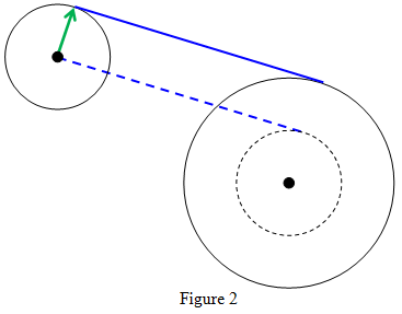
So yes, the track should be on the furthest edge of the circle to be correct.
And I mean the real meaning of tangent, not the "but it's already touching one edge" kind of meaning.
So yes, the track should be on the furthest edge of the circle to be correct.
awsome 

Heres something to ponder...
What is pippi's measurements & age?
(Yes I care)
What is pippi's measurements & age?
(Yes I care)
Its not really on the basis of drawing... I wouldn't mind knowing some approximate numbersDaru wrote:
Depends on who's drawing her.
Anywhere from 12 to 21, it would seem.

I'm not super familiar with "measurements", just that she's fairly modestly built.RBRat3 wrote:
Heres something to ponder...
What is pippi's measurements & age?
(Yes I care)
She was originally designed to be 17, but was scaled back to 15 at the time of inception. Depending on whether or not she ages in realtime, she's either 15, or 18~19 now.
thank you very much >u<boat wrote:
this is a good artstyletsuruui wrote:
i can't art but i was bored so i drew pippi-tan >w>
i like it
"i can't art"Daru wrote:
SPOILERi can't art but i was bored so i drew pippi-tan >w>Depends on who's drawing her.RBRat3 wrote:
Heres something to ponder...
What is pippi's measurements & age?
(Yes I care)
Anywhere from 12 to 21, it would seem.tsuruui wrote:
[spoilerbox]
It's not good to lie, ya'know.[/spoilerbox]pshhh, it's not that far from the truth = u =
http://www.youtube.com/watch?v=1X2bf76wn54RBRat3 wrote:
"This is what old osu! use to look like in the 70s"
Could I get some honest critique on this? 4chan's telling me the proportions are too skinny, but I'd like a second opinion.
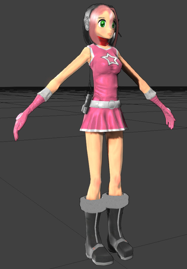
The chin feels way too sharp and sticking out imo, and the lips feel overly thick, but that's only because I keep thinking it has to be anime-ish.
And yes that is much too skinny
And yes that is much too skinny
Basically this.JInxyjem wrote:
The chin feels way too sharp and sticking out imo, and the lips feel overly thick, but that's only because I keep thinking it has to be anime-ish.
And yes that is much too skinny
Also, her hands are too large.
Her arms are too long and stomach area is too small.
Do you want a cartoony approach to it, or do you want her to actually look like a girl? Her torso looks more like a cylinder then an actual body, arms need to be 10-20% shorter, legs are not feminine. Its really weird and you should take a look at a real girl and perhaps take an approach that looks slightly more healthy and normal/real. I'd rather have a more realistic pippi then an anorexic twig pippi.Loginer wrote:
Could I get some honest critique on this? 4chan's telling me the proportions are too skinny, but I'd like a second opinion.
Definitely too skinny.Loginer wrote:
Could I get some honest critique on this? 4chan's telling me the proportions are too skinny, but I'd like a second opinion.
Arms are also a couple inches too long
There's a very uncanny-valley look to it, particularly with the clothing and skin texture.
The face also creeps me out. Possibly the shape of the mouth/jaw. It looks too narrow and distended. I'd suggest flushing it out a bit more, using models/images from video games as references.