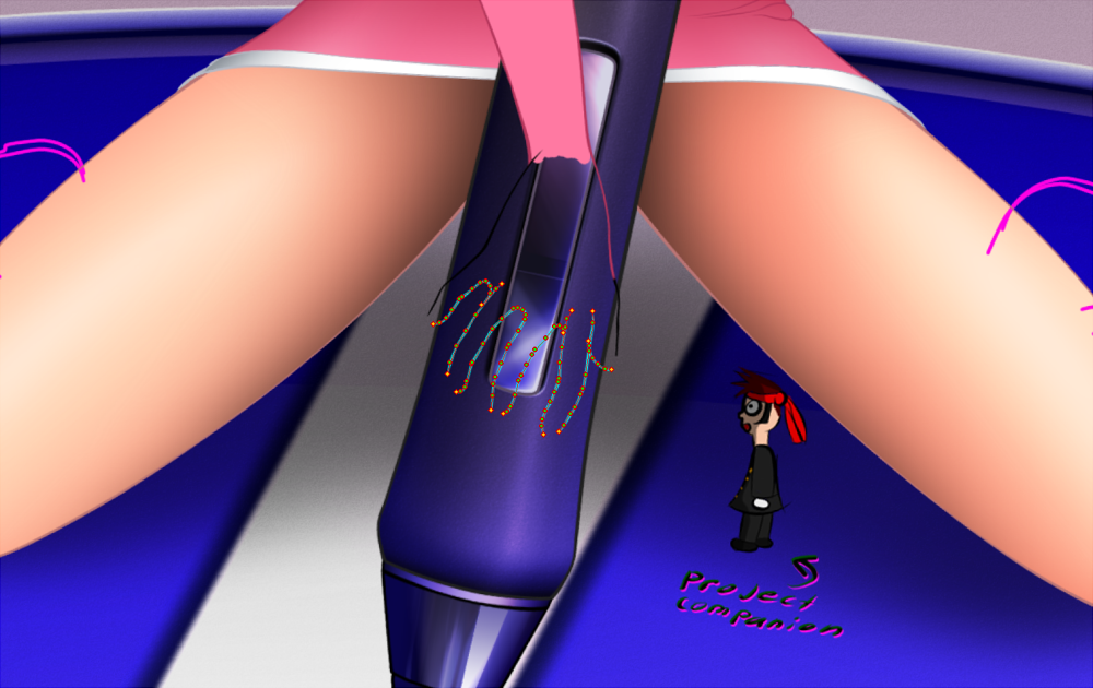
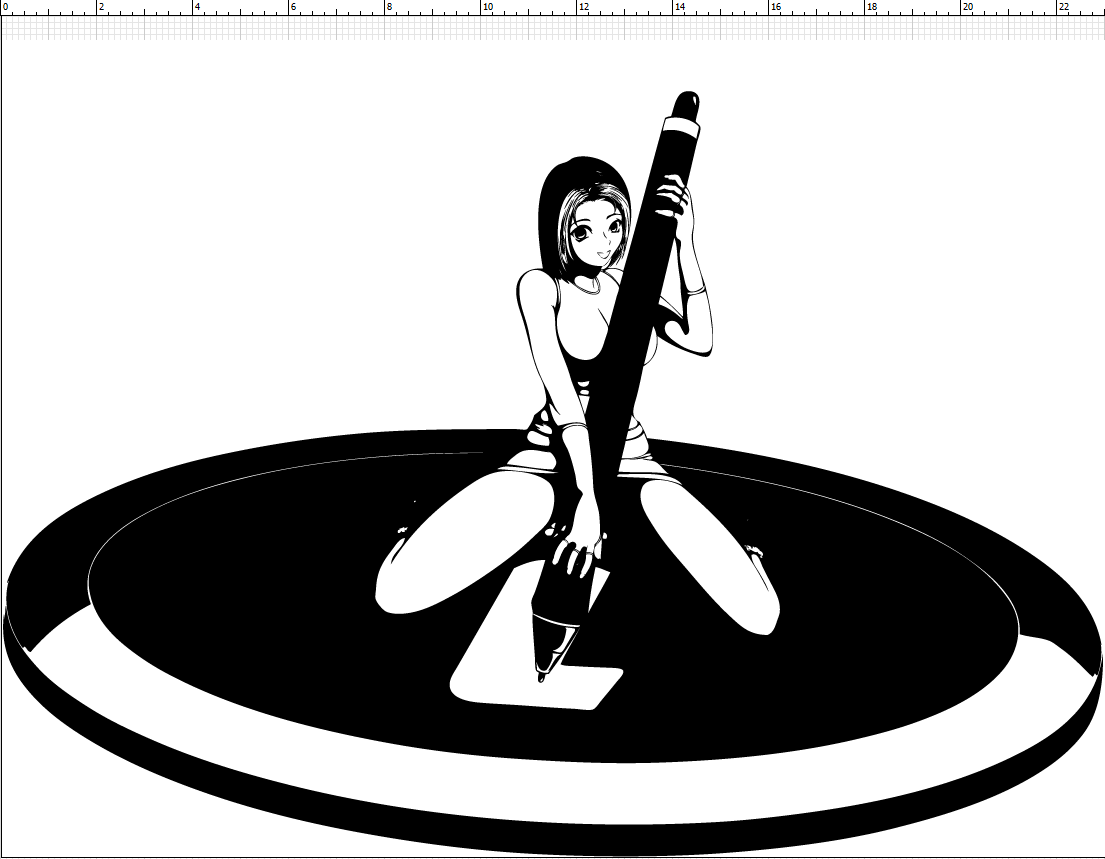
Project companion.... Brings good luck XD
forum
Post your osu! fan art!
posted
Total Posts
2,108
awp wrote:
Sarumaru inked it and I coloured itRBRat3 wrote:
BTW I thought Id ask, Who was responsible for this?
Ahh Ha, Stumbled on to their DA page now things make more sense. Thx
Edit: Been bored so I made a osu logo in max, Haven't a clue what to do with it so I just been fragmenting crap all over it. ( Images aren't useful just having fun any ideas let me know)
And


hahhaa...osu..osu...[color=#BF00FF]
@RBRat3: I demand more! That looks epic. Can you make a high res version of the white one which isn't clipped at the bottom?
I can do anything you want to it as long as its in the confines of my ram usage XDpeppy wrote:
@RBRat3: I demand more! That looks epic. Can you make a high res version of the white one which isn't clipped at the bottom?
What res do you want it? I wouldn't go any higher 10k WxH otherwise you might get the render next day.
That would be much higher than I'd need, but sure .
.1.
Preview
Full res at 5000x5000px PNG w/alpha 13.7mb
http://i.minus.com/dRF15Key3pyV1.png
2.
Preview
Full res at 5000x5000px PNG w/alpha 26.7mb
http://i.minus.com/dJSF91w2oex6W.png
3.
Preview
Full res at 5000x5000px PNG w/alpha 22.10mb
http://i.minus.com/dbn4ZDfXRieNEZ.png
Preview
Full res at 5000x5000px PNG w/alpha 13.7mb
http://i.minus.com/dRF15Key3pyV1.png
2.
Preview
Full res at 5000x5000px PNG w/alpha 26.7mb
http://i.minus.com/dJSF91w2oex6W.png
3.
Preview
Full res at 5000x5000px PNG w/alpha 22.10mb
http://i.minus.com/dbn4ZDfXRieNEZ.png
That is great stuff  . Make sure to keep the original 3ds files; I might ask for a custom render of this in the future for a specific use case.
. Make sure to keep the original 3ds files; I might ask for a custom render of this in the future for a specific use case.I made this for my current wallpaper: http://puu.sh/wb3B
friendok53
i love youpeppy wrote:
I made this for my current wallpaper: http://puu.sh/wb3B
Nice!!, I wanted to glow it but the filter interacted on the glass too much turning the scene into a giant light bulb. Figured it was better off being applied by an external program.peppy wrote:
I made this for my current wallpaper: http://puu.sh/wb3B
Works out great by itself XD
SPOILER
Damn I need to realign all that crap :<
Damn I need to realign all that crap :<
Yes it is o.Opeppy wrote:
That is great stuff
You got some rly nice stuff there RBRat3 (reeeeeeeeeaally nice)
my new wallpaper <3RBRat3 wrote:
Sliderbreaking is incredibly well explained by your drawing IMO
So much it should be in the FAQ
But wait, there's no sliderbreaking in Taiko! Well there kinda is if you fsck up the rhythm on the sliders but it doesn't actually break your combo.
So much it should be in the FAQ
But wait, there's no sliderbreaking in Taiko! Well there kinda is if you fsck up the rhythm on the sliders but it doesn't actually break your combo.
Oh my god that is amazing.
Wow, awesome.
Btw, what happened with Fanart section? :~
Btw, what happened with Fanart section? :~
I love your and also wallpaper RBRat13. That is amazing...friendok53 wrote:
i love youpeppy wrote:
I made this for my current wallpaper: http://puu.sh/wb3B
Huh didn't expect 45min to be well received... anyways Thank You!!!
The time it took is not always relevant to the outcome, nor quality of a piece, sir.RBRat3 wrote:
Huh didn't expect 45min to be well received... anyways Thank You!!!
A fully rendered piece is not necessarily better then something speedpainted, for instance. If the result is good, then who cares about how long it took, what came out of the time spent is what mattress.
Time is always relevant to the outcome, Its what you do within time that determines the outcome.
If I took it an hour or more I would have vectored all the cel shades that way I could push out its real resolution but no the primary goal of it was just to simply get it lined and all I did was bullshit shades in with the pen with a few gradient fades XD
Also if I took the extra 30 secs I would have dropped layers to get rid of color banding artifacts.
All in all it was just a quickie to make with the line plot that was constructed and physics simulation render which originally was gonna be pippi's hopping bunny pantsu but thats another story XD
RBRat3 wrote:
Time is always relevant to the outcome, Its what you do within time that determines the outcome.
Spending more time on a piece doesn't necessarily make it a better piece of art. That of course, within logical boundaries, in the matter of how much work you're actually able to pull off within said time. An unrendered painting isn't necessarily worse then a fully rendered and processed one, irregardless of that the latter took a load more time. Unless you judge "art" based off the artists abilities, which is quite stupid, at the very least in my book.boat wrote:
what came out of the time spent is what mattress.
Well in my case thats what it practically translates into on how my work aesthetically appeals to myself (always garbage). As for how its received its not a major concern to me since everything I do is never final until I take it into some sort of production phase such as heat transfers, decals, sublimation, large format printing... Basically anything physical is where I consider it permanent since its no longer in an actively editable medium.boat wrote:
Spending more time on a piece doesn't necessarily make it a better piece of art.
As long as I get my instant gratification of producing something nothing really matters, In the above case it was just the linework from ingame refrence (which I think sux still) XD
Just need to figure what use to put it to... ( If I had any pink I would rock that on the hood of my car
 )
)So we got Andy and Bob. They are both digital artists, they both have great skill and knowledge within digital painting. Andy, he likes to do photostudies, so he paints one, using this one photo of a car as a reference. He spends countless hours rendering it, making it as correct, similar and realistic in comparison to the reference photo. At first glance, you wouldn't be able to say that its a painting.
Now Bob, he is an innovative person, he likes to paint from his mind. He doesn't have a lot of time on his hands, but plenty to get a good result from the time spent. He paints lets say, a character he came up with who is striking some sort of pose in an environment he also came up with from his mind, something that nobody has seen before. His work is all anatomically correct, the perspective is correct, on similar factors its flawless. Only thing that differs is that he didn't put much time into rendering the piece all too much, the brushstrokes are visible. Its not bad at all, just clearly a painting, as he didn't even have half that Andy did.
Now, irregardless of that Andy spent a whole load more time then Bob did, he still lacks the innovation, charm and "imaginative-ness" which Bob has. His work is all polished and pretty, but it has no feeling, no emotion nor anything thats actually >interesting<. We've all seen that photo of the car before, but we haven't seen this character and environment which Bob painted up until now, which is new, fresh and interesting to look at.
Andys work can solely be valued in effort and time spent, whilst Bob has an actually artistic value to his.
Who's to say that Andy's doesn't have as much artistic value than Bob's? Just because something isn't as creative or imaginative as something else doesn't rob it of its value of art. Everyone views art differently than others. Some may favor the drafty feel of sketches, some full replications, and others downright abstract. Do all these styles mean that they are better than the other in terms of reflecting any kind of artistic value? I wouldn't think so.
Time doesn't always reflect on how great an art piece will turn out. It's just a measure of opportunity. Whether or not you choose to take the opportunities to seek improvements on your drawing is up to you and how you envision the "final result" in mind.
I find charm in artistic renditions of real life things, just by the way. I also enjoy sketches. While they are both "art", you can't fully compare one to the other. They are two separate entities that stand on their own and will have their own base of fans that appreciate them.
Sadly, both of you are right since art is subjective. Now, less bickering, more fan art.
Man, you're waaaaaaay too good at this.
That. Is. Awesome.
niceRBRat3 wrote:
I'm still waiting for osu 3d j/k
Weeee!!!!
Wow, that's really neat.RBRat3 wrote:
I'm still waiting for osu 3d j/k
Weeee!!!!
img
Holy crap this is epic.RBRat3 wrote:
I'm still waiting for osu 3d j/k
Weeee!!!!
The only issue I have is that the slider endpoint's radius doesn't match the track, like a badly-made skin :p.
Definitely had another thought the first time I looked at thisRBRat3 wrote:
Project companion.... Brings good luck XD
oh youthose wrote:
Definitely had another thought the first time I looked at thisRBRat3 wrote:
Project companion.... Brings good luck XD
I can round it off... Just thought it kept things separate and made more sense for a ball to roll on rounded tracks instead of square onespeppy wrote:
The only issue I have is that the slider endpoint's radius doesn't match the track, like a badly-made skin :p.
Anyways its alittle late now for what I was gonna use it for XD
I'm not sure I understand the rounded vs square you are talking about. The specific part I'm talking about is this join, though: 
The endpoint's outer ring is square while the track is tubular...
The join? As in the endpoint not being flush with the track or the radius not meeting up with the track width?
It intersects with it slightly, didn't think much about it since its far from view and put crap over it for what I wanted XD
The join? As in the endpoint not being flush with the track or the radius not meeting up with the track width?
It intersects with it slightly, didn't think much about it since its far from view and put crap over it for what I wanted XD
the track width should be equivalent to the start-point's diameter
You guys mean it should be tangent.
And I mean the real meaning of tangent, not the "but it's already touching one edge" kind of meaning.
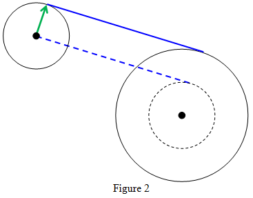
So yes, the track should be on the furthest edge of the circle to be correct.
And I mean the real meaning of tangent, not the "but it's already touching one edge" kind of meaning.
So yes, the track should be on the furthest edge of the circle to be correct.
awsome
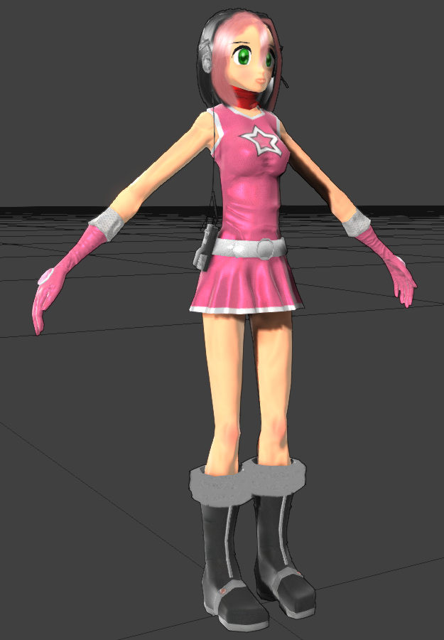
Heres something to ponder...
What is pippi's measurements & age?
(Yes I care)
What is pippi's measurements & age?
(Yes I care)
Its not really on the basis of drawing... I wouldn't mind knowing some approximate numbersDaru wrote:
Depends on who's drawing her.
Anywhere from 12 to 21, it would seem.
I'm not super familiar with "measurements", just that she's fairly modestly built.RBRat3 wrote:
Heres something to ponder...
What is pippi's measurements & age?
(Yes I care)
She was originally designed to be 17, but was scaled back to 15 at the time of inception. Depending on whether or not she ages in realtime, she's either 15, or 18~19 now.
thank you very much >u<boat wrote:
this is a good artstyletsuruui wrote:
i can't art but i was bored so i drew pippi-tan >w>
i like it
"i can't art"Daru wrote:
SPOILERi can't art but i was bored so i drew pippi-tan >w>Depends on who's drawing her.RBRat3 wrote:
Heres something to ponder...
What is pippi's measurements & age?
(Yes I care)
Anywhere from 12 to 21, it would seem.tsuruui wrote:
[spoilerbox]
It's not good to lie, ya'know.[/spoilerbox]pshhh, it's not that far from the truth = u =
http://www.youtube.com/watch?v=1X2bf76wn54RBRat3 wrote:
"This is what old osu! use to look like in the 70s"
Could I get some honest critique on this? 4chan's telling me the proportions are too skinny, but I'd like a second opinion.
The chin feels way too sharp and sticking out imo, and the lips feel overly thick, but that's only because I keep thinking it has to be anime-ish.
And yes that is much too skinny
And yes that is much too skinny
Basically this.JInxyjem wrote:
The chin feels way too sharp and sticking out imo, and the lips feel overly thick, but that's only because I keep thinking it has to be anime-ish.
And yes that is much too skinny
Also, her hands are too large.
Her arms are too long and stomach area is too small.
Do you want a cartoony approach to it, or do you want her to actually look like a girl? Her torso looks more like a cylinder then an actual body, arms need to be 10-20% shorter, legs are not feminine. Its really weird and you should take a look at a real girl and perhaps take an approach that looks slightly more healthy and normal/real. I'd rather have a more realistic pippi then an anorexic twig pippi.Loginer wrote:
Could I get some honest critique on this? 4chan's telling me the proportions are too skinny, but I'd like a second opinion.
Definitely too skinny.Loginer wrote:
Could I get some honest critique on this? 4chan's telling me the proportions are too skinny, but I'd like a second opinion.
Arms are also a couple inches too long
There's a very uncanny-valley look to it, particularly with the clothing and skin texture.
The face also creeps me out. Possibly the shape of the mouth/jaw. It looks too narrow and distended. I'd suggest flushing it out a bit more, using models/images from video games as references.
Her figure should be 2 heads wide, especially around her shoulders. I believe you have it around maybe a little more than 1 head wide but it's hard to tell from the angle. Her hands are too long and where her skirt ends is pretty much about the area that her crotch should be given the location of her tiny waist. Because her hips and thighs are not full enough, her legs are really skinny as a result and makes her resemble a little more like a trap than anything to me right now.
As for her facial features, I'd say move the mouth and nose up a little bit. It's up to you if you want to make the eyes a little smaller or prefer the really big Kanon-like eyes. Remember that the lips should be pushed a little further back than the nose or else she might possibly be confused with a chimpanzee.
- Wider shoulders and slightly more upper body mass (but not to the point of a manly figure, obv)
- Fuller hips (should bring out the butt figure as well and fill out the thighs more)
- Not as long/manly hands (NOT to be confused with smaller since you still need to stay in proportion with where a normal woman's arms should meet at the thigh)
- Bring the skirt down unless panty shots are your thing
Good job though. 3D modeling, especially manipulating polygons and such, can be pretty challenging. I'd recommend having bitmaps of a woman's figure (top, right, front) and setting them as the background in their respective camera views when you're modeling. I did this when I used to do 3D modeling as well, but for vehicles, and it works pretty well as a general guide.
tl;dr Feed her a little bit of American food
should be the new pippi looks much better then the current one
that is the current one, as far as I can tellboat wrote:
looks much better then the current one
Then you quite clearly can't tell all that far.
I can tell as far as the first 16 letters of the alphabet. That's over half of them. Good enough to pass
Whats so wrong with the current one? Lack of ass...ets?
big boobs would be bad character design for a dancer
Woah wait a min, When did she become a dancer now?
Ohh forgot to add that assets are a good thing to have when taking the pole position if we're talking about "Dancing" XD
Ohh forgot to add that assets are a good thing to have when taking the pole position if we're talking about "Dancing" XD
I mean dancer in the cheerleader/pep-rally sense? I guess? Like the EBA or OTO doing their dances. Boobs just get in the way
Didn't the Hard Rock mode prove that wrong though
it didn't prove anything
I meant realistically
but maybe I'm at fault for taking a realistic perspective when designing a cartoon
I meant realistically
but maybe I'm at fault for taking a realistic perspective when designing a cartoon
Well...I like em all kinda...
Heres a small story, Found a 45° blade laying in a junk box so I wasn't too sure if it was dull so gave me a reason to test a roll of vinyl a bought from a company im not familiar with and to see if the blade was in shape. After running around the house with a 24" x 30yd roll of vinyl on my arm pretending to be megaman I came to the conclusion that the fastest means of a test with minimal waste was to 2 tone that pippy I readily had available and slap it on my pc case XD
But sadly the vinyl adhesion to its carrier cant cope with the thin tolerances of her hair which resulted 2 failed cuts but awell I'll just have to tweak it
But sadly the vinyl adhesion to its carrier cant cope with the thin tolerances of her hair which resulted 2 failed cuts but awell I'll just have to tweak it
Her head is too small.
Welp you might have to take that one up with another artist, Im not the person who designed the original base body. It was pulled from an old reference book out of laziness with moderate changes to her leg size, slightly moved arm/finger positions and changed her sharp chin but other than that its untouched for the most part.
Ohh and rounded off her hip bones being I like women with something to grab onto, needed something fast and simple and finding that pose & size almost translated perfectly for the idea I was gonna half ass so I used it rather than dicking around with a drawing manikin.
BUT... The finished example reference did have the base with a rather large head of hair which may have covered up the perception of a small head. Overall it seems fine to me plus the image you see is a 2 tone version of a branch off from the original project file so its basically fun scrap to play with, with plenty of errors to pick out mind you. It was gonna be a wallpaper till I realized it wasn't gonna work out with the BG having gradients and the subject not having any so I wasn't about to redo that BG just get a shade method to look right so it just became incomplete scrap
I would finish the original if I wasn't too busy playing around with this ugly ass thing XD...
Originally I thought I would complete this faster than that pippy but it's slightly over my assumed timeframe :<
This is so Awesome :3
I don't know, what ur mean... did u think its a chibi?? because of the head??
but i think everything is alright O.o?
u see?
V

but i think everything is alright O.o?
u see?
V
I agree with Wojjan, her hips and possibly crotch (not her waist though) are a little too low. Try shifting them upwards a bit.
it does not seem off to me
at least, looking at the skeleton version
at least, looking at the skeleton version
Think of it this way
Our elbows are in level with our waist, or hip bone.
Our elbows are in level with our waist, or hip bone.
Welp I'd like to think im done with this XD

Full PNG, 3,430 x 6,020 pixels http://i.minus.com/dbeXKpb5p2JIeX/TaikoRun.png
Full PNG, 3,430 x 6,020 pixels http://i.minus.com/dbeXKpb5p2JIeX/TaikoRun.png
So much bloom ._.
But very nice looking nonetheless. Good job man
But very nice looking nonetheless. Good job man
Kitsunemimi wrote:
So much bloom ._.
But very nice looking nonetheless. Good job man
Close but its not bloom,
SPOILER
Anyways THX!!!!!Bloom interacts with luminescence and feathers it. What you saw was a camera shader nicknamed peppy porn star (glare) which renders on its own layer and works for and against lume (brightest pixel wins) but instead of feathering it will blur the affected areas. Chose to use it so I could get away with having 1 light source and no global lighting without rendering it a shit load of times to get it right (kinda a fix it all).
I would do it over and work on the lighting but forgot to save the changes to it after peppy said the sizes were off and it looked like shit XD
I would do it over and work on the lighting but forgot to save the changes to it after peppy said the sizes were off and it looked like shit XD
Cool.
Ryu_old
LmaoVext wrote:
I do my parkour in crocs as well.JMC wrote:
well i dont know my artwork included osu! fan art or not..
but this artwork inspired from FREEDOM DiVE beatmap, enjoy...
don't try this at IRL...!!!!
Ryu_old
Vext wrote:
I like the square sun and the all black hair with a pink hood in particular.Ryu wrote:
lol i ve just noticed i drew wrong
p.s.
ty moe vext >w</