Lince Cosmico wrote:
Doing this for M4M uwuGeneral
actually i dont know if i understood the new ranking criteria correctly, shouldn't the background be 1366x768 or 1920x1080? Opps, I turned this offBeginner
I'll start from the Beginner to the hardest one
The aesthetics on this diffs aren't really clear, in easier diffs, the usage of blankets is really important imo.
• 00:00:798 (2,1) - this isnt wrong, but the ending of the slider 2 is really close to slider 1, in visual terms, it doesn't looks good at all Added symmetry to make it look nice
• 00:11:706 (1) - the shape is kinda weird imo I think it looks okay, its a pretty basic shape
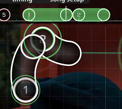
• 00:15:494 (1) - same Made this an elbow slider instead
• 00:18:979 (1) - same Made one of the corners a curve
• The angle of 00:26:403 (1) - from here 00:25:645 - to here 00:26:403 - isn't really good, i actually recommend to move it to the left and make a blanket with 00:24:585 (3) - reorganized this part
------------------ seems like you need a hard diff lmao -------------------- yeah lmaoLight Insane
• 00:02:615 (2,3,4,5) - idk how to explain this... this is, hard .. maybe you should reduce the spacing a bit I use this kind of spacing throughout the map. 00:07:161 (1,2,3) - 00:10:494 (5,6,1) -
• 00:02:918 (4,1) - be careful with this kind of overlaps, details are important my friend chagned slider shape
• 00:03:827 (2) - //// 00:05:342 (2,3) - //// 00:06:403 (3,4,5,6) - //// actually why are you overmapping this? This isnt an overmap. There are differnet notes there lol
• 00:07:767 (4,5,1) - the slider 5 seems to be overspaced, also, 00:07:767 (4,1) - they're too much closer S: you should move the slider 1 a bit up i think This patttern creates an easy back-and-forth type flow so its fine
• 00:09:130 (1,2,3) - why did you change the spacing at the third slider? if you want to keep the spacing as literally the same poke me in discord this flows better with the current sv.
• 00:10:494 (5,6,1) - the angle is that linear that it seems weird xD linear flow is okay xp
• 00:11:403 (2,3,4,1) - and here it's super curvy lmao its not curvy flow, its just jumps at an angle
• 00:13:979 (2,3,4,5) - The rhythm choice here sounds weird, try this:
Do it in this order "circle - slider - slider" and keeps the other as the same ////// http://puu.sh/uVSZH/ad3ffa2a7e.jpg this suggestion buts strong beats at the end of the slider
• 00:15:342 (1) - This seems better as a triple, using kicksliders in a light insane doesnt really fits tho I don't think the varience in rhythm is a bad thing, but i see how a triple would be more consistent. I'll see what others have to say about this first
• 00:14:888 (6,4) - You should be able to find a way to stack them This isn't really noticable during gameplay
• 00:20:645 (3) - This should be a normal slider, like 00:20:039 (1,2) - Then I would be skipping a note
• 00:20:342 (2,1) - fix stack ?
needs work but better than pika's one imoMisselthwaite Manore
same here, seems fine but only one thing
• 00:26:404 (2) - moving this to x:139 y:337 (basically stack it with 00:25:191 (4) - ) would be a lot better in flow termss This is just a different type of flow that I do on purpose, it goes with 00:25:645 (1,2,3,4) -
Thats all from me :p
Skylish wrote:
From your M4M queue
[Light Insane]
> 00:02:918 (4,1) - a bit overlapping of these objects can be enhanced by shifting the tail of the slider a bit away from 00:02:918 (4) - , but not too close to 00:02:767 (3) - . changed shape
> 00:03:827 (2,3) - DS=1.90 should be kept here, corresponding to the same mapping style at 00:00:192 (1,2) - this .05 difference in ds isnt noticable
> 00:05:342 (2,3,4) - Aren't they stacked too close to each other? DS=0.75 should fit more (take ref. at 00:17:464 (1,2,3) - ) space this a little more
> 00:06:403 (3,4,5,6,7) - I think these 5 combo are slightly overwhelmed in Light Insane. The maximum combo each time might be hold at 3 imo (and this 5 combo pattern stands out in the mapset, it should be changed). Using a similar reverse slider in 1/4 x4 would be nice already. My nc patterns follow the music, not combo length. Also, 00:10:949 (6) -
> 00:17:842 (2,3) - 3 is a bit far away from 2 (DS=0.79). Make it be consistent (change to DS=0.75)!This is unnoticable
> 00:24:585 (3,5) - obvious overlapping does not really match your style overall speaking. Detach 00:25:342 (5) - from the body of 00:24:585 (3) - . This flows well as is
> 00:26:403 (4) - For a better outlook of this circle, you may put it at 256,192, i.e. the centre of spinner. I stacked it with 00:25:342 (5) -
> 00:32:018 (2) - unsnapped, snap it to 00:32:009 plesae Fixed
> 00:30:645 - 75% seems too loud. 50 would be a compromised option. I just did this for the last circle
[Beginner]
! Slider tick rate as 2 is VERY VERY IRRITATING! The slider itself is long, then the slider tick rate must stay low (=1), or the clicking sounds will be full of 30s. Lol changed
! Notes do not fall on concrete on-beat, like 00:11:100 (2) - / 00:07:464 - . They can be very confusing. The map does not need a Beginner tbvh. There is an obvious snare at the notes you pointed out
GL from now on.
Thanks for the mods!fattypikachu wrote:
Hello for your M4M queue! ^-^
Well, we've got a lot of diffs to mod, so here we goooooooo
[Beginning]
First of all, I think the tick rate should be 1. At 2, the ticking sound gets annoying, and it doesn't really help if you're trying to keep people on the slider. Changed
00:08:070 (1) - Since in 00:00:798 (2) - , 00:04:433 (1) - , etc. there's a bump after 1.5 beats (I'm guessing as emphasis) The same thing should be the thing here. did this
00:11:706 (1) - Move the points down to bring out the bump: https://puu.sh/uTUKT/1ae8f2dde1.jpg
(You'll probably have to move other stuff) also did this
[Light Insane]
00:01:858 (1) - Move the head to x322 y351 so it looks more like a hexagon with 2,3,4,5 Good suggestion, but I'm satisfied with this as long as its symmetrical
00:10:494 (5) - Move the tail down slightly so that it's parallel with 00:09:736 (3) - This already looks parallel
00:11:858 (1) - Move the head to x182 y214 so the spacing's equal Sure why not
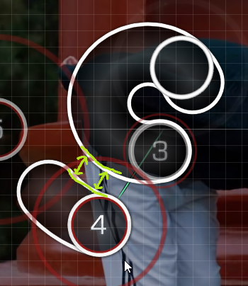
00:14:282 (3) - Move the tail down to y139 so it blankets 00:14:888 (6) - this didnt really matter but i fixed it anyways
00:20:342 (2) - This isn't exactly stacked on 00:21:100 (1) - This doesn't matter
00:23:524 (3) - Maybe make this a straight line and parallel with 00:22:767 (1) - its already the same curve as 00:24:282 (2) -
[Misselthwaite Manor]
00:16:403 (1,2,3,1,3) - Make this a pentagon with the polygon tool Thats not what I intend here
00:18:676 (3) - Move this down so the follow line passes straight through 00:18:373 (1) - : https://puu.sh/uWx3T/c9dcc6c69f.jpg This doesn't matter
00:20:494 (2) - Move to x292 y150 so the follow line goes straight through it: https://puu.sh/uWxoA/44d9a10b4f.jpg ^ I dont intend to do that aesthetic
00:22:615 (5) - Since you have all this momentum from the previous notes, why not make this the same distance from 4? The low spacing correlates to the strength of the notes here
Alternatively, you could make the spacings in 00:22:009 (1,2,3,4) - progressively smaller before a burst to 00:22:767 (1) - This is a good idea, I want to think about how i would do this and keep the pattern shape tho
That's it! Good luck with your set! ^-^
Updated current diffs, and since a lot of people are asking: I plan on having all diffs fully hitsounded, as well as the missing Advanced and Hard diffs done, by the next batch of mods (which will be smaller lol).


 ]
]