forum

Mr.T - EXE

posted
Total Posts
46
Topic Starter
Samah
This beatmap was submitted using in-game submission on Wednesday, 4 May 2011 at 9:34:33 AM

Artist: Mr.T
Title: EXE
Source: beatmania IIDX
Tags: bemani konami ddr iidx10
BPM: 158
Filesize: 3566kb
Play Time: 01:46
Difficulties Available:
  1. Another (4.97 stars, 267 notes)
  2. Beginner (2.64 stars, 112 notes)
  3. Hyper (4.47 stars, 174 notes)
  4. Normal (3.99 stars, 145 notes)
Download: Mr.T - EXE
Information: Scores/Beatmap Listing
---------------
Thanks XepherX3 for the pro storyboard.

Last full submit: 11/05/04

11/05/03: XepherX3's storyboard change.
11/05/02: rust45's mod, reduced storyboard load.
11/04/21: Small changes.
11/04/15: osuplayer111's mod.
11/04/13: gyt's mod.
11/04/11: JauiPlaY's mod.
11/04/09: Louis Cyphre's mod, SB change.
11/04/08: winber1's mod, SB changed again.
11/04/06: SB load reduced, letterboxing disabled.
11/04/05: Normal finished, storyboard added, other difficulties tweaked.
11/04/04: Beginner finished, new hitcircle added.
11/04/04: Hyper and Another finished, Normal and Beginner to come.
Hamuko

Also, pretty beatmap you have there, star.
XepherX3

Teta wrote:


Also, pretty beatmap you have there, star.
Hmm...will see what i can do..to the sb load..on my system it didn't exceed 10
XepherX3

XepherX3 wrote:

Teta wrote:


Also, pretty beatmap you have there, star.
Hmm...will see what i can do..to the sb load..on my system it didn't exceed 10
here you go Less SBload

i resized some images and edited the storyboard a bit
jnkinsu
:)
rrtyui
:P
Hijiri Tezuka
Some parts sounded off to me (though it could just be lag ;-;), but the maps were well-made.
winber1
Mod4Mod? :D

Another

00:25:387(3) - end slider here. Move combo 4 one blue tick ahead.
00:32:317(x) - add note?
00:33:077(x) - add note?
00:47:412(5) - perhaps end the repeat slider here (with finish) and start the spinner a little later. Sounds better imo.
01:26:146-01:33:838(section) - Do the same thing as I said with the previous section?
01:45:9889(6) - add clap

Hard

AR +1 or 2

01:12:855(spinner) - you don't really need this finish but ok.
01:13:235(1) - finish
01:37:539(1) - silence
01:37:918(2) - normal hitsound with finish and clap. The rest of the section will be soft.


Normal

This is too hard for a normal. Maybe just rename it so you don't have to deal with remapping.

00:24:627(1) - This repeat slider is not appropriate for normal difficulties, especially following these 1/2 beats. This includes all patterns like this
00:36:779(1) - even this may be not appropriate, but it's as big a deal as the other one.
01:04:311(1,2,3,4) - not appropriate for a normal
01:37:539(1) - silence
01:37:918(1) - normal with finish and clap

--Same goes with all the repeated patterns
--The patterns I didn't address i guess are fine, but you should still really consider either not making this difficulty with so many blue ticks, or rename this difficulty to like hard or something.

Beginner

Too many notes to be a begginer. This is more like a somehwat easy "normal" diffculty.

00:55:007(break) - i would map this as you did with the other difficulties
01:12:855(spinner) - i would just be consistent with the other difficulties and just end the spinner here, or you can end it at 01:13:235 and get rid of the fist combo that comes after
01:37:539(spinner) - silence

Cool map! :3
XepherX3
even less SB load

http://puu.sh/1ua3

Download: Mr.T - EXE (Samah).osb

[ChangeLog]
resized all images of the SB
edited SB consuming images from rgb to indexed colors
rescripted SB a bit
tidy up the osb

cursed 2473 times
broke the mouse 3 times
added a new hole in the wall 4 times

8-)
Ayeen_old
SB Modding:

Tidy up the SB code by eliminating the long numbers ( S,0,10956,,0.8335999) to this ( S,0,10956,,0.8). This can be done by saving the map first in editor mode and save the SB code that was written in notepad after the edit mode have been closed.
Use 1/8 Beatsnap divisor for SBing.
There is 3 (1024X768) element in your SB which is not allowable. Only 1 (1024x768) element is allowed
Generally, Storyboard loading should be less than 5x
Try to use Sprite library Foreground rather than using Background for SB purpose.

At 00:10:956, SB load = 5.87x, Not good

Why?
Sprite,Background,Centre,"SB EXEbar.png",320,240
F,0,10956,11146,1,0
M,0,10956,12428,0,316,327,316
Sprite,Foreground,Centre,"SB EXEload overlay.png",320,240
F,0,10956,12428,1
Sprite,Foreground,Centre,"SB EXELSB.png",320,240
M,0,10956,,326,357
F,0,10956,12428,1
Sprite,Foreground,Centre,"X.png",320,240
M,0,10956,,319,195
S,0,10956,,0.8335999
F,0,10956,12475,1,0

(1) 4 pictures loaded at the same time points.
(2) Load Overlay.png is 1024X768. recommended size for Sb is 640x480.As in this case here. You should use only the withe bar for SB or reduce the size.


At 00:12:475 SB Load = 9.02x, Very not good
Why is it so?
Sprite,Foreground,Centre,"SB EXEwhite.png",320,240
F,0,12475,12855,1,0
Sprite,Background,Centre,"SB EXEblack.png",320,240
F,0,12475,12523,1,0
Sprite,Background,Centre,"SB EXEbar.png",320,240
F,0,12428,12475,1,0
Sprite,Foreground,Centre,"SB EXEload overlay.png",320,240
F,0,12428,12475,1,0
Sprite,Foreground,Centre,"SB EXEbmbs.png",320,240
F,0,12475,14754,0,1
Sprite,Foreground,Centre,"layer 1.png",320,240
F,0,12475,,1 (The fading code is not completed too.)
Sprite,Foreground,Centre,"layer 1.png",320,240
M,0,12475,,320,240
S,0,12475,24627,5,1.0384
P,0,12475,24627,H
P,0,12475,24627,V
Sprite,Foreground,Centre,"X.png",320,240
F,0,10956,12475,1,0

(1) There was 3 (1024x768) Element was used in this time, "White.png","black.png","load overlay.png"
(2) "white.png", "black.png","bmbs.png","layer 1.png" load up at once at this point
(3) "bar.png","load overlay.png","X.png" ended at once at this point of time


At 00:24:627 SB load = 7.93x
Sprite,Foreground,Centre,"SB EXEwhite.png",320,240
F,0,24580,24627,0.02105266,1
F,0,24627,25007,1,0
Sprite,Foreground,Centre,"layer 1.png",320,240
S,0,12475,24627,1,3.304
Sprite,Foreground,Centre,"layer 2.png",320,240
S,0,24627,36779,1,5
Sprite,Foreground,Centre,"layer 1.png",320,240
S,0,12475,24627,5,1.0384
P,0,12475,24627,H
P,0,12475,24627,V

(1) There is 1 (1024x768) Element used at this time, "white.png"
(2) Ending of "layer 1.png", "layer 2. png" and "white.png" at the same time point


At 00:36:779 SB load = 5.87x
Sprite,Foreground,Centre,"SB EXEwhite.png",320,240
F,0,36779,37159,1,0
Sprite,Foreground,Centre,"layer 2.png",320,240
S,0,24627,36779,1,5
Sprite,Foreground,Centre,"nebula.png",320,240
M,0,36779,,320,240
S,0,36779,85387,0.1,5
P,0,36779,85387,H

(1) There is 1 (1024x768) and 1 (800x600) element used
(2) "layer 2.png" and "nebula.png" Start at the same points, while "white.png" end at this point too.
(3) At this point, 1024x768 can be ignored but the same starting and ending of SB making it >5 SB load


At 00:46:558 SB load = 5.01x
Sprite,Foreground,Centre,"nebula.png",320,240
S,0,36779,85387,0.1,5

(1) "Nebula.png" Scaled too large, 5

At 00:50:877 SB load 6.05x
Sprite,Foreground,Centre,"nebula.png",320,240
S,0,36779,85387,0.1,5

(1) "Nebula.png" Scaled too large, 5. Add up other elements, then it goes up too 6.05

At 01:25:387 SB load = 10.31x, way too heavy load
Sprite,Background,Centre,"Songs28372 MrT - EXEsun.png",320,240
M,0,85292,85387,212,195,454,294
Sprite,Background,Centre,"Songs28372 MrT - EXEearth.png",320,240
S,0,48931,85387,0.1,4.923981
Sprite,Foreground,Centre,"nebula.png",320,240
S,0,36779,85387,0.1,5
P,0,36779,85387,H
Sprite,Foreground,Centre,"nebula2.png",320,240
S,0,85387,109691,0.3408,1.416
R,0,85387,109691,0,2.5216
Sprite,Foreground,Centre,"layer 3.png",320,240
M,0,85387,,320,240
S,0,85387,112539,1,2.6768
P,0,85387,112539,H
P,0,85387,112539,V

(1) "Nebula2.png","earth.png" Scaling way too big, 5
(2) "Nebula2.png","layer 3.png" start at the same time.
(3) 1 (1024x768) element used during this time, "white.png"
(4) "sun.png", "earth.png", "nebula.png", End at this time


I just pinpoint the key that make the SB load more than 5. This key points should eliminate the SB loading issue.

I will recheck on your map later if I got the time and hoping that time no more SB issues. No Star for now till this fixed.
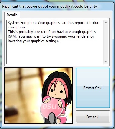

Q.Q My Osu! crashed trying to mod your SB
My first long mod for you Samah >.<

Lol, XepherX3 Ninjaed my modding ~.~ I discussed with him earlier in IRC though.

Edit: Sprite library there should be Foreground
Topic Starter
Samah

winber1 wrote:

Mod4Mod? :D
SPOILER
Another

00:25:387(3) - end slider here. Move combo 4 one blue tick ahead.
Not quite, but I did change this a bit to make it flow better.
00:32:317(x) - add note?
I really wanted to take this suggestion, but I just couldn't find a nice way to lay out the notes without making a horrendous mess of it.
00:33:077(x) - add note?
^
00:47:412(5) - perhaps end the repeat slider here (with finish) and start the spinner a little later. Sounds better imo.
Hmmm... ok.
01:26:146-01:33:838(section) - Do the same thing as I said with the previous section?
A bit.
01:45:9889(6) - add clap
Ok.

Hard

AR +1 or 2
+1

01:12:855(spinner) - you don't really need this finish but ok.
Gone.
01:13:235(1) - finish
Nah.
01:37:539(1) - silence
^
01:37:918(2) - normal hitsound with finish and clap. The rest of the section will be soft.
^

Normal

This is too hard for a normal. Maybe just rename it so you don't have to deal with remapping.
I can't rename it "hard" because there is no "hard" difficulty in IIDX.

00:24:627(1) - This repeat slider is not appropriate for normal difficulties, especially following these 1/2 beats. This includes all patterns like this
Replaced most of the short repeats.
00:36:779(1) - even this may be not appropriate, but it's as big a deal as the other one.
^
01:04:311(1,2,3,4) - not appropriate for a normal
^
01:37:539(1) - silence
Ok.
01:37:918(1) - normal with finish and clap
Nah.

--Same goes with all the repeated patterns
--The patterns I didn't address i guess are fine, but you should still really consider either not making this difficulty with so many blue ticks, or rename this difficulty to like hard or something.

Beginner

Too many notes to be a begginer. This is more like a somehwat easy "normal" diffculty.
Based on IIDX naming standards, the easiest map has to be "Beginner". If it's under 3 stars I think it's fine.

00:55:007(break) - i would map this as you did with the other difficulties
Easy diff = longer break.
01:12:855(spinner) - i would just be consistent with the other difficulties and just end the spinner here, or you can end it at 01:13:235 and get rid of the fist combo that comes after
For easy, it needs a larger gap between the end of the spinner and the first note of the next combo. Also I hate starting a new combo halfway through a bar.
01:37:539(spinner) - silence
Ok.
Cool map! :3
Thanks. :)

Ayeen, you're evil! D:
Louis Cyphre
Mod4Mod trade as you queue rules said.

- Background resolution is so poor, find better one with 800 x 600 or 1024 x 768
- SB element clouds has resolution of 1024 x 768, maximum size of SB elements must be <\= 800 x 600
- Add cursor trail.
- Your Eart pic is awful, seriously, ask some one to make it perfect.

[Beginner]
OD HP ~ - 1
Increase volume of hitsounds by 10%~15%
00:12:475 (1) - add finish at start
00:24:627 (1) - add finish at start
01:36:761 - absolutelly silenced spinner, increase volume at least by 15%. Also of the spinner has sound according to the song.
01:36:020 (1) - ^
01:46:653 (1) - ^ silence only spinner end.
00:36:020 (7) - remove finish
00:36:779 (1) - and add here.
01:01:083 (1) - add finish at start
01:10:197 (1) - weird construction. Suggestion 01:13:235 (1) - remove this and increase spinner length untill 01:13:235 and add finish.
Or Remove finish hitsound from the spinner. Better to remove to do this^
01:25:387 (1) - add finish at start

[Normal]
Same finish hitsound mod as in Beginner. Increase Volume oh hitsounds by 10~15%
00:23:108 (1) - remove finish or suggestion: Remove this note 00:24:627 (1) , increase spinner length untill that note and add finish.
00:35:260 (1,1) - ^
01:23:868 (1,1) - ^
00:38:298 (1) - i understand new combo, but please fix spacing.
00:41:336 (1) - ^
01:05:450 (4) - stream starts 01:05:640.
00:32:222 (5) - Normal criteria~ this note 00:31:463 (3) make repeat arrow hidden on this slider 00:32:222 (5)
01:32:602 (4,5) - ^
Same stuff about silenced spinners.

[Hyper]
Use same hitsound mod as in normal and beginner. Increase volume of hitsounds at least by 10 ~ 15%. Same stuff about silenced spinners.
01:03:172 (3) - better to start triplet there 01:03:361. Sounds better.
01:13:235 (1) - add finish at start
01:13:425 (2,3,4,5,6,7,8,9) - all notes are off.
01:16:463 (2,3,4,5,6,7,8,9) - ^

[Another]
Use same hitsound mod as in normal and beginner. Increase volume of hitsounds at least by 10 ~ 15%. Same stuff about silenced spinners.
Increase OD AR by 1.
01:13:805 (4,5,6,7) - notes are off.
This difficulty is overmapped, which makes it bad, very bad. I like Easy Normal and Hard, but this one is bad. I suggest to remap. without using such patterns: 00:13:520 (2,3) - , 00:14:849 (5,6) - ... ... 00:28:805 (5,6,7,1,2,3) - , 00:33:931 (1,2,3,4,5) -
00:41:336 (1,2,3,4) - this pattern dose not follow the song.
01:03:741 (6) - you need only 2 notes, not 4.
Topic Starter
Samah

Louis Cyphre wrote:

SPOILER
Mod4Mod trade as you queue rules said.

- Background resolution is so poor, find better one with 800 x 600 or 1024 x 768
Fixed.
- SB element clouds has resolution of 1024 x 768, maximum size of SB elements must be <\= 800 x 600
^
- Add cursor trail.
Not for now.
- Your Eart pic is awful, seriously, ask some one to make it perfect.
Fixed.

[Beginner]
OD HP ~ - 1
Ok.
Increase volume of hitsounds by 10%~15%
No.
00:12:475 (1) - add finish at start
^
00:24:627 (1) - add finish at start
^
01:36:761 - absolutelly silenced spinner, increase volume at least by 15%. Also of the spinner has sound according to the song.
Made it normal volume and added a finish.
01:36:020 (1) - ^
01:46:653 (1) - ^ silence only spinner end.
Ok.
00:36:020 (7) - remove finish
No.
00:36:779 (1) - and add here.
^
01:01:083 (1) - add finish at start
^
01:10:197 (1) - weird construction. Suggestion 01:13:235 (1) - remove this and increase spinner length untill 01:13:235 and add finish.
^
Or Remove finish hitsound from the spinner. Better to remove to do this^
Silenced the end instead.
01:25:387 (1) - add finish at start
No.

[Normal]
Same finish hitsound mod as in Beginner. Increase Volume oh hitsounds by 10~15%
No.
00:23:108 (1) - remove finish or suggestion: Remove this note 00:24:627 (1) , increase spinner length untill that note and add finish.
Moved the finish from the spinner to the hitcircle instead.
00:35:260 (1,1) - ^
^
01:23:868 (1,1) - ^
^
00:38:298 (1) - i understand new combo, but please fix spacing.
No.
00:41:336 (1) - ^
^
01:05:450 (4) - stream starts 01:05:640.
^
00:32:222 (5) - Normal criteria~ this note 00:31:463 (3) make repeat arrow hidden on this slider 00:32:222 (5)
Moved (3)
01:32:602 (4,5) - ^
^
Same stuff about silenced spinners.

[Hyper]
Use same hitsound mod as in normal and beginner. Increase volume of hitsounds at least by 10 ~ 15%. Same stuff about silenced spinners.
01:03:172 (3) - better to start triplet there 01:03:361. Sounds better.
No.
01:13:235 (1) - add finish at start
^
01:13:425 (2,3,4,5,6,7,8,9) - all notes are off.
They're supposed to be. They're on the offbeat with the bass.
01:16:463 (2,3,4,5,6,7,8,9) - ^
^

[Another]
Use same hitsound mod as in normal and beginner. Increase volume of hitsounds at least by 10 ~ 15%. Same stuff about silenced spinners.
Increase OD AR by 1.
I think they're fine.
01:13:805 (4,5,6,7) - notes are off.
Again, offbeat.
This difficulty is overmapped, which makes it bad, very bad. I like Easy Normal and Hard, but this one is bad. I suggest to remap. without using such patterns: 00:13:520 (2,3) - , 00:14:849 (5,6) - ... ... 00:28:805 (5,6,7,1,2,3) - , 00:33:931 (1,2,3,4,5) -
It's fine.
00:41:336 (1,2,3,4) - this pattern dose not follow the song.
^
01:03:741 (6) - you need only 2 notes, not 4.
^
Thanks. :)
JauiPlaY
hihi~
sry for the delay...i'm reaaally busy these days. :(

[General]
imo you need a cooler background.

[Beginner]
00:17:032(1) - remove nc.
00:45:893(1) - remove nc.
01:05:640(2,3) - why? i prefer a one more time repeat slider and remove the next note.
01:32:982(5) - nc.
01:34:501(1) - remove nc.

[Normal]
00:23:108(1) - ends at 00:24:627 and remove the next combo?
00:35:260(1) - ends at 00:36:779 and remove the next combo?
01:02:412(4) - too hard for a normal. remove this?
01:06:779(1) - remove nc.
01:23:868(1) - ends at 01:25:387 and remove the next combo?

[Hyper]
awesome diff, except:
01:05:640(1,2,3,4) - so weird imo. why not a couple of sliders like 00:40:577(2,3)?

[Another]
00:47:032(5) - repeats for twice is enough imo and bring the next spinner to 00:47:412.
01:10:197(6) - remove this note and bring the next spinner here?
01:43:425(8) - it needs a clap.
01:46:463(8) - ^
great.

so
star~
Topic Starter
Samah

JauiPlaY wrote:

hihi~
sry for the delay...i'm reaaally busy these days. :(
SPOILER
[General]
imo you need a cooler background.
But... I just replaced it with a cool one! D:

[Beginner]
00:17:032(1) - remove nc.
Ok.
00:45:893(1) - remove nc.
^
01:05:640(2,3) - why? i prefer a one more time repeat slider and remove the next note.
^
01:32:982(5) - nc.
^
01:34:501(1) - remove nc.
^

[Normal]
00:23:108(1) - ends at 00:24:627 and remove the next combo?
I really hate doing that, but I think it fits in this situation.
00:35:260(1) - ends at 00:36:779 and remove the next combo?
Ok.
01:02:412(4) - too hard for a normal. remove this?
^
01:06:779(1) - remove nc.
I removed the new combo at [01:07:159] instead.
01:23:868(1) - ends at 01:25:387 and remove the next combo?

[Hyper]
awesome diff, except:
01:05:640(1,2,3,4) - so weird imo. why not a couple of sliders like 00:40:577(2,3)?
I did something slightly different with it.

[Another]
00:47:032(5) - repeats for twice is enough imo and bring the next spinner to 00:47:412.
That's how I had it originally actually. I've changed it back.
01:10:197(6) - remove this note and bring the next spinner here?
Hmm... I tried it but I don't really like it, sorry. :(
01:43:425(8) - it needs a clap.
Nah.
01:46:463(8) - ^
Ok.
great.
so
star~
Thanks! :D
batman_old
:)
gyt
Hi!
some bad mod :D

[Hyper]
00:24:627 (1,2) - it is played bad, imo - turn 00:25:007 (2) down (or right) maybe?
00:40:577 (2), 00:41:336 (3) and others - clap on blue ticks sounds strange for me - replace it with clap at the end of 00:40:577 (2) and 00:44:374 (4) [+maybe 00:42:855 (1)], remove from 00:41:336 (3)
01:06:210 (2) - remove circle? (a bit confused)

[Normal]
00:21:589 (1,2) - clap on blue ticks again. Replace it with clap at the end?
01:15:703 - I want to click here at first (think this is a jump). So maybe add two repeats to 01:15:324 (6) and remove 01:15:893 (7)

[Beginner]
nice ^_^

oh, and [Another]
00:28:899 (6) - remove circle? (it seems random, because nothing on 00:29:659, for example)
00:36:779-00:44:184 - claps on blue ticks :P
01:04:311 (1,2,3,4,5,6) - I really don't like such stacks + jumps here, oh fuck

star
Topic Starter
Samah

gyt wrote:

Hi!
some bad mod :D
SPOILER
[Hyper]
00:24:627 (1,2) - it is played bad, imo - turn 00:25:007 (2) down (or right) maybe?
I want it to follow that shape.
00:40:577 (2), 00:41:336 (3) and others - clap on blue ticks sounds strange for me - replace it with clap at the end of 00:40:577 (2) and 00:44:374 (4) [+maybe 00:42:855 (1)], remove from 00:41:336 (3)
I changed some claps. Sorry, I had to put it back. It just didn't sound right. :/
01:06:210 (2) - remove circle? (a bit confused)
Nah.

[Normal]
00:21:589 (1,2) - clap on blue ticks again. Replace it with clap at the end?
I'll leave these ones.
01:15:703 - I want to click here at first (think this is a jump). So maybe add two repeats to 01:15:324 (6) and remove 01:15:893 (7)
Hmm... I see what you mean, but I think it sounds better like it is.

[Beginner]
nice ^_^

oh, and [Another]
00:28:899 (6) - remove circle? (it seems random, because nothing on 00:29:659, for example)
That sounds a lot better actually, ok.
00:36:779-00:44:184 - claps on blue ticks :P
Leaving these.
01:04:311 (1,2,3,4,5,6) - I really don't like such stacks + jumps here, oh fuck
:D
star
Thanks! :D
Evil_Victorica
nice map
star
Andrea
Little IRC Modding.

- Increased the Approach Rate by 1 tick on Another.
- Added a Black Background Colour on every difficulty.

Bubbled~
Ayeen_old
I guess too late for my mod, I was asleep while about to mod your map last night ~.~ BUt I see AR in normal is slow, should have +1
RobotoRaccoon
Star~
Alace
After some suggesting of hitsounds, it sounds good now
rebubble
cacipan
:)
Yomeiro
Hello there :o
Random "mod" .,.

Trying to point out some things, but there isn't probably that much....

I would like to see, if you could add some finishes to your difficulties.
This applies for all difficulties, at following points:

00:12:475
00:18:551
00:24:627
00:30:703
00:36:779
00:42:855
01:19:311
01:25:387
01:31:463
01:37:539
01:43:615

Since these change, how the Map sounds at some points, you could add some finishes (or maybe other hitsounds) at:

Beginner

00:15:513 (1)
00:17:032 (3)
00:21:589 (1)
00:23:108 (3)
00:35:260 (6)
00:44:374 (3)
00:45:893 (5)
01:20:830 (1)
01:22:349 (1)
01:23:868 (1).

Most hitsounds could be added here, since there aren't many notes and therefore, this map is affected by those finishes the most (I guess....)

Normal

Since there are more notes it's already fine...
But maybe you could add some finishes at:
00:21:589 and 00:22:349 please?^^

A little note for you maybe...:
01:13:235 (1,2,3,4,5,6,7) - You change at 1 too offbeat (I hope I'm right with that...), it add's some kind of a challenge to the map....
Just as a note for you, it may can get confusing for some "inexperienced" players.
I'm not saying, that you have to change this part (since I like what you did there), but maybe somebody is going so say "Duh, change this part, I don't like how this plays...."

Hyper

Some finish hitsounds are missing, but see my first point and this should be fixed...^^
You use the offbeat pattern at 01:13:235 again and it's a bit longer than in Normal
As I already said, I like that, but it may gets confusing for some players^^'

Another

01:04:311 (1,2,3,4,5,6,7) - Probably the only part I don't like at this map... I would probably like it more as at 01:01:273 (1), but well, It's "Another", so it needs more challenge :(
01:07:729 (4) - Just saying, but when I first played this diff, I didn't see this note at all. Maybe you need to change it's placement, maybe you can leave it like that... Just as a note, if somebody else is going to complain about this.

I hope I didn't leave something out or missed something x_x
Other than what I noticed, nice mapset and have this star :o
Topic Starter
Samah

Yomeiro wrote:

SPOILER
Hello there :o
Random "mod" .,.

Trying to point out some things, but there isn't probably that much....

I would like to see, if you could add some finishes to your difficulties.
This applies for all difficulties, at following points:

00:12:475
00:18:551
00:24:627
00:30:703
00:36:779
00:42:855
01:19:311
01:25:387
01:31:463
01:37:539
01:43:615

Since these change, how the Map sounds at some points, you could add some finishes (or maybe other hitsounds) at:

Beginner

00:15:513 (1)
00:17:032 (3)
00:21:589 (1)
00:23:108 (3)
00:35:260 (6)
00:44:374 (3)
00:45:893 (5)
01:20:830 (1)
01:22:349 (1)
01:23:868 (1).

Most hitsounds could be added here, since there aren't many notes and therefore, this map is affected by those finishes the most (I guess....)

Normal

Since there are more notes it's already fine...
But maybe you could add some finishes at:
00:21:589 and 00:22:349 please?^^

A little note for you maybe...:
01:13:235 (1,2,3,4,5,6,7) - You change at 1 too offbeat (I hope I'm right with that...), it add's some kind of a challenge to the map....
Just as a note for you, it may can get confusing for some "inexperienced" players.
I'm not saying, that you have to change this part (since I like what you did there), but maybe somebody is going so say "Duh, change this part, I don't like how this plays...."

Hyper

Some finish hitsounds are missing, but see my first point and this should be fixed...^^
You use the offbeat pattern at 01:13:235 again and it's a bit longer than in Normal
As I already said, I like that, but it may gets confusing for some players^^'

Another

01:04:311 (1,2,3,4,5,6,7) - Probably the only part I don't like at this map... I would probably like it more as at 01:01:273 (1), but well, It's "Another", so it needs more challenge :(
01:07:729 (4) - Just saying, but when I first played this diff, I didn't see this note at all. Maybe you need to change it's placement, maybe you can leave it like that... Just as a note, if somebody else is going to complain about this.

I hope I didn't leave something out or missed something x_x
Other than what I noticed, nice mapset and have this star :o
Hitsounds are fine as they are, and all those other parts are intentional.
Kudosu for the effort, but I'm not changing anything, sorry.
rust45
[SB]
The edges of the Earth Pic are really freaking sharp and it looks out of place. Also, you should place the earth pic so the random stars you have don't go over it, as that just looks odd.
And, starting at 01:09:701 up till the earth disappears, about 15 seconds, the SB load in game is over five. This I cannot accept and I must pop this until you optimize it. I suggest not making the earth as big, that would surely lower it.
01:45:513 - To end Not very long, but still over the limit.
Keep in mind that it's actually higher in the design tab, but I'm looking in game for when it gets too high.

The maps are great themselves, but I'm afraid I can't overlook that SB load. PM when you've optimized those two areas and I'll rebubble.
Ayeen_old

rust45 wrote:

[SB]
The edges of the Earth Pic are really freaking sharp and it looks out of place. Also, you should place the earth pic so the random stars you have don't go over it, as that just looks odd.
And, starting at 01:09:701 up till the earth disappears, about 15 seconds, the SB load in game is over five. This I cannot accept and I must pop this until you optimize it. I suggest not making the earth as big, that would surely lower it.
01:45:513 - To end Not very long, but still over the limit.
Keep in mind that it's actually higher in the design tab, but I'm looking in game for when it gets too high.

The maps are great themselves, but I'm afraid I can't overlook that SB load. PM when you've optimized those two areas and I'll rebubble.
Im guessing you're using/playing on resolution 640x480 because 800x600 and above SB load doesn't exceed 5.
Topic Starter
Samah

rust45 wrote:

[SB]
The edges of the Earth Pic are really freaking sharp and it looks out of place. Also, you should place the earth pic so the random stars you have don't go over it, as that just looks odd.
And, starting at 01:09:701 up till the earth disappears, about 15 seconds, the SB load in game is over five. This I cannot accept and I must pop this until you optimize it. I suggest not making the earth as big, that would surely lower it.
01:45:513 - To end Not very long, but still over the limit.
Keep in mind that it's actually higher in the design tab, but I'm looking in game for when it gets too high.

The maps are great themselves, but I'm afraid I can't overlook that SB load. PM when you've optimized those two areas and I'll rebubble.
I replaced the Earth image with a generic planet I whipped up in GIMP, then changed the scaling of everything to reduce the SB load at the end. Should be all good now I think.
XepherX3
minor sb change

Download: Mr.T - EXE (Samah).osb

moved the sun a bit and faded the last stars out
Topic Starter
Samah

XepherX3 wrote:

minor sb change

[attachment=0:a05a7]Mr.T - EXE (Samah).osb[/attachment:a05a7]

moved the sun a bit and faded the last stars out
Done, with a full submit. I had to dash to work so hopefully it went through alright.
rust45

Ayeen wrote:

Im guessing you're using/playing on resolution 640x480 because 800x600 and above SB load doesn't exceed 5.
That's interesting, but regardless, I'm sure there are other 640X480 players,and I'm sure some of them can't handle a 5 SB load, so it needed to be fixed. (And it has)

The Sun image looks really odd and I don't know why, it's also different from the actual image. http://osu.ppy.sh/ss/83750 I would like it if you found out why it looks like that, and fix it, as it looks not pretty. But you don't have to.
Also, I just noticed you don't have epilepsy warning checked, this is a pretty flashy map so you probably should have it checked.

Sorry, I should've noticed the epilepsy warning before, but it shouldn't be hard to put in on and reupload.
Topic Starter
Samah

rust45 wrote:

Ayeen wrote:

Im guessing you're using/playing on resolution 640x480 because 800x600 and above SB load doesn't exceed 5.
That's interesting, but regardless, I'm sure there are other 640X480 players,and I'm sure some of them can't handle a 5 SB load, so it needed to be fixed. (And it has)

The Sun image looks really odd and I don't know why, it's also different from the actual image. http://osu.ppy.sh/ss/83750 I would like it if you found out why it looks like that, and fix it, as it looks not pretty. But you don't have to.
Also, I just noticed you don't have epilepsy warning checked, this is a pretty flashy map so you probably should have it checked.

Sorry, I should've noticed the epilepsy warning before, but it shouldn't be hard to put in on and reupload.
Done, and I removed the sunspot from the sun.
kokono_tan
music and map is very nice! :)
rust45
You full submitted right? Cause I redownloaded the map, and I still see the sun spot. Also, you need to re-submit anyway because for some reason if I download the osz, I need to update the maps to their latest versions.
Topic Starter
Samah

rust45 wrote:

You full submitted right? Cause I redownloaded the map, and I still see the sun spot. Also, you need to re-submit anyway because for some reason if I download the osz, I need to update the maps to their latest versions.
Yes I full submitted. I manually downloaded the osz just now and renamed to .zip. The sun image is correct in there, and after replacing my local copy (I totally deleted it), it says "Latest version but not approved".
The BSS in osu! is reaaaalllly buggy if you don't actually make a change to the map. Soooo annoying. >_<
Ayeen_old

rust45 wrote:

Ayeen wrote:

Im guessing you're using/playing on resolution 640x480 because 800x600 and above SB load doesn't exceed 5.
That's interesting, but regardless, I'm sure there are other 640X480 players,and I'm sure some of them can't handle a 5 SB load, so it needed to be fixed. (And it has)

The Sun image looks really odd and I don't know why, it's also different from the actual image. http://osu.ppy.sh/ss/83750 I would like it if you found out why it looks like that, and fix it, as it looks not pretty. But you don't have to.
Also, I just noticed you don't have epilepsy warning checked, this is a pretty flashy map so you probably should have it checked.

Sorry, I should've noticed the epilepsy warning before, but it shouldn't be hard to put in on and reupload.

I didn't see anything odd in sun image now

And regarding your post on: "That's interesting, but regardless, I'm sure there are other 640X480 players,and I'm sure some of them can't handle a 5 SB load, so it needed to be fixed. (And it has)"

To reach no 5x load on 640x480.

1. The SB load on design tab shouldn't be reaching 5x as well.
2. No elements should be loaded at the same time points e.g : "A" load at 1234ms as same time with "B" (1234ms too) will cause Sb load higher
3. The element itself should not exceed 640x480 pixels. There is some element like 300 x 700, 1000 X 500 used in ranked maps today(2011). Those element will contribute to 5x load higher on 640x480
4. Are there any player that even play on 640x480 nowadays, even the lowest pc spec today give 800x600 the least
5. And uhm, I did saw some maps that made by..... cough..... cough.... B.A.T that even exceed 5x in 800x600 play mode and got ranked.
rust45
I get this when I delete and re-download the map.

And I still see this when I look at the SB, I don't know the reason but I suggest you just full submit again.

Anyway:

Ayeen wrote:

1. The SB load on design tab shouldn't be reaching 5x as well. IMO, most everything that matters is in the gameplay,if it's above 5 in the editor I don't find it to be as bad, now another MAT or BAT may come along disagreeing with this, but this subject as not being fully discussed in the management. I will actually bring this up after this post is posted.
2. No elements should be loaded at the same time points e.g : "A" load at 1234ms as same time with "B" (1234ms too) will cause Sb load higher If it doesn't exceed five it's fine, if it does, as long as it's for a split second and is only barely above.
3. The element itself should not exceed 640x480 pixels. There is some element like 300 x 700, 1000 X 500 used in ranked maps today(2011). Those element will contribute to 5x load higher on 640x480 This is true, but all the images used in the SB in this map don't exceed that limit.
4. Are there any player that even play on 640x480 nowadays, even the lowest pc spec today give 800x600 the least I do, but that's because I needed to use the resolution with my old computer, since I'm a tablet player, I was used to resolution and I play with it. I'm sure that there are other players that play with that resolution either because they have ancient 10 year old computers like I did, or because they're used to it.
5. And uhm, I did saw some maps that made by..... cough..... cough.... B.A.T that even exceed 5x in 800x600 play mode and got ranked.
This should be brought up to the creators themselves, irrelevant for this topic.
Please don't bring in irrelevant points in this topic, your last two points had nothing to do with the SB of this particular map.
Actually, while I was responding to him, I noticed you had an unused images, unless I'm mistaken. But I noticed a clouds.png in the SB EXE folder. Please remove this if I'm not mistaken.
Topic Starter
Samah
Alright. ARGH.

I have done the following:
  1. Deleted my local copy and confirmed it was gone.
  2. Deleted osu!.db, loaded osu! and refreshed the beatmap list.
  3. Manually downloaded the latest .osz and loaded it into osu! by dragging it into the window. clouds.png is there, and the sun.png is the correct version.
  4. Exited osu!, then deleted clouds.png.
  5. Loaded up osu! again, and it still says "Latest version but not approved", so I assume osu! only matches the actual .osu files to the server.
  6. Opened up the editor, and done a full submit.
  7. Manually downloaded the .osz again, and I can see that clouds.png is gone, and sun.png is still the correct version.
Can you please try deleting your osu!.db and refreshing the beatmap list? I've had your problem before and that fixed it for me.
rust45
Alright, everything is in order now, here is your bubble back.
Topic Starter
Samah

rust45 wrote:

Alright, everything is in order now, here is your bubble back.
ty <3
Now I just have to find another BAT >_<
So close!!!
Andrea
You don't have to ;)

Ranked~
Topic Starter
Samah

osuplayer111 wrote:

You don't have to ;)

Ranked~
you.
JauiPlaY
samah-san so moe <3
Topic Starter
Samah

JauiPlaY wrote:

samah-san so moe <3
/hug
ailici
音乐不错的说
Please sign in to reply.

New reply