from my q
general
easy
gl!
general
- disable letterbox as the artist and title appears automatically in-gameplay field, even if it's checked or not
- ^same with countdown as the countdown does not even appear when the song begins
easy
- as how the difficulty is structured, AR 3 would suit much better plus for a better spread (3>5)
- moving HP 1 to HP 2 would be more noob-friendly as the rhythm density is given here
- 00:10:579 (3) - this can be less sharpened as you did with 00:08:659 (1,2) - so that would be most likely for consistency
- 00:11:539 (1) - replacing hitwhistle with hitclap would suit much better as the drum is much stronger by that explosion sound which represents a kind of cymbal, in comparison with the drums from 00:13:459 (3) - and 00:15:379 (1) - // 00:17:299 (3) - same
- 00:23:059 (1,2,3,4) - comapring this measure with 00:26:899 (1,2,3) - and 00:32:659 (1,2,3,4,5,1,2,3,4) -, this is a little less dense than these sections because it contains only 1/1 slider + note + 1/1 slider rhythm and it makes a bit inconsistent as the 8-bit instruments are quite similar imo you can keep the 1/1 slider from 00:23:059 (1) - as on 00:19:219 (1,2,3,1,2,3) - is kinda much clicking and that 1/1 slider's role is to give to the player a little break from clicking in row but speaking about 00:24:979 (3) -, having something like this https://puu.sh/y9MJT/f9492f0484.jpg or like this http://puu.sh/y9MLo/0b2cd0699f.jpg, rhythmically speaking, it would make this part more consistent with 00:32:659 (1,2,3,4,5,1,2,3,4) - and 00:26:899 (1,2,3) -
- 00:35:539 (5) - maybe ctrl+J this slider and then rotate it at 16 degress? it will give a nice flow to the entire 00:34:579 (3,4,5,1,2) - pattern
- 00:37:459 (3,4) - that's quite weird to map 1/2 here as you mostly mapped 1/1 and the newbie player might get confused here as he got used to playing only 1/1 here something like this http://puu.sh/y9MTq/63c3e7fe75.jpg should work as it is supposed to follow 1/1
- how about using 0.90x spacing? the overlaps are pretty crampy and almost unnoticeable right now
- if you changed the AR in easy to 3, here the AR 5 would suit as the rhythm density is given here // same for HP it would fit much better the rhythm density as being setted to HP 4 plus that would be detrimental for advanced players and will give a better spread (2>4)
- 00:03:859 (1,2,3) - aren't these supposed to be parallel like this https://puu.sh/y9N4B/fd4ea79297.jpg?
- 00:03:859 (1,2,3,4,1,2,3,4,5,1,2,1,2,3,4,1,2,3,4,1,2,3,4,1,2,3,4,1,2,3,4,1) - there's so much clicking for newbie player and advanced ones. in addition, there are no even gaps i know that you're mostly foccusing on following the 8-bit instruments but you need to nerf this part to avoid constant clicking suggestion (removing 1/2 circles as i did in pic)
- 00:06:739 (3) - hitwhistle would suit better than hitclap here
- 00:07:699 (1) - what do you think about curving this slider? it will give a better flow than the straight one
- 00:09:619 (1) - that's quite similar to 00:07:699 (1) - and 00:03:859 (1) -. seems like you suddenly switched from 8-bit synth's extension to snares how about using here 1/1 slider for 8-bit synth's extension as you did before for 00:07:699 (1) - and 00:03:859 (1) -?
- 00:11:539 (1) - ; 00:17:299 (1) - same thing as i said in Easy regarding hitsounding
- 00:12:259 (2) - consider moving this hitcircle to 2|148 for instance as it overlaps with 00:11:059 (4) - and it doesn't look really nice visually speaking and for better flow
- 00:24:739 (4,5) - as the 8-bit synth prefers to lead mostly on a hitcircle, rather than 1/2 slider, having the rhyhtm structured by 1/2 hitcircle + 1/2 slider and repeat like this http://puu.sh/yaUtl/f124e19fd6.jpg would suit much better the 8-bit synth (and snares in the case of 00:25:219 (5) -)
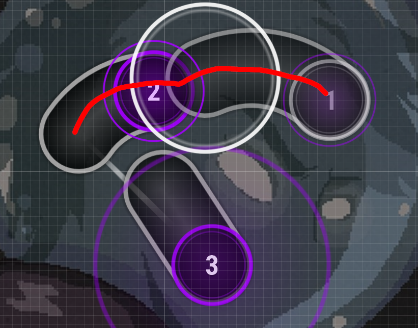
- 00:25:939 (1,2,1,2,3,4,5) - the flow feels a little bit crampy here moving 00:26:899 (1) - to 251|33 and restructuring the placement of 00:27:379 (2,3,4,5) -
https://puu.sh/yaUGY/3600f720bb.jpg would actually improve the flow of the whole pattern imo - 00:28:819 (1) - the spinner could've started on 00:28:579 (5) - as there's the new stanza it would suit much better than before but don't forget to delete 00:28:579 (5) -
- 00:36:499 (1) - that's almost offscreen on 4:3 resolution D:
gl!


 khand: