 From primate to memester
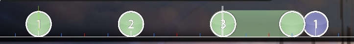
00:07:694 (2,3,1) - This transition is a little meh imo - It's technically fine, but it's somewhat linear, and you do mostly circular flow for this section - idea that's a little more curvy:
https://osu.ppy.sh/ss/7996851 -
It's supposed to be linear because it's transition tho o-o.. plus it's barely noticeable00:23:551 (4,1) - somewhat jarring movement here, since (again), you mainly lead into the notes with the slider movement you've been doing before this xd another random idea
https://osu.ppy.sh/ss/7996871 -
can agree with this, it's not super jarring but it does look a bit weird01:05:122 (1,2,3) - :thinking: (it's kinda weird compared to the others isn't it xd)
Sidenote: ascending spacing (tiny ascension) would be cool from 01:03:408 (1) - to 01:06:623 (3) - if you wanna be edgy. -
nah just doing different stuff for the stronger piano notes are fine I think01:35:872 (4,1) - Momentum isn't really too high, so the DC feels a little odd. I'd probably space the 16-note stream a tad more

(something similar to the 5-note right after
https://osu.ppy.sh/ss/7997171 ) -
spaced it a bit more but I want the change in DS01:43:480 (1,2) - Switch NC - cause 2 is the strong sound here
-
right01:43:694 (2,3,4,5) - same kinda applies here, but yeah, tiny DS things to make it similar to the spacing of the doubles and stuff -
https://osu.ppy.sh/ss/7997204 -
this one I wanna keep the change in DS--
01:47:015 (6,1,2,3) - changing rotation on 6,1 will make this flow better -
https://osu.ppy.sh/ss/7997195 &
https://osu.ppy.sh/ss/7997214 -
this flow doesn't really seem all that bad to me tho01:50:980 (1,2,1) - same sort of thing with rotational flow that you could do, if you REALLY wanna throw the emphasis in the player's face -
https://osu.ppy.sh/ss/7997233 -
mmm it seems fine as is^ keep in mind that the previous two things are suggestions applied to something that is already fine - This is just a way to make the emphasis clearer, but if that isn't your intention, feel free to keep it like that
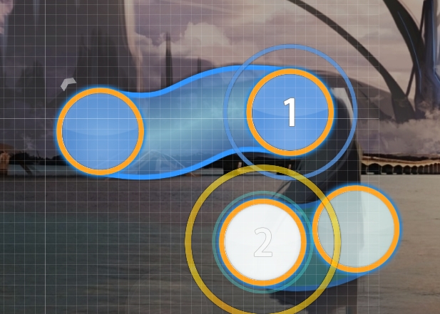
01:52:694 (3) - stronger sound than 01:52:480 (1) - , so (1) could either be a double with a DC or rotation change, or a kickslider xd -
made a double instead02:03:837 (1,2,1,2,1,2,3,4,1,2,3,4) - this flow makes me happy af
02:17:765 (2,3,4,5,6,7,8,1) - technically fine, but the flow doesn't feel too good from 02:18:194 (5,6) - , to which I'd suggest making it a little more circular considering 02:17:122 (1,2,3,4,5) - is fairly "round" movement
https://osu.ppy.sh/ss/7997307 -
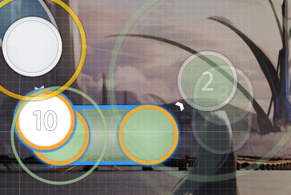
it's for the snare02:35:765 (10,1) - xd, you could make the curve more clean on 10 (also rotated the triple a bit)
https://osu.ppy.sh/ss/7997322 -
fair enough lol02:43:694 (5) - I'd NC this, 'cause the rhythm is pretty tough to read atm with the blue tick slider on 02:43:801 (6) -
sure I suppose02:45:408 (1,2,3,4,1,2,3,4,1) - same thing with momentum like I mentioned at like 1:30 ish xd
https://osu.ppy.sh/ss/7997353 That could help prevent awkward movement a bit. -
was considering changing this anyways03:35:980 (1,2) - Hmm, maybe end slider on 03:36:301 - and do two notes under instead? Can feel fairly deceiving -
should be okay as is I think, rhythm is quite weird here so I made it a bit weird too 03:40:480 (7,8,9) - small aesthetic thing:
https://osu.ppy.sh/ss/7997398 -
yo03:44:872 (4,1,4,1) - I'd personally make the DC's the same distance (I prefer the un-stacked ones, since it fits better with the momentum) -
yeah weird, did that04:13:480 (3,1) -
Only part that I felt was deceiving when I played through it. The movement makes it so the 3,1 feels like a 1/4 as well, even though it isn't - I also thought it was 1/3 actually because the pattern here is a lot different from everything else that you've mapped, as well as going in a triangle :p -
moved away the slider but im keeping the triangle because it is a very intense set of sounds compared to other places in the song04:24:194 (2,3,4,5,6) - 4,5,6 in ziggy-zaggy too maybe? :p
https://osu.ppy.sh/ss/7997422 -
okay04:56:122 (2,1,2,1) - even if not too noticeable in-game, it should be easy enough to make the first note here play part in some way too in the aesthetics (triangle or something else)
04:58:265 (1,2,1) -
https://osu.ppy.sh/ss/7997447 for aesthetics like before (in retrospect it might look nicer even if all notes aren't present at the same time) -
did both05:00:837 (2,3,1) - technically 3,1 should be different from 2,3 'cause the sounds are different (again, I'm being super nitpicky 'cause the map is already good, but it could definitely give a little more to the slow section here) Idea:
https://osu.ppy.sh/ss/7997469 -
eeeeeeeeeeeehhh it's fine I think, it's not a huge difference05:13:265 (2,1) - could look a tad cleaner:
https://osu.ppy.sh/ss/7997473 -
rightwubwubGood luck buddy Just poke me if you have some questions, you know where to find me lol xd


