Its not ranked yet?
Where the real Mir wtf
Where the real Mir wtf
Fixed those, thanks!Osuology wrote:
alright cool map
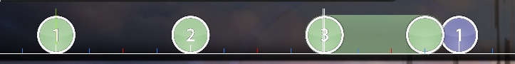
01:47:015 (4,1) - I started here because I was literally just enjoying the song and map and then I remembered I need to be looking xd. So, the jump here doesn't really emphasize anything. It's a small streamjump compared to others and considering how strong it is, it clashes with other information you feed to the player. Contrast that with the next snare noise which gets a lot of emphasis and it's rather strange when there's no emphasis in this case.
04:16:265 (1) - Here's another snare doing this. This really disconnects the player from seeing distance as emphasis, since it no longer emphasizes things as it should. Looking for other emphasis techniques you use, I don't see many really. Other than NC, SV, and rhythm, that is, but those are often default emphasis techniques to mapping.
Look for these throughout your map, I was getting distracted by song and BG often, as is proved by my next statement.
Why does the sign on the left say sour? LOL
Thanks!Nokashi wrote:
Hello There!
[Evolution]
- 00:04:265 (2,3) - Definitely should be spaced more so you are consistent with your spacing on these vocal holds. As it is, there is a ~ 0.50x DS Difference with 00:03:837 (1,2) - and it really shows when all 3 sliders express a held vocal that is similar. 00:08:980 (2,3) - Similar point here - foxed
- 00:16:051 (2) - I dont really see why this is directly stacked under the slider. I understand why you want to emphasize the bass with the extended slider but the fact that no movement is offered between the slider and the following circle kills the purpose of all previous sliders that also expressed the sound. Also it feels odd, since 1/1 gaps are relatively more spaced from each other, as seen here for example 00:01:694 (1,2) - yeah
- 00:19:694 (3,4,5) - The vocal gradually increases in strength but these circles dont really express that, 00:19:908 (4,5) - these are less spaced, when in my opinion, 00:19:694 (3,4) - this should have been the jump with less spacing - yeah
- 00:23:980 (5) - Better as a 1/2 slider since this is what u used for vocal hold, theres nothing here for me that directly correlates with the 1/1 gap - 00:18:837 (1,2) - I do it here too though, it's for the click sound
- 00:38:551 (3,4,5) - Why is this more spaced than other triples before like 00:33:837 (7,8,9) - ( which is even more intense in my opinion ) . Again, nothing in the music correlates with the spacing increase here - nerfed the previous ones since i use .5x more often
- 00:39:408 (1,2,3,4,5,6) - Alright so, since you are playing around with vocals mostly ( even more so here 00:39:408 (1,2,3) - where all ticks with choppy distorted vocals are made cickable) it would seem like a logical approach for this 00:39:837 (3,4) - to be a slider so the principle of clickable vocals in this section, since only these 00:40:265 (5,6) - would be clickable. I Feel like this is the most consistent choice - yeah
- 00:41:015 - I guess silence this to be consistent? - done
- 00:44:122 (6,1) - I dont get why this is more spaced than the jump that ends in a gunshot of a snare. Maybe a nerf is order here - changed spacing
- 00:53:122 (1) - Maybe curve it so the entry point to the 1/4 cirle afterwards is more lenient - Tis already lenient my friend and would clash with the previous curved slider
- 00:55:265 (1,2,1,2) - wewlads. Cool idea but at least work with consistent spacing 00:55:158 (4,1) - is 1.41x DS while the following stream jump is 1.00x DS. This is something unexpected so it should be made more lenient by evening out the spacings - yeah did that
- 01:21:837 (8) - Continuity would be nice here, so placing 1/2 slider instead would do the trick - yeah agreed
- 01:36:622 (1,2) - 1/4 slider would work better since there isnt anything thats different from 01:36:408 (1) - which is a 1/4 slider - drums come in here o.o
- 01:36:408 (1) - Would represent the music quite better if you placed focus on the snares in this section when mapping 1/4 sliders. For example these 2 01:36:837 (1,4) - utilize this by being made clickable on the snare. yet here 01:37:158 (2,3) - it is not the case. Emphasis is completely removed and placed on the following white tick when, in my ears it would work so much better if there was a 1/4 slider starting here 01:37:158 (2) - it would be really consistent - oh yeah, weird how i missed that
- 01:43:265 (2) - taking into consideration how you play with 1/4 sliders, a 1/4 slider here would have done the trick - changed to stream instead
- 01:56:980 (2,3,4) - I Would balance this out a bit, spacing wise. its super uneven. 02:05:122 (1,2,3) - Similar point here - tried
- 02:28:480 (7,8) - Cant say im fan of this really sharp angled jump when all of your jump streams were structured a lenient angle placement - yea
- 03:20:551 (1,2,3,4,5,6,7,8,1) - MUUUHH HEXAGONS
- 03:38:337 (7,8) - The sheer density of the streams makes this really hard to see in my opinion, maybe because im not a seasoned std player, but you should look into this issue nontheless - should be fine but i changed the rhythm
- 03:52:265 (6) - Why the sudden flowbreak? I Would expect a 1/1 slider for the hold here
- tfw preview point snapped on 1/1024 - haha
- 04:02:551 (4,5) - Should be made consistent with 04:02:444 (3,4) - changed things
- 04:03:622 (2,3) - Could work as a 1/4 slider to better highlight the double next - yeah
- 04:11:980 (5,6,7,1) - This is a pretty edgy pattern that i was originally against but due to the sheer strength of the beat i decided to let it pass and not mention it initially, but.... here its super overdone in my opinion, i would at least expect even spacing like 04:05:551 (1,2,3,1) - nerfed spacing?
- 04:53:122 (1,2,3) - You could silence slider ends here - yeah
- + some stuff we fixed on VC
Good Luck~
Will look over how I did the streams in general. Thank you very much for the mod Naxess!Naxess wrote:
Greetings
[General]Something feels iffy about the map though. Can't quite put my finger on it, but I'd assume it's got something to do with the lack of consistency between whether streams are disconnected or not in some cases compared to that of other cases. Could also have to do with that the spacing between streams is sometimes smaller and sometimes larger, not sure tbh. Will probably want to check that stuff either way.
- For metadata, refer to this. Bandcamp, iTunes, and other music stores are neither reliable nor valid for metadata. Would be more accurate to use the artist's own metadata rather than the record label's.
- Title: Transformations Ft. Laura Brehm
- Combo color 1 is going beyond the 220 luminosity, which means it's going to become a pain to look at in conjunction with kiai flashes. Try lowering it while keeping it different from combo color 2, or just don't have 1 and 2 right after each other (would also match the song better like that, considering that it's all going 1212, in terms of when instruments kick in and stuff).
[Evolution]- 00:11:337 - Would have this be curved similarly to 00:10:694 (1) - , where you also have the opportunity to blanket it with 00:11:980 (1) - . Could move them depending on how far you want the jump between (2) and (1) to be. You can start relying more on flow breaks and jumps at 00:14:122 - , as it's getting more intense. - sure
- 00:23:980 (5) - Would've NCed this instead of 00:24:408 (1) - , like was done for 00:01:694 - 00:18:837 - etc. - done
- 00:39:622 - Skipping this but covering 00:39:730 - seems a bit odd. Could try shortening the slider or just making it a triple like the others around here. - vocal is held imo here so I think I'll keep it a slider
- 00:40:051 (4) - Would be nice to keep vocals and other layers differentiated more, for example by stacking this on 00:40:265 (5) - , contrasting it from the other sounds here in accordance to the song. - fixed previously
- 00:43:265 - Only using circles here seems pretty boring, both in rhythm and in structure. Could turn 00:43:480 - into a 1/2 slider to keep rhythmical variation going. Same reasoning goes for 00:53:980 - . Would have turned 00:54:408 - into a 1/2 slider in this case, placing them something along these lines for instance, purposefully ending the slider on a vocal to indicate that we're temporarily switching instrumental layer for 00:54:837 - , making it easier to transition into. - did both things
- 00:59:980 - The new combo concept going on here seems kind of contradictory considering that 00:56:551 (1,2,3,4) - are all the same combo, but the same thing at 00:59:980 (1,2,3,1,2,3,1,2,3,1,2,3) - has each instance as it's own combo. I realize that you may use a different pattern in the latter example, but they shouldn't be so different to the point where they actually need different NCing if they're the same parts of the song, right? - nc'd them all accordingly (i hope that's what you meant)
- 01:02:979 (2,3) - 01:05:551 (2,3) - I noticed these are different, and are supported by the song in being different, but they don't really stand out. It sort of just looks like a mistake atm, even though I don't believe it is. To solve this, make it seem more intentional by having it contrast the rest of these patterns, and not just be moved slightly or have slightly larger DS. - done
- 01:10:265 (1,2,3,4,5) - 01:13:694 (1,2,3,4,5) - 01:17:122 (1,2,3,4,5) - All the same sounds and same pitch, but their spacing differs quite noticeably, especially the first and last (5). Try keeping the spacing relatively same and/or in a recognizable pattern. I'd also suggest you keep all instances similar in terms of how large the spacing should be, to keep things consistent. - done this
- 01:36:622 - No need to be spamming NC all over, it's not really going to make things any easier to read, as it doesn't stand out in context. Could solve this in at least two ways: either remove NC from 01:36:408 - and 01:36:837 - , or remove NC from 01:36:622 - alone. Would go for the first way since the metal-ish sounds start at 01:36:622 - . - done
- Well, either way, might want to see to how NCing is used. Wouldn't recommend pattern-based NCing, as this is basically relying on something that in turn relies on the song, rather than directly relying on the song itself. - gonna redo kiai stuff to address this
- 02:35:551 (8,9,10) - This is awfully curved, doesn't look very visually pleasing. Something like this would look less cramped. - mhm
- 02:46:265 (1) - Try giving this an offset similarly to how 02:45:730 (4,1) - was arranged, to make the end more visible. - did
- 03:20:551 - Having all clickable here sort of kills the accentuation that the vocals later in this pattern would otherwise hold. Better to keep the density different to bring about that contrast. Try turning 03:20:551 - and 03:20:980 - into 1/2 sliders. 03:20:122 - 03:20:551 - 03:20:980 - are more similar than 03:21:837 - , for instance. - changed stuff
- 03:54:837 - This is pretty much the only part that skips this beat. Additionally it does it by placing stress on weaker beats, 03:54:730 - 03:54:944 - . Try swapping the rhythm. This way you'll keep the transition between how snares are emphasized smoother, as the following pattern would make that clear. - yeah
- 04:03:622 (2,3) - Having these right before 04:03:837 (4) - , will make it seem like the previous two, hence being misleading. Instead, make those two different from the note on (4) to make it stand out more, for example by making them a 1/4 slider instead. - changed previously
- 04:12:730 - This isn't as strong as 04:12:622 - , so having both in the same stream would similarly be misleading. In my opinion it is more important to map sounds from how strong they are rather than whether there is a sound or not, so expressing that is something I'd say is important. In this case you could remove the 1/4 note and utilize the 1/2 gap as an anti-jump like this, to avoid confusion with patterns like 04:07:694 (1,2,3,4,5) - 04:14:551 (1,2,3,4,5) - . Could otherwise try stacking them like was done at 04:34:480 (2,3,4) - . - agreed
- 04:22:694 - Not mapping this makes the gap between 04:22:480 (2,3) - pretty awkward due to the 1/4 snapping into 1/2 snapping, when there's a sound in the song that would bridge this gap better being covered. - done
- 04:24:194 (2,3,4,5) - 04:25:051 (1,2,1,2,1,2) - Covering different sounds with the same pattern isn't something I'd recommend, as it makes it seem like the two places are the same in the song, hence being misleading. A few NCs isn't really going to change that, as they still play the same way and are positioned in the same way equally. Would try a different pattern instead, however you want to express it.
- 04:53:551 (2) - This is curved way too much imo, could do something along these lines, or this, or this,
you get the idea. - i do xd- 05:01:265 (3,1) - Don't really see why this would stray from the pattern of spacing these. 04:56:122 (2,1) - 04:57:837 (2,1) - 04:59:551 (2,1) - etc. Was spaced at 05:13:694 (1,2,1) - , for example, or at least in context. - yeah
- 05:17:122 (1,1) - Might've wanted to stack these. - indeed
 If there's a suggestion that I feel is a problem, I'll color it differently ^^ (something similar to the 5-note right after https://osu.ppy.sh/ss/7997171 ) Just poke me if you have some questions, you know where to find me lol xd
C00L wrote:
Its not ranked yet?
Where the real Mir wtf
Wow I'm late in replying, but thanks Sporky!Spork Lover wrote:
Heya Mir - Let's do that M4M thing we talked about, shall we?
Since there's not really too many straight up "issues" with the map from first glance, a lot of it is either gonna be nitpicky or purely subjective, so take the suggestions with a grain of salt
Color coding:Color codingUnrankable if unchanged
Normal Suggestion/Comment
Strong Suggestion
General
Image dimensions are a little funny xd You could try for a 1920x1200 thingy if you find one, but it shouldn't be a problem if you can't xd
For the kiai sections, you can add some more clear colors when strong SV changes come up to signal them a little bit more (aka color hax). - not really necessary imo
Tfw drain time is 05:00:XXX lol xd
From primate to memester
00:07:694 (2,3,1) - This transition is a little meh imo - It's technically fine, but it's somewhat linear, and you do mostly circular flow for this section - idea that's a little more curvy: https://osu.ppy.sh/ss/7996851 - It's supposed to be linear because it's transition tho o-o.. plus it's barely noticeable
00:23:551 (4,1) - somewhat jarring movement here, since (again), you mainly lead into the notes with the slider movement you've been doing before this xd another random idea https://osu.ppy.sh/ss/7996871 - can agree with this, it's not super jarring but it does look a bit weird
01:05:122 (1,2,3) - :thinking: (it's kinda weird compared to the others isn't it xd)
Sidenote: ascending spacing (tiny ascension) would be cool from 01:03:408 (1) - to 01:06:623 (3) - if you wanna be edgy. - nah just doing different stuff for the stronger piano notes are fine I think
01:35:872 (4,1) - Momentum isn't really too high, so the DC feels a little odd. I'd probably space the 16-note stream a tad more
01:43:480 (1,2) - Switch NC - cause 2 is the strong sound here
01:43:694 (2,3,4,5) - same kinda applies here, but yeah, tiny DS things to make it similar to the spacing of the doubles and stuff - https://osu.ppy.sh/ss/7997204 - this one I wanna keep the change in DS
--
01:47:015 (6,1,2,3) - changing rotation on 6,1 will make this flow better - https://osu.ppy.sh/ss/7997195 & https://osu.ppy.sh/ss/7997214 - this flow doesn't really seem all that bad to me tho
01:50:980 (1,2,1) - same sort of thing with rotational flow that you could do, if you REALLY wanna throw the emphasis in the player's face - https://osu.ppy.sh/ss/7997233 - mmm it seems fine as is
^ keep in mind that the previous two things are suggestions applied to something that is already fine - This is just a way to make the emphasis clearer, but if that isn't your intention, feel free to keep it like that
01:52:694 (3) - stronger sound than 01:52:480 (1) - , so (1) could either be a double with a DC or rotation change, or a kickslider xd - made a double instead
02:03:837 (1,2,1,2,1,2,3,4,1,2,3,4) - this flow makes me happy af
02:17:765 (2,3,4,5,6,7,8,1) - technically fine, but the flow doesn't feel too good from 02:18:194 (5,6) - , to which I'd suggest making it a little more circular considering 02:17:122 (1,2,3,4,5) - is fairly "round" movement https://osu.ppy.sh/ss/7997307 - it's for the snare
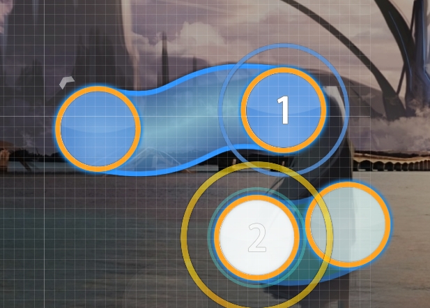
02:35:765 (10,1) - xd, you could make the curve more clean on 10 (also rotated the triple a bit) https://osu.ppy.sh/ss/7997322 - fair enough lol
02:43:694 (5) - I'd NC this, 'cause the rhythm is pretty tough to read atm with the blue tick slider on 02:43:801 (6) - sure I suppose
02:45:408 (1,2,3,4,1,2,3,4,1) - same thing with momentum like I mentioned at like 1:30 ish xd https://osu.ppy.sh/ss/7997353 That could help prevent awkward movement a bit. - was considering changing this anyways
03:35:980 (1,2) - Hmm, maybe end slider on 03:36:301 - and do two notes under instead? Can feel fairly deceiving - should be okay as is I think, rhythm is quite weird here so I made it a bit weird too
03:40:480 (7,8,9) - small aesthetic thing: https://osu.ppy.sh/ss/7997398 - yo
03:44:872 (4,1,4,1) - I'd personally make the DC's the same distance (I prefer the un-stacked ones, since it fits better with the momentum) - yeah weird, did that
04:13:480 (3,1) - Only part that I felt was deceiving when I played through it. The movement makes it so the 3,1 feels like a 1/4 as well, even though it isn't - I also thought it was 1/3 actually because the pattern here is a lot different from everything else that you've mapped, as well as going in a triangle :p - moved away the slider but im keeping the triangle because it is a very intense set of sounds compared to other places in the song
04:24:194 (2,3,4,5,6) - 4,5,6 in ziggy-zaggy too maybe? :p https://osu.ppy.sh/ss/7997422 - okay
04:56:122 (2,1,2,1) - even if not too noticeable in-game, it should be easy enough to make the first note here play part in some way too in the aesthetics (triangle or something else)
04:58:265 (1,2,1) - https://osu.ppy.sh/ss/7997447 for aesthetics like before (in retrospect it might look nicer even if all notes aren't present at the same time) - did both
05:00:837 (2,3,1) - technically 3,1 should be different from 2,3 'cause the sounds are different (again, I'm being super nitpicky 'cause the map is already good, but it could definitely give a little more to the slow section here) Idea: https://osu.ppy.sh/ss/7997469 - eeeeeeeeeeeehhh it's fine I think, it's not a huge difference
05:13:265 (2,1) - could look a tad cleaner: https://osu.ppy.sh/ss/7997473 - right
wubwub
Good luck buddy
All not replied = fix. Nice mod as always.~Lasse wrote:
hp6? current seemed too low to me when playing
would silence soft-sliderslide cause you have lots of sliders that don't map held sounds
00:00:408 (1,2,3) - think this would be nice as 3 circles instead cause bavkground melody only really starts on 00:01:694 -
or maybe http://lasse.s-ul.eu/0uy2maQg.jpg for the fading in sound there
00:11:337 (2,1) - how about rotating things a bit here to get sopmething like http://lasse.s-ul.eu/K0S5UpOn.jpg ? think that would look cute - this looks fine to me tbh :3
00:17:122 - 00:18:837 (1) - 00:20:551 - 00:22:265 - etc. I think the kick things here should really be hitsounded
just use s:c2 here and add a clap with a fitting sound cause this part has no snares? something like http://puu.sh/vV8BY/dccb3a7e73.wav could work - i tried really hard to make it nice x.x
00:26:980 (4,5,1) - :eyes: - excuse me i did this first :eyes:
00:32:658 (2) - I don't think a circle here makes much sense, even with the slight bavkground sound a 1/2 gaps fits the song better
00:49:587 (10,1,2,3) - I'd reduce 1/4 gaps here a bit to introduce this stuff better, maybe like http://lasse.s-ul.eu/KCQQ1Eb4.jpg
00:50:551 (4) - this feels so disconnected from all surrounding objects with this implied movement, why not http://lasse.s-ul.eu/JildRARz.jpg ?
00:54:837 (1,2,3,4,1,2,1,2) - 2x repeating pretty similar thing so idk why you mapped it so inconsistently
01:38:551 (1,2,3,1,2) - these extreme sv changes + similar overlapping makes stuff like this a bit gross to read cause you pretty much have to guess if you singletap or stream that lol
01:44:122 (1,1) - things like this really could use whistles
01:53:122 (1) - fix the ending curve it's so unbalanced
01:56:980 (2) - would look much better if aligned with slider path http://lasse.s-ul.eu/6jThx6ml.jpg
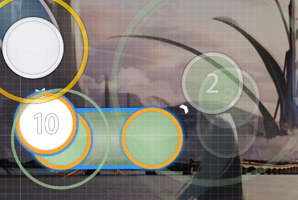
02:02:122 (3,4,5) - why the fuck is this so undermapped lol sth like 01:48:408 (2,3,4,1,2,3,1,2,3,4,1) - or even more intense would make sense - okay lemme explain, the wubs here are very unique in the sense that they are extremely prominent like... the 1/4 in the back kinda gets overshadowed by them, and I did create somewhat interesting flow (I hope) to show this uniqueness. I don't wanna map the 1/4 because I mapped it literally everywhere in the kiai and the streams right after map the 1/4 anyways. Had I mapped that 1/4 instead of the wub sliders it would lose impact cuz it would just all be 1/4.
02:04:586 (4,1) - streamjump angle here is so gross to play, think doing at least something like http://lasse.s-ul.eu/99rC4Pkk.jpg would be nicer
02:16:265 (1,2,3,4,1,2,3,4,1) - why is this harder than most patterns in the more intense parts
02:42:837 (1,2,3,4,1,2,3,4,5,1) - sounds like it should be filled with 1/4 rhythm cause the 1/4 melody synth stuff is so noticeable
03:48:194 (2,3,4,5) - double patterns are so much more intuitive if you click the first note of them => make 03:48:408 - clickable
03:59:230 - would reduce volume + spacing here cause most instruments stop
04:01:908 (2,5) - nice stack
04:02:980 (1) - looks a bit weird to me cause you combine sharp and curved visuals http://lasse.s-ul.eu/IqVaAk5J.jpg or http://lasse.s-ul.eu/BXeN45kK.jpg would be cute
04:06:408 (1,1) - whistles
04:13:694 (1) - offscreen
04:38:872 (4,1) - either overlap or space, not this gross thing
04:45:408 (1,2,3,4,1,2,3,4) - just make these repeats it seems way too quiet for circles
04:46:908 (2,3,4) - 1/4 jump is a bit overdone in this part
seems alright overall, poke me when you got bubbles or something
Fixed all except for one, but I have some things to say about the slider designs one part, 02:01:265 (1,1,2,3,4,5,1), because I have a feeling that's one of the things you're takling about. They're all curved somehow either at the end or in the middle except for the last one because the last one is a different tone. The rest of the design cohesiveness was fixed elsewhere though, I think.Monstrata wrote:
Evolution
00:06:408 (5) - Missing whistle on the head I think. Compare it with 00:02:980 - .
00:09:837 (4) - ^
01:06:837 (1,1,1) - Not really getting why you switch back to 1/2 repeats. 01:09:408 (1,2,3,4,1) - stand out but not in a good way because theyre so different despite being part of the same phrase (4 measure component).
01:17:122 (1,2,3,4,5) - Seem rather random in placement unnecessarily - not really, it's kind of a trapezoid thing but changing the stars made me move this around a bit so we'll see
01:19:265 (1,2,3,4,5) - And your stars are kinda off... are you rotating by 70 degrees instead of 72? lol (wait was that you or someone else).
01:30:837 (1,2,3,4,5,6,7,8,1,2,3,4,5,6,7,8,1,2,3,4,1,2,3,4,1,2,3,4,1,2,3,4,1,2,3,4,5,1,2,3,4,5,6,1,2) - Pretty awesome.
01:53:765 (1,2,3) - Stuff like this, I think using an gle change in tandem with a 1/4 jump will feel more impactful. Here the linear flow makes it seem a bit awkward in movement for me.I tried ctrl+g'ing 1+2 and restacking. it felt better to play for me since it created some circular flow as opposed to nothing01:59:122 (4) - Weird placement imo... it causes your structure to look kinda bad cuz of the overlap being next to clean symmetry and blanket patterns,http://puu.sh/vZLpE.jpg
02:11:980 (1,2) - Make 2 perfectly centered? It's slightly too far to the left.
02:23:551 (1,2,3) - The miniscule flow shift here isn't necessary imo. stick with either continuing the clockwise movement, or breaking into counterclockwise. The shift is occuring at a weird location imo.
02:43:265 (3,4,1,2) - I don't think this rhythm is appripriate xP/ It doesn't feel like it needs doublet clicking rhythm. Like right now the rhythm im clicking just feels too different from the rhythm i'm hearing, and that's not a good thing ;w;
[]
Modding half of it. It looks promising but I think theres still some room for improvements, particularly in placement. I feel you could also use more cohesion in your slider designs. There are combo's where you use like 3 different slider shapes in the same combo and it causes your visual design to feel a bit too detached.
Good luck! You can maybe poke me again down the road for a recheck since this definitely has the potential.


yepyep done~Lasse wrote:
re
00:04:694 (3,3,4) - gets really broken by autostacking
00:54:837 (1,2,3,4,1) - think first streamjump could be made a bit easier to hit to have a better introduction to them since it's the first one. could downscale. just decrese 4=>1 spacing a bit
01:02:980 (5) - see you mapped this differently because of the new drum thing, so you could probably put some hs on 5? your drum-hitnormal2 could fit - i just put another whistle, i hope that's fine
01:05:551 (2) - now for this one I don't really get the variation used since it maps piano like the others too - the piano gets slightly louder here so i spaced it slightly more
01:30:837 - could increase volume by 5 or 10% here since song builds up
and 01:35:980 - could be lowered a bit until 01:36:622 - volume wise
02:44:122 (5) - could have nc // 03:45:837 (5) - probably too - hmmm, not really necessary i think the other sounds around them are more deserving of ncs
02:49:801 - could have slightly more volume and a whistle for the piano sound
03:59:551 (1) - normal whistle on sliderbody?
04:39:408 (1) - streamjump feels a bit out of place since 04:38:872 (4,1) - is "normal" and a 1/4 jump also seems a bit overdone here
04:54:837 - why does this suddenly increase volume? 30% sounds better I think
05:08:551 (1) - this part would sound nice if you made all overmapped sliderticks + ends 10% instead and only used 20% on clickas which usually follow melody/piano - can't i just lower all of them by 10% uwu
things like 05:14:551 - should keep current volume though
spinner could also have some green lines to fade spinnerspin sound
that should be all
l was scared this might not be 5min drain due to the long break but seems like it is around 5:01