my part of them m4m
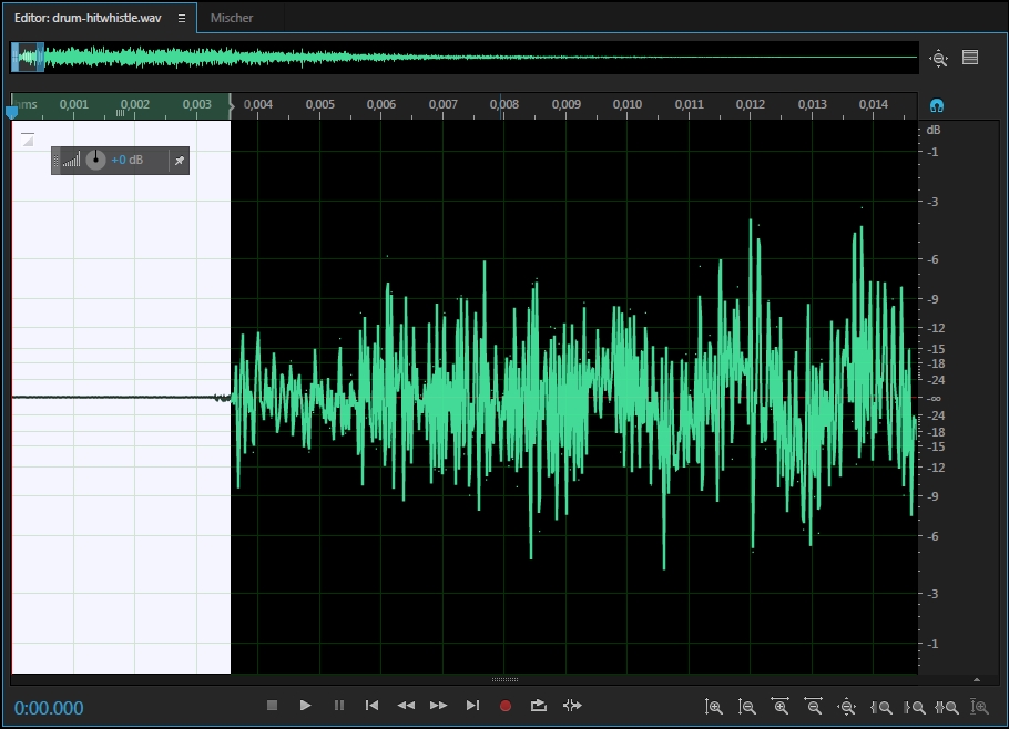
nearly 4ms delay on drum-hitwhistle and 2, though still rankable, not having delay would be much better to make it more responsive: http://puu.sh/s6ha1/77a2131a59.zip
insane
nc usage seemed a bit weird in some spots like for example 00:02:106 (2) -00:08:422 (6) - 00:53:620 (1,3) - where you deviate from your usual 1 measure pattern for no apparent reason
01:29:047 - timing point conflicts with other diffs, no idea why it would even be there lol
00:02:501 (3) - missing clap according to music/pattern (it's also there on lower diffs)
00:04:475 (3,4) - since the things you do here seem to focus more on guitar, ctrlg on this rhythm would be reasonable http://i.imgur.com/maBitu7.jpg
00:07:238 (2) - doesn't make too much sense to have such a comparatively big (though passive) jump here, seems like you intended to just ctrlg this (or even if not, that seems to make more sense as this doesn't stand out more than your even spaced things)
00:08:817 (1,2,3,4,5,6) - first half of this has no vocals, second half does. so making them stand out, be it bei patterning and/or rhythm or whatever would be great. You kinda did it by suddenly having linear movement, but it didn't really feel fitting to me and just felt like a kinda random pattern when playing. talking about something like http://i.imgur.com/1nvvyUF.jpg for example, which keeps the hexgrid idea you had but would make vocals stand out more while also feeling cleaner (though there are many other solutions to this=
00:11:382 (5) - has pretty much everything, vocals, drums, piano. yet you suddenly drop spacing and that just didn't seem to fit at all. how about stacking this on 00:12:172 (2) - head or doing something like http://i.imgur.com/EsIyc5Z.jpg ?
00:13:554 (2) - this one makes sense in comparison as cause it lacks so many key sounds
00:15:330 (2,3,4) - drum sampleset didn't seem intentional here
00:17:896 - how about trying a rhythm like http://i.imgur.com/5YIrAmW.jpg which still follow kicks, but also maps the piano and makes the snares at the end of the combo stand out more because you don't click 00:18:685 -
00:23:225 (3,4) - though not very important, but making such 90° rotated patterns with curved sliders of noticeably different curvature doesn't look very clean to me
00:25:593 (5,1) - stack which forces sudden stop in movement didn't feel very fitting here because of the very pronounced guitar on the end
00:28:751 (5,1) - this felt much nicer
00:35:856 (3,1,2,3,4) - this was pretty nice
00:39:014 (3,4,5) - pattern just looks so random because of seemingly random slider rotation and weird visual distance between objects, how about just going with 120° and even visual spacing while making a pattern that plays very similar: http://i.imgur.com/exHrJ6p.jpg
00:57:172 (4,5,1) - just a personal suggestion, but how about doing something like http://i.imgur.com/GWXDq7K.jpg would look a bit cleaner here
01:00:922 (2,3,1) - compared to how you spaced the rest of the chorus this seemed unreasonably low
01:01:514 (1,2,3,4,5,6) - kinda looks like a badly made wave converted into stream, just doesn't seem polished at all. could go with something like http://i.imgur.com/IFzPY1M.jpg which also has a nicer transition into the slider
01:04:672 (3) - another one of these things where the slider doesn't support the movement at all (mainly visually), when you could something like http://i.imgur.com/JNeYWCf.jpg
01:28:751 (3) - might as well make this 2 circles cause you made all other snares before clickable and the weird polarity after doesn't matter cause the map ends anyways
h
some things from insane might apply here too
00:02:106 (1,2,3) - the way sliderbodies are utilized here creates a really forced feeling movement http://i.imgur.com/G8kvphw.jpg which feel really out of place my suggestion for 00:01:712 (4,5,1,2,3) - would be something likehttp://i.imgur.com/jIF3kMI.jpg (obv. with cleaner angles, just a quick sketch)
00:06:843 (1,2,3,4) - 00:08:027 (4,1) - whole part just feel so unstructured visually with the angles, shapes not really working together etv. when
things like http://i.imgur.com/yy1tack.jpg could just be http://i.imgur.com/PqTyOj1.jpg etc. but that's pretty subjective so I'll leave it at that (just having cleaner structure for such things is something I personally think is great)
things like 00:20:462 (6,1,2) - actually look pretty nice, because the shapes fit together, the angles the sliderbodies make is nice etc.
but some patterns like the one mentioned above just stand out in a weird way (and also where standing out doesn't make much sense with the song)
00:33:685 (1,2,3) - first point again
00:35:856 (1) - rankable, but doesn't look very clean with how much it overlaps hp bar, could move things here a little if you want to avoid this
00:43:949 (4) - drums are pretty consistent, so only having a jump on the last doesn't seem that fitting, feels to emphasized compared to before, how about something like http://i.imgur.com/7pkYdsb.jpg or http://i.imgur.com/lKyds0C.jpg ?
feels like chorus lacks some 1/4 rhythms when insane uses some kinda spaced 5 note patterns already, though that would make the gap to normal kinda bit so I don't really know
01:27:370 (1,1) - last beat isn't trally stronger, so removing the circles at the end of each and adding another repeat would make more sense
n
my main issue is the ds you decided to use, especially things like 00:09:212 (4,5,1) - just end up feeling extremely clumped and it also makes small spacing inconsistencies really noticeable cause things nearly overlap. just increasing to 1.3 already would look much better and also be easier to read while not muc harder to aim.
if you are not going to change that (though I'd really recommend it) at least increase cs a bit
00:09:212 (4,5,1) - patterns like this just end up being really hard to read for beginners, it's clumped, movement doesn't really incorporate the slider/repeat http://i.imgur.com/PXl9a93.jpg etc. when you could do something like http://i.imgur.com/fmY6kcT.jpg
00:17:896 (3,1,2) - similar thing with not caring about the path on the slider at all making 3-1 a really awkward transition compared to something like http://i.imgur.com/WO9020q.jpg
00:20:462 (2,3,4,1) - why to no use this kind of ds.jpeg (also same issue as above)
00:31:317 (7) - hard to read cause sliders have hitbursts at their ends (00:30:330 (5) - )
00:33:488 (2,3,4) - example of what I meant with slight ds inconsistencies becoming really noticeable due to the ds used (and ugly)
01:00:922 (2,3,4) - only 1/2 pattern with 3 clicks in the whole map, don't think that is needed
01:14:738 (3,4,1) - so uncomfortably close, would also be solved by the ds thing
other things are pretty much same as what has already been stated above
e
00:00:528 - to 00:22:633 - could do someting to avoid the first quarter of the map being all circular clockwise flow lol


