forum

Yokota Mahito - Maigo

posted
Total Posts
74
Topic Starter
Joe Castle
This beatmap was submitted using in-game submission on jueves, 2 de noviembre de 2017 at 12:46:49 a. m.

Artist: Yokota Mahito
Title: Maigo
Source: スーパーマリオギャラクシー 2
Tags: smg2 Super Mario Galaxy 2 Bros Nintendo Ryo Nagamatsu Koji Kondo Orchesta Orchestal MoodyRPG
BPM: 107,81
Filesize: 982kb
Play Time: 00:34
Difficulties Available:
  1. Moody's Normal (1,65 stars, 50 notes)
  2. The Lost Cute Little Luma (2,25 stars, 54 notes)
Download: Yokota Mahito - Maigo
Information: Scores/Beatmap Listing
---------------
XOΔ▀XOΔ▀XOΔ▀XOΔ▀XOΔ▀XOΔ▀XOΔ▀XOΔ▀XOΔ▀


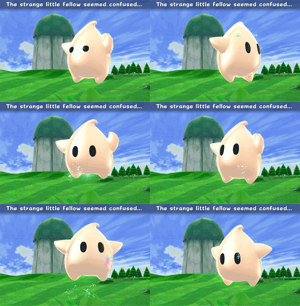
why lumas are so cute!?


Normal: Made by MoodyRPG! (thank you so much!)
The Lost Cute Little Luma: Made by me!

Download the diff made by my best friend - Squishi!

Dedicated to Renumi


Thank You Box
squirrelpascals (Help + Advice)
ezek (Timing fix + Mod + Better BG + Bubble)
Gabe (Mod + Star)
Aro (Mod)
Crimmi (Mod)
ShogunMoon (Mod)
victorfernando (Mod + First Favourite + Star)
rockstarrzz (Mod)
Stingy (Star)
x Arow (Mod)
Acnos (Mod + Star)
IamKwaN (Metadata Check)
wolf3211 (Mod)
Underforest (Mod)
Chewin (Mod)
Gero (Mod + Star Icon + Qualify)
Gordon123 (Mod)
ByBy (Mod + Patterns Ideas + Rechecks)
-Harpuia- (Mod + Star)
Hailie (Mod)
Aurele
hello! as requested by pm :)

General
  1. Don't forget to add "MoodyRPG" in the tags since he is part of the mapset, afterall.
  2. After doing some research, I found that the song is also called "Stray Child" or "The Lost Child". Ryo Nagamatsu (永松 亮) and Koji Kondo (近藤 浩治) are also composers of this song. These might also be added in the tags too! Also, maybe you could add "bros" into the tags as well to represent "Super Mario Bros" (which is pretty well known as a whole)
  3. The song's title should be "まいご" which is translated into "The Lost Luma" in the United States (Reference // Track #3)
  4. The artist's name should be "横田 真人" as seen here. (よこた まひと is also shown in parenthesis)
*These informations for the metadata can help you out a bit, it does not mean they are valid tho..*

Normal
  1. 00:05:223 (3) - I recommend you to add a new combo to this object as there is a small break with the previous object. (Also because 00:07:450 (1,2,3,4) - is pretty similar)
I really have nothing to complain about this difficulty, for real. I went through everything (the combos, the hitsounds, the flows, the spacings, the stacked notes) everything.. All the work is made in a consistent way. Nice job!

Hard
  1. 00:03:275 (2) - Maybe you can try to keep the spacing of this circle consistent on 1.84x like most of your patterns
  2. 00:09:955 (2) - I suggest you to do the same thing here
I have nothing else to add in here! You emphasized every intonations with the circle emplacements as well as the hitsounds. Good job.

---

Good luck! Here's a shiny star~
Topic Starter
Joe Castle

Gabe wrote:

hello! as requested by pm :)

General
  1. Don't forget to add "MoodyRPG" in the tags since he is part of the mapset, afterall. I forgot to add it since i was distracted hehe, Fixed!
  2. After doing some research, I found that the song is also called "Stray Child" or "The Lost Child". Ryo Nagamatsu (永松 亮) and Koji Kondo (近藤 浩治) are also composers of this song. These might also be added in the tags too! Also, maybe you could add "bros" into the tags as well to represent "Super Mario Bros" (which is pretty well known as a whole) Ok!
  3. The song's title should be "まいご" which is translated into "The Lost Luma" in the United States (Reference // Track #3) I will add that too!
  4. The artist's name should be "横田 真人" as seen here. (よこた まひと is also shown in parenthesis) I forgot to add the romaji name, thanks for doing the research! :)
*These informations for the metadata can help you out a bit, it does not mean they are valid tho..*

Hard
  1. 00:03:275 (2) - Maybe you can try to keep the spacing of this circle consistent on 1.84x like most of your patterns :o :o :o i totally forgot the spacing there, ill fix it
  2. 00:09:955 (2) - I suggest you to do the same thing here ill fix this too!
I have nothing else to add in here! You emphasized every intonations with the circle emplacements as well as the hitsounds. Good job.

---

Good luck! Here's a shiny star~
Man, thank you SO much for the mod and the star! i really appreciate your help!
MoodyRPG
Crimmi

Hello~


General (Metadata, Timing, etc.)


_________________________________________________________


  1. Your BG is 1100 x 618, I suggest finding a similar BG with at least 1024 x 768 or you can resize it if you wish.
  2. The gap between the difficulties "Moody's Normal" & "Cute Little Luma" is a tad big with them being 1.61 & 3.09 SR respectively, maybe you can buff the Normal up a bit and probably add an Easy to boot to balance things out or you can slightly nerf the Hard.

Moody's Normal


  1. Clear~

Cute Little Luma


  1. This difficulty is fine but I wished you had put some thought into putting patterns in the diff as it looked like you just placed the circles in different directions :cry: 00:00:770 (1,2,3,4,1) is a good example you did here so why didn't improvise on it further? xD
  2. 00:28:049 (3) - Align this with (2).

That's all I got for now, good luck on your set.

Shunao
heyo!

request by pm w

  • General
  1. I just wanted to suggest something lol, change the name of your background put just "bg" it's better imo
  • Moody's Normal
  1. Remove Widescreen
  2. 00:12:461 - ahh rip this sound, you need to map it like you did at 00:02:996 (1,2) - oo and there is no sound here 00:12:739
  3. 00:14:409 (2) - same here ^
  4. 00:18:584 - no sound..
  5. 00:21:090 (2) - like i said on the top (no sound on the tail)
  6. 00:23:316 (2) - ^
  7. 00:25:543 (2) - ^
  • Cute Little Luma
  1. lol the circle size
  2. tbh i tthink you should add some slider because when the melody change rhythm it's should difficult and confusing to follow it for example here 00:08:564 (4,5,6,1) - 6 should be very difficult to click. Here too about the rhythm 00:17:472 (4,5,6)
  3. 00:26:378 (4,5,6,1) - like i said ^
gl!~
Topic Starter
Joe Castle

Crimmi wrote:

Hello~

Hii!

General (Metadata, Timing, etc.)


_________________________________________________________


  1. Your BG is 1100 x 618, I suggest finding a similar BG with at least 1024 x 768 or you can resize it if you wish. Ok!
  2. The gap between the difficulties "Moody's Normal" & "Cute Little Luma" is a tad big with them being 1.61 & 3.09 SR respectively, maybe you can buff the Normal up a bit and probably add an Easy to boot to balance things out or you can slightly nerf the Hard.
i nerfed the hard a bit

Cute Little Luma


  1. This difficulty is fine but I wished you had put some thought into putting patterns in the diff as it looked like you just placed the circles in different directions :cry: 00:00:770 (1,2,3,4,1) is a good example you did here so why didn't improvise on it further? xD [/color]
  2. 00:28:049 (3) - Align this with (2). Done!
Thank you so much for the mod man!
Topic Starter
Joe Castle

ShogunMoon wrote:

heyo! Hi there! :3

request by pm w

  • General
  1. I just wanted to suggest something lol, change the name of your background put just "bg" it's better imo Ok :o
  • Cute Little Luma
  1. lol the circle size I talked about it with Moody, and we decided to make it a bit more bigger.
  2. tbh i think you should add some slider because when the melody change rhythm it's should difficult and confusing to follow it for example here 00:08:564 (4,5,6,1) - 6 should be very difficult to click. Here too about the rhythm 00:17:472 (4,5,6)
  3. 00:26:378 (4,5,6,1) - like i said ^ Ill consider it :3
gl!~ Thankies!
victorfernando
hi good map <3 So Lets Go

Cute little luma

  • 00:01:883 Cancel nc and move this note to X:416 Y:192 To make a star
    00:02:718 nc here and make a triangle
    00:02:996 move to X:76 Y:288
    00:03:275 move to X:208 Y:200
    00:05:780 move to X:352 Y:192
    00:06:615 move to X:352 Y:192 too , to make a overlap to emphasize on music
    00:08:842 make a ''S'' slider or one red point ''S''
    00:14:687 make another triangle put on X:300 Y:60
    00:21:368 another triangle ?
    00:23:038 make the on horizontal angle
    00:26:657 V slider or ''S'' slider
    00:29:997 continue mapping , remove this slider , just down the volume .
Topic Starter
Joe Castle

victorfernando wrote:

hi good map <3 So Lets Go Hi!

Cute little luma

  • 00:01:883 Cancel nc and move this note to X:416 Y:192 To make a star The coordinates makes it look less like a star, but moved the circle at 00:01:326 so it can look more like a star :( and the new combo... i like it that way, but if more people says the same, ill change it
    00:02:718 nc here and make a triangle Didnt made the NC, cause personal preferences (maybe gonna change it if more people says the same) but did move the circle at 00:03:275 (2) to make 00:02:718 (2,1,2) look more like a isosceles triangle :)
    00:02:996 move to X:76 Y:288 I prefer to keep it like it is... Sorry :(
    00:03:275 move to X:208 Y:200 Ok!
    00:05:780 move to X:352 Y:192 That wouldnt really emphasize the high note of the orchestal music, so no :(
    00:06:615 move to X:352 Y:192 too , to make a overlap to emphasize on music Here i will say no too...
    00:08:842 make a ''S'' slider or one red point ''S'' sure! made kind of a S shaped slider.
    00:14:687 make another triangle put on X:300 Y:60 not feeling a triangle there. i talked with a friend (also mapper) about that part, and he said it looks good like it is right now. Doing a triangle wouldnt make it look nice
    00:21:368 another triangle ? Uhm... Not really, ill keep it like that
    00:23:038 make the on horizontal angle Ok :)
    00:26:657 V slider or ''S'' slider Done!
    00:29:997 continue mapping , remove this slider , just down the volume. Sorry, but i will not do that. it wouldnt feel nice, so the spinner is ok there
Thank you so much for the mod, very appreciated!
rockstarrzz
Hi, from modreqs

Moody's Normal
AR and OD are a tad too high for 1.65* imo, consider changing to AR4 OD3, and possibly CS3
Hitsounds throughout are way too loud, I'd have them between 25-50% throughout, also try to find some nice custom ones
00:01:883 (3) - Don't overlap with 1, it will be too hard to read for a beginner
00:10:234 (2) - move this down a bit so 1 flows into it nicely, just for aesthetics
00:18:028 (3,4) - stack to repeat the pattern you've been using throughout
00:21:925 (3) - put parallel at end of slider
00:24:152 (3,4) - make 2 flow into these a little better, could also move this whole combo in a bit, not really needed to be in the very top left, it may also cover the HP bar? not sure
00:25:265 (1,2,3,4) - arrange these so they create a curve https://i.gyazo.com/d04fefd42a47a6e3ce7 ... 8e8e57.png
00:28:327 (2) - don't stack on 5, confusing to read for beginner

Cute Little Luma
AR7 is plenty for this difficulty
again, hitsounds are far too loud
00:01:883 (1) - remove nc
00:02:996 (1) - remove nc and add it on 00:02:718 (2) ?
00:06:615 (5) - could place in center
00:09:677 (1) - move closer to 5, distance too far imo
00:10:512 (4) - keep distance snap on jumps, this is less than 3* remember
00:28:327 (4) - ^
00:29:719 (1) - place in center
I think this map could use some more sliders, its quite jump heavy
Topic Starter
Joe Castle

rockstarrzz wrote:

Hi, from modreqs Hi there :)

Cute Little Luma
AR7 is plenty for this difficulty AR7 its pretty common in hard diffs :)
again, hitsounds are far too loud Reduced the volume a bit more, hopefully its now ok.
00:01:883 (1) - remove nc Ok, ill change it.
00:02:996 (1) - remove nc and add it on 00:02:718 (2) ? Added a new combo at 00:02:718 (1), but 00:02:996 (1) will be the same
00:06:615 (5) - could place in center I will keep it like that for now, im not feeling that circle to be in the center
00:09:677 (1) - move closer to 5, distance too far imo why tho :o ? theres enough time to hit 5 without any problem :S
00:10:512 (4) - keep distance snap on jumps, this is less than 3* remember as i previously said, theres enough time for the player to hit 00:10:512 (4,5) without any problem
00:28:327 (4) - ^ same reason as the previous problem :S
00:29:719 (1) - place in center sure!
I think this map could use some more sliders, its quite jump heavy The song doesnt really offers a good placement for sliders, i already have 3 on the map, and i wanted to make a circle-based map :P
Thank you very much for the mod! i appreciate your help :)
Arow
Hello from noobmodreqs
Your map looks very polished and clean :) Don't have much to say.

Moody's Normal
00:18:584 (1) - Slider starts on nothing and ends on strong sound soo...
00:19:141 (2) - what about deleting this circle and moving 00:18:584 (1) - this slider to next red tick.
MoodyRPG
Thanks guys, some fixed

https://puu.sh/xm0kU/6493cb560b.osu
Topic Starter
Joe Castle
Quick message saying that i will not be able to update the map for around 2-3 more days, because my right foot got infected by some kind of bug and I need medical treatment.

When I feel better, I will ask for mods again :)

Edit: Maybe this will take 2 weeks :( sorry

Edit 2: I feel good now, my thumb got the worst part, but some creams and pills will help, ready to ask for mods again :D
beaw
I don't have much of a mod, so here's something else.

I really think that there needs to be a difficulty in between these two. The difficulty gap between them is totally bizarre, and with the way it is now will never make it past the Ranking Process.
The jumps in the Cute Little Luma diff are huge compared to anything in the Normal difficulty, and not to mention how hard they are to read. The circle:slider ratio is insane, with most objects in the Normal being sliders and the top diff only having 3.

I can't really mod this map because I disagree greatly with the top difficulty's structure and the map's spread. I really believe that there needs to either be a Normal (Change Moody's to an Easy) or the top diff needs to be completely re-structured to be played like an Advanced or a Normal.

Thank you.
Akunosu
Hare este mod en español por que hablamos el mismo idioma :3
 Moody's Normal :
  1. 00:12:182 (2) - por que pusistes un slider?, 00:05:502 (2) - aqui, tu pusistes un hitcircle, si pones un slider seria muy confuso para los jugadores por que estarias dejando el tick blanco que sobrepasa el slider
  2. 00:14:409 (2) - ^
  3. 00:21:090 (2) - ^
  4. 00:23:316 (2) - ^
  5. 00:25:543 (2) - ^
 Cute Little Luma :
  1. 00:08:842 (5) - talvez cambiar el slider a otra forma? image

eso es todo,
Buena Suerte!
Topic Starter
Joe Castle

Acnos wrote:

Hare este mod en español por que hablamos el mismo idioma :3 Okiwis uwu

 Cute Little Luma :
  1. 00:08:842 (5) - talvez cambiar el slider a otra forma? Bueno, tu ejemplo es mas o menos similar al slider que esta actualmente en el mapa, pero considerare rotarlo un poco mas a la izquierda :)

    RIP. mejor lo dejo como esta xD
    image
eso es todo,
Buena Suerte!
Gracias :)
Topic Starter
Joe Castle

Stingy wrote:

I don't have much of a mod, so here's something else.

I really think that there needs to be a difficulty in between these two. The difficulty gap between them is totally bizarre, and with the way it is now will never make it past the Ranking Process.
The jumps in the Cute Little Luma diff are huge compared to anything in the Normal difficulty, and not to mention how hard they are to read. The circle:slider ratio is insane, with most objects in the Normal being sliders and the top diff only having 3.

I can't really mod this map because I disagree greatly with the top difficulty's structure and the map's spread. I really believe that there needs to either be a Normal (Change Moody's to an Easy) or the top diff needs to be completely re-structured to be played like an Advanced or a Normal.

Thank you.
Ok then, i will use your map Itz Mr. Grim to explain the situation with the difficulty "gap" youre talking about. In your mapset, Stingy, the gap between Polka´s Normal and your hard is very high, going from 1,88 to 3,16. Dont you think thats BIZARRE?, also, the gap isnt problematic here, since there is a lot of mapsets that have that "bizzare" gap youre saying. Lets remember that the original Cute Little Luma was a 3,10* diff, which i nerfed because previous modders asked for it. Before talking, make your RESEARCH

The circle/slider ratio isnt a problem either, since moody used some sounds to make the normal diff, while im using ALL OF THEM and using circles to emphasize those sounds.


Now, i appreciate your effort to give some "feedback" but just threw your opinion about it. Thats doesnt look cool at all.
Cote
Hi #modreqs

Moody's Normal


  1. 00:23:316 (2,3,4) - Agrega un poco de distancia a esos circles, toma 00:25:543 (2,3,4) - como referencia

Cute Little Luma

  1. 00:02:718 (1) - Desactiva este nc, no escucho un sonido diferente al anterior circle y menos aun fuerte
  2. 00:18:028 (5) - Es un poco raro tener la cola del slider apuntando a esta dirección, cuando 00:18:863 (1) - esta hacia la derecha
  3. 00:26:657 (5) - Podrías intentar hacer un slider circular, para que este cree un blanket con 00:28:327 (4) -
Y bueno, eso seria lo que encontré para un mapa simple y tranquilo. Good Luck!
Topic Starter
Joe Castle

wolf3211 wrote:

Hi #modreqs Hola! :D

Cute Little Luma

  1. 00:02:718 (1) - Desactiva este nc, no escucho un sonido diferente al anterior circle y menos aun fuerte El NC esta ahi por el sonido que viene despues, es decir, 00:02:996 (1,2,3,4), y con ese NC, 00:02:996 (1,2,3,4) sigue los mismos patrones que, por ejemplo, 00:11:904 (1,2,3,4) o 00:20:811 (1,2,3,4)
  2. 00:18:028 (5) - Es un poco raro tener la cola del slider apuntando a esta dirección, cuando 00:18:863 (1) - esta hacia la derecha Tienes razon. Yo tambien lo veia medio extraño, pero despues no le preste atencion. Lo arreglare cuando pueda y hare que vaya hacia la derecha :)
  3. 00:26:657 (5) - Podrías intentar hacer un slider circular, para que este cree un blanket con 00:28:327 (4) - Tendria que pensarlo bastante,
    pero creo que el slider que esta ahi esta bien.
Y bueno, eso seria lo que encontré para un mapa simple y tranquilo. Good Luck! Gracias buen hombre!
MoodyRPG

Acnos wrote:

Hare este mod en español por que hablamos el mismo idioma :3
 Moody's Normal :
  1. 00:12:182 (2) - por que pusistes un slider?, 00:05:502 (2) - aqui, tu pusistes un hitcircle, si pones un slider seria muy confuso para los jugadores por que estarias dejando el tick blanco que sobrepasa el slider Sigo la melodia principal de la cancion, por eso el slider, en cuanto a 00:05:502 (2), lo cambie por un slider largo, creo que se me habia olvidado ponerlo xD
  2. 00:14:409 (2) - ^ ^
  3. 00:21:090 (2) - ^
  4. 00:23:316 (2) - ^
  5. 00:25:543 (2) - ^
 Cute Little Luma :
  1. 00:08:842 (5) - talvez cambiar el slider a otra forma? image

eso es todo,
Buena Suerte!
Gracias por checkear

Solo hice un arreglo

http://puu.sh/xwQgU/607a6eee4c.osu
Topic Starter
Joe Castle
Quick message saying that I can't update the map for at least 1 week, since I'll be traveling with my family to do some papers and stuff like that, so we can have our own car :) please understand. When I can found time, I'll update it


EDIT: Im back! Ready to get some mods :)
Underforest
NM from #modreqs

[moody's normal]
00:00:770 (1,3) - moverlo al principio del slider 2 puede servir para un mejor flow
00:27:213 (5,2) - error de stack xD

[cute little luma]
la ar puede ser 7, 7.5 no encaja
00:10:234 (3,4) - entiendo que es una diff con jumps pero esto es demasiado en esta parte
00:28:327 (4,5,6) - la musica se esta "desvaneciendo" aqui, por lo que puedes hacer que el spacing se reduzca progresivamente en su lugar, no crees?

buena suerte~
Topic Starter
Joe Castle

Underforest wrote:

NM from #modreqs hola :)

[cute little luma]
la ar puede ser 7, 7.5 no encaja Ok :o
00:10:234 (3,4) - entiendo que es una diff con jumps pero esto es demasiado en esta parte Reduje el jump considerablemente. Espero que funcione.
00:28:327 (4,5,6) - la musica se esta "desvaneciendo" aqui, por lo que puedes hacer que el spacing se reduzca progresivamente en su lugar, no crees? Si, pero el volumen de la musica no baja de manera tan rapida, por lo tanto, no creo necesario bajarle tanto el spacing (por lo menos eso pienso yo). De todas maneras, reduje el spacing de 00:28:049 (3,4) - (hice lo mismo que con el primer problema que escribiste) y movi 00:28:884 (5,6) hacia la izquierda para que se viera "mejor" :S

Tambien acomode el jump en 00:18:863 (1,2,3) para que asi siga el mismo spacing que los otros 2 jumps que existian anteriormente :P

buena suerte~ Muchas gracias por el mod chamo! :D :D :D
MoodyRPG
Chewin
Hello Joe Castle! I am sorry for being late ;w; This is your mod from my Queue!

~General~

  1. I had issues with the timing tbh. I tried to set this manually and I got:
    BPM: 107,81 (this 0.03 difference looks nazi but it really affects on the elements because if you hear carefully with 25% playback rate some elements like 00:03:553 (2) - 00:09:677 (1,2) - seem to be offtimed)
    Offset: It's set too early right now (you can check with your whistles hitsounds). I have 778 (+8)ms. Try this and let me know!
  2. I will mod hitsounding here since both diffs are using the same: 00:03:553 (2) - being the higher pitch on the tail you should use whistle on it instead of using it on the head (two close whistles like that sound bad imo), 00:07:728 (2) - I would remove the whistle from the tail here so the one on the head is more emphasized as it should, 00:08:564 (3,4) - I would use whistle on both here because the pitches are higher on both elements and if you apply what I said about 00:07:728 (2) - these two whistles would fill in the best way imo, 00:10:234 (2) - I would use whistle on the tail too because of the stronger pitch, 00:13:017 (3) - here as well because it has the same intensity of 00:12:182 (2) - 's head and if you do so use whistle on 00:15:244 (3) - 's head as well, same for next parts that are similar. Well, it's a personal taste but I would set them like this xP
  3. Move your mapset to pending
~Moody's Normal

  1. 00:09:677 (1,2) - I felt this two sliders a bit unflowing honestly: the way you curved them just destroyed the flow you created on previous patterns. What about setting them like this instead? https://osu.ppy.sh/ss/9110683 If you adjust this don't forget to fix next 00:11:069 (3,4) - placement as well
  2. 00:27:492 (1) - Place this slider on the center because the next slider 00:28:327 (2) - is actually placed on top of its body and it looks messy imo. This would give a smoother pattern to play: https://osu.ppy.sh/ss/9110696
~Cute Little Luma~

  1. 00:00:770 (1,2,3,4,5) - This is the only pattern in which there is inconsistency in the spacing compared to the rest of the map. Make it consistent? It would be awesome and nice xP
I have #feelz in my #kokoro right now TwT Check the timing issues and hitsounding suggestions btw xP
Good luck for the rank!
Topic Starter
Joe Castle

Chewin wrote:

Hello Joe Castle! I am sorry for being late ;w; This is your mod from my Queue! Hi chewin!

~General~

  1. I had issues with the timing tbh. I tried to set this manually and I got:
    BPM: 107,81 (this 0.03 difference looks nazi but it really affects on the elements because if you hear carefully with 25% playback rate some elements like 00:03:553 (2) - 00:09:677 (1,2) - seem to be offtimed)
    Offset: It's set too early right now (you can check with your whistles hitsounds). I have 778 (+8)ms. Try this and let me know! Ok, ill adjust those things :)
  2. I will mod hitsounding here since both diffs are using the same:
    00:03:553 (2) - being the higher pitch on the tail you should use whistle on it instead of using it on the head (two close whistles like that sound bad imo) 00:07:728 (2) - I would remove the whistle from the tail here so the one on the head is more emphasized as it should
    00:08:564 (3,4) - I would use whistle on both here because the pitches are higher on both elements and if you apply what I said about 00:07:728 (2) - these two whistles would fill in the best way imo
    00:10:234 (2) - I would use whistle on the tail too because of the stronger pitch
    00:13:017 (3) - here as well because it has the same intensity of 00:12:182 (2) - 's head and if you do so use whistle on 00:15:244 (3) - 's head as well, same for next parts that are similar. Well, it's a personal taste but I would set them like this xP Well... ill stick with the current placement uwu sorry paisano (?)
  3. Move your mapset to pending Whoops, sorry xD
~Cute Little Luma~

  1. 00:00:770 (1,2,3,4,5) - This is the only pattern in which there is inconsistency in the spacing compared to the rest of the map. Make it consistent? It would be awesome and nice xP Reduced the spacing a bit more, but not too much, because it would make the pattern look kinda weird.
I have #feelz in my #kokoro right now TwT Check the timing issues and hitsounding suggestions btw xP Thats why i mapped this song,
because of the childhood uwuwuwuwuwu

Good luck for the rank! Thank you so much paisano :3
ZekeyHache
omaigod :v

[General]
  1. Mejor bg (+calidad +ligera)
  2. "soft-hitnormal2.mp3" es un mp3, pls usa un wav
[Moody's Normal]
  1. 00:05:508 (2) - 00:12:186 (2) - 00:14:412 (2) - 00:21:090 (2) - 00:23:316 (2) - 00:25:542 (2) - Que es lo que sigues al final de estos sliders? No puedo oir nada y aparte de eso ignoras un beat que si se escucha, el cual queda ignorado en el tick de enmedio :c
regreso despues del Gero
Topic Starter
Joe Castle

ezek wrote:

omaigod :v

[General]
  1. Mejor bg (+calidad +ligera) Cambiado uwu, gracias por el BG
  2. "soft-hitnormal2.mp3" es un mp3, pls usa un wav Cambiado uwu
regreso despues del Gero Vale :O
gracias por la ayuda ese uwu

Vamos a esperar al panita moody para que revise el mod de chewin y el tuyo uwu
MoodyRPG
Fixed all, thanks Chewin and ezek :)

http://puu.sh/xDOhK/70eef965db.osu
Topic Starter
Joe Castle
Updated Moody´s diff. Now waiting for el panita Gero

UWUWUWUWUWUWUWUWUWU
Chewin
bubble this pls
Topic Starter
Joe Castle

Chewin wrote:

bubble this pls
apparently Gero will make his mod on the weekend, since he is busy with university :o

after that, the map will be bubbled uwuwuwuwu

EDIT: GERO WHERE ARE YOU ITS BEEN 5 DAYS ;W;

EDIT 2: ALMOST TWO WEEKS GERO ;;;;w;;;;

EDIT 3:


EDIT 4: AAAAAAAAAAAAAAAAAAAAAAAAAAAAAAAAAAAAAAAAAAAA

EDIT 5: okay, +20 now, hope this gets the attention of Gero ;w;

EDIT 6: G E R O F O R F U C K S A K E
Mithia
N I C E owo
ZekeyHache
Gero pls
Mithia
ezek Habla español :0, lol
Gero
Hola.

Moody's Normal

  1. 00:05:508 (2,3,4) - Considera aumentar el espacio entre 00:05:508 (2,3) - debido a que anteriormente y a lo largo de todo el mapa haz usado una distancia consistente, por lo tanto es un poco extraño el romperla ya que esto puede crear confusión a los jugadores que no son experimentados. Ademas de que no es muy recomendable hacer este tipo de antijumps en una Normal.
  2. 00:14:412 (2,3) - Lo mismo.
  3. 00:14:134 (1,2) - Aumentar el espacio en esta sección podría ser opcional, pero ya que es el mismo ritmo y anteriormente hiciste algo como esto 00:03:560 (2,1) - el cual respeta la distancia constante de 1.2x es mas recomendable mantener la coherencia.
  4. 00:18:029 (3,4,1,2) - No quisiera ser demasiado nazi, pero 00:18:029 (3,4) - estoy bastante seguro que posicionar estos en el centro de la cuadricula estaría mucho mejor y aumentaría la calidad de la simetría del patrón que haz intentado hacer. también si haces esto considera remover el apilado los dos círculos siguientes haciendo lo de la siguiente imagen.
  5. 00:21:925 (3,1,2) - La misma cuestión del espaciamiento, considera mover (1) y (2) a otro lado.
Cute Little Luma

  1. 00:00:778 (1,2,3,4,5) - Entiendo que estas enfatizando los sonidos que son fuertes al inicio del mapa, pero revisando con cuidado es el único jump de todo el mapa. a excepción de 00:02:725 (1,1) - Por lo tanto de alguna manera es extraño introducir saltos así al inicio del mapa.
  2. 00:02:725 (1) - En lo personal esto es spam para mi. No afecta en nada, lo unico en lo que ayuda es entender que hay un cambio de espacio entre (1) a (1) en 1/2.
  3. 00:16:916 (3,4,5) - Hay demasiada incoherencia en el espaciamiento usado a lo largo de toda la dificultad. Algo como esto es de muy baja calidad ya que va de 00:16:916 (3) - 1.35x a 00:17:473 (4) - 1.37x y derrepente a 00:18:029 (5) - 1.04x lo cual es extraño, teniendo en cuenta que se trata de un mismo tipo de ritmo en 1/1.
Honestamente, siento que podrías conseguir unos cuantos mods mas antes de considerar el conseguir un BN para nominarlo. En general el mapa esta decente, pero la falta de uso de sliders hace que el mapa parezca que no tenga una estructura, por lo cual da la impresión de que no hay algo solido detrás de el posicionamiento de las notas, debido a que de alguna manera la técnica no fue ejecutada correctamente, por lo tanto por ahora solo te dejo la estrella.
Topic Starter
Joe Castle

Gero wrote:

Hola. A L E L U Y A ! ! !

Cute Little Luma

  1. 00:00:778 (1,2,3,4,5) - Entiendo que estas enfatizando los sonidos que son fuertes al inicio del mapa, pero revisando con cuidado es el único jump de todo el mapa. a excepción de 00:02:725 (1,1) - Por lo tanto de alguna manera es extraño introducir saltos así al inicio del mapa. Comprendo,
    quite los jumps, pero deje la forma de estrella
  2. 00:02:725 (1) - En lo personal esto es spam para mi. No afecta en nada, lo unico en lo que ayuda es entender que hay un cambio de espacio entre (1) a (1) en 1/2. Esta bien?
  3. 00:16:916 (3,4,5) - Hay demasiada incoherencia en el espaciamiento usado a lo largo de toda la dificultad. Algo como esto es de muy baja calidad ya que va de 00:16:916 (3) - 1.35x a 00:17:473 (4) - 1.37x y derrepente a 00:18:029 (5) - 1.04x lo cual es extraño, teniendo en cuenta que se trata de un mismo tipo de ritmo en 1/1. Ajuste los que tu pusiste aqui de todas maneras, aunque necesitaria un poco de ayuda para ver si hay muchos otros errores :P, trate de arreglar alguno que otro que vi, pero si hay muchos que quedaron, es porque soy muy tonto xP
Honestamente, siento que podrías conseguir unos cuantos mods mas antes de considerar el conseguir un BN para nominarlo. En general el mapa esta decente, pero la falta de uso de sliders hace que el mapa parezca que no tenga una estructura, por lo cual da la impresión de que no hay algo solido detrás de el posicionamiento de las notas, debido a que de alguna manera la técnica no fue ejecutada correctamente, por lo tanto por ahora solo te dejo la estrella. Pues, con respecto al tema de los sliders, mi intención era representar cada sonido de la cancion con circulos, y sinceramente no encuentro otros lugares para poner sliders, disculpa. Buscare mas mods y muchas gracias por tu estrella y mod Gero, muchisimas gracias :)
Gordon123
hello as ur request about m4m :roll:
[general]
  1. maybe at the beginning u can use 65% volume then 70,because it sounds a little loud o .o
[Moody's Normal]

  • maybe CS=3.9? LOL for 1.6 stars
    really looks good,idk what i need to mod here ._.
    I just dont like how this place begins here 00:00:778 (1,2,3) - I think you can make it a bit prettier
    00:25:264 (1,2) - do it a little rounded
[Cute Little Luma]

  • 00:08:847 (5) - add for all slider whistle - sounds better
    00:26:655 (5) - ^ same too here
    00:29:716 (1) - maybe in сentre? LOL
~~~~~~~~~~~~~~~~~~~~~~~~~~~~~

This map really looks good,good luck with rank (:


Good Luck ;)
MoodyRPG
Topic Starter
Joe Castle

Gordon123 wrote:

hello as ur request about m4m :roll: Hi :)

[Cute Little Luma]

  • 00:08:847 (5) - add for all slider whistle - sounds better Ok :o
    00:26:655 (5) - ^ same too here ok :o x2
    00:29:716 (1) - maybe in сentre? LOL fixed!
~~~~~~~~~~~~~~~~~~~~~~~~~~~~~

This map really looks good,good luck with rank (: thank you so much buddy :)


Good Luck ;)
thank you for the mod, i really appreacite it!
meii18
random mod

general

combo colours are not setted

moody's normal

HP 5 isn't recommended for the easiest diff use HP 3 instead
OD 4
00:02:725 (4,1,2) - the current rhythm doesn't follow really well the piano, if you intended that for more accurate rhythm you can do something like this http://puu.sh/xXrDQ/99f699c462.jpg so it would follow the piano much better than before
00:05:508 (2) - this 1/2 slider can be extended to 1/2 tick (00:06:064 - ) as it still follows the piano or whatever so it would be an 2/2 slider
actually, speaking of 00:07:734 (2) - // 00:12:186 (2) - // 00:14:412 (2) - and so on there's too mch 1/2 spam for the easiest diff of the set tbh the newbie player won't get used so fast to these 1/2 spams you have to nerf a little bit the rhythm just for the sake of newbie players the only sollution for this issue is to replace the 1/2 spam by making 2/2 sliders instead it would be more easier for the target players to aim them properly
00:07:734 (2,3,4) - the flow is a bit broken as the cursor goes directly to the upside part after aiming 00:07:734 (2) - but suddenly you have to drag the cursor down to (3) - and (4) - which actually makes the flow a little bit weird and broken in order to fix that just move 00:08:569 (3,4) - to 489|19 so the flow would become more smoothlier // 00:12:186 (2,3) - same
00:15:247 (3) - ctrl+G for better flow but pay attention to not ruin the flow of 00:15:247 (3,1) -
using doublets like 00:11:073 (3,4) - in normals is fine but spamming them is not so i would avoid to spam them and nerf some of them imo

cute little luma

the diff itself is mostly fullfilled with circles only which makes the diff too monotonous, even if the song is kinda repetitive but replacing some notes with sliders and making creative patterns to form circular flow or angle flow for instance will make the diff to seem fun to play instead of making too monotonous :roll:
00:02:725 (1,1,2,3,4) - this one's flow is pretty bad because the cursor goes likely chaotically through these circles tbh https://puu.sh/xYd3U/48c7ce61e5.jpg in order to improve the flow the pattern can be re-arranged like this one https://puu.sh/xYdc9/79578196a2.jpg and 00:04:117 (4) - moved to 295|88
00:26:655 (5) - this slider feels pretty sloopy i'd like to rotate it at 15 degress and then re-arrange the slider a bit you'll get something like this https://puu.sh/xYdxv/96fc1499d9.jpg

there are many issues including flows issues and it's repeating and repeating...

solid map but i think you have to remap the hard diff :( you can call me back to mod it again
gl!
Topic Starter
Joe Castle

ByBy wrote:

random mod Oh :o

cute little luma

the diff itself is mostly fullfilled with circles only which makes the diff too monotonous, even if the song is kinda repetitive but replacing some notes with sliders and making creative patterns to form circular flow or angle flow for instance will make the diff to seem fun to play instead of making too monotonous :roll:
00:02:725 (1,1,2,3,4) - this one's flow is pretty bad because the cursor goes likely chaotically through these circles tbh https://puu.sh/xYd3U/48c7ce61e5.jpg in order to improve the flow the pattern can be re-arranged like this one https://puu.sh/xYdc9/79578196a2.jpg and 00:04:117 (4) - moved to 295|88 im going to apply this pattern
00:26:655 (5) - this slider feels pretty sloopy i'd like to rotate it at 15 degress and then re-arrange the slider a bit you'll get something like this https://puu.sh/xYdxv/96fc1499d9.jpg Im going to apply this too.

there are many issues including flows issues and it's repeating and repeating... but, the thing is, you cant really make a lot of patterns with just 3 circles each second... and flow... uhm... well, the song just goes high pitch to low pitch, the song doesnt let you be very creative imo...

solid map but i think you have to remap the hard diff :( you can call me back to mod it again i might change some stuff... but complete remap is not an option, sorry :(, but if you can help with more patterns, ideas, that would be cool!
gl!
meii18
alrighty i'm here to give you some examples of how to make patterns (sorry for not mentioning in my mod :( )

  1. 00:00:778 (1,2,3,4,5) - http://puu.sh/xZQbv/b5c279f5c3.jpg // https://puu.sh/xZQg3/4da41a683e.jpg the intro can be nerfed a little bit so the player won't be introduced by a crowd of hitcircles just from the first glance
  2. 00:02:725 (1,2,3,4) - https://puu.sh/xZQm9/aa63fa0422.jpg at 00:03:560 (3) - i placed an 1/1 stack so it will emphasize the 1/1 gap
  3. 00:08:847 (5,1,2,3,4) - https://puu.sh/xZQve/e4d2d93823.jpg
  4. 00:18:029 (5,6) - splitting this into 2 circles would be cool
remember that you can stack circles like 00:12:186 (2,3) - // 00:16:638 (2,3) - // 00:07:734 (2,3) - etc. they'll still give emphasis to the instruments

no kds for this

EDIT: seems like you've got a bug at the hardest diff you have to change the diffname in order to fix the bug :c
Topic Starter
Joe Castle

ByBy wrote:

EDIT: seems like you've got a bug at the hardest diff you have to change the diffname in order to fix the bug :c
RIP CUTE LITTLE LUMA ;w; changed the name
meii18
re-recheck o/

the lost little cute luma

  1. 00:00:778 (1,2,3,4,5) - as the diff contains mostly sliders (obviously), starting to play the diff with a chain of 5 hitcircles is no the best idea imo i wold nerf a bit this part like this https://puu.sh/y4xw7/b9082a34b7.jpg
  2. 00:02:725 (1) - you don't need to add NC here as i don't see any new stanza here tbh
  3. 00:03:004 (1) - i know that i suggested an angle slider here but it was just an example so you weren't obligated to put an angle slider here the flow is pretty crampy at this moment because of the angle slider which has got placed randomly i would replace that with a curved slider as it will improve the flow http://puu.sh/y4xO1/27fe3bd29a.jpg
  4. 00:07:456 (1) - move the red anchor to 164|374 in order to improve the slider's shape and also don't forget to move 00:08:012 (2) - to 271|163 for example so you won't destroy the flow
  5. 00:08:847 (4,1) - blanket is pretty off i think the only soluttion is to re-arrange 00:08:847 (4) - 's wave shape in order to fix the blanket and then move 00:09:682 (1) - to 253|282 http://puu.sh/y4y2A/34f35f6136.jpg
  6. 00:09:682 (1,2) - spacing error (kind of) as 00:10:517 (2) - needs more space and there's no enough space for using 1.40x distance snap better move it to 133|321 so it would have more space than before
  7. 00:18:029 (4) - this one feels pretty crampy because of its weird slider shape i will prefer to replace this one with a curved slider for instance
  8. 00:18:864 (1) - by making this slider curve it would improve the entire flow as it feels a bit weird imo
  9. 00:26:655 (4,1) - same as 00:08:847 (4,1) - the blanket is pretty off here as well you just have to re-arrange 00:26:655 (4) - a bit plus rotate it with 1 degress and then move 00:27:490 (1) - to 254|273 in order to improve the blanket http://puu.sh/y4yqY/41dcc41585.jpg
  10. 00:27:490 (1,2) - same as 00:09:682 (1,2) - but here you used another distance snap maybe that was accidentally but you can fix it quickly by spacing them with 1.40x distance snap as you did to the rest of the diff
this time i wrote a wall of text, auch (welp kind of)
hitsounding is pretty basic as it contains only whistles but i think it is because in the song there are no snares as i can see
gl and once again no kds
Topic Starter
Joe Castle

ByBy wrote:

re-recheck o/ re-re-re Hi there!

the lost little cute luma

  1. 00:00:778 (1,2,3,4,5) - as the diff contains mostly sliders (obviously), starting to play the diff with a chain of 5 hitcircles is no the best idea imo i wold nerf a bit this part like this https://puu.sh/y4xw7/b9082a34b7.jpg ill keep the star pattern like that...
  2. 00:02:725 (1) - you don't need to add NC here as i don't see any new stanza here tbh others modders previously said that, so i changed it
  3. 00:03:004 (1) - i know that i suggested an angle slider here but it was just an example so you weren't obligated to put an angle slider here the flow is pretty crampy at this moment because of the angle slider which has got placed randomly i would replace that with a curved slider as it will improve the flow http://puu.sh/y4xO1/27fe3bd29a.jpg changed
  4. 00:07:456 (1) - move the red anchor to 164|374 in order to improve the slider's shape and also don't forget to move 00:08:012 (2) - to 271|163 for example so you won't destroy the flow changed to a simple curved slider tho
  5. 00:08:847 (4,1) - blanket is pretty off i think the only soluttion is to re-arrange 00:08:847 (4) - 's wave shape in order to fix the blanket and then move 00:09:682 (1) - to 253|282 http://puu.sh/y4y2A/34f35f6136.jpg tried my best to fix this
  6. 00:09:682 (1,2) - spacing error (kind of) as 00:10:517 (2) - needs more space and there's no enough space for using 1.40x distance snap better move it to 133|321 so it would have more space than before also tried my best to fix this too
  7. 00:18:029 (4) - this one feels pretty crampy because of its weird slider shape i will prefer to replace this one with a curved slider for instance fixed
  8. 00:18:864 (1) - by making this slider curve it would improve the entire flow as it feels a bit weird imo fixed
  9. 00:26:655 (4,1) - same as 00:08:847 (4,1) - the blanket is pretty off here as well you just have to re-arrange 00:26:655 (4) - a bit plus rotate it with 1 degress and then move 00:27:490 (1) - to 254|273 in order to improve the blanket http://puu.sh/y4yqY/41dcc41585.jpg tried to fix this :S
  10. 00:27:490 (1,2) - same as 00:09:682 (1,2) - but here you used another distance snap maybe that was accidentally but you can fix it quickly by spacing them with 1.40x distance snap as you did to the rest of the diffmade something like you told me on 00:09:682 (1,2)
this time i wrote a wall of text, auch (welp kind of) nah, youre fine xP
hitsounding is pretty basic as it contains only whistles but i think it is because in the song there are no snares as i can see
gl and once again no kds
Thank you so much for the multiple mods you made byby, you really deserve those kudos! :D
-Zeraora
Heya! Sorry I'm late.
I suck at modding but here you go ;A;

those things from super mario galaxy or something like that
  1. 00:05:230 (1,2) - Maybe it's just me, but how 00:05:230 (1) - curves looks... off. Try making it more similar to how 00:03:004 (2) - curves toward 00:03:560 (3) - by adjusting some angles and/or curvature.
  2. 00:08:012 (2,3,4) - I have a bit of suggestion on this one. Maybe try to stack 00:08:569 (3,4) - . I kinda noticed 00:06:343 (3,4) - were stacked and then mapped onto the same instruments as in 00:08:569 (3,4) - ... I think. With that done, the 00:11:073 (3,4) - variants would be left unstacked, which are mapped onto a different sound. Stacking would help giving more meaning as to why the stack was broken in 00:08:569 (3,4) - .
  3. 00:08:847 (4,1) - Having a blanket here will save the world. Make the second half of 00:08:847 (4) - blanket the slider-end of 00:09:682 (1) - :3
  4. 00:18:029 (4) - Curious as to why this is a slider :c
  5. 00:26:655 (4) - It would look better if the shape was even imo. While still being able to blanket the one next, of course xd

Dunno how to mod the other one, sorry!
Anyway, that's all from me. Good luck! :D
MoodyRPG

ByBy wrote:

random mod

general

combo colours are not setted

moody's normal

HP 5 isn't recommended for the easiest diff use HP 3 instead
OD 4
00:02:725 (4,1,2) - the current rhythm doesn't follow really well the piano, if you intended that for more accurate rhythm you can do something like this http://puu.sh/xXrDQ/99f699c462.jpg so it would follow the piano much better than before Fixed a bit
00:05:508 (2) - this 1/2 slider can be extended to 1/2 tick (00:06:064 - ) as it still follows the piano or whatever so it would be an 2/2 slider
actually, speaking of 00:07:734 (2) - // 00:12:186 (2) - // 00:14:412 (2) - and so on there's too mch 1/2 spam for the easiest diff of the set tbh the newbie player won't get used so fast to these 1/2 spams you have to nerf a little bit the rhythm just for the sake of newbie players the only sollution for this issue is to replace the 1/2 spam by making 2/2 sliders instead it would be more easier for the target players to aim them properly I don't see the problem here
00:07:734 (2,3,4) - the flow is a bit broken as the cursor goes directly to the upside part after aiming 00:07:734 (2) - but suddenly you have to drag the cursor down to (3) - and (4) - which actually makes the flow a little bit weird and broken in order to fix that just move 00:08:569 (3,4) - to 489|19 so the flow would become more smoothlier // 00:12:186 (2,3) - same Fixed
00:15:247 (3) - ctrl+G for better flow but pay attention to not ruin the flow of 00:15:247 (3,1) -
using doublets like 00:11:073 (3,4) - in normals is fine but spamming them is not so i would avoid to spam them and nerf some of them imo WHAT? BETTER FLOW?

cute little luma

the diff itself is mostly fullfilled with circles only which makes the diff too monotonous, even if the song is kinda repetitive but replacing some notes with sliders and making creative patterns to form circular flow or angle flow for instance will make the diff to seem fun to play instead of making too monotonous :roll:
00:02:725 (1,1,2,3,4) - this one's flow is pretty bad because the cursor goes likely chaotically through these circles tbh https://puu.sh/xYd3U/48c7ce61e5.jpg in order to improve the flow the pattern can be re-arranged like this one https://puu.sh/xYdc9/79578196a2.jpg and 00:04:117 (4) - moved to 295|88
00:26:655 (5) - this slider feels pretty sloopy i'd like to rotate it at 15 degress and then re-arrange the slider a bit you'll get something like this https://puu.sh/xYdxv/96fc1499d9.jpg

there are many issues including flows issues and it's repeating and repeating...

solid map but i think you have to remap the hard diff :( you can call me back to mod it again
gl!
Thanks :)

http://puu.sh/y5EQH/e7774971e7.osu
show more
Please sign in to reply.

New reply