forum

Koronba - Iwashi ga Tsuchi kara Haete Kurunda

posted
Total Posts
33
Topic Starter
Damnjelly
This beatmap was submitted using in-game submission on zaterdag 14 april 2018 at 11:05:56

Artist: Koronba
Title: Iwashi ga Tsuchi kara Haete Kurunda
Tags: Nemu Kasane Teto Pumpking CACTLOID Neumafu Miteinanda cambrian creatures anomalocaris canadinesis jellyfish nautilus opabinia regalis fossil fossils ground evolution train station 8bit 8-bit ころんば4号 ネウマフ 未ていなんだ 草声ネムUTAU UTAUloid Vocaloid Kusagoe Nemu A Sardine Grows from the Soil
BPM: 135
Filesize: 8093kb
Play Time: 02:49
Difficulties Available:
  1. Hard (3.38 stars, 504 notes)
  2. Medium (2 stars, 269 notes)
  3. Sardine (4.62 stars, 658 notes)
Download: Koronba - Iwashi ga Tsuchi kara Haete Kurunda
Information: Scores/Beatmap Listing
---------------
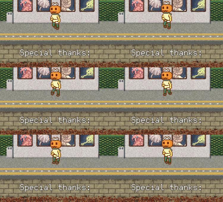
Map
Thanks Hakura for helping me through the modding process
Thanks Mir for extensively helping improve the map
Thanks Halfslashed for pushing the map into qualified

Storyboarders
Thanks tochi- for introducing me to storyboarding and helping me with the first steps
Thanks Starrodkriby for helping me with the questions i had
Thanks Damnae for solving that one very big issue no one knew how to solve lol

Metadata
Thanks Noffy, S o h and Coppertine for the help with metadata


Without any of these guys, the map wouldn't be where it is now!
_____________________________________________________
Source BG
Swerro
Terribly timed,
the corrected offset for this song is 7.102
Topic Starter
Damnjelly

Swerro wrote:

Terribly timed,
the corrected offset for this song is 7.102 SHUT THE UP
Thanks for the mod! ;)
Uni
Mooie map xD
Vivyanne


kd pls
Swerro
Nice map!

- You forgot to set a preview point! I would suggest 00:28:433 or 01:32:433
- I'd also suggest adding 1 or more Kiai mode sections, considering the chorus occurs multiple times. For example: at 00:28:433 the chorus starts and difficulty increases, in my opinion it's worth/should be a Kiai section
- Sliderend-circle spacing: At 01:16:433 you have a 1/8th returnholdslider with a 1/8th gap for the next note. On here it's okay since the bpm is only ~130 and the spacing at the gap isn't that large. But at the end of the kickbackslider at 01:25:332 the gap is quite large (comparable to a 260bpm streamjump) I would either make the gap 1/4th instead of 1/8th or decrease the spacing between those two
Topic Starter
Damnjelly

Swerro wrote:

Nice map!

- You forgot to set a preview point! I would suggest 00:28:433 or 01:32:433 Oh missed that, i added it!
- I'd also suggest adding 1 or more Kiai mode sections, considering the chorus occurs multiple times. For example: at 00:28:433 the chorus starts and difficulty increases, in my opinion it's worth/should be a Kiai section According to the mapping guidlines it is advised to have 1/3rd of your map be a kiai.
Adding a kiai to all the choruses would be 1/3 of the map in kiai.

- Sliderend-circle spacing: At 01:16:433 you have a 1/8th returnholdslider with a 1/8th gap for the next not. On here it's okay since the bpm is only ~130 and the spacing at the gap isn't that large. But at the end of the kickbackslider at 01:25:332 the gap is quite large (comparable to a 260bpm streamjump) I would either make the gap 1/4th instead of 1/8th or decrease the spacing between those two Fair enough, fixed!
Thanks for the mod! ;)
Musty
If I can do a GD on this id be glad because your map is so much fun already, i love it
Topic Starter
Damnjelly

Musty wrote:

If I can do a GD on this id be glad because your map is so much fun already, i love it
Yeah sure go ahead dude! I'm trying to get it ready for rank if i can, so keep that in mind i guess.
SakiZ
awesome map ★
audinor
<=====<========<============SQUISHI MOD=====>========>============


SARDINE

00:15:099 (3,1) - Timeline distance isn't very clear, could be mistaken for 1/2 or player would not be given enough time to aim to the next. Of course, this might just be introducing it, but move it closer to ease players in.
00:26:988 (2,3,4) - Do something like NCing these notes to clear up the timeline distance.
00:57:914 (4,5,6,7,8) - Can you use sliders for these to clear up the 1/3s?
02:34:433 (9) - 02:34:877 (3) - Overlap is exrtemely messy, but putting (9) anywhere else still flows well.
In general, really solid and fun map. I love the rush that the end gives.

HARD

00:23:988 (3,4,5,6,1,2,3,4,1,2,3,4,1) - This pattern goes on far too long. Players would be easily exhausted, and the complicated sahpes only add to that. Consider more 1/2 sliders.
01:01:322 (3,4,1) - Move 3,4 closer together. It's a pretty big jump, as even I was caught off by this while playing.
01:37:988 (1,2,3,1,2,3,4,1,2,3,4,1) - Consider more 1/2.
Sorry that's only 3 problems. This diff is real well structured..


NORMAL

This diff just has 1 general problem. It's all the overlaps. Combine this with the low AR and CS, and players are practically left in a dazed state after playing this.


cute sb uwu
Topic Starter
Damnjelly

squishi wrote:

<=====<========<============SQUISHI MOD=====>========>============


SARDINE

00:15:099 (3,1) - Timeline distance isn't very clear, could be mistaken for 1/2 or player would not be given enough time to aim to the next. Of course, this might just be introducing it, but move it closer to ease players in. You're right, i moved the slider to be more in line with the last jump (00:14:655 (2) - )
00:26:988 (2,3,4) - Do something like NCing these notes to clear up the timeline distance. I think that with the pattern, angle, flow and the nc thats already there, there is enough already to signal a diffrence in rhythm. And the OD allows you to still hit it even if you're early.
00:57:914 (4,5,6,7,8) - Can you use sliders for these to clear up the 1/3s? I think they're fine, i want to stay in the spirit of the circular patterns that are in the part before it. I'm also using the sliders 01:01:322 (1,2,1,2) - because these 1/3s are different from the ones pointed out. making everything sliders would make it so it doesn't consistently follows the song.
02:34:433 (9) - 02:34:877 (3) - Overlap is exrtemely messy, but putting (9) anywhere else still flows well. Fixed
In general, really solid and fun map. I love the rush that the end gives. Thanks!

HARD

00:23:988 (3,4,5,6,1,2,3,4,1,2,3,4,1) - This pattern goes on far too long. Players would be easily exhausted, and the complicated sahpes only add to that. Consider more 1/2 sliders. I think the heavier use of 1/2 fits the hard myself, else the diffrence between the normal is quite a bit bigger
01:01:322 (3,4,1) - Move 3,4 closer together. It's a pretty big jump, as even I was caught off by this while playing. Fair point, changed it
01:37:988 (1,2,3,1,2,3,4,1,2,3,4,1) - Consider more 1/2. Same reason as the first one
Sorry that's only 3 problems. This diff is real well structured.. Thanks! I tried really hard to structure it properly, glad it got noticed :D


N̶O̶R̶M̶A̶L̶
MEDIUM
This diff just has 1 general problem. It's all the overlaps. Combine this with the low AR and CS, and players are practically left in a dazed state after playing this. I understand, I don't have the time to go through the map right now but i'll change it later this week or next week


cute sb uwu 3000 hours in notepad confirmed :^)
Thanks a lot for taking your time to mod my map, i honestly appriciate it!
Daxxel
Hard:
01:55:544 (9) - NC
02:00:877 (7) - NC desperately needed here
02:04:433 (7) - NC
02:25:322 (8) - NC
02:39:544 (8) - NC

Sardine:
Love the flower shaped streams in the last kiai

All in all an amazing map. the hitsounding is amazing, would love to see this get ranked someday! ^^
Daxxel
Amazing storyboard too, have star from me ^^
Topic Starter
Damnjelly

Daxxel wrote:

Hard:
01:55:544 (9) - NC
02:00:877 (7) - NC desperately needed here
02:04:433 (7) - NC
02:25:322 (8) - NC
02:39:544 (8) - NC
Added all the nc's, thanks!

Sardine:
Love the flower shaped streams in the last kiai

All in all an amazing map. the hitsounding is amazing, would love to see this get ranked someday! ^^
Mir
hi some things about spread/readability in the normal

normal

overall this diff needs to be totally buffed with more 1/2 circles (active 1/2) there's too big a jump between normal and hard, but hard and insane are very linear in terms of how much 1/4 is used

- 01:11:099 (1,2) - 01:18:211 (1,2,3) - these shouldn't be stacked cuz it's a little hard to read imo, would unstack

you might need an easy for how dense this will eventually become and the hard is very 1/4 heavy too, so the spread is sort of unstable rn.

tl;dr:
- get an easy and more active 1/2 in the normal (not the last kiai)
- get rid of those stacking patterns in the normal since they're too hard to read for newbs

others:
sb files unused:
click
sb\CACTLOID\ca_2\10.png
sb\CACTLOID\ca_2\11.png
sb\CACTLOID\ca_2\12.png
sb\CACTLOID\ca_2\13.png
sb\CACTLOID\ca_2\14.png
sb\CACTLOID\ca_2\15.png
sb\CACTLOID\ca_2\8.png
sb\CACTLOID\ca_2\9.png
sb\CACTLOID\ca_3\10.png
sb\CACTLOID\ca_3\11.png
sb\CACTLOID\ca_3\12.png
sb\CACTLOID\ca_3\13.png
sb\CACTLOID\ca_3\14.png
sb\CACTLOID\ca_3\15.png
sb\CACTLOID\ca_3\8.png
sb\CACTLOID\ca_3\9.png
sb\Nemu\sn_10\0.png
sb\Nemu\sn_10\1.png
sb\Nemu\sn_10\10.png
sb\Nemu\sn_10\11.png
sb\Nemu\sn_10\12.png
sb\Nemu\sn_10\13.png
sb\Nemu\sn_10\14.png
sb\Nemu\sn_10\15.png
sb\Nemu\sn_10\16.png
sb\Nemu\sn_10\17.png
sb\Nemu\sn_10\18.png
sb\Nemu\sn_10\19.png
sb\Nemu\sn_10\2.png
sb\Nemu\sn_10\20.png
sb\Nemu\sn_10\21.png
sb\Nemu\sn_10\22.png
sb\Nemu\sn_10\23.png
sb\Nemu\sn_10\24.png
sb\Nemu\sn_10\25.png
sb\Nemu\sn_10\26.png
sb\Nemu\sn_10\27.png
sb\Nemu\sn_10\28.png
sb\Nemu\sn_10\29.png
sb\Nemu\sn_10\3.png
sb\Nemu\sn_10\30.png
sb\Nemu\sn_10\31.png
sb\Nemu\sn_10\4.png
sb\Nemu\sn_10\5.png
sb\Nemu\sn_10\6.png
sb\Nemu\sn_10\7.png
sb\Nemu\sn_10\8.png
sb\Nemu\sn_10\9.png
sb\Neumafu\nf_3\24.png
sb\Neumafu\nf_3\25.png
sb\Neumafu\nf_3\26.png
sb\Neumafu\nf_3\27.png
sb\Neumafu\nf_3\28.png
sb\Neumafu\nf_3\29.png
sb\Neumafu\nf_3\30.png
sb\Neumafu\nf_3\31.png
sb\Neumafu\nf_6\126.png
sb\Neumafu\nf_6\127.png
sb\Pumpking\pu_1\32.png
sb\Pumpking\pu_1_3\8.png

files that aren't found:
click
Storyboard files not found:
sb\Teto\te_1_1\32.png
sb\Teto\te_1_1\33.png
sb\Teto\te_1_1\34.png
sb\Teto\te_1_1\35.png
sb\Teto\te_1_1\36.png
sb\Teto\te_1_1\37.png
sb\Teto\te_1_1\38.png
sb\Teto\te_1_1\39.png
sb\Teto\te_1_1\40.png
sb\Teto\te_1_1\41.png
sb\Teto\te_1_1\42.png
sb\Teto\te_1_1\43.png
sb\Teto\te_1_1\44.png
sb\Teto\te_1_1\45.png
sb\Teto\te_1_1\46.png
sb\Teto\te_1_1\47.png
sb\Teto\te_1_1\48.png
sb\Teto\te_1_1\49.png
sb\Teto\te_1_1\50.png
sb\Teto\te_1_1\51.png
sb\Teto\te_1_1\52.png
sb\Teto\te_1_1\53.png
sb\Teto\te_1_1\54.png
sb\Teto\te_1_1\55.png
sb\Teto\te_1_1\56.png
sb\Teto\te_1_1\57.png
sb\Teto\te_1_1\58.png
sb\Teto\te_1_1\59.png
sb\Teto\te_1_1\60.png
sb\Teto\te_1_1\61.png
sb\Teto\te_1_1\62.png
sb\Teto\te_1_1\63.png

Unused hitsounds:
drum-hitnormal.wav
normal-hitnormal.wav

Background dimensions are more than allowed maximum - exceed rankable limitation of 1920x1200:
Medium: sardinebg.jpg (2133x1199)
Hard: sardinebg.jpg (2133x1199)
Sardine: sardinebg.jpg (2133x1199)
fix all of this and you may call me back
Linada
rank itttttttttttt

edit:

01:01:322 (1) - it's 1/4 there
01:08:433 (1) - same

perfect map
Topic Starter
Damnjelly

Linada wrote:

rank itttttttttttt okkkkkkkkkkkkkkkk

edit:

01:01:322 (1) - it's 1/4 there
01:08:433 (1) - same yeah sure, both fixed

perfect map
sorry for the late response dude, but thanks a lot for the mod! :)
Swerro
birthday mod, grats btw.
- 00:48:877 (5,6,7) - the (6) sounds significantly weaker/different compared to 5 and 7- i suggest you change spacing. (similar to how you handled 01:41:099 (5))
- 00:53:322 (1,2,1,2,12) - not sure if you want all (1,2)'s to be the same strength here, but if not: not only spacing but also the sharp angle change on that slider hits really hard combined making it stand out quite alot.
01:18:655 (2,1,2,3) - look at the movement you are required to make here really. In all previous sections of the streams they slider into the 1,2,3 can be executed by a flowy circularcomfortable movement, but this one seems to require the player to make an actual zig-zag pattern.

finish your medium diff >:(
Vivyanne
please delete the following folders from the sb folder

"Koronba"
"CACTLOID"


these have to be deleted from the map as they ruin literally everything thanks
Topic Starter
Damnjelly

Swerro wrote:

birthday mod, grats btw.
- 00:48:877 (5,6,7) - the (6) sounds significantly weaker/different compared to 5 and 7- i suggest you change spacing. (similar to how you handled 01:41:099 (5)) SHUT THE UP, no but seriously, i follows the style of the map, if more people point it out i'll change it.
- 00:53:322 (1,2,1,2,12) - not sure if you want all (1,2)'s to be the same strength here, but if not: not only spacing but also the sharp angle change on that slider hits really hard combined making it stand out quite alot. SHUT THE UP, no but seriously, it does not impact the game at all in my opinion, if someone else complains aside from you i'll change it maybe
01:18:655 (2,1,2,3) - look at the movement you are required to make here really. In all previous sections of the streams they slider into the 1,2,3 can be executed by a flowy circularcomfortable movement, but this one seems to require the player to make an actual zig-zag pattern. SHUT THE UP, the map is not supposed to easy anyways.

finish your medium diff >:(
Thanks for the mod! ;)
Mir
OK THEN

after rechecking and some extensive irc modding i think this is ready to go

gl with this~
Topic Starter
Damnjelly

Mir wrote:

OK THEN

after rechecking and some extensive irc modding i think this is ready to go

gl with this~
Thanks my dude, you've been a great help!
Halfslashed
[Medium]
00:42:655 (3,4) - Stick to distance snap for this, stacking objects under slider tails like this is not appropriate for normal difficulties.
02:00:877 (1) - Remove this NC for consistency with stuff like 02:02:211 (1,2,3,4) -.

[Hard]
00:07:099 - I find it weird how you use a non-overlapping 1/4 distance at the intro while sticking to overlapping 1/4 for most of the map. Since the intro is lower intensity than the rest of the song, I recommend overlapping stuff like 00:07:544 (2,1) - similarly to 00:14:211 (1,2) - or with more of an overlap.

Call me back.
Topic Starter
Damnjelly
Mir's mod was mostely handled with in pm's but i'll post it here for clarity sake

Mir wrote:

hi some things about spread/readability in the normal

normal

overall this diff needs to be totally buffed with more 1/2 circles (active 1/2) there's too big a jump between normal and hard, but hard and insane are very linear in terms of how much 1/4 is used
Fixed

- 01:11:099 (1,2) - 01:18:211 (1,2,3) - these shouldn't be stacked cuz it's a little hard to read imo, would unstack
Fixed

you might need an easy for how dense this will eventually become and the hard is very 1/4 heavy too, so the spread is sort of unstable rn.
This did not happen in the end since the medium was easy enough to make the mapset elligible for rank.

tl;dr:
- get an easy and more active 1/2 in the normal (not the last kiai)
- get rid of those stacking patterns in the normal since they're too hard to read for newbs
Fixed (after much rechecking and such)

others:
sb files unused:
click
sb\CACTLOID\ca_2\10.png
sb\CACTLOID\ca_2\11.png
sb\CACTLOID\ca_2\12.png
sb\CACTLOID\ca_2\13.png
sb\CACTLOID\ca_2\14.png
sb\CACTLOID\ca_2\15.png
sb\CACTLOID\ca_2\8.png
sb\CACTLOID\ca_2\9.png
sb\CACTLOID\ca_3\10.png
sb\CACTLOID\ca_3\11.png
sb\CACTLOID\ca_3\12.png
sb\CACTLOID\ca_3\13.png
sb\CACTLOID\ca_3\14.png
sb\CACTLOID\ca_3\15.png
sb\CACTLOID\ca_3\8.png
sb\CACTLOID\ca_3\9.png
sb\Nemu\sn_10\0.png
sb\Nemu\sn_10\1.png
sb\Nemu\sn_10\10.png
sb\Nemu\sn_10\11.png
sb\Nemu\sn_10\12.png
sb\Nemu\sn_10\13.png
sb\Nemu\sn_10\14.png
sb\Nemu\sn_10\15.png
sb\Nemu\sn_10\16.png
sb\Nemu\sn_10\17.png
sb\Nemu\sn_10\18.png
sb\Nemu\sn_10\19.png
sb\Nemu\sn_10\2.png
sb\Nemu\sn_10\20.png
sb\Nemu\sn_10\21.png
sb\Nemu\sn_10\22.png
sb\Nemu\sn_10\23.png
sb\Nemu\sn_10\24.png
sb\Nemu\sn_10\25.png
sb\Nemu\sn_10\26.png
sb\Nemu\sn_10\27.png
sb\Nemu\sn_10\28.png
sb\Nemu\sn_10\29.png
sb\Nemu\sn_10\3.png
sb\Nemu\sn_10\30.png
sb\Nemu\sn_10\31.png
sb\Nemu\sn_10\4.png
sb\Nemu\sn_10\5.png
sb\Nemu\sn_10\6.png
sb\Nemu\sn_10\7.png
sb\Nemu\sn_10\8.png
sb\Nemu\sn_10\9.png
sb\Neumafu\nf_3\24.png
sb\Neumafu\nf_3\25.png
sb\Neumafu\nf_3\26.png
sb\Neumafu\nf_3\27.png
sb\Neumafu\nf_3\28.png
sb\Neumafu\nf_3\29.png
sb\Neumafu\nf_3\30.png
sb\Neumafu\nf_3\31.png
sb\Neumafu\nf_6\126.png
sb\Neumafu\nf_6\127.png
sb\Pumpking\pu_1\32.png
sb\Pumpking\pu_1_3\8.png
Fixed

files that aren't found:
click
Storyboard files not found:
sb\Teto\te_1_1\32.png
sb\Teto\te_1_1\33.png
sb\Teto\te_1_1\34.png
sb\Teto\te_1_1\35.png
sb\Teto\te_1_1\36.png
sb\Teto\te_1_1\37.png
sb\Teto\te_1_1\38.png
sb\Teto\te_1_1\39.png
sb\Teto\te_1_1\40.png
sb\Teto\te_1_1\41.png
sb\Teto\te_1_1\42.png
sb\Teto\te_1_1\43.png
sb\Teto\te_1_1\44.png
sb\Teto\te_1_1\45.png
sb\Teto\te_1_1\46.png
sb\Teto\te_1_1\47.png
sb\Teto\te_1_1\48.png
sb\Teto\te_1_1\49.png
sb\Teto\te_1_1\50.png
sb\Teto\te_1_1\51.png
sb\Teto\te_1_1\52.png
sb\Teto\te_1_1\53.png
sb\Teto\te_1_1\54.png
sb\Teto\te_1_1\55.png
sb\Teto\te_1_1\56.png
sb\Teto\te_1_1\57.png
sb\Teto\te_1_1\58.png
sb\Teto\te_1_1\59.png
sb\Teto\te_1_1\60.png
sb\Teto\te_1_1\61.png
sb\Teto\te_1_1\62.png
sb\Teto\te_1_1\63.png
Fixed


Unused hitsounds:
drum-hitnormal.wav
normal-hitnormal.wav
Deleted

Background dimensions are more than allowed maximum - exceed rankable limitation of 1920x1200:
Medium: sardinebg.jpg (2133x1199)
Hard: sardinebg.jpg (2133x1199)
Sardine: sardinebg.jpg (2133x1199)
Fixed
fix all of this and you may call me back
Thanks for the mod! (and all the help dude, thank you so much) ;)

Halfslashed wrote:

[Medium]
00:42:655 (3,4) - Stick to distance snap for this, stacking objects under slider tails like this is not appropriate for normal difficulties This should've been fixed already, idk why it isn't, anyways, fixed.
02:00:877 (1) - Remove this NC for consistency with stuff like 02:02:211 (1,2,3,4) -. Very true, Fixed

[Hard]
00:07:099 - I find it weird how you use a non-overlapping 1/4 distance at the intro while sticking to overlapping 1/4 for most of the map. Since the intro is lower intensity than the rest of the song, I recommend overlapping stuff like 00:07:544 (2,1) - similarly to 00:14:211 (1,2) - or with more of an overlap.
Fixed

Call me back.
Thanks for the mod! ;)
Halfslashed
Triangle to Square to Pentagon.
Noffy
Congrats!!

I remember actually seeing this exact video like a year ago and thinking "this could totally be storyboarded" and then realizing it was way too hard for me to pull off... so seeing that someone did exactly that with a fantastic mapset to match is really impressive!

Good job!
👏👏
ghm12
i'm in love.
Trynna

ghm12 wrote:

i'm in love.
Aurele
Disqualified for unsnapped objects in the Hard difficulty.

00:54:879 (4) -
01:39:988 (3) -

Awesome storyboard, by the way!
UndeadCapulet
gabe.. 2ms unsnaps aren't unrankable, lol..
Topic Starter
Damnjelly

Gabe wrote:

Disqualified for unsnapped objects in the Hard difficulty.

00:54:879 (4) -
01:39:988 (3) -

Awesome storyboard, by the way!
Fixed the issues, thanks for the compliment :)
Aurele
She is back!
Please sign in to reply.

New reply