forum

sasakure.UK x DECO*27 - 39

posted
Total Posts
57
Topic Starter
L_P
This beatmap was submitted using in-game submission on Sunday, 5 February 2023 at 10:07:12 pm

Artist: sasakure.UK x DECO*27
Title: 39
Tags: vocaloid hatsune miku thank you sankyuu san kyuu
BPM: 175
Filesize: 29374kb
Play Time: 03:05
Difficulties Available:
  1. Easy (1.75 stars, 181 notes)
  2. Hard (3.38 stars, 396 notes)
  3. Normal (2.14 stars, 210 notes)
  4. San-kyuu (4.75 stars, 669 notes)
Download: sasakure.UK x DECO*27 - 39
Download: sasakure.UK x DECO*27 - 39 (no video)
Information: Scores/Beatmap Listing
---------------
XD

was planed to rank on 39 but orz
anywayz thx for the patience
n years old map
thanks for the support
<3

Previous modding page: https://osu.ppy.sh/community/forums/topics/125338
Midasmens
irc Mod
SPOILER
19:32 L_P: 得空?
19:32 L_P: 试图吗~
19:32 Midasmens: 39?
19:32 L_P: 对
19:36 Midasmens: 咦
19:36 L_P: = = ll
19:36 Midasmens: 遮挡有点
19:37 Midasmens: 目害
19:38 L_P: fail得很突然...
19:38 Midasmens: HP是不是有点高了呢
19:39 L_P: 6吧?
19:39 L_P: 还是7。。
19:41 Midasmens: 呼
19:41 L_P: 哈
19:42 L_P: 说说哪些地方你想杀了我
19:43 Midasmens: 02:38:508 (1) - 后面的slider
19:43 Midasmens: spacing太大了有点呢
19:43 L_P: ok
19:43 L_P: 嗯 我试试看渐大
19:44 Midasmens: 00:24:965 (2) - 唔。。。。
19:45 Midasmens: 总感觉有点坑吧~~移到3下面?
19:45 Midasmens: (建议
19:45 L_P: 嗯 我想想
19:51 Midasmens: 01:30:794 (6) -
19:51 L_P: 不顺手?
19:51 Midasmens: 换成note吧~~ (建议
19:51 L_P: 好
19:51 Midasmens: 音乐这里明显3个音
19:52 L_P: 恩恩
19:52 Midasmens: 额~可以稍等么
19:52 Midasmens: 要有点事
19:52 L_P: 没问题
19:52 Midasmens: 嗯嗯
20:05 Midasmens: 好了
20:06 L_P: 喔
20:09 Midasmens: 01:36:276 (4) -
20:09 L_P: 嗯?
20:11 Midasmens: 没什么~
20:11 L_P: ..... - -ll
20:12 Midasmens: 只是感觉后面那个note可以不要或者换成slider
20:13 L_P: 还是note好了啦
20:14 Midasmens: http://osu.ppy.sh/ss/687674
20:14 Midasmens: ?
20:14 L_P: 哦 不错
20:17 Midasmens: 01:40:222 (1,2,3,4,5,6,7,8,9,10,11) - 这里实话说嘛~~因为前面都感觉是跟着vocal还有鼓点啦
20:17 Midasmens: 突然跟着一个不怎么能够察觉的钢琴不太好吧~~
20:17 Midasmens: 虽然想法不错呢
20:17 L_P: 真的吗.....我好想用呢
20:18 Midasmens: (嘛~ 只是针对第一次玩有点坑啦
20:18 L_P: 先留着 嗯 我了解 想听听看别人是否也不喜
20:19 Midasmens: 01:41:937 (12) - 应该可以NC
20:19 L_P: 嗯
20:20 Midasmens: 那段钢琴完全被miku声音给替代了~~~
20:20 Midasmens: 玩家会想这里怎么完全不配vocal
20:20 Midasmens: (吐槽而已~~见谅
20:21 L_P: 呵呵 可能也是因为我调过amplifiyer 我试试看用普通耳机一下
20:23 L_P: 真的有点...
20:23 Midasmens: 对吧~~会困扰的呢
20:25 Midasmens: 01:53:937 (3,4,5) - 这里嘛~~
20:26 L_P: 额..
20:26 Midasmens: 不是不好哦~~
20:27 Midasmens: 01:57:022 (4,5,6) - 这里和之前那里应该保持一样才好
20:27 Midasmens: 两者选其一
20:27 L_P: 哦
20:30 Midasmens: 02:00:108 (6,7,8) - 这里为啥3连呢~~
20:31 L_P: 其实没特别意义
20:31 Midasmens: http://osu.ppy.sh/ss/687706
20:31 Midasmens: 这样试试
20:32 L_P: 嗯
20:33 Midasmens: 02:01:047 (2,3) - 不太好吧
20:34 L_P: 先留
20:34 Midasmens: 嗯
20:38 Midasmens: 02:10:737 (7) - 后面相同梗的地方spacing一致
20:38 L_P: 刚刚调过了 哈
20:42 Midasmens: 02:15:194 (1,2,3,4,5,6,1) - 节奏
20:42 Midasmens: (纯建议啊
20:42 L_P: 嗯..?
20:43 Midasmens: http://osu.ppy.sh/ss/687722
20:43 Midasmens: 把slider提前~~后面连打前加一个note这样
20:44 L_P: 额...我还在弄清
20:44 L_P: 哦了解你意思了
20:44 L_P: 但我想留02:15:708 (3,4) - 这两个鼓点多于跟vocal
20:44 L_P: 所以这里不改
20:44 Midasmens: 嗯
20:45 Midasmens: 没事
20:46 Midasmens: 02:37:651 (4,5,6,7,8) - 感觉别学0108~ 这曲子不适合(可能是自己太菜
20:47 L_P: 这里我是觉得蛮好玩de....
20:47 Midasmens: (噗
20:48 L_P: stream感觉不到 02:37:822 (5,6,7,8) - 这四个的....
20:48 L_P: 怎么说
20:48 Midasmens: 对
20:48 Midasmens: 总归太快加间距太大
20:49 L_P: 这边感觉可以用四个note或者stream 但是都会有牺牲
20:49 Midasmens: 嗯
20:49 L_P: 用0108slider的话刚好对我说
20:49 Midasmens: -w-
20:49 L_P: 本来想试试02:37:651 (4) - 用note
20:49 L_P: 但是好像太坑了
20:50 Midasmens: 用折返slider就行(如果是我
20:50 Midasmens: 当然瓦不能反对乃的风格啦
20:50 L_P: 折返没那种4个note的feel啊..
20:52 Midasmens: 先留着~~等大神来看看吧
20:52 Midasmens: 02:38:851 (2) - 这个一定要改
20:53 L_P: 改了啦 你之前说了
20:53 Midasmens: 02:43:308 (1,2,3) - 这里用前面1,2梗挺好的(真触
20:54 L_P: 我试试看
20:59 Midasmens: 最后吐槽
21:00 L_P: 嗯?
21:00 Midasmens: 乃需要snap一下
21:00 Midasmens: 好多
21:00 L_P: 哇 不会吧 我看一下
21:00 Midasmens: 吓你一跳
21:00 L_P: ooooooo
21:00 L_P: 好的 我弄
21:01 Midasmens: 没了

:D :D :D
Topic Starter
L_P
bump
[CSGA]Ar3sgice
防顶小天使
GustKraken
打了三四pc的HD,感觉不错/w\

XD

其实最后断滑条了 /.\
happy623
支持 :D
- Miomio Chii -
<3333
love this song 彡★
Topic Starter
L_P
>///<
riffy
Yo.

[General]
  1. Check your title again. I think it's meant to be 39 (Thank You). If yes, change title and remove thank you from tags.
  2. You should add Vocaloid2 to tags. People do this a lot, cause Vocaloid and Vocaloid2 are related ~.~
  3. Try to get BG of recommended size, 1024x768 or 1366x768. So, eople with big screen resolution will get better quality picture.
[Normal]

  • This is the easiest diff and there's only one break for 3 minutes long song? 2 minutes of non stop playing are tiring for players.
  1. 00:02:507 (3) - nazi - make it a bit different from (1) or at least unstack them. Since 00:01:478 (2,1) - are unstacked, it's reasonable to do the same with 00:00:450 (1,3)!
  2. 00:29:249 (2) - replace this one with two 1/1 sliders, that will give you better rhythm (I want you to follow vocals here) + it plays much better, imo.example (feel free to ignore (3), tho)
  3. 00:31:306 - oh, and I don't really like the way how vocals are ignored. Consider using custom slidertick to map these vocals or finish slider at 00:31:306 - and put a circle on 00:31:649. You can't just ignore such beats!
  4. 01:23:248 - 1/2 slider here is missed, if I understand it right you're following vocals, so follow them! Oh, and kinda the same goes for 01:21:534 - but here you should add 1/2 slider with repeat. Make it even more interesting for players!
  5. 01:57:019 - I'm sure that you've missed a circle here. It sounds kinda empty without it and you follow vocals close, so it sounds strange that you've ignored this one.
  6. 01:59:247 - it's all about vocals. If you're following vocals, you should've placed an 1/1 slider here, so it'd follow tricky vocals perfectly. Anyway, try to do it because (4) sounds totally of rhythm to me.
  7. 02:27:533 - maaan, you're overusing slowdowns. THis is still the easiest diff of mapset, so SV changes shouldn't be so sudden. I'd go with x0.75 Velocity Multipler here.
    Note: 03:05:590 (1) - same as above

    Flow is quite messy, rhythm goes random sometimes. I guess I'm not a fan of your style and I think that diff needs some SERIOUS improvements. But maybe it's just me. Opinions are different. Sorry.
[Hard]
  1. Whoa, man your OD/HP are really too low. That totally breaks balance beteen diffs! Consider increasing OD and HP by two or even three ticks, that will make more sense with your rhythm and patterns!
  2. To be honest, AR7 looks kinda too slow for me, too. But if we set AR8 we break balance of this diff completely. So, I'd recommend you to make SV/Rhythm easier to make AR fit to music or switch AR to 8 and map an [Easy] diff. So, we will be able to keep diff spread more balanced.

    Note: if you agree to follow this suggestion it will take A LOT of time to re-arrange rhythm or to make an [Easy]. Anyway, I think that it is really needed here, so feel free to poke me if you'll need any help.
[San-kyuu]
  1. Ahh, and diff settings are too low. Increase them, this is [Insane] diff, hardest diff of this mapset! It should be hard!
  2. 00:00:450 (1,2) - such overlaps don't make sliders readable or good-looking. Try to avoid this ioverlap if it is possible.
  3. 00:17:678 - since there's no any beat in music, 00:17:250 (4,1,2) - this pattern can be considered as overmap. Try to avoid overmapping even for the hardest diff, it ruins rhythm of the music.
  4. 00:29:420 (2,3,4) - I'm not sure that keeping 1/4 beats spaced like this is a good idea. Players may read it as 1/2 patterns and be confused. I just wanted to ask you what is the point of increasing DS for 1/4 patterns? It looks really weird to me
  5. 00:56:164 (1) - isn't it an unrankable pattern? As far as I know sliders MUST HAVE CLEAR AND VISIBLE PATH from begining and till the end. I can't say that this one is visible. ._.
    Note: 02:36:962 (1) - 02:55:476 (3) - :< such patterns make me cry
  6. 01:26:334 (8,9,10) - isn't it overmap? You do overmap a lot of patterns. So, i ruins all the fun from playing your diff, imo. How can we enjoy it if it's overmapped? We won't be able even co catch rhythm!
  7. 01:40:733 (4,5,6,1) - why spacing here is different? I consider it as a random spacing ecause such spacing changes don't really fit with music and it looks really strange.
  8. 02:25:305 (3) - almost the same as above, from jumps to antijumps so suddenly. It isn't even playable, please at least place NC or stack them properly to make this pattern understandable!
  9. 02:40:219 (2,3) - it's time to say it - you're totally overdoing 1/4 jumps. Totally. Such jumps are playable because your OD is too low. Personally, I think that you should reduce distance of ALL 1/4 jumps and avoid them when it is possible.
  10. 03:05:590 (1,2,3,4,1) - why these beats are here? Do you follow piano? Piano beats should be snapped in 1/8 here, otherwise it sounds totally overmapped. :<

    Overmapped. It looks totally overmmapped to me and 1/4 jumps are too hard. Get more opinions about them, maybe it's just me.
Please let me know if you will re-map or at least re-work our patterns. probably I'll be able to help you!
~~~~~~~~~~~~~~~~~~~~~~~~~~~~~~~~~~~~~~~~~~~~~~~~~~~~~~~~~~~~~~~

Good luck, anyway!
Topic Starter
L_P

-Bakari- wrote:

Yo.

[General]
  1. Check your title again. I think it's meant to be 39 (Thank You). If yes, change title and remove thank you from tags. http://www.nicovideo.jp/watch/1341499584
  2. You should add Vocaloid2 to tags. People do this a lot, cause Vocaloid and Vocaloid2 are related ~.~ i personally think people would search vocaloid instead of vocaloid2..
  3. Try to get BG of recommended size, 1024x768 or 1366x768. So, eople with big screen resolution will get better quality picture. will try
[Normal]

  • This is the easiest diff and there's only one break for 3 minutes long song? 2 minutes of non stop playing are tiring for players. actually not, because the rhythm is not intense at all
  1. 00:02:507 (3) - nazi - make it a bit different from (1) or at least unstack them. Since 00:01:478 (2,1) - are unstacked, it's reasonable to do the same with 00:00:450 (1,3)! ok
  2. 00:29:249 (2) - replace this one with two 1/1 sliders, that will give you better rhythm (I want you to follow vocals here) + it plays much better, imo.example (feel free to ignore (3), tho) ok
  3. 00:31:306 - oh, and I don't really like the way how vocals are ignored. Consider using custom slidertick to map these vocals or finish slider at 00:31:306 - and put a circle on 00:31:649. You can't just ignore such beats! no for this..
  4. 01:23:248 - 1/2 slider here is missed, if I understand it right you're following vocals, so follow them! Oh, and kinda the same goes for 01:21:534 - but here you should add 1/2 slider with repeat. Make it even more interesting for players! i started the slider for the music sound, 01:23:762
  5. 01:57:019 - I'm sure that you've missed a circle here. It sounds kinda empty without it and you follow vocals close, so it sounds strange that you've ignored this one. fixed
  6. 01:59:247 - it's all about vocals. If you're following vocals, you should've placed an 1/1 slider here, so it'd follow tricky vocals perfectly. Anyway, try to do it because (4) sounds totally of rhythm to me. i dont feel like mapping all based on vocal..
  7. 02:27:533 - maaan, you're overusing slowdowns. THis is still the easiest diff of mapset, so SV changes shouldn't be so sudden. I'd go with x0.75 Velocity Multipler here. why?? it really suits the song, and it is not hard to play at all
    Note: 03:05:590 (1) - same as above

    Flow is quite messy, rhythm goes random sometimes. I guess I'm not a fan of your style and I think that diff needs some SERIOUS improvements. But maybe it's just me. Opinions are different. Sorry.
[Hard]
  1. Whoa, man your OD/HP are really too low. That totally breaks balance beteen diffs! Consider increasing OD and HP by two or even three ticks, that will make more sense with your rhythm and patterns! a difficulty of it is not just the setting right? ive increased the AR8 for the diff and it really looks balance to me, because the main thing of the diff is to let those who cant play insane diff have fun..and the diff itself is not easy, imo kinda for those who have about 10000 ranks
  2. To be honest, AR7 looks kinda too slow for me, too. But if we set AR8 we break balance of this diff completely. So, I'd recommend you to make SV/Rhythm easier to make AR fit to music or switch AR to 8 and map an [Easy] diff. So, we will be able to keep diff spread more balanced. changed to AR8

    Note: if you agree to follow this suggestion it will take A LOT of time to re-arrange rhythm or to make an [Easy]. Anyway, I think that it is really needed here, so feel free to poke me if you'll need any help.
[San-kyuu]
  1. Ahh, and diff settings are too low. Increase them, this is [Insane] diff, hardest diff of this mapset! It should be hard! really cant agree with this... the diff itself is made with 1/4 jumps and stuff that really makes some slow player and hard sight-reading for some lower ranked player. thus i need a balanced setting for those stuff..
  2. 00:00:450 (1,2) - such overlaps don't make sliders readable or good-looking. Try to avoid this ioverlap if it is possible. but i really like this style...i dont really know which map i first seen these slider but i love it at first sight, it was just different taste i think
  3. 00:17:678 - since there's no any beat in music, 00:17:250 (4,1,2) - this pattern can be considered as overmap. Try to avoid overmapping even for the hardest diff, it ruins rhythm of the music. not sure of this, if another modder points it out ill change this this kind of stuff had been used really much on recent Insane maps, as stuff in my previous map, i know that many players hate it, many love it, just different taste of playing im sure.
  4. 00:29:420 (2,3,4) - I'm not sure that keeping 1/4 beats spaced like this is a good idea. Players may read it as 1/2 patterns and be confused. I just wanted to ask you what is the point of increasing DS for 1/4 patterns? It looks really weird to me
  5. 00:56:164 (1) - isn't it an unrankable pattern? As far as I know sliders MUST HAVE CLEAR AND VISIBLE PATH from begining and till the end. I can't say that this one is visible. ._. nope, slider like this is readable it have clear and visible path as well, done a lot of these slider in my previous maps...
    Note: 02:36:962 (1) - 02:55:476 (3) - :< such patterns make me cry hm i changed a bit of the shape...
  6. 01:26:334 (8,9,10) - isn't it overmap? You do overmap a lot of patterns. So, i ruins all the fun from playing your diff, imo. How can we enjoy it if it's overmapped? We won't be able even co catch rhythm! you mean 01:26:420 - right, yeah u can see this as overmap but what i did here is just wanna connect notes together...i dont know player hates it lol fixed
  7. 01:40:733 (4,5,6,1) - why spacing here is different? I consider it as a random spacing ecause such spacing changes don't really fit with music and it looks really strange. you can actually feel 01:41:933 (1) - this has a slow down factor or whatever and slowdown is good to hint by spacing changes always..
  8. 02:25:305 (3) - almost the same as above, from jumps to antijumps so suddenly. It isn't even playable, please at least place NC or stack them properly to make this pattern understandable! NC-ed. actually no test players of this map cant read this..
  9. 02:40:219 (2,3) - it's time to say it - you're totally overdoing 1/4 jumps. Totally. Such jumps are playable because your OD is too low. Personally, I think that you should reduce distance of ALL 1/4 jumps and avoid them when it is possible. no for this, i enjoyed this slider pretty pretty much since i had the biggest improvement on mapping in this map and no other mapper started this kind of slider earlier than me (maybe). but a lot of players love it~!
  10. 03:05:590 (1,2,3,4,1) - why these beats are here? Do you follow piano? Piano beats should be snapped in 1/8 here, otherwise it sounds totally overmapped. :<

    Overmapped. It looks totally overmmapped to me and 1/4 jumps are too hard. Get more opinions about them, maybe it's just me. i really think that my beats are placed with sense and rhythm is flowing, hey, rhythm of that song is also made by human right, he can increase or reduce beat when he wants to. if your opinion was not to place beat when the song has no beat it is definitely bad for mappers creativity and stuff..
Please let me know if you will re-map or at least re-work our patterns. probably I'll be able to help you!
~~~~~~~~~~~~~~~~~~~~~~~~~~~~~~~~~~~~~~~~~~~~~~~~~~~~~~~~~~~~~~~

Good luck, anyway!
idk why the map looks bad to you... /_\
but seems like i still have fans who love this style..
overmapped...ha
ill think of it
thanks for the effort anyway!
Dino99
來啦~

Suggestion
Extremely suggestion
Unrankable stuff
----------------------

<General>


<Normal>
00:01:478 (2,3) - (2)的尾巴和(3)的尾巴有點疊到了.. 有點不好看<_>a 改一下??
00:35:420 (3) - 聽著有點怪o.o.. 把這長條縮到 00:35:764 - 結束吧~ 好些w
00:45:364 (3) - nazi.. =w= 但移到[X:276 Y:224]好些唄
00:56:849 (2) - finish?
02:58:390 (2) - Ctrl + G? flow比較好w 間距你再微調下~
03:05:590 (1) - whistle?

<Hard>
HP & OD 至少各+1吧.. 不然太簡單了=w= 大家都打SS~
00:51:364 (3,4,5,6,7) - 感覺有點亂 差評>_> 00:51:535 (4,5) - 建議把這兩個改成一個長條w
01:04:564 (1,2,3,4) - 哇.. 這個間距可以加大一點點?
01:24:962 (2) - 這長條太高了._. 壓到acc率沒記錯的話是Unrankable?? 改改吧!
02:56:505 (2,3,4) - nazi~ 間距用一樣吧 好些w
03:05:590 (1) - whistle?

<San-kyuu>
00:17:250 (4,1,2) - 節奏有點怪>_>a 改成這樣如何? http://osu.ppy.sh/ss/861916
03:02:847 (9,10) - 改成一個長條? 單圈連打後面我覺得接長條好些~ owo
03:05:590 (1) - whistle?
這難度太鬼觸了=w=.. mod不能<_>"

嘛~ 就這樣啦~
加油加油!!~ ;)
Topic Starter
L_P

12BARRY21 wrote:

03:02:847 (9,10) - 改成一個長條? 單圈連打後面我覺得接長條好些~ owo
加油加油!!~ ;)
只有一個沒改,謝謝啦~~~
waxman
your map op :D
but its difficult for me to pass. (´・ω・`)
waxman
[San-kyuu]

00:52:392 (2,3) - 00:52:392 (2,3,4) is better :D but its not bad :p
01:52:219 (3,4) - bad spacing
02:17:933 (1,2) - 02:18:276 (3,4) - 02:18:619 (5,6) - 02:18:962 (7,8) - I want you to change to same spacing between 1,2 / 3,4 / 5,6 and 7,8
Topic Starter
L_P

waxman wrote:

[San-kyuu]

00:52:392 (2,3) - 00:52:392 (2,3,4) is better :D but its not bad :p um..dont know what you want to tell me..
01:52:219 (3,4) - bad spacing intentional, not changing
02:17:933 (1,2) - 02:18:276 (3,4) - 02:18:619 (5,6) - 02:18:962 (7,8) - I want you to change to same spacing between 1,2 / 3,4 / 5,6 and 7,8 did spacing changes, see if u like it
thanks for the mod ha
KonataN
posting because of your modding queue t/71755 ^-^
http://www12.zippyshare.com/v/83029849/file.html <- replay file
pieguyn
http://puu.sh/3E6hf.osr
SPOILER
http://osu.ppy.sh/ss/869389
plz read my post in your queue to explain NF, I hope I can still post ><
a32
Hi~Requested from 19 days ago > >
[General]
  1. Artist要不要像pv里一样写 sasakure.UK × DECO*27?
  2. tick最好mute?


[Normal]
  1. 00:02:507 (3) - 稍微移开点吧 和之前2有点overlap
  2. 02:27:533 - 这边感觉spacing好像略微妙?


[Hard]
  1. 00:19:992 (8,1) - 我觉得这样不如直接stack得了...
  2. 00:22:221 - 感觉和前面对应似乎要加finish?不过前面那个finish也感觉不太好...
  3. 00:37:306 - 应该有个normal来着? 还有下面一段音效有点没规律> >
  4. 02:57:705 - 用normal finish?和下面对应


[39]
  1. 00:27:363 (5,6,7) - 处理得不够好> > 感觉太突兀
  2. 01:04:563 (1,2,3,4) - 为什么不统一下spacing
  3. 03:05:590 (1,2,3,4,1) - 这个形状也不好...


That's all~Nice song and map~Good luck with ranking~
Topic Starter
L_P

a3272509123 wrote:

Hi~Requested from 19 days ago > >
[General]
  1. Artist要不要像pv里一样写 sasakure.UK × DECO*27? 个人是觉得没什么差别啦,懒得改 除非BAT硬要我弄呵呵
  2. tick最好mute? 其实我也想,但是sliderslide & tick只能择一(rule orz)


[Normal]
  1. 00:02:507 (3) - 稍微移开点吧 和之前2有点overlap fixed
  2. 02:27:533 - 这边感觉spacing好像略微妙? 是没觉得啦,加了break


[Hard]
  1. 00:19:992 (8,1) - 我觉得这样不如直接stack得了... hao
  2. 00:22:221 - 感觉和前面对应似乎要加finish?不过前面那个finish也感觉不太好... 删前finish
  3. 00:37:306 - 应该有个normal来着? 还有下面一段音效有点没规律> > 其实是因为节奏不够鼓点不能尽下,删了一个音效
  4. 02:57:705 - 用normal finish?和下面对应 后面改soft finish (混用了)


[39]
  1. 00:27:363 (5,6,7) - 处理得不够好> > 感觉太突兀 增大spacing?
  2. 01:04:563 (1,2,3,4) - 为什么不统一下spacing 留..觉得渐小比较适..
  3. 03:05:590 (1,2,3,4,1) - 这个形状也不好... spacing的错?用2x调了一下


That's all~Nice song and map~Good luck with ranking~


~
kosiga
Hi~ L_P :)

thank you for the request~

here my mod~

[General]
  1. Song Setup - Artist「sasakure.UK & DECO*27」 - 「sasakure.UK × DECO*27」 is better i think, too. :P http://puu.sh/3EcBy.jpg
  2. Song Setup - Source 「Vocaloid」 - plz move to tags. You must follow the rules. :(
    Rule
    Vocaloid names must never go in Artist or Source. Instead, use the composer of said song with "Vocaloid" as Artist, the Vocaloid name can go in the tags
[Normal]
  1. 00:14:850 - overlap of the green&red line. You should avoid unnecessary overlap :P so remove green line. also same point ↓
    ・00:25:135
    ・01:13:478
  2. 00:22:392 (1) - remove NC and 00:23:078 (2) - add NC. Following the vocal in the same way as other. and I thought that there is no need to extend this rhythm. because it has a sound(vocal,drum) that should be emphasized to 00:22:735. so I thought it was enough even to end at 00:22:735.
  3. 00:24:964 (3) - Suggestion of the rhythm: http://puu.sh/3HPi3.jpg because 00:23:078 (2) - This finish sound is emphasized very much. However, this note that follow only vocal. so I felt that it was slightly unsatisfactory. :( 00:23:078 (2) - . 00:25:135.  I suggest that you emphasize all these finish sounds.
  4. 00:25:649 (1) - add whistle to end of the slider? i think it will fit the vocal, also next whistle.
  5. 00:36:449 (4) - add NC and 00:37:135 (1) - remove NC. Turning point of the rhythm & beginning of a new vocal
  6. 00:46:221 (x) - hmm... I really hope to put note here. =~=; or http://puu.sh/3HPWq.jpg such a rhythm. Do you not put a spinner in all diff intentionally ==?
  7. 00:50:335 (2) - nazi. one grid up. I think better to give priority to an appearance the DS here.
  8. 00:51:706 (4) - If you put a note here for only vocal, 00:52:049 - I think that it should be placed here as well. They sound to be tuned. If you think it is difficult, 00:51:706 (4) - I suggest that you remove it. or 00:50:849 (3) - add repeat this slider.
  9. 01:04:564 (3) - add samplset Normal to start of the slider. i think it will fit~
  10. 01:21:020 - hmm...=~= Why do you lower the volume here? I thought the volume is too low. i mean to maintain the volume of the previous.
  11. 01:21:534 (4) - add NC and 01:22:220 (1) - remove NC. reason same as 00:36:449 (4).
  12. 01:21:534 (4,1,2,3,4) - I feel the rhythm a little random. vocal is the main rhythm but 01:24:791 (3) - this is a little different. I suggest simple rhythm more. for ex: http://puu.sh/3HRdA.jpg
  13. 01:31:990 (1) - remove whistle and add sampleset Normal? for similar this part 01:34:733 (2) - 01:37:476 (2) -
  14. 01:59:419 (4) - add whistle. also 02:00:105 (1) - add whistle to repeat of the slider. ( 01:58:047 (3) - whistle from here to 02:01:476 (2). do not have a sound so lonely sound. >.<; I suggest that you put few whistles between. )
  15. 02:06:962 (1) - add clap to start of the slider?
  16. 02:25:647~02:27:533 -
  17. 02:27:533 (1) ~ - The slider speed worries about being too slow for normal. :( I hope there is no problem~
  18. 02:38:505 (1) - add finish to start of the slider instead to clap. If you use the clap, I feel that it is not effective to put kiaitime here.
  19. 02:41:247 (1,2,3) - Suggestion of the rhythm for ex: http://puu.sh/3HSpk.jpg ( 02:38:505 (1,2,3,4) - I suggest that you match it with vocal like these. )
[Hard]
  1. OD +1 It seems to have bad balance to me ==; because these differences... Hard: HD5>OD4, Insane: HD6<OD7.
  2. 00:07:307 (1) ~ 00:14:335 (5) - match them with drum more? for ex:
    SPOILER
    ・00:08:850
    ・00:09:364
    ・00:10:221
    ・00:12:278
    ・00:13:650
    ・00:14:164

    They have a pattern of drum. so that you use the normal sound here.
  3. 00:14:850 - same as Normal
  4. 00:20:850 (x) - I really hope to put note here. have the beginning of vocal here. reason to reduce rhythm there was not found for me. even if you do not match it with a vocal. :( for ex, this rhythm that matches the vocal http://puu.sh/3HXEW.jpg
  5. 00:25:649 (x) - ^
  6. 00:45:364 (1,2,3,4) - I prefer the pattern that increased more changes ( it is such as angle ) for ex: http://puu.sh/3HYih.jpg
  7. 00:56:506 (1,2) - just Suggestion of the flow: http://puu.sh/3I0sm.jpg
  8. 01:05:935 - If you do not put a note here, breaktime should begin from here in the same way as Normal,Insane.
  9. 01:13:478~01:21:534 - Why not map? If you do map in normal, I think you should map in hard :? everybody will wonder that it is only hard.
  10. 01:22:220 (3) - The repeat part does not match a vocal, also rhythm. Even if you want to make a quiet rhythm, it is not a good idea to put in the place that does not have a sound. :( for ex: http://puu.sh/3HYWw.jpg
  11. 01:24:962 (2) - ^ http://puu.sh/3HZ1O.jpg
  12. 01:30:277 (3) - nazi suggest. 01:29:248 (1,2,3) - change in the angle of these. and 01:30:277 (3,4) - use an opposite angle for appearance. http://puu.sh/3HZci.jpg
  13. 01:42:962 (3,4) - just suggestion of the form: http://puu.sh/3HZn2.jpg
  14. 01:51:533 (x) - add note(and add sampleset Normal). Because you do not use the rhythm only for vocal in the rhythm of the previous. I think that you should put constant rhythm like previous rhythm here.
  15. 01:55:305 (5,6) - 01:55:305 (5) - add whistle. and 01:55:647 (6) - add sampleset Normal, additions soft.
  16. 02:09:019 (2) - appearance of the overlap is a little bad @@? I think that better to put it without overlap of the slider start than slider end. http://puu.sh/3I05s.jpg
  17. 02:10:390 (3) - 02:11:762 (3) - add sampleset Normal?
  18. 02:38:505 (1) - same as Normal.
[San-kyuu]
  1. 00:05:421 (1) - volume of repeat outstanding a little in this sound. so i suggest the volume change to 5%. or use the same rhythm as the others.
  2. 00:07:307 (1) - add finish. and I thought to see this diff. why change the volume only this diff from here o.o? also should apply other diff.
  3. 00:13:478 (2,5) - 00:13:478 (2) - add sampleset Normal, addtions Soft to end of the slider. 00:14:164 (5) - add sampleset Normal, addtions Soft.
  4. 00:14:850 - same as Normal
  5. 00:44:678 (3,4,5) - 00:43:992 (1,2,3) - I prefer the flow pattern like this. http://puu.sh/3I2OX.jpg ( only image. place is free ) or 00:44:335 (2) - change a flow of this note. http://puu.sh/3I2Wi.jpg
  6. 00:55:992 (1) - i feel the slider speed is too different as compared with before or after it.. :? I think that about 1.2x are enough.
  7. 01:20:335 (1) - add sampleset Normal?
  8. 01:21:020 - same as Normal
  9. 01:26:162 (x) - add note. Because you do not match it with only a vocal. 01:26:334 (9) - I think that it is good to put it there to let this rhythm be outstanding like these 01:23:248 (7,8,9,10) -
  10. 01:38:333 (6) - add NC. 01:38:333 (6,7) - maybe these DS will be slightly near. I suggest that put NC to notice in it.
  11. 01:39:362 (x) - add note. reason same as 01:26:162 (x)
  12. 02:07:647 (3) - sorry.. i think this 1/3 rhythm not to really match here. :? http://puu.sh/3I5zy.jpg i think the rhythm that is enough in this
  13. 02:14:505 (1,2,3) - hmm... here too.. =.=; I do not know whether this rhythm matches. :? but if use , 02:14:962 (3) - I thought that this should use 1/3 rhythm.
  14. 02:36:790 (1) - same as 00:55:992 (1)
  15. 02:43:305 (1,2,3) - same as 02:07:647 (3). http://puu.sh/3I5FM.jpg
  16. 03:02:505 (5,6,7,8,9) - I suggest that you do not stack them. for ex image: http://puu.sh/3I5T9.jpg I think it creates a natural flow.
  17. 03:05:590 (1,2,3,4,1) - This stream i thought it was overmapped a little in this quiet part. =~=; If you want to really put, I think that you should put it in the rhythm before having a piano sound. http://puu.sh/3I63F.jpg
Good :3 ~☆

Good luck~ :)
Topic Starter
L_P

kosiga wrote:

Hi~ L_P :)

applied almost all in Normal and Easy diff! good mod! just some minor stuff i didnt change

[San-kyuu]
  1. 00:05:421 (1) - volume of repeat outstanding a little in this sound. so i suggest the volume change to 5%. or use the same rhythm as the others. used 13% drum whistle
  2. 00:07:307 (1) - add finish. and I thought to see this diff. why change the volume only this diff from here o.o? also should apply other diff. fixed finish
  3. 00:13:478 (2,5) - 00:13:478 (2) - add sampleset Normal, addtions Soft to end of the slider. 00:14:164 (5) - add sampleset Normal, addtions Soft. good
  4. 00:14:850 - same as Normal fixed
  5. 00:44:678 (3,4,5) - 00:43:992 (1,2,3) - I prefer the flow pattern like this. http://puu.sh/3I2OX.jpg ( only image. place is free ) or 00:44:335 (2) - change a flow of this note. http://puu.sh/3I2Wi.jpg i change spacing at note 4 and 5, hope that it would be better
  6. 00:55:992 (1) - i feel the slider speed is too different as compared with before or after it.. :? I think that about 1.2x are enough. id like to keep it hehe, i think it was really fun and not much reading problem so far..
  7. 01:20:335 (1) - add sampleset Normal? sure
  8. 01:21:020 - same as Normal fixed
  9. 01:26:162 (x) - add note. Because you do not match it with only a vocal. 01:26:334 (9) - I think that it is good to put it there to let this rhythm be outstanding like these 01:23:248 (7,8,9,10) - changed due to large amount of complain /_\
  10. 01:38:333 (6) - add NC. 01:38:333 (6,7) - maybe these DS will be slightly near. I suggest that put NC to notice in it. NCed
  11. 01:39:362 (x) - add note. reason same as 01:26:162 (x) i dont want a note here..
  12. 02:07:647 (3) - sorry.. i think this 1/3 rhythm not to really match here. :? http://puu.sh/3I5zy.jpg i think the rhythm that is enough in this haha different taste maybe? im having fun with 1/3 here
  13. 02:14:505 (1,2,3) - hmm... here too.. =.=; I do not know whether this rhythm matches. :? but if use , 02:14:962 (3) - I thought that this should use 1/3 rhythm. hmhm
  14. 02:36:790 (1) - same as 00:55:992 (1)
  15. 02:43:305 (1,2,3) - same as 02:07:647 (3). http://puu.sh/3I5FM.jpg
  16. 03:02:505 (5,6,7,8,9) - I suggest that you do not stack them. for ex image: http://puu.sh/3I5T9.jpg I think it creates a natural flow. tried the way you told me, it flows well but the reason why i stacked them together is from 02:57:705 (1) - here i map with jump and no slowdown here, stacking is for a sudden pause and then sudden slowdown at 03:04:562 (1) - so im keeping this..
  17. 03:05:590 (1,2,3,4,1) - This stream i thought it was overmapped a little in this quiet part. =~=; If you want to really put, I think that you should put it in the rhythm before having a piano sound. http://puu.sh/3I63F.jpg changed to slider(a mod before told me that was overmapped as well), but i really think stream is better /_\
Good :3 ~☆ pro mod here!

Good luck~ :)
\o/


T
h
a
n
k
s
~
!


`
Xivaxi
Hi, for the m4m req!
[San-Kyuu]
00:03:021 (2,3,4,1,2) - Something about these feels off. The overpowering rhythm here is the hard synth hits, but the 3 circles don't do that great of a job covering it. I tried shortening the first slider and making its end into a hit circle and/or turning the last slider into 2 stacked notes, but nothing really felt right... The two stacked notes felt best I think, but it's not that big an issue.

00:49:306 (1) - Would feel better stacked on 00:48:621 (5) - 's head

00:51:363 (4,5,6) - Evenly spaced? 0.8 0.9 or 1.0
00:51:706 (7,8,9) - ^
00:57:706 (1,2,3) - ^
00:58:392 (5,6,7) - ^
00:59:763 (4,5,6) - ^
01:01:135 (3,4,5) - ^
I wasn't sure if you were trying to do some variable distance on these triples like the quad's, but if you were, it wasn't clean enough to be noticeable - they just look kind of messy :(

01:03:706 (3) - Feels better stacked on 01:03:192 (1) - 's head
01:34:733 (4) - Maybe I accidentally moved this, but shouldn't this be stacked on 01:33:705 (5) - 's head?
01:38:333 (1,2,3,4,5,6) - Spacing here is a little awkward. I think if you stack 2 on 1, and put 3 out on its own, it feels a little nicer and becomes a little easier to read

02:38:162 (7) - Move over for smoother flow?
02:47:933 (1) - Stacked on 02:47:247 (3) - 's head feels nicer
02:49:305 (1) - Stacked on 02:48:619 (4) - 's head
02:50:676 (1,3) - Stacked directly on top of eachother? Or cleaner manual stack, it looks a little messy right now

[Hard]
00:07:307 (1) - From here on to the next timing section the hitsounds are too quiet (I had to check they were even there)
00:21:535 (5) - 2nd point x:104 y:250 3rd point x:59 y:206, to blanket that slider
00:51:535 (4) - Unnecessary note, I'd suggest removing this and moving 00:51:706 (5) - Further away for a nice rest/break effect lining up with the vocals
01:23:248 (4) - Add note to line up with the previous slider's red-line end (and because the vocals)
01:33:533 (5) - Note here for vocals
01:57:705 (4) - Note here because it feels very empty, and there's a fairly prominent snare hit in the drums. :|
01:51:019 (2) - 2nd point x:483 y:165
02:17:933 (1,2,3,4) - Space evenly to 1.4

[Easy]
00:03:364 (1) - Make similar to 00:02:507 (3) - ?
00:23:078 (1) - 2nd point x:486 y:97 3rd point x:429 y:161 and then adjust the notes after
00:26:677 (2) - x:221 y:157, to center it with that round slider
00:27:020 (3) - If you do the above, then you can move this to somewhere around x:309 y:239 to center and blanket the next slider pretty nicely, optionally adjusting final point a bit
00:42:621 (4) - Make similar to 00:41:249 (3) - but in the reverse direction?
01:00:449 (1) - make this a perfect mirror of 00:59:078 (3) across 00:58:735 (2,4) - that axis
01:24:791 (4) - Make slightly curved like 01:23:762 (3) - ?
01:42:962 (2) - x:62 y:361 or so to mirror the previous 4 across that slider
02:05:590 (5) - Curve this the other direction?
02:09:019 (4) - Make straight to match 02:06:962 (1) - ?
02:12:447 (3,4,5) - Either make these perfectly in line with 3's endpoint, or make them more jaggedy
02:15:190 (1,2) - 02:21:705 (3) - x:323 y:234 for a cleaner triangle, adjust following notes for distance
02:22:047 (4,5) - When you adjust these, try and make 5 a straight line off of 4
02:23:076 (6) - And then perfectly triangle this
02:57:019 (3) - x:157 y:250 for clean triangle
This song, video, and map were fantastic. I had quite a good time modding this, have a star and such~!

GL!
Topic Starter
L_P

Xivaxi wrote:

Hi, for the m4m req!
[San-Kyuu]
00:03:021 (2,3,4,1,2) - Something about these feels off. The overpowering rhythm here is the hard synth hits, but the 3 circles don't do that great of a job covering it. I tried shortening the first slider and making its end into a hit circle and/or turning the last slider into 2 stacked notes, but nothing really felt right... The two stacked notes felt best I think, but it's not that big an issue. not changing until i find a better arrangement..

00:49:306 (1) - Would feel better stacked on 00:48:621 (5) - 's head

00:51:363 (4,5,6) - Evenly spaced? 0.8 0.9 or 1.0 fixed
00:51:706 (7,8,9) - ^ fixed
00:57:706 (1,2,3) - ^ fixed
00:58:392 (5,6,7) - ^ fixed
00:59:763 (4,5,6) - ^ fixed
01:01:135 (3,4,5) - ^ fixed
I wasn't sure if you were trying to do some variable distance on these triples like the quad's, but if you were, it wasn't clean enough to be noticeable - they just look kind of messy :(

01:03:706 (3) - Feels better stacked on 01:03:192 (1) - 's head not here
01:34:733 (4) - Maybe I accidentally moved this, but shouldn't this be stacked on 01:33:705 (5) - 's head? haha actually it is me accidentally moved this
01:38:333 (1,2,3,4,5,6) - Spacing here is a little awkward. I think if you stack 2 on 1, and put 3 out on its own, it feels a little nicer and becomes a little easier to read nice

02:38:162 (7) - Move over for smoother flow? ok
02:47:933 (1) - Stacked on 02:47:247 (3) - 's head feels nicer no
02:49:305 (1) - Stacked on 02:48:619 (4) - 's head no
02:50:676 (1,3) - Stacked directly on top of eachother? Or cleaner manual stack, it looks a little messy right now moved closer together

[Hard]
00:07:307 (1) - From here on to the next timing section the hitsounds are too quiet (I had to check they were even there) agreed
00:21:535 (5) - 2nd point x:104 y:250 3rd point x:59 y:206, to blanket that slider ok
00:51:535 (4) - Unnecessary note, I'd suggest removing this and moving 00:51:706 (5) - Further away for a nice rest/break effect lining up with the vocals cool
01:23:248 (4) - Add note to line up with the previous slider's red-line end (and because the vocals) hmhm
01:33:533 (5) - Note here for vocals not here
01:57:705 (4) - Note here because it feels very empty, and there's a fairly prominent snare hit in the drums. :| ok
01:51:019 (2) - 2nd point x:483 y:165 ok
02:17:933 (1,2,3,4) - Space evenly to 1.4 fixed

[Easy]
00:03:364 (1) - Make similar to 00:02:507 (3) - ? fixed (i think)
00:23:078 (1) - 2nd point x:486 y:97 3rd point x:429 y:161 and then adjust the notes after k
00:26:677 (2) - x:221 y:157, to center it with that round slider k
00:27:020 (3) - If you do the above, then you can move this to somewhere around x:309 y:239 to center and blanket the next slider pretty nicely, optionally adjusting final point a bit yea
00:42:621 (4) - Make similar to 00:41:249 (3) - but in the reverse direction? kinda
01:00:449 (1) - make this a perfect mirror of 00:59:078 (3) across 00:58:735 (2,4) - that axis kinda
01:24:791 (4) - Make slightly curved like 01:23:762 (3) - ? lazy hehe
01:42:962 (2) - x:62 y:361 or so to mirror the previous 4 across that slider k
02:05:590 (5) - Curve this the other direction? no here
02:09:019 (4) - Make straight to match 02:06:962 (1) - ? dont need to i think
02:12:447 (3,4,5) - Either make these perfectly in line with 3's endpoint, or make them more jaggedy ok
02:15:190 (1,2) - 02:21:705 (3) - x:323 y:234 for a cleaner triangle, adjust following notes for distance moved something here, along with others ↓
02:22:047 (4,5) - When you adjust these, try and make 5 a straight line off of 4
02:23:076 (6) - And then perfectly triangle this
02:57:019 (3) - x:157 y:250 for clean triangle
This song, video, and map were fantastic. I had quite a good time modding this, have a star and such~! thanks!!

GL!
really thanks for the effort!!!
heaahaa

edit: updated
Skystar
[San-kyuu]
  • 因為你比較注重打圖的感覺所以我就不提那些細節啥的了, 就說說我打了之後有哪些覺得比較蛋疼的地方.
  1. 00:01:478 (3,4) - 雖然說不提細節不過這個實在是太難看了, 把3的尾巴移到x:420 y:244可破.
  2. 00:51:706 (7,8,9) - http://osu.ppy.sh/ss/913581 ?
  3. 01:16:220 (4,5,6) - 這個地方打起來很莫名, 我建議將5移到x:320 y:320左右.
  4. 01:21:020 (1) - 感覺這NC不是那麼必要?
  5. 01:35:247 (1,2,3,4) - 這個用3/4我感覺完全不可能打懂... 尤其是這裡vocal比較弱化, 我建議正常一點.
  6. 02:17:933 (1,2,3,4,5,6,7,8) - 每兩個加一個NC? 因為你後面02:23:762 (2,3,1,2,1,2,1,2) - .
  7. 02:25:819 - 建議將這個break拿掉, 就像NR說的break time是用來讓人把緊張感放掉的東西, 而這裡還不是.
  8. 後面全程awesome啦沒啥好說的渣渣mod饒命;w;
Topic Starter
L_P
謝mod~~
00:51:706 (7,8,9) 這地方還是覺得現狀不錯
break個人是想在那放空一下,(反正沒音樂)而且後面是慢速
其他改了

sor遲reply
YGOkid8
General:
  1. Hitsounds are really soft, can barely hear anything, especially the intro.
San-kyuu:
  1. I know 39 is a clever play on "sankyuu" or "thank you", but I would still go on calling it Insane.
00:00:450 (1,2) - If you listen carefully, the second note in the music is actually shorter than the first one. This also applies to the following sliders as well, going long short long short etc. Therefore I would highly recommend using a hitcircle instead of a slider for the second note.
00:03:021 (2,3,4,1) - For the set of 4 electronic like notes in the music, I would use jumps to bring them out.
00:07:135 (4,1) - Again here, I would use a bigger jump to accentuate the change in the music.
00:08:335 (5,6) - Move the (6) 1/2 forward in the timeline, then add a repeat on the (5). That way, the head of (6) is on the snare drum in the music, bringing it out more and making it more obvious.
00:10:735 (1,2) - Here, you're using a hitcircle then a slider for the guitar riff thing in the music. 00:07:821 (3,4) - I would recommend doing the same thing here for consistency. 00:08:335 (5) - Also consider throwing in a repeat slider like I suggested earlier to mix it up a bit.
00:16:735 (3) - Using a 1/1 slider here kinda breaks flow, considering we have a bass drum on every white tick pushing the song along. I would recommend shortening the 1/1 slider into a 1/2 slider, then adding a hitcircle where it originally ended.
00:17:250 (4) - Not exactly sure why you decided to extend the slider a 1/4 further, but it doesn't musically or rhythmically make sense, so I would advise against it.
00:21:535 (1) - Same comment as before about 1/1 slider usage.
00:22:221 (3) - Same comment as before.
00:22:564 (4) - Adding a repeat here would make it flow better imo.
00:23:078 (1,2,3,4,5,6) - Not a big fan of the overlaps here. Not only do they not look fantastic, but it plays okay as well.
00:24:621 (1) - Would use a 1/2 slider here, as the gap in the music afterwards is a bit jarring.
00:24:964 (2,3) - Bigger jump here to bring out the change in music.
00:27:535 (7) - 1/2 slider, same reason as before.
00:29:077 (1,2,3) - As before about 1/4 extensions.
00:33:192 - Again gap in music feels weird.
00:39:021 - ^
00:39:706 - ^
00:47:249 (4) - As before... don't think I need to keep pointing these out anymore.
00:56:164 (1) - Slowdown here doesn't feel very appropriate for me.

All I'm going to point out for Insane, for if I keep going we could be here for a long time. In general I think you could've mapped to the music a lot better, and stuff I've pointed out are usually about that. Also be more conscious of where you put little breaks in your map, e.g. at 00:39:021 - and 00:39:706 - , those gaps are the only gaps you use in that entire flowy section, which makes up a pretty big reason why they felt out of place. Otherwise difficulty isn't bad.

Hard:
00:03:878 (1) - I highly suggest starting this 1/2 later (ending in the same spot) then adding a hitcircle where it originally started. It's more intuitive that way, and adds variation to the section.
00:15:707 (4) - Just be mindful that when you put 1/1 sliders on the red tick, the bass drum in the music falls in between the slider. It's not necessarily a bad thing, but if you do so unintentionally, it could make the map flow a bit weird. This slider would be an instance where I think it flows weird.
00:53:592 (1,2,3,1,2,3) - Please no 1/4 extensions like these.
01:13:478 (1,1,2,1,1,2,3) - Not really a big fan of this section here. It just looks like you're using long sliders to fill in the gaps. What you did at the beginning of the difficulty was a lot more interesting and fun.
02:27:533 (1) - Personally don't think slow down in this section works particularly well.
02:38:505 (1) - Meanwhile this 1/1 slider section, like before, just looks lazy and I think you could do something more interesting.

Not fantastic, but I do think your Hard is a lot better than your Insane. It definitely flows a lot better and makes more sense.

Normal:
  1. Difficulty could look better in terms of beat placement, but otherwise not really any complaints.
Easy:
  1. Should start from the very beginning like in the other difficulties for consistency.
  2. Otherwise same as Normal. Could look better, but otherwise I'm fine with most things.
Topic Starter
L_P

YGOkid8 wrote:

General:
  1. Hitsounds are really soft, can barely hear anything, especially the intro. ive been using a amplifier while mapping this song orz, fixed
San-kyuu:
  1. I know 39 is a clever play on "sankyuu" or "thank you", but I would still go on calling it Insane. no change haha
00:00:450 (1,2) - If you listen carefully, the second note in the music is actually shorter than the first one. This also applies to the following sliders as well, going long short long short etc. Therefore I would highly recommend using a hitcircle instead of a slider for the second note. agreed
00:03:021 (2,3,4,1) - For the set of 4 electronic like notes in the music, I would use jumps to bring them out. yea i agree what u say but for me i think current state is fun to play with those spacing changes and could still emphasize this part with hitsounds (and some spacing changes)
00:07:135 (4,1) - Again here, I would use a bigger jump to accentuate the change in the music. ^
00:08:335 (5,6) - Move the (6) 1/2 forward in the timeline, then add a repeat on the (5). That way, the head of (6) is on the snare drum in the music, bringing it out more and making it more obvious. changed
00:10:735 (1,2) - Here, you're using a hitcircle then a slider for the guitar riff thing in the music. 00:07:821 (3,4) - I would recommend doing the same thing here for consistency. 00:08:335 (5) - Also consider throwing in a repeat slider like I suggested earlier to mix it up a bit. i do change all of it to the style note-slider for the same guitar pattern (mi-mi-mi re-re-re etc)
00:16:735 (3) - Using a 1/1 slider here kinda breaks flow, considering we have a bass drum on every white tick pushing the song along. I would recommend shortening the 1/1 slider into a 1/2 slider, then adding a hitcircle where it originally ended. fixed
00:17:250 (4) - Not exactly sure why you decided to extend the slider a 1/4 further, but it doesn't musically or rhythmically make sense, so I would advise against it. not changing it, i personally like this pattern and it plays better to me (well...i like the click and hold slider - sudden release and press again stuff)
00:21:535 (1) - Same comment as before about 1/1 slider usage. yeap
00:22:221 (3) - Same comment as before.
00:22:564 (4) - Adding a repeat here would make it flow better imo. hmhm
00:23:078 (1,2,3,4,5,6) - Not a big fan of the overlaps here. Not only do they not look fantastic, but it plays okay as well. changed
00:24:621 (1) - Would use a 1/2 slider here, as the gap in the music afterwards is a bit jarring. i felt a stop should be here but for me both are the same (ive played ur maps and know that u like to fill the map with objects haha) personal preference i think
00:24:964 (2,3) - Bigger jump here to bring out the change in music. fixed
00:27:535 (7) - 1/2 slider, same reason as before. fixed
00:29:077 (1,2,3) - As before about 1/4 extensions. no change
00:33:192 - Again gap in music feels weird. ^
00:39:021 - ^ ^
00:39:706 - ^
00:47:249 (4) - As before... don't think I need to keep pointing these out anymore.
00:56:164 (1) - Slowdown here doesn't feel very appropriate for me. well i map it on the change in the texture of the song and wanna emphasize the later "speed up" feeling at those 1/4 sliders

All I'm going to point out for Insane, for if I keep going we could be here for a long time. In general I think you could've mapped to the music a lot better, and stuff I've pointed out are usually about that. Also be more conscious of where you put little breaks in your map, e.g. at 00:39:021 - and 00:39:706 - , those gaps are the only gaps you use in that entire flowy section, which makes up a pretty big reason why they felt out of place. Otherwise difficulty isn't bad.

Hard:
00:03:878 (1) - I highly suggest starting this 1/2 later (ending in the same spot) then adding a hitcircle where it originally started. It's more intuitive that way, and adds variation to the section.
00:15:707 (4) - Just be mindful that when you put 1/1 sliders on the red tick, the bass drum in the music falls in between the slider. It's not necessarily a bad thing, but if you do so unintentionally, it could make the map flow a bit weird. This slider would be an instance where I think it flows weird.
00:53:592 (1,2,3,1,2,3) - Please no 1/4 extensions like these.
01:13:478 (1,1,2,1,1,2,3) - Not really a big fan of this section here. It just looks like you're using long sliders to fill in the gaps. What you did at the beginning of the difficulty was a lot more interesting and fun.
02:27:533 (1) - Personally don't think slow down in this section works particularly well.
02:38:505 (1) - Meanwhile this 1/1 slider section, like before, just looks lazy and I think you could do something more interesting.

i think i fixed all of them and about the long sliders i was thinking about the star rating haha. but later after i made another normal diff i forgot to change it back

Not fantastic, but I do think your Hard is a lot better than your Insane. It definitely flows a lot better and makes more sense.

Normal:
  1. Difficulty could look better in terms of beat placement, but otherwise not really any complaints.
Easy:
  1. Should start from the very beginning like in the other difficulties for consistency.
  2. Otherwise same as Normal. Could look better, but otherwise I'm fine with most things.
thx~
KantoKun
Change your diff name to Insane please , Another name will be Unrankable
Topic Starter
L_P

KantoKun wrote:

Change your diff name to Insane please , Another name will be Unrankable
@KantoKun http://osu.ppy.sh/wiki/Ranking_Criteria#Mapset
Zero__wind
oh god, alive!
with many noticeable changes in Insane
Natsu

L_P wrote:

KantoKun wrote:

Change your diff name to Insane please , Another name will be Unrankable
@KantoKun http://osu.ppy.sh/wiki/Ranking_Criteria#Mapset
You should change it to ¨Insane¨ check why: https://osu.ppy.sh/forum/p/2725713
Topic Starter
L_P
thx for the reminder.
since i lack the motive to get a bubble
im just lazy to change it (it wont hurt yaXD
bite me
kanpakyin
wa 還活著阿
Topic Starter
L_P
XDDD
Natteke
this is great!
Zero__wind
It's about time

Unrankable issues
Highly recommend to fix
Common sugestions

General
San-kyuu diff needs an additional uninherited point at 01:21:020 - to switch metronome and be consistent with other diffs
your drum-hitnormal and soft-sliderslide file is not suitable to use, plz use this as them two instead
your preview point is unsnapped, plz reset it to 02:46:733 - in all diffs

try to resize your bg pic or find another one with proper resolution?

Easy
consider AR3 for this diff as BPM is high
00:14:850 - finish
00:25:135 - ^
01:21:020 (4) - ^ remove normal
01:29:248 - ^ remove clap
01:36:790 - ^ ?
02:04:219 - ^
00:35:420 - normal
00:45:364 - ^
01:31:134 - ^
00:50:849 (3) - extend to 00:51:878 - and have a normal at end instead would be easier for beginners to play imo
02:51:362 - remove normal? it's ok that you keep it in lower diffs
02:54:276 - ^
03:04:562 - finish like H&I diff
03:05:590 - whistle like other diffs

Normal
consider HP4 OD4 AR5 for this diff, cause jumping from AR4 (Normal) to AR8 (Hard) is quite a tough job
00:07:992 (2,3) - inconsistent spacing
00:22:392 (4,1) - ^

00:14:164 - normal
00:24:964 - ^
00:57:364 - ^ and remove clap
02:01:133 - ^
00:33:363 (4,1) - exchange NC?
00:45:878 - finish?
02:09:705 - ^ and remove the clap, if you wanna keep the clap you'd better also add on 02:11:076 (2,3,5) - and 02:15:190 (1,3,1,2,3,1,4) -
02:15:190 - finish
02:20:676 - ^
02:23:419 - ^
00:54:964 - clap
01:58:733 - ^
02:37:133 (3) - still keep x0.75 sv? as in same combo with 02:36:105 (2) - . and rise up to x1.0 from 02:38:505 (1) -
02:52:219 (3) - remove normal at end? as it's different rhythm from 02:48:105 (1,3,1) -
03:04:562 - finish like H&I diff

Hard
HP6 OD6 for this one, if you changed the settings in Normal
00:08:335 (4,1,2,3,4,5,6,7) - weird hitsound usage for this part, plz better refer to what you have in Insane diff
00:13:650 - normal?
00:14:335 (5) - better have a soft finish instead like Insane diff
00:16:907 - remove clap, otherwise you'd rather need to add moooooore claps for this part
00:45:878 (3) - finish instead of clap for this note to make some difference? as the vocal pitch is high
00:56:506 (1) - clap
01:15:363 - soft instaed of normal to fit the music better
01:16:735 - ^
01:18:792 - ^
01:16:906 (7) - NC to split long combo set, and you could consider adding another NC on 01:15:535 (4) -
01:18:963 - normal
01:33:705 - remove normal? no drums here
01:36:790 - may finish to emphasize
01:37:133 (4,1) - exchange NC, they're in the same phrase, seperate from 01:36:447 (3) -
01:57:705 (4) - normal
02:00:790 (1) - finish seems more fitting than clap at this point
02:02:847 (1,2) - exchange NC, as 02:02:162 (1,1) - should be in the same combo according to vocal and the rhythm changed to 1/1 from 02:03:190 (2) -
02:21:533 (4) - the normal on head is a bit weird cause the snare drum which it's representing actually lands at 02:21:705 - I'd suggest to just remove the normal and maybe add a whistle, like 02:19:819 (6) - , they're quite the same case
02:22:047 (5,1) - exchange NC, as 02:22:047 (5) - starts a new stanza and rhythm of 02:22:047 (5,6,1,2) - is pretty coherent without 1/1, and you also need a NC on 02:23:419 (3) - to divide between different stanzas and indicate rhythm changes
02:25:305 (3) - soft finish instead of drum one for this note to make some difference? as the vocal pitch is high
02:38:162 - this normal finish is simply just too much, better replace it with soft finish plz

San-kyuu
just plz rename it to Insane although I'm sad to say so
HP7 if you did the changes in Hard
00:05:421 (1) - any reason for a single new combo?
00:09:364 (8) - add NC to divide long combo set
00:45:878 (1,2) - finish for 1 and clap for 2 instead? like Hard diff
01:35:590 - normal for snare drum sound?
01:38:333 (1) - ^
01:41:847 (6) - this placement is evil
01:50:162 - the clap is redundant according to your previous hitsound usage and doesn't sound really nice, better move it
01:52:219 (3) - ^
02:14:933 (3) - unsnapped slider, resnap on 1/3 like the other two plz
02:25:305 (1) - soft finish instead of drum one for this note to make some difference? as the vocal pitch is high
02:53:419 - clap seems unnecessary
03:05:590 - whistle like other diffs
02:57:705 (1) - till end, best part

call me back when you get ready
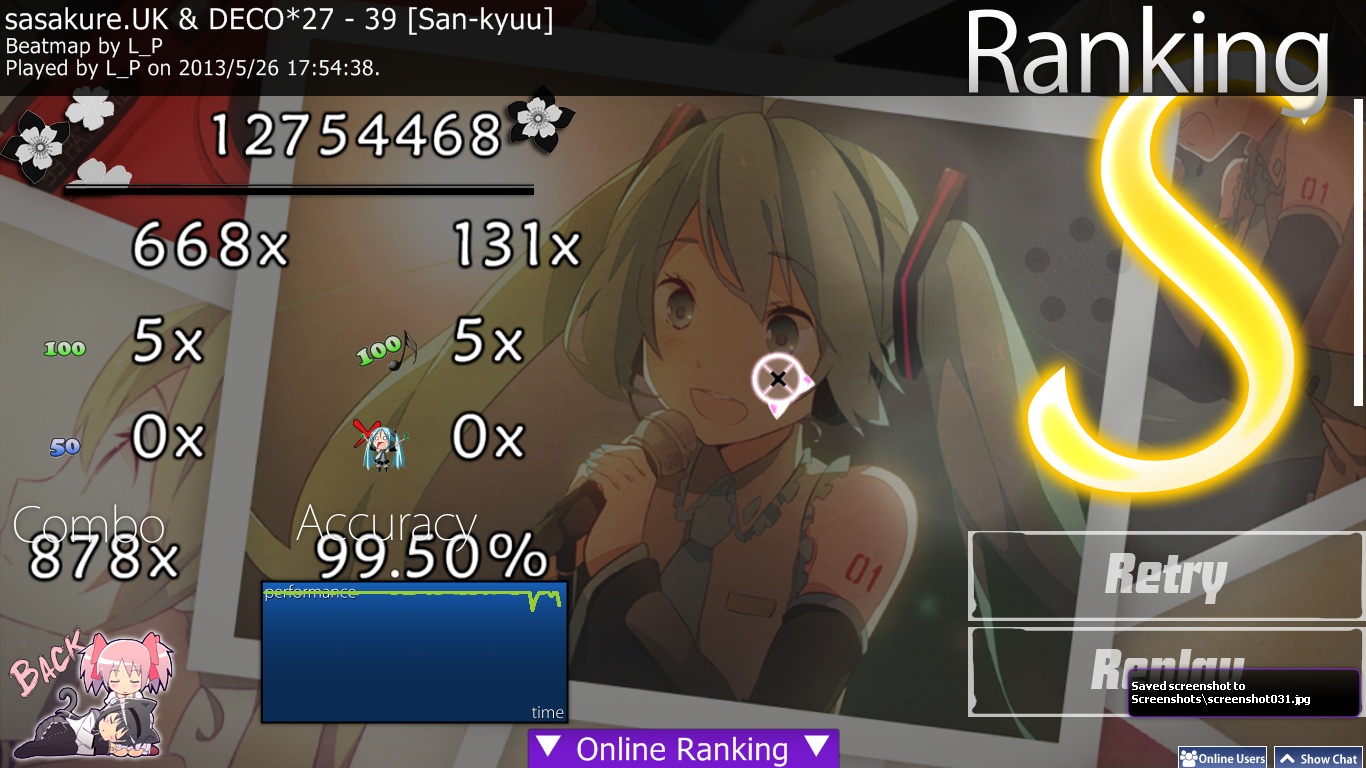
mintong89
rank前留名
Topic Starter
L_P

Zero__wind wrote:

02:57:705 (1) - till end, best part <3 <3
[changelog]
applied most of it, only few hitsounds like finish - whistle etc
Insane's HPdrain kept on 7

THXXXX
Zero__wind
recheck, no kd

your bg became 1024*769 =.= please make it "768" lol
and plz remove the "original" pic from the folder as it's no longer used in the map, you could add it in your creator's words instead


Easy
the AR accidently became 1, plz set it to 3 properly

Hard
00:45:878 (3) - still got no finish sound, it's ok if you don't want to have that but as I saw you did it in Insane and Normal, so I'm mentioning again
02:23:419 (5) - still prefer to see a NC here as the music is like going into a new phrase
02:25:305 (3) - it didn't have a normal sample like the Insane diff, only whistle seems too soft

Insane
02:14:933 (3) - still unsnappedddddddddddddd
Topic Starter
L_P

Zero__wind wrote:

recheck, no kd

your bg became 1024*769 =.= please make it "768" lol
and plz remove the "original" pic from the folder as it's no longer used in the map, you could add it in your creator's words instead
orz

Easy
the AR accidently became 1, plz set it to 3 properly fixed

Hard
00:45:878 (3) - still got no finish sound, it's ok if you don't want to have that but as I saw you did it in Insane and Normal, so I'm mentioning again
02:23:419 (5) - still prefer to see a NC here as the music is like going into a new phrase
02:25:305 (3) - it didn't have a normal sample like the Insane diff, only whistle seems too soft

Insane
02:14:933 (3) - still unsnappedddddddddddddd haha 我一直以为是slider尾巴 原来是头..
ww
Zero__wind
Bubbled.
Zero__wind
mapper self-popped to fix some hitsounds
rechecked and it's good now
bubble repaired
sorry for the inconvenience
Skystar
39
TheNekoNextDoor
Wow, I love this song! Anyway, down to the feedback.
I tested this using Catch the Beat mode.

> Insane is really, really hard (and that's a good thing - Insane is meant to be hard XD)
> Each difficulty is as it should be. (Easy, Medium, Hard or Insane)
> No spinners? :(
> Good image choice, but try to get it into a full-screen resolution.

Overall, great job. Just a few improvements, but I can see how much effort you've put into this. ;)
Topic Starter
L_P
thx for the feedback :D
ill keep the jpg as i cant really find another suitable bg for this map
and 1024*768 is okay for almost all player i think
SapphireGhost
Might be able to mod this tomorrow since sasakure.UK, also maybe not. So we'll see.
Topic Starter
L_P
\o/
SapphireGhost
Let's do it. I just have some small stuff to point out.

Insane
- Use OD8 here to vary the scoreboards and make it more interesting to play for accuracy, especially with 0 spinners.
02:37:647 (4,5,6,7,8) - This wasn't intuitive for me on the first playthrough, try lowering the spacing some.

Easy
- It felt very strange to start this at a different time than the other difficulties. I would definitely map the beginning of this.

And that's all.
Garven
I think my version is a little out-dated.

Topic Starter
L_P

SapphireGhost wrote:

Let's do it. I just have some small stuff to point out.

Insane
- Use OD8 here to vary the scoreboards and make it more interesting to play for accuracy, especially with 0 spinners. fixed
02:37:647 (4,5,6,7,8) - This wasn't intuitive for me on the first playthrough, try lowering the spacing some. fixed

Easy
- It felt very strange to start this at a different time than the other difficulties. I would definitely map the beginning of this. lol mapped(ive no idea why i started on that point)

And that's all.

Garven wrote:

I think my version is a little out-dated.

yea...due to the changes i cant name it "sankyuu" anymore QAQ
show more
Please sign in to reply.

New reply