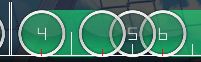
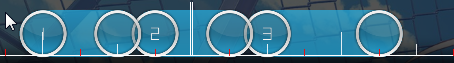
00:06:559 (1,2,3,4) - There's nothing wrong with this pattern, but you could vary this a bit more based on the concepts of your previous pattern. Here's my idea:
https://halfslashed.s-ul.eu/odjFvjcY00:08:277 (4,6) - Overlaps are fine, just try to stick to the same overlap you established earlier like at 00:07:809 (1,3).
00:08:902 (8,1) - You're missing an audible note on 00:08:980.
00:09:840 (6) - This could use more emphasis. It's a pretty powerful note and it kinda makes the transition to 00:10:152 (1) weak. Not to mention that flow isn't the greatest from the previous note. If you stacked this on 00:10:152 (1), you can give proper emphasis to both of these notes.
00:10:621 (3,5) - A blanket would be nice here.
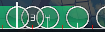
00:10:934 (4,6) - My previous comments about overlaps apply. using an equal hit circle overlap and sticking to it consistently would help this pattern out greatly. Judging from some notes farther up, it seems you wanted to apply this concept to the slider end, so here's what I came up with:
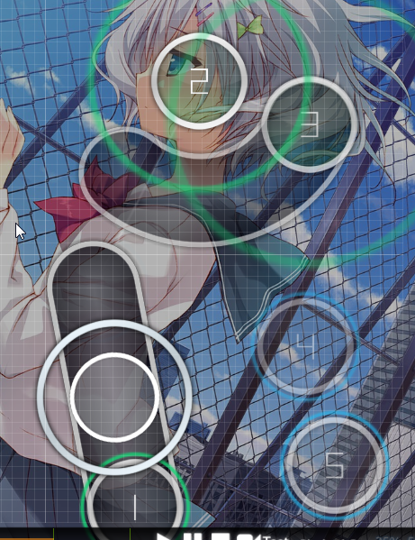
https://halfslashed.s-ul.eu/BiWP7Wo900:12:496 (6,1,2) - It looks like you're trying to emphasize the guitar here, but this flow isn't a good way to do it. You want to position 2 in a way that the player would follow the full length of the slider. This is what the flow looks like right now:
https://halfslashed.s-ul.eu/g3D2HF7I00:17:652 (1,2) - A similar concept applies here.
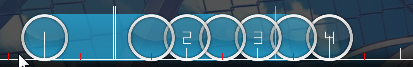
00:19:684 (1,2,3,4,1,2,3,4,1) - Two things: The stream is a bit messy, and I would prefer a sharper angle between the two streams. Also I don't think 00:19:684 (1) - should be NC'd.
00:21:871 (3,6,7,8) - Either use your overlap concept here, or stack these properly.
00:24:059 (1,2,3) - You emphasized the guitar at 00:23:434 (4) - with that 1/1 slider, why not do the same here?
00:24:684 (1,2,3,4,1,2,3,4,1) - If you're going to use a sharp turn in a stream earlier on, you should do so again. Also the entry angle to the next slider should be the same.
00:27:184 (5,6,7,8) - I wish you'd introduce these angles earlier, but there's nothing wrong with them. The bigger concern is how this looks. It'd be better if you had a nicer diamond shape here, one that forms a triangle at 00:26:715 (2,3,6) and has the same symmetry with 00:26:559 (1,4,8), and of course the same with the parallel edges.
00:27:809 (1,2) - Flipping the slider vertically and repositioning this note would work better, since right now the angle between 1 and 2 is kind of awkward visually, and prior you had been emphasizing stronger sounds with anti-flow slider entries.
00:27:809 (1,2,3,4) - Another note, what are you following here, vocals or drums? Drums are prominent on the white ticks, but the vocals are on 00:28:590 and both ends of 00:28:746 (4), yet only one of these is clickable. If you're following drums, why isn't 00:28:121 clickable?
00:29:059 (1,2,3) - This doesn't make too much sense either. Pick drums or vocals, and switch appropriately. The vocals start again on 3, both ends of the first slider should be clickable if you're following drums.
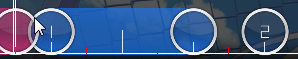
00:37:496 (5,6,7,8) - I think this level of spacing increase is pretty jarring, despite intensity picking up quite a bit. Intensity isn't the same as the first 30 seconds, and you even indicate that by starting with a stack instead of higher spacing. I think your spacing at 00:19:684 (1,2,3,4) works better here.
00:39:684 (3,5) - Why not use your equal overlaps here?
00:44:527 (3,4) - This type of emphasis works better at 00:45:152 (6,1) - since you've been using this more consistently for stronger notes.
00:45:309 (1,2,3,4) - Okay. You should really be using consistent aesthetics here. Pick either of 00:45:309 (1,3) and make 00:45:621 (2,4) the same shape.
00:47:418 - There's a note here.
00:47:730 - And another one here. Both of these are drums.
00:47:809 (1) - I get that you're following guitar here, but since you're skipping a prominent vocal, this doesn't work as well, even if you're not explicitly following it. Try a 1/2 slider and a circle instead.
00:52:496 (5,1) - Emphasis would work much better here with your equal overlap. Not necessarily a stack though.
00:52:809 (1,2,3) - I love these kinds of angles, but you cannot just throw them in or they play pretty badly for most people. You need to introduce these earlier and more often if you want to use them in less intense sections here, else they only really make sense in the kiai.
00:56:559 (1,5) - I would again recommend and equal overlap here.
01:04:996 (6,7,8,9,1) - Spacing is overkill here and the lead-in angle isn't pleasant. Try lower spacing or even a stack.
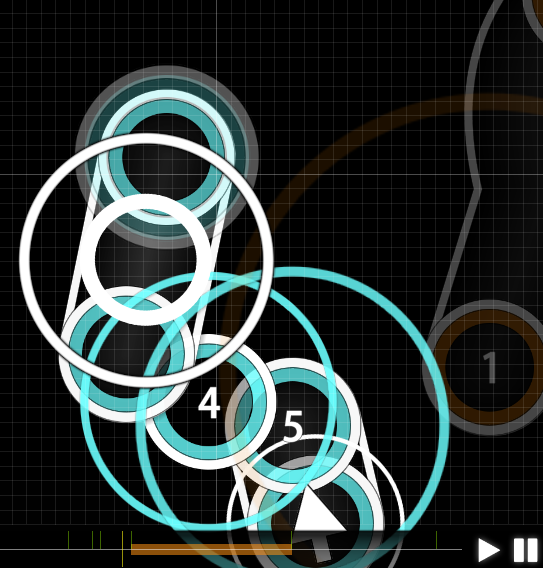
01:03:434 (3,3) - Fix stack?
01:05:309 (1,2,3) - This is going to require some pattern manipulation to fix, but the exit angle from 1 to 2 is unpleasant and doesn't really serve and emphasis purpose. Try ctrl+g on 2 and 3 and orient your star pattern around that for some better flow.
01:12:652 (1) - Introducing this shape earlier in the kiai or just earlier in the map would make it look like it fits better than it currently does.
01:15:152 (1) - I question the rankability of this due to the heavily overlapping slider tracks towards the end, though it's readable...
01:15:777 (3,1,2,3,4,5) - Stack fix.
01:17:340 (9,1) - Overlap the slider tail?
01:19:527 (4,1) - Not a perpendicular intersection.
01:20:934 (4,1) - It's a new overlap type. Way too late in the map, IMO. Either stick to the overlaps you've already introduced or introduce them earlier.
01:25:152 (1,2,3,4,5) - What are you even jumping to here. I can't tell what you're trying to emphasize since the spacing here is basically all the same. The strong drum hits are on 1,3,4 by the way.
01:29:996 (2,3,4,5,1) - Spacing needs to be buffed here. It's way too small compared to your less intense sections, and even your intro has non-overlapping spaced streams: 00:19:996 (1,2,3,4,1).
01:41:715 (2,3,4) - This is the last pattern you want to introduce this late in the map. On top of that, it doesn't provide proper emphasis because the player will stop on 3, which takes emphasis away from that as they have to start up again to jump to 4. Again, I like this pattern, but you need to introduce this earlier.
01:42:184 (5,6,7,8,9,10,11,1) - 01:42:418 - There's a beat here. Why not use a similar pattern to 00:19:684 (1,2,3,4,1,2,3,4,1) ?
01:42:809 - 01:47:809 - I'm not going to be too specific from here on out since it's an issue with most of this section, but what happened to using sliders for guitar notes? This section has pretty much completely strayed from emphasizing particular notes due to spacing between all notes being much higher and everything being clickable. The only advice I can give here really is do something similar to what you were doing earlier on.
The main takeaway from this is that you need to make it more clear what rhythms you're following in the less intense sections, stick to one visual concept (one-two types of overlaps), introduce obscure patterns earlier on, and use different placements to emphasize held notes. I liked the fact that you were introducing interesting angles (I pointed some out) so please do try to make them fit into your map better. Also, I didn't point every instance of every error out, so try your best.


