What I really like about current one is a friendly contrast. The new forums have too much contrast for my taste, it's much heavier for my eyes.
forum
What is your opinion on the new forum design?
posted
Total Posts
171
Have you checked today? There have been some changes to contrast levels.
Actually, I did not. I just checked it, nice. 
BTW, will there be mobile support for it?
BTW, will there be mobile support for it?
Since there's a thread. One thing that's been kinda bothering me both on the old forums and the new ones, is that you don't really scale it with the browser window:
Is there any particular reason you don't prefer more automatic scaling? It looks kinda silly to me with that long pink bar at the top, but then only half the space is actually being used.
Also, I'm also one of those people that prefer to have pagination. Having autoscrolling is fine, but I'd like there to be both tbh, since there are cases where one or the other is more intuitive or preferable.
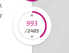
I thought the circle/wheel was something you could click on to scroll through posts quickly, but instead clicking on the upper or lower half of it (probably the arrows) just takes me to the top or bottom, which I didn't find that intuitive. And what's the purpose of clicking on the page number? For now it seems like it just goes down a few posts or something, but I think clicking into a textfield where you can put in a page number would be more intuitive than having the page jump thing inside the search button.
And the quote thing is nice, but I think you need a dismiss/discard button, and make it a bit clearer that the button is for quoting.
Well, you're probably aware of some of this already, so eh.
Is there any particular reason you don't prefer more automatic scaling? It looks kinda silly to me with that long pink bar at the top, but then only half the space is actually being used.
Also, I'm also one of those people that prefer to have pagination. Having autoscrolling is fine, but I'd like there to be both tbh, since there are cases where one or the other is more intuitive or preferable.
I thought the circle/wheel was something you could click on to scroll through posts quickly, but instead clicking on the upper or lower half of it (probably the arrows) just takes me to the top or bottom, which I didn't find that intuitive. And what's the purpose of clicking on the page number? For now it seems like it just goes down a few posts or something, but I think clicking into a textfield where you can put in a page number would be more intuitive than having the page jump thing inside the search button.
And the quote thing is nice, but I think you need a dismiss/discard button, and make it a bit clearer that the button is for quoting.
Well, you're probably aware of some of this already, so eh.

I'm mostly fine with it. I tend to like dim websites so I'm too big a fan of the super flashy white theme overall, several websites have an alternative design with dimmer colors (Tomorrow on that one imageboard for instance) would be neat to have something akin to that.
I'm one of the few people I've seen who appreciates the infinite scrolling, as well as the absence of pages.
What I don't like as much is I feel that the old designed was very compact yet clean; I work on small monitors and that's great for that, since I don't need to scroll everywhere since everything is utilizing minimal space. Here I feel like there's huge gaps that could be filled, for instance the horizontal width of threads (which I noticed has been increased but the font size as well as larger margins give the opposite impression), as well as the overall font size. I also feel like the top bar that shows when you scroll down a thread takes up too much room. I get the overall feeling that new design has trouble making good use of space and it ends up being a bit of a pain to navigate through compared to the old one.
Now, in terms of aesthetics themselves -- this is fucking pretty. Lots of details, nice color schemes, I particularly love the loading animation on clicks, the font choice, and the overall theme. It's all very, very neat and pretty to look at, and I have to commend the work that's been done here.
And that's basically it. Margins and paddings take too much space for my taste and navigating everything is a bit more annoying than with the old design, but it is much more appealing to the eye.
It looks awesome, that's for sure. Animations and everything
There are atleast 2 things bothering me though:
1. The operational zone is way too narrow. Maybe it's because the font is bigger? Maybe make post width wider instead (not smaller like now)?
2. The image on the top takes 1/3 of the screen --- I'd prefer to see more actual forum stuff, instead of an image (even a cute one)
I actually agree with this too. Sadly, lately the only place I can actually browse the forums is from my workplace, and I am doing it on a small resolution on a 19" screen, and that thing takes way too much space and is not really neutral enough for that particular environment.Kert wrote:
2. The image on the top takes 1/3 of the screen --- I'd prefer to see more actual forum stuff, instead of an image (even a cute one)
I personally don't really care about what kind of an image it is, but someone else might. (at least it's easy to just scroll down, but still)
P.S.
I would like to see more colors for the thread icons. While the icons are different, the background color of the circle isn't, and when you aren't focusing on it, it's difficult to differentiate them.
feels weird, doesnt feel like that everything in the old forum is visible in the new one
but idk, time will tell
but idk, time will tell
Clicking a thread from the main forum page goes to unread, but in a subforum, clicking either the speech bubble icon or the thread name seems to bring to the first post? As far as I can see, the only button to get to last unread is the small arrow on the right. The rest of the entire bar, including clicking on "latest reply", brings you to first post on Chrome.
Contrast with the current setup where the thread icon brought you to last unread. Admittedly this is a "used-to-it" thing but it's a lot more intuitive since the different buttons are in close proximity to each other.
The circular post counter on the bottom right of a thread... Well, personally I think the jump to first and jump to last are great but could be larger and more obvious.
However, clicking on the post number to load (keyword being load, the entire page shows the loading animation instead of just shifting the page down) the next post is pointless as fuck considering I can see the next post 90% of the time unless it's a wall of text. (e.g. counter says post 4, but I can see post 5 and half of post 6 already).
Why not give a button to jump up/down by 20 posts instead? Yes, it's semi-pagination but helpful when you want to go to a certain post but you don't remember its post number and only remember what the content of the surrounding posts were. <- might also be why some people prefer to have pagination. I don't really know how to explain it, but instead of thinking to the scale of 150 (posts), I only have to think of 10 (pages) which would allow me to pinpoint where a post was more easily imo.
EDIT: Changed 10 posts to 20 posts, which is the same as how many posts are loaded in when you scroll and hit the top or bottom. Basically, a way to skip scrolling though to get to posts above or below. Easier than typing (current post no. +/- 20) into the search imo
I also thought that the wheel thing was so that you could quickly scroll through the thread. Hell, maybe even enter the post number as a jump-to type of function. Having to scroll through large threads is really time consuming, especially if you know that post x is on page 133 at the very top, while youre being thrown onto post y at page 245.
I'd really just like to see some sort of paging or easier in-thread control/movement.
I'd really just like to see some sort of paging or easier in-thread control/movement.
this one exists, it's the big magnifying glass button above the wheelYauxo wrote:
Hell, maybe even enter the post number as a jump-to type of function
waitwaitwait
since when has that been there
since when has that been there
It bugs out when trying to post to the Video Games forum.
I do prefer the current forum over this new design, HOWEVER, I must say that the new userpages look really really nice. Really liking the userpage design over there
I like it, however some things seem they need some adjustements or fixing to me. For example:
- I don't mind the lack of paging and continous scrolling, however I don't like the top header of the page (you know, the links of community, store, account controls) not being fixed like the navigation controls. If I wanted to access them in a very long thread, I would have to scroll the page to the very top. It's not pleasant.
- I find the forum body too narrow. Yeah, the old one was narrow too, but in my screen, it only takes half of it.
- Not a big issue, but I liked to see the post count of each user in the posts, you know, where the user name, avatar and country flag are.
Nevertheless, I think the new design is quite beautiful and rich. I have yet to try it on my tablet, though.
Cheers!
PS: Why is it called jizz? That's slang for, you know.
Design wise its pretty but i have my gripes with it.
First and foremost, it looks like its made for smartphones. Things are oversimplified and for the most part not inutive.
As example is this navigation bubble which doesnt actually let you navigate anything, the header that looks like it would have dropdowns for more options but doesnt. Spoilers that dont highlight nor animate on hover to signify that they're clickable.
The color sheme is fancy but unfriendly to the eyes, particulary the white background of the posts area stands out there and hurts in the eyes, please use a less bright and intense color, a light grayish blue like on the current forum is much easier on the eyes.
On the profile pages where the about me begins, the dark gray background does magnify the effect of the white background in the main area. I get what you were going for design wise, but perhaps it would be better to gradually darken the outer background as you scroll down and instead keep the dark gray bar at the width of the active area. Also, fade the bar out when the user scrolls down and only fade it in when the user hovers near the top of the page - or make it less thick.
Moving on to the index page and more to the functionality side of things, i get the feel that the space is badly and inefficently used, it does look good and all, but userexperience should go before design. As suggestion, decrease the border between the invidual boards - currently you could fit two if not three lines of text there, too much. Again, a designed for mobile feel comes up - things are bigger than they should be.
Likewise on list of threads - decrease the distance between them. This continues further in the threads themselfes, 2 posts with oneliners fit just barely on my screen, altough here its mostly due the increased font size - decreasing the font size by one would help with the longer posts but one liners and short posts, especially those from users without signature have the issue of empty space.

Whats with these 2 cm of nothing? cut that off.
Similary with posts such as this:

The supporter heart should be next to the flag and the signature under the text, next to the avatar border thingy. Dont leave it sticking out like a sore thumb unless the text pushes it out.

More empty, unused, wasted space i have to scroll past, this should be almost half as thick. Same applies to the Pippi header on the index (but its far less worse here, it just needs to be a bit thinner, nothing as severe as half as thick) - from a users side its space you have to scroll past before you can do whatever you wanted to do. A nuisance in the long run.
Then of lastly and finally, theres features outright missing i understand its WIP but... Where are the maps on the profile? changing avatar? PMs? Where do i access the user control panel for changing settings? Where do i click to see the oldest unread post in a thread? Subscribing to threads? I could go on for ages - not even half the functionality is here.
...Pages? Even semi paigation where you just jump 20 posts or so would be A START.
Have a simple ticker under/above the navigation bubble that scrolls right by one page for every 20 post count. Replace the jump to first/last post of the bubble with jump 20 posts forward/backwards and let the ticker take care of the jump to first/last post. Make the post count pop up the jump to post, rather than linking the current post (its just more inutive), add post numbers to the posts themselfes to take care of the direct linking instead. Possibly fade the ticker, the current jump-to-bubble (yes keep it, accessibly is good) and any other bubbles you want to add out unless the user hovers on the bubble. Long story short: Make the navigation bubble actually let you navigate the thread rather than being a needlessy fancy post counter. Hell, i might just swish something together on photoshop to illustrate what im talking about here.
Make infinite scrolling preload 5 or so posts into either direction (even if they're not being displayed) to smooth the infinite scrolling, rather than having the user bump to the end of either side to load more (but keep that as fallback should the user scroll too fast). Give users the option to opt out of infinite scrolling to save bandwidth (they gotta use the bubbles pseudo pages then). Remove the OP post being displayed unless the user is on the first "page", with infinite scrolling theres no feasible way to view the OP to begin with (aside from being at the beginning of the thread.
Get the functionality down first THEN polish the thing. As is, its way too early to promote it on all pages of the old design. This id call an alpha relase at best. Definitively not useable for the broad userbase right now.
On the bright side, the loading image is nice. Yes, i dont like the new design.
First and foremost, it looks like its made for smartphones. Things are oversimplified and for the most part not inutive.
As example is this navigation bubble which doesnt actually let you navigate anything, the header that looks like it would have dropdowns for more options but doesnt. Spoilers that dont highlight nor animate on hover to signify that they're clickable.
The color sheme is fancy but unfriendly to the eyes, particulary the white background of the posts area stands out there and hurts in the eyes, please use a less bright and intense color, a light grayish blue like on the current forum is much easier on the eyes.
On the profile pages where the about me begins, the dark gray background does magnify the effect of the white background in the main area. I get what you were going for design wise, but perhaps it would be better to gradually darken the outer background as you scroll down and instead keep the dark gray bar at the width of the active area. Also, fade the bar out when the user scrolls down and only fade it in when the user hovers near the top of the page - or make it less thick.
Moving on to the index page and more to the functionality side of things, i get the feel that the space is badly and inefficently used, it does look good and all, but userexperience should go before design. As suggestion, decrease the border between the invidual boards - currently you could fit two if not three lines of text there, too much. Again, a designed for mobile feel comes up - things are bigger than they should be.
Likewise on list of threads - decrease the distance between them. This continues further in the threads themselfes, 2 posts with oneliners fit just barely on my screen, altough here its mostly due the increased font size - decreasing the font size by one would help with the longer posts but one liners and short posts, especially those from users without signature have the issue of empty space.
Whats with these 2 cm of nothing? cut that off.
Similary with posts such as this:
The supporter heart should be next to the flag and the signature under the text, next to the avatar border thingy. Dont leave it sticking out like a sore thumb unless the text pushes it out.
More empty, unused, wasted space i have to scroll past, this should be almost half as thick. Same applies to the Pippi header on the index (but its far less worse here, it just needs to be a bit thinner, nothing as severe as half as thick) - from a users side its space you have to scroll past before you can do whatever you wanted to do. A nuisance in the long run.
Then of lastly and finally, theres features outright missing i understand its WIP but... Where are the maps on the profile? changing avatar? PMs? Where do i access the user control panel for changing settings? Where do i click to see the oldest unread post in a thread? Subscribing to threads? I could go on for ages - not even half the functionality is here.
...Pages? Even semi paigation where you just jump 20 posts or so would be A START.
Have a simple ticker under/above the navigation bubble that scrolls right by one page for every 20 post count. Replace the jump to first/last post of the bubble with jump 20 posts forward/backwards and let the ticker take care of the jump to first/last post. Make the post count pop up the jump to post, rather than linking the current post (its just more inutive), add post numbers to the posts themselfes to take care of the direct linking instead. Possibly fade the ticker, the current jump-to-bubble (yes keep it, accessibly is good) and any other bubbles you want to add out unless the user hovers on the bubble. Long story short: Make the navigation bubble actually let you navigate the thread rather than being a needlessy fancy post counter. Hell, i might just swish something together on photoshop to illustrate what im talking about here.
Make infinite scrolling preload 5 or so posts into either direction (even if they're not being displayed) to smooth the infinite scrolling, rather than having the user bump to the end of either side to load more (but keep that as fallback should the user scroll too fast). Give users the option to opt out of infinite scrolling to save bandwidth (they gotta use the bubbles pseudo pages then). Remove the OP post being displayed unless the user is on the first "page", with infinite scrolling theres no feasible way to view the OP to begin with (aside from being at the beginning of the thread.
Get the functionality down first THEN polish the thing. As is, its way too early to promote it on all pages of the old design. This id call an alpha relase at best. Definitively not useable for the broad userbase right now.
On the bright side, the loading image is nice. Yes, i dont like the new design.
If white hurts your eyes, you need to TURN DOWN YOUR MONITOR BRIGHTNESS.
The "simplicity" is not because it was made for phones. It's to make it simple.
Missing features are because it's a WIP. Are you retarded? Stop posting in a feedback thread without understanding what you are looking at first, please.
It's called jizz because I chose that for the testing subdomain. It's a WIP and will eventually replace the original site (and no longer be fjizz?).
Infinite scrolling is not going anywhere, but the navigation control (bottom right) is not final.
In terms of looks, its pretty nice in my opinion, but it still needs some work so its more user friendly. More customization features such as an option to change the colour for background might be pretty neat to have as well.
So far it's quite nice on the eyes. The pagination works smoothly on browser and phone, and the color scheme makes each post pop out quite well. Too bad the content of said posts can be hit or miss, haha.
I am curious to see how you handle the menu items and the user/beatmap searches with this design as I found that I was missing those fairly quick into testing.
I am curious to see how you handle the menu items and the user/beatmap searches with this design as I found that I was missing those fairly quick into testing.
I wonder how it handles embedded spoiler boxes
Text before new box
SPOILER
Text inside new box

I assure you i know what im looking at here, i even said i know its WIP; i've mentioned the missing features as it ties into how the new design is not fit for mass testing yet, at least in my oponion.peppy wrote:
If white hurts your eyes, you need to TURN DOWN YOUR MONITOR BRIGHTNESS.
The "simplicity" is not because it was made for phones. It's to make it simple.
Missing features are because it's a WIP. Are you retarded? Stop posting in a feedback thread without understanding what you are looking at first, please.
It's called jizz because I chose that for the testing subdomain. It's a WIP and will eventually replace the original site (and no longer be fjizz?).
Infinite scrolling is not going anywhere, but the navigation control (bottom right) is not final.
Simplicity is good, but it just feels too simple, too spacious just as if it would be for smart phones where massive and extremely simple interfaces are a neccesity due the small screens. Its something worthy of improving as such would largely be uneccesary for desktop systems - you can easily fit more information and more advanced functions on the screen here without running into issues regarding useability.
Im looking forward to the updated navigation bubble! Just to clear eventual misunderstandings, im not suggesting to remove infinite scrolling, but to support it with pseudo pages for more efficent navigation. Infinite scrolling is neat.
And regarding the brightness... sure, i could do that but then again, having the users bend to and change their brightness up and down as they visit various websites is not exactly userfriendly. 100% pure and shining white is just a harsh color for large areas, like, say neon pink, so im suggesting you to use something less harsh, giving the white a tint of blue or some other color might just work.
I like the new forum design. And it's WIP too. Looking forward to the end result.
I have to agree though, using jizz is really unprofessional and I really hope it will be changed when officially released. Otherwise i'd really have trouble introducing friends to the site and I'm sure others would too .
.
I have to agree though, using jizz is really unprofessional and I really hope it will be changed when officially released. Otherwise i'd really have trouble introducing friends to the site and I'm sure others would too
.I really like it but well...
1. What are these moving triangles at the top doing? They look, in my opinion, a bit ugly and irritating.
2. I just dislike the color pink.
Other than that It is extremely AWESOME! especially because it's so minimal.
#EDIT:
I don't have to care about what I dislike about the design anymore. Started skinning it right now.
The current forum doesn't look that bad. what I think it happens we're used to this forums template so it can come weird to us. Remeber best things take their own time.
looks a lot more eye-catchy and looks more modern.. i really like the profile page tho.. <3
can't wait until the new-fully-working forum released, and can't wait to see the big change of the homepage too!
can't wait until the new-fully-working forum released, and can't wait to see the big change of the homepage too!
rip anyoner who uses firefox and/or has an old CPU, infinite scrolling is absolute hell, the farther you go the worse you lag. At least it's been that way on every other website ive ever used that had it. Maybe the overly simple design was an attempt at optimization, but i believe we've lost more than we've gained from it.
Although im sure it's better for people who are on their iphones at work and want to just swipe down over and over while they loudly chew their bubblegum, I can't see how anyone sitting in front of a computer using anything but the screen for input can find this better. Navigating is a lot harder overall, at least for someone like me who uses a PC with a mouse+kb.
I can appreciate that you put a lot of hard work into this peppy, you really do put in the time for us, but it's not about just pushing content out it's about making sure it's wanted in the first place as well.
I love you, Peppy.
I like having pages. It makes things easier for me to parse, especially for long threads. But I'm not a dev, and I don't use the forum all that much, so I can accept the new layout as inevitable.
But still, we have to agree, there is one objectively superior layout for every given forum. In this case, it would be the one Peppy chooses, since he's the leader. If he wanted someone's opinions, he would personally contact them. Disagreement over things that aren't going to change divides the community, and distracts from topics that will have an effect.
It would be nice if Peppy could make a list of things he knows to be factual, then the mods could ban people when they say something wrong instead of letting their idiocy rot the board. But I'm not a mod, so I have to assume things are better this way. Thinking anything current might be bad is only an admission of ignorance.
Overall I think there are too many wasted space.
I agree with everyone who thinks posts are too narrow. White space on the right side of each post needs to be trimmed off a bit.
A separation between the avatar area and post area would be nice. Right now everything is on a white background and it feels like they're just thrown there creating a mess. Something along the line of the current forums with different background colors would be nice.
I personally dislike the avatar box thing. The contrast with the background is way too high and it looks bulky. I suggest removing it entirely. With that box away there are more space for longer usernames and larger display space for avatars. Seriously though, why the smaller avatars?
My only complain about the profile page is how the profile details are displayed. Does everything really need to be represented as characters? I think the current design with images and tooltips are a lot better and faster to read.
Another thing, something should be done to the username on top right of the page tomake it look more important because I like feeling important get user attention. Right now it feels like it's just a bunch of characters thrown randomly and it doesn't feel much different than being a guest. I think making it bold like on the current design would work just fine.
Kudos for the new editor at the bottom of the page, I really like it.
Edit: ctrl + enter still works
I agree with everyone who thinks posts are too narrow. White space on the right side of each post needs to be trimmed off a bit.
A separation between the avatar area and post area would be nice. Right now everything is on a white background and it feels like they're just thrown there creating a mess. Something along the line of the current forums with different background colors would be nice.
I personally dislike the avatar box thing. The contrast with the background is way too high and it looks bulky. I suggest removing it entirely. With that box away there are more space for longer usernames and larger display space for avatars. Seriously though, why the smaller avatars?
My only complain about the profile page is how the profile details are displayed. Does everything really need to be represented as characters? I think the current design with images and tooltips are a lot better and faster to read.
Another thing, something should be done to the username on top right of the page to
Kudos for the new editor at the bottom of the page, I really like it.
Edit: ctrl + enter still works
Why does everything have to be so big?

what is that aberration masquerading as the american flag?piruchan wrote:
Overall I think there are too many wasted space.
I agree with everyone who thinks posts are too narrow. White space on the right side of each post needs to be trimmed off a bit.
A separation between the avatar area and post area would be nice. Right now everything is on a white background and it feels like they're just thrown there creating a mess. Something along the line of the current forums with different background colors would be nice.
I personally dislike the avatar box thing. The contrast with the background is way too high and it looks bulky. I suggest removing it entirely. With that box away there are more space for longer usernames and larger display space for avatars. Seriously though, why the smaller avatars?
My only complain about the profile page is how the profile details are displayed. Does everything really need to be represented as characters? I think the current design with images and tooltips are a lot better and faster to read.
Another thing, something should be done to the username on top right of the page tomake it look more important because I like feeling importantget user attention. Right now it feels like it's just a bunch of characters thrown randomly and it doesn't feel much different than being a guest. I think making it bold like on the current design would work just fine.
Kudos for the new editor at the bottom of the page, I really like it.
Edit: ctrl + enter still works
White stings my eyes a lot less nowpeppy wrote:
Have you checked today? There have been some changes to contrast levels.
Another thing I noticed:
It looks a bit weird how pippi's sleeve laps out of the heading-box on the right but her hairs don't. Nonsensical 3d if you ask me

- it uses up too much space. Instead of "simple and modern", it just looks bulky to me. (look at Gumpyyy's picture). This is the only real complaint I have, actually. Next one is minor.
- Using different colors for different sections in the index makes things more confusing instead of being a step towards simplicity and user-friendliness. Unity is an important factor concerning that, and this includes the color scheme. (very minor)
- I'm not a fan of infinite scrolling, but as opposed to the other points I brought up, this might just be because I'm not used to it yet. We are creatures of habit after all, and it's easy for us to blindly oppose new things for the sake of maintaining the status quo. I think in terms of practicability, infinite scrolling might even outperform the current system with pages, so I am open for change in this area (even though I don't like it as of yet).
Gumpyyy wrote:
Why does everything have to be so big?
Simplicity i guess
Personally, I like the clean look
having that big achieves nothing besides making it more clunky.erikG wrote:
Simplicity i guess
Personally, I like the clean look
It's alright but, imo I am actually a fan of the old form design.
It's simple and easy to look at.
It's simple and easy to look at.
[deleted]
I miss spoilers 
Endaris wrote:
[spoiler]I miss spoilers
Spoilers? As in the boxes you can expand? Or spoiling someone about something?
personally, I am not satisfied by the look of the new website, at least yet. the only thing I really liked is the achievement % :\
Concerning the missing features, it's not done, they just give the players the possibility to take a look at their work before it's done.
For the word "Jizz" in the address (Dudes, when I type it in google, the first link is a p**n website -_-), they're not giving an example of maturity...
Oh, and I think they shouldn't have removed this
This exact box you can't see and that doesn't get converted in the new forum.H3X0RZ wrote:
Spoilers? As in the boxes you can expand? Or spoiling someone about something?Endaris wrote:
I miss spoilers
peppy wrote:
Pagination as you know it is gone forever. It makes no sense.
Tell that to a person looking for specific information/a particular post in a massive thread that just so happens to be directly in the center of the thread. With someone who has tens of thousands of forum posts, I find it hard to believe you've never appreciated the concept of going back in chunks rather than having to load everything irrelevant in between.
But... whatever. It is your design and you can do with it what you choose. I very highly doubt that I am alone, in any case.
EDIT: and if you're very deliberately ignoring corner-cases in your development, that's hardly a good precedent.
I tend to focus more on text. A design that can handle large blocks of text and would not have its designs distract me while I read them would be appreciated. The designs look cool and very !next, but the devs might consider giving an option to make things more compact?
The following comparison is not made against the old forum.
Pro:
+ design style
+ design style
+ design style
+ design style
Con:
- pagination (this is a religion)
- width (as other people have pointed out)
- permanent link to each thread (we don't have that right now)
- one-line-per-thread list of each topic (like an abstract in an article, scan tens of posts at a glance)
- option: fixed-width font when editing post (I'm a programmer)
Now, I'm patiently waiting for new functionality to come in.

Hmmm...one thing I noticed is that the new one failed to show the < and > character in the profile page.
Taking about the forum design I guess everything takes time to get used with, but the fonts could be smaller like the old one imo
Taking about the forum design I guess everything takes time to get used with, but the fonts could be smaller like the old one imo
Halogen- wrote:
peppy wrote:
Pagination as you know it is gone forever. It makes no sense.
Tell that to a person looking for specific information/a particular post in a massive thread that just so happens to be directly in the center of the thread.
EDIT: and if you're very deliberately ignoring corner-cases in your development, that's hardly a good precedent.
how is remembering a page number different from remembering a post number? you can already jump to a specific post.
Probably he means jumping to a specific page from herepeppy wrote:
how is remembering a page number different from remembering a post number? you can already jump to a specific post.
I also use this feature often and it's pretty convinient
fewer digits with page numberspeppy wrote:
how is remembering a page number different from remembering a post number?
i like forum
It's okay but I favour the current looks, as they are cleaner and better structured (for now). The design itself is not my preference.
Another thing that I've recently notice is that sometimes it will double post by itself.
It's been happening to me quite a bit this morning.
It's been happening to me quite a bit this morning.
I think we need a small tutorial on how to use the new forum.
Infinite scrolling seems to be an unknown/unintuitive concept for most people. Can't say that I would miss pages that much either though @Halogen and I've spent a big amount of my time online in forums for the past years. I think it works just as well and it doesn't even compare to shittyness of redditstyle they used for the LoL-forums
As for the small arrows on the post number it would probably be the easiest if you removed the one pointing to the threadstart and make the one pointing to the end bigger. No clue how you can make this goodlooking while keeping the circle-shape but for usability this would be very good I think.
As for the top-bar, I think it would be best if it grew larger on hovering over it so you have an easier time clicking on the navigation links.
And smileys seem to be a bit too small/misplaced compared to the text as their lower edge is way below the baseline of text but don't get to the topline of it either.
The design is great but it'd be better if it was scaled to the size of the browser window
I feel like half the people here are only complaining just to complain. There's nothing fundamentally wrong with the design, imo. The only valid issues I've seen so far is with the large amount of white space and how narrow the forums are.
With the former, white space is just plain ugly and that can unanimously be agreed upon. However, proper spacing is still important (which the old design lacks and causes everything to be too bunched up).
With the latter, that's mostly just a matter of opinion. There's nothing wrong with a narrow design in principle, but the thing that bothers me most with it is when posts in a thread get even more narrow after the OP. That doesn't really make much of any sense to me as a design aspect, as there are much better ways of distinguishing an OP.
As far as pagination goes, there's nothing wrong with it. If people know what page to look for, then they should also know the approximate post number to look for. Post # = Page # x Posts-per-Page.
However, I will say that having the current post number be clickable doesn't make much sense. In fact, it might be better to make it so you can use that "current post" number space to type in the number for the search, instead of having to click the search icon to type it in. One less icon to worry about then, and better convenience.
Aside from those things, I find the design itself to be beautiful overall, and I'm sure it will only continue to improve. Functionality will be added later and it's not even worth commenting on yet until it's actually implemented.
And I still don't get why people are complaining over the test domain name. Who even gives a jizz about a temporary name.
You kind of have a problem if you think you need a tutorial though. The design should be as intuitive as possible, meaning anyone should be able to figure it out.Endaris wrote:
I think we need a small tutorial on how to use the new forum.
Infinite scrolling seems to be an unknown/unintuitive concept for most people. Can't say that I would miss pages that much either though @Halogen and I've spent a big amount of my time online in forums for the past years. I think it works just as well and it doesn't even compare to shittyness of redditstyle they used for the LoL-forums
As for the small arrows on the post number it would probably be the easiest if you removed the one pointing to the threadstart and make the one pointing to the end bigger. No clue how you can make this goodlooking while keeping the circle-shape but for usability this would be very good I think.
As for the top-bar, I think it would be best if it grew larger on hovering over it so you have an easier time clicking on the navigation links.
And smileys seem to be a bit too small/misplaced compared to the text as their lower edge is way below the baseline of text but don't get to the topline of it either.
It's not so much that autoscrolling is a foreign concept moreso than it just being something I don't enjoy using all the time. In some cases, I find it useful, while in other cases it's just really annoying to not have pages. Autoscrolling has been around for a while now on the internet, so I'm sure most people that don't like it have had enough time to "get used to it", and still don't enjoy using it.
@Top Bunk: Most people will "complain" or give critisism, since that's what's generally helpful and a reason to post in the first place. Saying "Omg this looks great!!!" doesn't really help getting things better. In general, if people don't mention something, you can assume they thought that was fine, and works well as it is.
Actually I never encountered infinitescrolling on a site I'm actually using before so I'm not used to it and since I consider myself to be an experienced internet user I just assumed that a lot of people would feel the same.
The first time I tried to get out of a long thread I scrolled to the top and tried to be faster in clicking the header than the page would load the next posts I scrolled to so you can see where I am coming from.
It took me 2min to figure everything out so you may or may not say that it is intuitive but the stuff I pointed out certainly hinders intuitive use.
Pages are more intuitive in the way that everyone knows how to read a book and has an immediate guess when being in a thread for the first time and seeing pages. Infinite scrolling isn't a thing you know from RL though, mainly from smartphones(and im not a smartphone user) so it is naturally harder to operate when encountering it for the first time - which is why a tutorial might not be a bad thing.
Once you got it, it is very intuitive as everything makes sense in itself but you will inevitably get undesired results if you try to use it like a conventional forum.
Why is pewdiepie not on jizz?
The problem here is that it's mostly complaining with lack of proper constructive criticism. I'm not saying all the posts are like that, but a majority of them are (even the longer posts which pretend like they go into detail when it's really just pointing more directly at what they're complaining about). At the very least people should say why they dislike something and what can be done to further fix/improve it. Especially considering the new site design will be implemented regardless of the people who dislike it. So instead of those complaining without a basis, they should at least attempt to make reasonable suggestions.CXu wrote:
@Top Bunk: Most people will "complain" or give critisism, since that's what's generally helpful and a reason to post in the first place. Saying "Omg this looks great!!!" doesn't really help getting things better. In general, if people don't mention something, you can assume they thought that was fine, and works well as it is.
Also, let's not forget important things here. 1) Peppy gets the final say in the direction everything goes in. 2) You can't please everybody, so people will be forced to settle on compromises and deal with things they're not satisfied with either way.
The design and layout looks nice but the "Scroll up for the previous 10 posts" thing is just weird and annoying tbh.
Actually we know full well that this thread is a farce that doesn't matter because Peppy will do what he wants to regardless of what anyone and everyone thinks because fuck you that's why.Top Bunk wrote:
The problem here is that it's mostly complaining with lack of proper constructive criticism. I'm not saying all the posts are like that, but a majority of them are (even the longer posts which pretend like they go into detail when it's really just pointing more directly at what they're complaining about). At the very least people should say why they dislike something and what can be done to further fix/improve it. Especially considering the new site design will be implemented regardless of the people who dislike it. So instead of those complaining without a basis, they should at least attempt to make reasonable suggestions.CXu wrote:
@Top Bunk: Most people will "complain" or give critisism, since that's what's generally helpful and a reason to post in the first place. Saying "Omg this looks great!!!" doesn't really help getting things better. In general, if people don't mention something, you can assume they thought that was fine, and works well as it is.
Also, let's not forget important things here. 1) Peppy gets the final say in the direction everything goes in. 2) You can't please everybody, so people will be forced to settle on compromises and deal with things they're not satisfied with either way.
Yeah, pages works way better. Also, where's "View your posts"? :cRaiken- wrote:
The design and layout looks nice but the "Scroll up for the previous 10 posts" thing is just weird and annoying tbh.
Good point :vKhelly wrote:
Actually we know full well that this thread is a farce that doesn't matter because Peppy will do what he wants to regardless of what anyone and everyone thinks because fuck you that's why.
imo the design is beautiful but just need needs more work on the feature
anyway is the forum will be called jizz forever?
anyway is the forum will be called jizz forever?
↓↓↓↓↓↓↓↓↓Jieshengwoo wrote:
imo the design is beautiful but just need needs more work on the feature
anyway is the forum will be called jizz forever?
read previous postpeppy wrote:
It's called jizz because I chose that for the testing subdomain. It's a WIP and will eventually replace the original site (and no longer be fjizz?).
JMC wrote:
Jieshengwoo wrote:
imo the design is beautiful but just need needs more work on the feature
anyway is the forum will be called jizz forever?
↓↓↓↓↓↓↓↓↓peppy wrote:
It's called jizz because I chose that for the testing subdomain. It's a WIP and will eventually replace the original site (and no longer be fjizz?).
read previous post
oops sorry!! my wrong, really sorry o(╥﹏╥)o
It looks pretty nice. I can't exactly put it up for comparison right now (502 MB RAM on a school PC, wha), but whoever did the design has done a great job.
Just as an update, we are now loading image dimensions before images are displayed. This means that scrolling upwards in a thread should feel much more natural, and overall performance should also have improved.
You'll also notice that this means we could remove the "expanding post" logic, improving the experience further.
You'll also notice that this means we could remove the "expanding post" logic, improving the experience further.
Mentioning something I posted in the wrong forum a day ago...
The design is great, plus I love the color scheme of it. (And it being bigger to view ofc, especially on phones)
Only two things I don't really like is the pagination removed and the wasted space, as mentioned by other people.
For beatmappers in particular, clicking to a particular page helps to see mod posts more conveniently imo (also I doubt people can really remember that much post numbers lol... Especially for those who frequent the forum such as the requests section)
Others are really good imo. Dunno if it is feasible, maybe an option could be included in user settings to allow switching between infinite scrolling and pagination.
Just my 2 cents after being a lurker of other forum software, as 90% tend to use pagination anyway
It's way different. In a good way though. I love the design.
It will take some getting used to of course, being so different and all, but other than that I think it's great!
It will take some getting used to of course, being so different and all, but other than that I think it's great!
There is a chance that final version can be good, but now I'm really sad.
Only thing I really want is an option to choose between new/old forum style, since I'm satisfied with old one most of all. This new one is too... modern for me personally. I like old paging and old spoilerboxes way more, because it was easier to press them as a pagewide link/hovering, not like it is now.
Hope for keeping both styles to make everyone happy.
Given how this current design and the new design are using different software (iirc), I highly doubt there will be an option to choose one or the other.Ruineko wrote:
There is a chance that final version can be good, but now I'm really sad.
Only thing I really want is an option to choose between new/old forum style, since I'm satisfied with old one most of all. This new one is too... modern for me personally. I like old paging and old spoilerboxes way more, because it was easier to press them as a pagewide link/hovering, not like it is now.
Hope for keeping both styles to make everyone happy.
Change is often a necessity, so for those that can't adjust to it, then oh well. Deal with it.
efdu_DELETED
En nordmannCXu wrote:
Since there's a thread. One thing that's been kinda bothering me both on the old forums and the new ones, is that you don't really scale it with the browser window:
Is there any particular reason you don't prefer more automatic scaling? It looks kinda silly to me with that long pink bar at the top, but then only half the space is actually being used.
Also, I'm also one of those people that prefer to have pagination. Having autoscrolling is fine, but I'd like there to be both tbh, since there are cases where one or the other is more intuitive or preferable.
I thought the circle/wheel was something you could click on to scroll through posts quickly, but instead clicking on the upper or lower half of it (probably the arrows) just takes me to the top or bottom, which I didn't find that intuitive. And what's the purpose of clicking on the page number? For now it seems like it just goes down a few posts or something, but I think clicking into a textfield where you can put in a page number would be more intuitive than having the page jump thing inside the search button.
And the quote thing is nice, but I think you need a dismiss/discard button, and make it a bit clearer that the button is for quoting.
Well, you're probably aware of some of this already, so eh.
Well, I'm quite satisfied with the design (I usually make simple typography design for my desktop wallpaper)
oh, and I really like the triangle(s) btw, it give me an energetic feeling
just one flaw, it has so many empty space in here, ex: like the header design at forum front page
suggestion:
maybe you can add another menubar on both sides of the empty space
but overall is good
oh, and I really like the triangle(s) btw, it give me an energetic feeling
just one flaw, it has so many empty space in here, ex: like the header design at forum front page
suggestion:
maybe you can add another menubar on both sides of the empty space
but overall is good
I really like the design but 2 things which dissappoint me:
1) You need to scroll down to the very bottom to reply to a post? Makes it kinda weird when a post has 100 replies like this one.
2) You can't click on the timestamps when you get a mod (I hope this isn't intentional)
1) You need to scroll down to the very bottom to reply to a post? Makes it kinda weird when a post has 100 replies like this one.
2) You can't click on the timestamps when you get a mod (I hope this isn't intentional)
There is a button that allows you to scroll to the bottom of the page instantly.
I have tried the new forum on my Android tablet. It works well on the default, stock browser, simply dubbed "Browser". However, I also have tried it in Chrome (on my Android tablet, too) and the reply box doesn't appear, only a button which says "Load more". Is anyone else experiencing the same issue as me?
Ikarugamesh wrote:
I have tried the new forum on my Android tablet. It works well on the default, stock browser, simply dubbed "Browser". However, I also have tried it in Chrome (on my Android tablet, too) and the reply box doesn't appear, only a button which says "Load more". Is anyone else experiencing the same issue as me?
Do you happen to have javascript disabled?
Pittigbaasje wrote:
I really like the design but 2 things which dissappoint me:
1) You need to scroll down to the very bottom to reply to a post? Makes it kinda weird when a post has 100 replies like this one.
You could also click the reply button on the post you are currently reading (to the right) and then delete the quoted post content if you don't need it.
Pittigbaasje wrote:
2) You can't click on the timestamps when you get a mod (I hope this isn't intentional)
This will be implemented at a later point.
In my opinion the design is better but funtions are less.
Something about user-friendliness.
It gives me a more of a chilly feeling with the bright colors on the top of the page but the sides are white (gray) and is disturbing when you read forum posts (as the topic post color is also white). I like the new layout but this is the only thing I've found annoying. It'd be nice if you could change the color of the side of the page from white (gray) to something slightly darker so the eyes can concentrate on the topic board instead.
i couldn't see the other achievement that i already did

peppy wrote:
Ikarugamesh wrote:
I have tried the new forum on my Android tablet. It works well on the default, stock browser, simply dubbed "Browser". However, I also have tried it in Chrome (on my Android tablet, too) and the reply box doesn't appear, only a button which says "Load more". Is anyone else experiencing the same issue as me?
Do you happen to have javascript disabled?
It was enabled all this time. Nevermind, it seems that problem is fixed now. Thanks.
We made some changes to page navigation!
I think I've forgotten or is it not available to change backgrounds on the new forum yet?
I like it. It looks pretty nice, and I think it feels close enough to pagination that I most likely won't be bothered by the lack of them (since I can fairly quickly figure out where a certain post is in a long thread by dividing it up in chunks in my head, probably).
The whole bottom bar is a bit big, especially when you're not using it and just reading a thread. Maybe make it smaller, and show the whole thing by moving the mouse downward?
And I still think

is the part where you should type to jump to a specific post, and use the magnifying glass for actually searching for words within the thread, since a magnifying glass almost always means searching.
Maybe you can add a reply button onto the navigation bar as well, since you can't post in a thread without either going to the bottom or quoting someone.
The whole bottom bar is a bit big, especially when you're not using it and just reading a thread. Maybe make it smaller, and show the whole thing by moving the mouse downward?
And I still think
is the part where you should type to jump to a specific post, and use the magnifying glass for actually searching for words within the thread, since a magnifying glass almost always means searching.
Maybe you can add a reply button onto the navigation bar as well, since you can't post in a thread without either going to the bottom or quoting someone.
CXu wrote:
is the part where you should type to jump to a specific post, and use the magnifying glass for actually searching for words within the thread, since a magnifying glass almost always means searching.
Maybe you can add a reply button onto the navigation bar as well, since you can't post in a thread without either going to the bottom or quoting someone.
Both of these features are already in the final design, and should go live this week.
Well, for me this is a little confusing xD I feel the old one is more simple...
And why new.ppy.sh not osu.ppy.sh :/ ? Like the topic starter said that jizz is the slang for sperm... I think it's not safe for underage children :3 and I feel a bit disgusted reading osu! website's address has "jizz" :'v
Edit: ouch it seems like someone has asked it already xD
Edit: ouch it seems like someone has asked it already xD
peppy wrote:
Xanandra wrote:
It still doesn´t have the option to go directly to last read post
Yes it does? Clicking a thread will take you to the last read.
So according to peppy, the option to go to last read post is already available, but I don´t seem to be able to find it. Anyone care to enlighten me?
I did what peppy said on his post, but it takes me directly to the first post, so what am I doing wrong here?
ONE THING: wish that forums were more condensed view, for more clarity. Especially for mobile devices.
deadbeat wrote:
i've been here for 6 years. i welcome any change
also enjoy https://youtu.be/tICLLkOlpno?t=10m32s
agreed.
I've been here for almost 6 years and I welcome any change.
And I just
https://www.youtube.com/watch?v=VLnWf1sQkjY
Due to people being too immature to handle the jizz, I'm renaming the new design to https://new.ppy.sh. Please update your links, or continue to use jizz.
ey, while you're here: your current concept of page navigation is perfect; had I known this would have been the end result, I'd never have made any posts involving forum pagination because yeah, what you have here is great. Once the ability to type in a specific post number is added, I mean... it doesn't really get much better than that, haha.
I like the change to the pagination, but it was a little weird scrolling to the bottom with the ticker register the post number at the top of the page instead of saying I was at the end (like right now while typing the post, it says I'm at 121/122). Just a minor thing though.