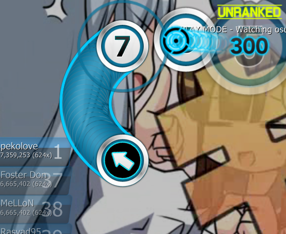
Another suggestions to perfect your skin.
1/ I find the reversearrows odd. The colours used to fill them are too... sharp with the rest of the skin during a play (a perfect white and perfect black).
What I would suggest is to use the same gradation used for your default numbers, i.e. 48-48-48 on the top and 0-0-0 on the bottom of the circle.
So instead of having the first reversearrow, you would have the second one, softer for the eye:

Of course this is only valid for the white note add-on. For the default skin with the white reverse arrow, you would use the same logic, with inverted colours: 255-255-255 and 207-207-207.
2/ Why not put some colours to your ranks? Like you did with your score star recolour add-on and with the red letter D, the ranks X, S, A, B, C would be far more easily recognizable if there was some colour to highlight them (AFAIAC I first check the colour to know my rank, not the letter). X and S in gold, A in green, B in dark blue and C in purple? For SH and XH, I don't know.
These are only suggestions of course.

 )
)


 Why?
Why?