Hello, today I'd like to share beta of a skin I'm working on right now. It's going to get many improvements in coming days, but I think it is in a releasable state as of now.
The main theme of the skin are minimalistic diamonds, and so is themed this whole presentation.

Video preview
The main theme of the skin are minimalistic diamonds, and so is themed this whole presentation.
Presentation Video
Here is some cringy video for the contest i made, to present my skin
Features
*6 different colors in different combinations to give maximum possibilities of customization:
-Sapphire Blue
-Agate Green
-Topaz Orange
-Kunzite Pink
-Ruby Red
-Lemon Quartz Yellow
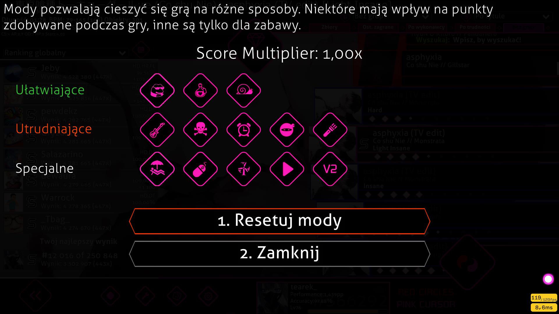
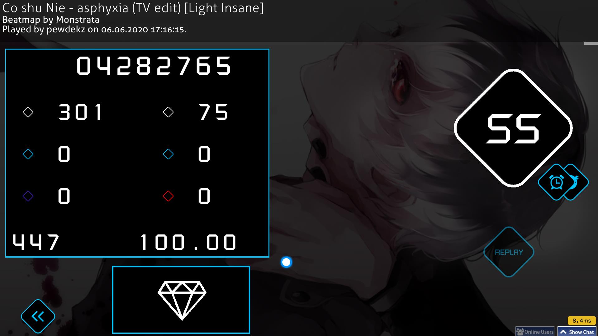
*Diamond-like stylized hud, mod icons, buttons and more to give you the best crystal immersion for your game.
*Soft, sparkle like sounds in main menu and song select, while keeping the classic hitsounds without much change - tryhard in game, chill out in song select.
*Fully customizable everything with 6 preset colors prepared, and a mixed ones with their own logo if you want to use multicolors, all assets included.
Screenshots
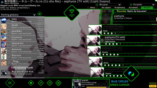
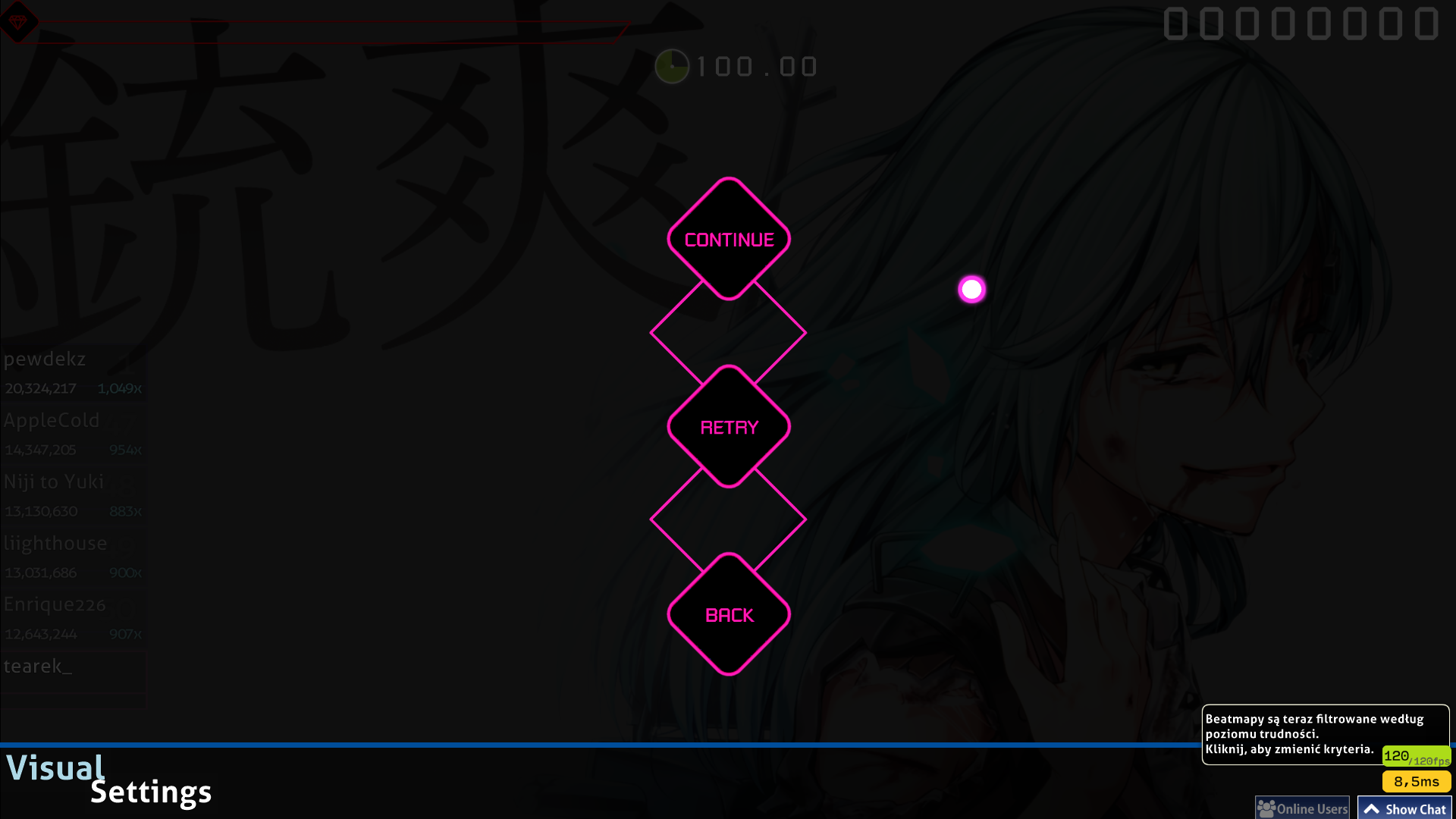
Gameplay is shown in the video, so I'll show only HUD


Work in progress
The skin is still under heavy development, some textures will definitely change in the future.
I'm heavily interested in anyone's opinion on what could be improved/done better, as it is my first skin I made + I'm not playing osu! that much to know 100% what players expect in the gameplay elements - saying so I'm open for all criticism and tips.
All of the assets were tested on 1920x1080 resolution, let me know if there are any problems with yours.
Due to 36 preset combinations there might me slight mistakes, so let me know if you find any.
More elements of the HUD are gonna get skinned as I learn how to do them, so thanks for using the skin in its current state and I hope you find it playable.
Also thanks to Skinship discord people for guiding me through.
GLHF
Downloads
I'm using Google Drive as my main point of uploads, it's easier to add and remove elements after I update them.
Every skin is named according to their circle-cursor theme, (eg.: Blue and Green means blue circles and green cursor, while Green and Blue means green circles and blue cursor).
Customization folder includes all 6 color folders with every HUD part I've created, and also "mixed" which contains lower base hud with "mixed" logotype, so you don't have to use standard ones that are not matching your customized parts.
https://drive.google.com/drive/folders/16i_vM90yj0zYWnQQ0N1Lh9KDBpjaCv19?usp=sharing
FOR NOW ONLY BLUE-RED IS ON THE DISC.
Due to PC factory reset, rest is going to be uploaded at the end of the week again
(https://drive.google.com/drive/folders/1AX-0u1Wh-HSldDLZxH_XaPWsFGtr8t_T its old disc, and it's not gonna be updated - but old versions will stay there).
Again, thanks for downloading and have fun with it.
Every skin is named according to their circle-cursor theme, (eg.: Blue and Green means blue circles and green cursor, while Green and Blue means green circles and blue cursor).
Customization folder includes all 6 color folders with every HUD part I've created, and also "mixed" which contains lower base hud with "mixed" logotype, so you don't have to use standard ones that are not matching your customized parts.
https://drive.google.com/drive/folders/16i_vM90yj0zYWnQQ0N1Lh9KDBpjaCv19?usp=sharing
FOR NOW ONLY BLUE-RED IS ON THE DISC.
Due to PC factory reset, rest is going to be uploaded at the end of the week again

(https://drive.google.com/drive/folders/1AX-0u1Wh-HSldDLZxH_XaPWsFGtr8t_T its old disc, and it's not gonna be updated - but old versions will stay there).
Again, thanks for downloading and have fun with it.
Changelog
Update v1
-changed hit100 and hit50 images to be easier visible
-added combobreak.wav + no combo break sound .wav
-adjusted hitcircleoverlap
Update v2
-added alternative circular 100s and 50s for preference purposes(available on google drive)
-adjusted sounds volume and swapped combobreak.wav for a new, less annoying one
-updated cursors' textures to better quality
Update v3
Blue-Red only (rest is gonna be uploaded at the end of the week due to PC factory reset)
-swapped mixed elements with my own
-swapped some textures with new, less jagged ones
Credits
Huge thanks to RockRoller for allowing me to use or edit some assets of his amazing Futuristic Miku skin, which heavy inspired my skin aswell.
https://osu.ppy.sh/community/forums/topics/680124
Also I'd like to credit downy and his hitcircles - I based my current hitcirle on his, so big kudos to him too.
https://osu.ppy.sh/community/forums/topics/680124
Also I'd like to credit downy and his hitcircles - I based my current hitcirle on his, so big kudos to him too.