Okami 1.3
To do:
Enhance hits.
Check 300k
Alter cursor tail color
version1.3
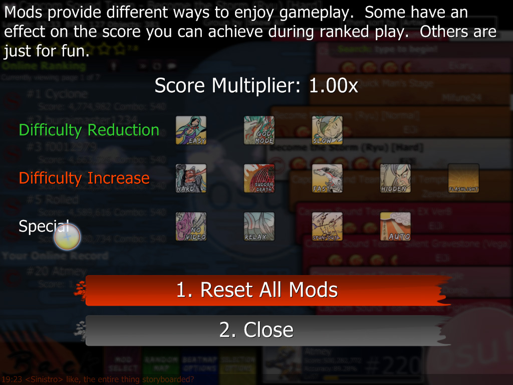
Added mods pictures
Fixed/improved sakura beats
Customized Button
Added fail background
Added pause-overlay
minor tweaks
version1.2
Added three types of hits: plain, sword and sakura, sakura is the default.
Fix combo burst.wav, a little shorter
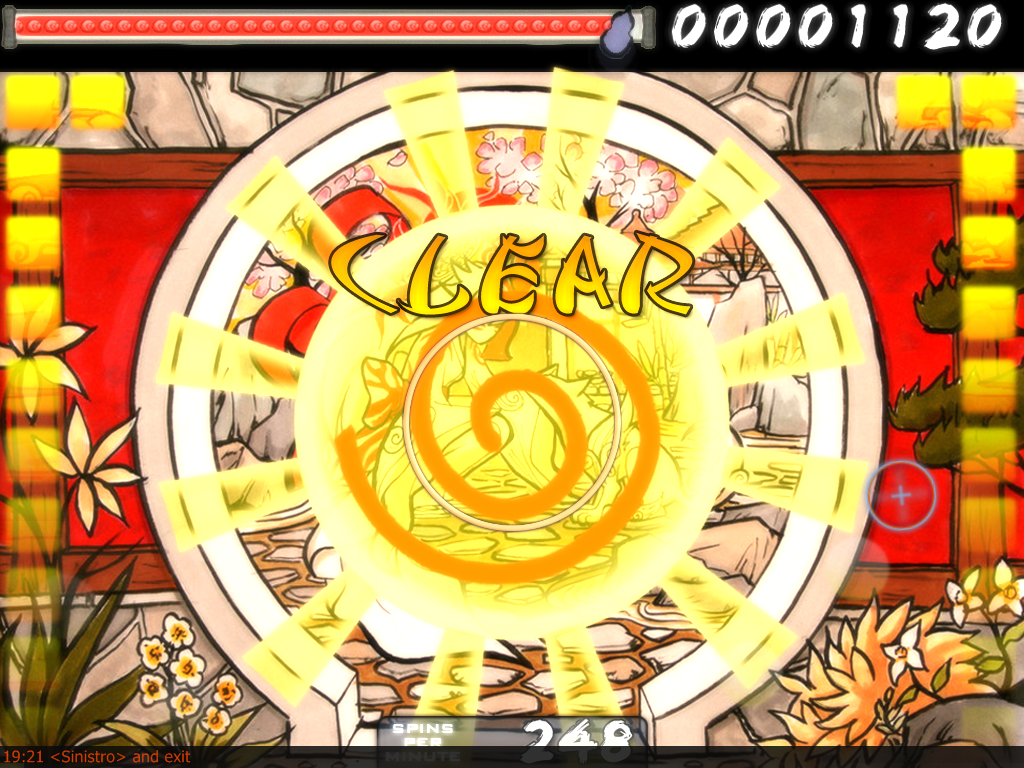
New spinner
version1.1
Added a little + in the cursor; to stand out more.
Added few sounds: applause, readys, sectionfail, sectionpass, failsound, comboburst, combobreak, menuhit
Changed combo burst to Amaterasu (3 images)
Added Issun as a slider
Added a sword in the background of a hit
Few minor changes.
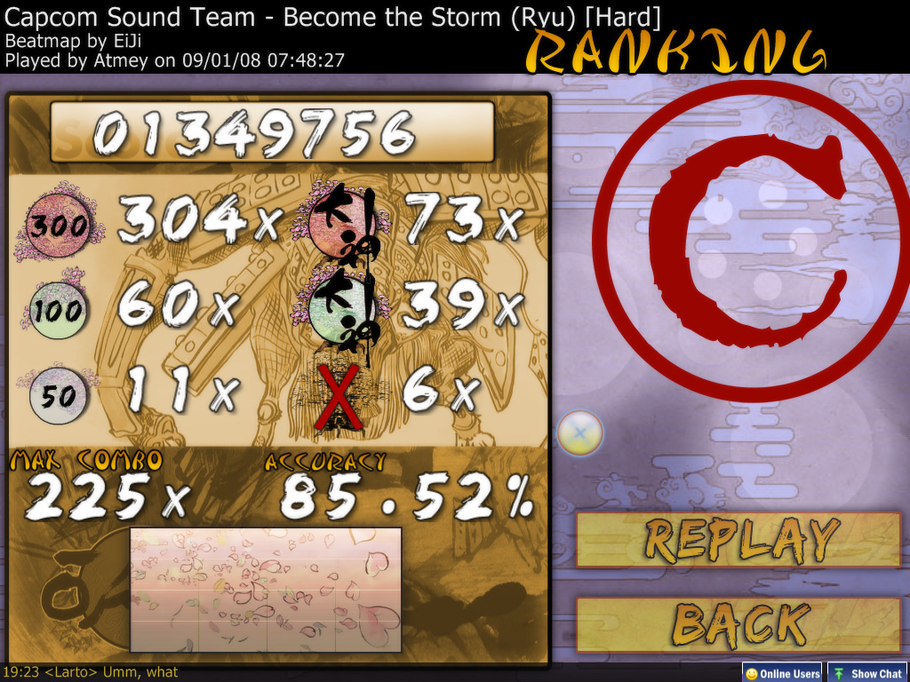
Screenshots
To do:
Enhance hits.
Check 300k
Alter cursor tail color
version1.3
Added mods pictures
Fixed/improved sakura beats
Customized Button
Added fail background
Added pause-overlay
minor tweaks
version1.2
Added three types of hits: plain, sword and sakura, sakura is the default.
Fix combo burst.wav, a little shorter
New spinner
version1.1
Added a little + in the cursor; to stand out more.
Added few sounds: applause, readys, sectionfail, sectionpass, failsound, comboburst, combobreak, menuhit
Changed combo burst to Amaterasu (3 images)
Added Issun as a slider
Added a sword in the background of a hit
Few minor changes.
Screenshots


