Spoke in-game about the map. The snappings at 02:35:233 (1,2,1,2,1,2,1,2) - and 05:11:513 (1,2,1,2,1,2,1,2) - are now 1/8, along with the principles for 01:23:721 - and 04:00:001 - now being the same, etc.
General
00:16:744 - Time signature is 3/4, not 4/4, as Halfslashed mentioned. Resets at 00:27:906 - etc you get the idea. As much as I want to ignore this, it's used for the main menu screen and thus part of the rc as well. applied ingame
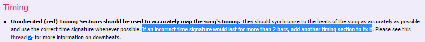
02:35:233 - 05:11:513 - May want to add the epilepsy warning
Shiirn
01:18:488 (2,3,4,1,2,3,4,1,2,3,4,1,2,3,4) - 03:54:768 (2,3,4,1,2,3,4,1,2,3,4,1,2,3,4) - I'd say just pick one and stick to it, especially in cases like these were it's barely even noticeable and doesn't help to express anything significant.
01:41:076 (4,5,6,1) - This change in angle makes the pattern much less recognizable, as pretty much all others have been quite strict in their placement. Possible to still Ctrl+G 01:41:512 (1,2) - and then do the same for 01:41:861 (2) - alone to get the same result in flow and backwards motion. ofc if you change, do the same for hitsounds accordingly. Anyway same thing seems to happen even more noticeably at 04:06:193 (4,5,6,1) - .
01:46:046 (1) - Last slider point is unnecessarily close to the previous path,
just move it up slightly so it's more clear.
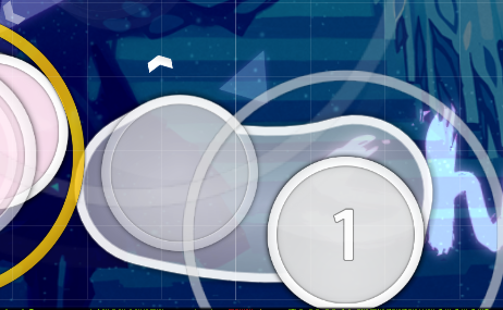
02:13:605 - 04:49:885 - Would suggest having both clickable
04:23:024 (5,6) - These are awfully close compared to the other ones
04:35:321 (2,1) - 04:40:902 (5,1) - Compared to mir's section and 04:29:739 (2,1) - , these are really close. Anyway mir had one basically the exact same so may want to make a joint decision about those. Emphasizing same sounds in different methods is generally something I'm against, though, as it both creates unwarranted contrast between the two and also ruins the potential of contrast between other things alike.
Mir
Compared to 01:53:459 (2,1) - 02:04:622 (5,1) - 02:10:203 (2,1) - , the one at 01:59:041 (2,1) - is way too close.
Would try rearranging 01:58:953 (1,2) - a bit.
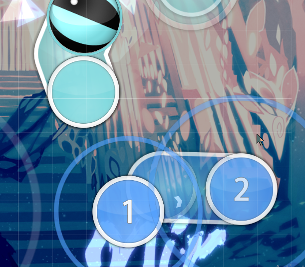
02:13:605 (1,2) - Suggested making this clearer
by failing the stack even more, to make it more distinct.
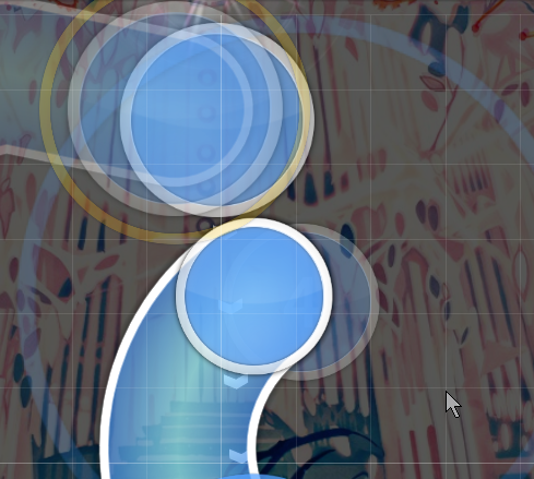
02:36:279 (1,1) - This felt really underwhelming due to the spacing, especially in comparison to 02:43:256 (1,1) - , which is almost too much. Try balancing these a bit so each transition has about equal strength.
03:16:046 (2,4) -
Could probably have these snares connected to their sliders like shiirn has most of theirs, and also like 03:16:831 (2,3) - is done.
Try doing something similar for 03:14:564 (2,1) - as well. This way there would only exist two types of expressions for circles, either connected to the next slider or connected to the previous slider, which in turn would make the visual appearance more familiar and recognizable throughout this section.
Hitsounds
01:04:883 - 01:40:814 - 01:42:209 - 02:16:395 - 02:21:977 - 02:25:465 - 02:27:558 - 02:28:256 - 02:30:349 - 02:33:140 - 02:35:233 - 04:07:326 - 04:10:815 - 04:17:094 - 04:18:489 - 04:52:675 - 04:53:373 - 04:55:466 - 04:56:164 - 04:58:257 - 04:58:954 - 05:01:745 - 05:03:838 - 05:04:536 - 05:06:629 - 05:07:326 - 05:09:420 - 05:10:117 - 05:11:513 - clap. tbh I was thinking perhaps some were intentionally skipped, but they're also inconsistently skipped in many cases so lol
02:08:721 - 04:45:001 - soft addition
03:43:256 - 40% volume
poke me when replied

