forum

Selena Gomez - Everything Is Not What It Seems

posted
Total Posts
88
show more
Ora
General: I notice that a lot of your problems have to do with inconsistent rhythm. You should try better to map to strong sounds (in the lyrics since that's what you map most of the song to) and make them clickable. Most of the issues can be easily fixed. Most of the ones I point out will be in Hard diff. Normal diff is looking pretty good ^^

Advanced:
00:03:328 (2,3) - blankettt, try to use the approch circle to create the curve
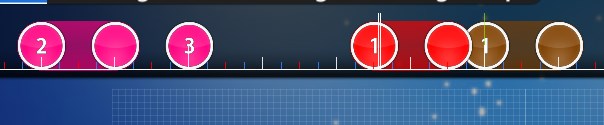
00:23:008 (2,3) - 3 can be blanketed on the tail of 2 better. Adjust DS for the next 2 circles accordingly
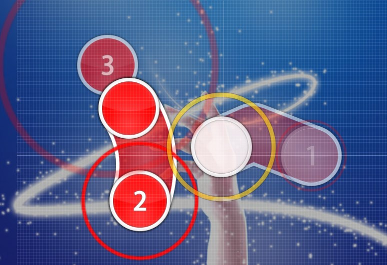
00:29:488 (2,3,4,5) - can be polished, something like this: http://puu.sh/t8yl7/03d1926371.jpg . Here's the code for one I made (just delete what you have there, save, and copy paste these objects to the bottom of your notepad, save again ofc)
New pattern
232,364,29488,2,0,P|298:348|333:297,1,130
313,210,30208,1,2,0:0:0:0:
240,155,30448,2,0,P|220:220|247:275,1,130
332,299,30928,1,2,0:0:0:0:
If you accept ^ 00:31:648 (1) - DS will be off and need to be readjusted
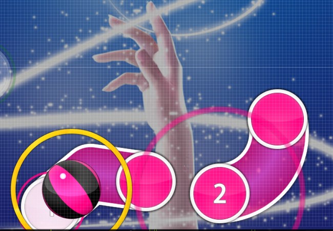
00:34:528 (1) - give a better curve for a better blanket
00:41:248 (3) - same^
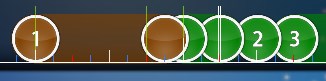
you do a better job with blanketing here 00:44:128 (1,2) -
00:46:528 (1,2,3) - the DS seems awkward here, could be an optional change though
00:46:528 (1,2,3) - Better rhythm here could be: http://puu.sh/t8yyR/e9ee33bf2e.jpg

Hard:
00:17:248 (1,2,3) - you start mapping to the lyrics, then you miss a strong note on 00:18:928 - and start mapping to the music at 00:19:168 (1,2,3,4) - , and then awkwardly switch back at 00:21:088 (1) - . Please try to be more consistent with the rhythm
00:21:088 (1,2) - make these the same!! copy/paste 1
00:26:848 (1,2,3,4,5) - I think the rhythm here should be http://puu.sh/t8xr2/95cacdc30f.jpg
00:28:768 (1) - this whole combo you are mapping the lyrics. maybe try to make this a short reverse slider to accomodate the "-vry" part of the lyrics like this: https://osu.ppy.sh/ss/6955378
00:36:448 (1,2,3,4,5) - try this rhythm: http://puu.sh/t8xC8/9158c4a733.jpg 00:37:888 (5) - could also be 2 circles as well. fits better mapping to the lyrics
00:44:128 (1,2,3,4,5) - try this rhythm: http://puu.sh/t8xFn/4eb6667654.jpg fits better mapping to the lyrics
00:46:768 - this can be mapped, it's the hard diff anyways

GL for rank! Fun song
_orange
NM from my queue

[Normal]

00:17:248 (1,2,3) - imo this should be denser, so that is is more similar to 00:24:928 (1,2,3) - and 00:28:768 (1,2,3,4) -
00:31:648 (6,1) - make this the same as advanced and hard?
00:34:288 - I feel like the should be a note or something here
00:41:968 (4,5) - spacing problem

[Advanced]

00:20:128 (1) - this shape just looks a bit odd to me, if you want you could try something like this
00:42:928 (3,4) - stack this like 00:39:088 (2,3) - here?

[Hard]

00:41:248 (3) - again the shape looks uneven and odd, try the same thing as i said in advanced?
00:44:128 (1,2,3,4,5) - try make the sliderheads on where the vocals are, this problem is only in hard for some reason

That should be it, GL!
WildCry
Hello° NM from my modding post queue


Normal
00:13:408 (1) - Put the red point of the silder more in the center, this to have a better representation of the song.
00:47:488 (3) - Add a circle in the next white tick, Or make the circle a slider like this 00:21:088 (1) - ( this circle 00:47:488 (3) - )


Advanced
00:47:488 (3) - Same of the last mod in the normal diff' but here i recomend more the circle


Hard

00:46:528 (1) - Add NC
00:47:488 (3) - Remove NC
00:47:728 (1) - Add NC


That's all, Good Luck!
Frost
hi

General


  • Looks good.

Hard


  • 00:11:008 (1) - Remove NC.
    00:11:488 (2) - Add NC.
    00:12:808 (1) - Remove NC.
    00:13:408 (3) - Add NC.
    00:14:368 (1) - Remove NC.
    00:15:328 (2) - Add NC.
    00:17:968 (3) - This slider bothers me because the very center is on a big drum beat but has nothing to capture it. :/
    00:31:648 (1) - I feel like this should be further spaced from the previous note? Distance snap probably adjusted the spacing to your new slider velocity, but the transition is somewhat awkward. Also, the end of the slider is on a massive note, which feels weird. You could shorten by 1 tick and put a circle at the end instead like you did at 00:08:608 (1,1) - ?
    00:39:088 (2) - Drum in the middle again, aaaaa.
    00:42:928 (4) - ^.
    00:45:568 (5) - Again with the slider ending on the big note thing.
    00:46:528 (1,2,3) - This is weird because of how distinctly different (1) is from (2) and (3). Imo, it would be better to highlight the similarities between the music at notes 2 + 3, making sure to differentiate from note 1 (something like making 2 + 3 their own combo/making them each 1/2 sliders/whatever you can think of).

I don't even mod hards usually so I definitely can't go lower aaaa.
Hope I helped?
-BLuR-
(1 star) Normal


00:05:728 (1,2,3) - Make the them point at the next object, looks a bit ugly when it's uneven
00:16:768 (2) - ^ (small change though)
00:43:648 (7) - ^
00:16:768 (2) - ^ idk if the unevenness is on purpose but it looks better straight at some parts.


(2 star) Normal


00:46:528 (1) - Fix distance spacing here, and maybe make it a 1/2 slider, since the last two are on very different sounds.
00:47:008 (2,3) - They have bad ds too.
Hard


00:16:528 (4,5) - Fix ds
Lilyanna
M4M from ur q

General

00:31:648 - Kiai he is not needed tbh for all difficulties
background need to be resized to 1920x1080

Normal

00:03:808 (2,3) - it would look aesthaticaly better if u blanket like this http://puu.sh/tenJR/cb3cb250db.jpg
00:08:608 (1) - u kinda messed up the rythm here and the vocals follow up first the sliders end on a downbeat ruined the rythm it feels better to be clickable like this 00:01:888 - try this rythm
http://puu.sh/teo2G/0bbeddc056.jpg
00:16:048 (1) - remove nc its noot needed tbh
00:22:048 (2,3,4,5,6) - move all this pattern together to x154 y182 to avoid that wierd overlap here 00:21:088 (1,2) -
00:24:928 (1,2,3) - same here if u want u can move these together to x309 y280 to create a better symmetry visualy here 00:23:728 (5,1) -
http://puu.sh/teocw/fad195e96b.jpg
00:30:208 (3) - move this down for better movement its placed wierd http://puu.sh/teogb/dc36bba075.jpg
00:46:528 (1,2,3) - no need nc here aswell it breaks the nc consistency
00:47:968 - pretty strong beat can put a hitcircle here (if you do u can put nc)

advanced

00:03:808 (3) - nc
00:15:328 (5) - nc should be here on the down beat not 00:16:048 (1) -
00:29:488 (2,3,4) - can be better blankets
00:32:608 - pls make clickable like u did here 00:17:248 - its triggering xd
00:18:688 (3) - nc 00:20:128 (1) - remove nc 00:21:088 (3) - nc 00:22:768 (1) - remove nc 00:23:008 (2) - nc 00:30:208 (3) - nc
00:46:048 (5,1) - swap the ncs
00:47:488 (3) - imo either make it 3 hitcricles or 1/2 repeat because of vocals here 00:47:728 -

Hard

00:11:008 (1,2) - swap the nc on the downbeat
00:12:808 (1,2) - ^
00:14:368 (1,2) - ^
00:16:048 (1) - no reason for nc here ..
00:31:648 (1) - can be better loop slider search it up
00:32:608 - same as i mentioned before clickable
00:46:528 (1,1) - remove these nc 00:47:968 (2) - add nc on downbeat

overall lot of unconsistent ncs and few blankets can be polished also few rythms i suggested should be polished and everything it should be like what it seems xd I love Wizards of Waverly Place!
Good luck!
Jonarwhal
Hello! NM from my queue! I'd like to give you a friendly reminder that you should reply to mods to help the modder improve their modding skills!
[General]
  1. "normal-slidertick2 is an unused hitsound" that is taking up space in the map's folder. You must either make use of it or delete it.
    If you wanted, you could include an Insane in this mapset because you have a lot of unused vocal sounds from Selena. This could be either one that you map or a GD, but it's not at all required so please don't feel obligated to do it. :D
  2. An overall suggestion for your hitsounds, I noticed you're using a good amount of soft/normal additionals, but in my opinion the song could better benefit from a few drum additionals. For example, 00:01:888 - try adding a finish here will the drum additionals an d I think you will like how it sounds more than the whistle you typically use there. This will work because the background music is mostly drums (and sparkly noises which you can add as whistles). Not required, but strongly recommended unless you have a reason to understate those drum-finishes.
  3. 00:17:248 - / 00:32:608 - I think you're definitely missing a normal-finish here.
[Hard]
  1. please note that the map has changed a little since when I started modding
  2. OD4 is not typical for a hard. It's too low, and it doesn't reflect your intentions for this difficulty (unless you're intentionally making an Easier hard). I recommend you raise it to at least 5.
  3. 00:03:088 (4,5) - I can't tell what the claps are meant to emphasize. If you're trying to emphasize the digital sound, I don't recommend doing this. This is because there's nothing more important about the digital sound 00:03:088 (4,5) - here than the digital sound 00:01:888 (1,2) - here. They're even a similar pitch. Since adding it there would increase emphasis on the digital sound, that would mean you should also add it 00:01:888 (1,2) - here for consistency, but then that's too many hitsounds. I would solve this problem by simply removing the claps until they are needed later in the song. Specifically, remove claps from the quiet section 00:01:888 - / 00:09:568 - here. This is done by highlighting the section then pressing "r" twice. Consider using a whistle in place of them to maintain the sound.
  4. 00:07:168 (5) - Because you use a lot of hitsounds, leaving this slider-head without a hitsound seems lacking. Consider adding a whitstle to the slider-head.
  5. 00:16:048 (1,2,3) - stack this for more intuitive pitch following, ie no pitch change = no movement
  6. 00:18:688 (4,2) - Because this map doesn't use a lot of overlap, and doesn't have a lot of reason to overlap because you don't have a lot of objects, when you do overlap it looks like a mistake. I recommend you remove overlaps, for this reason, and because they look better when fixed. here, you can fix it while keeping the triangle like this:
    Or fix it while making a parallelogram like this:
  7. 00:21:088 (1,3) - overlaps, again, just stack it this time
  8. 00:22:528 (4,1,2) - Because you copy/pasted the slider but didn't even out the shape, it looks like an unfinished symmetrical pattern. I recommend you even out the shape to make it look nicer.
  9. 00:28:768 - / 00:31:168 - same as the claps at the beginning, they aren't emphasizing anything in particular
  10. 00:32:608 - Definitely try to make your kiai start on a clickable beat. This note should receive plenty of emphasis, hence it begins the kiai. Because you didn't make that beat clickable, 00:32:848 - there is too much emphasis on the offbeat and the NC that should have been 00:32:608 - here is instead on the offbeat.
    00:33:328 (2,3,1,2,3,4,5) - overlaps ;-; same reasoning
  11. 00:44:368 (2,5) - ^^^ just stack it
[Advanced]
  1. 00:01:888 (1,2) - I don't really understand your rhythm choice here because whether you're following the (cell phone) noise or Selena's voice, you're missing some beats, and the polarity is bad. Here are a few alternate rhythm choices that preserve polarity.
  2. 00:08:608 (1) - I don't really understand what this slider is following either. I recommend you make it a 1/1 slider starting either 00:08:608 - here to follow the strings (ending 00:09:088 - here) or start is 00:08:848 - here and end 00:09:328 - here to follow the laughter.
  3. 00:16:288 - This is too emphasized to be mapped with a sliderend, remember you should generally avoid starting sliders on top of red ticks because it gives the offbeat too much emphasis unless a red tick needs emphasis, which is rare. This is the rhythm you should consider using:
  4. 00:39:088 (2,3) - This is confusing because it's your first tailstack in the map and it's inconsistent with your style.
  5. 00:42:928 (3,4) - ^^^ you can't just justify switching to tailstacks by using more tailstacks, it's inconsistent and it can confuse an Advanced player
[Normal]
  1. 00:01:888 (1) - This rhythm is too Easy, it's inconsistent with the rest of this difficulty and it gives the wrong impression of how difficult the map is going to be from the beginning. Consider separating it into a few objects so that it's consistent with the following pattern.
  2. 00:17:248 - / 00:21:088 - Same as the first slider in your map, this rhythm is too easy/inconsistent with the rest of the kiai. It would be best to follow the lyrics to that the player plays more consistently with the rest of the kiai. If you want to maintain a relaxed feel while still getting the red offbeats, then go for this rhythm: (the red tick sliders are justified because the vocal sounds are strong there)
best of luck!! :)
Topic Starter
Juiceys

Jonawaga wrote:

Hello! NM from my queue! I'd like to give you a friendly reminder that you should reply to mods to help the modder improve their modding skills!
[General]
  1. "normal-slidertick2 is an unused hitsound" that is taking up space in the map's folder. You must either make use of it or delete it.
    If you wanted, you could include an Insane in this mapset because you have a lot of unused vocal sounds from Selena. This could be either one that you map or a GD, but it's not at all required so please don't feel obligated to do it. :D Fixed hitsound and will consider another diff
  2. An overall suggestion for your hitsounds, I noticed you're using a good amount of soft/normal additionals, but in my opinion the song could better benefit from a few drum additionals. For example, 00:01:888 - try adding a finish here will the drum additionals an d I think you will like how it sounds more than the whistle you typically use there. This will work because the background music is mostly drums (and sparkly noises which you can add as whistles). Not required, but strongly recommended unless you have a reason to understate those drum-finishes. I'll test it later l0l
  3. 00:17:248 - / 00:32:608 - I think you're definitely missing a normal-finish here.
[Hard]
  1. please note that the map has changed a little since when I started modding
  2. OD4 is not typical for a hard. It's too low, and it doesn't reflect your intentions for this difficulty (unless you're intentionally making an Easier hard). I recommend you raise it to at least 5. ok
  3. 00:03:088 (4,5) - I can't tell what the claps are meant to emphasize. If you're trying to emphasize the digital sound, I don't recommend doing this. This is because there's nothing more important about the digital sound 00:03:088 (4,5) - here than the digital sound 00:01:888 (1,2) - here. They're even a similar pitch. Since adding it there would increase emphasis on the digital sound, that would mean you should also add it 00:01:888 (1,2) - here for consistency, but then that's too many hitsounds. I would solve this problem by simply removing the claps until they are needed later in the song. Specifically, remove claps from the quiet section 00:01:888 - / 00:09:568 - here. This is done by highlighting the section then pressing "r" twice. Consider using a whistle in place of them to maintain the sound. MAde sounds consistent
  4. 00:07:168 (5) - Because you use a lot of hitsounds, leaving this slider-head without a hitsound seems lacking. Consider adding a whitstle to the slider-head. ^
  5. 00:16:048 (1,2,3) - stack this for more intuitive pitch following, ie no pitch change = no movement It's not too much of a problem
  6. 00:18:688 (4,2) - Because this map doesn't use a lot of overlap, and doesn't have a lot of reason to overlap because you don't have a lot of objects, when you do overlap it looks like a mistake. I recommend you remove overlaps, for this reason, and because they look better when fixed. here, you can fix it while keeping the triangle like this:
    Or fix it while making a parallelogram like this:
  7. 00:21:088 (1,3) - overlaps, again, just stack it this time Fixed overlaps
  8. 00:22:528 (4,1,2) - Because you copy/pasted the slider but didn't even out the shape, it looks like an unfinished symmetrical pattern. I recommend you even out the shape to make it look nicer. ya
  9. 00:28:768 - / 00:31:168 - same as the claps at the beginning, they aren't emphasizing anything in particular true
  10. 00:32:608 - Definitely try to make your kiai start on a clickable beat. This note should receive plenty of emphasis, hence it begins the kiai. Because you didn't make that beat clickable, 00:32:848 - there is too much emphasis on the offbeat and the NC that should have been 00:32:608 - here is instead on the offbeat. I think its fine
    00:33:328 (2,3,1,2,3,4,5) - overlaps ;-; same reasoning fixed
  11. 00:44:368 (2,5) - ^^^ just stack it fixed
Fixed all vvvvvvvvvv

[Advanced]
  1. 00:01:888 (1,2) - I don't really understand your rhythm choice here because whether you're following the (cell phone) noise or Selena's voice, you're missing some beats, and the polarity is bad. Here are a few alternate rhythm choices that preserve polarity.
  2. 00:08:608 (1) - I don't really understand what this slider is following either. I recommend you make it a 1/1 slider starting either 00:08:608 - here to follow the strings (ending 00:09:088 - here) or start is 00:08:848 - here and end 00:09:328 - here to follow the laughter.
  3. 00:16:288 - This is too emphasized to be mapped with a sliderend, remember you should generally avoid starting sliders on top of red ticks because it gives the offbeat too much emphasis unless a red tick needs emphasis, which is rare. This is the rhythm you should consider using:
  4. 00:39:088 (2,3) - This is confusing because it's your first tailstack in the map and it's inconsistent with your style.
  5. 00:42:928 (3,4) - ^^^ you can't just justify switching to tailstacks by using more tailstacks, it's inconsistent and it can confuse an Advanced player
[Normal]
  1. 00:01:888 (1) - This rhythm is too Easy, it's inconsistent with the rest of this difficulty and it gives the wrong impression of how difficult the map is going to be from the beginning. Consider separating it into a few objects so that it's consistent with the following pattern.
  2. 00:17:248 - / 00:21:088 - Same as the first slider in your map, this rhythm is too easy/inconsistent with the rest of the kiai. It would be best to follow the lyrics to that the player plays more consistently with the rest of the kiai. If you want to maintain a relaxed feel while still getting the red offbeats, then go for this rhythm: (the red tick sliders are justified because the vocal sounds are strong there)
best of luck!! :)[/box]
Affirmation
Q

[Normal]
00:18:688 (2,4) - stack
00:21:088 (1,2) - looks bad overlap, avoid them.
00:26:848 (4,5) - 00:28:768 (1,2) - flow looks really hard,

[advanced]
00:08:608 (1) - unnecessary NC
00:38:368 (1,2) - avoid overlap

[Hard]
00:14:728 - where is beat, you should add a beat here since you followed vocal

GL
-NanoRIPE-
m4m?

[General]
  1. 00:31:648 - im not understand,why you put a kiai time here? i mean this not particular part that needs a kiai imo
[Normal]
00:03:808 (2,3) - the pattern looks odd (the flow too) maybe try this one http://prnt.sc/dv0jg0
00:12:448 (4) - hmm the slider shape looks too curved,maybe uncurve just a little bit for make it better ~ (try blanket it with the previous object)
00:26:848 (4) - ^ http://prnt.sc/dv0k7r
00:28:768 (1) - ^ http://prnt.sc/dv0kj0
00:36:448 (1,2,3,4,5,6,7,8) - this pattern looks boring and dense ~ try this rhythm for make it better i think.. http://prnt.sc/dv0m1a
00:40:288 (1,2,3,4,5,6,7,8) - ^ (maybe you can try another rhythm for make variation)

[Advance]
00:05:008 (2) - uncurve a little bit for better blanket
00:05:008 (2,1) - the shape between these slider not congruent
00:09:568 until 00:16:768 - the ds looks small here? why? (i think the ds must small on the intro and when began to enter kiai time the ds increased)
00:18:688 (3,1) - ctrl g for better rhythm
00:30:208 (1,2) - the blanket is kinda off
00:34:288 (4,1) - ctrl g for better rhythm (for make the rhythm better on the next object)
00:47:008 (3) - move to (212,204) for better flow between object (1,2,3)

Note : im suggest make the ds consistent except at the kiai time increase the ds to 1,10 or 1,20 so it wouldnt make a ds issues for this diff

[Hard]
00:11:008 (6) - i think straight slider goes well here than curve slider
00:16:048 (2,3,4,5,6) - hmm odd pattern imo,maybe try this one ~ http://prnt.sc/dv0qos
00:20:128 (3) - cut this slider into a 1/2 slider and a circle because long slider ruins the vocal (and because this is hard diff so maybe make it little harder than advanced)
00:29:368 (1,2,3) - im not sure about this pattern... how about this? http://%20prntscr.com/dv0rpq
00:33:328 (2,3,1,2) - bad rhythm imo ~ try this http://prnt.sc/dv0snv
00:43:648 (5) - ctrl j for better flow with slider (4)
00:45:568 (5,6) - the rhythm lack of emphatize (just follow vocal here) maybe you want make the end of pattern at the big white tick but its still seems not right for me http://prnt.sc/dv0tii

ok thats it from me (sorry for bad mod because this my first mod after afk from modding) ~
and sorry for bad english xd
GL!
Chatree
From your req ( ^ = same as above, Imo = In my opinion)

Normal

  1. 00:22:048 (2) - blanket prev. slider Imo
  2. 00:24:928 (1) - change to curve would be nice Imo

Advanced

  1. 00:05:488 - add circle here
  2. 00:08:368 - ^ but start NC here
  3. 00:35:728 (3) - change to short slider like prev. one and put circle on red tick
  4. 00:39:088 (2) - blanket prev. slider much better?

Hard

  1. 00:03:568 - add circle would be nice
  2. 00:08:368 - ^
  3. 00:14:368 (3) - change to 2 short sliders like prev.
  4. 00:24:928 (1) - remove NC and NC > 00:25:408 (2) next one

P.S Hope this ranked soon
WITH LOVE
blobdash
Hey :)

from my mod queue
green = personal opinions/idead

General :
00:31:648 (6) - Do not switch quickly kiai time, it's forbiden by the ranking criterias. (All diffs)
Maybe an Insane diff would be cool? Not that it's unrankable, but I think that you should have one.

Normal : couldn't find anything wrong

Advanced :
00:47:968 (1) - New combo? Why?
00:45:568 (3,1) - These two are useless, even if they follow the rythm. The "not" is on the red tick
00:48:448 (1) - Could be cool to have a circle when the spinner starts and make the spinner start on the next red tick. (like this)
Maybe speeding up the sliders on the kiai time?

Hard :
00:478968 (1,2,3) - Replacing those three with a fast slider.

Hope it helped, even if it's nothing because i couldn't find anything :(
Watch My Skill
Easy
Good overall, maybe just consider position of 00:12:448 (4) - as it could be more inside the borders

Adv.
I think 00:48:448 (1) - should be moved back to the red tick, and change 00:47:968 (1) - to a slider that finishes on the white tick. OR put a single note on the white tick, i just feel it ends poorly
Smooth otherwise, has nice flow

Hard
00:10:888 (5) - Just move this over to the right a little, it will smooth the flow really nicely in this section
00:48:448 (3,1) - The end of ADVANCED should look like this!!!

Otherwise its quite well done, i would say the other mods have done really good job on this.
riffy
Well, you requested a BN to check the set.

Forst of all, the code of conduct requires you to respond to every mod. So, please, do not ignore messages in the thread. Chances are, we'll be suggesting the same things over and over untill you explain why/why not to apply certain stuff.

[General]
  1. Is there any chance we could get an HD background? Since the rankable maximum is 1920x1200 you could use something of much higher quality.
  2. Colours don't really fit with the background, this is something you might want to change if you keep the current bckground.
  3. I would increase Overall Difficulty / HP Drain for each difficulty by 1 or even two. They don't quite match with the approach rate/rhythm.
[Normal]
  1. 00:01:888 (1) - the song has no long hold sounds, there are clear vocals/drums and for that reason the slider feels out of place. Try to split it into shorter objects?
  2. 00:08:608 (1) - none f the vocals/drum beats are clickable to player, 00:09:568 - this, for example ignores the strong beat and a circle here would be a better option, the laughter/giggle/whatever sound that is played on 00:08:848 - 00:09:088 - 00:09:328 - also sounds much stronger than anything you mapped on 00:08:608 - why not try something like this?
  3. 00:21:088 (1,2) - this kind of overlap could confuse beginners. Perhaps, we could prevent overlaps and re-arrange things? a poorly-made example
  4. The kiai parts felt a bit overloaded with 1/2 beats in general. Remember that longer 1/2 chains also require some reading skills from beginners, and this is what makes long overlapping chains of 1/2 beats kind of unfriendly for beginners. Besides, the less 1/2 beats you use, the more special they will feel and the more emphasis they will give.

    The main thing that leaves a rather negative impression is the patterning itself, I believe, it is so because of the sharp angles and untidy blankets, for example 00:03:808 (2,3,1) - or 00:21:088 (1,2) - it is something that could be polished with a few more mods, so I guiess it's no big deal.
[Advanced]
  1. 00:08:608 (4) - see the comment on the similar slider in Normal for reference, the slider does go off the key sounds of this part and feels forced.
  2. 00:16:768 (4) - this probably would sound better as a circle. There is no actual reason to make a slider since the sound on 00:16:768 - kind of stands as an individual beat.
  3. 00:21:088 (1,2,3,4,1) - minor - wasn't it supposed to be symmetrical? The sound/patterning kind of suggests it.
  4. 00:28:768 (1,2) - I would personally make some more direct transition between these two for softer flow. example
  5. 00:38:368 (1,2) - given that this is the only overlap of this kind in the difficulty it feels inconsistent/unintentional. Perhaps, you could add 1-2 more of those or avoid this one?

    Mostly blanketing and flow, rhythmically it felt okay.
[Hard]
  1. 00:05:008 (4) - two circles would work better as there are two individual beats that feel better when mapped individually.
  2. 00:07:648 - probably this also needs a single circle as there is a finish that clearly stands out. Probably a 1/2 slider and then a circle on the downbeat?
  3. 00:08:608 (1) - see the comment on the similar slider in Normal for reference, the slider does go off the key sounds of this part and feels forced.
  4. 00:32:848 (1) - the stronger beat is actually on 00:33:088 - and leaving it unclickable to the player is quite a confusing thing. Perhaps, the rhythm here should be more like this?

    Not bad at all, could use some polishing and a couple of mods to improve the rhythm, but hey, it's still pretty cool even as it is!
I guess that's about it, I don't quite like the way patterns are designed at times and it could be worked on in terms of rhythm, but that is a pretty decent set that has the potential.

~~~~~~~~~~~~~~~~~~~~~~~

Best of luck!
Topic Starter
Juiceys

Bakari wrote:

Well, you requested a BN to check the set.

Forst of all, the code of conduct requires you to respond to every mod. So, please, do not ignore messages in the thread. Chances are, we'll be suggesting the same things over and over untill you explain why/why not to apply certain stuff. o ok

[General]
  1. Is there any chance we could get an HD background? Since the rankable maximum is 1920x1200 you could use something of much higher quality. I'll look
  2. Colours don't really fit with the background, this is something you might want to change if you keep the current bckground. will keep in mind
  3. I would increase Overall Difficulty / HP Drain for each difficulty by 1 or even two. They don't quite match with the approach rate/rhythm. gotcha
[Normal]
  1. 00:01:888 (1) - the song has no long hold sounds, there are clear vocals/drums and for that reason the slider feels out of place. Try to split it into shorter objects? mk
  2. 00:08:608 (1) - none f the vocals/drum beats are clickable to player, 00:09:568 - this, for example ignores the strong beat and a circle here would be a better option, the laughter/giggle/whatever sound that is played on 00:08:848 - 00:09:088 - 00:09:328 - also sounds much stronger than anything you mapped on 00:08:608 - why not try something like this? alright
  3. 00:21:088 (1,2) - this kind of overlap could confuse beginners. Perhaps, we could prevent overlaps and re-arrange things? a poorly-made example yeah okay
  4. The kiai parts felt a bit overloaded with 1/2 beats in general. Remember that longer 1/2 chains also require some reading skills from beginners, and this is what makes long overlapping chains of 1/2 beats kind of unfriendly for beginners. Besides, the less 1/2 beats you use, the more special they will feel and the more emphasis they will give. inserted a couple breaks

    The main thing that leaves a rather negative impression is the patterning itself, I believe, it is so because of the sharp angles and untidy blankets, for example 00:03:808 (2,3,1) - or 00:21:088 (1,2) - it is something that could be polished with a few more mods, so I guiess it's no big deal.
[Advanced]
  1. 00:08:608 (4) - see the comment on the similar slider in Normal for reference, the slider does go off the key sounds of this part and feels forced. ya
  2. 00:16:768 (4) - this probably would sound better as a circle. There is no actual reason to make a slider since the sound on 00:16:768 - kind of stands as an individual beat. yeah something was off about this
  3. 00:21:088 (1,2,3,4,1) - minor - wasn't it supposed to be symmetrical? The sound/patterning kind of suggests it. wasn't intentional but good suggestion
  4. 00:28:768 (1,2) - I would personally make some more direct transition between these two for softer flow. example ok
  5. 00:38:368 (1,2) - given that this is the only overlap of this kind in the difficulty it feels inconsistent/unintentional. Perhaps, you could add 1-2 more of those or avoid this one? fixed

    Mostly blanketing and flow, rhythmically it felt okay.
[Hard]
  1. 00:05:008 (4) - two circles would work better as there are two individual beats that feel better when mapped individually. mk
  2. 00:07:648 - probably this also needs a single circle as there is a finish that clearly stands out. Probably a 1/2 slider and then a circle on the downbeat? ill see what i can do
  3. 00:08:608 (1) - see the comment on the similar slider in Normal for reference, the slider does go off the key sounds of this part and feels forced. it was supposed to map the pulling sound and I think its ok in this diff
  4. 00:32:848 (1) - the stronger beat is actually on 00:33:088 - and leaving it unclickable to the player is quite a confusing thing. Perhaps, the rhythm here should be more like this? shore

    Not bad at all, could use some polishing and a couple of mods to improve the rhythm, but hey, it's still pretty cool even as it is!
I guess that's about it, I don't quite like the way patterns are designed at times and it could be worked on in terms of rhythm, but that is a pretty decent set that has the potential.

~~~~~~~~~~~~~~~~~~~~~~~


Best of luck!

Thanks will try to reply to other mods soon
Topic Starter
Juiceys

Watch My Skill wrote:

Easy
Good overall, maybe just consider position of 00:12:448 (4) - as it could be more inside the borders think it's fine

Adv.
I think 00:48:448 (1) - should be moved back to the red tick, and change 00:47:968 (1) - to a slider that finishes on the white tick. OR put a single note on the white tick, i just feel it ends poorly it seems fine the way it is
Smooth otherwise, has nice flow

Hard
00:10:888 (5) - Just move this over to the right a little, it will smooth the flow really nicely in this section sure
00:48:448 (3,1) - The end of ADVANCED should look like this!!! nah too many circles in a row for advanced

Otherwise its quite well done, i would say the other mods have done really good job on this.
Topic Starter
Juiceys

FruityEnLoops wrote:

Hey :)

from my mod queue
green = personal opinions/idead

General :
00:31:648 (6) - Do not switch quickly kiai time, it's forbiden by the ranking criterias. (All diffs) it should be fine, a bn told me to do this
Maybe an Insane diff would be cool? Not that it's unrankable, but I think that you should have one. maybe

Normal : couldn't find anything wrong

Advanced :
00:47:968 (1) - New combo? Why? downbeat
00:45:568 (3,1) - These two are useless, even if they follow the rythm. The "not" is on the red tick it ok lo
00:48:448 (1) - Could be cool to have a circle when the spinner starts and make the spinner start on the next red tick. (like this) too hard to read for advanced
Maybe speeding up the sliders on the kiai time? [/color]

Hard :
00:478968 (1,2,3) - Replacing those three with a fast slider. [/color]

Hope it helped, even if it's nothing because i couldn't find anything :(
Topic Starter
Juiceys

-NanoRIPE- wrote:

m4m?

[General]
  1. 00:31:648 - im not understand,why you put a kiai time here? i mean this not particular part that needs a kiai imo
[Normal]
00:03:808 (2,3) - the pattern looks odd (the flow too) maybe try this one http://prnt.sc/dv0jg0
00:12:448 (4) - hmm the slider shape looks too curved,maybe uncurve just a little bit for make it better ~ (try blanket it with the previous object)
00:26:848 (4) - ^ http://prnt.sc/dv0k7r
00:28:768 (1) - ^ http://prnt.sc/dv0kj0
00:36:448 (1,2,3,4,5,6,7,8) - this pattern looks boring and dense ~ try this rhythm for make it better i think.. http://prnt.sc/dv0m1a
00:40:288 (1,2,3,4,5,6,7,8) - ^ (maybe you can try another rhythm for make variation)

[Advance]
00:05:008 (2) - uncurve a little bit for better blanket
00:05:008 (2,1) - the shape between these slider not congruent
00:09:568 until 00:16:768 - the ds looks small here? why? (i think the ds must small on the intro and when began to enter kiai time the ds increased)
00:18:688 (3,1) - ctrl g for better rhythm
00:30:208 (1,2) - the blanket is kinda off
00:34:288 (4,1) - ctrl g for better rhythm (for make the rhythm better on the next object)
00:47:008 (3) - move to (212,204) for better flow between object (1,2,3)

Note : im suggest make the ds consistent except at the kiai time increase the ds to 1,10 or 1,20 so it wouldnt make a ds issues for this diff

[Hard]
00:11:008 (6) - i think straight slider goes well here than curve slider
00:16:048 (2,3,4,5,6) - hmm odd pattern imo,maybe try this one ~ http://prnt.sc/dv0qos
00:20:128 (3) - cut this slider into a 1/2 slider and a circle because long slider ruins the vocal (and because this is hard diff so maybe make it little harder than advanced)
00:29:368 (1,2,3) - im not sure about this pattern... how about this? http://%20prntscr.com/dv0rpq
00:33:328 (2,3,1,2) - bad rhythm imo ~ try this http://prnt.sc/dv0snv
00:43:648 (5) - ctrl j for better flow with slider (4)
00:45:568 (5,6) - the rhythm lack of emphatize (just follow vocal here) maybe you want make the end of pattern at the big white tick but its still seems not right for me http://prnt.sc/dv0tii

ok thats it from me (sorry for bad mod because this my first mod after afk from modding) ~
and sorry for bad english xd
GL!

Neoskylove wrote:

Q

[Normal]
00:18:688 (2,4) - stack
00:21:088 (1,2) - looks bad overlap, avoid them.
00:26:848 (4,5) - 00:28:768 (1,2) - flow looks really hard,

[advanced]
00:08:608 (1) - unnecessary NC
00:38:368 (1,2) - avoid overlap

[Hard]
00:14:728 - where is beat, you should add a beat here since you followed vocal

GL

KrastrovLap wrote:

From your req ( ^ = same as above, Imo = In my opinion)

Normal

  1. 00:22:048 (2) - blanket prev. slider Imo
  2. 00:24:928 (1) - change to curve would be nice Imo

Advanced

  1. 00:05:488 - add circle here
  2. 00:08:368 - ^ but start NC here
  3. 00:35:728 (3) - change to short slider like prev. one and put circle on red tick
  4. 00:39:088 (2) - blanket prev. slider much better?

Hard

  1. 00:03:568 - add circle would be nice
  2. 00:08:368 - ^
  3. 00:14:368 (3) - change to 2 short sliders like prev.
  4. 00:24:928 (1) - remove NC and NC > 00:25:408 (2) next one

P.S Hope this ranked soon
WITH LOVE

These were too long ago that i can't remember what i changed, Thank you though :)
Topic Starter
Juiceys

Lilyanna wrote:

M4M from ur q

General

00:31:648 - Kiai he is not needed tbh for all difficulties
background need to be resized to 1920x1080

Normal

00:03:808 (2,3) - it would look aesthaticaly better if u blanket like this http://puu.sh/tenJR/cb3cb250db.jpg
00:08:608 (1) - u kinda messed up the rythm here and the vocals follow up first the sliders end on a downbeat ruined the rythm it feels better to be clickable like this 00:01:888 - try this rythm
http://puu.sh/teo2G/0bbeddc056.jpg
00:16:048 (1) - remove nc its noot needed tbh
00:22:048 (2,3,4,5,6) - move all this pattern together to x154 y182 to avoid that wierd overlap here 00:21:088 (1,2) -
00:24:928 (1,2,3) - same here if u want u can move these together to x309 y280 to create a better symmetry visualy here 00:23:728 (5,1) -
http://puu.sh/teocw/fad195e96b.jpg
00:30:208 (3) - move this down for better movement its placed wierd http://puu.sh/teogb/dc36bba075.jpg
00:46:528 (1,2,3) - no need nc here aswell it breaks the nc consistency
00:47:968 - pretty strong beat can put a hitcircle here (if you do u can put nc)

advanced

00:03:808 (3) - nc
00:15:328 (5) - nc should be here on the down beat not 00:16:048 (1) -
00:29:488 (2,3,4) - can be better blankets
00:32:608 - pls make clickable like u did here 00:17:248 - its triggering xd
00:18:688 (3) - nc 00:20:128 (1) - remove nc 00:21:088 (3) - nc 00:22:768 (1) - remove nc 00:23:008 (2) - nc 00:30:208 (3) - nc
00:46:048 (5,1) - swap the ncs
00:47:488 (3) - imo either make it 3 hitcricles or 1/2 repeat because of vocals here 00:47:728 -

Hard

00:11:008 (1,2) - swap the nc on the downbeat
00:12:808 (1,2) - ^
00:14:368 (1,2) - ^
00:16:048 (1) - no reason for nc here ..
00:31:648 (1) - can be better loop slider search it up
00:32:608 - same as i mentioned before clickable
00:46:528 (1,1) - remove these nc 00:47:968 (2) - add nc on downbeat

overall lot of unconsistent ncs and few blankets can be polished also few rythms i suggested should be polished and everything it should be like what it seems xd I love Wizards of Waverly Place!
Good luck!

Neoskylove wrote:

Q

[Normal]
00:18:688 (2,4) - stack
00:21:088 (1,2) - looks bad overlap, avoid them.
00:26:848 (4,5) - 00:28:768 (1,2) - flow looks really hard,

[advanced]
00:08:608 (1) - unnecessary NC
00:38:368 (1,2) - avoid overlap

[Hard]
00:14:728 - where is beat, you should add a beat here since you followed vocal

GL

Thank you :D
aetwuns
aaaaaaaaaaaaaaaaaa

chat
19:30 Smolboi: i think i'll just do it IRC
19:30 Juiceys: Does your map have hitsounds?
19:30 Smolboi: not yet
19:30 Smolboi: i'm lazy
19:30 Juiceys: Lol do u want me to hitsound it for you?
19:30 Smolboi: fuck it
19:30 Smolboi: if you got some nice hitsounds then sure
19:30 Smolboi: On normal
19:30 Smolboi: 00:26:608 - this should have a note on it
19:31 Juiceys: Eh i'd probably just use normal hitsoudns
19:31 Juiceys: Hm you'd probably want some custom hitsounds
19:31 Smolboi: i don't really care
19:31 Smolboi: whatevery you think sounds nice n chill
19:31 Juiceys: Ya hitsounds are dumb
19:32 Smolboi: 00:31:648 - idk whats up with the kiai here
19:32 Juiceys: Idk a BN told me to do that
19:32 Juiceys: xdd
19:32 Smolboi: lol
19:34 Juiceys: Fixed the 00:26:608 thing
19:35 Juiceys: This is a pretty chill song you picked out
19:35 Juiceys: I like it
19:36 Smolboi: i actually did it because i speedmapped a Gd for a friend without asking him
19:36 Smolboi: he shot it down
19:36 Smolboi: i was like "fuck it, i'll make my own set
19:36 Juiceys: Aw
19:36 Juiceys: Nice
19:36 Juiceys: sounds fun lol
19:36 Smolboi: 00:34:288 - sound nicer like this http://prnt.sc/ec9ylc
19:37 Juiceys: What diff
19:37 Smolboi: lowest
19:37 Juiceys: k
19:37 Smolboi: 00:48:448 - could put a note here at the start of the spinner
19:37 Smolboi: on to the advanced
19:40 Smolboi: 00:17:248 (1,2,3) - sounds nicer like this http://prnt.sc/ec9zng
19:41 Smolboi: 00:30:208 (1,2) - this blanket could look nicer
19:41 Smolboi: 00:36:448 (1,2,3,4,5) - not sure what sliders are emphasizing here
19:41 Smolboi: they kinda just happen whenever
19:42 Smolboi: 00:48:448 - same remark about last map
19:42 Smolboi: could put a not on the begining of the spinner
19:42 Smolboi: note*
19:42 Smolboi: on to the hard
19:43 Smolboi: 00:08:608 (1) - this slider ends one tick too late
19:43 Smolboi: it should end on the red tick
19:43 Smolboi: 00:16:048 (2,3,4) - i'd just stack these, considering that this is only a hard
19:44 Smolboi: 00:33:328 (3,4) - blanket
19:44 Smolboi: 00:44:128 (1,2,3,4,5) - sliders are confusing again
19:45 Smolboi: and thats about it
19:45 Smolboi: i'd go back and look out for blankets, i think i saw a few others that looked funky
19:45 Smolboi: otherwise, pretty nice
19:45 Smolboi: osu needs more meme maps
19:45 Juiceys: Alright cool
Topic Starter
Juiceys

Smolboi wrote:

aaaaaaaaaaaaaaaaaa

chat
19:30 Smolboi: i think i'll just do it IRC
19:30 Juiceys: Does your map have hitsounds?
19:30 Smolboi: not yet
19:30 Smolboi: i'm lazy
19:30 Juiceys: Lol do u want me to hitsound it for you?
19:30 Smolboi: fuck it
19:30 Smolboi: if you got some nice hitsounds then sure
19:30 Smolboi: On normal
19:30 Smolboi: 00:26:608 - this should have a note on it
19:31 Juiceys: Eh i'd probably just use normal hitsoudns
19:31 Juiceys: Hm you'd probably want some custom hitsounds
19:31 Smolboi: i don't really care
19:31 Smolboi: whatevery you think sounds nice n chill
19:31 Juiceys: Ya hitsounds are dumb
19:32 Smolboi: 00:31:648 - idk whats up with the kiai here
19:32 Juiceys: Idk a BN told me to do that
19:32 Juiceys: xdd
19:32 Smolboi: lol
19:34 Juiceys: Fixed the 00:26:608 thing
19:35 Juiceys: This is a pretty chill song you picked out
19:35 Juiceys: I like it
19:36 Smolboi: i actually did it because i speedmapped a Gd for a friend without asking him
19:36 Smolboi: he shot it down
19:36 Smolboi: i was like "fuck it, i'll make my own set
19:36 Juiceys: Aw
19:36 Juiceys: Nice
19:36 Juiceys: sounds fun lol
19:36 Smolboi: 00:34:288 - sound nicer like this http://prnt.sc/ec9ylc
19:37 Juiceys: What diff
19:37 Smolboi: lowest
19:37 Juiceys: k
19:37 Smolboi: 00:48:448 - could put a note here at the start of the spinner
19:37 Smolboi: on to the advanced
19:40 Smolboi: 00:17:248 (1,2,3) - sounds nicer like this http://prnt.sc/ec9zng
19:41 Smolboi: 00:30:208 (1,2) - this blanket could look nicer
19:41 Smolboi: 00:36:448 (1,2,3,4,5) - not sure what sliders are emphasizing here
19:41 Smolboi: they kinda just happen whenever
19:42 Smolboi: 00:48:448 - same remark about last map
19:42 Smolboi: could put a not on the begining of the spinner
19:42 Smolboi: note*
19:42 Smolboi: on to the hard
19:43 Smolboi: 00:08:608 (1) - this slider ends one tick too late
19:43 Smolboi: it should end on the red tick
19:43 Smolboi: 00:16:048 (2,3,4) - i'd just stack these, considering that this is only a hard
19:44 Smolboi: 00:33:328 (3,4) - blanket
19:44 Smolboi: 00:44:128 (1,2,3,4,5) - sliders are confusing again
19:45 Smolboi: and thats about it
19:45 Smolboi: i'd go back and look out for blankets, i think i saw a few others that looked funky
19:45 Smolboi: otherwise, pretty nice
19:45 Smolboi: osu needs more meme maps
19:45 Juiceys: Alright cool
Corrections
Fixed all the normals ones, but didn't apply the advanced or hard because they were mostly just suggestions that I thought were incorrect. Thanks for the mod :D

Thank you!
Nao Tomori
hello there!

after looking through the map, i've come to the conclusion that this mapping is unsuitable for nomination!

i'll explain why!

[hard]
this difficulty lacks both rhythm consistency and visual spacing consistency.
why is that?

regarding rhythm:
you follow different parts of the song differently, which is fine, but you also follow sections that are the same differently, which means that the map seems like it is just randomly placed objects rather than a cohesive set of them. here's some examples.

00:02:848 (3) - this object is not on the background sound that you are following, so it should be removed or made unclickable.
00:04:768 - for example is the exact same sound yet one time you followed it with circle and one time with slider end.
00:06:688 - and here it's circle again.

00:07:168 (5) - until here you followed the background thingy under the vocals, but then you switch to vocals here.
this is an issue because 00:07:648 - which is a fairly strong beat is then on a slider end, which means that it doesn't have the emphasis it should have according to how you mapped the previous part.

00:08:608 (1) - it's very unclear what this slider is following. in fact, it doesn't appear to follow anything at all to me.

00:10:168 - this part is weird because you switch between following vocals and not following vocals, using 1/4 and 1/2 gaps without any real pattern.

in fact, the rest of the map does the same thing, where it seems to randomly choose whether or not to follow vocals. you end up with a bunch of 1/1 sliders that follow vocals then 1/2 ones that have vocals on the slider ends, like 00:39:088 (2) - vs 00:44:608 (3,4) - . some parts, like 00:40:288 (1,2,3) - are good because they consistently follow the vocals, but other parts have the issues i talked about above.


regarding placement:

the use of DS the entire time is kind of meh imo, since it's a higher diff you can at least break it for strongest sounds imo. however, DS itself is not the issue.

the real problem is the use of angles and cursor movement, which looks very random to me. you use different angles for the same thing and the same angles for different things with no pattern, similar to your rhythm choice. for example: 00:03:088 (4,5) - 4 has emphasis, yet there is no angle change or anything on it. even 5's angle, while a sharper angle, is not that sharp to me (though that's pretty subjective.)

00:05:008 (4,5,6) - all of these are in a separate musical 'section' from the previous few objects, and they all should have emphasis according to your rhythm structure (following the background part) but instead it just sort of meanders upwards with no angle changes.
these issues repeat throughout the map. 00:39:808 (3,4,1) - for example, uses a wide angle but 00:44:128 (1,2,3) - uses a sharp one despite the song being quite similar.

aside from angle use, your use of visual spacing and aesthetics is rather poor, maybe since you used DS the entire time. for example, 00:03:808 (1,3) - is very close together, closer than 00:03:808 (1,2) - and 00:04:288 (2,3) - so it looks pretty bad. 00:05:248 (5,6,1) - same thing here.

00:17:968 (3,4) - this is a pretty clear blanket

00:20:128 (3,4,1) - has very inconsistent visual spacing with the surrounding patterns

00:22:528 (4,2) - same here

00:31:648 (1) - use red points to make a better loop, like https://osu.ppy.sh/ss/7489918


pm me in game if you want me to explain better or more in depth, since a forum post is rather bad for this kind of thing.
Topic Starter
Juiceys

Nao Tomori wrote:

hello there!

after looking through the map, i've come to the conclusion that this mapping is unsuitable for nomination!

i'll explain why!

[hard]
this difficulty lacks both rhythm consistency and visual spacing consistency.
why is that?

regarding rhythm:
you follow different parts of the song differently, which is fine, but you also follow sections that are the same differently, which means that the map seems like it is just randomly placed objects rather than a cohesive set of them. here's some examples.

00:02:848 (3) - this object is not on the background sound that you are following, so it should be removed or made unclickable. Alright yeah makes sense
00:04:768 - for example is the exact same sound yet one time you followed it with circle and one time with slider end. ^
00:06:688 - and here it's circle again. ^

00:07:168 (5) - until here you followed the background thingy under the vocals, but then you switch to vocals here.
this is an issue because 00:07:648 - which is a fairly strong beat is then on a slider end, which means that it doesn't have the emphasis it should have according to how you mapped the previous part. Made it 3/4 slider + Circle

00:08:608 (1) - it's very unclear what this slider is following. in fact, it doesn't appear to follow anything at all to me. changed to follow the laugh

00:10:168 - this part is weird because you switch between following vocals and not following vocals, using 1/4 and 1/2 gaps without any real pattern. Adjusted the pattern to make it follow the vocals

in fact, the rest of the map does the same thing, where it seems to randomly choose whether or not to follow vocals. you end up with a bunch of 1/1 sliders that follow vocals then 1/2 ones that have vocals on the slider ends, like 00:39:088 (2) - vs 00:44:608 (3,4) - . some parts, like 00:40:288 (1,2,3) - are good because they consistently follow the vocals, but other parts have the issues i talked about above. ^


regarding placement:

the use of DS the entire time is kind of meh imo, since it's a higher diff you can at least break it for strongest sounds imo. however, DS itself is not the issue.

the real problem is the use of angles and cursor movement, which looks very random to me. you use different angles for the same thing and the same angles for different things with no pattern, similar to your rhythm choice. for example: 00:03:088 (4,5) - 4 has emphasis, yet there is no angle change or anything on it. even 5's angle, while a sharper angle, is not that sharp to me (though that's pretty subjective.) Applied to map

00:05:008 (4,5,6) - all of these are in a separate musical 'section' from the previous few objects, and they all should have emphasis according to your rhythm structure (following the background part) but instead it just sort of meanders upwards with no angle changes.
these issues repeat throughout the map. 00:39:808 (3,4,1) - for example, uses a wide angle but 00:44:128 (1,2,3) - uses a sharp one despite the song being quite similar. Put emphasis

aside from angle use, your use of visual spacing and aesthetics is rather poor, maybe since you used DS the entire time. for example, 00:03:808 (1,3) - is very close together, closer than 00:03:808 (1,2) - and 00:04:288 (2,3) - so it looks pretty bad. 00:05:248 (5,6,1) - same thing here. Okay, fixed

00:17:968 (3,4) - this is a pretty clear blanket oops

00:20:128 (3,4,1) - has very inconsistent visual spacing with the surrounding patterns changed with DS

00:22:528 (4,2) - same here ^

00:31:648 (1) - use red points to make a better loop, like https://osu.ppy.sh/ss/7489918 Fixed


pm me in game if you want me to explain better or more in depth, since a forum post is rather bad for this kind of thing.
KnightC0re
Going to the routes of fiery huh?

Normal
00:03:808(4) - It'll be better if this lines up with other object better
00:08:848(1) - This as well
00:38:368(5) - I don't recommend sliders that are too curved
I'm not really sure how to really mod this better. If I am going to go down to my opinions then it might be unnecessary changes.

Advanced
00:08:848(4) - It might be better to just shorten this to the white tick
00:34:528(1) - Might look better if it enters better
Imma be honest, there's not much to change at all in my concern, just watch out if objects enters and exits well or not.

Hard
00:04:528(3) - This could enter better
00:17:248(1) - Don't curve too much, it'll look better if it has a smaller curve
00:22:528(4) - Lemme just get this straight... pun intended
00:43:648(5) - Again, could enter better
Yeah that's all I got.

I thought modding a short song might be easier... and I still find it hard to find points that needs improvement. Maybe I'm just not as good at mapping as everyone else I dunno.
Topic Starter
Juiceys

KnightC0re wrote:

Going to the routes of fiery huh?

Normal
00:03:808(4) - It'll be better if this lines up with other object better applied
00:08:848(1) - This as well ^
00:38:368(5) - I don't recommend sliders that are too curved It's not a big deal
I'm not really sure how to really mod this better. If I am going to go down to my opinions then it might be unnecessary changes.

Advanced
00:08:848(4) - It might be better to just shorten this to the white tick It's fine imo
00:34:528(1) - Might look better if it enters better Sureee
Imma be honest, there's not much to change at all in my concern, just watch out if objects enters and exits well or not.

Hard
00:04:528(3) - This could enter better ok
00:17:248(1) - Don't curve too much, it'll look better if it has a smaller curve It looks fine
00:22:528(4) - Lemme just get this straight... pun intended Good idea!
00:43:648(5) - Again, could enter better ok
Yeah that's all I got.

I thought modding a short song might be easier... and I still find it hard to find points that needs improvement. Maybe I'm just not as good at mapping as everyone else I dunno.

Thanks for the mod! Helped a bunch
Rad-
Everything is not what it seems. (aka from my queue)


General:
-You need to find a better background, thats on the appropriate size, like 1366x768 or max 1920x1080, needs to maintain a 16:9 res
-You could make combo colors fit more to the background, they look a bit random, buuuut, thats not a problem ofc, its just me.
-Use claps instead of whistles on kiais and instead of making 1/4s and 3/4s on the beat as claps/whistles, make them on 2/4 and 4/4s (check the timing tab's top right corner to see what i mean.
00:31:648 (1) - This part doesn't really need a kiai, it just confused a bit more as there are flashing and all so remove this (all difficulties)

On Hard: 00:05:248 (5,6,1) - Fix the distancing one these objects, no need for that very small jump, keep it consistent
00:10:888 (5,1) - Fix distancing (make 1.1xx just like the rest)


Overall the maps are fine, just those issues that really need to be fixed.

Good Luck!
Topic Starter
Juiceys

Rad- wrote:

Everything is not what it seems. (aka from my queue)


General:
-You need to find a better background, thats on the appropriate size, like 1366x768 or max 1920x1080, needs to maintain a 16:9 res I'll see
-You could make combo colors fit more to the background, they look a bit random, buuuut, thats not a problem ofc, its just me.
-Use claps instead of whistles on kiais and instead of making 1/4s and 3/4s on the beat as claps/whistles, make them on 2/4 and 4/4s (check the timing tab's top right corner to see what i mean. I think it's fine tbh
00:31:648 (1) - This part doesn't really need a kiai, it just confused a bit more as there are flashing and all so remove this BN suggested it (all difficulties)

On Hard: 00:05:248 (5,6,1) - Fix the distancing one these objects, no need for that very small jump, keep it consistent This sound is a lot more apparent tho
00:10:888 (5,1) - Fix distancing (make 1.1xx just like the rest) ^ And that jump is used several other times in that section


Overall the maps are fine, just those issues that really need to be fixed.

Good Luck!
-Roz
NM from my queue.

The lower difficulties aren't too bad in terms of rhythm though the higher one has a small blip. This mod is opinion based, and has to do with mostly visuals.

Normal
00:01:888 (1) - Move to x:223 y:105 for better looks.

00:04:768 (5,1) - Straighten these sliders out like http://puu.sh/uHVSL/0130ec5e9d.png

00:08:848 (1,1) - ^

00:16:768 (5) - Move to x:75 y:159

00:21:088 (1) - A lot of the sliders in the map use these odd angles, maybe you could change them to bend more in the middle like 00:23:008 (4)?

00:39:808 (7) - Move to x:134 y:21

00:43:648 (7) - Move to x:368 y:67

Advanced
00:05:008 (2) - Make this the same amount of curve 00:03:088 (2) uses.

00:06:928 (2) - ^

00:16:048 (2,3,4) - Switch to https://puu.sh/uHWz1/fc895f41f4.png

00:21:088 (1) - Just like in Normal, why do these have an uneven bend? Nothing in the song shows a change

00:47:728 (5,1) - Change these last two to a 1/2 slider, with another hitcircle where the slider starts.

Hard
00:05:248 (5,6) - These have a higher spacing then the notes around it.

00:16:048 (2,3,4) - In my opinion these would be better closer together

00:24:928 (1,2) - Stack these to put emphasis on the sounds

00:35:488 (3,4,5) - Replace with two 1/2 sliders because the sliderhead starts on a red tick

00:47:728 (4,1) - replace with 1/2 slider

There's still a lot of change that needs to be made in order for the map to be a lot more polished, imo most of the visual elements aren't up to par with the majority of newer maps. This is COMPLETELY opinionated though, and the map itself plays fine as it is. I'm sorry if this mod seems picky in any way! :o
Topic Starter
Juiceys

-Roz wrote:

NM from my queue.

The lower difficulties aren't too bad in terms of rhythm though the higher one has a small blip. This mod is opinion based, and has to do with mostly visuals.

Normal
00:01:888 (1) - Move to x:223 y:105 for better looks.

00:04:768 (5,1) - Straighten these sliders out like http://puu.sh/uHVSL/0130ec5e9d.png

00:08:848 (1,1) - ^

00:16:768 (5) - Move to x:75 y:159

00:21:088 (1) - A lot of the sliders in the map use these odd angles, maybe you could change them to bend more in the middle like 00:23:008 (4)?

00:39:808 (7) - Move to x:134 y:21

00:43:648 (7) - Move to x:368 y:67

Advanced
00:05:008 (2) - Make this the same amount of curve 00:03:088 (2) uses.

00:06:928 (2) - ^

00:16:048 (2,3,4) - Switch to https://puu.sh/uHWz1/fc895f41f4.png

00:21:088 (1) - Just like in Normal, why do these have an uneven bend? Nothing in the song shows a change

00:47:728 (5,1) - Change these last two to a 1/2 slider, with another hitcircle where the slider starts.

Hard
00:05:248 (5,6) - These have a higher spacing then the notes around it.

00:16:048 (2,3,4) - In my opinion these would be better closer together

00:24:928 (1,2) - Stack these to put emphasis on the sounds

00:35:488 (3,4,5) - Replace with two 1/2 sliders because the sliderhead starts on a red tick

00:47:728 (4,1) - replace with 1/2 slider

There's still a lot of change that needs to be made in order for the map to be a lot more polished, imo most of the visual elements aren't up to par with the majority of newer maps. This is COMPLETELY opinionated though, and the map itself plays fine as it is. I'm sorry if this mod seems picky in any way! :o
I feel your opinions didn't match up with mine much, sorry nothing changed

thank you for the mod!
-Keitaro
from my queue

[Hard]
00:02:368 (2) - x:232 y:120?
00:05:488 (6) - x:88 y:92 would be better~
00:23:728 (3) - the shape could be better~
00:33:328 (3,4) - Are you trying to blanket this? If yes, try to make it better~

[Advanced]
Good diff :3

[Normal]
00:17:248 (1) - Better shape plz?


bad mod no kds if not helping
Pretty good beatmap~
anyway, gl~
Topic Starter
Juiceys

Error- wrote:

from my queue

[Hard]
00:02:368 (2) - x:232 y:120? Doesn't work with DS and it looks fine as it is now
00:05:488 (6) - x:88 y:92 would be better~ Emphasizing a sound here, leaving the jump
00:23:728 (3) - the shape could be better~ I think it's fine?
00:33:328 (3,4) - Are you trying to blanket this? If yes, try to make it better~ Aya~ (Ok)

[Advanced]
Good diff :3 <3

[Normal]
00:17:248 (1) - Better shape plz? Good suggestion :D


bad mod no kds if not helping
Pretty good beatmap~
anyway, gl~
Thanks :D
Xinying
From my modding queue

Normal

  1. 00:17:248 (1) - Minor aesthetic issue here, try moving red node to the right abit to make the slider look even.
  2. 00:21:088 (1) - From here on out you mapped all the 1/2 notes to vocal, which is different from your rhythm choice at the start of the song up to this point. Since it's a Normal difficulty this is fine, but I don't like the transition you made here simply because the music rhythm is the same from 00:17:248 (1) - to 00:20:608 (4) - and 00:21:088 (1) - to 00:31:168 (5) -

    I'd suggest to either 1.) 00:17:248 (1,2,3,4) - map this to the vocal like you did or 2.) 00:24:928 (1,2,3,4,5,6,7) - map this to 1/1 like you did 00:17:248 (1,2,3,4) -
    here. Either way, try to keep 00:28:768 (1,2,3,4,5,6) - because it transitions better to the chorus and serves as a build up

Advanced

  1. 00:05:488 - add a note here to denote (that pun) the drum+vocal
  2. 00:08:848 (4) - You NC'ed this note on your other diffs
  3. 00:16:048 (2,3) - Try this rhythm, leaving the drum sound out 00:16:168 - here feels weird

    List of Blankets that affect aesthetics
    1. Feel free to ignore
    2. 00:13:168 (4,1) -
    3. 00:23:008 (1,2) -
    4. 00:30:208 (1,2) -
    5. 00:38:368 (1,2) -
    6. 00:41:008 (2,3) -
    7. 00:44:128 (1,2) -

Hard


List of Blankets that affect aesthetics
  1. Feel free to ignore
  2. 00:09:808 (2,3) -
  3. 00:20:128 (3,4) -

really simple mapset overall, so I don't see anything wrong playability wise - aside from aesthetics. Of course, aesthetics is just to make your map pretty
Topic Starter
Juiceys

Xinying wrote:

From my modding queue

Normal

  1. 00:17:248 (1) - Minor aesthetic issue here, try moving red node to the right abit to make the slider look Yeah it looks nicer noweven.
  2. 00:21:088 (1) - From here on out you mapped all the 1/2 notes to vocal, which is different from your rhythm choice at the start of the song up to this point. Since it's a Normal difficulty this is fine, but I don't like the transition you made here simply because the music rhythm is the same from 00:17:248 (1) - to 00:20:608 (4) - and 00:21:088 (1) - to 00:31:168 (5) - Applied

    I'd suggest to either 1.) 00:17:248 (1,2,3,4) - map this to the vocal like you did or 2.) 00:24:928 (1,2,3,4,5,6,7) - map this to 1/1 like you did 00:17:248 (1,2,3,4) -
    here. Either way, try to keep 00:28:768 (1,2,3,4,5,6) - because it transitions better to the chorus and serves as a build up

Advanced

  1. 00:05:488 - add a note here to denote (that pun) the drum+vocal I think it's fine now
  2. 00:08:848 (4) - You NC'ed this note on your other diffs Good catch
  3. 00:16:048 (2,3) - Try this rhythm, leaving the drum sound out 00:16:168 - here feels weird Ok

    List of Blankets that affect aesthetics
    1. Feel free to ignore
    2. 00:13:168 (4,1) -
    3. 00:23:008 (1,2) -
    4. 00:30:208 (1,2) -
    5. 00:38:368 (1,2) -
    6. 00:41:008 (2,3) -
    7. 00:44:128 (1,2) -

Hard


List of Blankets that affect aesthetics
  1. Feel free to ignore
  2. 00:09:808 (2,3) -
  3. 00:20:128 (3,4) -

really simple mapset overall, so I don't see anything wrong playability wise - aside from aesthetics. Of course, aesthetics is just to make your map pretty
Blankets not fixed, thanks for the mod! :D
Halliday
Hi, M4M :D My map

General
00:31:648 - Remove this small kiai on all diffs, there's no need for it.

Normal
00:31:168 (5,6) - Blanket. It would look good. Also, place 5 following the direction of the previous slider

Advanced
Reduce AR to 5
00:16:048 (2) - I don't recommend you use this 1/4 short slider on this diff. Just replace it with a single circle.
00:36:448 (1,3) - Probably this shape is too hard to understand for this level. Consider changing it.

Hard
AR7 is probably too high for this map. It's just 2.5*. Reduce it to 6.

00:05:488 (6) - Start the new combo here, so both patterns are clearly recognizable.
Also, why emphasize 6? You are following that pitch on the background that plays on 1/2 beats, not the vocals, so there's no reason to do that. I suggest to remove it, plus, that tiny jump doesn't really makes any difference
00:09:808 (2,3) - It would look better if you do a blanket
00:17:968 (3,4) - Same
00:12:448 (4,5,6) - Wouldn't it look better if you flip 00:12:928 (6) - horizontally?
00:13:408 (1,2,3) - I don't think this part covers all the important vocal sounds... How about something like this?

00:18:928 - Should definitely be clickable. I suggest this rhytm:

00:20:128 (3,1) - Why not blanket the head of 3 and the body of 1, it would look nice.
00:29:488 (2,3) - 3 is too close to 2
00:36:448 (1,2,3) - Blanket here, 2 and the curves of both sliders
00:41:248 (3,1) - Same here, with 3 and 1
00:48:568 (1) - I think this spinner should start here instead 00:48:688 -
00:17:248 (1) - 00:03:808 (1) - 00:10:048 (3) - As you are using them, these really curved sliders don't really help with aesthetic, specially because you are using them along with -regular curved- sliders or in place of them.


I think your map could play a whole lot better if you placed objects following the movement direction of the previous ones, avoiding sharp flow
I also recommend you this little guide:
t/208596
It's a nice reading, and it will help you make the patterns of this map (and future ones) look way neater C:

Good luck ~~~
Topic Starter
Juiceys

HallidayASR wrote:

Hi, M4M :D My map

General
00:31:648 - Remove this small kiai on all diffs, there's no need for it. BN Suggested it

Normal
00:31:168 (5,6) - Blanket. It would look good. Also, place 5 following the direction of the previous slider Mk

Advanced
Reduce AR to 5 no
00:16:048 (2) - I don't recommend you use this 1/4 short slider on this diff. Just replace it with a single circle. Yeah weird difficulty spike there
00:36:448 (1,3) - Probably this shape is too hard to understand for this level. Consider changing it. ok

Hard
AR7 is probably too high for this map. It's just 2.5*. Reduce it to 6.

00:05:488 (6) - Start the new combo here, so both patterns are clearly recognizable. Following downbeats
Also, why emphasize 6? You are following that pitch on the background that plays on 1/2 beats, not the vocals, so there's no reason to do that. I suggest to remove it, plus, that tiny jump doesn't really makes any difference It's the drum sound here
00:09:808 (2,3) - It would look better if you do a blanket ?
00:17:968 (3,4) - Same ^
00:12:448 (4,5,6) - Wouldn't it look better if you flip 00:12:928 (6) - horizontally? It looks fine now
00:13:408 (1,2,3) - I don't think this part covers all the important vocal sounds... How about something like this? Sureee

00:18:928 - Should definitely be clickable. I suggest this rhytm: I think it's fine now

00:20:128 (3,1) - Why not blanket the head of 3 and the body of 1, it would look nice. it is
00:29:488 (2,3) - 3 is too close to 2 it's supposed to be difficult here, i think the spike is fine
00:36:448 (1,2,3) - Blanket here, 2 and the curves of both sliders It looks fine now
00:41:248 (3,1) - Same here, with 3 and 1 No point by then the AR will make the blanket unnoticable
00:48:568 (1) - I think this spinner should start here instead 00:48:688 - It's fine now
00:17:248 (1) - 00:03:808 (1) - 00:10:048 (3) - As you are using them, these really curved sliders don't really help with aesthetic, specially because you are using them along with -regular curved- sliders or in place of them. I'll think about it

I think your map could play a whole lot better if you placed objects following the movement direction of the previous ones, avoiding sharp flow
I also recommend you this little guide:
t/208596
It's a nice reading, and it will help you make the patterns of this map (and future ones) look way neater C:

Good luck ~~~
Thanks for the mod

Aya~
_MiaoFUuU_
Hi M4M From your Queue

Normal

  1. 00:06:688 (2) - ctrl+g with two times and put the slider red spot at middle,i can make your map look more clean
  2. 00:11:488 (3,4) - blanket like this https://osu.ppy.sh/ss/7822157
  3. 00:19:168 (3,4,5) - distance
  4. 00:31:648 - i think you should del this kiai
  5. 00:36:448 (1,2,3) - ds

Advanced

  1. 00:16:048 (2,3,4) - ds
  2. 00:29:488 (2,1,2) - blanket
  3. 00:38:128 (4,2) - here is overlap
  4. 00:45:808 (4,1,2) - make them like straight line

hard

  1. 00:05:488 (6) - try stack at 00:05:248 (5) - or 00:05:728 (1) - ,it's better to play
  2. 00:10:528 (4,5) - change another like 00:12:448 (4,5,6) - suggest for you:you should follow with rhythm in this part or voice
  3. 00:13:888 - don't pass it
  4. 00:16:048 (2,3,4,5,6) - Noisy circle cause finish is too more try add 30% volume at 00:16:048 - 35% 00:16:288 - 40% 00:16:768 -
  5. 00:45:808 (6,4) - stack
  6. 00:47:968 (1,2) - use slider instead of it
Kyuukai
ay m4m from ur modding queue

Normal
Check aiMod
00:01:888 (1,2,3,4) - Doesn't flow really well, way too linear
00:08:848 (1) - That slider is not needed, you can delete it
00:31:168 (5,6) - Blanket fix
00:48:448 - You can add a note right here and start the spinner after

Advanced
00:08:848 (1) - You can delete it, it is not needed
00:11:248 (4,1) - Flow's not good right here
00:14:368 (3,4,1) - ^
00:18:688 (3,1,2) - ^
00:32:608 (1,2) - ^
00:38:128 (4,2) - That overlap doesn't look good
00:37:408 (3,4,1) - Flow
00:48:448 - You can add a note right here and start the spinner after

Hard
00:02:608 (3,1) - Overlap
00:04:528 (3,4,5,6) - Flow is not good, moreover, why does the distance increase between thoses 00:05:248 (5,6) -
00:08:848 (1) - Delete the Finish hitsound on the tail of that slider
00:16:048 (2,3,4,5,6) - Flow
00:17:968 (3,4) - Blanket
00:24:448 (4,1) - The player might missread this, you should space them
00:28:768 (1,2) - ^
00:31:648 (1) - Delete the Finish hitsound on the tail of that slider
00:34:528 (1,2,3,4) - flow
00:43:648 (5,1) - transition is too linear, and it doesn't flow really well

Good luck !
Topic Starter
Juiceys

_MiaoFUuU_ wrote:

Hi M4M From your Queue

Normal

  1. 00:06:688 (2) - ctrl+g with two times and put the slider red spot at middle,i can make your map look more clean It looks fine lol
  2. 00:11:488 (3,4) - blanket like this https://osu.ppy.sh/ss/7822157 oke
  3. 00:19:168 (3,4,5) - distance oops
  4. 00:31:648 - i think you should del this kiai Suggested by BN
  5. 00:36:448 (1,2,3) - dsYep

Advanced

  1. 00:16:048 (2,3,4) - ds It is?
  2. 00:29:488 (2,1,2) - blanket ^
  3. 00:38:128 (4,2) - here is overlap yes there is?
  4. 00:45:808 (4,1,2) - make them like straight lineThat would ruin the DS lol

hard

  1. 00:05:488 (6) - try stack at 00:05:248 (5) - or 00:05:728 (1) - ,it's better to play It's fine right now emphasizing drums
  2. 00:10:528 (4,5) - change another like 00:12:448 (4,5,6) - suggest for you:you should follow with rhythm in this part or voice ?
  3. 00:13:888 - don't pass it what?
  4. 00:16:048 (2,3,4,5,6) - Noisy circle cause finish is too more try add 30% volume at 00:16:048 - 35% 00:16:288 - 40% 00:16:768 - It's emphasizing sound why lower volume at a part im emphasizing?
  5. 00:45:808 (6,4) - stack Why?
  6. 00:47:968 (1,2) - use slider instead of itNo point in doing this tbh
Topic Starter
Juiceys

Kyuukai wrote:

ay m4m from ur modding queue

Normal
Check aiMod My bad LOL
00:01:888 (1,2,3,4) - Doesn't flow really well, way too linear changed a bit
00:08:848 (1) - That slider is not needed, you can delete it its in every other diff and its representing the laugh
00:31:168 (5,6) - Blanket fix it is blanketed
00:48:448 - You can add a note right here and start the spinner afterToo difficult for this diff

Advanced
00:08:848 (1) - You can delete it, it is not needed As said above
00:11:248 (4,1) - Flow's not good right here its a triangle flow?
00:14:368 (3,4,1) - ^ how? its following a smooth angle
00:18:688 (3,1,2) - ^ ^
00:32:608 (1,2) - ^ Its a horizantal line tho?
00:38:128 (4,2) - That overlap doesn't look good made neater
00:37:408 (3,4,1) - Flow its a triangle flow
00:48:448 - You can add a note right here and start the spinner afteras said above

Hard
00:02:608 (3,1) - Overlap AR makes it unnoticable
00:04:528 (3,4,5,6) - Flow is not good, moreover, why does the distance increase between thoses 00:05:248 (5,6) - representing drum noise with emphasis
00:08:848 (1) - Delete the Finish hitsound on the tail of that slider didnt even notice that
00:16:048 (2,3,4,5,6) - Flow poor flow represents the drum and serves as a transition to a harder portion
00:17:968 (3,4) - Blanket it is
00:24:448 (4,1) - The player might missread this, you should space them stacks aren't hard to read
00:28:768 (1,2) - ^ ^
00:31:648 (1) - Delete the Finish hitsound on the tail of that slider No, its emphasizing transition to the kiai
00:34:528 (1,2,3,4) - flow its fine?
00:43:648 (5,1) - transition is too linear, and it doesn't flow really wellemphasizing noise with SLIGHTflow break

Good luck !
Misery
Hi! From the osuwot modq. Sorry for late, irl matters kicked me atm.

Normal
-00:01:888 (1,4) - these two sliders could lead to the next object better by moving the endpoints east and south, respectively
-00:31:168 (5) - move upwards a bit
-00:33:328 (2) - inserting a note here can be possible
-00:44:848 (2,3) - would look better if these two sliders are identical
-00:47:968 (1) - better if this lines up the same way as circle 5 on the x-axis (hence perfect triangle)

Advanced
-00:45:808 (4,1,2,3) - would be better if these 4 circles line up perfectly
-00:47:488 (4,5,1) - same as Normal diff: line up the x-axis

Hard
-00:17:248 (1) - move the endpoint a little east?
-00:32:608 (1) - nudge this a bit to the left so it leads to the next circle better

I can't really give much bc this map is already good by me. Good luck! :)
show more
Please sign in to reply.

New reply