Making common sliders neat: A Guide.
Hello, I'm here because I feel that most maps nowadays had a lot of less-than-perfect slider designs. Most of them are caused by common problems: imperfect blankets, weird shapes, wrong sliderpoint placements, etc etc etc. These problems are very common that whenever I mod a map, I had to point out almost the same thing over and over to people, how to make this slider looks good, looks nice, etc. as it happens to most sliders on every maps I modded.
Yes I know there's already a guide about making delicious sliders, but since the first post is kinda outdated and the guide is not specifically made for the new slider algorithm (which developed just not so long time ago) and the guide is mostly about long-juicy-jumbo-delicous sliders and not specifically common sliders (what did I mean by common here is sliders you see everyday, you play everyday, you put everyday on mapping, such as simple blankets, waves, wiggles, etc), I'm here to help out.
Also, keep in mind that some issues here are pointed out mostly from my own perspective, in which not all people might be able to agree. I try to be as objective in my view as possible though. If you have any problems about it please don't hesitate to tell me about it.
Let's start right away.
How to make curvy sliders and its descendants look neat. We're talking about simple general curves here, like sliders with no more than 3-5 sliderpoints or anchors.
1. Blanket sliders


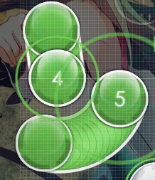
Been used since roughly 2008-ish, blanket sliders is very popular among every maps. Almost any map you played nowadays had at least some blanket sliders on it. Back then, blanket sliders are hard to make as we use Bezier Curve algorithm which draws slider parametrically in bezier slider points, thus every slider points decide how the curve will be drawn. Usually it took 3-4 sliderpoints to make good blanket sliders back then. Now, that mm201 had introduced the newly Circular Curve algorithm which draws slider circularly, it is way easier to draw blanket sliders as most blankets are curved in circular way, which only use up to 1 sliderpoints in the middle of the slider to make a perfect circular curve.
Here, I'm not going to explain how to make blanket sliders as it's just another simply curved slider which blanket things. I'm here just to point out the issues we commonly notice in blankets.
What's the problem?
Blanket perfection in every slider is somehow kind of hard to achieve, as most mappers just tend to blanket things as fast as possible. This is the most common problem in almost every map. As you can see below, these happens mostly because the mapper didn't really paid much attention to their blanket sliders as said earlier, they tend to blanket things as fast as possible.
Back then, with the Bezier Curve algorithm these are pretty forgivable as blankets are hard to make. But now, even with the new Circular Curve algorithm implemented it still didn't help much, as things would only work out if someone gave attention to it. Here, as most mappers tend to give less attention to their own blanket sliders, welp, even with the new slider algorithm their slider would still suck. This very simple mistake could lead to another problem such as bad spacing, wrong placements, ugly overlaps etc.
So how am I going to do it better?
Easiest way to draw good blanket is by blanketing the slider on to approach circles. Take a look at these.
Why? It is easier to wrap the blankets closely because the blanket will be way more precise. If you're making it good in close distance, then you could do the same on far distance too! Trust me, this always works. Just make sure you're doing it right.
Also, you noticed that blankets had spacing, just like other notes. Yep, they do. But you're wondering how should they be spaced? How far? As far as possible? Well, you're not the only one asking those questions. Most mappers with no knowledge of good blanket spacing would end up making good blanket sliders but they're badly spaced. Notice down here.
As you can see, all those have good blankets but as they're wrongly spaced, they looks bad now. The first blanket shows that the spacing between the (2)'s sliderhead is too close to the body of (1) slider compared to the spacing of the blankets. The second blanket is good but (3)'s blanket spacing is too close compared to the upper blanket. The third blanket had issues with slider design. Finally, the fourth blanket had different blanket spacing on how close (1) to (2) and (2) to (3).
How to solve? Easy. Just stick around with the usual spacing you put on the distance snapping. Take a look at these good spaced blanket sliders.
That's right, unified blanket spacing across the map is the way to go.
Anything else?
You would have noticed that some maps had blanket sliders that blanket sliders (recursive at its best B^) ), not blanket circles. Haven't seen one? Take a look.
These are also nice, yeah, but still to make them good you had to pay a lot of attention on the process. This kind of blanket sliders share the same way (and same problems too) with the usual blanket sliders. Anyways, there's still no official name for this kind of blanket sliders. They should share the same name with usual ones too then.
2. Sliderbows
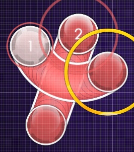
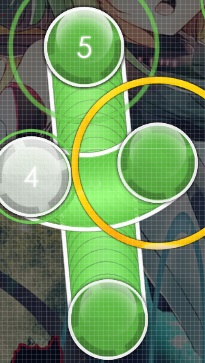
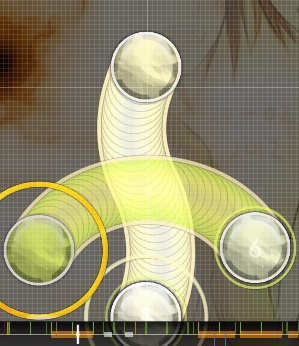
Basically; just a simple blanket slider with another slider (preferrably straight sliders) looping towards the blanket. Been used a lot since long time ago too, though not as old as blanket sliders.
It's pretty simple to make, as the steps to do so is just by making a blanket slider as the bow and a straight slider as the arrow, then arrange them into perfection. The only condition to follow is just one: don't let the arrow slider be shorter than the bow slider. It's just that simple.
What's the problem?
As I already stated earlier, the bow slider must be longer than the arrow slider. Maybe you asked, why? Usually, the arrow slider's tail got overlapped by the bow slider as the arrow slider is just shorter. Most of us seems to agree that this kind of overlap is considered bad, especially if the slidertail had a repeat and it got covered, oh oh. Problem is most people didn't really know about this, resulting in some pictures below.
The other problem is some sliderbows are not symmetric. This is more into mapper's preference though, as some asymmetric sliderbows are not that bad, so keep it in mind.
Oh well.
So how am I going to do it better?
Just follow the condition I've stated above. Don't let the arrow shorter than the bow, because in most cases there it would make an ugly overlap. Also, if you're wondering how to make sliderbows symmetrically, just make a x-y-symmetric wise sliderbow first then rotate it as you wish.
Another method possible is by aligning the arrow's center slidertick with the bow's center slidertick. That should actually do the trick too. Note that this would only work if tickrate you're using gave one tick at the center of each slider.
Anything else?
Sliderbows could also be composed by non-straight arrows sliders, and could also be composed of non-simply curved bow sliders. The bow slider could also be shorter than the arrow slider. Take a look.
After all, it's up to your creativity.
2. Sliderwaves
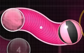


Another common slider yet also commonly problematic too. Consists of a slider with 2 curves (or maybe more), each curves alternating direction (up-down or left-right)
There are several methods on how to create sliderwaves, though.
Also some slightly similar methods that used in some maps.
What's the problem?
Just like blanket sliders, mappers tend to make sliderwaves as fast as possible without paying much attention on them. Some follows the methods above and some doesn't. Here lies ugly sliderwaves.
Also, don't you agree that sliderwaves look pretty imbalanced when drawn diagonally?
Here, it seems that sliderwaves are only good when they're facing left, right, up, or down only. They didn't really worked out in diagonal directions.
So how am I going to do it better?
Just follow the method above that fits you. Also notice that even sliderwaves rarely flow bad, the way they look or shaped should not be ignored. It's not that hard anyway! (-:
Anything else?
Some sliderwaves if long enough could be shaped into 8-shape or chain shape. Real long ones could even blanket things inside them. Take a look.
Note that those are possible for very long sliders, which is not so common. Still, they definitely worth a try though.
4. Sliderkinks

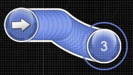
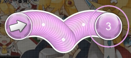

Common sliders with anchors on them that intends to change slider direction or track shape of the slider. Not really used that much compared to blanket sliders or sliderwaves, but still made a significant role in common sliders.
There are basically two types of common sliderkinks, they're gull-shaped kinks or L-shaped kinks and spoon-shaped kinks or gun-shaped kinks. Names are given due to their rough but close resemblance to each shape (or maybe I'm just simply suck at naming things B^) ). There are also non-common kinks shaped like a staff or a bench too, and probably some other. It's up to one mapper's creativity, after all!
Here I'm just going to explain the most common sliderkinks, gull-shape and spoon-shape and how to make them.
Also, notice that there's also some unwritten guidelines on how to make good sliderkinks. Again, keep in mind it's just an unwritten guideline which I'm not even sure anyone would follow but eh
Failure in following the guidelines (mostly no.2 and 3, but mostly 2) above usually results in a not-so-good sliderkinks such as shown below.
So how am I going to do it better?
Do it right and try to follow the provided guidelines. I'm not trying to force anything here, I'm just pointing out how to get better on mapping sliderkinks. It's not that hard anyway :^)
Straight sliders, yes. Shoo shoo curves.
1. Tight elbows
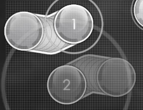
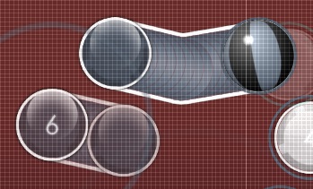
Very common among every mappers, especially those who prefer to map less curvy sliders. These works great in changing flow movements and directions as they're pretty straightforward. Making one is really easy, you don't even need to ask anyone on how to make it.
What's the problem?
When I said that making a tight elbow is really easy, however it doesn't apply when it comes to placing these tight elbows. It is not-so-widely known that arranging these sliders to look good is pretty hard. Welp, yes they actually do. Take a look at these.
So how am I going to do it better?
Don't worry, you could still place them nicely as long as you know how to place them right.
Also, if you think you're kinda short-minded about the shape, or where to put the elbow, the sliderkink guideline works pretty well here. With an addition about angle: it's better to limit elbow angle to not go below 90°, as most of tight elbows with less than 90° angle results in weird shapes.

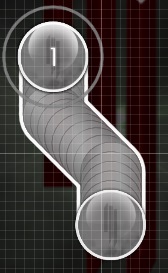
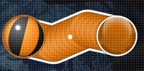
Straight counterpart of sliderwaves. Used way more common than regular sliderwaves due to the fact that these tight elbow sliderwaves are easier to made than those regular ones. Due to their common usage, they're also commonly problematic either.
What's the problem?
When one could make sliderwaves as fast as possible, it is very likely that one could make these tight elbow sliderwaves way faster. As you already know, one tends to make things less perfect when they make it as fast as they could. Proofs could be seen above, on other sliders, yep a lot.
Needless to say, the only problem is not much attention given on sliderwaves. Take a look at these imperfect, raw sliderwaves that mappers usually forget to recheck back when they're done.
Not quite good aren't they?
So how am I going to do it better?
Make one like you're making a regular sliderwave, draw it as proportional as it could. Less proportional tight elbow sliderwaves might work, but is kinda unlikely to be good. Use it on the right length, short sliders and pretty long sliders are not that good for tight elbow sliderwaves. The rest is just common sense.
Et cetera, et cetera. Those who didn't fit general curves nor straights. Might not be so common, but oh well, why not.
Wobble sliders


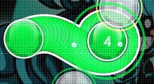
One word: wub. These sliders are pretty new, the first one ever might not even older than one year. The only reason this was here is because wobble sliders are just getting more common as more mappers mapped more dubstep maps.
Not only limited to be used on dubstep or drumstep maps, these could also be used everywhere as the wobble movement is just an emphasis made by the slider for certain parts of a song (on dubstep, usually the wobble part) thus making these kind of slider flexible to use on almost any fitting song (in a fitting part)
It is pretty hard to make one, yep. Creativity is your friend here, use it at it's best.
As there are no distinct method to make wobble sliders, I'm just going to put some pics of them along with how it was made. Well actually there are some basic sense of making wobble sliders, which is wobble it the way song wobbles, put wobbles right at the place. Usually, you put these when the wobble starts, hence the slider wobbles at the sliderhead.
Placeholder0
WIP, to be added:
Hello, I'm here because I feel that most maps nowadays had a lot of less-than-perfect slider designs. Most of them are caused by common problems: imperfect blankets, weird shapes, wrong sliderpoint placements, etc etc etc. These problems are very common that whenever I mod a map, I had to point out almost the same thing over and over to people, how to make this slider looks good, looks nice, etc. as it happens to most sliders on every maps I modded.
Yes I know there's already a guide about making delicious sliders, but since the first post is kinda outdated and the guide is not specifically made for the new slider algorithm (which developed just not so long time ago) and the guide is mostly about long-juicy-jumbo-delicous sliders and not specifically common sliders (what did I mean by common here is sliders you see everyday, you play everyday, you put everyday on mapping, such as simple blankets, waves, wiggles, etc), I'm here to help out.
Also, keep in mind that some issues here are pointed out mostly from my own perspective, in which not all people might be able to agree. I try to be as objective in my view as possible though. If you have any problems about it please don't hesitate to tell me about it.
Let's start right away.
General Curves
How to make curvy sliders and its descendants look neat. We're talking about simple general curves here, like sliders with no more than 3-5 sliderpoints or anchors.
1. Blanket sliders
Been used since roughly 2008-ish, blanket sliders is very popular among every maps. Almost any map you played nowadays had at least some blanket sliders on it. Back then, blanket sliders are hard to make as we use Bezier Curve algorithm which draws slider parametrically in bezier slider points, thus every slider points decide how the curve will be drawn. Usually it took 3-4 sliderpoints to make good blanket sliders back then. Now, that mm201 had introduced the newly Circular Curve algorithm which draws slider circularly, it is way easier to draw blanket sliders as most blankets are curved in circular way, which only use up to 1 sliderpoints in the middle of the slider to make a perfect circular curve.
Here, I'm not going to explain how to make blanket sliders as it's just another simply curved slider which blanket things. I'm here just to point out the issues we commonly notice in blankets.
What's the problem?
Blanket perfection in every slider is somehow kind of hard to achieve, as most mappers just tend to blanket things as fast as possible. This is the most common problem in almost every map. As you can see below, these happens mostly because the mapper didn't really paid much attention to their blanket sliders as said earlier, they tend to blanket things as fast as possible.
Back then, with the Bezier Curve algorithm these are pretty forgivable as blankets are hard to make. But now, even with the new Circular Curve algorithm implemented it still didn't help much, as things would only work out if someone gave attention to it. Here, as most mappers tend to give less attention to their own blanket sliders, welp, even with the new slider algorithm their slider would still suck. This very simple mistake could lead to another problem such as bad spacing, wrong placements, ugly overlaps etc.
So how am I going to do it better?
Easiest way to draw good blanket is by blanketing the slider on to approach circles. Take a look at these.
Why? It is easier to wrap the blankets closely because the blanket will be way more precise. If you're making it good in close distance, then you could do the same on far distance too! Trust me, this always works. Just make sure you're doing it right.
Also, you noticed that blankets had spacing, just like other notes. Yep, they do. But you're wondering how should they be spaced? How far? As far as possible? Well, you're not the only one asking those questions. Most mappers with no knowledge of good blanket spacing would end up making good blanket sliders but they're badly spaced. Notice down here.
As you can see, all those have good blankets but as they're wrongly spaced, they looks bad now. The first blanket shows that the spacing between the (2)'s sliderhead is too close to the body of (1) slider compared to the spacing of the blankets. The second blanket is good but (3)'s blanket spacing is too close compared to the upper blanket. The third blanket had issues with slider design. Finally, the fourth blanket had different blanket spacing on how close (1) to (2) and (2) to (3).
How to solve? Easy. Just stick around with the usual spacing you put on the distance snapping. Take a look at these good spaced blanket sliders.
That's right, unified blanket spacing across the map is the way to go.
Anything else?
You would have noticed that some maps had blanket sliders that blanket sliders (recursive at its best B^) ), not blanket circles. Haven't seen one? Take a look.
These are also nice, yeah, but still to make them good you had to pay a lot of attention on the process. This kind of blanket sliders share the same way (and same problems too) with the usual blanket sliders. Anyways, there's still no official name for this kind of blanket sliders. They should share the same name with usual ones too then.
- Some tips:
- Almost everything is blanket-able! Except spinners.
- It is possible to blanket a lot of things at once. You could blanket more than just a circle!
- Complex sliders = awesome. Complex sliders+blankets = SUPER awesome.
- Be careful that advanced or complex slider blankets will involve more than one sliderpoints, which will truncate the Circular Curve algorithm appliance on the slider and switch back to the Bezier Curve algorithm.
- If it's hard to blanket something because they're too far away on the timeline (they appear way later) don't be afraid to drag them closer on the timeline! You can always put it back later.
- Blankets could also be made from streams.
Gallery of blanket arts
on map Renard - Love Song; by Blue Dragon

on map Owl City - Dreams Don't turn to Dust; by SapphireGhost

on map Truxton - Sento Nel Core; by inverness

on map Juugoya Crisis - Kimi ni Aitai; by Niva
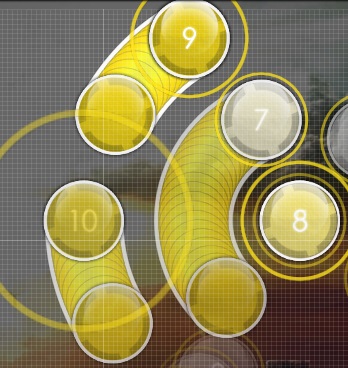
on map Renard - Da Nu Nuttah; by Blue Dragvon
on map Renard - Love Song; by Blue Dragon
on map Owl City - Dreams Don't turn to Dust; by SapphireGhost
on map Truxton - Sento Nel Core; by inverness
on map Juugoya Crisis - Kimi ni Aitai; by Niva
on map Renard - Da Nu Nuttah; by Blue Dragvon
2. Sliderbows
Basically; just a simple blanket slider with another slider (preferrably straight sliders) looping towards the blanket. Been used a lot since long time ago too, though not as old as blanket sliders.
It's pretty simple to make, as the steps to do so is just by making a blanket slider as the bow and a straight slider as the arrow, then arrange them into perfection. The only condition to follow is just one: don't let the arrow slider be shorter than the bow slider. It's just that simple.
What's the problem?
As I already stated earlier, the bow slider must be longer than the arrow slider. Maybe you asked, why? Usually, the arrow slider's tail got overlapped by the bow slider as the arrow slider is just shorter. Most of us seems to agree that this kind of overlap is considered bad, especially if the slidertail had a repeat and it got covered, oh oh. Problem is most people didn't really know about this, resulting in some pictures below.
The other problem is some sliderbows are not symmetric. This is more into mapper's preference though, as some asymmetric sliderbows are not that bad, so keep it in mind.
Oh well.
So how am I going to do it better?
Just follow the condition I've stated above. Don't let the arrow shorter than the bow, because in most cases there it would make an ugly overlap. Also, if you're wondering how to make sliderbows symmetrically, just make a x-y-symmetric wise sliderbow first then rotate it as you wish.
Another method possible is by aligning the arrow's center slidertick with the bow's center slidertick. That should actually do the trick too. Note that this would only work if tickrate you're using gave one tick at the center of each slider.
Anything else?
Sliderbows could also be composed by non-straight arrows sliders, and could also be composed of non-simply curved bow sliders. The bow slider could also be shorter than the arrow slider. Take a look.
After all, it's up to your creativity.
- Some tips:
- As it's also composed by a blanket slider, make sure to recheck the blanket, are they good?
- Sliderbows didn't really have to be close in timeline. You might understand if you look at this
Gallery of neat sliderbows
on map sasakure.UK - The Trash Heap Princess and ` ; by SapphireGhost
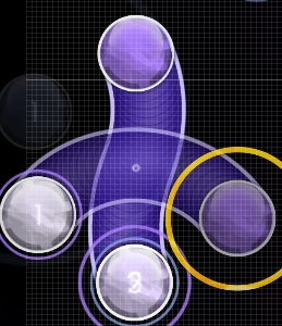
on map Ani feat. B - Ververg (ver. B); by Niva

on map Juugoya Crisis - Kimi ni Aitai; by Niva
on map sasakure.UK - The Trash Heap Princess and ` ; by SapphireGhost
on map Ani feat. B - Ververg (ver. B); by Niva
on map Juugoya Crisis - Kimi ni Aitai; by Niva
2. Sliderwaves
Another common slider yet also commonly problematic too. Consists of a slider with 2 curves (or maybe more), each curves alternating direction (up-down or left-right)
There are several methods on how to create sliderwaves, though.
Method I: Simplest way (or also known as the ϟimplest way)

All you need to do is to draw a proportional ϟ shape with the sliderpoints (notice picture above). Make sure the slidertick (if there are any) is positioned in the center of the ϟ to maintain perfect symmetry. Some rearrangements here and there and it's done. Simple.
Although, if you're looking for blanket-able sliderwave shape, this might be hard to achieve as it's pretty hard to control the sliderpoints to draw the blankets.
Method II: Advanced way

A very hard method to learn to, but is considered the most working method in creating sliderwaves. You need to draw sliderpoints like drawn in above picture, preferably proportionally. You could either draw the way like left picture or right picture. Again, in order to maintain symmetry make sure the center sliderpoints are on top of the center slidertick (or if there are no center slidertick, proportionally put it between two sliderticks)
Also considered as the better method if you're working on blanket-able sliderwaves. It is way easier to control the blankets as the sliderpoints are right on their curves, unlike the simpler way that just stated above this method.
Notably known on Niva's maps back then.
Method III: Yoeri™
All you need to do is to draw the sliderpoints the way it's drawn above. For more info, check out this video.
Notably popularized by Yoeri and also mostly known on Yoeri's maps.
All you need to do is to draw the sliderpoints the way it's drawn above. For more info, check out this video.
Notably popularized by Yoeri and also mostly known on Yoeri's maps.
Also some slightly similar methods that used in some maps.
What's the problem?
Just like blanket sliders, mappers tend to make sliderwaves as fast as possible without paying much attention on them. Some follows the methods above and some doesn't. Here lies ugly sliderwaves.
Also, don't you agree that sliderwaves look pretty imbalanced when drawn diagonally?
Here, it seems that sliderwaves are only good when they're facing left, right, up, or down only. They didn't really worked out in diagonal directions.
So how am I going to do it better?
Just follow the method above that fits you. Also notice that even sliderwaves rarely flow bad, the way they look or shaped should not be ignored. It's not that hard anyway! (-:
Anything else?
Some sliderwaves if long enough could be shaped into 8-shape or chain shape. Real long ones could even blanket things inside them. Take a look.
Note that those are possible for very long sliders, which is not so common. Still, they definitely worth a try though.
- Some tips:
- Proportional sliderpoints placement is not always the answer. Sometimes sliderwaves could also worked out without proportional sliderpoints placement.
- Blanket-able sliderwaves is way better than non-blanket-able ones. You wouldn't know how far you could experiment with these blankets!
- Sliderwaves are best used not so short, not too long. Usually 1/1 length would do the trick.
- You could make sliderwaves with more waves! Make sure you use the advanced sliderwave method though.
Gallery of nice sliderwaves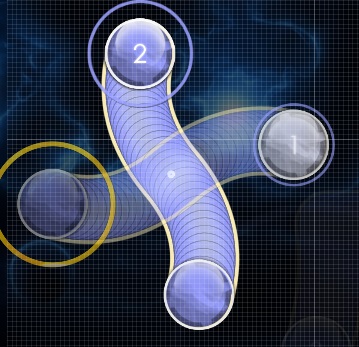
on map Juugoya Crisis - Kimi ni Aitai; by Niva

on map Stan SB - Stratosphere; by inverness (unsubmitted)

on map Hujuniseikoyuu-P - Talent Shredder; by Lesjuh
on map Juugoya Crisis - Kimi ni Aitai; by Niva
on map Stan SB - Stratosphere; by inverness (unsubmitted)
on map Hujuniseikoyuu-P - Talent Shredder; by Lesjuh
4. Sliderkinks
Common sliders with anchors on them that intends to change slider direction or track shape of the slider. Not really used that much compared to blanket sliders or sliderwaves, but still made a significant role in common sliders.
There are basically two types of common sliderkinks, they're gull-shaped kinks or L-shaped kinks and spoon-shaped kinks or gun-shaped kinks. Names are given due to their rough but close resemblance to each shape (or maybe I'm just simply suck at naming things B^) ). There are also non-common kinks shaped like a staff or a bench too, and probably some other. It's up to one mapper's creativity, after all!
Here I'm just going to explain the most common sliderkinks, gull-shape and spoon-shape and how to make them.
Gull-shaped (or L-shaped)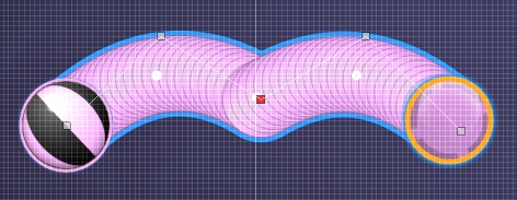

Notice their close resemblance to the shape of a seagull and L letter? :^)
To make one, just simply start drawing the sliderpoints similar to the way you draw advanced sliderwaves points, but this time facing up-up or down-down (or left/right, up to you) instead of alternating them. If you want to maintain symmetry, make sure the red anchor is on top of the center slider tick, or between two sliderticks proportionally. Simple.
Usually, the longer the slider, the easier to draw, but also harder to make it perfect. Just make sure not to make it very long though, as these are just basic shape that usually looks uglier the longer they are. Well up to one mapper's preference tho.
Spoon-shaped (or gun-shaped)


I'm not even sure that's called "gun-shaped". Well I suck at naming anyways.
Mostly drawn by alternating curves and straights (or just alternating curve directions). Would look way nicer if the kink is placed right on top of the center slidertick.
Not really good for very long sliders though.
I'm not even sure that's called "gun-shaped". Well I suck at naming anyways.
Mostly drawn by alternating curves and straights (or just alternating curve directions). Would look way nicer if the kink is placed right on top of the center slidertick.
Not really good for very long sliders though.
Complex shaped
Rely on your creativity (-:
Yeah because there's a lot of complex shaped sliderkinks out there, you could even hardly list them (as they're so much, so diverse). Very good to apply on long sliders, because the longer the slider the more place to put kinks.
Don't have good creativity? Make sure you visit the sliderkinks gallery to get some inspiration B^)
Also, notice that there's also some unwritten guidelines on how to make good sliderkinks. Again, keep in mind it's just an unwritten guideline which I'm not even sure anyone would follow but eh
- Gull-shaped sliderkinks are best used symmetrically proportional.
- Place kinks right on timeline, place them on half beats or place them on 3/4 beats. Kinks not placed in right beat makes no sense. [url]Example:[/url] Notice how the kink lands on beat and properly covered by the sliderball, resulting smooth bounce onto the right direction.
- Kinks should also be placed not-too-close to the sliderhead or slidertail.
- Watch out for ugly curves and wrong directions too.
Failure in following the guidelines (mostly no.2 and 3, but mostly 2) above usually results in a not-so-good sliderkinks such as shown below.
SPOILER
Asymmetric sliderkink placed in symmetric way. Not matching aren't they?

The kink doesn't land anywhere, thus making no sense. You would notice how the sliderball would bounce not on beats.
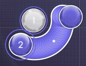
The kink is way too close to the slidertail.
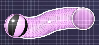

Bad curves. Now it looks more like a failed sliderwave. Right picture shows wrong direction that leads to a not-so-good sliderkink.
Asymmetric sliderkink placed in symmetric way. Not matching aren't they?
The kink doesn't land anywhere, thus making no sense. You would notice how the sliderball would bounce not on beats.
The kink is way too close to the slidertail.
Bad curves. Now it looks more like a failed sliderwave. Right picture shows wrong direction that leads to a not-so-good sliderkink.
So how am I going to do it better?
Do it right and try to follow the provided guidelines. I'm not trying to force anything here, I'm just pointing out how to get better on mapping sliderkinks. It's not that hard anyway :^)
- Some tips:
- Sliderkinks are very potential for blankets too.
- There are far more kinds of kinks you might discover out there, who knows? Or maybe you could even make your own unique kinks!
- Could be mixed up for and with sliderbows and sliderwaves as well.
Gallery of beautiful sliderkinks
on map Ani feat. B - Ververg; by Niva
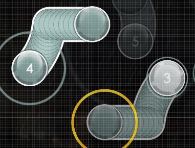
on map Truxton - Sento Nel Core; by inverness
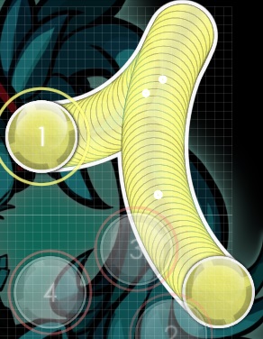
on map Hujuniseikoyuu-P - Talent Shredder; by Lesjuh

on map Masashi Hamauzu - Hope Given; by cheesiest (unsubmitted)

on map Renard - Da Nu Nuttah; by Blue Dragon

on map Truxton - Bitch Clap; by vipto
on map Ani feat. B - Ververg; by Niva
on map Truxton - Sento Nel Core; by inverness
on map Hujuniseikoyuu-P - Talent Shredder; by Lesjuh
on map Masashi Hamauzu - Hope Given; by cheesiest (unsubmitted)
on map Renard - Da Nu Nuttah; by Blue Dragon
on map Truxton - Bitch Clap; by vipto
Complex ones
Click on each picture to see how the sliderpoints are drawn

on map Truxton - Bitch Clap; by vipto
Tip: vipto's Bitch Clap map had lots of badass sliderkinks. Make sure you check it out for more.

on map DJ Murasame vs DJ killer - SHADE; by Niva

on map Masashi Hamauzu - Hope Given; by cheesiest (unsubmitted)'
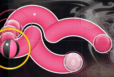
on map Masashi Hamauzu - Hope Given; by cheesiest (unsubmitted)
on map Truxton - Bitch Clap; by vipto
Tip: vipto's Bitch Clap map had lots of badass sliderkinks. Make sure you check it out for more.
on map DJ Murasame vs DJ killer - SHADE; by Niva
on map Masashi Hamauzu - Hope Given; by cheesiest (unsubmitted)'
on map Masashi Hamauzu - Hope Given; by cheesiest (unsubmitted)
General Straight
Straight sliders, yes. Shoo shoo curves.
1. Tight elbows
Very common among every mappers, especially those who prefer to map less curvy sliders. These works great in changing flow movements and directions as they're pretty straightforward. Making one is really easy, you don't even need to ask anyone on how to make it.
What's the problem?
When I said that making a tight elbow is really easy, however it doesn't apply when it comes to placing these tight elbows. It is not-so-widely known that arranging these sliders to look good is pretty hard. Welp, yes they actually do. Take a look at these.
So how am I going to do it better?
Don't worry, you could still place them nicely as long as you know how to place them right.
Parallel them?

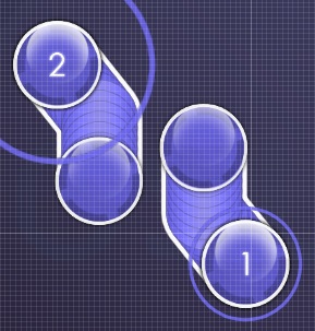

Works everytime. Just place them in the way the tracks are aligned parallel proportionally.
Works everytime. Just place them in the way the tracks are aligned parallel proportionally.
Peel motion placement?
Nice one right here.
Nice one right here.
Windmill them?

Further experimentation on peel motion placement, also works as well. Rotate tool and Ctrl+> is your friend here.
Further experimentation on peel motion placement, also works as well. Rotate tool and Ctrl+> is your friend here.
Also, if you think you're kinda short-minded about the shape, or where to put the elbow, the sliderkink guideline works pretty well here. With an addition about angle: it's better to limit elbow angle to not go below 90°, as most of tight elbows with less than 90° angle results in weird shapes.
- Some tips:
- Best used few. Tight elbows never beat curve sliders, except you're not into curve sliders (prefers to work with straight sliders)
- Not really good when used in longer sliders.
Straight counterpart of sliderwaves. Used way more common than regular sliderwaves due to the fact that these tight elbow sliderwaves are easier to made than those regular ones. Due to their common usage, they're also commonly problematic either.
What's the problem?
When one could make sliderwaves as fast as possible, it is very likely that one could make these tight elbow sliderwaves way faster. As you already know, one tends to make things less perfect when they make it as fast as they could. Proofs could be seen above, on other sliders, yep a lot.
Needless to say, the only problem is not much attention given on sliderwaves. Take a look at these imperfect, raw sliderwaves that mappers usually forget to recheck back when they're done.
Not quite good aren't they?
So how am I going to do it better?
Make one like you're making a regular sliderwave, draw it as proportional as it could. Less proportional tight elbow sliderwaves might work, but is kinda unlikely to be good. Use it on the right length, short sliders and pretty long sliders are not that good for tight elbow sliderwaves. The rest is just common sense.
- Some tips:
- Just like tight elbows, use these sparingly. It doesn't beat nice regular sliderwaves anyway.
- Some guidelines on sliderkinks could also be applied here. Just experiment with those, you would never know what you would achieve later!
- Yeah, it is also possible to put more waves.
Miscellanous
Et cetera, et cetera. Those who didn't fit general curves nor straights. Might not be so common, but oh well, why not.
Wobble sliders
One word: wub. These sliders are pretty new, the first one ever might not even older than one year. The only reason this was here is because wobble sliders are just getting more common as more mappers mapped more dubstep maps.
Not only limited to be used on dubstep or drumstep maps, these could also be used everywhere as the wobble movement is just an emphasis made by the slider for certain parts of a song (on dubstep, usually the wobble part) thus making these kind of slider flexible to use on almost any fitting song (in a fitting part)
It is pretty hard to make one, yep. Creativity is your friend here, use it at it's best.
As there are no distinct method to make wobble sliders, I'm just going to put some pics of them along with how it was made. Well actually there are some basic sense of making wobble sliders, which is wobble it the way song wobbles, put wobbles right at the place. Usually, you put these when the wobble starts, hence the slider wobbles at the sliderhead.
Simple wob
Click on each picture to see how the sliderpoints are drawn
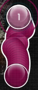
on map Zomboy - Mind Control; by inverness

on map Zomboy - Mind Control; by inverness
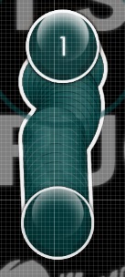
on map Zomboy - Mind Control; by inverness
Tip: My Mind Control map had a lot of wobble sliders. Make sure you check it out for more.

on map Skrillex - Imma try it Out; by Foreverends

on map Skrillex - Imma try it Out; by Foreverends
Tip: Ends' Imma try it out map also had a lot of wobble sliders. Make sure you check it out for more.

on map Savant - Bad Baws; by Zero__wind

on map Avril Lavigne - Hello Kitty; by Irreversible
on map Zomboy - Mind Control; by inverness
on map Zomboy - Mind Control; by inverness
on map Zomboy - Mind Control; by inverness
Tip: My Mind Control map had a lot of wobble sliders. Make sure you check it out for more.
on map Skrillex - Imma try it Out; by Foreverends
on map Skrillex - Imma try it Out; by Foreverends
Tip: Ends' Imma try it out map also had a lot of wobble sliders. Make sure you check it out for more.
on map Savant - Bad Baws; by Zero__wind
on map Avril Lavigne - Hello Kitty; by Irreversible
Wobber wob
Complex version of wobble sliders.
Click on each picture to see how the sliderpoints are drawn

on map Skrillex - Imma try it Out; by Foreverends

on map Skrillex - Imma try it Out; by Foreverends

on map HujuniseikoyuuP - Talent Shredder; by Ayu (unsubmitted)

on map Sota Fujimori - WOBBLE IMPACT; by fanzhen0019

on map Ebico & jioyi - Slit; by Foreverends
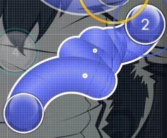
on map Truxton - Bitch Clap; by vipto
Click on each picture to see how the sliderpoints are drawn
on map Skrillex - Imma try it Out; by Foreverends
on map Skrillex - Imma try it Out; by Foreverends
on map HujuniseikoyuuP - Talent Shredder; by Ayu (unsubmitted)
on map Sota Fujimori - WOBBLE IMPACT; by fanzhen0019
on map Ebico & jioyi - Slit; by Foreverends
on map Truxton - Bitch Clap; by vipto
Placeholder0
- Some tips:
- Placeholder1
Changelog
- May 13, 2014 - Initial release
- May 14, 2014 - First update, added straight sliders section and wobble sliders section
- May 24, 2014 - Added examples on wobble sliders and some formatting edit
- June 21, 2014 - Content wording edit
WIP, to be added:
- More examples on gallery (sorry for such few examples, I didn't have that much maps )-: )
- Editing & formatting here and there
- A lot of things, more to come!
- Sure, you guys could help with anything. I'd be thankful!