Someone have a anime wallpaper with 4 girls and 1 boy? It's for a collab
Not nisekoi please
Not nisekoi please
These are actually really beautiful. Good job!a1l2d3r4e5d6 wrote:
More attempts at the circular avatars that I'm planning to add to my GFX emporium. :p
Standard and text-spaced version (text-spaced, not sure if I'll keep it.)
Of course, the colours would change to match the image that would be used with it.
I also need to look for some patterns to use, but I'm having a hard time looking for decent ones. :c
Fourth wrote:
<3 it and your edits keep getting better and better ovo <3Wall-ed wrote:
hmmm i was change my thread banner :3
amazing work as usual <3Wall-ed wrote:
i finally did it \o/
the image edges are sorta pixelated, you might wanna fix thatNelly wrote:
coooooolLukaXGAMErs wrote:
Another experiment (- K a t h - gave me video tutorials and stuff. Thanks~
lmaoLigerZero wrote:
After have married your waifu
really nice omg <3333LukaXGAMErs wrote:
Another GIF that I experiment.
Aww thank you saki-ryusakihatsue- wrote:
coooooolLukaXGAMErs wrote:
Another experiment (- K a t h - gave me video tutorials and stuff. Thanks~really nice omg <3333LukaXGAMErs wrote:
Another GIF that I experiment.
❤️❤️OMFG. OMFG.LukaXGAMErs wrote:
Another experiment (Song: ZICO - I am you, you are me. It's a nice song!) it might take awhile to load.. and I can't use this sig because it has too many frames T^T
ahaha thanks to you sensei!! huehuehuehuehue HUEHUEHUE GWAPO NIYA DBA???( ͡° ͜ʖ ͡°)- K a t h - wrote:
OMFG. OMFG.LukaXGAMErs wrote:
Another experiment (Song: ZICO - I am you, you are me. It's a nice song!) it might take awhile to load.. and I can't use this sig because it has too many frames T^T
whoa that perfect :3SSShaymin wrote:
wips...?SPOILER
This is better than five rounds of background building... right? Also tried working with gifs after almost a year. This was just a small trial to see how much my gif making skills have rusted before I flubb up on actual sigs. Sorry to anyone I've offended by making these.
Nah, the sig where it is at the moment is far from perfect. It still has a ways to go before I think I'm really done with it (although apparently my background building says otherwise). But thank you anyway. : >Wall-ed wrote:
whoa that perfect :3
i want add animated thing to in my avatar but that make it quality drop,and i must reduce it size max 88kb -_-
Kyaaa that's pretty Nila~ >//<Nila-chan wrote:
Interesting!Nila-chan wrote:
- K a t h - wrote:
Kyaaa that's pretty Nila~ >//<Nila-chan wrote:
thanks c:Shizuku- wrote:
Interesting!Nila-chan wrote:
Luxikuma wrote:
still kinda new so i started on avatars :3
Ah man, these look nice! This is a good start, but you might wanna downsize your avatars a bit more. Actually the size for these avatars are fine, it's just that avatars are supposed to be small. Keep that in mind.Luxikuma wrote:
still kinda new so i started on avatars :3
thank you! ^^LukaXGAMErs wrote:
Luxikuma wrote:
still kinda new so i started on avatars :3
Nice! Keep up the great work
Thank you! Also yeah, I have the 128 versions of these avatars, I just wanted to post these so the details are much clearer! ^-^SSShaymin wrote:
Ah man, these look nice! This is a good start, but you might wanna downsize your avatars a bit more. Actually the size for these avatars are fine, it's just that avatars are supposed to be small. Keep that in mind.Luxikuma wrote:
still kinda new so i started on avatars :3


..! Your avatars are really cute, especially your text! You won't get much of anywhere just blurring pictures, though. Try practicing renders on smaller canvas like 350 x 150 and go from there. I can't work with plain old images myself, but that doesn't mean I can't try. All it takes it practice. And a bit of resource hunting and finding tutorials. Those too.Shiv wrote:
idk if this counted as GFX too ;-;, im just making this to fill my timebanner
srsly i dont know how to make effect properly ;w;
if someone can teach me, i'd be grateful
i cant deal with big canvas and rendered image, so i cant make a wallpaper properly ;w;
!!! Okay, your first piece is probably your best one of the bunch. The lighting is good (for what little it's supposed to be, anyway), the flow is lovely, and your text doesn't stand out so much that it draws away from the focal, yet stands out on its own. It suffers from a lack of color and depth, though.Deadly wrote:
probably my proudest things i've made so far heH.... huge images, sorry ><"(don't mind the watermark it was on my personal profolio/old website ;w;)
Thank you for the advice.SSShaymin wrote:
..! Your avatars are really cute, especially your text! You won't get much of anywhere just blurring pictures, though. Try practicing renders on smaller canvas like 350 x 150 and go from there. I can't work with plain old images myself, but that doesn't mean I can't try. All it takes it practice. And a bit of resource hunting and finding tutorials. Those too.
I hope i can be better at this thing someday.both of them looks cool xDAlmaz wrote:
Did a new header-thingy for my GFX thread today, and I'm pretty proud of it ^^
Raisha Millenia wrote:
Looks good! How do you do the border on that?Shiv wrote:
Hey, i made a new banner for my friend. Let me know your opinion guys
im using stroke options on the shape selectionAlmaz wrote:
Looks good! How do you do the border on that?Shiv wrote:
Hey, i made a new banner for my friend. Let me know your opinion guys
Ahh, I don't think I have that in my photoshop (CS2 ahaha)Shiv wrote:
im using stroke options on the shape selection
don't add a border to it maybe??Shiv wrote:
srsly how to make a good avatar using rendered image ;w;
yes, i delete the border tho. it doesnt look good in game :vAomi wrote:
don't add a border to it maybe??
it's pointless :v
Almaz wrote:
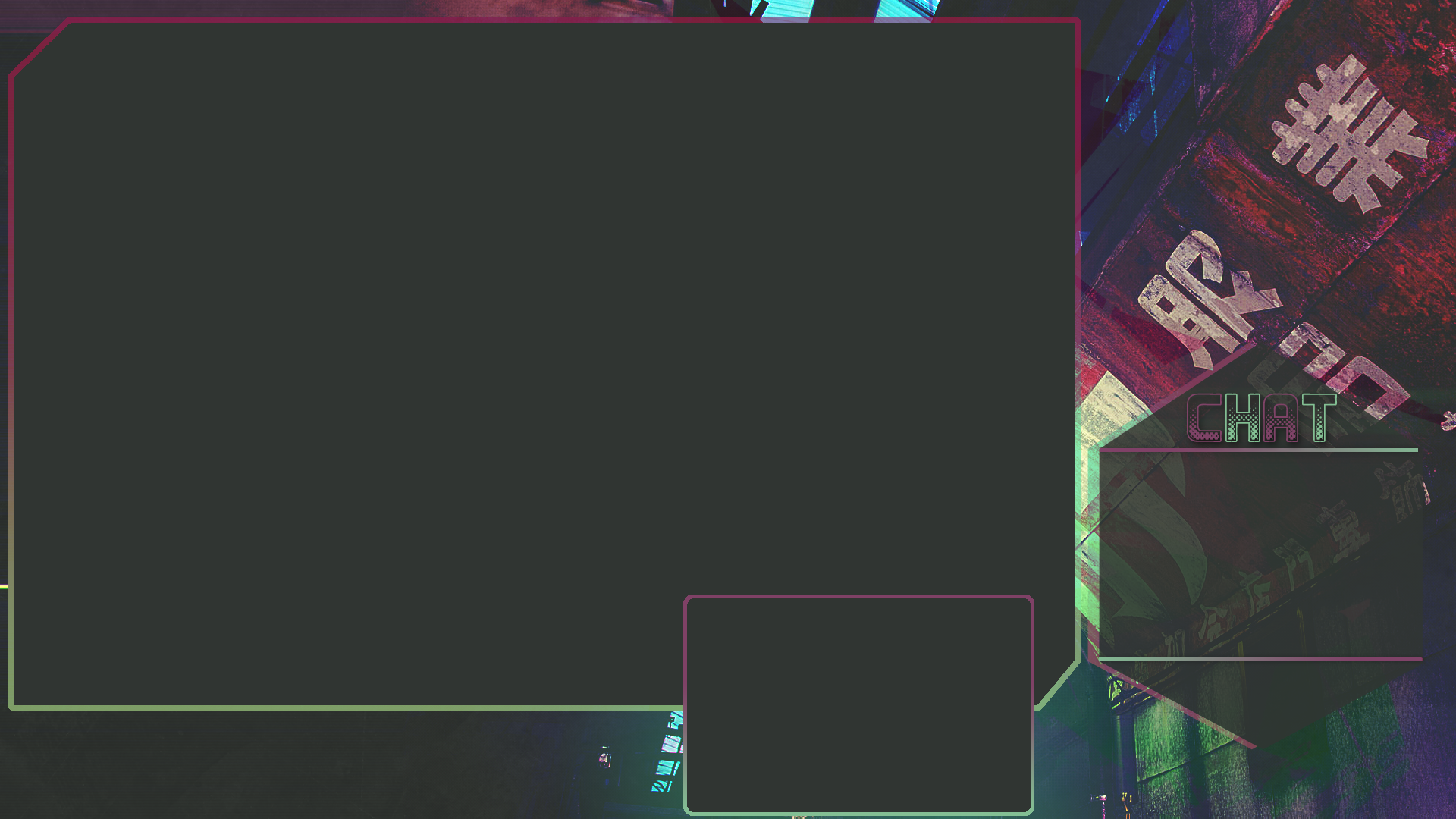
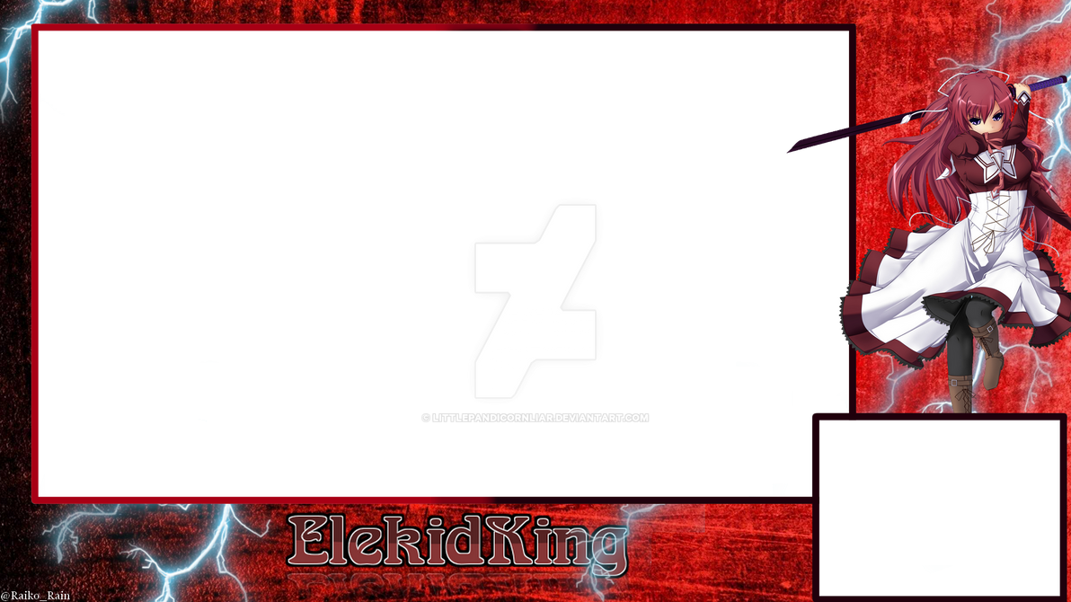
I made this yesterday, plan to get streaming some time soon. Feel free to tell me what you think, and how I can improve ^^
Thank you for your input!ReachingHavoc wrote:
Assuming this is an Osu! stream.
I think the background could be animated if you got the skill to do so. If there's one thing I've learned from Osu! streams is that every single one of them is the same in terms of an overlay. Kutsuu is pretty much the only one who has a moving one and to me that's eye candy. Other than that it's a very nice and smooth overlay.
Your text doesn't really fit the image well at the moment, due to the outer glow and the text colour clashing, which makes it less appealing, in my opinion. Try experimenting and see what looks good. (:Jonawaga wrote:
How do I make my banners less ugly? Any suggestions welcome.