forum

UPLIFT SPICE - Omega Rhythm

posted
Total Posts
38
Topic Starter
kajiyatta
This beatmap was submitted using in-game submission on 2014年5月10日 at 23:23:01

Artist: UPLIFT SPICE
Title: Omega Rhythm
BPM: 173
Filesize: 5360kb
Play Time: 02:57
Difficulties Available:
  1. Easy (2.27 stars, 166 notes)
  2. Hard (4.96 stars, 473 notes)
  3. Insane (5 stars, 725 notes)
  4. Normal (4.05 stars, 240 notes)
Download: UPLIFT SPICE - Omega Rhythm
Information: Scores/Beatmap Listing
---------------
#19
- Melody
M4M ♥

: Must fix
: Suggestion


General ;

Set Preview Point to 00:40:035 ?


Easy ;

02:11:249 (4) - Move to 324//192 to make it symmetrical?
02:22:001 (2) - Whistle?
01:03:619 (1) - Move it to another place? It's maybe confusing for beginners when the Spinner Circle overlaps with the Approach Circle.


Normal ;

02:33:099 (4) - Add Clap? It sounds good for me.
02:51:481 (3) - Add Finish?
01:36:914 (1) - ^
01:37:608 (3) - ^
01:48:012 - ^
01:48:706 - ^


Hard ;

00:01:192 (1,2,3,4) - Add Finish only at the end of the Sliders.
00:16:105 (4,5,6,7) - Make a square? Example.


Good Luck ♥
Topic Starter
kajiyatta

- Melody wrote:

M4M ♥

: Must fix
: Suggestion


General ;

Set Preview Point to 00:40:035 ? Current is fine and athers did so.


Easy ;

02:11:249 (4) - Move to 324//192 to make it symmetrical?
02:22:001 (2) - Whistle? For pattern, no added.
01:03:619 (1) - Move it to another place? It's maybe confusing for beginners when the Spinner Circle overlaps with the Approach Circle. If someone tells me same suggestion, I'll fix.


Normal ;

02:33:099 (4) - Add Clap? It sounds good for me.
02:51:481 (3) - Add Finish?
01:36:914 (1) - ^
01:37:608 (3) - ^
01:48:012 - ^
01:48:706 - ^
Some added but I don't like to use finish much.


Hard ;

00:01:192 (1,2,3,4) - Add Finish only at the end of the Sliders. No, it is calm part.
00:16:105 (4,5,6,7) - Make a square? Sorry, it's intensional. Example.


Good Luck ♥
No comment = fixed
Thanks for modding.
[ infL ]
m4m ありがとう ^^
役に立つかどうかわからないけどやってみました。

Easy
  1. 01:14:718 (1) - This way looks better:
  2. 01:22:694 (2) - Maybe move to 01:23:041 and move slider across
Hard
  1. 00:32:926 (6) - add whistle and clap
  2. 00:38:648 (7) - Fix this DS so its same as 3,4,5,6
  3. 01:29:978 (6) - You can change
    From this:

    To:
  4. 02:55:989 (1, 2, 3, 4) - You can change to this:
    From:

    To:

Insane

  1. 00:28:850 (13) - Add clap
  2. 00:33:619 (9) - ^
  3. 01:29:457 (6) - ^
  4. 02:51:827 (3) - Remove nc
  5. 02:53:215 (1) - add nc
Topic Starter
kajiyatta
miss post
Topic Starter
kajiyatta

[ infL ] wrote:

m4m ありがとう ^^
役に立つかどうかわからないけどやってみました。

Easy
  1. 01:14:718 (1) - This way looks better:
  2. 01:22:694 (2) - Maybe move to 01:23:041 and move slider across No, current seem fine for me.
Hard
  1. 00:32:926 (6) - add whistle and clap
  2. 00:38:648 (7) - Fix this DS so its same as 3,4,5,6
  3. 01:29:978 (6) - You can change
    From this:

    To:
  4. 02:55:989 (1, 2, 3, 4) - You can change to this:
    From:

    To:
Sorry no changed all ;w;


Insane

  1. 00:28:850 (13) - Add clap
  2. 00:33:619 (9) - ^ Intensinal, it's no sound here.
  3. 01:29:457 (6) - ^ ^
  4. 02:51:827 (3) - Remove nc KIAI ended at here, so it's neccesarry.
  5. 02:53:215 (1) - add nc For pattern, I don't add NC here.
No comment = fixed
Thanks for modding.
smallboat
star~ :idea:
Satellite
Hai~

[General]
AudioLeadIn: 0は曲がいきなりはじまるので500か1000にしてみては如何でしょうか

[Easy]
とても綺麗なEasyでした

[Normal]
指摘する箇所がありません :(
Good Diffです :)

1つきになる?ところとしては 02:57:030 - ここの部分は最後の 02:57:290 - ここまで
NormalならSliderを引いてもいいかなーと思いました。


[Hard]
00:13:677 (5) - 00:14:197 (6) - こちらの反転したものを使ってみては~
00:37:955 (3,4,5,6,7) - 曲調にはfitしてると思うのですがHardでは少し難しいかもしれません
01:11:596 (9) - 00:11:943 (8) - 同じ曲調なのでどちらか、どちらにDSをあわせてみては
01:40:902 (4) - 01:41:076 (5) - ここの頭の対称の位置である x200 y28はどうでしょう

[Insane]
00:45:238 (11,12) - 私ならここの配置をCtrl+Gして逆にします~
00:49:053 (3) - SamplesetのDrumを使ってclapのみで音入れしてみてください~
00:52:348 (6) - 流れ的には星型を崩して 00:52:001 (4) - こちらにスタックしたほうが綺麗だと思います
00:56:683 (1,2,3,4,5) - 試してみてください、後ろの配置はそのままなので気に入って頂けたら調整してください
164,372,56683,6,0,B|56:372|24:268,1,190,2|10,0:0|0:0,0:0:0:0:
60,164,57203,1,0,0:0:0:0:
219,260,57376,2,0,B|172:284|128:260,1,95,10|0,0:0|0:0,0:0:0:0:
124,76,57723,2,0,B|168:52|215:75,1,95,2|0,0:0|0:0,0:0:0:0:
460,164,58070,2,0,B|364:112|280:164,1,190,2|10,0:0|0:0,0:0:0:0:

とても難易度バランスが整っているMapsetだと思いました :)
Rankedまで期待してます
 (/・ω・)/
Topic Starter
kajiyatta

Satellite wrote:

Hai~

[General]
AudioLeadIn: 0は曲がいきなりはじまるので500か1000にしてみては如何でしょうか

[Easy]
とても綺麗なEasyでした

[Normal]
指摘する箇所がありません :(
Good Diffです :)

1つきになる?ところとしては 02:57:030 - ここの部分は最後の 02:57:290 - ここまで
NormalならSliderを引いてもいいかなーと思いました。 やっぱり聞こえが悪くなるのでこのままで


[Hard]
00:13:677 (5) - 00:14:197 (6) - こちらの反転したものを使ってみては~
00:37:955 (3,4,5,6,7) - 曲調にはfitしてると思うのですがHardでは少し難しいかもしれません 同様の指摘を受けたら変更します
01:11:596 (9) - 00:11:943 (8) - 同じ曲調なのでどちらか、どちらにDSをあわせてみては 前者と後者では曲調の盛り上がりが違うので、多少違うように配置しても問題ないかなと思います
01:40:902 (4) - 01:41:076 (5) - ここの頭の対称の位置である x200 y28はどうでしょう

[Insane]
00:45:238 (11,12) - 私ならここの配置をCtrl+Gして逆にします~
00:49:053 (3) - SamplesetのDrumを使ってclapのみで音入れしてみてください~
00:52:348 (6) - 流れ的には星型を崩して 00:52:001 (4) - こちらにスタックしたほうが綺麗だと思います
00:56:683 (1,2,3,4,5) - 試してみてください、後ろの配置はそのままなので気に入って頂けたら調整してください
164,372,56683,6,0,B|56:372|24:268,1,190,2|10,0:0|0:0,0:0:0:0:
60,164,57203,1,0,0:0:0:0:
219,260,57376,2,0,B|172:284|128:260,1,95,10|0,0:0|0:0,0:0:0:0:
124,76,57723,2,0,B|168:52|215:75,1,95,2|0,0:0|0:0,0:0:0:0:
460,164,58070,2,0,B|364:112|280:164,1,190,2|10,0:0|0:0,0:0:0:0:

とても難易度バランスが整っているMapsetだと思いました :)
Rankedまで期待してます
 (/・ω・)/
書いてないところは全て修正しました
Moddingありがとうございました 
Guy
Hi! for m4m :3

Red : You must be fix.
Blue : You should be fix.
Black : Just suggestion.


[General]
  1. Widescreen supportのチェックを外しましょう。

[Insane]
  1. 00:01:192 (1) - ここCtrl+Gした方がかなり流れ良くなって叩きやすいです。
  2. 01:23:388 (2) - 01:23:561 - ここにAdd drum clap
  3. 01:23:735 (3) - ^
  4. 01:24:428 (1) - drum clap
  5. 01:24:949 (7) - ^
  6. 01:25:469 (5) - sampleset drumのclapに変更
  7. 01:28:764 (2) - 流れ的に真横にAIMするのはあまり気持ちよくないので少し下の方に移動してみてはどうでしょう
  8. 01:40:902 (9) - ここにもdrum clap入りそうです
  9. 01:41:943 (5) - ^
  10. 01:54:255 (1) - 終端にもclap入れましょう
  11. 02:51:481 (2) - drum finishの方が合うかも?

[Hard]
  1. 00:16:452 (6) - note多めでspacingが変わってる配置なのでこの辺でNCしておいた方が読みやすいかもしれません。
  2. 00:32:926 (6) - stackするにしても不自然な位置だったのでx172 y260へ移動?
  3. 00:38:648 (7) - ここも一定のspacingで来ていて急に大きく変わるのでNCした方が良いかと
  4. 01:24:428 (5) - もう少し前のnoteに近づけた方がいいかもです。せめて2.00xくらい?

[Normal]
  1. 01:16:105 (3) - 始端にwhistle忘れ?
  2. 01:34:139 (1) - 細かいですがもう少し綺麗なブランケットにしてみては?

[Easy]
  1. Easyにももっとwhistleを入れてみてはどうでしょう? tickにもclap入ってるしNormalと同じような音付けが出来ると思いました。
  2. 02:54:602 (1,3) - 2の直線上にくるようにして流れをよくしましょう。
頑張ってください :)
Topic Starter
kajiyatta

Guy wrote:

Hi! for m4m :3

Red : You must be fix.
Blue : You should be fix.
Black : Just suggestion.


[General]
  1. Widescreen supportのチェックを外しましょう。

[Insane]
  1. 00:01:192 (1) - ここCtrl+Gした方がかなり流れ良くなって叩きやすいです。
  2. 01:23:388 (2) - 01:23:561 - ここにAdd drum clap
  3. 01:23:735 (3) - ^
  4. 01:24:428 (1) - drum clap
  5. 01:24:949 (7) - ^
  6. 01:25:469 (5) - sampleset drumのclapに変更
  7. 01:28:764 (2) - 流れ的に真横にAIMするのはあまり気持ちよくないので少し下の方に移動してみてはどうでしょう
  8. 01:40:902 (9) - ここにもdrum clap入りそうです
  9. 01:41:943 (5) - ^
  10. 01:54:255 (1) - 終端にもclap入れましょう
  11. 02:51:481 (2) - drum finishの方が合うかも?
    ヒットサウンドはほぼ指摘通りに変更しました

[Hard]
  1. 00:16:452 (6) - note多めでspacingが変わってる配置なのでこの辺でNCしておいた方が読みやすいかもしれません。
  2. 00:32:926 (6) - stackするにしても不自然な位置だったのでx172 y260へ移動? ボーカルが盛り上がるところでジャンプさせたいのでこのままで
  3. 00:38:648 (7) - ここも一定のspacingで来ていて急に大きく変わるのでNCした方が良いかと
  4. 01:24:428 (5) - もう少し前のnoteに近づけた方がいいかもです。せめて2.00xくらい?

[Normal]
  1. 01:16:105 (3) - 始端にwhistle忘れ?
  2. 01:34:139 (1) - 細かいですがもう少し綺麗なブランケットにしてみては?

[Easy]
  1. Easyにももっとwhistleを入れてみてはどうでしょう? tickにもclap入ってるしNormalと同じような音付けが出来ると思いました。 対照的な音取りができないのでwhistleのみ入れてます。clapは一切入れてません
  2. 02:54:602 (1,3) - 2の直線上にくるようにして流れをよくしましょう。
頑張ってください :)
書いてないところは修正済です
Moddingありがとうございました :)
Bellum_old
Hi. I'll try this m4m

[General]

Fine


[Easy]

■00:26:856 (1,2,3) I think this pattern shape a little improve imo. (3) slider grid up is better
■01:39:949 (1,2,3) Can you try this?
■00:42:810 (1) This is slider head add finish I think hear this slider head finish sound.
■00:48:359 (1) I hear this slider head finish sound, can you add finish?
■00:53:908 (1) ^
■00:56:683 (1) This is slider head too I hear finish sound here.
■01:28:590 (1) I think this slider head not hear finish sound, remove please.
■01:34:139 (1) Add finish
■01:38:301 (3) ^
■01:39:689 (1) ^
■01:45:238 (1) This is slider same, hear finish sound, add finish please.
■02:06:047 (1) Do you hear the sound where the finish?, I'm not hear this point finish sound. slider head remove finish.
■02:31:018 (1) add finish please.
■02:33:793 (1) ^


[Normal]

■00:09:515 (1,2,3,4) This is pattern flow, you try this ?
■00:24:082 (2) Umm, I don't understand this slider rhythm, before slider rhythm 1/2 but why this point add this 1/4 slider ?
I think a little awkward rhythm sound here.
■02:20:613 (2,3) I suggestion this pattern rhythm here.


[Hard]

■00:03:099 (5,6,7) This is pattern spacing you are intended? I don't agree this distance spacing.
it's a players a little confuse this. I suggestion spacing this pattern.
■00:05:874 (8,9) This is spacing too, don't agree here. What is the reason that made you do this?
It can be confusing to players.
■00:15:758 (3,4,5,1,2,3) Uhh.. (5) this note why x:92 y:88 point? if you intended this note flow, a little bad imo.
so if you agree, can you try this?
■00:41:423 (5,6) Hmm.. This is two slider flow a little bad, I think this two slider ctrl+G is better.
■01:15:064 (2) Can you try this slider curve? it's a little awkward..
■01:24:428 (1) Please check this pattern spacing. you change this pattern spacing.
■01:40:729 (3,4) Please this two slider ctrl+g, I think it is a better imo.


[Insane]

■00:58:070 (5) Hmm, A little far this slider.. you try ctrl+g?


P.S : Check this map finish sounds. I think you don't add finish so many imo. anyways, Good luck !
My map : https://osu.ppy.sh/s/129022
Topic Starter
kajiyatta

Preo wrote:

Hi. I'll try this m4m

[General]

Fine


[Easy]

■00:26:856 (1,2,3) I think this pattern shape a little improve imo. (3) slider grid up is better
■01:39:949 (1,2,3) Can you try this?
■00:42:810 (1) This is slider head add finish I think hear this slider head finish sound. I know you rsuggestions about finishes, but for me it's suitable to add drum whistles and claps than finish. But if others say same things again, I'll consider again.
■00:48:359 (1) I hear this slider head finish sound, can you add finish?
■00:53:908 (1) ^
■00:56:683 (1) This is slider head too I hear finish sound here.
■01:28:590 (1) I think this slider head not hear finish sound, remove please.
■01:34:139 (1) Add finish
■01:38:301 (3) ^
■01:39:689 (1) ^
■01:45:238 (1) This is slider same, hear finish sound, add finish please.
■02:06:047 (1) Do you hear the sound where the finish?, I'm not hear this point finish sound. slider head remove finish. For consistence pattern
■02:31:018 (1) add finish please.
■02:33:793 (1) ^


[Normal]

■00:09:515 (1,2,3,4) This is pattern flow, you try this ? ?
■00:24:082 (2) Umm, I don't understand this slider rhythm, before slider rhythm 1/2 but why this point add this 1/4 slider ?
I think a little awkward rhythm sound here.
■02:20:613 (2,3) I suggestion this pattern rhythm here. To follow the whistle sound, keep current way.


[Hard]

■00:03:099 (5,6,7) This is pattern spacing you are intended? I don't agree this distance spacing.
it's a players a little confuse this. I suggestion spacing this pattern. The sound of music has emphasized a bit, so I put away these notes.
■00:05:874 (8,9) This is spacing too, don't agree here. What is the reason that made you do this?
It can be confusing to players.
■00:15:758 (3,4,5,1,2,3) Uhh.. (5) this note why x:92 y:88 point? if you intended this note flow, a little bad imo.
so if you agree, can you try this? Same as above, it's intensional.
■00:41:423 (5,6) Hmm.. This is two slider flow a little bad, I think this two slider ctrl+G is better.
■01:15:064 (2) Can you try this slider curve? it's a little awkward.. I'll change if someone says that again.
■01:24:428 (1) Please check this pattern spacing. you change this pattern spacing.
■01:40:729 (3,4) Please this two slider ctrl+g, I think it is a better imo.


[Insane]

■00:58:070 (5) Hmm, A little far this slider.. you try ctrl+g? Consider now.


P.S : Check this map finish sounds. I think you don't add finish so many imo. I don't add too much finishes since this sounds odd. anyways, Good luck !
My map : https://osu.ppy.sh/s/129022
no comment = fixed.
Thanks for modding.
captin1
hi

modding everything even though you told me not to :D

[Easy]
00:23:388 (1) - slider shape looks odd, perhaps redo it with new slider code
00:27:203 (2,3) - move to the left? x12 y120 with both selected, will also improve blanket
00:31:712 (1,2,3,4) - looks a bit odd, try this maybe?
00:41:076 (2,3) - perhaps move left and up a bit? for consistency with 00:44:197 (3,4,1) - curve
01:17:492 (1) - same as 00:23:388 (1) -
01:18:533 (2,3) - make these a bit neater? (2) to x96 y268, (3) to x176 y268
01:34:139 (1) - same
01:37:955 (2,3,4) - perhaps give this symmetry?
01:44:891 (4,2,1) - unsure if this much stacking is good in easy, the hitbursts may make it confusing. up to you to change if you agree
02:26:856 (3) - perhaps rotate this? better slider flow
02:32:405 (3) - spacing error

[Normal]

rhythm seems very basic, but I suppose it is fine

00:11:596 (4) - move to left for better symmetry with 3?
00:12:983 (2,3,4) - pattern here can be improved
SPOILER
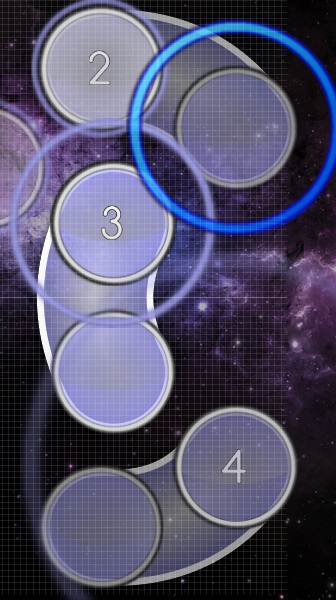
Code for these and fixed spacing after if you like it
392,44,12983,2,0,B|448:40|480:84,1,100,2|2,0:0|0:0,0:0:0:0:
400,144,13677,2,0,B|376:192|400:240,1,100,2|2,0:0|0:0,0:0:0:0:
479,301,14371,2,0,B|448:344|392:340,1,100,2|2,0:0|0:0,0:0:0:0:
312,280,15064,6,0,B|268:256|216:276,1,100,2|2,0:0|0:0,0:0:0:0:
144,344,15758,2,0,B|96:368|48:344,1,100,2|4,0:0|0:0,0:0:0:0:
00:16:452 (3) - NC for music change?
00:31:712 (1) - why not give this symmetry with 00:33:099 (3) - ?
01:17:492 (1) - turn off grid snap so you can give even spacing
01:45:931 (2,3,4) - pattern here can be improved
SPOILER
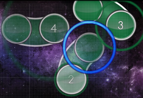
Code if you like it
368,192,105931,2,0,B|367:137|415:109,1,100,2|10,0:0|0:0,0:0:0:0:
504,60,106625,2,0,B|472:16|416:16,1,100,2|10,0:0|0:0,0:0:0:0:
328,60,107319,2,0,B|280:80|228:60,1,100,2|10,0:0|0:0,0:0:0:0:
01:48:012 (1) - maybe copy 01:49:400 (3) - slider and adjust so blanket is the same way
02:57:030 (4) - maybe make this a 1/2 slider to fit guitar

[Hard]

00:03:272 (7) - I think jump should be here with guitar, not after. try this?
00:15:758 (3) - this might flow and look better like this
01:25:469 (7) - odd, I think jump from 7-1 is nice but jump 6-7 not needed, so try this?
02:06:741 (3,4,5,6) - I think this curve can be more smooth
SPOILER
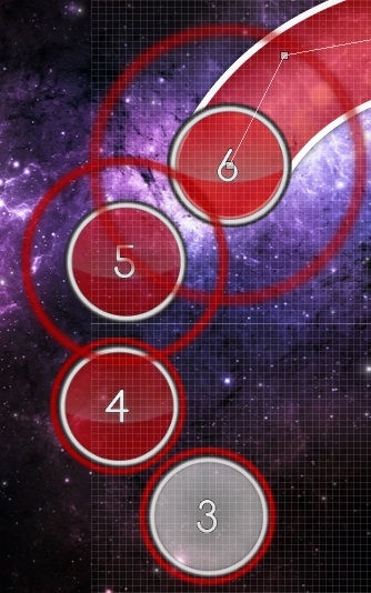
Code if you like it
68,304,126741,1,2,0:0:0:0:
16,240,126914,1,0,0:0:0:0:
20,156,127087,1,10,0:0:0:0:
80,100,127261,2,0,B|112:36|200:20,1,150,0|0,0:0|0:0,0:0:0:0:
02:11:076 (7,9) - seems a bit too hard for a Hard diff, maybe x148 y172 for these to reduce?
02:28:937 (3,4,5,6) - hmm, I think this would be better to play with a ctrl+g on 02:29:111 (4,5) - , will create better flow, and also create cool stop motion on (5,6) since vocal is quieter on these

very cool diff!

[Insane]

I am surprised you did not use any sort of kick slider streaming in this. I feel like it would fit the style of the map very well.
perhaps sections like 00:49:746 (1,2,3,4,5,1,2,3,4,5) - these two could be changed into sliders like this?
the regular stream after 00:50:787 (1,2,3,4,1) - I think is cool as it is, but those two before could be changed to make them a little more interesting :3
can be applied to many sections in the map if you agree

00:01:192 (1,2) - jump felt sudden for start of the map, perhaps move closer together to reduce?
00:06:394 (10,1) - notes feel too close, since sections before had such high spacing
00:32:579 (4) - I feel a jump here, maybe stack with head of 00:31:712 (1) - ? since you have a jump here in hard would make sense
00:33:099 (6,7) - ctrl+g here feels better to me
01:10:729 (6,7) - ^
01:47:319 (10,12) - ^
02:11:249 (10) - feels odd not having jump, perhaps stack on head of 02:10:556 (7) - , will still have a pattern, just not a star
02:35:180 (5) - I think this would flow better at x212 y248

another cool diff, fun to play!

very nice set, just some things to clean up in lower diffs. take a star, and good luck!
Topic Starter
kajiyatta

captin1 wrote:

hi

modding everything even though you told me not to :D

[Easy]
00:23:388 (1) - slider shape looks odd, perhaps redo it with new slider code a bit changed.
00:27:203 (2,3) - move to the left? x12 y120 with both selected, will also improve blanket
00:31:712 (1,2,3,4) - looks a bit odd, try this maybe? The flow (2) to (1) is a bit sharped I suppose.
00:41:076 (2,3) - perhaps move left and up a bit? for consistency with 00:44:197 (3,4,1) - curve
01:17:492 (1) - same as 00:23:388 (1) -
01:18:533 (2,3) - make these a bit neater? (2) to x96 y268, (3) to x176 y268
01:34:139 (1) - same
01:37:955 (2,3,4) - perhaps give this symmetry? Already sonsistence I suppose.
01:44:891 (4,2,1) - unsure if this much stacking is good in easy, the hitbursts may make it confusing. up to you to change if you agree Will be changed if others say same thing.
02:26:856 (3) - perhaps rotate this? better slider flow
02:32:405 (3) - spacing error

[Normal]

rhythm seems very basic, but I suppose it is fine

00:11:596 (4) - move to left for better symmetry with 3?
00:12:983 (2,3,4) - pattern here can be improved
SPOILER

Code for these and fixed spacing after if you like it
392,44,12983,2,0,B|448:40|480:84,1,100,2|2,0:0|0:0,0:0:0:0:
400,144,13677,2,0,B|376:192|400:240,1,100,2|2,0:0|0:0,0:0:0:0:
479,301,14371,2,0,B|448:344|392:340,1,100,2|2,0:0|0:0,0:0:0:0:
312,280,15064,6,0,B|268:256|216:276,1,100,2|2,0:0|0:0,0:0:0:0:
144,344,15758,2,0,B|96:368|48:344,1,100,2|4,0:0|0:0,0:0:0:0:
00:16:452 (3) - NC for music change? I don't add NC here in easier diffs, it's unnecessary I suppose.
00:31:712 (1) - why not give this symmetry with 00:33:099 (3) - ? I just feel better in this way.
01:17:492 (1) - turn off grid snap so you can give even spacing
01:45:931 (2,3,4) - pattern here can be improved
SPOILER

Code if you like it
368,192,105931,2,0,B|367:137|415:109,1,100,2|10,0:0|0:0,0:0:0:0:
504,60,106625,2,0,B|472:16|416:16,1,100,2|10,0:0|0:0,0:0:0:0:
328,60,107319,2,0,B|280:80|228:60,1,100,2|10,0:0|0:0,0:0:0:0:
01:48:012 (1) - maybe copy 01:49:400 (3) - slider and adjust so blanket is the same way
02:57:030 (4) - maybe make this a 1/2 slider to fit guitar

[Hard]

00:03:272 (7) - I think jump should be here with guitar, not after. try this? From (6) to (7), it's not suitable flow imo.
00:15:758 (3) - this might flow and look better like this
01:25:469 (7) - odd, I think jump from 7-1 is nice but jump 6-7 not needed, so try this?
02:06:741 (3,4,5,6) - I think this curve can be more smooth
SPOILER

Code if you like it
68,304,126741,1,2,0:0:0:0:
16,240,126914,1,0,0:0:0:0:
20,156,127087,1,10,0:0:0:0:
80,100,127261,2,0,B|112:36|200:20,1,150,0|0,0:0|0:0,0:0:0:0:
02:11:076 (7,9) - seems a bit too hard for a Hard diff, maybe x148 y172 for these to reduce? I like current pattern , so keep now. But if others say same thing, I'll change.
02:28:937 (3,4,5,6) - hmm, I think this would be better to play with a ctrl+g on 02:29:111 (4,5) - , will create better flow, and also create cool stop motion on (5,6) since vocal is quieter on these

very cool diff!

[Insane]

I am surprised you did not use any sort of kick slider streaming in this. I feel like it would fit the style of the map very well.
perhaps sections like 00:49:746 (1,2,3,4,5,1,2,3,4,5) - these two could be changed into sliders like this?
the regular stream after 00:50:787 (1,2,3,4,1) - I think is cool as it is, but those two before could be changed to make them a little more interesting :3
can be applied to many sections in the map if you agree I suppose your suggestion is really interesting, but after tried it, I just feel current one sounds more fun. sorry.

00:01:192 (1,2) - jump felt sudden for start of the map, perhaps move closer together to reduce?
00:06:394 (10,1) - notes feel too close, since sections before had such high spacing
00:32:579 (4) - I feel a jump here, maybe stack with head of 00:31:712 (1) - ? since you have a jump here in hard would make sense
00:33:099 (6,7) - ctrl+g here feels better to me
01:10:729 (6,7) - ^
01:47:319 (10,12) - ^
02:11:249 (10) - feels odd not having jump, perhaps stack on head of 02:10:556 (7) - , will still have a pattern, just not a star
02:35:180 (5) - I think this would flow better at x212 y248

another cool diff, fun to play!

very nice set, just some things to clean up in lower diffs. take a star, and good luck!
No comment = fixed.
Thanks for modding & star :)
P A N
hi, m4m here :3

Insane]

00:16:105 (4) - ctrl+g for better flow and feel better to play imo.
00:18:533 (3,4) - try to move them like this? I think its more flow. please try
00:19:746 (9) - redo this slider because this slider is old version (can't blanket well) and make them like this is better flow.
01:10:729 (6,7) - I think ctrl+g is more flow and still keep the jump pattern.
01:13:850 (8,9) - what about this pattern? I think its more flow and can still keep the jump pattern.
01:46:625 (8) - what about NC here?
02:10:035 (6) - I think this slider change to 1/2 rhythm sounds better and play better.
02:13:330 (7) - make pattern like this is more flow, please try D:
02:42:637 (2) - 1/2 rhythm is better.

[Hard]

00:12:983 (3,4) - move both 1 grid right and change 6 to the same shape with (5), then move 5 to 192|352 for center symmetry.
00:41:423 (5) - ctrl+g and (6) - ctrl+g to better flow for hard diff and it not a strong beat so I think its fine.
01:01:365 (2) - 2 grid left and change the (3)'s shape to same as (1) for center symmetry if you want.
01:23:735 (3,4,5) - maybe this? because the repeat slider's end is opposite side to next slider is a bit hard imo.
01:31:018 (9) - ^
01:43:950 (7) - NC for new pattern? XD

[Normal]

00:16:452 (3,4) - maybe this rhythm instead? its fine for normal imo.
02:25:469 (1,2) - swap NC? for start a new vocal D:
02:36:567 (1,2) - ^

[Easy]

hmm nothing to say, just find something to mod, 02:55:989 - maybe change to spinner and end at 02:57:290 D:

nice song and nice map AHH YES good luck :3
Topic Starter
kajiyatta

P A N wrote:

hi, m4m here :3

Insane]

00:16:105 (4) - ctrl+g for better flow and feel better to play imo.
00:18:533 (3,4) - try to move them like this? I think its more flow. please try
00:19:746 (9) - redo this slider because this slider is old version (can't blanket well) and make them like this is better flow.
01:10:729 (6,7) - I think ctrl+g is more flow and still keep the jump pattern.
01:13:850 (8,9) - what about this pattern? I think its more flow and can still keep the jump pattern. It's intensional, so keep current way.
01:46:625 (8) - what about NC here?
02:10:035 (6) - I think this slider change to 1/2 rhythm sounds better and play better. I'll consider about it.
02:13:330 (7) - make pattern like this is more flow, please try D: know this rotationally flow, but keep current way since I like this pattern.
02:42:637 (2) - 1/2 rhythm is better.

[Hard]

00:12:983 (3,4) - move both 1 grid right and change 6 to the same shape with (5), then move 5 to 192|352 for center symmetry.
00:41:423 (5) - ctrl+g and (6) - ctrl+g to better flow for hard diff and it not a strong beat so I think its fine.
01:01:365 (2) - 2 grid left and change the (3)'s shape to same as (1) for center symmetry if you want.
01:23:735 (3,4,5) - maybe this? because the repeat slider's end is opposite side to next slider is a bit hard imo. I'll wait for another opinion here, just imo it's fine.
01:31:018 (9) - ^
01:43:950 (7) - NC for new pattern? XD Keep pattern for consistence :3

[Normal]

00:16:452 (3,4) - maybe this rhythm instead? its fine for normal imo.
02:25:469 (1,2) - swap NC? for start a new vocal D: Just followed music about NC.
02:36:567 (1,2) - ^ ^

[Easy]

hmm nothing to say, just find something to mod, 02:55:989 - maybe change to spinner and end at 02:57:290 D: It's too soon for the easiest diff I suppose...

nice song and nice map AHH YES good luck :3
No cooment = fixed.
Thanks for modding :)
Losertic
Hello!

From Modding Queue.

Modding

General

  1. Pass.

Easy

  1. 01:03:272 - how about this pattern?

Normal

  1. Pass.

Hard

  1. 01:14:544 (1) - move (345,144)? http://osu.ppy.sh/ss/1165236

Insane

  1. 01:36:914 (1) - change this rhythm?
    01:36:914 ~ 01:37:087 - add slider
    01:37:261 ~ 01:37:434 - add slider
    01:37:608 - add note.

pretty beatmap o.ov
Topic Starter
kajiyatta

Losertic wrote:

Hello!

From Modding Queue.

Modding

General

  1. Pass.

Easy

  1. 01:03:272 - how about this pattern? Where is this...

Normal

  1. Pass.

Hard

  1. 01:14:544 (1) - move (345,144)? http://osu.ppy.sh/ss/1165236

Insane

  1. 01:36:914 (1) - change this rhythm? In this part, it's intensional.
    01:36:914 ~ 01:37:087 - add slider
    01:37:261 ~ 01:37:434 - add slider
    01:37:608 - add note.
No comment = fixed.
Thanks for moddng.
pretty beatmap o.ov
Losertic

kajiyatta wrote:

Easy

  1. 01:03:272 - how about this pattern? Where is this...
it's my mistake

maybe... i wrote my opinion. but.. i remove this sentence.


GL ;)
Lanturn
Hey kajiyatta~ M4M from my queue

You said to skip your easier diffs if I wanted, but I'd rather do just the opposite. I'd rather mod your easier diffs and not worry so much about your insane.

[General]
Tags: Add アップリフト・スパイス band name is japanese unicode doesn't hurt, plus it adds a bit more to your tags.
The other thing is that they're described as an emo punk rock band, so it's not jpop. jrock would suit as a tag better, and maybepunk or emo if you wanted as well.


[Easy]
Pretty good.
First attempt: https://osu.ppy.sh/ss/1193484 | Spacing might be a tad close, but it should be fine.
Everything played nicely on the map so I won't have too much to say.

The only thing I think would be nice is if you used a few other slider shapes. Seeing curves and straight lines through the whole entire map was a bit dull to me.

SliderMultiplier:0.799999999999999 ? lol First time I've seen that

  1. 00:09:515 (1,2,1,2,1,2,1) - ok... so this is a pretty big idea that I think you'll really like. It involves moving quite a few notes. but the general idea is to make the (1) first listed symmetrical with the next (1), and also create some balance on that (2) slider. Instead of trying to explain this, I'll just toss you the code, and you can decide if you like it or not.
    SPOILER
    412,40,9515,6,0,B|456:116|412:192,1,160,2|2,0:0|0:0,0:0:0:0:
    332,332,10902,2,0,B|256:292|176:332,1,160,2|2,0:0|0:0,0:0:0:0:
    100,192,12290,6,0,B|56:116|100:40,2,160,2|2|2,0:0|0:0|0:0,0:0:0:0:
    256,156,14371,1,2,0:0:0:0:
    412,192,15064,6,0,B|456:116|412:40,2,160,2|2|8,0:0|0:0|0:0,0:0:0:0:
    256,156,17145,1,8,0:0:0:0:
    244,316,17839,6,0,P|172:340|88:316,2,160,4|0|0,0:0|0:0|0:0,0:0:0:0:
  2. 00:23:388 (1) - the angle on this note seems a bit excessive no? how about trying a different kind of slider anyways. Also try making a good flow from (3) to (4) on the previous couple notes. | http://puu.sh/5VyTB.jpg
  3. 00:33:099 (3) - http://puu.sh/5Vz04.jpg | How about this?
  4. 00:37:261 (1) - 01:28:590 (1) - 40% volume for these finishes? the second one in particular is too loud.
  5. 00:45:585 (1) - 00:56:683 (1) - 01:36:914 (1) - 01:48:012 (1) - 02:33:793 (1) - How about adding finishes to all these notes? It's a proper 4/1 measure reset here so a finish would normally be expected.
  6. 01:00:845 (1,1) - | 01:52:174 (1) - | how about making these the same, one way or the other?
  7. 02:11:249 (4) - x328 y192? | it fits and makes for some good symmetry. | you could if you wanted, also put the (2) there as well, like you do at 02:31:018 (1,2,3,4) -
  8. 02:33:793 (1,2,3) - http://puu.sh/5VzU5.jpg ? | not sure if this will be a bit too much flow-wise.
  9. 02:37:955 (1) - end this 1/1 earlier. I understand you want to catch the end of the vocals but it is actually just fade-out at that point from 02:40:729 - and shouldn't even really be bothered with.
Very nice Easy difficulty :)

[Normal]
This diff is pretty similar, if not almost exactly the same as Easy with just a few more 1/1s instead of 2/1s during the slow parts and a wider distance spacing. Not sure what to say here. Everything plays fine, looks fine etc. Just it seems like there should be more of a difference between the two difficulties. The only other thing is that it gets a little bland when you map almost every 1/1 note. Maybe you could sneak in the occasional 1/2 that isn't hard to predict to add a little variety, or some 1/1s and maybe try some different slider shapes for the 1/1 sliders.

  1. 00:09:515 (1,2) - Is there a way you can keep symmetry on this to the middle of the map? having this note stick so far up almost off the map is pretty ugly. Move (1) to about x52 y332, and adjust (2) to be symmetrical. You'll have to move (3,4) around a bit as well.
  2. 00:37:261 (1) - 01:28:590 (1) - 40% volume.. same as Easy
  3. 00:45:585 (1) - 00:56:683 (1) - 01:36:914 (1) - 01:48:012 (1) - 02:33:793 (1) - Finishes like I suggested in Easy.
  4. 00:53:908 (1) - how about this? | http://puu.sh/5VBPt.jpg
  5. 01:23:041 (1,2) - combine these into one big slider? or maybe have a gap here or something? seems rather unnecessary to map these all 1/1
  6. 01:54:255 (2) - Remove this finish?
  7. 02:10:902 (4,5) - how about a 1/4 reverse slider here? to catch the drum hit at 02:11:076 - | honestly this song needs to have a better variety of drums xD
  8. 02:17:145 (1,3,4) - (3,4) would sound much better as a long slider like (1) | Music slows down bigtime here as well. | How about trying a 3/2 slider with a reverse?
  9. 02:24:775 (4,1) - combine these two sliders? Held vocals and nothing really plays at the end of (4)
  10. 02:39:342 (1) - same as Easy, maybe end this 1/2 sooner?
  11. 02:46:972 (4,1,2) - http://puu.sh/5VDPK.jpg | It wrecks your NC consistency but it really suits the music. | It's just odd having the vocals start halfway in the (1) slider at 02:48:012 - and it not get mapped to.
[Hard]
  1. 00:28:937 (1,2,3) - http://puu.sh/5VEEn.jpg ?
  2. 00:32:926 (6) - x168 y260? | I think this should be visible because its not part of the previous 3 drum notes you have, and this helps eliminate some of the jump confusion between (3,4) | When I played this, I was thinking the note was a fallback (basically (4,5) were control+g'd
  3. 00:37:261 (1) - 01:28:590 (1) - 40% volume.. same as Easy
  4. 00:45:585 (1) - 00:56:683 (1) - 01:36:914 (1) - 01:48:012 (1) - 02:33:793 (1) - Finishes like I suggested in Easy.
  5. 01:02:405 (4) - 01:53:735 (4) - 02:50:613 (4) - How about an NC here to be consistent with the previous NC you have? This will create 3 smaller combos instead of one small and one big. | If you wanted to be more consistent, maybe add an NC at 02:53:215 (5) - as well, but this one isn't needed as much as the others.
  6. 01:27:550 (6) - http://puu.sh/5VFBD.jpg ?
  7. 01:33:099 (6) - straight slider? | http://puu.sh/5VFEh.jpg | maybe a bit more distance.
  8. 02:37:955 (4,5,6) - http://puu.sh/5VFZT.jpg | ? Symmetry works pretty good with these.
  9. 02:53:908 (7) - control+H and move to x328 y180? or even just control+g.
Not much to say, Nicely designed. Most of the suggestions are just nazi anyways. Hopefully some of my ideas can help. The difficulty gap from Normal to Hard is pretty big though. Wish it could be a little more balanced, but it's fine I guess.

[Insane]
I don't really have any suggestions for this. Flow is nice, and it looks beautiful. Nice work on it~

  1. 00:37:261 (1) - 01:28:590 (1) - 40% volume.. same as Easy
  2. 00:45:585 (1) - 00:56:683 (1) - 01:36:914 (1) - 01:48:012 (1) - 02:33:793 (1) - Finishes like I suggested in Easy.
    It seems like you have your own idea for New Combos at the spots I mentioned in hard, so this is probably fine how it is.
sorry about the crappy insane mod. Hopefully the rest make up for it. Good luck~

2 KD from this, shooting one back for a nice map.
Topic Starter
kajiyatta

Lanturn wrote:

Hey kajiyatta~ M4M from my queue

You said to skip your easier diffs if I wanted, but I'd rather do just the opposite. I'd rather mod your easier diffs and not worry so much about your insane.

[General]
Tags: Add アップリフト・スパイス band name is japanese unicode doesn't hurt, plus it adds a bit more to your tags.
The other thing is that they're described as an emo punk rock band, so it's not jpop. jrock would suit as a tag better, and maybepunk or emo if you wanted as well.


[Easy]
Pretty good.
First attempt: https://osu.ppy.sh/ss/1193484 | Spacing might be a tad close, but it should be fine.
Everything played nicely on the map so I won't have too much to say.

The only thing I think would be nice is if you used a few other slider shapes. Seeing curves and straight lines through the whole entire map was a bit dull to me.

SliderMultiplier:0.799999999999999 ? lol First time I've seen that

  1. 00:09:515 (1,2,1,2,1,2,1) - ok... so this is a pretty big idea that I think you'll really like. It involves moving quite a few notes. but the general idea is to make the (1) first listed symmetrical with the next (1), and also create some balance on that (2) slider. Instead of trying to explain this, I'll just toss you the code, and you can decide if you like it or not.
    SPOILER
    412,40,9515,6,0,B|456:116|412:192,1,160,2|2,0:0|0:0,0:0:0:0:
    332,332,10902,2,0,B|256:292|176:332,1,160,2|2,0:0|0:0,0:0:0:0:
    100,192,12290,6,0,B|56:116|100:40,2,160,2|2|2,0:0|0:0|0:0,0:0:0:0:
    256,156,14371,1,2,0:0:0:0:
    412,192,15064,6,0,B|456:116|412:40,2,160,2|2|8,0:0|0:0|0:0,0:0:0:0:
    256,156,17145,1,8,0:0:0:0:
    244,316,17839,6,0,P|172:340|88:316,2,160,4|0|0,0:0|0:0|0:0,0:0:0:0:
  2. 00:23:388 (1) - the angle on this note seems a bit excessive no? how about trying a different kind of slider anyways. Also try making a good flow from (3) to (4) on the previous couple notes. | http://puu.sh/5VyTB.jpg
  3. 00:33:099 (3) - http://puu.sh/5Vz04.jpg | How about this?
  4. 00:37:261 (1) - 01:28:590 (1) - 40% volume for these finishes? the second one in particular is too loud. I'll get some opinon in this part.
  5. 00:45:585 (1) - 00:56:683 (1) - 01:36:914 (1) - 01:48:012 (1) - 02:33:793 (1) - How about adding finishes to all these notes? It's a proper 4/1 measure reset here so a finish would normally be expected.
  6. 01:00:845 (1,1) - | 01:52:174 (1) - | how about making these the same, one way or the other? Intensional since the music sounds not in the same way.
  7. 02:11:249 (4) - x328 y192? | it fits and makes for some good symmetry. | you could if you wanted, also put the (2) there as well, like you do at 02:31:018 (1,2,3,4) -
  8. 02:33:793 (1,2,3) - http://puu.sh/5VzU5.jpg ? | not sure if this will be a bit too much flow-wise. I just seem fine in my current way.
  9. 02:37:955 (1) - end this 1/1 earlier. I understand you want to catch the end of the vocals but it is actually just fade-out at that point from 02:40:729 - and shouldn't even really be bothered with.
Very nice Easy difficulty :)

[Normal]
This diff is pretty similar, if not almost exactly the same as Easy with just a few more 1/1s instead of 2/1s during the slow parts and a wider distance spacing. Not sure what to say here. Everything plays fine, looks fine etc. Just it seems like there should be more of a difference between the two difficulties. The only other thing is that it gets a little bland when you map almost every 1/1 note. Maybe you could sneak in the occasional 1/2 that isn't hard to predict to add a little variety, or some 1/1s and maybe try some different slider shapes for the 1/1 sliders. I'll try these diffs get more spread.

  1. 00:09:515 (1,2) - Is there a way you can keep symmetry on this to the middle of the map? having this note stick so far up almost off the map is pretty ugly. Move (1) to about x52 y332, and adjust (2) to be symmetrical. You'll have to move (3,4) around a bit as well.
  2. 00:37:261 (1) - 01:28:590 (1) - 40% volume.. same as Easy Same as Easy.
  3. 00:45:585 (1) - 00:56:683 (1) - 01:36:914 (1) - 01:48:012 (1) - 02:33:793 (1) - Finishes like I suggested in Easy.
  4. 00:53:908 (1) - how about this? | http://puu.sh/5VBPt.jpg
  5. 01:23:041 (1,2) - combine these into one big slider? or maybe have a gap here or something? seems rather unnecessary to map these all 1/1 I'll consider this, but now I don't have any placement pattern.
  6. 01:54:255 (2) - Remove this finish? No, it's clearly sounded.
  7. 02:10:902 (4,5) - how about a 1/4 reverse slider here? to catch the drum hit at 02:11:076 - | honestly this song needs to have a better variety of drums xD
  8. 02:17:145 (1,3,4) - (3,4) would sound much better as a long slider like (1) | Music slows down bigtime here as well. | How about trying a 3/2 slider with a reverse? I know your mean but I just think better if follow the vocal.
  9. 02:24:775 (4,1) - combine these two sliders? Held vocals and nothing really plays at the end of (4)
  10. 02:39:342 (1) - same as Easy, maybe end this 1/2 sooner?
  11. 02:46:972 (4,1,2) - http://puu.sh/5VDPK.jpg | It wrecks your NC consistency but it really suits the music. | It's just odd having the vocals start halfway in the (1) slider at 02:48:012 - and it not get mapped to Keep current pattern since it is followed my NC pattrn..
[Hard]
  1. 00:28:937 (1,2,3) - http://puu.sh/5VEEn.jpg ?
  2. 00:32:926 (6) - x168 y260? | I think this should be visible because its not part of the previous 3 drum notes you have, and this helps eliminate some of the jump confusion between (3,4) | When I played this, I was thinking the note was a fallback (basically (4,5) were control+g'd Another modder say current placement is good, so I just changed my previous placement. So I'LL get some opinion in this parts now.
  3. 00:37:261 (1) - 01:28:590 (1) - 40% volume.. same as Easy Consider now.
  4. 00:45:585 (1) - 00:56:683 (1) - 01:36:914 (1) - 01:48:012 (1) - 02:33:793 (1) - Finishes like I suggested in Easy.
  5. 01:02:405 (4) - 01:53:735 (4) - 02:50:613 (4) - How about an NC here to be consistent with the previous NC you have? This will create 3 smaller combos instead of one small and one big. | If you wanted to be more consistent, maybe add an NC at 02:53:215 (5) - as well, but this one isn't needed as much as the others. I don't suppose it is neccessary, but if others say same things I'll change.
  6. 01:27:550 (6) - http://puu.sh/5VFBD.jpg ? No, I want to make a jump (6) to (7) not (5) to (6) since the vocal has emphasized.
  7. 01:33:099 (6) - straight slider? | http://puu.sh/5VFEh.jpg | maybe a bit more distance.
  8. 02:37:955 (4,5,6) - http://puu.sh/5VFZT.jpg | ? Symmetry works pretty good with these.
  9. 02:53:908 (7) - control+H and move to x328 y180? or even just control+g.
Not much to say, Nicely designed. Most of the suggestions are just nazi anyways. Hopefully some of my ideas can help. The difficulty gap from Normal to Hard is pretty big though. Wish it could be a little more balanced, but it's fine I guess. I'll consider this point.

[Insane]
I don't really have any suggestions for this. Flow is nice, and it looks beautiful. Nice work on it~

  1. 00:37:261 (1) - 01:28:590 (1) - 40% volume.. same as Easy Same as Easy.
  2. 00:45:585 (1) - 00:56:683 (1) - 01:36:914 (1) - 01:48:012 (1) - 02:33:793 (1) - Finishes like I suggested in Easy.
    It seems like you have your own idea for New Combos at the spots I mentioned in hard, so this is probably fine how it is.
sorry about the crappy insane mod. Hopefully the rest make up for it. Good luck~

2 KD from this, shotting one back for a nice map.
No comment = fixed.
Thanks for modding :)
P o M u T a
こんちゃ。

[General]
  1. E/N/HのWidescreen Supportのチェックを外しましょう。Iはalready外れてるみたいです。
  2. アップリフト・スパイスって言うtagは必要でしょうか。このバンド名自体がUPLIFT SPICEですし、カタカナ名で見ることも無いので検索する人も居ないと思います。付けておいても無難かもしれませんが、個人的にこのtagは違和感を持ちました。
[Easy]
  1. 00:31:365 (2) - 前の(1)と後の(3)との間隔が1.01xと1.03xとなってるのもあり、地味に違って汚く見えたので、(x:206 y:161)に置く事を奨めたい。これで間隔は前後1.00xとなり見た目も綺麗になります。
  2. 00:36:914 - これも↑と同様、1.03xと0.98という前後で間隔が地味に違っており、見た目も悪く見えます。(x:70 y:141)に移動する事により前後1.00xの間隔になり、見た目も綺麗になります。細かい指摘ですが綺麗な譜面だからこそ、こういうのが非常に目立つ物になります。
  3. 00:49:746 ~ 00:50:787 - 音量を下げたいと言う意図はわかりますが、20%下げるのは下げすぎにかんじますし、再生しても違和感を覚えました。個人的にはKiai timeの-10%を推奨し60%へ上げてもいいのではと思いました。聴き具合も良いです。
  4. 01:41:076 ~ 01:42:116 - これらの緑線も上記と同じで違和感を感じるので+10%させ60%の音量を推奨したいです。
  5. 02:15:758 (3) - (3)の場所の流れの提案ですが僕は画像の場所の方が好きだったりします。(1,2,3)で△の流れで。(3,4,1)で真っ直ぐ降りる感じです。 
  6. 02:26:163 (2) - AdditionsかSample SetをDrumsにし、clapを追加。fitすると思いますのでお試しを。
  7. 02:26:856 (3) - ドラム等が鳴り始めサビに行く準備のパートです。勢いづけにしては50%の音量は寂しいと感じ、60%を提案したいです。50%(静かなパート)→60%(勢いづけ)→70%(サビ)という形が僕の理想です。
  8. 02:37:608 (2) - この配置でも良いのですが、本来のスライダーの流れに沿えば、もう少し↑に上げた方が自然にもかんじます。(x:112 y:28)か(x:116 y:24)あたりを奨めます。
  9. 02:57:030 (4) - サークルで終わらせるより、スライダーに変更し終点は02:57:203にする事でより音楽にfitすると思います。Easyだからと言えど曲の終点が赤線でもあるので難しさに影響が無いのと音取りの幅を広げたいという2点の理由で奨めたいです。
[Normal]
  1. 00:24:082 (2) - この長いスライダーの音取りですが、僕は、1/1スライダーとサークルを駆使する方がボーカルにもドラムにもfitするので良いと思いました。00:24:775 - ここも大きな白線であるのと、ある程度強いパートという意味でサークルを叩かせたいという気持ちがあります。参考にしてみてください。
  2. 00:49:746 ~ 00:50:787 - Easyと同じ理由で60%に上げることを奨めます。
  3. 01:00:845 ~ 01:01:885 - ^
  4. 01:41:076 ~ 01:42:116 - ^
  5. 01:52:174 ~ 01:53:215 - ^
  6. 02:26:163 (2) - Easyと同じ提案で、AdditionsかSample SetをDrumsにし、clapを追加。
  7. 02:37:955 ~ 02:38:995 - 音量60%の提案。
  8. 02:47:665 (1) - 完全には聴き取れませんが、かすかに音楽からシンバルの音がしないでも無いので、slider headにFinishの追加を提案します。もし採用であれば全diffよろしくお願いします。
  9. 02:53:908 (4) ~ 最後 - 全部クリックした後に、(4)を(x:476 y:168)に移動。02:55:642 (2) - が真ん中のライン上に来てない事に違和感を感じ汚く見えたのでお勧めします。
[Hard]
  1. Hardくらいのノート数になれば、個人的にはSlider Tick Rateを2にしたい所。しかしながら、tick rateのcustomを使ってるようなので、fitしないと思えば変更しないで結構です。
  2. 00:12:637 (2,3) - (4)が真ん中ラインに来てるので、上手く(2,3)がctrl+Hをしても左右対称になるように配置できると個人的には綺麗で好きです。
  3. 01:40:729 (3,5) - ↑に同様完璧な左右対称にしたい所です。01:41:076 (5) - を(x:320 y:28)に単純移動するだけで解決はしますがどうでしょう。
  4. 02:26:163 - AdditionsかSample SetをDrumsに変更。
  5. 02:38:995 (6) - ctrl+Jした流れの方が個人的に好きです。
Hardのjumpの使い方がとても好きで参考になりました。感謝しています。
[Insane]
  1. プレイしたら100x1だったんで、OD8でも良いかな?とは思いましたが、kajiyattaさんのinsaneはod7と言う印象が強いのでこのままで良いです。
  2. 02:26:163 - AdditionsかSample SetをDrumsに変更。
insaneに関しては言う事は有りません。rankedに十分値すると思います。
ではrankedまでファイトです。
Topic Starter
kajiyatta

P o M u T a wrote:

こんちゃ。

[General]
  1. E/N/HのWidescreen Supportのチェックを外しましょう。Iはalready外れてるみたいです。
  2. アップリフト・スパイスって言うtagは必要でしょうか。このバンド名自体がUPLIFT SPICEですし、カタカナ名で見ることも無いので検索する人も居ないと思います。付けておいても無難かもしれませんが、個人的にこのtagは違和感を持ちました。
[Easy]
  1. 00:31:365 (2) - 前の(1)と後の(3)との間隔が1.01xと1.03xとなってるのもあり、地味に違って汚く見えたので、(x:206 y:161)に置く事を奨めたい。これで間隔は前後1.00xとなり見た目も綺麗になります。
  2. 00:36:914 - これも↑と同様、1.03xと0.98という前後で間隔が地味に違っており、見た目も悪く見えます。(x:70 y:141)に移動する事により前後1.00xの間隔になり、見た目も綺麗になります。細かい指摘ですが綺麗な譜面だからこそ、こういうのが非常に目立つ物になります。
  3. 00:49:746 ~ 00:50:787 - 音量を下げたいと言う意図はわかりますが、20%下げるのは下げすぎにかんじますし、再生しても違和感を覚えました。個人的にはKiai timeの-10%を推奨し60%へ上げてもいいのではと思いました。聴き具合も良いです。
  4. 01:41:076 ~ 01:42:116 - これらの緑線も上記と同じで違和感を感じるので+10%させ60%の音量を推奨したいです。
  5. 02:15:758 (3) - (3)の場所の流れの提案ですが僕は画像の場所の方が好きだったりします。(1,2,3)で△の流れで。(3,4,1)で真っ直ぐ降りる感じです。 
  6. 02:26:163 (2) - AdditionsかSample SetをDrumsにし、clapを追加。fitすると思いますのでお試しを。
  7. 02:26:856 (3) - ドラム等が鳴り始めサビに行く準備のパートです。勢いづけにしては50%の音量は寂しいと感じ、60%を提案したいです。50%(静かなパート)→60%(勢いづけ)→70%(サビ)という形が僕の理想です。
  8. 02:37:608 (2) - この配置でも良いのですが、本来のスライダーの流れに沿えば、もう少し↑に上げた方が自然にもかんじます。(x:112 y:28)か(x:116 y:24)あたりを奨めます。
  9. 02:57:030 (4) - サークルで終わらせるより、スライダーに変更し終点は02:57:203にする事でより音楽にfitすると思います。Easyだからと言えど曲の終点が赤線でもあるので難しさに影響が無いのと音取りの幅を広げたいという2点の理由で奨めたいです。
[Normal]
  1. 00:24:082 (2) - この長いスライダーの音取りですが、僕は、1/1スライダーとサークルを駆使する方がボーカルにもドラムにもfitするので良いと思いました。00:24:775 - ここも大きな白線であるのと、ある程度強いパートという意味でサークルを叩かせたいという気持ちがあります。参考にしてみてください。
  2. 00:49:746 ~ 00:50:787 - Easyと同じ理由で60%に上げることを奨めます。
  3. 01:00:845 ~ 01:01:885 - ^
  4. 01:41:076 ~ 01:42:116 - ^
  5. 01:52:174 ~ 01:53:215 - ^
  6. 02:26:163 (2) - Easyと同じ提案で、AdditionsかSample SetをDrumsにし、clapを追加。
  7. 02:37:955 ~ 02:38:995 - 音量60%の提案。
  8. 02:47:665 (1) - 完全には聴き取れませんが、かすかに音楽からシンバルの音がしないでも無いので、slider headにFinishの追加を提案します。もし採用であれば全diffよろしくお願いします。 少し音が小さいと思うので、今のところそのままです。
  9. 02:53:908 (4) ~ 最後 - 全部クリックした後に、(4)を(x:476 y:168)に移動。02:55:642 (2) - が真ん中のライン上に来てない事に違和感を感じ汚く見えたのでお勧めします。
[Hard]
  1. Hardくらいのノート数になれば、個人的にはSlider Tick Rateを2にしたい所。しかしながら、tick rateのcustomを使ってるようなので、fitしないと思えば変更しないで結構です。ここも他の意見を聞いてみて検討します。ただ、個人的にはtick2にするのは少し難しいという見解です。
  2. 00:12:637 (2,3) - (4)が真ん中ラインに来てるので、上手く(2,3)がctrl+Hをしても左右対称になるように配置できると個人的には綺麗で好きです。
  3. 01:40:729 (3,5) - ↑に同様完璧な左右対称にしたい所です。01:41:076 (5) - を(x:320 y:28)に単純移動するだけで解決はしますがどうでしょう。
  4. 02:26:163 - AdditionsかSample SetをDrumsに変更。
  5. 02:38:995 (6) - ctrl+Jした流れの方が個人的に好きです。 ここは(4,5,6)と対称に配置したいのでこのままで。
Hardのjumpの使い方がとても好きで参考になりました。感謝しています。
[Insane]
  1. プレイしたら100x1だったんで、OD8でも良いかな?とは思いましたが、kajiyattaさんのinsaneはod7と言う印象が強いのでこのままで良いです。 ここも同様の意見が続くようであれば変更します。
  2. 02:26:163 - AdditionsかSample SetをDrumsに変更。
insaneに関しては言う事は有りません。rankedに十分値すると思います。
ではrankedまでファイトです。
書いてないところは修正しました。
近いうちに譜面見に行きます! modありがとうございました :)
AppLoad
:idea: This is my first mod. Many tips can just skip.
-------------------------------------------------------------------------------------------
Easy:
02:45:931 (2) - move to x: 32 y: 304
02:46:278 (3) - move to x: 96 y: 352
02:47:319 (4) - move to x: 308 y: 296
02:47:665 (1) - move to x: 384 y: 276
02:48:706 (2) - move to x: 452 y: 320
Everything else is done well.
-------------------------------------------------------------------------------------------
Normal is good diff.
-------------------------------------------------------------------------------------------
Hard:
00:09:168 (9) - move to x: 124 y: 148?
add this in Timing Setup Panel?
01:36:047 (7) - move to x: 256 y: 344
01:36:220 (8) - move to x: 72 y: 356
01:36:567 (9) - remake this on this (x: 124 y:268)
02:35:700 (6) - move to x: 12 y: 136
Everything else is done well.
-------------------------------------------------------------------------------------------
Insane:
00:06:741 (1) - move to x: 80 y: 236
00:06:915 (2) - move to x: 172 y: 196
01:43:330 (4) - move to x: 52 y: 280
01:43:504 (5) - move to x: 204 y: 280
01:43:677 (6) - move to x: 52 y: 300
Everything else is done well.
-------------------------------------------------------------------------------------------
P.S. How do you like this BG? Maybe use it?
-------------------------------------------------------------------------------------------
P.S.S.

^ It's very hard jumps!
Topic Starter
kajiyatta

[AppLoad] wrote:

This is my first mod. Many tips can just skip.
-------------------------------------------------------------------------------------------
Easy:
02:45:931 (2) - move to x: 32 y: 304
02:46:278 (3) - move to x: 96 y: 352
02:47:319 (4) - move to x: 308 y: 296
02:47:665 (1) - move to x: 384 y: 276
02:48:706 (2) - move to x: 452 y: 320 Sorry I don't think these placement is better than current one.
Everything else is done well.
-------------------------------------------------------------------------------------------
Normal is good diff.
-------------------------------------------------------------------------------------------
Hard:
00:09:168 (9) - move to x: 124 y: 148?
add this in Timing Setup Panel?
01:36:047 (7) - move to x: 256 y: 344
01:36:220 (8) - move to x: 72 y: 356
01:36:567 (9) - remake this on this (x: 124 y:268)
02:35:700 (6) - move to x: 12 y: 136 I want to mkae a jump here.
Everything else is done well.
-------------------------------------------------------------------------------------------
Insane:
00:06:741 (1) - move to x: 80 y: 236
00:06:915 (2) - move to x: 172 y: 196
01:43:330 (4) - move to x: 52 y: 280
01:43:504 (5) - move to x: 204 y: 280
01:43:677 (6) - move to x: 52 y: 300 I tried that but nothing done sorry...
Everything else is done well.
-------------------------------------------------------------------------------------------
P.S. How do you like this BG? Maybe use it? I don't want to use moe BG on the song.
-------------------------------------------------------------------------------------------
P.S.S.

^ It's very hard jumps!
No comment = fixed.
Thanks for modding.
DreaM117er
From my queue:
and thanks your mod :)

Easy
Damn...Nice map :o
No problem

Normal
Open to read
01:00:845 (3) - move to x156 y156, looks better
01:27:897 (5) - move to x308 y128
01:46:625 (3) - move to x496 y52
01:50:787 (1) - this??


Hard
Open to read
Jump point too much= =|||

00:43:677 (3) - reverse selection better
01:00:498 (4) - ^
00:55:122 (4) - move to x24 y264, better than before
00:56:336 (8) - a little far jump, get close??
01:03:619 (9) - ending no jump better
01:12:637 (3) - reverse selection better
01:31:018 (9) - snap
01:33:099 (6) - x96 y344 better jump
01:36:047 (7,8) - no jump better
01:47:665 (8) - reverse selection
01:53:215 (3) - make bending like:

01:54:949 (9) - ending no jump
02:07:781 (7) - reverse selection
02:28:590 (2) - ^
02:33:099 (8) - ^
02:33:446 (9) - ^
02:53:908 (7) - ^


Insane
Open to read
00:38:648 (1,2,3,4,5) - too far
01:07:781 (1,2,3,4,5) - stack like this:

01:08:301 (6,7,8,9,10) - ^
01:08:822 (11,12,13,14) - ^
01:26:509 (3,4,5) - this??

01:32:405 (4,5) - reverse selection better
02:04:833 (2,3,4,5,6) - same as 01:07:781 (1,2,3,4,5)
02:05:527 (2,3,4,5,6) - ^
02:11:423 (11,1) - too far
02:16:798 (7,8) - ^
Topic Starter
kajiyatta

m1223961117 wrote:

From my queue:
and thanks your mod :)

Easy
Damn...Nice map :o
No problem

Normal
Open to read
01:00:845 (3) - move to x156 y156, looks better Another changed.
01:27:897 (5) - move to x308 y128 No, aim to symmetrical with center line.
01:46:625 (3) - move to x496 y52
01:50:787 (1) - this?? I don't suppose this would be better than current one.


Hard
Open to read
Jump point too much= =||| I know but it's ok maybe.

00:43:677 (3) - reverse selection better No, it's intensional.
01:00:498 (4) - ^
00:55:122 (4) - move to x24 y264, better than before
00:56:336 (8) - a little far jump, get close?? Less than ×2.00 so it is allowed on Hard.
01:03:619 (9) - ending no jump better No, jump fits to music since it is emphasized.
01:12:637 (3) - reverse selection better
01:31:018 (9) - snap
01:33:099 (6) - x96 y344 better jump
01:36:047 (7,8) - no jump better
01:47:665 (8) - reverse selection
01:53:215 (3) - make bending like:

01:54:949 (9) - ending no jump
02:07:781 (7) - reverse selection
02:28:590 (2) - ^
02:33:099 (8) - ^
02:33:446 (9) - ^
02:53:908 (7) - ^
Well, I just keep most of jumping since it is not unreasonable, but I'll consider if others say that.


Insane
Open to read
00:38:648 (1,2,3,4,5) - too far Testers can play this with no problem, so keep it.
01:07:781 (1,2,3,4,5) - stack like this: Why? I don't know this is better than current.

01:08:301 (6,7,8,9,10) - ^
01:08:822 (11,12,13,14) - ^
01:26:509 (3,4,5) - this?? Another changed.

01:32:405 (4,5) - reverse selection better No, I want to make a jump here.
02:04:833 (2,3,4,5,6) - same as 01:07:781 (1,2,3,4,5) No changed.
02:05:527 (2,3,4,5,6) - ^ ^
02:11:423 (11,1) - too far I'll consider it.
02:16:798 (7,8) - ^
No comment = fixed.
Thanks for modding.
He Ang CTB
http://www.youtube.com/watch?v=XPR9kr5y ... e=youtu.be

;D VERY FUN IN CTB!! I hope it gets ranked soon ><

The background is surprisingly fitting :)
DeletedUser_3044645
Map's been modded a lot of times, so I couldn't really find any big errors
So, I'll give you a star for good map

But though, you should find another BG with a cute girl XD
Topic Starter
kajiyatta

He Ang Erika wrote:

http://www.youtube.com/watch?v=XPR9kr5yQuE&feature=youtu.be

;D VERY FUN IN CTB!! I hope it gets ranked soon ><

The background is surprisingly fitting :)
lol, anyway thanks.


No Dap wrote:

Map's been modded a lot of times, so I couldn't really find any big errors
So, I'll give you a star for good map

But though, you should find another BG with a cute girl XD
K, thanks for checking. But I don't suppose it is better to fit with cute girl.
toara_fict
応援してます!頑張ってください!!
arviejhay
Hi
I didn't find any errors here in this map
sorry
but i love the song so i will give you a star
Topic Starter
kajiyatta

toara_fict wrote:

応援してます!頑張ってください!!
starありがとうございます!

arviejhay wrote:

Hi
I didn't find any errors here in this map
sorry
but i love the song so i will give you a star
Thanks for star!
Trust
hihi

These are all suggestions,
feel free to use any~
[Easy]
  1. 02:36:567 (1) - A soft drum-clap fits well on the tail of this slider to match the drum roll.
  2. 02:55:989 (3) - Same as above, on the head.
[Normal]
  1. 01:10:902 (4) - Missed a clap on the head? You have one here for Hard and Insane.
  2. 02:49:053 (3) - I would prefer you reduce volume to 60% for the finishes instead of 50% like you had for 00:49:746 (3) and similar parts. 50% feels rather quiet.
  3. 02:51:481 (3) - A clap to go along the whistle would fit the music well and be consistent with what's here for Insane diff.
  4. 02:55:989 (3) - As mentioned for Easy, a soft drum-clap to match the drum roll would fit nicely.
[Hard]

Well AR8 played a lot better for me because of less note clutter and it made your jump patterns and stacks a lot easier to read. Something to consider.
  • 00:41:423 (5) - Remove the clap here? It doesn't really fit with the pattern you've established. Just a whistle here should be fine anyways.
  1. 00:48:879 (3) - Soft drum-clap on the tail sounds nice, you also used one here for both Easy and Normal.
  2. 01:30:498 (7) - The pattern here is actually very difficult to read. You would expect the reverse slider before it to have less repeats because of how closely spaced this note is to it if you compare it to how you spaced the reverse sliders for 01:07:781 (1,2,3). I would give this note more spacing from the previous slider or remove two reverses from the slider and add a note on 01:30:324.
  3. 01:41:596 (6,7) - Can definitely make a nice blanket between these two. How about using a 3-point slider?
  4. 01:42:463 (1) - Stacking the tail of this slider on the head of 01:41:596 (6) would make things look cleaner here.
  5. 02:31:712 (4) - Same as 00:41:423 (5).
  6. 02:37:955 (4) - Having a NC here would be consistent with how you use it for this vocal on every other kiai section.
  7. 02:51:481 (8) - Similar suggestion as mentioned for Normal, this time add a whistle on the head for consistency.
[Insane]

The difficulty is near flawless and really fun to play: https://osu.ppy.sh/ss/1350535
  1. 02:49:573 (1,2,3,4,5) - Only thing I can say is that the movement into this stream from the previous one didn't feel very natural when I played it.
Sorry for the small mod, but I guess that's what you should expect considering how excellent the map is. Hope some of this was useful,
Best of luck~ edit: grammar
Topic Starter
kajiyatta

Trust wrote:

hihi

These are all suggestions,
feel free to use any~
[Easy]
  1. 02:36:567 (1) - A soft drum-clap fits well on the tail of this slider to match the drum roll. I put hit-sounds on pattern, so keep current way.
  2. 02:55:989 (3) - Same as above, on the head. I don't use soft-clap on this diff for consistence.
[Normal]
  1. 01:10:902 (4) - Missed a clap on the head? You have one here for Hard and Insane.
  2. 02:49:053 (3) - I would prefer you reduce volume to 60% for the finishes instead of 50% like you had for 00:49:746 (3) and similar parts. 50% feels rather quiet.
  3. 02:51:481 (3) - A clap to go along the whistle would fit the music well and be consistent with what's here for Insane diff.
  4. 02:55:989 (3) - As mentioned for Easy, a soft drum-clap to match the drum roll would fit nicely.
[Hard]

Well AR8 played a lot better for me because of less note clutter and it made your jump patterns and stacks a lot easier to read. Something to consider. Need some opinions on this.
  • 00:41:423 (5) - Remove the clap here? It doesn't really fit with the pattern you've established. Just a whistle here should be fine anyways.
  1. 00:48:879 (3) - Soft drum-clap on the tail sounds nice, you also used one here for both Easy and Normal.
  2. 01:30:498 (7) - The pattern here is actually very difficult to read. You would expect the reverse slider before it to have less repeats because of how closely spaced this note is to it if you compare it to how you spaced the reverse sliders for 01:07:781 (1,2,3). I would give this note more spacing from the previous slider or remove two reverses from the slider and add a note on 01:30:324.
  3. 01:41:596 (6,7) - Can definitely make a nice blanket between these two. How about using a 3-point slider?
  4. 01:42:463 (1) - Stacking the tail of this slider on the head of 01:41:596 (6) would make things look cleaner here.
  5. 02:31:712 (4) - Same as 00:41:423 (5).
  6. 02:37:955 (4) - Having a NC here would be consistent with how you use it for this vocal on every other kiai section. I don't add NC on same part in before, so keep my pattern.
  7. 02:51:481 (8) - Similar suggestion as mentioned for Normal, this time add a whistle on the head for consistency.
[Insane]

The difficulty is near flawless and really fun to play: https://osu.ppy.sh/ss/1350535 Good!
  1. 02:49:573 (1,2,3,4,5) - Only thing I can say is that the movement into this stream from the previous one didn't feel very natural when I played it. I'll consider on this point, yeah the fspacing looks big and odd, but for Insane I suppose it would be allowed for challenge player.
Sorry for the small mod, but I guess that's what you should expect considering how excellent the map is. Hope some of this was useful,
Best of luck~ edit: grammar
No comment = fixed.
Thanks for modding!
RandF
Thank you for M4M~

[General]
  1. 16:9のBGなのでWidescreenSupportにcheck入れてはどうでしょう?
  2. sb.jpgがずれてるように見えました。sizeを800*600にするときれいに見えると思います。
    WidescreenSupportを入れる場合は、800*450にしてscaleを大きくすれば良いかと(x1.07以上でしょうか)
    RankingCriteriaを変える議論はあるみたいですが :arrow: t/148987
[Easy]

  • Good!
[Normal]
  1. 00:24:082 (2) - whistleとclap忘れ?
  2. 01:28:590 (1,2) - 1番と同じにlong sliderにした方が好みです
  3. 01:48:012 (1,2) - blanketさせてはどうでしょう?
[Hard]
  1. 00:37:608 (2) - drumに合わせてcircle x2が良いかなと
  2. 02:13:330 (5) - 配置の提案: 直後の02:13:677 (6) -と点対称にして02:12:810 (4) - をblanket
[Insane]
  1. 00:23:735 (2,4) - stackがずれすぎなような・・・
  2. 00:44:891 (9,10,11,12) - やりにくく感じました。これはどうでしょう?
いつもrequestありがとうございます。
機会あれば私からもお声がけさせていただくかもです :D
~Good Luck~
Topic Starter
kajiyatta

RandomEffect wrote:

Thank you for M4M~

[General]
  1. 16:9のBGなのでWidescreenSupportにcheck入れてはどうでしょう?
  2. sb.jpgがずれてるように見えました。sizeを800*600にするときれいに見えると思います。
    WidescreenSupportを入れる場合は、800*450にしてscaleを大きくすれば良いかと(x1.07以上でしょうか)
    初めてSB入れてみたので助かりました。All fixed.
    RankingCriteriaを変える議論はあるみたいですが :arrow: http://osu.ppy.sh/forum/t/148987
[Easy]

  • Good!
[Normal]
  1. 00:24:082 (2) - whistleとclap忘れ?
  2. 01:28:590 (1,2) - 1番と同じにlong sliderにした方が好みです ここは
  3. 01:48:012 (1,2) - blanketさせてはどうでしょう? 微調整しました。
[Hard]
  1. 00:37:608 (2) - drumに合わせてcircle x2が良いかなと (1,2)で揃えたいのでこのままで。
  2. 02:13:330 (5) - 配置の提案: 直後の02:13:677 (6) -と点対称にして02:12:810 (4) - をblanket
[Insane]
  1. 00:23:735 (2,4) - stackがずれすぎなような・・・
  2. 00:44:891 (9,10,11,12) - やりにくく感じました。これはどうでしょう?(9)から(10)への動きが垂直になりかえって打ちにくいような気がします。
いつもrequestありがとうございます。
機会あれば私からもお声がけさせていただくかもです :D
~Good Luck~
書いてない部分は修正しました。
Modありがとうございます!
Please sign in to reply.

New reply