cute bg
second crossbeats song I've seen so far in osu :eyes:the thing that stood out most to me while playing:
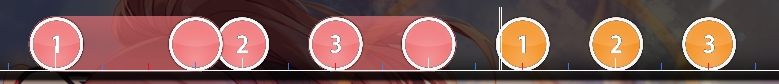
01:33:353 - 03:44:020 - while these parts represent the same thing in the music they already seem a bit too similar, it felt like i played the same thing, just a bit flipped. I think it would be great if you varied jump patterns of either part a little bit since these are the highlights of the song, but the second one felt a bit disappointing cause of the extreme similarity.
hitsounding: why don't you utilize some more whistles?
for example the 00:24:021 - part could use them to highlight the trumpet or whatever that is on spots like 00:25:520 (1,2) - (heads), or the emphasized vocals like 00:27:854 (1) -
other hitsounding: 00:18:186 (1,2) - would remove the drumwhistles here as they don't seem to fitting and it makes the one on 00:18:521 (3) - have more impact
01:12:020 (1) - maybe finish // 02:42:687 (1) -
01:14:186 - missing drum/kick/..
01:16:687 (3) - probably same
01:19:520 - ^ // 01:21:853 - // 01:24:853 - and similar sliderends in this part
02:20:354 (2) - finish //03:33:353 (1) - // 04:42:687 (1) -
02:22:020 (3) - no idea why most sliders in this part have softw on sliderbody, but it seems unfitting to me
02:44:853 - same kick stuff as before for many sliderends in this part
03:30:186 - again some missing slidertail kicks in this part
04:26:686 (1) - maybe finish // 04:48:021 (1) -
05:03:103 - 10% volume here for less annoying sliderticks
05:06:520 - 5% here
mapping:
00:13:853 (2,3) - why the sudden switch to drum rhythm when you otherwise emphasized melody? => 00:14:186 - should be clickable (maybe a 1/2 slider there) // 00:16:521 (2,3,4) - same
00:22:520 (1,2,3) - would look great if you polished the wave a bit and went for the same visual spacing on both sides
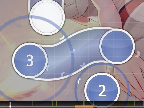
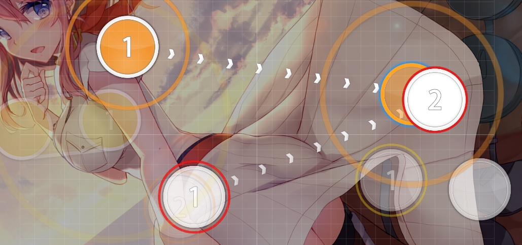
http://lasse.s-ul.eu/38nxGIXb.jpg00:24:021 (1,2) - could tone down spacing a little to introduce such spaced passive 1/4 gaps better. maybe something like
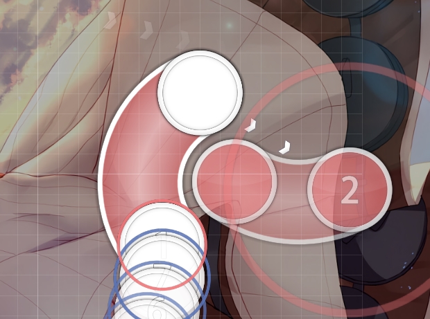
http://lasse.s-ul.eu/l5ohGxo4.jpg00:28:354 (2,3) - how about something like
http://lasse.s-ul.eu/mQEWI8D1.jpg ? plays the same but cuter visually
00:40:353 (2) - unlike other similar rhythm here you also have the melody on tail, so to differentiate them I think two circles would be better. something like
http://lasse.s-ul.eu/mZlYbef7.jpg would greatly emphasize vocals and melody here
00:46:521 (2,1,2) - no idea why these continue the jump pattern when melody stops here. you could at least tone down distance on 00:46:687 (1,2) - or something. maybe
http://lasse.s-ul.eu/3NBumdWO.jpg00:47:854 (2) - movement into this seemed a bit unnatural compared to the other jumps here. would either stack on 00:47:021 (1) - head or continue overlap stuff like
http://lasse.s-ul.eu/BWFP2NNn.jpg00:57:021 (4,1) - stack doesn't make much sense when you usually space 1/2 vocals. also rhythm on 00:51:187 (2,3,4) - makes much more sense than 00:56:687 (3,4) - cause vocal stuff you did before but now suddenly on sliderend
01:07:354 (3,4) - same here
01:11:687 (3,4,5) - triple feels really out of place with such strong 1/2 drums // 02:42:354 (3,4,5) - same here
01:38:021 (3) - equal spacing would look great here and play pretty much the same
http://lasse.s-ul.eu/2bcUef4I.jpg01:43:687 (1) - 3/4 slider over clear 1/2 vocals pls no
01:49:020 (2,1) - emphasis wise 01:49:353 (1) - should have the higher spacing. you could even reduce sv on 01:49:020 (2) - or maybe even 01:48:687 (1,2) - t o make the next one stand out more
01:39:021 (2) - 01:49:687 (2) - 01:52:021 (4) - these are just a bit too much spacing wise, look extremely similar to your 1/2 gaps around them etc. I think you could tone these down a bit to make the map much more enjoyable to play instead of having to guess rhythm
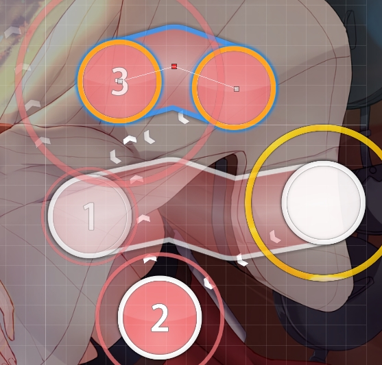
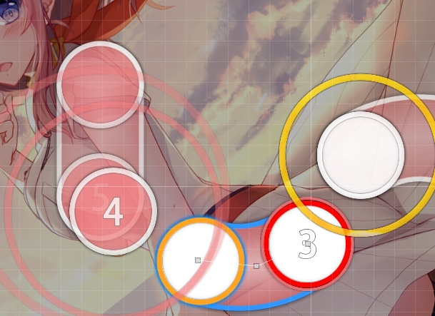
01:58:021 (3) - shape/curve makes it look so disconnected from anything here, why not just something like
http://lasse.s-ul.eu/slkQ06Z3.jpg02:36:521 (1,2,3,4) - bit overspaced for this part in comparison to your other patterns
03:20:687 (3) - nc on such stream changes usually fits really well and slightly helps reading imo
similar things from chorus 1 also apply for second
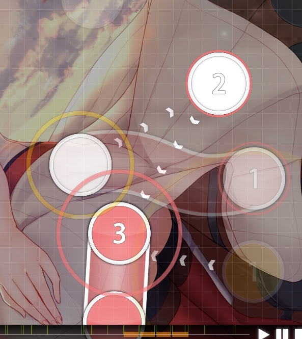
04:09:021 (2) - would reduce the jump on this to make vocals on 1+3 stand out more, like
http://lasse.s-ul.eu/JECmjPbE.jpg04:14:521 (1) - rotation/angle of this makes it look so out of place, why not something like
http://lasse.s-ul.eu/FQff9IuD.jpg[]
map seems nice overall, but hitsounding was a bit lacking and visuals could be more polished
feel free to call me back after you improved these things, shouldn't be too hard
maybe try to get one or two more mods from experienced modders or something
or just poke me after you got bubbles


