forum

GFX Bimonthy #3 - Colorful [Finished]

posted
Total Posts
32
Topic Starter
Reunilu
Submissions: closed! This time, I'll put the submissions in a spoiler since this week called for vertical signatures. Same rules for voting apply for this competition.

  1. Everyone is able to vote. However, the participants will not be able to vote for themselves, as votes towards themselves will not count.
  2. Voting is about who has the most skill.
  3. Votes will be counted by post, not poll.
  4. All votes must have a reason for their vote. You don't have to be a GFX artist to list technical reasons, of course. That said, constructive critcism is highly encouraged.
  5. One vote per person.
  6. This isn't a required part of voting, but if you would like to suggest themes for future GFX Bimonthies, go ahead. : >
A quote from my friend Spitty:

  1. Does the signature fit the theme?
  2. Does it look pleasing?
  3. Do you think proper techniques were used?


Entries
Fruits Basket
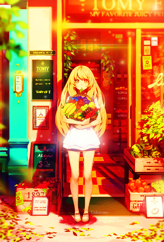

Life is Full of Colours


Removed due to plagiarism

Kirigiri


Konpaku Youmu


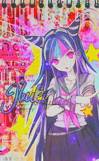
Ibuki

S U N S H I N E


Colorful


Voting ends April 22nd!


Previous edit
A day late, but we can make up for that during voting.

Remember the following if you want to participate:

  1. Anyone can enter unless specified by me. Yes, even beginners can partipate! It's all good clean fun.
  2. Your entry must follow the theme and GFX type.
  3. Your entry must be within size limits.
  4. Premade GFX is allowed.
  5. Work must be submitted before midnight GMT of the due date.
  6. Plagiarism is absolutely, most definitely, and highly not allowed. You will be disqualified if I find you editing someone else's GFX without permission and banned from future competitions.
Updated/New Rules!


  1. All submissions have to be anonymous. If you're participating, you can leave a post here saying that you're participating, but it's not required. You can also leave comments about your entry, but don't outright post what it looks like.
  2. As such, please PM me with the form below.
  3. Because this is all anonymous, if you have a watermark that includes your name, please use a different watermark.


Theme: Colorful
GFX Type: Vertical Signature
Max Size: 600 x 800


Form and Example:

[insert entry here]
[insert forum code for image here]
Proof:


[img]http://orig06.deviantart.net/f6f2/f/2014/158/a/4/a4abacda5735b72780f54392e700b5ff-d7lfc7o.png[/img]
Proof: http://www.mediafire.com/file/01da4llnewsukau/cirno.psd


Due Date: April 16th
JayM3_
Drinking smoothie while making mine :D :D
Lyaneii
I'll be trying to compete too!
Luisina
I'll participate!~
Tae
ehh what does a vertical signature even look like? I'll have a go... I guess?
Topic Starter
Reunilu

Tae wrote:

ehh what does a vertical signature even look like? I'll have a go... I guess?
Basically it's just GFX created in portrait view. It's not that different from creating a signature, it's just that having a different orientation might be a little... difficult to work with. I made one not too long ago, but I personally don't make them very often.

juesus
I'll participate
Kurochiie
Gonna participate once again.
I swear I suck at this theme.
MyAngeLNahuel
An interesting theme~
Good luck all.
I'll participate
Topic Starter
Reunilu
Reminder that you've got less than 48 hours to submit your entries.

Just sayin'.
JayM3_
I cant wait to see the submissions, hahaha.
^^
Topic Starter
Reunilu
Submissions: closed! This time, I'll put the submissions in a spoiler since this week called for vertical signatures. Same rules for voting apply for this competition.

  1. Everyone is able to vote. However, the participants will not be able to vote for themselves, as votes towards themselves will not count.
  2. Voting is about who has the most skill.
  3. Votes will be counted by post, not poll.
  4. All votes must have a reason for their vote. You don't have to be a GFX artist to list technical reasons, of course. That said, constructive critcism is highly encouraged.
  5. One vote per person.
  6. This isn't a required part of voting, but if you would like to suggest themes for future GFX Bimonthies, go ahead. : >
A quote from my friend Spitty:

  1. Does the signature fit the theme?
  2. Does it look pleasing?
  3. Do you think proper techniques were used?


Entries
Fruits Basket


Life is Full of Colours


Removed due to plagiarism

Kirigiri


Konpaku Youmu


Ibuki


S U N S H I N E


Colorful


Voting ends April 22nd!
- K a t h -
My vote would go for the first entry, but I will try and will give my opinions for every piece c;

First entry:

The vibrant colors caught my eyes on this one. For some reason, I find it very captivating. The subtle lightings enhanced the image by making it have a calming vibe to it. It definitely fits the theme even if it is simple. It would have been better if a rendered image was used though. Blending an image with the background is tough, and since a rendered image was not used in this piece, the only thing you can change or add is the coloring and add lightings etc. I can't say this used a lot of techniques, but in the end, this piece got my vote because of the colors~
Second entry:

Choice of background on this one is spot on (the buildings are colorful, true). But I would have to say that the background did not support the focal/render. The paint blots behind the text could have been better if the edges weren't so rough (since everything in the piece seemed to be smooth, if that makes sense). Text is cool and it's placement is okay~ Would prefer if the render didn't have the glow but I understand why it was done c:
Third entry:

I think I saw something quite similar from this one in deviantart? Too similar actually. But yeah, the render is blended really well. Textures used is good. Colors are nice and bright. And it fits the theme perfectly~
Fourth entry:

This one is cute and adorable and I like it. The texture using the pattern fill created a really nice effect in the overall piece. Only thing I noticed is the lighting I guess in Kirigiri's body did not fit in quite well. Background is awesome and supported the focal. Would rate A for cuteness ;3
Fifth entry:

Well this one is very pretty c; Coloring is nicely done. I like the blurred effect of the render on the back but would prefer if the background had more variety. And since the theme is colorful, I think this piece lacks just a little with the combination and contrast of colors.
Sixth entry:

I like this one. The background supports the render and it totally reflects on Ibuki's personality. Coloring is great but it didn't work so well with the textures at the back. The coloring made the textures look a little harsh and overpowered the colors of the focal. The text is cute and I like that style~
Seventh entry:

Just wow~ Despite being simple, a lot of techniques were used in terms of placement of textures, balancing of colors, lightings, and other effects. A great amount of skill was shown in this piece. This would be my vote, but the first entry's coloring just really caught my attention. If a tie was only possible ;w;
Last entry:

This is cute~ Everything's okay, textures, placement, everything. But the coloring could have been better. Maybe more colors could have been added and not just focus on the pinks. Nice choice of textures though c;
JayM3_
HOLY SH-T!
These weeks' entries are AMAZINGGGGG
My vote will be for S U N S H I N E
Ill try criticize 2nd, 3rd and 7th entry because these entries are the ones that captured my attention.
Life is full of Colors.
I seriously like this one! The colors used are very fitting though i find the text font not fitting hehehe and it kinda blocks the view of the city. This may be an example of something that really fits the theme! BUT the things that made me not choose this is that 1st it is not really vertical... like... BRUH ;) and that paint splats behind the text but further it really is a beautiful art!
Superstar.
Hmmm... This one, i cant really say a lot because... yeah you cant really see a lot... not that it is bad or the image size is too small. But the colors used are too likely to be not so different from each other that you cant differentiate what you're seeing. But all in all qua placement of vectors or those ornamental things are very well done it focuses on the character itself and shows beauty.
S U N S H I NE
Wow. Just WOW. I totally agree with Kath ^^ The techniques are superb and very well executed. colors are somewhat not alot but the brightness pays it off i cant say really a lot because it just totally takes my breath away!
Lyaneii
So many great entries!! I can't decide which one to choose ;oo
Lyaneii
💝 My final vote: Ibuki 💝

Fruits Basket: Even though it is very simple, the colour balance is beautifully executed. Really fits the theme, but it seems a bit empty in terms of own contribution to the picture.

Life is Full of Colours: Background really fits the theme, but the render is too bright, could be blended in better. Left side of the colour splash doesn't seem to correspond to the colours in the picture(A bit too saturated).

💝 Superstar: Everything is blended in so well with the picture, I love it. There is nothing that seems really off to me actually, maybe could have put "Star" under "Super" text, but that is just a personal opinion.

Kirigiri: I love the patterns you used as a background, truly beautiful. The thing that bothers me in this picture is that you used that black border for quite a few things, but those 2 badges that have zoomed in body parts don't have that kind of border and nor does the render have that kind of border fully. Which makes these 2 things not blend in the picture.

💝 Konpaku Youmu: I love the elegancy of this picture, the use of a blurred version with the render in front really catches my interests. The text could have been put a little to the left so it doesn't cover a part of the girl's hair in the background.

💝 Ibuki: I really love how much space you filled with all these beautiful colours. I think this is technically the best one to me. But literally the only thing that I don't like is the way the text is put into the picture, it doesn't seem to fit the style at all and the contrast between the rest of the picture doesn't seem to fit either with that text, I don't know if it's just me.

S U N S H I N E: Really nice contrast on the colours, but I think the white part of the background or I don't know what you call it doesn't seem to fit the picture, the shape doesn't really follow anything in the picture.

Colorful: Really nice use of the space, nothing seems empty, but the colours seem to be concentrated to the girls clothes, wish the colours would have been expanded over the whole picture, because you only used a pink tint for the rest of the picture.

PS: I love them all, don't get me wrong with the hearts, it's just to show between which I wanted to decide xd.
Tenyante
My vote goes to Konpaku Youmu, the lightning effect is great, the roses on the background make it look more "cute" and the colors are in my opinion, on-point
Kurochiie
My vote goes to Konpaku Youmu.
The simplicity of it caught my attention. Although the background is empty, the coloring covered it all.
Less effects but nicely done.

My first choice was the Fruits Basket entry but I saw the original image.
Coloring was just applied to it and little bit of fractals. It's a minus point, but it was really nice. :>

For the Superstar entry, I think the one who made that only changed the render? I'm pretty sure I saw a PSD reference to that on Deviantart.
Topic Starter
Reunilu
[Just came home from school didn't have an opportunity to do this sooner because school Wi-Fi blocks deviantART.]

Gods bless you guys for saying something about the Superstar entry. Proves that I certainly can't check for plagiarism with what I have now or by myself. Through some searching, I was able to find the original PSD. There's no point in just removing the entry, since I'll have to have a banlist of names sooner or later.


Kamikazy, the owner of the Superstar tag, has been banned from GFX Bimonthy until further notice.
- K e n -
wow.
Taking someones work, "change" something
and then say its "my work "is so sad.
I can just laugh about it xD


My vote goes for Fruits Basket
I mean yeah there wasn't much work done
but I really like that its so colorful.

I really support what Kath did say about it:
The vibrant colors caught my eyes on this one. For some reason, I find it very captivating. The subtle lightings enhanced the image by making it have a calming vibe to it. It definitely fits the theme even if it is simple. It would have been better if a rendered image was used though. Blending an image with the background is tough, and since a rendered image was not used in this piece, the only thing you can change or add is the coloring and add lightings etc. I can't say this used a lot of techniques, but in the end, this piece got my vote because of the colors~
JayM3_
Oh shit. Damn.....
Not trying to offend Kamikazy though not at all but this is a very heavy violation. since we are here trying to compete with OUR skills and someone comes here with skills from another person who might even be better than the contestants which makes it very unfair and wrong
- K a t h -

JayM3_ wrote:

Oh shit. Damn.....
Not trying to offend Kamikazy though not at all but this is a very heavy violation. since we are here trying to compete with OUR skills and someone comes here with skills from another person who might even be better than the contestants which makes it very unfair and wrong
I agree. I've seen a lot of Kamikazy's works in their GFX thread. A lot of his/her work came from PSD references from deviantart. PSD References are meant to teach aspiring GFX artists. They are not meant to be ripped or plagiarized. I'm not saying this to offend Kamikazy, I believe that he/she just really wants to learn. But actually taking the whole PSD file and changing the render does not count as learning.
JayM3_

- K a t h - wrote:

I agree. I've seen a lot of Kamikazy's works in their GFX thread. A lot of his/her work came from PSD references from deviantart. PSD References are meant to teach aspiring GFX artists. They are not meant to be ripped or plagiarized. I'm not saying this to offend Kamikazy, I believe that he/she just really wants to learn. But actually taking the whole PSD file and changing the render does not count as learning.
If what you say is true by meaning that "A lot of his/her work came from PSD references from deviantart." and IS in his GFX thread claimed as his own then im afraid that he has really violated an actual rule in this thread that might get him kicked out


P.S that Signature of Kath's is FAB as F*ck btw i like it ;) . Nice work Kuro!
Topic Starter
Reunilu
Hey guys, submission time cut into voting time as y'all know and you've got a little over two days left to vote.
Luisina
My vote is for S U N S H I N E, I like the flowers, the light effects and the colors, also I love daisy flowers~
a1l2d3r4e5d6
I'm bad with words, but I'll give this a go. σ( ̄∇ ̄;)

Voting for: Ibuki
I like this one. The use of strong colours and contrasting elements work well in making this stand out; befitting of the given theme.
The colour range could be improved though as it feels to me that one particular colour is dominating.
Fruits basket (runner-up pick)
I quite like this one too. The way the colours are intesified helps to emphasise the fruit(s) basket ha!
That said, having seen the original image, it leaves much to be desired with the editing. It looks as if only the saturation was increased and an overlay was applied. Simple, yes; effective, yes, but I feel that more could be added to it.


Life is Full of Colours
Interesting one. The render, though full of colour, feels out of place with the bg. I think more could be done to make her be 'at one' with the environment.
The colourful splashes on the bg is clever, but I feel that it conflicts too much with itself; it just looks muddy to me instead of vibrant. :/
Other than that, it's quite cool even if it isn't in a vertical format. ;p


Kirigiri
The patterns are nice and the colours are well executed, complimenting the subject (render). The separate elements focusing on certain parts of the person adds to the charm. The black borders could be better if you made them match the colour palette and, referring to the theme, made the colours a tad more vibrant or at least add more range. Otherwise, a job well done.

Konpaku Youmu
Pretty. The border is clean and intriguing. The text is noticable and subtle so it doesn't detract from the image that much. It also seems like a handful of layers were applied featuring a wise selection of elements that complement each other.
The colours are on the soft side though, and screams of more 'serene' or 'subtle' rather than 'colourful'.


S U N S H I N E
It's very clean and beautiful. The use of the many layers and elements work well with each other.
Again, like some of the other submissions, the colours seem soft and the palette a tad limited. It's a well-made work that doesn't quite portray 'colour' that well for me.


Colorful
Very nice. The elements and texure used adds to its charm. Everything works well with each other.
I think it could be shorter, either that or the render moved up slightly. Contrary to its title, there's not a lot of colour being seen. It's bright, but it's soft and it doesn't capture the theme of colour that well.
juesus
My vote is directed to Ibuki, I like how in the same image he was able to combine the tones and colors shown, thus highlighting the subject of competition.

I would like to say something about two other works:

S U N S H I N E: I really like this image, but the background becomes very bright, making it less pleasing to the eye.

Life is Full of Colours: In my opinion you could add a filter to combine render and background.
AngeLNarancia
My vote is for ''Konpaku Youmu'', simple but beautiful. I also love the Blush background effect. The other jobs are so beautiful!
Phenlex
I vote for "Fruits Basket". I agree with some of the other replies; it doesn't look disparate to the original, like many of the other works, but following the theme of "colourful" I definitely thing it fits the best. Props to "Konpaku Youmu" as well, looks dope.
Topic Starter
Reunilu
You guys and your ties. To be honest, when I said "Colorful", I meant something like the Ibuki entry, but if it got someone out of the comfort zone, then I've met my quota.

1st Place

JayM3_


XxCrystal


Luisina

2nd Place

Kurochiie

No 3rd Place :o
AngeLNarancia
I would like to know when there will be another contest of these!

I would like to participate
Topic Starter
Reunilu

-Hime wrote:

I would like to know when there will be another contest of these!

I would like to participate

GFX Bimonthy is always running, but submissions are always every other week! The newest one is here, which is accepting submissions at the moment: p/5967924
Please sign in to reply.

New reply