forum

GFX Bimonthly #4 - Set Render [Finished]

posted
Total Posts
31
Topic Starter
Reunilu
Affiliiated with Artem Familia

Aaand submissions closed! I'll go ahead and anounce next week's prompt, since I've been dying to see this one in action and it might take a little bit of prep, depending on who you are. You guys need a little less dependence on some things, so next week I'm putting restrictions on what you can do! Here's the list:

  1. The blend mode Luminosity is banned.
  2. The adjustment layer Gradient Map is banned.
  3. Text is not allowed unless used as decoration (such as using typography textures like this one) or as a watermark.
  4. Fractals,bokehs, and anything focused on being sparkly are banned.
  5. You cannot use more than 4 adjustment layers.
("I hope I'm not confusing you", version: It's Freestyle/Anything Goes without limits on sizes, except some GFX resources and features of editing programs are banned (see above))

New!

I'll be giving out a little GFX piece to every voter, just to say thanks for voting! Here's what they might look like:


Things to remember about voting:
  1. Everyone is able to vote. However, the participants will not be able to vote for themselves, as votes towards themselves will not count.
  2. Voting is about who has the most skill.
  3. Votes will be counted by post, not poll.
  4. One vote per person.
  5. This isn't a required part of voting, but if you would like to suggest themes for future GFX Bimonthies, go ahead. : >
Updated!

  1. You must have a valid reason for your vote to count. Vague things like "this looks better than the others" and "this is perfect" and off-topic statements like "because I said so" are the only things that will not make your vote count. That said, constructive critcism is highly encouraged.
A quote from my friend Spitty:

  1. Does the signature fit the theme?
  2. Does it look pleasing?
  3. Do you think proper techniques were used?


Entries
Flowerbed


Lucid


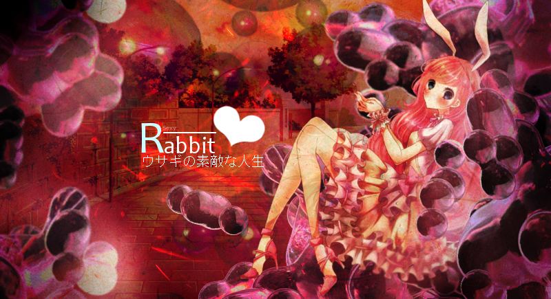
A Wonderful Rabbit Life

あなたにムチュー


Bunny~


Little Bunny
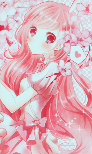

Timeless


Magic


WahUsaMimi


Bloom Where You Are Planted


Voting ends May 6th!


Previous edit
Let's do something different for this one. The next couple ones might be different too, depending on what happens.

Remember the following if you want to participate:

  1. Anyone can enter unless specified by me. Yes, even beginners can partipate! It's all good clean fun.
  2. Your entry must follow the theme and GFX type.
  3. Your entry must be within size limits.
  4. Work must be submitted before midnight GMT of the due date.
  5. Plagiarism is absolutely, most definitely, and highly not allowed. You will be disqualified if I find you editing someone else's GFX without permission and banned from future competitions.
  6. All submissions have to be anonymous. If you're participating, you can leave a post here saying that you're participating, but it's not required. You can also leave comments about your entry, but don't outright post what it looks like.
  7. As such, please PM me with the form below.
  8. Because this is all anonymous, if you have a watermark that includes your name, please use a different watermark.
Updated Rules!

  1. Now that Artem Familia is a thing, I'll allow entries to be submitted via DM on Discord. I'll still need the codes for entries, of course.


Theme: Set Render
GFX Type: Any
Max Size: None

The render can be found here!: http://partyxglam.deviantart.com/art/Bu ... -452059312


Form and Example:

[insert entry here]
[insert forum code for image here]
Proof:


[img]http://orig06.deviantart.net/f6f2/f/2014/158/a/4/a4abacda5735b72780f54392e700b5ff-d7lfc7o.png[/img]
Proof: http://www.mediafire.com/file/01da4llnewsukau/cirno.psd


Due Date: April 29th


Banlist

  • Kamikazy - Plagiarism. Cannot participate 'til hell freezes over.
Luisina
I'll participate!~
again
JayM3_
Lemme try something new
AngeLNarancia
a doubt

Does it have to be a specific render or can it be any?
a1l2d3r4e5d6

-Hime wrote:

Does it have to be a specific render or can it be any?
It's a specific render and can be found in the original post. :p

Reunilu wrote:

Theme: Set Render
GFX Type: Any
Max Size: None

The render can be found here!: http://partyxglam.deviantart.com/art/Bu ... -452059312
AngeLNarancia

a1l2d3r4e5d6 wrote:

-Hime wrote:

Does it have to be a specific render or can it be any?
It's a specific render and can be found in the original post. :p

Reunilu wrote:

Theme: Set Render
GFX Type: Any
Max Size: None

The render can be found here!: http://partyxglam.deviantart.com/art/Bu ... -452059312
Okey thanks uwu
Kurochiie

JayM3_ wrote:

Lemme try something new.
I'll participate. :>
AngeLNarancia
I'll participate uwu
Senritsu
Participating 'cause i can c:
Topic Starter
Reunilu
Friendly reminder that submissions end in a little over 36 hours : >
Topic Starter
Reunilu
Aaand submissions closed! I'll go ahead and anounce next week's prompt, since I've been dying to see this one in action and it might take a little bit of prep, depending on who you are. You guys need a little less dependence on some things, so next week I'm putting restrictions on what you can do! Here's the list:

  1. The blend mode Luminosity is banned.
  2. The adjustment layer Gradient Map is banned.
  3. Text is not allowed unless used as decoration (such as using typography textures like this one) or as a watermark.
  4. Fractals, bokehs, and anything focused on being sparkly are banned.
  5. You cannot use more than 4 adjustment layers.
("I hope I'm not confusing you", version: It's Freestyle/Anything Goes without limits on sizes, except some GFX resources and features of editing programs are banned (see above))

New!

I'll be giving out a little GFX piece to every voter, just to say thanks for voting! Here's what they might look like:


Things to remember about voting:
  1. Everyone is able to vote. However, the participants will not be able to vote for themselves, as votes towards themselves will not count.
  2. Voting is about who has the most skill.
  3. Votes will be counted by post, not poll.
  4. One vote per person.
  5. This isn't a required part of voting, but if you would like to suggest themes for future GFX Bimonthies, go ahead. : >
Updated!

  1. You must have a valid reason for your vote to count. Vague things like "this looks better than the others" and "this is perfect" and off-topic statements like "because I said so" are the only things that will not make your vote count. That said, constructive critcism is highly encouraged.
A quote from my friend Spitty:

  1. Does the signature fit the theme?
  2. Does it look pleasing?
  3. Do you think proper techniques were used?


Entries
Flowerbed


Lucid


A Wonderful Rabbit Life


あなたにムチュー


Bunny~


Little Bunny


Timeless


Magic


WahUsaMimi


Bloom Where You Are Planted


Voting ends May 6th!
Luisina
My vote goes for Timeless, I like the background and the idea of use the render in this way is just unique. Clean and good edit~
Akito
Hi, I really don't know anything about GFX but I'll be voting since I promised to do so.
I thought every entry was really good, but in the end it came down to what stood out to me the most.
I'll be voting for "Lucid", I find it really nice to look at while still capturing my interest. I really like how I didn't have to stare at the image to see everything that's going on and the colours in the background helped with that.
Also sorry Jay, I kinda had to disregard your submission because I knew it was yours and idk the rules around that but I didn't want to be biased :c.
Janpai
I want to say to all artist who joined this bimonthy a congratulations for all your works! I honestly feel envy on the skills of the following artist but anyway here's my vote it's my first time to vote though and I'm not experienced as others do.
My vote goes to Timeless
I was mindblown on this entry. Like when I saw the render, I'm expecting entrants to make it cute because it's a rabbit ofc but this one is super unique. The concept is really nice and there's something mysterious about the girl makes me so curious about. Although the girl could have another color aside from blue and orange palette. I can't say anything more, it's really amazing >///<)b
[ Spoon ]
I am not a GFX artist nor do I know anything about it. However there was one piece that really stood out to me. I'll be voting for Timeless. I think this artwork does a great job of using shadows and highlights but what most stood out was the window behind the girl that shows different weather conditions and it leaves me thinking why the artist put that in there. Although I somewhat feel like the girl is a bit out of place, I still think this is a great artwork! :) Very mysterious~
Tae
gonna go against these other people and vote for あなたにムチュー. While it is what you'd expect of this render, it still works well and looks p good imo :^)
is she meant to be hovering like that in the timeless entry...?
Topic Starter
Reunilu

-Akito wrote:

idk the rules around that but I didn't want to be biased :c.
There actually aren't any rules regarding biased voting, since I can't prove prejudiced votes like I can for plagiarism (most of the time, anyway). I leave that all on the moral conscious of the person that votes. That, and if you have a good enough eye, it's possible to guess who made what based on the style and I can't stop a person from doing that.

Though, if it becomes obvious that a person is biased by repeated votes for a particular person and I have good reason to think so, I might do something about it~
Phenlex
I don't even know if my vote counts cause I'm a shitter nobody, but in the case that it does; I vote for Timeless. Fuck, that shit so on fleek, even mothafuckin Jesus in on board wid it. Gud shit. (Translation: I really like how the colours are contrasting, but still manage to blend in to the environment smoothly. There's also a lot of depth in the image itself, and it looks cleanly edited. Props to the artist.)
- K a t h -

Phenlex wrote:

I don't even know if my vote counts cause I'm a shitter nobody, but in the case that it does; I vote for Timeless. Fuck, that shit so on fleek, even mothafuckin Jesus in on board wid it. Gud shit. (Translation: I really like how the colours are contrasting, but still manage to blend in to the environment smoothly. There's also a lot of depth in the image itself, and it looks cleanly edited. Props to the artist.)
This is why I love you dude. ♥
I also agree, of all the entries, Timeless is the only one who used a different technique and really executed everything well.
Lyaneii
My vote definitely goes to Timeless, everything is just perfect, the colours, the setting and how you positioned the render so it looks like she is sitting on something. Truly beautiful 💝.
notkesh
My vote: Timeless

This was so well put together that it could pass for an original illustration. Also, this is different from every other attempt and a very good change from the usual go-to style, and it came out perfect. I like the colors too, kinda gives out the Halloween vibe imo. Congratulations to the artist.
- K e n -
Vote : Timeless ¯\_(ツ)_/¯
Reason: It looks perfect, I mean the render suits really well into the picture.
The color sheme is also very cool imo, i like the fact that is soo "dark" and then
you see some stuff with good lightning standing out of the picture.

The other entries are pretty good too c;
but the Timeless one caught my eye in an instant.
juesus
Like most people my vote is for Timeless.

What stands out is the difference with the other works, and the render comes to agree with the background, it is simply spectacular. Like the other resources used as the shines and lamps that come to give a touch type 'Halloween'. It is also characteristic of the image that the filter put is not what most stands out by focusing on the image itself. It was definitely a great job.
Mikichiyo
It's a pretty hard decision because I'm in love with all entries!
But I'm going to vote for Timeless as well because I like the dark theme used here. It's pretty cool how he or she managed to create such a dark atmosphere, though it's a cute render ~
Shiv

あなたにムチュー

the render, and the background matched perfectly (if i say so myself), the carrots, that lil ribbit, the colours, i love 'em all
ah, i'm really suck at making opinion :'(
JayM3_
My vote.... hmmmm..... My vote.... MAMA!!!!!!!!!!!!!! HELP ME FOR GOD SAKE! This is hard asf! this bimonthy in particular shows the skill of each participant to create a great artwork with a given render, which is fucking hard as fuck. this shows the skill of which how you can create an artwork with a preset. Only a few artists can manage to create a piece that goes well with the render. who does not do this very often or doesnt have the experience in GFX cant execute this properly. OMG Guys! so maybe my vote can go for the one who did the theme of the render over the whole image; the one who made a gfx around the render and not alter the mood of the render.
Flowerbed is my vote, since it really flourishes among the participants. i just feel that flowers are the correct image you get by looking at the render.
hehehehe ;)
Kurani_old
My vote is for Timeless. I really like the background and also I think that is different from the others, I like the dark theme and how everything looks perfect. Beautiful edit <3
Kurochiie
My vote goes to Lucid. I was expecting the participants to make a whole-sized canvas, but this one didn't. The render looks like it is inside a giant crystal ball, but it'd be nice if the background from behind was pinkish or orange-ish (the color seems out of place-- imo). Overall, it's good. Well-thought.

Thumbs up to the person who made it!
ixTailz
My vote goes to Lucid. I feel that it is underrated considering how it makes use of the free size criteria. The crystal ball design looks very interesting and is very pleasant to look at. I like the glass-looking lines (I don't know what to call it...) around the circle so that the image doesn't look too flat. Agreed with Kurochiie that the background is slightly off. Maybe the designer didn't want everything to look so pink? It also feels like the designer picked the title to relate to his design. A very creative entry.

How did I not notice this Bimonthly thing earlier?
Topic Starter
Reunilu

ixTailz wrote:

How did I not notice this Bimonthly thing earlier?
Don't worry, a lot of people don't want to notice it. But bless you for noticing it and taking the time to vote <3
Topic Starter
Reunilu
I should make a game where the person who guesses the most artists for the entries correctly to this competition wins two months of supporter.

/flavortext

Those who voted should get their puzzle piece for this week right about now.


1st Place: Kurochiie


2nd Place: stal


3rd Place: Luisina
Please sign in to reply.

New reply