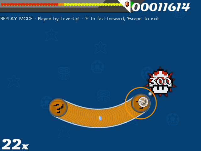
Hmm. Here are my opinions, feel free to take them with a grain of salt.
Things I like:
-The flag as the score bar
-Morph ball samus
-The general look of the beat explosions
Things I think could be improved:
-Things that aren't skinned should be (followpoint, sliderscorepoint, and the spinner background)
-While I do like the use of Link as the reverse arrow, the size of the sprite makes it awkward. Maybe shrink him a bit, so that he doesn't extend so far beyond the edges of the circle. Also, why the GBC sprite instead of an NES one?
-The hit circles as "?" Blocks is clever, but you seem to be placing a square peg in a round whole, so to speak. Maybe lose the straight edges, and just paste the ? mark onto a blank circle. If you want, you could then try to add a border to the circle (probably on the "overlay" image) to make it look more like the ? blocks.
-I see what you mean about the star explosions looking good behind yours, but I suggest at least tracing over them yourself on a new layer. That way you'd have the benefit of that star shape, but none of the original skin actually shows.
-I feel like there should be some kind of game logic behind the choice of sprites for the beat explosions. There just doesn't seem to be any rhyme or reason to it as far as I can tell. They all look good, but as a set they don't feel cohesive. Although I just noticed that the Elite Beat is a sort of combination of the 300 and the regular Beat, so maybe I'm not giving you enough credit. In any case, you should consider throwing in a sprite of
Beat.

Things I object to on a fundamental level:
-Pokemon. Not that I have anything against Pokemon, but it doesn't fit the theme.
I know that seems like a lot of complaints, but they're mostly small nitpicks that just require a lot of words to explain. It's still good.
