Open Sliders-
Hard to explain: A slider that has no end. Just like a normal slider, but no end hit or sound. I've always wondered why this wasn't included (probably because the game is aiming to stick to traditional Ouendan and EBA as much as possible) but surely they would add a lot of variety in maps, and would provide lots of unique patterns and whatnot.
Editing mode additions-
Timing sections can control a lot already, so adding:
slider speed (unless an equation is set by the bpm to determine this or something, thus not enabling it to be changed);
slider tick;
and type of slider would give you even MORE control. I just thought it would be useful.
Also, in song setup, how come overall difficulty controls three options? Being able to set those options would be kinda useful too.
Filter played-
This way, you can see which songs you haven't played yet. o_o
Endless/Marathon Mode-
Beatmap after beatmap after beatmap...
Survival is definitely an option, as well as timed, and other stuff. It's not a fully formed idea yet, but it seems feasible.
(ranked/unranked play, and also multiplayer perhaps?)
Beatmap sorting ideas-
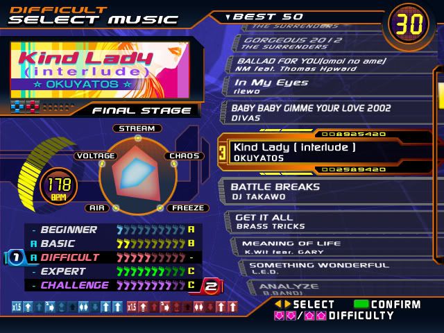
Why can't you have a pack of beatmaps that really belong as a pack rather than scattered everywhere? Also, I was wondering: why not make difficulty selection similar to StepMania, where you just press up-up or down-down to change the difficulty, rather than having the same song's difficulties be scattered and listed as completely different beatmaps? I mean, I KNOW they are completely different maps, but it's just weird. It's the same song.
I also thought showing a few statistics of the maps before playing it would be useful too.
Oh and, lastly: how about a preview bar? (Another option in design mode in editing, maybe)
Example:

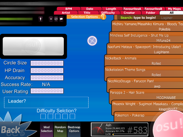
The problem with these ideas, though, is that the current selection screen is crowded a bit, and there's nowhere to put them without further clogging an already-clogged drain, so to speak. I can see it's as condensed as it could ever be. A redesign wouldn't be too hard to do, though. The only issue I can think of is where to put the online stats. Hm. They could possibly scroll, or you could just change to local/online rankings with the buttons on top (you know, where you find the arrows to change the page of the online rankings). I'd love to give it a shot, honestly.

Rushed. It, of course, wouldn't look NEARLY this bad and unprofessional (hopefully, lol), but it works okay for a concept, right?
osu! community Frappr map-
It couldn't hurt! You could call it "Frappy" or something.
No video mod being optional in multiplayer-
The ability to turn on and off video should be on the player's end, not the decision of the host. Some people may want to view the video, and some may not.
Genre sorting-
...I'm sure this has been suggested before.
Hard to explain: A slider that has no end. Just like a normal slider, but no end hit or sound. I've always wondered why this wasn't included (probably because the game is aiming to stick to traditional Ouendan and EBA as much as possible) but surely they would add a lot of variety in maps, and would provide lots of unique patterns and whatnot.
Editing mode additions-
Timing sections can control a lot already, so adding:
slider speed (unless an equation is set by the bpm to determine this or something, thus not enabling it to be changed);
slider tick;
and type of slider would give you even MORE control. I just thought it would be useful.
Also, in song setup, how come overall difficulty controls three options? Being able to set those options would be kinda useful too.
Filter played-
This way, you can see which songs you haven't played yet. o_o
Endless/Marathon Mode-
Beatmap after beatmap after beatmap...
Survival is definitely an option, as well as timed, and other stuff. It's not a fully formed idea yet, but it seems feasible.
(ranked/unranked play, and also multiplayer perhaps?)
Beatmap sorting ideas-
Why can't you have a pack of beatmaps that really belong as a pack rather than scattered everywhere? Also, I was wondering: why not make difficulty selection similar to StepMania, where you just press up-up or down-down to change the difficulty, rather than having the same song's difficulties be scattered and listed as completely different beatmaps? I mean, I KNOW they are completely different maps, but it's just weird. It's the same song.
I also thought showing a few statistics of the maps before playing it would be useful too.
Oh and, lastly: how about a preview bar? (Another option in design mode in editing, maybe)
Example:
The problem with these ideas, though, is that the current selection screen is crowded a bit, and there's nowhere to put them without further clogging an already-clogged drain, so to speak. I can see it's as condensed as it could ever be. A redesign wouldn't be too hard to do, though. The only issue I can think of is where to put the online stats. Hm. They could possibly scroll, or you could just change to local/online rankings with the buttons on top (you know, where you find the arrows to change the page of the online rankings). I'd love to give it a shot, honestly.
Rushed. It, of course, wouldn't look NEARLY this bad and unprofessional (hopefully, lol), but it works okay for a concept, right?

osu! community Frappr map-
It couldn't hurt! You could call it "Frappy" or something.
No video mod being optional in multiplayer-
The ability to turn on and off video should be on the player's end, not the decision of the host. Some people may want to view the video, and some may not.
Genre sorting-
...I'm sure this has been suggested before.

 .
.