Let me have a crack at this with my Low Quality Mod ™
[Phantasm Stage]
Song 1 00:52:376 - (SB) I think this would look better if there was a transition from black to picture here. You should really do a really quick flash of light and then fading into the background.
Exampleshttps://osu.ppy.sh/b/909391 < This map
- 02:43:252 -
- 03:56:038 -
00:52:397 - Random unsnapped bookmark for no reason.
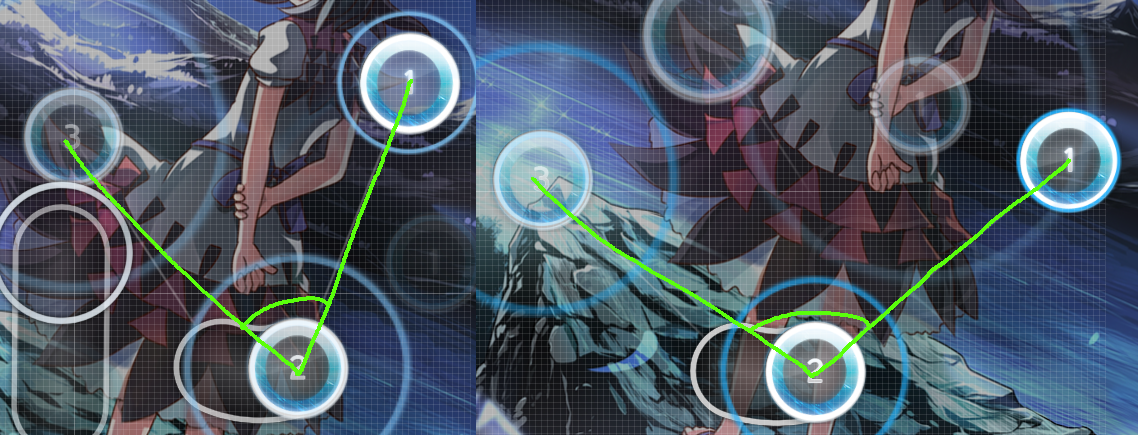
00:53:050 (3) - Shouldnt this slider be symmetrical? It is obviously lopsided to the right.
00:53:724 - (SB) This text is quite difficult to read over the background with very similar color palette. Also, the text should finish flying in exactly at 00:53:724 - instead of 00:53:808 - so it syncs up with the beat of the song. It will definitely make it more visually appealing.
01:08:218 (6,7,8,9,1) - This non curved stream pattern here is very offputting. I suggest making it curved like basically all of the other streams.
Song 201:43:935 - Again, the text should finish flying in exactly on the white tick with the beat, and is hard to read with the background. Also, this uses the same font as the first song. I think it could be spiced up by using a font that fits more with the theme of the background.
01:43:935 (1,2,3,1,2,3,1,2,3,1,2,3,1,2,3,1,2,3,1,2,3,1,2,3,1,2,3,1,2,3,4,5,1,2,3,1,2,3,1,2,3,1,2,3,1,2,3,4,1,2,3,4,1,2,3,4,1,2,3,4) - This singletapping sequence goes on for a bit... Maybe even it out with a slider in the middle?
01:54:485 (1,3,5) - This would look neater if they were all the same slider, just rotated differently.
02:04:045 - 02:05:363 - 02:06:187 - 02:07:011 - I think you messed up your hitsounds here. If this in intentional, I advise removing it because it is very distracting due to how inconsistent it is (especially to the player). NOTE I only pointed out 4 examples, this random hitsound inconsistency goes on for basically the whole song. You should just listen through the song and fix it whenever it pops up
02:37:258 - I think we should get a bit more black screen before throwing the next bg at us. You could do that by making the bg before this black out earlier / quicker, and making the new one come later / quicker
Song 302:40:749 - Text is readable, but still doesnt sync with the white tick and still uses same font. The fact that you are only using one font is getting very noticeable at this point.
02:45:776 - ITS HAPPENING AGAIN!!!! MAKE IT STOP!!
03:01:182 (3,4,5) - These dont have to be highly spaced because they are in thirds. In fact, it would probably look neater if they were closer together.
03:16:911 (1) - Ending of this slider could look more natural
03:22:100 - We are mid Kiai and we are switching hitsounds for some reason. There is really no reason to be switching hitsounds, especially in the middle of a Kiai. Again, it is very offputting and distracting to the player.
03:27:290 - Oh and the new hitsounds stopped in the middle of the kiai again for some dang strange reason.
03:37:019 (4,5,1,2,3,4,5,6) - This stream is very ugly imo.
03:43:019 - Spinner would fit in well here.
Song 4 03:49:817 - Text should settle on white tick, same font, blah blah blah. Also, I think this specific one would look much better if it was in rainbow colors (With the rainbow designs in the bg). I also noticed that for some reason this text comes in right when the music starts, as opposed to your first three songs where the text comes in a few seconds after the music starts. Also, I noticed that when the text comes on, it just kind of stays there. It doesnt pulse with strong beats or release a sort of pulsating glow, it just stays there, unmoving. The beautiful storyboard from
https://osu.ppy.sh/b/909391 (mentioned above) shows many different ways of making your text look good when it is standing still, instead of it being 100% static.
03:53:323 - The inconsistent, annoying, distracting hitsounds are back!
03:54:710 (6,7,8,9,1,2,3,4,5,6,7,8,9,10,11,12,1) - You can see how annoying the hitsounds are when you listen to this being played.
04:19:492 (1,2) - Would feel much better as a slider and excluding 04:19:818 (3) -
04:28:949 (5,6,7,8,1) - I dont know why the DS dropped so dang dramatically. The music definitely doesnt warrant it, it sounds exactly the same as the rest of the stream. You should definitely make this part of the stream the same DS as the rest.
04:33:921 (2,3,4,1) - I feel DS could be higher here.
04:34:166 (1,1,1) - I know these are far away from eachother in time, but I dont think they should be so far away. The player gets more of a break if they arent across the screen from eachother.
04:38:242 (2,3,4,5,1,2,3,4) - This feels hella awkward. I have no advice on how to fix this, but this is hella awkward
04:49:165 - 05:10:035 - I think a Kiai would be good here.
Song 5 05:17:203 - Did I mention the text yet? Not synced, same font, and inconsistent with first 3 songs (but goes with 4th). Also, this text is very faded compared to all the others, and makes it even harder to read.
05:22:124 - IT KEEPS HAPPENING!
05:33:711 (1,2) - Blanket?
05:34:187 (2) - This slider is particularly sexy. I just felt the need to point that out.
05:51:489 (1,2,3,4,5) - This mini stream could look cleaner in its curve.
06:05:299 (2,3,4,5,6,7,8,9,10,11) - ^
06:13:870 (1,2,3,4,1) - As said above, I dont see what warrants this DS drop.
Song 6 06:25:387 - Oh, in case I didnt bring it up earlier, the text is not synced with white tick, status, inconsistent with first 3 songs, same font as all other ones, and has a color that makes it hard to read.
06:27:071 - Did I mention the detached, distracting hitsounds?
06:44:826 (1) - This slider could look more sexier...
07:13:755 (4,5,6,7,8) - I really dont think this is warranted, considering the music doesnt even give warrant for a stream, much less a hella high DS stream.
Song 7 07:21:657 - This text magically synced with the white tick! But it still has all those other problems so...
07:21:657 (1,1,1,1) - LETS, DO, THE TIME, WARP, AGAIN!!!!!!
https://youtu.be/tkplPbd2f60?t=37s08:03:807 - Right when I thought it stopped, its back.
Review This is a very solid map and I really like it. The mapping itself is good to look at and looks like it plays well.
The Storyboard really needs some improvement to make it look nicer in general (contact a pro SBer to check it out), and the hitsounds REALLY need to be fixed.
Good luck!

