forum

(K)NoW_NAME - Knew day (TV Size)

posted
Total Posts
157
show more
Topic Starter
Avishay
@Krfawy, changed everything (except adding that soft hitsound in the end, I can't find anything fitting ehhh), including the thing on Easy, although I declined it on Squirrel's mod, I guess it should be just changed as you both mentioned it.

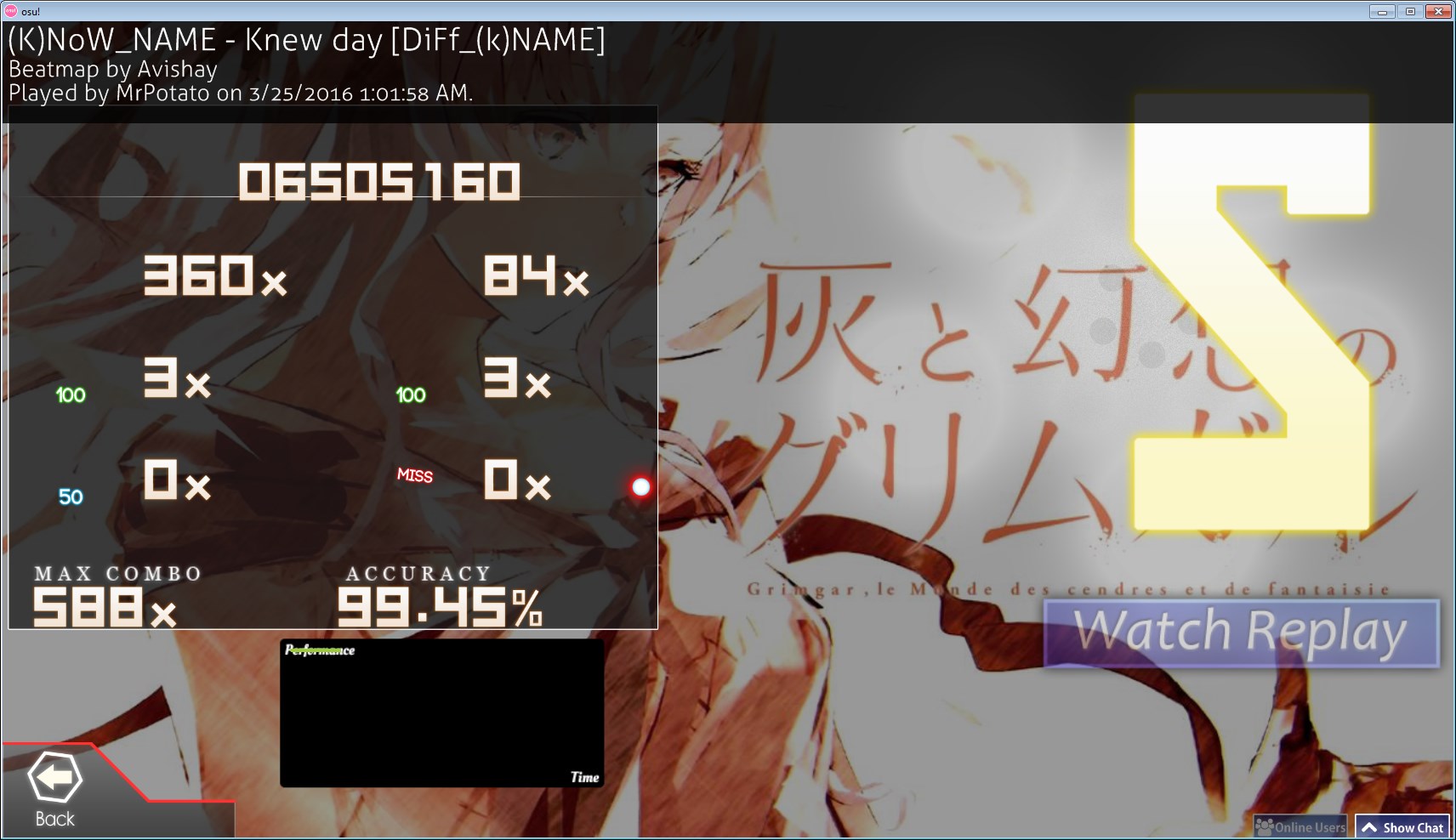
BTW, here's MrPotato's play at the current ver (which I am going to update over it too)

Alec T Ota
Nice map, shoot star
Topic Starter
Avishay
Thanks for the star, trying to find some BN to push it forward atm.
Kibbleru
u should use at least tickrate 2 for this type of style

ex
00:08:586 (8) - repeat is so hard to see >< can u increase sv for this slider
00:54:186 (3,4,5) - flow is kinda sharp here, and if ur going to map like this, i think you should avoid things that are jittery to play.
01:04:386 (1,2,3,4,5,6) - idk what to really say about this.. dont u think the spacing gets a little harsh at the end lol
01:07:186 (5,6) - why is this spaced so big?


insane
00:32:986 (1,2,3,4) - can u not do something like this lol, too misleading and no manual stack on 00:32:986 (1,2) - doesn't help cuz it all looks the same in game
01:03:986 (3,4,5) - u need more spacing here, looks too similar to 01:04:586 (1,2,3,4) -
01:10:686 (6,7,8) - the stack makes the movement super jittery, can u either space them all out or stack them all

hard
00:27:686 (4) - unecessary triplets here imo
00:30:886 (4) - ^
why does hard diff have lower CS than advanced? follow something linear pls?
also i think its better to rename advanced > hard and hard > hyper

normal
00:43:586 (4,5,1,2,3,4,1,2,3,4,1) - can u insert a 1/1 break somewhere here? 1/2 chain a bit too long imo

easy
can u not use 1/2s here? >< otherwise it becomes more like a normal
Topic Starter
Avishay

Kibbleru wrote:

u should use at least tickrate 2 for this type of style OH, right, changed in all diffs.

ex
00:08:586 (8) - repeat is so hard to see >< can u increase sv for this slider I guess incresaing the SV could work too, should be okay now.
00:54:186 (3,4,5) - flow is kinda sharp here, and if ur going to map like this, i think you should avoid things that are jittery to play. To be honest I use sharp flow in more places, it goes really well with the vocals. e.g. 00:53:386 (7,1) - 01:01:586 (9,1) - The reasoning for the movement from 3->4 is the vocals obv but the movement from 4->5 is quite fun and not as terrible as it might seem in the editor, here's how it actually plays http://puu.sh/o593N/f25cd66713.jpg (excuse my terrible paint skills lol)
01:04:386 (1,2,3,4,5,6) - idk what to really say about this.. dont u think the spacing gets a little harsh at the end lol Not really, it's quite smooth, everyone who played it found it just fine :P Maybe it's a bit scary on the editor.
01:07:186 (5,6) - why is this spaced so big? Mostly because of the sudden strong violin (and because it looks really well!), unlike 01:09:686 (9,1) - which starts really low


insane
00:32:986 (1,2,3,4) - can u not do something like this lol, too misleading and no manual stack on 00:32:986 (1,2) - doesn't help cuz it all looks the same in game Not really sure what to do here then, everything else is even more overdone or awful.
01:03:986 (3,4,5) - u need more spacing here, looks too similar to 01:04:586 (1,2,3,4) - NC is the best I can offer, the pattern is not that hard to distinguish and you can hear the intensity change too.
01:10:686 (6,7,8) - the stack makes the movement super jittery, can u either space them all out or stack them all Yeah I agree. BUT GOD DAMNIT everything else just doesn't work, 01:10:786 (7) - is clearly the strongest drum, the play here should be this way 01:10:386 (5,6,7) - is supposed to play like a triplet on sliderend but then it gets mixed with a double here 01:10:786 (7,8) -, honestly blame the song, I tried placing the slider at 1/2 but it makes the whole pattern sound awful. I do think lieaving it like this is the wise choice too, as the pattern is well constructed otherwise.

hard
00:27:686 (4) - unecessary triplets here imo I used those triplets to fill in some of the rhythm, since the vocals halt there, unlike 00:29:186 (3) - and 00:32:586 (3) -
00:30:886 (4) - ^
why does hard diff have lower CS than advanced? follow something linear pls? Yeah okay, I explained it previously and I will again, Hard is big spacing oriented, means I focus on big movements rather than aim, hence the forgiving circle size. For example - 00:49:186 (1,2,1,2,1,2,1,2) - on Hard, compared to 00:49:186 (1,1,1,1,1,1,1,1) - on Insane, I hope it's understandable.
also i think its better to rename advanced > hard and hard > hyper Eghh, could be fine but I don't really want to user Hyper here, seems unfitting.

normal
00:43:586 (4,5,1,2,3,4,1,2,3,4,1) - can u insert a 1/1 break somewhere here? 1/2 chain a bit too long imo I tried, again and again, but the vocals are just intense and non-stop here, it just feels wrong to cut it somewhere, 00:44:986 (3) - was 1/2 at first but I made it easier with a 1/1, maybe a halt at 00:46:786 (4) - would work but that's the endof the pattern and there's a 1/1 break right afterwards, so I think it's best to keep it as it is.

easy
can u not use 1/2s here? >< otherwise it becomes more like a normal [b]That's unavoidable :< Shift between strong beats and vocals is on 1/2, I can't avoid that completely otherwise it's just terrible, there's still quite a gap between this and Normal.[/b
I might have ended declining most stuff, but most of those did appear before and I am declining those like I did back then, I hope my explanations are understandable!
Topic Starter
Avishay
adding response to some additional irc stuff

2016-04-04 03:17 Kibbleru: as for 00:32:986 (1,2) - in insane
2016-04-04 03:17 Kibbleru: u can try swapping the nc maybe
2016-04-04 03:17 Kibbleru: itll help a bit It was like that at the origin, some people said it should be this way and some this way, I guess I'll NC it.
2016-04-04 03:17 Kibbleru: 01:04:386 (5) - maybe nc on here too? It's just a NC, so okay.
2016-04-04 03:17 Kibbleru: to indicate start of stream
2016-04-04 03:19 Kibbleru: on easy 01:09:386 (3) - i dont think u need to use 1/2 here If I move it to the red tick then it'll be even worse, I did follow all the strong vocals I could on this kiai, which was my aim from the beginning, so it wouldn't be right.
2016-04-04 03:19 Kibbleru: 01:09:386 - doesn' really land on any percussion
2016-04-04 03:20 Kibbleru: so its rather a weak beat
2016-04-04 03:20 Kibbleru: 01:03:586 (3) - consider adding repeat If I do that, I'd have to map everything between 01:03:586 (3,1) -, otherwise it's awkward, I intentionally ignored the vocals between the kiais, it's cool.
Kibbleru
alright u worked hard finding lots of mods n feed back so, support
Nozhomi
The IRC check~
2016-04-05 15:06 Nozhomi: OKAY
2016-04-05 15:06 Nozhomi: let's do this boi !
2016-04-05 15:07 Avishay: OKAY
2016-04-05 15:07 Nozhomi: will just see if I don't see unplaisant things since I liked kinda everything before
2016-04-05 15:12 Nozhomi: ACTION is editing [https://osu.ppy.sh/b/921369 (K)NoW_NAME - Knew day [Normal]]
2016-04-05 15:13 Nozhomi: 00:28:186 (1,2,3,1) - can you try to adjust slightly spacing here ?
2016-04-05 15:13 Nozhomi: It's quite nazi but it goes at 1.07x
2016-04-05 15:13 Avishay: sure
2016-04-05 15:14 Nozhomi: 00:54:386 (3,4) - Same lol 1.13x
2016-04-05 15:14 Nozhomi: 01:08:786 (2,3) - 1.07x
2016-04-05 15:15 Avishay: v
2016-04-05 15:18 Nozhomi: ACTION is editing [https://osu.ppy.sh/b/921634 (K)NoW_NAME - Knew day [Advanced]]
2016-04-05 15:18 Nozhomi: 00:40:186 (3,4) - I don't feel like this should be stacked imo
2016-04-05 15:19 Nozhomi: sounds wrong
2016-04-05 15:20 Avishay: hm
2016-04-05 15:20 Avishay: any placement suggestions?
2016-04-05 15:20 Avishay: because it is supposed to emphasize some halt
2016-04-05 15:20 Avishay: could stack it on 00:40:986 (1) - but it will be overkill
2016-04-05 15:20 Avishay: 00:43:786 (3) - is the same
2016-04-05 15:20 Nozhomi: ohwell nvm then
2016-04-05 15:21 Avishay: 00:49:186 (1,2,3,4,5) - I think about changing this a bit
2016-04-05 15:21 Avishay: perhaps making the first notes non-linear
2016-04-05 15:21 Nozhomi: yeah sure
2016-04-05 15:23 Avishay: did this
2016-04-05 15:23 Avishay: http://puu.sh/o6Y7V/ae701d1a35.jpg
2016-04-05 15:24 Nozhomi: looks fine to me
2016-04-05 15:29 Nozhomi: I guess you don't want to change CS in Hard even if it's for CS3.2 ? XD (I read you explication about it)
2016-04-05 15:30 Avishay: sure cs3.2 is fine too
2016-04-05 15:30 Avishay: will make it a bit harder too but not too much
2016-04-05 15:31 Nozhomi: because yeah CS3 feels too low :c
2016-04-05 15:35 Nozhomi: ACTION is editing [https://osu.ppy.sh/b/921368 (K)NoW_NAME - Knew day [Insane]]
2016-04-05 15:35 Nozhomi: 01:03:986 (3,4,1) - So I see what Kibb said about this, but why not done like this to increase a little the spacing here ? http://puu.sh/o6YIR/bfd8889fb1.jpg
2016-04-05 15:37 Avishay: uhmmm
2016-04-05 15:37 Avishay: I guess I will change it
2016-04-05 15:37 Avishay: I like your suggestion
2016-04-05 15:37 Avishay: and since I didn't stack 01:03:786 (2) -
2016-04-05 15:37 Avishay: it should be fine to not stack 01:04:186 (4) - too
2016-04-05 15:38 Nozhomi: yea
2016-04-05 15:38 Nozhomi: the stacks are not visible in game anyway
2016-04-05 15:38 Nozhomi: they're too spaced in time
2016-04-05 15:39 Avishay: yeah but the players remembers them lol
2016-04-05 15:39 Nozhomi: lol
2016-04-05 15:46 Nozhomi: ACTION is editing [https://osu.ppy.sh/b/921294 (K)NoW_NAME - Knew day [DiFf_(k)NAME]]
2016-04-05 15:46 Nozhomi: damn this diffname
2016-04-05 15:46 Nozhomi: XD
2016-04-05 15:47 Avishay: better than 'Extra'
2016-04-05 15:47 Nozhomi: I don't blame diffname because I understand why you did it
2016-04-05 15:48 Nozhomi: but I hope everyone will too ^^'
2016-04-05 15:48 Avishay: it's not thatt hard to understnad haha
2016-04-05 15:48 Nozhomi: haters are stupid remember
2016-04-05 15:49 Nozhomi: 00:12:186 - about this part
2016-04-05 15:49 Nozhomi: now I'm looking quite deeper on it
2016-04-05 15:49 Avishay: bkg;khptiyuoioiroltijleujtoho;;hgiduhiglhighdghjfk
2016-04-05 15:50 Avishay: ,gmhbljgfknnnnnnnnnnnnnnnnnnnnnnnnnnnnnnnnnnnnnnnnnnnnnnnnnnnnnnnnnnnnnnnnnnnnnnn
2016-04-05 15:50 Avishay: ,.,,,,.kljkhnkhfjgjfb
2016-04-05 15:50 Nozhomi: hue calm
2016-04-05 15:50 Avishay: cvdbfdhfhfhbfbvhnty
2016-04-05 15:50 Nozhomi: it's just about rhythm you used
2016-04-05 15:50 Nozhomi: about the 00:19:186 (1) - 6/4 sliders like this one
2016-04-05 15:50 Nozhomi: you usually used them for holded violin notes
2016-04-05 15:51 Avishay: oh oops
2016-04-05 15:51 Avishay: I went afk for 2 mins
2016-04-05 15:51 Avishay: and my little brother just hopped in lol
2016-04-05 15:51 Nozhomi: oh
2016-04-05 15:52 Nozhomi: that explain the
2016-04-05 15:52 Nozhomi: ...spam ? XD
2016-04-05 15:52 Nozhomi: ANYWAY
2016-04-05 15:53 Nozhomi: so for exemple what I can't understand is
2016-04-05 15:53 Nozhomi: why use a 1/1 slider for 00:15:386 (1) - (it fits violin = nice)
2016-04-05 15:54 Nozhomi: but then why do something different for 00:18:586 - ?
2016-04-05 15:54 Nozhomi: it's basically the same rhythm pattern on the song
2016-04-05 15:54 Nozhomi: :c
2016-04-05 15:54 Avishay: 00:15:386 (1) - violin halts and doesn't continue here
2016-04-05 15:55 Avishay: unlike
2016-04-05 15:55 Avishay: 00:18:586 (1) -
2016-04-05 15:55 Avishay: which is undermapped
2016-04-05 15:55 Avishay: since the violin hits 1/3
2016-04-05 15:55 Avishay: and there's a new violin at the next object 00:18:786 (2) -
2016-04-05 15:55 Avishay: but at 00:15:386 (1) - it resumes on the next blue tick and not on the red tick
2016-04-05 15:55 Avishay: and there are no 1/3 violin hah
2016-04-05 15:56 Nozhomi: fair enough
2016-04-05 15:57 Nozhomi: btw I hate you 00:35:586 (2,3,4,5,1) - this pattern makes me miss everytime XD
2016-04-05 15:58 Avishay: just imagine it as a strream
2016-04-05 15:58 Avishay: stream
2016-04-05 15:58 Avishay: rather than individual objects
2016-04-05 15:58 Avishay: it'll be easier to hit
2016-04-05 15:58 Avishay: I can't play the map well anymorexd
2016-04-05 15:58 Avishay: I memorized it unfortunately
2016-04-05 15:58 Avishay: so reading sucks
2016-04-05 15:58 Nozhomi: XD
2016-04-05 15:59 Nozhomi: well I don't have anymore stuff to add there
2016-04-05 15:59 Avishay: kk updatting
2016-04-05 15:59 Avishay: updating
2016-04-05 15:59 Nozhomi: update it and will see if your fixes are goodshit
2016-04-05 15:59 Avishay: gooooooooooooodshit
2016-04-05 16:00 Avishay: updated
2016-04-05 16:05 Nozhomi: OK
2016-04-05 16:05 Nozhomi: looks fine
2016-04-05 16:05 Nozhomi: will play it last time
2016-04-05 16:05 Avishay: woo
2016-04-05 16:05 Nozhomi: to be sure

Ok for me.

Qualified~


Also I have to apologise for rushed the bubble without have more thoughts about the set :c That was quite absurd even if I still think it was fine. Sorry.
Bearizm
why is this diff name something u can easily qualify LOL triggered by this artist/song/diff name my god

oh, and gratz!
ztrot
Sorry about this but I'm not sure this is ready quite yet.

[DiFf_(k)NAME]
I see what you are doing with this map and I'm wanting to start off by saying the map isn't bad but there are a lot of inconsistent spacing that could be made consistent while still keeping your vision in tact.
01:04:386 (1,2,3,4,5,6) - prime example currently the spacing is all over the place I figure you are trying to match the pitch change, but there is a far more consistent approach to this, you can take 1 2 3 and make them all one consistent spacing and on 4 (where the pitch actually changes you could increase the spacing a bit more like in this screenshot https://osu.ppy.sh/ss/4870661 I suggest you take a bit more time on the final diff and look through it fully as these happen a bit more than once. I would also like to see some discussion about possible consistent fixes from the community and as to why you might feel this is okay. overall the set isn't bad timing is good and all the other stuff checks out but trust me someone is going to point out these flaws in spacing so it is better to get it fixed now than wait to have it DQ'ed in the last day. If you have questions feel free to contact me.
Sonnyc
[DiFf_(k)NAME]
Several 1/4 spacings could get revised. 00:52:786 (4,5,6) - 00:55:186 (1,2,3) - 00:56:586 (2,3,4) - 00:59:886 (6,1) - 01:04:986 (1,2,3) - 01:05:586 (4,5,6) - 01:07:486 (6,7) - 01:07:986 (1,2,3,4,5,6,7) - 01:10:186 (3,4,5) - Assuming the consistent spacing for the kiai section was meant to be 1.5x, these were stuffs that needed a rearrange for a better organization.

00:57:786 (3,4,5) - Besides, this jump having less relevance to spacing, resulted in less organization.
01:15:386 (1,2) - Also you'll want to start the combo from (2) since that's where the symmetry pattern starts, and 01:15:386 (1) belongs to the previous increasing spacing pattern of 01:14:986 (1,2,3,4).
Nozhomi
Sadly I can't disagree with ztrot and Sonnyc about these issues.
Would add too about 00:13:186 (2,3,4) - / 00:13:786 (1,2,3) - these spcaing who could be more consistant here since the violin is not stronger at any point, nor the drums.
00:37:786 - About these sliders (since we talked about them with ztrot), I still wonder if they had to be all NC due to small SV changes.

Call me back when issues are resolved, and once again sorry or these mistakes.
Topic Starter
Avishay
Thanks for the input, I'll take a look when I get home.
worst fl player
damn son. dat went quick
Topic Starter
Avishay
Alright!

ztrot wrote:

Sorry about this but I'm not sure this is ready quite yet.

[DiFf_(k)NAME]
I see what you are doing with this map and I'm wanting to start off by saying the map isn't bad but there are a lot of inconsistent spacing that could be made consistent while still keeping your vision in tact.
01:04:386 (1,2,3,4,5,6) - prime example currently the spacing is all over the place I figure you are trying to match the pitch change, but there is a far more consistent approach to this, you can take 1 2 3 and make them all one consistent spacing and on 4 (where the pitch actually changes you could increase the spacing a bit more like in this screenshot https://osu.ppy.sh/ss/4870661 I suggest you take a bit more time on the final diff and look through it fully as these happen a bit more than once. I would also like to see some discussion about possible consistent fixes from the community and as to why you might feel this is okay. overall the set isn't bad timing is good and all the other stuff checks out but trust me someone is going to point out these flaws in spacing so it is better to get it fixed now than wait to have it DQ'ed in the last day. If you have questions feel free to contact me.
I guess it is unavoidable then, personally, I don't see it as a flaw, I purposely didn't make it completely consistent, it'd kill the freedom in the difficulty, I don't want it to be uptight, just enjoy the abundant music with the map.

Unfortunately it seems that I do need to make it a bit more strict, which I'll do now.

Relating to your prime example, it's simple, the pattern is building emphasization towards the entrance of the kiai, I didn't like your screenshot, it's too sharp, the emphasization comes with the increased speed, not with the movement, the movement is supposed to be fluid, it's completely readable and plays great, never seen anyone mess this up by getting confused about 1/2 or whatever. Even if the song doesn't increase the pitch after every note, I build the emphasization myself, and it works really well.

Making a reference to the stuff I want to comment on Sonnyc's mentions -

  1. 01:07:486 (6,7) - I slightlyd increase the spacing here to 1.3, but 1.5 would simple be overkill with the jump from 01:07:186 (5) -
Everything else on Sonnyc's mod was changed / fixed.

Sliders @00:37:786, SVs changes are a little play with the vocals, the pair NCs work really well here and using NC on everyone would be unnecessarily too spammy.

I did read the chat on #nominators (it was open luckily so I could scroll up), I hope everything is understandable!

Oh, and about this quote

Trust me, I put much thought into my maps, perhaps even too much, if something is not clear, feel free to ask.
Stjpa
Yet every map of you got disqualified because if inconsistency, when will you learn? ;_;
Sonnyc

Avishay wrote:

Okay! I've decided to get some more opinions from high rank players on the highest diff, therefore I'll pop the bubble myself, I'll post screenshots and logs here.
Also better not pop your own bubble using a self-icon since it raises 5 star priority. Doing such stuff isn't right in the ranking procedure, and is unfair for non-bns afterall!
Topic Starter
Avishay

Sonnyc wrote:

Avishay wrote:

Okay! I've decided to get some more opinions from high rank players on the highest diff, therefore I'll pop the bubble myself, I'll post screenshots and logs here.
Also better not pop your own bubble using a self-icon since it raises 5 star priority. Doing such stuff isn't right in the ranking procedure, and is unfair for non-bns afterall!
I did not know it does that, sorry.

But I am highly positive that stat priority has no importance.


@Stjpa, it's just that I don't myself the need to be so tight when mapping HL difficulties.
ztrot
just to clear a few things up once the examples have been cleaned up and the other patterns are brought up feel free to have BN recheck the map for the ranking process again.
Topic Starter
Avishay
Great, I will.
wonders
hitsounds are strange
Topic Starter
Avishay
I can't really give a response to that, could you elaborate? I hitsound in a way that is honset to the song and not automated, while keeping note feedback in place.
Kibbleru
well, it seems like the issues were fixed/addressed to so we can get it back on the road now.

if any1 else has any concerns, now is the time to speak up.
wonders

Avishay wrote:

I can't really give a response to that, could you elaborate? I hitsound in a way that is honset to the song and not automated, while keeping note feedback in place.
sorry, never mind,that's just my mistake. :(


plus, a little tip:
DiFf_(k)NAME
00:31:386 flow uncomfortable.
Topic Starter
Avishay
@^
Not really sure how to comment on that, I tried looking around but it seems pretty fine, next time elaborate further on why.
Nozhomi
IRC again
2016-04-09 21:44 Nozhomi: ACTION is editing [https://osu.ppy.sh/b/921294 (K)NoW_NAME - Knew day [DiFf_(k)NAME]]
2016-04-09 21:44 Nozhomi: only this diff
2016-04-09 21:44 Avishay: yep
2016-04-09 21:44 Nozhomi: was the focus of issues
2016-04-09 21:45 Nozhomi: so let's see if everything is now clean
2016-04-09 21:45 Nozhomi: (won't ever be clean at 100% but well :c )
2016-04-09 21:46 Avishay: ;p
2016-04-09 21:47 Nozhomi: 00:05:586 (1,2,3) - can you adjust spacing between them ?
2016-04-09 21:47 Nozhomi: could be a perfect triangle here
2016-04-09 21:48 Avishay: but it is a triangle?
2016-04-09 21:48 Nozhomi: but if I click on 00:05:986 (2) - you can see the spacing is different between other objects
2016-04-09 21:48 Nozhomi: you should fix that :)
2016-04-09 21:50 Avishay: uhm alright I think I fixed it
2016-04-09 21:50 Avishay: 00:06:786 (4) - moved this a bit to fit the new center
2016-04-09 21:51 Nozhomi: cool
2016-04-09 21:53 Nozhomi: hmm I have concern about spacing on these patterns : 00:29:186 (5,6,7,5,6,7) -
2016-04-09 21:53 Avishay: on this particular one?
2016-04-09 21:54 Nozhomi: it's an example, I think it can be applied on some other places maybe
2016-04-09 21:54 Nozhomi: I explain : 00:29:386 (6,7) - I totally agree on this high spacing here since the emphasis with vocal is nice
2016-04-09 21:54 Nozhomi: but just after on 00:30:786 (5,6) - you use the same but there is just drums, no more vocal to emphasis a such spacing
2016-04-09 21:55 Nozhomi: and I think that's kinda weird imo
2016-04-09 21:55 Avishay: tbh both vocals and drums are pretty strong here :P I admit the spacing is not consistent but the main goal here is keeping the same rhythm while having good use of the visual board
2016-04-09 21:55 Avishay: I thought someone might mention it
2016-04-09 21:55 Avishay: but NOONE did so far
2016-04-09 21:55 Nozhomi: also 00:30:786 (5,6,7) - is different from 00:27:586 (5,6,7) -
2016-04-09 21:55 Avishay: and it plays pretty well
2016-04-09 21:56 Nozhomi: would be at least nice if you do both pattern alike no ?
2016-04-09 21:56 Nozhomi: since they're exactly the same drum pattern
2016-04-09 21:56 Nozhomi: no ?
2016-04-09 21:56 Avishay: is having the same pattern really necessary?
2016-04-09 21:56 Avishay: the rhythm is the same
2016-04-09 21:56 Avishay: and it plays similary
2016-04-09 21:57 Nozhomi: some more spacing consistency, I don't ask to be perfectly same
2016-04-09 21:57 Avishay: but I admit I spent most of my thoughts here to be visually appealing
2016-04-09 21:57 Avishay: while keeping the same rhythm
2016-04-09 21:57 Nozhomi: but more like close
2016-04-09 21:57 Avishay: I guess I can increase it on 00:30:786 (5,6,7) -
2016-04-09 21:58 Nozhomi: 00:30:986 (6,7) - this one a little pls yeah
2016-04-09 21:58 Nozhomi: even aroud 4.00x would be enough
2016-04-09 21:58 Avishay: alrighty
2016-04-09 21:59 Avishay: 4x is too much
2016-04-09 21:59 Nozhomi: XD
2016-04-09 21:59 Avishay: I will use around 3.6x
2016-04-09 21:59 Nozhomi: k
2016-04-09 21:59 Nozhomi: sounds fair
2016-04-09 22:04 Nozhomi: oh
2016-04-09 22:04 Avishay: oh
2016-04-09 22:05 Nozhomi: I finally understand how worked ztrot example for 01:04:386 (1,2,3,4,5,6) -
2016-04-09 22:05 Nozhomi: ^^'
2016-04-09 22:06 Avishay: egh it looks more awkward than necessary
2016-04-09 22:06 Nozhomi: he did that because
2016-04-09 22:06 Nozhomi: he focused his example on vocal more than a combinaison from vocal + drum
2016-04-09 22:07 Nozhomi: so ofc vocal are on 1/2 tics so he grouped circles like that by group of 2
2016-04-09 22:07 Nozhomi: and did spacing between them
2016-04-09 22:07 Avishay: his example looks like groups of 3?..
2016-04-09 22:07 Avishay: https://osu.ppy.sh/ss/4870661
2016-04-09 22:07 Avishay: not of 2
2016-04-09 22:07 Nozhomi: oh
2016-04-09 22:08 Nozhomi: well maybe kinda like I said but more strange
2016-04-09 22:08 Nozhomi: lol
2016-04-09 22:08 Avishay: anyway mine works really well regardless, emphasized with vocals and drums towards next kiai >.>
2016-04-09 22:09 Nozhomi: ye
2016-04-09 22:10 Nozhomi: could you just move 01:04:786 (5) - to 116:20 ? Would make it slightly more curved ><
2016-04-09 22:11 Avishay: oh cool
2016-04-09 22:11 Avishay: sure
2016-04-09 22:12 Nozhomi: last think from this https://osu.ppy.sh/forum/p/5025199
2016-04-09 22:12 Nozhomi: doing something ?
2016-04-09 22:12 Avishay: nope
2016-04-09 22:13 Avishay: it's completely fine imo
2016-04-09 22:13 Avishay: he didn't really explain himself
2016-04-09 22:13 Avishay: not sure if it's the flow from the previous note or into the next note
2016-04-09 22:14 Nozhomi: I assume it's into the next slider
2016-04-09 22:14 Nozhomi: ...probably ?
2016-04-09 22:15 Avishay: eghh then I see no problem
2016-04-09 22:15 Avishay: do you?
2016-04-09 22:15 Nozhomi: not really ^^'
2016-04-09 22:21 Avishay: anything else you see?
2016-04-09 22:21 Nozhomi: not really
2016-04-09 22:21 Nozhomi: dunno if I'm missing something or not
2016-04-09 22:23 Nozhomi: ACTION is editing [https://osu.ppy.sh/b/921368 (K)NoW_NAME - Knew day [Insane]]
2016-04-09 22:23 Nozhomi: 00:38:586 (3,4) - don't you think this one is quite a huge spacing here ?
2016-04-09 22:24 Avishay: it's big yeah
2016-04-09 22:24 Avishay: but not that significant
2016-04-09 22:25 Avishay: it's was done to make it look well
2016-04-09 22:25 Nozhomi: maybe move it to 220:220 ?
2016-04-09 22:25 Nozhomi: looks nice too
2016-04-09 22:25 Avishay: and it goes nicely with the drum too
2016-04-09 22:25 Avishay: then I'll have to move this one 00:38:586 (3) - too
2016-04-09 22:25 Avishay: since 1,3 is the same as 2,4
2016-04-09 22:26 Avishay: it's kinda ew xd
2016-04-09 22:27 Nozhomi: uh kk
2016-04-09 22:31 Nozhomi: don't really see any other problems here :/
2016-04-09 22:31 Nozhomi: still scared dunno why ^^'
2016-04-09 22:32 Avishay: zzz
2016-04-09 22:32 Avishay: updating
2016-04-09 22:32 Nozhomi: k

We fixed last inconsistencies with spacing, at least what looks weird to me :/
Since issues were fixed, should be to go again.
Underforest
(K)NoW_GRATZ
Anxient
(A)Vi_SHAY - Rank map

congrats!
Lasse
(K)NiCe_MEME
good luck on round 2 :d
Gero
Hello, congratulations for get this mapset qualified but there are some things that concern me a lot and for obvious reasons could be improved.

DiFf_(k)NAME

  1. 00:01:586 (1,1,1,1) - These kind of patterns look good and are awesome if they fit, but this is not the case here. In this song the music and the voice at the beginning sound consistent and there technically is no change in the music. I would like to recommend you to do something different instead.
  2. 00:05:586 - 00:10:586 - The whole section is quite weird itself, due to that there are some beats that were completely ignored so it can be somehow difficult to understand and to play play also these changes of speeds doesn't helps at all neither.
    00:29:786 (1,2) - Could you explain to me why you've used a spacing lower at this section in compared to the rest that is technically the same kind of rhythm and that you've added jumps there?
  3. 00:10:586 (1,1) - The pitch in both sections feels almost the same. The only difference is the sound finish at the background but the voice seems like the same, so a change of speed in this part makes no sense at all.
  4. 00:32:786 (7,1,2) - I really don't understand the point of the constantly mapped into a double BPM and then go back to typical 1/2 rhythm? actually this could be even more confused due that the previous object is 1/4 and then swap it into 1/2 is difficult to read anyways I'm quite sure that most of the players will be confused or probably will fail that part so I would suggest you remap the whole pattern by anything else.
  5. 01:03:786 (1,2,3,1,2,3,4,5,6,1) - The same thing happens here, just that in this part it is a bit different - but I guess you get the idea.
  6. 00:40:386 (2) - This SV makes no sense, the vocal is not that much lower to do something like this.
  7. 00:43:286 - How about to add something clickable here? There are some sounds that are quite noticeable.
  8. 00:51:186 (1,2,3,4,5) - Overall it's not that bad but I'm pretty sure that this could be more polished, try to make it consistent.
  9. 00:56:386 (1,2,5) - I think these kind of jumps are quite inconsistent because the background sound seems like the same all the time and having jumps like this is weird and obviously plays bad.
  10. 00:57:186 (7,1) - What are you trying to emphasize here?
  11. 00:57:786 (3,4,5,6) - I really would like to see other kind of patterns here, apparently your intention to make it fun is great but the kind of flow you've used seems inappropiate and the cursormovement feels forced as well.
  12. 00:58:586 (1,2) - Same as above.
  13. 01:14:986 (1,2,3,4,5) - This is way too much for an extra difficulty, the amount of objects in a such a short time feels too dense in my opinion.
Best of luck.
Underforest
rip rank

#2000 post ewe
Hula
Stop rushing the bubbles guys!
Stjpa
actually I didn't want to mod but it seems like this map needs some. :v

[Easy]
In the beginning I can't really figure out your system of how ur whistles are placed. It definitely can't be that one "whoosh" sound because it would make the hitsounding inconsistent except you wanted it to be lol.
00:48:186 (2) - Why didn't you place this slider on the previous red tick for the vocals? You used 1/2 in the kiai too, so this would be a great transition if you ask me.
01:09:386 (3) - Shouldn't there be a clap on the sliderhead? Seems inconsistent otherwise.

[Normal]
00:10:386 (5) - Not really satisfying that the downbeat which has a prominent sound on it is not clickable.
01:17:386 (1,1) - ^ and especially here you can't use an excuse because there's no reason at all to ignore it.

[Advanced]
00:24:186 (6) - A kickslider in an Advanced? It's already meh to use them in a Hard.
00:35:786 (3,4,5) - Not really a problem, but why would you use a custom stack so randomly?

Hard is fine, but I really don't know what to say about the spacing in Insane. For that difficulty it seems way too much sometimes.
IamKwaN
Glancing through the map, I have to withdraw it from the qualified pool for now. Please reply properly to the above suggestions and good luck with requalification.
Topic Starter
Avishay
Ok. Will take a look later.
Nozhomi

Hula wrote:

Stop rushing the bubbles guys!
We don't. Actually I looked at Gero and Stjpa suggestions and kinda agree on 2-3 max of them. To me the map was fine and play fine too, so we can't call that a "rush" :/
Monstrata
If you scrutinize hard enough, you can comment/suggest changes on any map. There's no sense in spiting the BN's involved, because objectively there is nothing wrong. Subjectively, people can always disagree and that's perfectly fine. These disagreements have nothing to do with BN's rushing their decision to icon/qualify this set.

Good luck with ranking. Imo, it's only rushed if obvious unrankable issues are overlooked, like unused hitsounds etc... which doesn't seem to be the case here.
Topic Starter
Avishay
Hello again, I'll start by responding to the concerns that were raised and hopefully we can get to an agreement about the state of this map.

Gero wrote:

Hello, congratulations for get this mapset qualified but there are some things that concern me a lot and for obvious reasons could be improved.

DiFf_(k)NAME

  1. 00:01:586 (1,1,1,1) - These kind of patterns look good and are awesome if they fit, but this is not the case here. In this song the music and the voice at the beginning sound consistent and there technically is no change in the music. I would like to recommend you to do something different instead. That's just wrong, the background sound is being increased in volume, the vocals become more intense, I am trying to understand why you would say something like that. I like that, it fits, it plays well, it looks well, so I can't really agree on that.
  2. 00:05:586 - 00:10:586 - The whole section is quite weird itself, due to that there are some beats that were completely ignored so it can be somehow difficult to understand and to play play also these changes of speeds doesn't helps at all neither. It's not complicated at all. Did you even try playing it? Lett me start with the SV changes: 00:08:586 (8) - Done to make the reverse arrow more visible, it has no impact on the gameplay, at all. 00:08:986 (1) - Returning to the original SV before this change. 00:09:586 (1) - Slight increase to make a transition into the next section, since 0.5 -> 1.5 is quite huge, reducing the gap helps. As for the section itself, I can't follow everything, it sounds awful, takes emphasization from vocals, too dense and more stuff, present rhythms are well thought and placed, if you had any suggestion for improvement, I'd like to hear that.
  3. 00:29:786 (1,2) - Could you explain to me why you've used a spacing lower at this section in compared to the rest that is technically the same kind of rhythm and that you've added jumps there? Valid concern. But, the patterns in this section use mostly the same rhythm and similar pattern structure, I am not using the same spacing all over this section, it makes it unnecessarily boring. Perhaps it looks a bit odd in the editor, but I can assure you that the whole section plays really well, this specific pattern does not stand out. I'll elaborate a bit more on the spacing anyway - it is quite similar to 00:28:186 (1,2,3) - in that manner, the pattern looks different, but it is spaced the same, giving emphasization to the last slider, if it's such a huge concern I might change it, but it doesn't really matter in my opinion.
  4. 00:10:586 (1,1) - The pitch in both sections feels almost the same. The only difference is the sound finish at the background but the voice seems like the same, so a change of speed in this part makes no sense at all. Please, try putting a bit more thought, it's clearly obvious for everyone. 00:10:586 (1) - The sound here is unexpected, giving it huge SV allows the momentum of the surprise to be actually played, at first I wanted to extend 00:10:386 (3) - just to follow the vocals, but it was awful, so I had to follow this note, even though it disturbs the vocals, hence the surprise. 00:10:786 (1) - There's nothing new on the sliderhead, some weird sound started playing but the intensity from the previous slider is gone, reducing the SV is just appropriate, but I ended up making this whole section gimmicky and fun, and it makes sense too.
  5. 00:32:786 (7,1,2) - I really don't understand the point of the constantly mapped into a double BPM and then go back to typical 1/2 rhythm? actually this could be even more confused due that the previous object is 1/4 and then swap it into 1/2 is difficult to read anyways I'm quite sure that most of the players will be confused or probably will fail that part so I would suggest you remap the whole pattern by anything else. It is done because the rhythm changes, unlike the previous patterns, there are no vocals at 00:32:986 (1) -, meaning I can't use the same pattern there, anyway there isn't any point of having 00:32:786 (7) - as a 1/4 slider because of the sudden shift to a single 1/2, it just plays odd, I did try it before and it did not work at all. No players got confused here, they aren't supposed to predict how the song plays, but read it and react accordingly, how are you so sure they will fail?
  6. 01:03:786 (1,2,3,1,2,3,4,5,6,1) - The same thing happens here, just that in this part it is a bit different - but I guess you get the idea. I don't, we are not in the kiai anymore this is an intersection between both kiai sections, mapping any 1/4 on those 01:03:786 (1,2,3) - is just wrong, nothing supports it, and it takes away the intensity and impact of the next stream.
  7. 00:40:386 (2) - This SV makes no sense, the vocal is not that much lower to do something like this. Yeah, this is gimmicky, might a bit hard to understand it immediately. I had explained this whole section before in some comment that I can't seem to find, so I'll just explain again. 00:37:786 (1) - till 00:47:386 (1) - is a section that can get cut to 3 sections, the first two are quite similar, vocal intensity is medium+- and it doesn't really change much, therefore they are mirroring each other, the thitd section is irrelevant in this explanation so I'll cut to the mentioned slider - because the sections are mirrored, the last and first notes of the first and second sections respectively are identical, I wanted to make something that allows the player to actually sense the cut between the sections, the slow reverse slider does it in a nice fashion, both time the head hits it's on a vocal and the slider doesn't put any pressure at all as he plays a mere transition into the upcoming section (I use this word a lot don't I)
  8. 00:43:286 - How about to add something clickable here? There are some sounds that are quite noticeable. It's not that noticeable in my opinion, but it does exist. I did follow this note on Insane but not here, my claim behind this is because I want the mirroring pattern to be kinda perfect, the triplet wouldn't work if a sliderend is a part of it, it's just odd. Yeah this might not be the best explanation, but I simply wish to undermap it.
  9. 00:51:186 (1,2,3,4,5) - Overall it's not that bad but I'm pretty sure that this could be more polished, try to make it consistent. I am lost on this one, what do you mean by making it more consistent? Spacing is increasing, creating a triangle that builds itself from inside, what's wrong here?
  10. 00:56:386 (1,2,5) - I think these kind of jumps are quite inconsistent because the background sound seems like the same all the time and having jumps like this is weird and obviously plays bad. Listen to the violin, I tried following the drums too but as the strongest drums land on the blue ticks it's quite hard, the violin supports this pattern really well, nothing I can add here. But I wonder, how did you conclude that it plays bad? I don't really like this judgement.
  11. 00:57:186 (7,1) - What are you trying to emphasize here? Last violin note, it's held and placing it this way makes the whole pattern consistent, along with some buildup to the upcoming vocals.
  12. 00:57:786 (3,4,5,6) - I really would like to see other kind of patterns here, apparently your intention to make it fun is great but the kind of flow you've used seems inappropiate and the cursormovement feels forced as well. Hm, it can be improved indeed, changed.
  13. 00:58:586 (1,2) - Same as above. That's actually just fine, a bit forceful yeah, but the drums supports it regardless, it's cool.
  14. 01:14:986 (1,2,3,4,5) - This is way too much for an extra difficulty, the amount of objects in a such a short time feels too dense in my opinion. Egh.. what? It's literally a 1/4 stream, the whole song is as dense as this.
Best of luck.

Stjpa wrote:

actually I didn't want to mod but it seems like this map needs some. :v

[Easy]
In the beginning I can't really figure out your system of how ur whistles are placed. It definitely can't be that one "whoosh" sound because it would make the hitsounding inconsistent except you wanted it to be lol. They were copied from the highest diff, but because it is not as dense as the other one the hitsounds are different, fixed it up a bit.
00:48:186 (2) - Why didn't you place this slider on the previous red tick for the vocals? You used 1/2 in the kiai too, so this would be a great transition if you ask me. I definitely agree, it's much better.
01:09:386 (3) - Shouldn't there be a clap on the sliderhead? Seems inconsistent otherwise. Claps are on redtick, so nope.

[Normal]
00:10:386 (5) - Not really satisfying that the downbeat which has a prominent sound on it is not clickable. It's fine, main focus is the vocals, and the halt after the downbeat creates a nice effect with the sliderend.
01:17:386 (1,1) - ^ and especially here you can't use an excuse because there's no reason at all to ignore it. There is, vocals. Same happens on advanced but you haven't said anything.

[Advanced]
00:24:186 (6) - A kickslider in an Advanced? It's already meh to use them in a Hard. It's pretty good with the violin, what's wrong?
00:35:786 (3,4,5) - Not really a problem, but why would you use a custom stack so randomly? It was stacked normally before, however someone suggested I do this to avoid overlapping with 00:35:186 (2) - because of the stack leniency.

Hard is fine, but I really don't know what to say about the spacing in Insane. For that difficulty it seems way too much sometimes.
First of all, I thank you both for your time you took to help and improve this set.

Now, as for the set and the disqualification themselves, the whole situation is just disrespectful, and not for me, but for Nozhomi and Kibbleru (and the many other people who helped me and mod this map), whom spent a lot of time looking through the set several times. Yes, this is not your regular extra difficulty. Yes, I am known for not being a consistent mapper. Yes, my maps are not for everyone. Yet, I did gather many opinions, from both mappers and players. I fixed inconsistencies to be more respectful to the RC. I am trying to make everyone happy while keeping my vision in tact (which obviously is almost impossible to achieve, but still).

I do not want to offend anyone, but at this point, after the Extra difficulty was checked by many eyes, you can't just judge it without playing it properly, the patterns were placed with lots of thoughts, ideas, improvements. Some may look weird on paper (the editor) but they end up playing really well while making sense, I almost never place notes randomly, I enjoy thinking about connections and then applying them. Sometimes they end extremely fun and great, and sometimes they are not that good, when that happens I obviosuly try to improve / change it by myself or by other's opinions.

As Monstrata mentioned above, "If you scrutinize hard enough, you can comment/suggest changes on any map". You can always suggest stuff on people's maps, mainly because mapping can be done in many ways, some are bad, some are not, some are likeable by certain people and some are not. If you wish to understand my thoughts behind this set, you can just PM me and I'll gladly explain, but don't be disrespectful towards the work done by me, the modders and the other BNs.
Natsu

Avishay wrote:

you can't just judge it without playing it properly
First wrong point, with experience you can judge mostly any kind of map.

Avishay wrote:

you can just PM me and I'll gladly explain, but don't be disrespectful towards the work done by me, the modders and the other BNs.
Disrespectful? for posting their concerns about your map during Qualified period? qualified period is supposed to be the time where your map get criticism from the community, the one being disrespectful is you, by discouraging people from checking qualify maps, is true that Hula was a bit rude, but take a more deep look to Gero mod, I think you can still improve your map with it.

anyways GL with this
Topic Starter
Avishay

Natsu wrote:

Avishay wrote:

you can't just judge it without playing it properly
First wrong point, with experience you can judge mostly any kind of map.

Avishay wrote:

you can just PM me and I'll gladly explain, but don't be disrespectful towards the work done by me, the modders and the other BNs.
Disrespectful? for posting their concerns about your map during Qualified period? qualified period is supposed to be the time where your map get criticism from the community, the one being disrespectful is you, by discouraging people from checking qualify maps, is true that Hula was a bit rude, but take a more deep look to Gero mod, I thn you could still improve your map with it.

anyways GL with this
My opinion differs from yours, as long as this is not a traditional map, you still may interpret it in a bad way, even if you are experienced.

It is disrespectful because when you say "obviously plays bad" while you most likely didn't even play it properly. I am open for criticism but when it's done in such manner it's infuriating.
Natsu
Is a really normal map, it doesn't have nothing special apart of the comboing in 00:49:186 (1,1,1,1,1,1,1,1) - and a lot of inconsistencies (even i have a similar map in graveyard and did icon a few), double bpm mapping isn't new, then again you suppose he didn't play the map, even tho I saw him testing it alot, that's why supposing stuff is bad, specially in a normal map which isn't hard to play at all. Anyways maybe I'll take a look as well after sleep a bit.
Topic Starter
Avishay
Even if he did, (and again, sorry for being rude) I can't expect him to play it well on his skill level. Yeah it's double bpm but it's a really small minority, the NCs are irrelevant.

Please note that I am not mad, I did not decline most of Gero's mod because of saltiness, those are my honest thoughts.
Shiirn

Natsu wrote:

qualified period is supposed to be the time where your map get criticism from the community

I really didn't want to post in this map thread because I feel like the highest diff's basic concept is sound but could do with large swaths of remapping entirely to pin down the concept (right now with everyone pointing out minor flaws and errors you end up with a patchwerk mess, better to remap with so many bandaids being forced onto it)

but


what the f*** is that supposed to mean?

I thought qualification was supposed to be about QAT checking to make sure maps are error free in the sense that anything clearly looked over (missing hitsounds, wrong snaps, unrankability, etc)

not about having "the community" (which almost always consists of the same handful of people) point out personal judgements on a person's mapping style.


This is just an example, but if you, a modder, were to say "These kind of patterns look good and are awesome if they fit, but this is not the case here. In this song the music and the voice at the beginning sound consistent and there technically is no change in the music. I would like to recommend you to do something different instead." and the mapper were to respond "the volume itself is increasing and thus the spacing and slider speeds are" then that's all that's necessary.


I'm tired of people throwing pointless walls of text to make their posts look big and scary during qualification. It's underhanded and disgusting. Stick to any actual, valid concerns about the rankability of certain patterns. If you think the flow is shit, if you don't like how it plays, go somewhere else. There are hundreds of other maps in pending that could do with that sort of modding. Keep it out of qualification. If it's good enough for a handful of other BNs, then it's good enough for ranking - whether you personally like it or not.
HappyRocket88
Posting your opinion here about the post-qualification mods won't change anything. The system allows people who test the map to judge from their experience what flows bad or what patterns create misleading rhythms. Remember ranking maps now isn't a group of people who know how to make maps and discuss what should be good or bad; nowadays everyone can participate and improve the quality of any map. Even after it was checked by x numbers of modders and BNs.
Monstrata

Shiirn wrote:

Natsu wrote:

qualified period is supposed to be the time where your map get criticism from the community

I really didn't want to post in this map thread because I feel like the highest diff's basic concept is sound but could do with large swaths of remapping entirely to pin down the concept (right now with everyone pointing out minor flaws and errors you end up with a patchwerk mess, better to remap with so many bandaids being forced onto it)

but


what the f*** is that supposed to mean?

I thought qualification was supposed to be about QAT checking to make sure maps are error free in the sense that anything clearly looked over (missing hitsounds, wrong snaps, unrankability, etc)

not about having "the community" (which almost always consists of the same handful of people) point out personal judgements on a person's mapping style.


This is just an example, but if you, a modder, were to say "These kind of patterns look good and are awesome if they fit, but this is not the case here. In this song the music and the voice at the beginning sound consistent and there technically is no change in the music. I would like to recommend you to do something different instead." and the mapper were to respond "the volume itself is increasing and thus the spacing and slider speeds are" then that's all that's necessary.


I'm tired of people throwing pointless walls of text to make their posts look big and scary during qualification. It's underhanded and disgusting. Stick to any actual, valid concerns about the rankability of certain patterns. If you think the flow is shit, if you don't like how it plays, go somewhere else. There are hundreds of other maps in pending that could do with that sort of modding. Keep it out of qualification. If it's good enough for a handful of other BNs, then it's good enough for ranking - whether you personally like it or not.


Unfortunately, this is how the ranking/disqualifying system works now :P. Previously, QAT's received a lot of heat from the mapping/modding community because of subjective disqualifications. I guess you weren't around during the time of the QAT Bot and stuff, but yea. We used to get disqualifications because certain sections in a map didn't receive adequate hitsounding. There were also dq's for combo colors blending with the background/storyboard/video too much, OD 6 being too low on an Insane, HP 3 being too high on Easy, and just general dq's for very very subjective stuff. It's just how the process is nowadays, since if you notice, QAT's dq almost exclusively for objective'y unrankable issues (concurrent red/green lines, offscreen sliders, incorrect metadata etc...). The process now relies on the community to point out stuff they believe require further modding.

If you want to maintain a quality standard above "rankable" then this is the process nowadays. The only QAT who currently dq's for anything outside of metadata/automod/aibat is Irre (and sometimes Millhi on really difficult maps). So yea, if you want to help maintain quality standards, this is currently the only way to help out since there's a clear lack of QAT presence.
Shiirn
The clear lack of QAT presence is obvious. The problem is the fact that you end up with BNs disagreeing and relatively random community members being given the same level of input capabilities as QAT. Quality standards are subjective past a certain point. Where do we drawn the line? An entire section has no hitsounds because default don't work that well? Quality-wise better get some customs. But what if I don't like a pattern because it plays poorly? Is having a pattern that plays poorly but fits the music unrankable? Is having a pattern that plays well but ignores the music rankable? Where is the line drawn as to who can say what is or isn't rankable? This is what BNs (and any living QATs) should be thinking about.

Clearly the map is fine for Kibbleru and Nozhomi, and yes they're new BNs, but clearly Gero and Natsu disagree. I understand the sentiment that both Gero and Natsu are more experienced, but they're also both very narrow-minded as to what they require in a map to consider it rankable.

I guess it boils down to the fact that modding sucks right now and the few people trying are stressed from having too much to do and too little motivation to do it because there's just more work after work is done with no end in sight.

But maybe there'd be less work if ya'll actually worked together instead of working against each other over disagreements over the map. Reach common ground. Why are you (general you, the reader, not Monstrata) modding? What are the standards you want to follow when modding or ranking a map? What kind of knowledge or experience are you trying to impart when you make suggestions or comments? The hardest thing in modding is realizing when you're pushing your own values onto a mapper, and whether those values are wanted.

That said, DQ for discussion is bullshit and I know anyone with an ounce of sense agrees there.
Topic Starter
Avishay
We do need someone to set down the line, hopefully my reasonings were clear enough for Kwan or anyone that reads this thread for that matter.
Natsu
edited to discuss in proper place
Topic Starter
Avishay
An update - I will remap some parts of the highest difficulties, while trying to keep myself and everyone else satisfied.
ztrot
Overall quality is a rankablity issue, it will continue to be a rankablity issue and this will not change!
There is no NEED for QAT for make some final call if the initial fixes are made and the stuff that kept the map from going though is fixed. Remember this thing was already qualified once! There is no need to comb over it for every single detail. I personally think the last diff is a mess and I would suggest a remap. That being said, the only thing I DQ'ed for what the massive amount of inconsistent spacing.
These issues were addressed and adjusted. If the BN feel that it wasn't adjusted to fit the standards then so be it. But do not attack others or there views. Just kindly tell them yes or no and explain it. You are a BN you should ESPECIALLY know this as you are a BN, this behaviour is not acceptable. This can be considered a final warning. This stuff doesn't fly and if this keeps being an issue, I will get more involved in not in a great way.
JUST CHILL AND TALK IT OVER.
Topic Starter
Avishay
I'm pretty sure I did comment on everything as calmly as possible?

Regardless, I'll try to do something else on the Extra diff, stay tuned.
Topic Starter
Avishay
Just saying, this might take a while, making this a 150bpm singletapping diff would just make it incredibly difficult, if the spacing is big, it's really fast to aim and press, if the spacing is close then it's just incredibly hard to read, I started the Extra as a new difficulty and am just starting over, I'm gonna update it as a regular diff so please take a look if you wish, and complaints / suggestsions / whatever you can either post here or pm me in game or at the forums thanks.

Oh, obviously it's experimental and nothing is set in stone, I might just ignore the drums at point and map to other instuments as their presence is much different.

AAND, I might just remap sections of the current diff if I am simply lost.
[ Joey ]

ztrot wrote:

Overall quality is a rankablity issue, it will continue to be a rankablity issue
THIS
Kibbleru
i think at this point it'd be better calling gero to icon this map since they're the ones who seems to have problems with it.

if nozhomi or i bubbled it, we already think its fine so it might just lead to another dq lol
Topic Starter
Avishay
I am doubtful they'll oblige.
Arusamour
h o t sexY map
wonders
in my opinion, it's a nice map and the highest diff is wonderful, there is no need to remap.
Doj
Yea tbh, although I do fail at the end of the highest diff it's hella fun. You shouldn't be ashamed at this map in any way.
Topic Starter
Avishay
Thanks guys.

I still need to do some thinking, as I did love the diff when I pushed it forward, but as you can see, you can't make everyone happy with the same .osu file, this affected me and made me feel a bit more unhappy towards the difficulty. One option would be just remapping of some sections I think should be done differently, after I'm done, I'll get some mods and push it forward again.

I'm still busy with finals and such so I barely have to time play or do anything at all, but I might have some time until this weekend.
Xayler
What I would suggest is to not use blues in kiai time, as in my opinion they doesn't sync in with music. At start and in the middle the blue part is what makes it awesome. It goes for the highest difficulty then.

At start 00:12:186 (1) - from here the blue is really good part, but lots of notes are all over the place, I would higher the CS in this difficulty tbh, to 4.2 or something, then the spacing would be a little bit easier to see.
I would even make the spacing higher in that part, and I would let the current spacing start at 00:24:986 (1) .
But yea from here 00:52:186 (1) - I would remove the blues as there kinda isn't any beat at all, except for parts like those 01:02:686 (1,2,3,4,5) .

I'm not a experienced mapper though, but I usually avoid using blues when they're not needed, as it can bring lots of confusion when there isn't a beat or something.

Been following this mapset for a while now, hopefully you will find the motivation (with the time :D ) to finish it soon.
Good luck. ;)
Topic Starter
Avishay
Thanks for the feedback Xayler, but I finished remapping.

So, it's pretty much different, MORE CONSISTENT, LESS OVERMAPS (if at all), different rhythms because if I can't overmap it is just awful, hopefully it'll be more enjoyable this way.
FCL
  • [diff_name]
  1. 00:01:586- volume of this slider sounds a bit loud imo, reducing to 30% looks better
  2. 00:02:586 (1,2) - hmmm, this high spacing between sliders with low sv at the beginning of the map plays kinda uncomfortable (at least for me exactly). At least 7x between sliders could works better
  3. 00:04:186 (1,2) - something similar, but 8x here could works good. Anyway you should get more opinions about it
  4. 00:10:586 (1,1,1) - since you had mapped these sliders to vocal, would be good you will make muting of the tails of these sliders, cuz they haven't some sounds
  5. 00:14:686 (7) - this combo feels a bit long, so I recommend you add nc here since spacing was changed
  6. 00:19:586 (6) - nc would be good too for better readability of stack
  7. 00:22:986 (7,1) - just you could improve this blanket
  8. 00:23:386 (1,3) - seems you made these 1/2 sliders intentionally, but anyway I think that mapping of 1/4 would work good cuz fit with song better. just replace these sliders to 1/4 repeats looks like great idea, just try. https://osu.ppy.sh/ss/5235431
  9. 00:25:986 (5) - I'd add nc's for all these sliders cuz sections with 3 kicksliders looks different from previous patterns
  10. 00:49:186 (1,1,1,1,1,1,1,1) - nc spam looks fine for me, but you could make the placement of notes more structured, now they looks kinda randomly and doesn't so understandable imo
  11. 00:51:186 (1,2,3,1,2) - seems whistles fit good with these circles, cuz we have only vocal without music, just try again
  12. 01:15:986 (2,3,4) - ^same for heads of sliders
  13. pretty good stuff, and remapped diff seems better for me than before lul
Strategas
[name diff]

00:02:586 (1,2,4,1,2) - this spacing is really overdone here, this is so calm, it doesn't matter if there is a buildup sound, it just doesn't call for this spacing, you should try emphasizing differently here

00:05:586 (4) - then it's weird you put no pressure here when you focused so much on spacing the vocals uhhh

00:07:386 (4) - dunno if you just don't nc here cause it looks better, but it breaks consistency

00:08:786 (2) - might sounds dumb but, I'm assuming you nced 00:08:586 (1) - because of sv change but didn't nc 00:08:786 (2) - tbh I find no need to nc 00:08:586 (1) - in the first place if you don't follow your ncing logic,

00:09:586 - aaa this green line does nothing, I guess it won't hurt to remove it

00:19:586 (6) - nc for consistency

00:28:486 (2) - you can possibly polish this slider, I just find it ew atm, 00:29:786 (1) - is much better

00:35:386 (1) - ctrl g plays much better since you made it linear it's kick slider and has even amount of space between 00:34:986 (3,4,1) - on the clickable object, it will not feel comfy when dealing with same movement on different distance

00:39:786 (6) - I disagree with changing the shape here, if you keep it like 00:38:186 (3) - 00:38:986 (3) - it will be much cooler imo

00:39:386 (4) - also nc

00:40:498 - slider end unsnapped

00:58:986 (2,3) - looks sloppy, I'm sure you can polish

01:03:186 (7) - nc?

01:11:186 (7) - nc instead of 01:11:586 (1) - ? seems more reasonable to me if you compare note intensity, also I dunno if it's good here to keep that slider on downbeat even if you follow that vocal, the instrument is also strong here

01:13:186 (8) - missing clap on sliderhead

01:12:786 (7) - I'd suggest nc here, remove nc at 01:13:986 (1) - and add nc 01:14:586 (3) - or 01:14:186 (2) - ,the slider end would be ideal place for nc but you have it on slider end which I don't agree either xd, then nc 01:14:986 (5) - because of sv change at 01:15:386 (9) - and just fits the music, then removing nc on 01:15:786 (1) - and adding on 01:15:986 (2) - would make more sense to the music atleast

01:16:988 - slider end unsnapped

ai mod pointing the stack leniency thing, dunno up to you to change it or not

oh and 00:16:786 (5,1) - 00:24:086 (1,2,3) - 00:17:486 (3,4,5,6) - not sure if you intended to keep the antiflow movements here, but they are only for challenge if anything since they don't really play that well, unless you're beyong this level


didn't expect to write much here, overall the aesthetics were the main thing for me, but that's subjective I guess. I liked the kiai tho xd

hope it helps somehow, good luck requalifying
Lasse
:eyes:
map: https://osu.ppy.sh/s/455756 just pick one of the two extras or something, it doesnt have enough mods to go for ranking yet anyways :v

general stuff was already checked well enough here in the past so I'll skip that

[ex ex]
00:05:586 (4) - having this spaced like 00:03:986 (4) - (or even more) would fit the vocal+pitch wy better than a stack
00:09:786 (3,1) - not stacking this would make 00:12:986 (5,1) - easier to get since right now it'S easy to expect the second one to also be a stacked 1/1 (at least is messed me up on my sightread and I'd consider my ar9.3 reading fine enough)
00:17:286 (2) - would work wel las a kickslider to cover the weaker sound on the white tick, probably sth like http://i.imgur.com/uKrdTOy.jpg
00:24:286 (3) - slider starting on blue tick doesnt work that well here cause
00:29:786 (1,2) - i hate pointing out minor visual things, but http://i.imgur.com/02NX78U.jpgwould look so much nicer than the sligh overlap on the slidertail
00:40:386 (2) - is unsnapped, you probably wanted 0.9x sv here?
00:46:586 (2,3) - if you go with the "muted 1/4 sliders to emphasize vocals" thing then shoudnt those also be such sliders?
or maybe at least 00:45:786 (5,2) - cause they even have weak sounds on the blue ticks
01:03:186 (7) - missed nc? fits your 4/1 pattern in the chorus
01:16:786 (4) - unsnapped again, should use 2x sv or change the length slightly, but the first option fits the pattern better
01:17:786 (1) - could be spaced more to emphasize the finish, with how high the spacing before is it's unlikely to be misread as 1/2, sth like http://i.imgur.com/xOLAn9S.jpg
01:18:386 (4,6) - would work well with a bit higher sv cause they are pretty strong and high pitched
Gloria Guard
Hello from your m4m queue :D/


[General]

Please uncheck this map widescreen support

00:02:586 ~ 00:09:786 this parts is whistle sound a little awkward, I recommend hitsound here. http://puu.sh/p4Sgp/9668dbde90.zip


[Easy]

■ 00:23:786 (3) This is slider head point add finish please.
■ 00:26:186 (1) The slider end remove clap here, I dont heard this point clap sound.
■ 00:29:386 (1) The same suggestion this slider end point remove clap.and 00:32:586 (1) same.
■ 00:29:786 (2) I think the sliders end point add whistle sound is better imo. and 00:32:986 the same.
■ 00:36:586 (2) You missing this slider end finish sound. please add here.
■ 00:37:786 (1) This is slider head add finish please.
■ 00:43:386 (4) The slider end point add clap is awkward imo. Please remove it
■ 00:44:186 (1) The slider head add finish please.
■01:04:186 ~ 01:04:586 Why you don't mapping this part?, I just suggestion, 01:04:186 and 01:04:586 add notes also add 1/2 slider is better imo.
■ 01:07:586 (4) If you don't intended this slider end point whistle, remove please.
■ 01:22:386 (1) I think the slider end point rhythm is wrong. because the guitar end point is 01:25:786 here.


[Normal]

■ 00:04:786 (2) Why you used this sldier head and end point normal whistle sound here.I think a little suddnely sound imo. I recommend the remove this slider whsitles
■ 00:26:386 (3) Remove this slider end point clap, I don't heard it :P
■ 00:26:886 (2) I think the slider repeat point remove clap is good sound it.
■ 00:29:386 (2) The same suggestion this slider end point clap sound remove here.
■ 00:30:986 (3) ^
■ 00:32:586 (3) ^
■ 00:35:786 (3) I don't understand this sldier end point add Normal and clap sound. You listen to volume 20% here I don't listen drum and normal sound.
■ 00:36:586 (1) The slider end add finish please.
■ 00:40:186 (3,4) I recommend the patterns is add 1/2 repeat slider here.
■ 00:44:186 (1) The slider head point add finish please.
■ 00:49:386 (1,2,3) This is part emphasized the drum sound but I don't well listen this sliders drum sound. I recommend to change sample normal sound is better.
■ 01:22:386 (1) The same suggestion this slider end rhythm by easy diff.
■ 01:25:884 Unsnapped slider end


[Advanced]

■ 00:23:786 (5) The slider repeat add finish sound.
■ 00:36:586 (1) You missing this note finish sound. please add here.
■ 00:37:786 (3) Please add this slider end point finish sound.
■ 00:44:186 (1) The slider head point add finish sound please.
■ 00:53:486 (5) I think the add this note add clap a little awkward imo. i recommend to remove clap.
■ 00:55:086 (5) The same suggestion ^
■ 01:09:386 (5) I don't agree to ignore the drum sound of this part 01:09:586 here. If you agree, you try this pattern rhythm.
■ 01:19:786 (1) Add finish please.
■ 01:22:386 (1) Easy Normal diff same suggestion this slider end point rhythm.


[Hard]

■ 00:23:786 (2) The slider head point add finish please.
■ 00:26:486 (4,5,1) I think the (5) note remove is good 1/2 rhythm imo.
■ 00:36:586 (2) This is slider head add finish please.
■ 00:44:186 (1) Add finish this note.


[Insane]

■ 00:05:586 (1) The slider shape quality a little low. You try this slider shape
■ 00:36:586 (1) The slider head point add finish please.
■ 00:37:786 (1) ^
■ 00:44:186 (1) ^


[Diff (K)name]

Hmm. I can't find this diff problem.. Sorry ;w;


I think a lot of missing to hitsounds problem :P but this map is good ~ I hope to reranking this map!! anyways Good luck !

Here is my map lnik :3 https://osu.ppy.sh/s/451384
wonders
definitely, the original one is better, looks like a whole map, this one is weird,not a good map :x
wonders
i strong recommend you keep the original one and find a new bat, THIS IS NOT TOO DIFFICULT, (40000+rank)even i can play it
wonders
http://puu.sh/p5wT4/afa19feaf7.jpg
if the difficult span too large,i suggest add a new diff. you can ask someone make a standard jump style map as insane.
Topic Starter
Avishay
@wonders, I'm more fond with the previous diff too. Thing is, I can't satisfy everyone, I consider using both diffs, as some might enjoy that and some the other, we'll see.

FCL wrote:

  • [diff_name]
  1. 00:01:586- volume of this slider sounds a bit loud imo, reducing to 30% looks better
  2. 00:02:586 (1,2) - hmmm, this high spacing between sliders with low sv at the beginning of the map plays kinda uncomfortable (at least for me exactly). At least 7x between sliders could works better I admit it's a bit extreme but I'll keep it anyway, it's fun and not hard at all.
  3. 00:04:186 (1,2) - something similar, but 8x here could works good. Anyway you should get more opinions about it I will.
  4. 00:10:586 (1,1,1) - since you had mapped these sliders to vocal, would be good you will make muting of the tails of these sliders, cuz they haven't some sounds
  5. 00:14:686 (7) - this combo feels a bit long, so I recommend you add nc here since spacing was changed
  6. 00:19:586 (6) - nc would be good too for better readability of stack
  7. 00:22:986 (7,1) - just you could improve this blanket
  8. 00:23:386 (1,3) - seems you made these 1/2 sliders intentionally, but anyway I think that mapping of 1/4 would work good cuz fit with song better. just replace these sliders to 1/4 repeats looks like great idea, just try. https://osu.ppy.sh/ss/5235431 I don't really like those, not a fan of such patterns.
  9. 00:25:986 (5) - I'd add nc's for all these sliders cuz sections with 3 kicksliders looks different from previous patterns Yeah but it's consistent, NC would just be too spammy.
  10. 00:49:186 (1,1,1,1,1,1,1,1) - nc spam looks fine for me, but you could make the placement of notes more structured, now they looks kinda randomly and doesn't so understandable imo I tried make it something that supports back&forth movement, it seems good for me.
  11. 00:51:186 (1,2,3,1,2) - seems whistles fit good with these circles, cuz we have only vocal without music, just try again
  12. 01:15:986 (2,3,4) - ^same for heads of sliders
  13. pretty good stuff, and remapped diff seems better for me than before lul

Strategas wrote:

[name diff]

00:02:586 (1,2,4,1,2) - this spacing is really overdone here, this is so calm, it doesn't matter if there is a buildup sound, it just doesn't call for this spacing, you should try emphasizing differently here I'll keep that in mind.

00:05:586 (4) - then it's weird you put no pressure here when you focused so much on spacing the vocals uhhh

00:07:386 (4) - dunno if you just don't nc here cause it looks better, but it breaks consistency

00:08:786 (2) - might sounds dumb but, I'm assuming you nced 00:08:586 (1) - because of sv change but didn't nc 00:08:786 (2) - tbh I find no need to nc 00:08:586 (1) - in the first place if you don't follow your ncing logic,

00:09:586 - aaa this green line does nothing, I guess it won't hurt to remove it

00:19:586 (6) - nc for consistency

00:28:486 (2) - you can possibly polish this slider, I just find it ew atm, 00:29:786 (1) - is much better

00:35:386 (1) - ctrl g plays much better since you made it linear it's kick slider and has even amount of space between 00:34:986 (3,4,1) - on the clickable object, it will not feel comfy when dealing with same movement on different distance

00:39:786 (6) - I disagree with changing the shape here, if you keep it like 00:38:186 (3) - 00:38:986 (3) - it will be much cooler imo Feels forced for me :P

00:39:386 (4) - also nc

00:40:498 - slider end unsnapped

00:58:986 (2,3) - looks sloppy, I'm sure you can polish

01:03:186 (7) - nc?

01:11:186 (7) - nc instead of 01:11:586 (1) - ? seems more reasonable to me if you compare note intensity, also I dunno if it's good here to keep that slider on downbeat even if you follow that vocal, the instrument is also strong here

01:13:186 (8) - missing clap on sliderhead

01:12:786 (7) - I'd suggest nc here, remove nc at 01:13:986 (1) - and add nc 01:14:586 (3) - or 01:14:186 (2) - ,the slider end would be ideal place for nc but you have it on slider end which I don't agree either xd, then nc 01:14:986 (5) - because of sv change at 01:15:386 (9) - and just fits the music, then removing nc on 01:15:786 (1) - and adding on 01:15:986 (2) - would make more sense to the music atleast

01:16:988 - slider end unsnapped

ai mod pointing the stack leniency thing, dunno up to you to change it or not

oh and 00:16:786 (5,1) - 00:24:086 (1,2,3) - 00:17:486 (3,4,5,6) - not sure if you intended to keep the antiflow movements here, but they are only for challenge if anything since they don't really play that well, unless you're beyong this level


didn't expect to write much here, overall the aesthetics were the main thing for me, but that's subjective I guess. I liked the kiai tho xd

hope it helps somehow, good luck requalifying

Lasse wrote:

even though this was remapped I'd feel bad to get kd for modding the same thing twice lol
map: https://osu.ppy.sh/s/455756 just pick one of the two extras or something, it doesnt have enough mods to go for ranking yet anyways :v

general stuff was already checked well enough here in the past so I'll skip that

[ex ex]
00:05:586 (4) - having this spaced like 00:03:986 (4) - (or even more) would fit the vocal+pitch wy better than a stack
00:09:786 (3,1) - not stacking this would make 00:12:986 (5,1) - easier to get since right now it'S easy to expect the second one to also be a stacked 1/1 (at least is messed me up on my sightread and I'd consider my ar9.3 reading fine enough)
00:17:286 (2) - would work wel las a kickslider to cover the weaker sound on the white tick, probably sth like http://i.imgur.com/uKrdTOy.jpg
00:24:286 (3) - slider starting on blue tick doesnt work that well here cause cause what? .-, blame the song
00:29:786 (1,2) - i hate pointing out minor visual things, but http://i.imgur.com/02NX78U.jpgwould look so much nicer than the sligh overlap on the slidertail
00:40:386 (2) - is unsnapped, you probably wanted 0.9x sv here?
00:46:586 (2,3) - if you go with the "muted 1/4 sliders to emphasize vocals" thing then shoudnt those also be such sliders?
or maybe at least 00:45:786 (5,2) - cause they even have weak sounds on the blue ticks
01:03:186 (7) - missed nc? fits your 4/1 pattern in the chorus
01:16:786 (4) - unsnapped again, should use 2x sv or change the length slightly, but the first option fits the pattern better
01:17:786 (1) - could be spaced more to emphasize the finish, with how high the spacing before is it's unlikely to be misread as 1/2, sth like http://i.imgur.com/xOLAn9S.jpg
01:18:386 (4,6) - would work well with a bit higher sv cause they are pretty strong and high pitched
Unnoted = Fixed / changed / whatever.

@gloria I didn't ask for mods on the other diffs ._. I'll check it later.
Left
M4M place holder use!
http://osu.ppy.sh/s/452412

00:17:786 (6) - NC? for consistency?
00:21:086 (1) - ^
00:22:786 (5) - NC
00:26:886 (2,3) - better blanket
00:40:186 (1,1) - I think it's really uncomfortable to use this DS while 00:37:786 (1,2) - -> 00:38:586 (1,2) - -> 00:39:386 (1,2) - -> increasing DS
00:41:786 (4) - NC
00:43:986 (3,4,5) - how about using same pattern with 00:43:586 (1,2) - . now I think it's not suitable for downbeat.
00:56:386 (2,4) - blanket
00:52:186 (1) - How about using NC every 2 downbeat? it's kiai part.
01:06:786 (7) - NC
01:17:386 (1) - I think using more fast slider would be better..but it's your interpretation
00:58:986 (2,3,4) - DS between 2,3 is too low, considering other same patterns and song's difficulty. And one more, it's too linear pattern (2->3->4) I felt a bit hard to hit 4. How about at least use different flow like here 01:11:986 (4,5,6) - ?

Good luck! I like this map.
Topic Starter
Avishay

Left wrote:

M4M place holder use!
http://osu.ppy.sh/s/452412

00:17:786 (6) - NC? for consistency?
00:21:086 (1) - ^
00:22:786 (5) - NC
00:26:886 (2,3) - better blanket
00:40:186 (1,1) - I think it's really uncomfortable to use this DS while 00:37:786 (1,2) - -> 00:38:586 (1,2) - -> 00:39:386 (1,2) - -> increasing DS Yeah but those are 1/4 sliders that put more pressure in the current context.
00:41:786 (4) - NC
00:43:986 (3,4,5) - how about using same pattern with 00:43:586 (1,2) - . now I think it's not suitable for downbeat. It's fine because of the vocals.
00:56:386 (2,4) - blanket
00:52:186 (1) - How about using NC every 2 downbeat? it's kiai part.
01:06:786 (7) - NC
01:17:386 (1) - I think using more fast slider would be better..but it's your interpretation It is.
00:58:986 (2,3,4) - DS between 2,3 is too low, considering other same patterns and song's difficulty. And one more, it's too linear pattern (2->3->4) I felt a bit hard to hit 4. How about at least use different flow like here 01:11:986 (4,5,6) - ? It's not completely linear, I agree it's a bit tough to play, but it is planned in a way that allows you to quickly move to 3 without actually following 2, I think it's cool.

Good luck! I like this map.
Cellina

Diff... what was the diff's name xD

  1. 00:05:786 (1,2,3) - what about this?
  2. 00:32:386 (5,6,7) - why did you used 1/2 slider even you used 1/4 for other parts? i strongly recommend change into the 1/4.
  3. 00:44:186 (5) - NC?
  4. 00:52:486 - place a note here with stacking on 00:52:586 (2) - ?

nice beatmap, gl!
Topic Starter
Avishay

Cellina wrote:

Diff... what was the diff's name xD

  1. 00:05:786 (1,2,3) - what about this?
  2. 00:32:386 (5,6,7) - why did you used 1/2 slider even you used 1/4 for other parts? i strongly recommend change into the 1/4. It doesn't work well at all, unfortunately.
  3. 00:44:186 (5) - NC?
  4. 00:52:486 - place a note here with stacking on 00:52:586 (2) - ? It's overmapped :< I'd love to do this but I decided to avoid overmapping as much as I can here.

nice beatmap, gl!
made some changes of my own too

@gloria guard, as most (if not all) of your suggestions were towards hitsounds weren't really relevant as I didn't really find them to my liking while I asked for mods on the highest diff only, I am not really going to respond on that, sorry. I'll return the favor anyway, but only for one diff.
Chocolat

wonders wrote:

i strong recommend you keep the original one and find a new bat, THIS IS NOT TOO DIFFICULT, (40000+rank)even i can play it
The problem with the map wasn't because it was difficult, It was the mapping. It was too all over the place.
Xayler
Isn't the CS now too high compared to Insane? It goes from 3,5 to 4,8 , where is normal 4? I think that 4,8 is too high, maybe 4,2 or something would be better to aim.
Also the 0,3x slider velocity, it's remembering me pensamento beatmap now, lol.
I also think that the previous one was better, maybe mix the new and previous one together? Or just maybe this mapset doesn't need an Extra, that would also be an option, well making insane a bit harder then.
Looking forward to this map evolution!

I would do a proper mod, but my experience isn't that high so idk.
Topic Starter
Avishay

Xayler wrote:

Isn't the CS now too high compared to Insane? It goes from 3,5 to 4,8 , where is normal 4? I think that 4,8 is too high, maybe 4,2 or something would be better to aim.
Also the 0,3x slider velocity, it's remembering me pensamento beatmap now, lol.
I also think that the previous one was better, maybe mix the new and previous one together? Or just maybe this mapset doesn't need an Extra, that would also be an option, well making insane a bit harder then.
Looking forward to this map evolution!

I would do a proper mod, but my experience isn't that high so idk.
That's the gimmick, otherwise it just feels 'weak' and boring :\
Bearizm

pishifat wrote:

Avishay wrote:

Decent formatting in your mod post is viewed positively.
u did this to yourself

NORMAL
thE diFficUlty itSeLf is k but wAy tOo deNse foR tHe loWest diFf:(
lIke reAlly yOu nEed An eaSy, eVeN iF it woUlD mEan uNdeRmaPping a loT oF tHe reD tiCk snArEs aNd nOisE spAm StuFf
oH aNd soMe hItSouNds (wHiCh woUld bE on aLl diFfs i guESs):
01:18:620 (2) - miSsinG fiNish or soMEthing liKe 01:21:820 (2) -
01:04:220 (2) - sAMe soRta ThiNg lIkE 01:02:620 (2) -
00:49:020 (5) - fiNisH>clAp tbH muSiC

ADVANCED
00:22:020 (1,2,3) - sUpeR miNor buT dUnNo hoW intEntiOnal tHe swiTchiNg to 1.5x sPaCinG waS hEre sInCe evEryThiNg iS 1.4 in thE seCtiOn anD muSIc is SameEe

HARD
thE

INSANE
00:08:820 (5) - sHoulD pRobAblY gEt riD oF thAt LasT rEpeaT likE You diD wiTh tHe exTra. i tHinK yoU dId iT on tHe upPer diFf for lEnienCy whEn moViNg to tHe neXt NoTe, buT lenIenCy froM juSt ClicKinG is A tHinG toO (espEciaLly WhEn lOts of pEoPle tRy To siNglEtaP stuFf liKe tHis soMeHoW)
01:02:620 (4,1) - pLeAse yoUr cuRreNt plAceMent Is makIng iT seEm liKe strEam sTarTs At 01:02:920 (1) - wHich iT Um doESnt
seParAtiNg 4 And 1 spaCing wIsE adDs to The wHat Too
aNd bLue TicK nEw cOmBoinG wiThOut inDiCatIve sPacIng is LikE noT idEaL SinCe coMboINg asSisTS reAdiNg bY alWAys hAvIng tHem StaRt oN wHitE/redzZzzZZZz tHiS wAs oN tEe Bn tEst YOu alrEadY KnOw iT
ooOOo aND tHe SamE thIng hapPeNs on eXtrA pLs


EXTRA!!!!
00:01:820 (1,1) - sV indICaTinG tHe bUilD uP woUlD Be coOl
00:40:420 (3) - sOmeThiNg tO MaKe pEoplE knOw thIs iS aCtuAlLy haLviNg in sPEed wOulD bE o K
00:19:420 (5,1) - 00:21:020 (4,1) - aSsuMinG yOu ReaD tHe raNt oN inSanE u kNow wHaT i WanT to SAy. sWaPpinG nCs wOulD mAke TheSe Not GroSs
01:15:220 (1,2,3,4,1) - UM wouLd haVe moRe oF a bUilD up eFfeCt iF yOu aCtualLy sTartEd wIth NoT-huGe sPaCIng. bEginNing wItH yoUr pReViouS usUaL 1/4 sPacInG 01:14:420 (7,8,1) - thEn goiNg Up frOm thEre Is liKe "wOah It'S geTtiNg faSTeR"" RatHer thAn "woAh iT's FasT" yeS
01:18:620 (3) - sHouLd ReaLly hAve SomE sOrT oF emPhaSis To hEre:(

https://osu.ppy.sh/s/414289 i have to apply handsome's mod and do some timing thing but after that $$$$$$$
u did this to yourself
Topic Starter
Avishay

Bearizm wrote:

u did this to yourself
WAT R U DOIN
pishifat
hi, mod req

https://osu.ppy.sh/s/406273

thanks in advance !
Topic Starter
Avishay

pishifat wrote:

hi, mod req

https://osu.ppy.sh/s/406273

thanks in advance !
c3VyZSwgcmFuayBteSBtYXAgZmlyc3Q=
pishifat
Bearizm


fuck yea bn material
Topic Starter
Avishay
fuck yea bn material
MAH BASS CANNON
pishifat QAT, AXION ranked...time to bring this gem back from the dust? with old diff maybe? for what it's worth no one iv'e spoken to about this map thinks the old diff is "unreadable", it's the exact same as any other alternating map.
Topic Starter
Avishay

MAH BASS CANNON wrote:

pishifat QAT, AXION ranked...time to bring this gem back from the dust? with old diff maybe? for what it's worth no one iv'e spoken to about this map thinks the old diff is "unreadable", it's the exact same as any other alternating map.
hi, old diff is back, after not looking for several months I want it to stay :d thanks
MILK_16

Avishay wrote:

This beatmap was submitted using in-game submission on יום שישי 28 אוקטובר 2016 at 13:26:43

Artist: (K)NoW_NAME
Title: Knew day
Source: 灰と幻想のグリムガル
Tags: hai to gensou no grimgar op opening tv size
BPM: 150
Filesize: 17737kb
Play Time: 01:22
Difficulties Available:
  1. Advanced (2.97 stars, 201 notes)
  2. DiFf_(k)NAME (5.32 stars, 364 notes)
  3. Easy (1.33 stars, 84 notes)
  4. Hard (3.58 stars, 281 notes)
  5. Insane (4.48 stars, 357 notes)
  6. Normal (1.98 stars, 153 notes)
Download: (K)NoW_NAME - Knew day
Download: (K)NoW_NAME - Knew day (no video)
Information: Scores/Beatmap Listing
---------------
yeee lets undermap and insert big jumpss
old (new) extra - https://puu.sh/rYnjT/981a06328c.osu
BanchoBot
This modding thread has been migrated to the new "modding discussions" system. Please make sure to re-post any existing (and unresolved) efforts to the new system as required.
Please sign in to reply.

New reply