forum

Hexarcle [SD/HD][std/mania/ctb]

posted
Total Posts
64
Topic Starter
BDWZ


Expand

v0.1 :
  1. changed the hitcircles from hexagon into simple circle.
  2. added additional resources available under 'EXTRAS' inside the skin folder.
v0.2 :
  1. changed the reverse arrow to make it more noticeable.
  2. set the default cursor using simple big circle as default (not the one with crosshair).
v0.3 :
  1. changed the approach circle into a simple circle.
  2. changed the lifebar.
  3. changed the cursor trail to make it less distractive.
v0.4 :
  1. divide the skin into 3 basic color theme, Red, Blue, and Green.
v0.5 :
  1. changed the combo color to suit the theme.
  2. changed the cursor.
  3. changed the lifebar.
  4. did various positioning on the skin's elements.
v0.6 :
  1. added mania skin (support 1k-18k(9k co-op)).
  2. re-position the hexagonal pattern on menu-background image.
v0.7 :
  1. added catch the beat skin.
  2. added additional resource (hitcircle transparency rate and cursor glow rate) under 'EXTRAS' inside the skin folder.
  3. added a simple hexagonal pattern as comboburst.


Expand (Warning, large content inside.)
Red's screenshot


Green's screenshot


Blue's screenshot


Mania Red's screenshot


Mania Green's screenshot


Mania Blue's screenshot


Catch the Beat Red's screenshot


Catch the Beat Green's screenshot


Catch the Beat Blue's screenshot
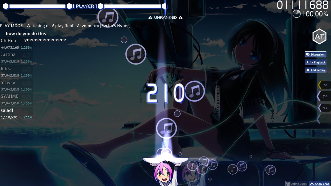


Video Preview v0.5


Video Preview v0.7 (not available, help needed :D)


thank you Catricius for providing me with main menu background screenshot :)
*main menu background only works if you are an *


Expand
--- Recommended Option ---

to make sure you get the same experience on the skin, this is the recommended option screenshot :


--- Custom Lifebar ---

custom lifebar request is closed

but you can make your own using this .PSD (right-click > save link as..)
*forgot that you need the font file for the PSD to work :D*
you can get the font file here.
--- Requested Lifebar ---

i decided to move all the requested lifebar into one place (in-case you want to re-download so you won't need to scroll through the thread post), so here you go :
  1. Tespia
  2. NinjaBreadBro
  3. M!CKEY
  4. Mina
  5. We Go Down
  6. Nameless
  7. Elric
  8. kakalak
  9. N1k0
  10. Innocent
  11. Baka


*please tell me if there are any broken link or misplaced one*
*hope to see more feedback :D*
CyberPoutine
I really love the UI. Love it... <3

However, the gameplay is... meh for me.

I understand you are attempting to give osu a hexagon feeling instead of a circle one, and on one hand I don't like it, because it isn't circles, but on the other hand I believe the way you put them in was really well done.

Tips: The health bar seems out of place, and some low spec computers probably can't handle your spinner. I suggest a more minimalistic one.
Danger Melon
Feel like the hitcircles are too small, would rather have them be too big for the hitbox. The cursor is hilarious on the level of the old csgo skin with the gun lol. Best part of your skin is the menu sounds imo.
Topic Starter
BDWZ

kevinosuaccount wrote:

Tips: The health bar seems out of place, and some low spec computers probably can't handle your spinner. I suggest a more minimalistic one.
thanks for the feedback! ^^
i fixed the health bar to a more simple one, and trying to blend with other elements. also i make the spinner more simple too.

Danger Melon wrote:

Feel like the hitcircles are too small, would rather have them be too big for the hitbox. The cursor is hilarious on the level of the old csgo skin with the gun lol. Best part of your skin is the menu sounds imo.
thanks for the feedback! ^^
when i'm trying to make a bigger hitbox, the slider ruins it because the hitbox are hexagon, and there are no way around that (in my knowledge). so instead of hexagon, i make the hitbox circles.. i guess it's still gonna works because the name has -rcle on it xD
also i provide custom cursor on the skin folder under 'EXTRAS' you can copy some from there and paste it on the skin folder to get rid of the crosshair if you don't like it :D
Topic Starter
BDWZ
i got an advice in-game for the skin,
1. make the reverse arrow more visible/noticeable (at v0.1 the reverse arrow looks similar to the hitcircle number)
2. also make the cursor a simple big circle as default (at v0.1 the default cursor are the one with crosshair, a lot of people annoyed by that xD)

because the crosshair are not the default cursor anymore.. so i decided to change the menu sound of the skin while still providing some additional resources under EXTRAS inside the skin folder.

any feedback/critique/review for the Hexarcle v0.2 are welcome :)
Topic Starter
BDWZ
another feedback i got in-game
1. change approach circle into a simple circle
2. make scorebar/lifebar a non-animated one as default (because the animation on the lifebar takes player attention at v0.2)
3. the cursor trail distracting the exact posistion of the cursor (changed the color bright pink so it will be different with the cursor (additional white cursor trail available under EXTRAS))

4. the hitsounds on gameplay? (i decided to leave it as default as each beatmaps has its own hitsounds (untick the 'ignore beatmaps hitsounds' on options) to make it more enjoyable (except for some 'joke' beatmaps))
5. the hitcircle number? (i decided to leave as it is because...)

thanks for the feedback :D
hope to see more feedback on Hexarcle v0.3
cheers :D
O2MasterFX
Would you mind, add the screenshots?
Topic Starter
BDWZ

O2MasterFX wrote:

Would you mind, add the screenshots?
added.
Goldeneye11
Hey, i used it and the skin is pretty cool. But, the slider circles are a bit out of place.
Topic Starter
BDWZ

Goldeneye11 wrote:

Hey, i used it and the skin is pretty cool. But, the slider circles are a bit out of place.
thanks for the feedback :)
ah the dots? or the slider ball?
Goldeneye11

BDWZ wrote:

Goldeneye11 wrote:

Hey, i used it and the skin is pretty cool. But, the slider circles are a bit out of place.
thanks for the feedback :)
ah the dots? or the slider ball?
No, not the dots or slider ball. I mean the circles you click. (Sorry if i didn't explain too well.)
AGRX
your resolution for hitcircles in HD is 300x300 pixels, should be 512x512. SD should be in 256x256. Suggest to use default skin template.
Topic Starter
BDWZ

Goldeneye11 wrote:

No, not the dots or slider ball. I mean the circles you click. (Sorry if i didn't explain too well.)
yes, at v0.0 they are using the same theme, hexagonal hitcircle.. that was not out-of-place at all, but the gameplay ruined.. so instead i'm using circles right now, and looks out-of-place but that's fine i guess.. and if you got any suggestion to make it better but still using a circle.. i would really appreciate it :)
*by the way the dots on slider, i need to change it to a circle on v0.4 later because i'm using circles right now*

thanks for the feedback :)

Agrrox wrote:

your resolution for hitcircles in HD is 300x300 pixels, should be 512x512. SD should be in 256x256. Suggest to use default skin template.
i tried your suggestion resulting in this kind of behavior..
the hitcircle was too big there, i guess i will stick with the lower resolution one..
*i'm currently using a finished skin as a template. will use default skin template for future references*
EDIT1 : *the finished skin using 256x256 for HD and 128x128 for SD, mine just have some transparent area, but the circle size are the same.. i can get rid the transparent area later on*

thanks for the feedback :)
Frosthereal
i would appreciate it if you could send me a version of change in background of the ranking panel into blue
PS: I liek your skin :D thanks
Topic Starter
BDWZ

Extrazer wrote:

i would appreciate it if you could send me a version of change in background of the ranking panel into blue
PS: I liek your skin :D thanks
okay i will consider adding another color theme on v0.4 later :)

thanks for the feedback :)
Topic Starter
BDWZ
ok v0.4 available now, and i guess i'm finished with it as i'm pretty satisfied playing with it.. thanks for all the feedback guys :) hope you like it :)
*will do an update if necessary*
Topic Starter
BDWZ
decided to release my personal changes as an update to this skin, v0.5 available.. check the first post :D
Pulse
Name to display: Tespia
Color: Blue

also, great skin, good job <3

edit: what about creating a .psd to edit the hpbar?
Topic Starter
BDWZ

Tespia wrote:

Name to display: Tespia
Color: Blue

also, great skin, good job <3

edit: what about creating a .psd to edit the hpbar?
here you go :)
nah.. just want to track if there's someone actually using it xD not just download.. thanks :D
Pulse

BDWZ wrote:

Tespia wrote:

Name to display: Tespia
Color: Blue

also, great skin, good job <3

edit: what about creating a .psd to edit the hpbar?
here you go :)
nah.. just want to track if there's someone actually using it xD not just download.. thanks :D
thanks <3
deadbeat
I checked the blue version and it looks all there, so i'll just assume red and green are the same :p

also why on earth is this v0.5 :/
Topic Starter
BDWZ

deadbeat wrote:

I checked the blue version and it looks all there, so i'll just assume red and green are the same :p
yes it is the same :D

deadbeat wrote:

also why on earth is this v0.5 :/
every time i make changes, i add 0.1 to the version number, now i'm busy with some project and planning to do some update later before going for an eternal slumber :D (like adding some PSD etc and fixing the skin.ini version(going to change it to 2.2 instead of latest))
_YuZa_
Name to display : NinjaBreadBro
Color : Red

I was looking for a new skin when all of a sudden I found this beast.
Won't have to find a new one for a while. Thanks for making it :P
PEPPERA629
Name to display: M!CKEY
Color: Blue


<3
mina-
Name to display : Mina
Color : Blue
Topic Starter
BDWZ

NinjaBreadBro wrote:

Name to display : NinjaBreadBro
Color : Red

I was looking for a new skin when all of a sudden I found this beast.
Won't have to find a new one for a while. Thanks for making it :P
Glad you like it! :D
here you go~

mickey629 wrote:

Name to display: M!CKEY
Color: Blue


<3
<3 <3
here you go~

mina- wrote:

Name to display : Mina
Color : Blue
here you go~
Topic Starter
BDWZ
added .PSD file for your own custom lifebar (in-case i'm busy)
check the 1st post :D
Sheev Palpatine
Name to display : We Go Down
Color : Red
Nameless
Name to display: Nameless
Color: Green
Topic Starter
BDWZ

We Go Down wrote:

Name to display : We Go Down
Color : Red
here you go~

Nameless wrote:

Name to display: Nameless
Color: Green
here you go~
Elric
Name to display: Elric
Color: Green
thank you!
Topic Starter
BDWZ

Elric wrote:

Name to display: Elric
Color: Green
thank you!
your welcome :D
here you go~
kakalak
Could i have one ? Thank you very much
Name: kakalak
Color: Blue :D :D :D
nyathil
Name to display : N1k0 | Color: Blue
Topic Starter
BDWZ

kakalak wrote:

Could i have one ? Thank you very much
Name: kakalak
Color: Blue :D :D :D
sure~ your welcome :D
here you go~

N1k0 wrote:

Name to display : N1k0 | Color: Blue
here you go~
Topic Starter
BDWZ
added mania skin, and changed the skin.ini version to 2.2 instead of latest for distribution purpose.
did some fixing on the menu-background position (supporter screenshot needed :D)(updated the screenshot).
check the 1st post for Hexarcle v0.6
thanks :D
Innocent
Can I have one too? :D
Name: Innocent
Colour: Red
Thanks in advance!
Ned
.
Topic Starter
BDWZ

Innocent wrote:

Can I have one too? :D
Name: Innocent
Colour: Red
Thanks in advance!
sure~ :D your welcome~
here you go~
Topic Starter
BDWZ

Ned wrote:

Wow, epic!
Red colour is the best :P
Thank you friend!
Thanks Ned :D glad you like it~
Baka94
The skin itself looks really nice but playing with it is really hard :c
The glow around the cursor is the biggest distraction for me, but the transparency of the hit objects center part also becomes an issue when there are loads of stacked hit objects :/
Topic Starter
BDWZ

Baka94 wrote:

The skin itself looks really nice but playing with it is really hard :c
The glow around the cursor is the biggest distraction for me, but the transparency of the hit objects center part also becomes an issue when there are loads of stacked hit objects :/
thanks for the feedback Baka94 :D
i will provide a cursor without glow later under EXTRAS folder, but i will keep the default cursor like the way it is.
and i make the transparency on the center part to see if there's a hitcircle stacked, so the player can prepare for it. (sometimes there's a hitcircle exactly the same position below the 1st one, thus transparency come handy at that situation)
*btw the recommended background dim is 75% for this skin, if you have it any lower, then sure the transparency can be distracted, i will provide hitcircle without transparency later under EXTRAS folder*
again, thanks for the feedback :D
Baka94
You don't need to completely remove the glow or remove the transparency in the circle center. Probably better would be to provide different transparency/glow rates where others can pick the ones they like the most. For me a faint glow and transparency will be just fine. If the transparency is too high it's hard to see which one of the stacked objects is the first one. The stacked objects move to the side automatically anyways. I personally use the approach circles to figure out the number of circles in the stack.

Also:
Name: Baka
Color: green
Topic Starter
BDWZ

Baka94 wrote:

You don't need to completely remove the glow or remove the transparency in the circle center. Probably better would be to provide different transparency/glow rates where others can pick the ones they like the most. For me a faint glow and transparency will be just fine. If the transparency is too high it's hard to see which one of the stacked objects is the first one. The stacked objects move to the side automatically anyways. I personally use the approach circles to figure out the number of circles in the stack.

Also:
Name: Baka
Color: green
Ah, that's a good idea.. i'll add them on v0.7 later *in a few days maybe*
thanks for the suggestion! :D
here you go~
Topic Starter
BDWZ

BDWZ wrote:

Baka94 wrote:

You don't need to completely remove the glow or remove the transparency in the circle center. Probably better would be to provide different transparency/glow rates where others can pick the ones they like the most. For me a faint glow and transparency will be just fine. If the transparency is too high it's hard to see which one of the stacked objects is the first one. The stacked objects move to the side automatically anyways. I personally use the approach circles to figure out the number of circles in the stack.

Also:
Name: Baka
Color: green
Ah, that's a good idea.. i'll add them on v0.7 later *in a few days maybe*
thanks for the suggestion! :D
here you go~
updated the skin to v0.7, check the changelog on 1st post for more details :D
TortlePancake
what's the scorebar text font? I'd like to use it to some of my non osu related works lol
Topic Starter
BDWZ

TortlePancake wrote:

what's the scorebar text font? I'd like to use it to some of my non osu related works lol
good font? :D
here you go~
ReBOOting_ExE
Ok, its kinda confusing on how do i change my name on my health bar since i dont hve photoshop but ill try the skinn out it looks good :) :) :) :) :) :) :) :) :) :) :) :) :) :) :) :D :D :D :D :D :D :D :D :D :D :D :D :D :D :P :P :P :P :P :P :P :P :oops: :oops: :oops: :oops: :oops: :oops: :oops:
snz
Nice skin imao :v
Topic Starter
BDWZ

RebOOTing wrote:

Ok, its kinda confusing on how do i change my name on my health bar since i dont hve photoshop but ill try the skinn out it looks good :) :) :) :) :) :) :) :) :) :) :) :) :) :) :) :D :D :D :D :D :D :D :D :D :D :D :D :D :D :P :P :P :P :P :P :P :P :oops: :oops: :oops: :oops: :oops: :oops: :oops:
well you need at least a software that can open .PSD files properly (also download the font too, if you're planning to edit it yourself) :D
or you can request like mentioned in "Misc" part on the 1st post :D


Ppus wrote:

Nice skin imao :v
Thanks lol :v
show more
Please sign in to reply.

New reply