Hey, mod from my queue <3
Welcome back \:D/
I'm so late, sorry ;w;
00:01:904 (2,1) - There's an overlap here, it's just a suggestion but maybe you can move (1) 2 grids up, it'll not overlap with the head, so it'll look prettier. The overlap with the tail will not be noticeable as much as you think because the player will focus on the top of the screen.
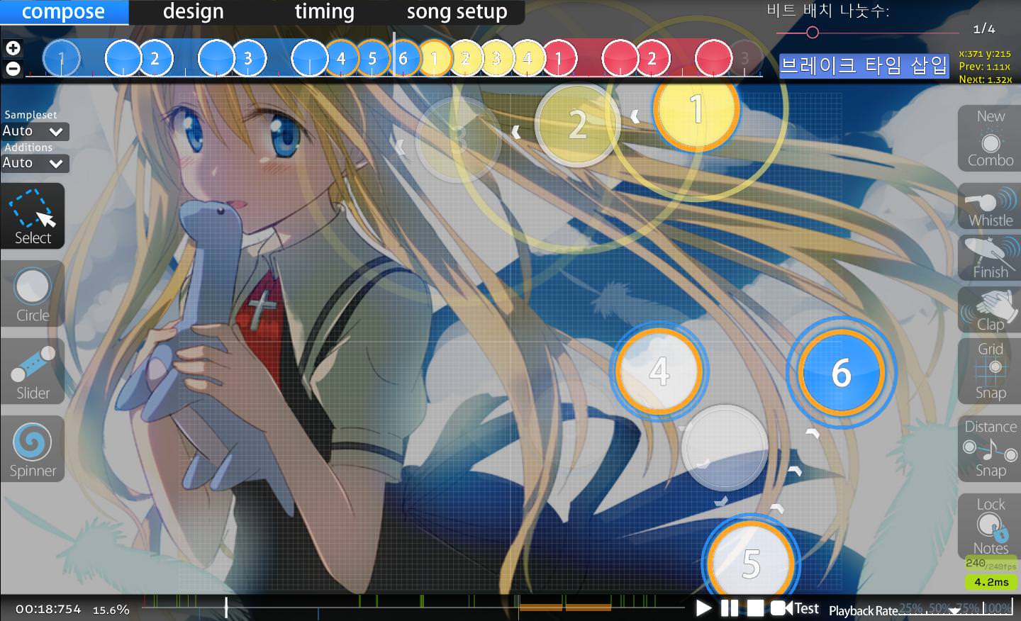
00:03:483 (1,2) - You can make a better blanket to have a p
erfect pattern. Try to follow the circleoverlay like in this exemple :
00:08:535 (1) - I suggest to reverse this curve to increase the flow, it'll make a perfect transition with 00:09:483 (2) because it'll follow its movement.
00:13:430 (2) - I'm not a big fan of sliders on red ticks because I know beginners have a problem with them. It's a bit annoying, so maybe you can follow this pattern ? (same for the next patterns)

00:36:956 (3) - Just a suggestion : you can move it to x356|y164 to increase the flow and follow the 2 sliders' movement.
00:49:588 (2) - You can maybe try to move it like on the following picture to make a good flow with (2) and a blanket with (3) ? :
01:01:904 (4,1) - You can improve the blanket here, it'll make a cleaner pattern.
01:18:956 (1) - I don't really think this circle is needed, it breaks the break, so it's a bit annoying.
01:29:062 (1,2,3) - This pattern seems too hard for a Beginner diff. I suggest this exemle : (same for the next patterns)

The diff. is quite perfect except the little problems I noticed above
00:20:851 (2,3) - I'm not a big fan of the 1/3 distance between these 2 objects. I think its's gonna create problems for beginners. I suggest to have the 2 objects on a white tick, like at 01:12:641 (1,2,3) or like this exemple :

00:26:535 (6) - This slider makes the big white tick unclickable. However, the beat at 00:27:167 - is emphasized. You even put a finish on ! So it should be clickable in my opinion.
00:52:904 (2) - Objects which starts on red tick can be annoying for beginners. I suggest this pattern : (same for the next patterns)

01:18:956 (1) - Same as the Easy diff, this circle breaks the break. The sound isn't enough emphasized for having a circle here in my opinion.
The diff is clean and beautiful. Good job :3
00:05:062 (3,4) - Warning, this pattern looks like 00:03:798 (3,1) but there aren't the same rhythmically. It's quite tricky.
00:05:377 (4,1) - The distance snap between these 2 sliders is very high... I thought it was 1/1 spacing =/ I suggest this pattern : (just move (1) a bit)
00:25:904 (4,5,6,7) - If you look at (4)'s movement, it goes to (7) instead of (5) (like on this screenshot) so I suggest to reverse horizontally the slider (CTRL + H)
00:31:904 (4,1) - You missed a good opportunity to make a blanket. It'll looks prettier in my opinion (and it'll increase a bit the flow) :
00:34:667 (5) - It's quite hard to notice this circle when playing =/ It can make you sliderbreak easily, so I suggest to increase the distance between these 2 objects.
00:36:325 (2,4) - I think you can reverse the curves of these 2 slider, then it'll blanket with 00:36:009 (1,3) and increase the flow for 00:36:956 (4,5,1).
01:02:535 (3,4) - I suggest for these 2 circles to use a pattern similar as 01:05:062 (2,3) because it can be confusing with the stack ("when should you click the second circle ?")
01:25:904 - You missed an important beat here. I suggest to reverse (1)
01:30:956 - Same as above. I suggest to add a circle at x400|y4
01:36:009 - ^ I suggest to add a circle at x284|y65
01:41:062 - Same problem here. Maybe you can put a circle at x412|y56 ?
Your mapping style makes the diff perfect. Congratz :3
00:10:431 (4,5,6,1) - I suggest to use a higher distance snap for these circles since it looks like a 1/4 pattern (or maybe you can use sliders)
There's no other problem I noticed (except a little thing : the diff. is too hard for an Another diff in my opinion)
00:10:114 (2,3) - The distance between these 2 objects is too much high. Also, (3) is hidden by 00:09:799 (1). I suggest this pattern :
00:21:088 (1,2,3) - Maybe you can increase the distance snap between these 3 circles to emphasize the rhythm change ?
00:38:851 (7,9,10,1) - You can improve the stack here to make it prettier to play.
00:41:299 (2) - This slider makes 00:41:377 unclickable, however it's important to click it, so I suggest to add 2 circles instead of this slider.
00:58:035 (4) - This slider isn't logical with the rhythm. So you MUST delete it and maybe add a circle at 00:58:114 instead ?
01:04:430 (1,2) - This is quite hard to read. The player can think (1) is a slider. I suggest to add a NC for (2) or to move it somewhere else.
01:08:141 (5) - Same as above, this slider isn't logical with the rhythm and MUST be deleted. This is an exemple of a good rhythm :
01:11:298 (6) - This should be replaced by 2 circles to be logical with the song.
01:37:825 (2) - As I said above, this means there's only 01:37:825 clickable. This is not an important beat, so you should add a circle at 01:37:904 instead.
01:53:930 (3) - This slider isn't logical with the rhythm. This is the good rhythm for this pattern :

I think the mapset has a good quality, it's ready to be ranked in my opinion.
Good luck for rank <3
Welcome back \:D/
I'm so late, sorry ;w;
Beginner
2 Slider Tick Rate seems a bit too much for me and it's not needed, try to move it to 1, sliders will seems "cleaner"00:01:904 (2,1) - There's an overlap here, it's just a suggestion but maybe you can move (1) 2 grids up, it'll not overlap with the head, so it'll look prettier. The overlap with the tail will not be noticeable as much as you think because the player will focus on the top of the screen.
00:03:483 (1,2) - You can make a better blanket to have a p
erfect pattern. Try to follow the circleoverlay like in this exemple :
00:08:535 (1) - I suggest to reverse this curve to increase the flow, it'll make a perfect transition with 00:09:483 (2) because it'll follow its movement.
00:13:430 (2) - I'm not a big fan of sliders on red ticks because I know beginners have a problem with them. It's a bit annoying, so maybe you can follow this pattern ? (same for the next patterns)
00:36:956 (3) - Just a suggestion : you can move it to x356|y164 to increase the flow and follow the 2 sliders' movement.
00:49:588 (2) - You can maybe try to move it like on the following picture to make a good flow with (2) and a blanket with (3) ? :
01:01:904 (4,1) - You can improve the blanket here, it'll make a cleaner pattern.
01:18:956 (1) - I don't really think this circle is needed, it breaks the break, so it's a bit annoying.
01:29:062 (1,2,3) - This pattern seems too hard for a Beginner diff. I suggest this exemle : (same for the next patterns)
The diff. is quite perfect except the little problems I noticed above
W h i t e's Standard
00:07:588 (5) - I think this 1/2 slider isn't needed, it doesn't follow the rhythm of previous patterns, so you may replace is by a circle.00:20:851 (2,3) - I'm not a big fan of the 1/3 distance between these 2 objects. I think its's gonna create problems for beginners. I suggest to have the 2 objects on a white tick, like at 01:12:641 (1,2,3) or like this exemple :
00:26:535 (6) - This slider makes the big white tick unclickable. However, the beat at 00:27:167 - is emphasized. You even put a finish on ! So it should be clickable in my opinion.
00:52:904 (2) - Objects which starts on red tick can be annoying for beginners. I suggest this pattern : (same for the next patterns)
01:18:956 (1) - Same as the Easy diff, this circle breaks the break. The sound isn't enough emphasized for having a circle here in my opinion.
The diff is clean and beautiful. Good job :3
Niva's Hyper
00:05:062 (3,4) - Warning, this pattern looks like 00:03:798 (3,1) but there aren't the same rhythmically. It's quite tricky.
00:05:377 (4,1) - The distance snap between these 2 sliders is very high... I thought it was 1/1 spacing =/ I suggest this pattern : (just move (1) a bit)
00:25:904 (4,5,6,7) - If you look at (4)'s movement, it goes to (7) instead of (5) (like on this screenshot) so I suggest to reverse horizontally the slider (CTRL + H)
00:31:904 (4,1) - You missed a good opportunity to make a blanket. It'll looks prettier in my opinion (and it'll increase a bit the flow) :
00:34:667 (5) - It's quite hard to notice this circle when playing =/ It can make you sliderbreak easily, so I suggest to increase the distance between these 2 objects.
00:36:325 (2,4) - I think you can reverse the curves of these 2 slider, then it'll blanket with 00:36:009 (1,3) and increase the flow for 00:36:956 (4,5,1).
01:02:535 (3,4) - I suggest for these 2 circles to use a pattern similar as 01:05:062 (2,3) because it can be confusing with the stack ("when should you click the second circle ?")
01:25:904 - You missed an important beat here. I suggest to reverse (1)
01:30:956 - Same as above. I suggest to add a circle at x400|y4
01:36:009 - ^ I suggest to add a circle at x284|y65
01:41:062 - Same problem here. Maybe you can put a circle at x412|y56 ?
Your mapping style makes the diff perfect. Congratz :3
Muya's Another
HP 8 and OD 8 seems too much hard for me. The Hyper diff. is HP6 and OD 7, the Extra diff. is HP8 and OD 8. Then you should use HP 7 and OD7 / 7,5.00:10:431 (4,5,6,1) - I suggest to use a higher distance snap for these circles since it looks like a 1/4 pattern (or maybe you can use sliders)
There's no other problem I noticed (except a little thing : the diff. is too hard for an Another diff in my opinion)
Extra
00:10:114 (2,3) - The distance between these 2 objects is too much high. Also, (3) is hidden by 00:09:799 (1). I suggest this pattern :
00:21:088 (1,2,3) - Maybe you can increase the distance snap between these 3 circles to emphasize the rhythm change ?
00:38:851 (7,9,10,1) - You can improve the stack here to make it prettier to play.
00:41:299 (2) - This slider makes 00:41:377 unclickable, however it's important to click it, so I suggest to add 2 circles instead of this slider.
00:58:035 (4) - This slider isn't logical with the rhythm. So you MUST delete it and maybe add a circle at 00:58:114 instead ?
01:04:430 (1,2) - This is quite hard to read. The player can think (1) is a slider. I suggest to add a NC for (2) or to move it somewhere else.
01:08:141 (5) - Same as above, this slider isn't logical with the rhythm and MUST be deleted. This is an exemple of a good rhythm :
01:11:298 (6) - This should be replaced by 2 circles to be logical with the song.
01:37:825 (2) - As I said above, this means there's only 01:37:825 clickable. This is not an important beat, so you should add a circle at 01:37:904 instead.
01:53:930 (3) - This slider isn't logical with the rhythm. This is the good rhythm for this pattern :
I think the mapset has a good quality, it's ready to be ranked in my opinion.
Good luck for rank <3


