Hi, from Forum PM I guess :d
• 00:02:678 (5) - Minor stuff but because it's not a singular beat, I think it'd better be a 1/8 slider, but it's up to you
• 00:10:516 (4,1) - Using 2 reverse slider for 2 different vocal continuously, it feels like you're not following vocal pretty well. I would change 00:11:326 (1) - into 3 circles, just to express the "sakura" differently, and to have a bit emphasis for it
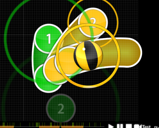
• 00:23:218 (1,2,3) - lately you were using like 0.2-0.3x spacing for triples, so why are you stacking them now?
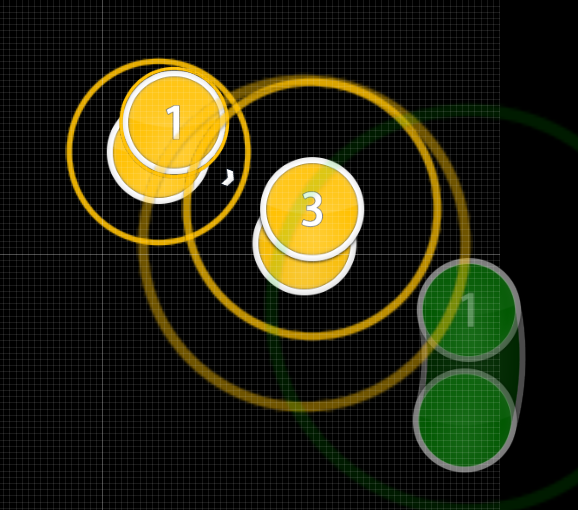
• 00:24:299 (1,1,2) - They are literally the same in instrument, different patterns is not what I recommended tbh. Why not just making them all circles? Or if you wanna keep the sliders, change these 00:24:840 (2,3) - into sliders too, because in this section, that is the only place where you used 2 circles instead
• 00:39:975 (2,3) - Spacing is kinda unexpected, as you used similar spacing to 00:39:434 (1,2) - for 1/2 beat, so players might misread this as 1/2 too
• 00:41:597 (1) - I'd increase spacing a bit, for more emphasis
• 00:59:840 - aren't you gonna map the vocal here?
• 01:13:759 (6,1,2,3,4) - talking about playability, this seems to be too much clickable, while the song has a change in intensity for 01:14:029 (1,2,3,4) - so I think
this pattern might be better, as it reduce the intensity you're having for 2 specific patterns
• 01:20:516 (1,2,3,4,5,6,7,8) - Same thing about the concept. Vocal didn't have any changes except for lowering pitch, so why did you have a different jump direction for 01:21:597 (5,6,7,8) - while you were going counter clockwise for 01:20:516 (1,2,3,4) - ?
• 01:33:353 - you have a missing beat here too
• 01:41:326 (2,3,4) - I would increase the spacing a bit more, so players might easily know that they are 1/2, not 1/4 like you were doing throughout the map
• 01:55:110 (1,2,3) - I noticed this is the only place where you use red anchor for sliders of this patterns, which is weird because if you wanna create some diversity, you should do this more regularly instead of just this 1 time
• 02:02:678 (3) - Same thing I mentioned before, I mean I can't hear any strong beats that need this spacing to emphasize it, so why did you choose to have such huge spacing?
• 02:11:326 (1,2) - I can tell that you wanna reduce the intensity a bit here, but the spacing is still a bit too much tho. How about
this?
• 02:28:353 (4,5,6) - Woah the sudden direction change of this triple really freaks me out though xd why not ctrl+g them?
• 02:37:813 (2) - It's like 2 white ticks go by, so I suggest stacking it with 02:36:732 (1) - instead, to make the pattern cleaner. Also was the sliderwhistle on sliderbody intentional? It sounds pretty off to me
• 02:54:570 (1,2,1,2) - Ok I think this is too much, comparing to 01:32:407 (1,2,1,2) - they were not even that big tbh.
• 03:09:164 (3,4) - Why not making these 1/4 sliders?
• 04:41:597 (1,2,3) - Spacing should be decreased a bit more, so players can feel the emphasis you have on 04:43:759 (1) - tho
There's a few suggestions that should be applied more than just 1 timestamp I pointed out, so remember to check them all out :3
Pretty decent map owo)b
Good luck~

