Hey there! From queue~
... I owe you lmao, so here is something in-return xdd
[- - Easy - -]
[- - Broom&Witches - -]
Quite a good map btw! Still needs a few more polishing~ but hopefully it suffices.
Good Luck!
... I owe you lmao, so here is something in-return xdd
[- -
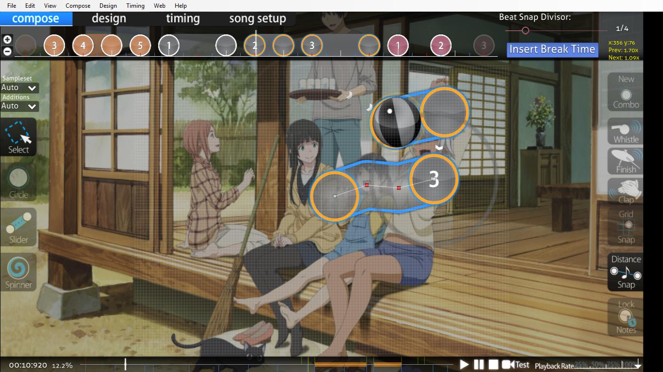
- 00:09:799 (4,3) - Optional objective: It might just be me, but there's some tiny overlapping which doesn't really suit best here tbh. You could try moving circle (3) around x:86|y:135 or somewhere to redo the structure. But it's up to you ofc.
- 00:17:799 (4,1) - Optional objective: Sorry if I'm being a little minor on this one, but you could see this closer that the blanket is a little away from slider (4)'s head. You can fix it by moving the slider (4) a bit down, or in the other way... moving slider (1)'s last two slider points a little few grids up should also work.
- 00:26:243 (1,2,3) - 00:35:577 (4,1,2) - 00:41:354 (2,3,4) - Well, I can literally tell that these notes are incorrectly spaced out randomly. I can see 1.1x is the default distance spacing over many tracks, but these kinda ruined some structures in comparison. I probably suggest spacing them out a bit more balanced at least. It wouldn't be that hard though~
- 00:56:466 (2) - I probably think a new combo could really fit here tbh after the long empty track. I know it starts on 00:55:132 (1) -, but adding one more combo after that space should be implement for the HP drain rate, especially when it's on the long white tick. So I may presume this is necessary.
- 01:18:688 (2,3) - I wonder how this 1.25x spacing shows out of the sudden. I'm pretty sure this might be mistaken or not purposed to do because of the patterning. So yeah, might need a little fix?
[- -
- 00:04:466 (4,2) - Not sure, but the stacking here isn't quite correct imo unless you're intending a manual stacking. I mostly suggest completely stacking them because it looks really really odd in gameplay based on the stack leniency.
- 00:12:910 (1,2,3) - The triangle doesn't seem bad though, I think the placements can be put into another suitable place which would polish them much greater. How about selecting these, moving them a bit more left and up, and centralize it on the previous triangle? Something like this for example, that'd describe much better~
- 00:23:577 (5,1,2) - Well, I probably prefer a higher note density of the jump here should be on (1)&(2) instead of (5)&(1). The structure here is the probably main point that makes this pattern play plainly. On the other hand, this also doesn't emphasize much in the music especially when opposing jumps. I personally believe that none of them have this feeling of "intensity increment". I hope you'll change this into less queer.
- 00:29:799 (4) - This kind of slider doesn't look like you're actually using the middle sliderpoint on this kind of straight slide body. The curve is way too small and barely noticeable. So I suggest deleting it, or either use the sliderpoint by curving this slider and make it identical to 00:30:243 (1) - .
- 00:42:021 (2,4) - The same thing about the stacking.
- 01:08:021 (5,6) - I can see a sudden 0.85x distance spacing here, which is really short tbh. And it's quite confusing as well in spite of using a lot of bigger spacing on the previous tracks. I can literally understand you're making a blanket here, but this shouldn't be the only issue for that. I recommend increasing it for a consecutive structural flowing over this track.
Quite a good map btw! Still needs a few more polishing~ but hopefully it suffices.
Good Luck!
 hope this helps a little