Hi~ M4M is here~ :3
Okay that's all~
Good Luck in rank~ >w</
Surprise Box \>w</General
* fhaaaaaanaaaaaaaaaaaaaaaaa issssssss loooooooooooooveeeeeeeeeee fhaaaaaaaanaaaaaaaaaaaa isssssssssss liiiiiiiiiiiiiivvvvvvvvvvveeeeeeeeee
* Others seems fine~ :3
Easy
* Please disable the Widescreen Support since there's no storyboard in this mapset
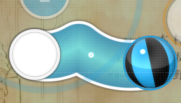
* 00:06:140 (3,1) - This blanket could use some improvement like this :

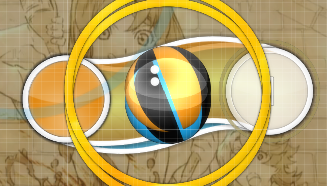
* 00:13:746 (1) - Just a suggestion, but how about moving this slider into x:259 y:204 so that the head of this slider would be indirectly stacked with the tail of the previous slider -> 00:11:210 (1) and it would make a parallel pattern with 00:12:055 (3) like this :

To fix the DS problem, you only need to tweak the tail of 00:13:746 (1) like this :

It would add an aesthetic touch in this part
* 00:21:774 (2,3) - This blanket could be improved like this :

* 00:23:041 (4,1) - Improve this blanket by moving the point at the tail of this slider -> 00:23:464 (4) one grid to the left, then move the center point of this slider's frame one grid to the right

* 00:34:872 (1,2) - This blanket also could be improved as well. Just do it like this :

* 00:42:055 (2,3) - Improve this blanket by moving the tail point of this slider -> 00:42:478 (3) one grid to the left. After that, just move the next slider -> 00:43:323 (4) one grid downwards
* 00:43:323 (4,1) - Improve this blanket by moving the center point of 00:43:323 (4) one grid to the left like this :

* 00:59:379 (3,4) - These twin sliders could be improved. Just move this note -> 00:58:957 (2) to x:32 y:320, then move the next slider -> 00:59:379 (3) into x:112 y:372 like this :


It wouldn't cause any DS problem so it should be fine
* 01:02:760 (3,4) - This slider -> 01:01:915 (3) is too curvy for the blanket with 01:03:182 (4) . So, please move the center point of 01:01:915 (3) one grid to the left to fix it
* 01:28:112 (1) - How about improving the shape of this slider into like this :

To add some aesthetic touch on it
* 01:34:872 (1) - Using 70% volume in this note while the music ended was too loud. Please lower down the volume of this note into 40% so that it would blend perfectly with the cymbals from the main music
Akitoshi's Normal
* Please disable the Widescreen Support since there's no storyboard in this mapset
* 00:13:323 (7,1) - You could improve this blanket by moving the end point of this slider's frame -> 00:13:746 (1) a little bit to the left by disabling the grid snap like this :

* 00:38:886 (3) - Since you were mapping the voice here, in my opinion, it would be nice if you make the shape of this slider into a perfectly centered 'v'-shaped slider like this :

Since it would emphasize here voice better
* 00:42:267 (3) - This 'v'-shaped slider almost perfect. Just tweak the center point (the red point) of this slider's frame to fix it like this :

* 00:52:196 (2) - How about change the shape of this slider into a curvy slider instead of the straight slider, so that it would blanket the tail of 00:51:774 (1) ?
* 01:04:450 (1) - This slider shape could be improved since the first angle of its round side is a little bit too curvy. You could tweak it a little here and there like this :

* 01:34:872 (3) - Using 70% volume in this note while the music ended was too loud. Please lower down the volume of this note into 40% so that it would blend perfectly with the cymbals from the main music, then change its audio into soft-custom 1 (S:C1) since the audio that you were using at that slider now (soft-default) was making some disturbing noises >.<
Journey
* In my opinion, using 3 Stack Leniency is a bit dangerous for the ranking process. How about using 4 Stack Leniency instead? Just to make it safer
* Um, the way you were mapping this diff was just like a Light Insane diff (by looking at some long distance jumps, 1/8 sliders, and the spacing between the objects), and it somehow made the gap with the previous diff (Normal diff) a little bit bigger than how it should be, since usually the QAT would look at the map's spread by its game play in each diff, not with its star difficulty, so I suggest you to make or ask someone to make a GD for a Hard/Advanced diff (if you refer the Journey diff as a Hard diff) to make it safe during the ranking process
* 00:54:098 (5,1) - This blanket could be improved like by moving the tail point of this slider -> 00:55:154 (1) one grid upwards like this :

* 01:11:844 (2,4) - How about stacking this note -> 01:11:844 (2) directly with the head of this slider -> 01:12:478 (4) directly? Or, if you want them to keep indirectly stacked then, how about moving this slider -> 01:12:478 (4) into x:288 y:88 it like this :

To make the jump pattern more aesthetic, plus it would make a better emphasize with the next upbeat -> 01:12:901 (1)
* The flow and the jumps in this diff were very nice. I really enjoy test playing this diff :3
* fhaaaaaanaaaaaaaaaaaaaaaaa issssssss loooooooooooooveeeeeeeeeee fhaaaaaaaanaaaaaaaaaaaa isssssssssss liiiiiiiiiiiiiivvvvvvvvvvveeeeeeeeee
* Others seems fine~ :3
* Please disable the Widescreen Support since there's no storyboard in this mapset
* 00:06:140 (3,1) - This blanket could use some improvement like this :
* 00:13:746 (1) - Just a suggestion, but how about moving this slider into x:259 y:204 so that the head of this slider would be indirectly stacked with the tail of the previous slider -> 00:11:210 (1) and it would make a parallel pattern with 00:12:055 (3) like this :
To fix the DS problem, you only need to tweak the tail of 00:13:746 (1) like this :
It would add an aesthetic touch in this part
* 00:21:774 (2,3) - This blanket could be improved like this :
* 00:23:041 (4,1) - Improve this blanket by moving the point at the tail of this slider -> 00:23:464 (4) one grid to the left, then move the center point of this slider's frame one grid to the right
* 00:34:872 (1,2) - This blanket also could be improved as well. Just do it like this :
* 00:42:055 (2,3) - Improve this blanket by moving the tail point of this slider -> 00:42:478 (3) one grid to the left. After that, just move the next slider -> 00:43:323 (4) one grid downwards
* 00:43:323 (4,1) - Improve this blanket by moving the center point of 00:43:323 (4) one grid to the left like this :
* 00:59:379 (3,4) - These twin sliders could be improved. Just move this note -> 00:58:957 (2) to x:32 y:320, then move the next slider -> 00:59:379 (3) into x:112 y:372 like this :
It wouldn't cause any DS problem so it should be fine
* 01:02:760 (3,4) - This slider -> 01:01:915 (3) is too curvy for the blanket with 01:03:182 (4) . So, please move the center point of 01:01:915 (3) one grid to the left to fix it
* 01:28:112 (1) - How about improving the shape of this slider into like this :
To add some aesthetic touch on it
* 01:34:872 (1) - Using 70% volume in this note while the music ended was too loud. Please lower down the volume of this note into 40% so that it would blend perfectly with the cymbals from the main music
* Please disable the Widescreen Support since there's no storyboard in this mapset
* 00:13:323 (7,1) - You could improve this blanket by moving the end point of this slider's frame -> 00:13:746 (1) a little bit to the left by disabling the grid snap like this :
* 00:38:886 (3) - Since you were mapping the voice here, in my opinion, it would be nice if you make the shape of this slider into a perfectly centered 'v'-shaped slider like this :
Since it would emphasize here voice better
* 00:42:267 (3) - This 'v'-shaped slider almost perfect. Just tweak the center point (the red point) of this slider's frame to fix it like this :
* 00:52:196 (2) - How about change the shape of this slider into a curvy slider instead of the straight slider, so that it would blanket the tail of 00:51:774 (1) ?
* 01:04:450 (1) - This slider shape could be improved since the first angle of its round side is a little bit too curvy. You could tweak it a little here and there like this :
* 01:34:872 (3) - Using 70% volume in this note while the music ended was too loud. Please lower down the volume of this note into 40% so that it would blend perfectly with the cymbals from the main music, then change its audio into soft-custom 1 (S:C1) since the audio that you were using at that slider now (soft-default) was making some disturbing noises >.<
* In my opinion, using 3 Stack Leniency is a bit dangerous for the ranking process. How about using 4 Stack Leniency instead? Just to make it safer
* Um, the way you were mapping this diff was just like a Light Insane diff (by looking at some long distance jumps, 1/8 sliders, and the spacing between the objects), and it somehow made the gap with the previous diff (Normal diff) a little bit bigger than how it should be, since usually the QAT would look at the map's spread by its game play in each diff, not with its star difficulty, so I suggest you to make or ask someone to make a GD for a Hard/Advanced diff (if you refer the Journey diff as a Hard diff) to make it safe during the ranking process
* 00:54:098 (5,1) - This blanket could be improved like by moving the tail point of this slider -> 00:55:154 (1) one grid upwards like this :
* 01:11:844 (2,4) - How about stacking this note -> 01:11:844 (2) directly with the head of this slider -> 01:12:478 (4) directly? Or, if you want them to keep indirectly stacked then, how about moving this slider -> 01:12:478 (4) into x:288 y:88 it like this :
To make the jump pattern more aesthetic, plus it would make a better emphasize with the next upbeat -> 01:12:901 (1)
* The flow and the jumps in this diff were very nice. I really enjoy test playing this diff :3
Okay that's all~
Good Luck in rank~ >w</
 xDD
xDD
