probably the most rushed bs mod you'll ever see --feat. caps lock // (tv size version edit)--
[general]
[medium]
[byfar]looks like a nice diff... looks... looks
fort'sand deetz''''''s diffs are cool (and majority of byfar's), but the other diffs need a lot of... something. i need to find a way to explain what good/bad object placement is, but until then, looking at those two diffs would be a good way to judge what is nice
i ran out of osu!coins pressing f5 during this mod. i need more mods in return thx
[general]
- THAT SLIDER SLIDE IS THE MOST OBNOXIOUS THING I'VE EVER HEARD PLEASE
- COMBO COLOR 1 IS WAY TOO CONCENTRATED BLUENESS. IT'S IMPOSSIBLE TO SEE ON BG/ANY%DIM. RGB 50,92,171 LOOKS K. MAKING COMBO COLORS 3 AND 4 LESS STRONG WOULD ALSO BE NICE BUT IT'S NOT AS NECESSARY
- SPREAD BETWEEN WALAO/DEETZ IS PRETTY HUGE. DEETZ'S DIFF IS NONSTOP 1/4 AND WALAO'S HAS NONE
- the stuff with sv changes in lower diffs kinda needs to go
- 00:16:780 (1,2) - STACKING A CIRCLE ON A SLIDER THAT HAS FULLY APPEARED BY THE TIME YOU HIT IT PLEASE DON'T DO. BASICALLY ANY OTHER PLACEMENT IS ACCEPTABLE. 00:38:380 (2,1) - ON THE OTHER HAND IS FINE
- 00:26:380 (2,3) - THIS KIND OF SPACING IS A BIG NOPE
- 00:40:780 (1,2) - OVERLAPPING HEADS ON THIS DIFF SHOULD BE A NOPE. FROM HERE ON SLIDERS GO INTO OVERLAPPING MADNESS WHICH IS NOT SO GREAT
- 00:14:380 - 00:23:980 - SV CHANGES ON THIS DIFF NOT REALLY A THING YOU SHOULD BE DOING. 00:33:580 (1) - ESPECIALLY THAT ONE DAM
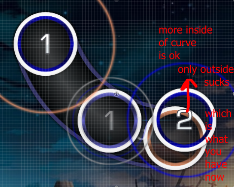
- 00:15:580 (1,2) - THIS IS GOING TO SOUND REALLY STUPID BUT IT'S A THING THAT I SEE PEOPLE DOING A LOT. WHEN YOU'VE GOT 2 SUPPOSED TO BE FOLLOWING THE CURVE OF 1, IT WOULD MAKE SENSE FOR IT TO BE EITHER MORE TOWARDS THE INSIDE OF THE CURVE/ON THE CURVE RATHER THAN GOING AGAINST THE CURVE. IN THIS IMAGE, ORANGE SLIDER = CURVE OF 1. AS YOU CAN SEE 2 IS NOT FOLLOWING CURVE VERY WELL. HERE OR HERE BETTER TYTY. 00:15:580 (1,2) - ON MEDIUM DOES IT GREAT NICE
- 00:16:780 (2,1) - SPACING SHOULD BE MORE THAN .5X SINCE THINGS COULD GET CONFUSING WITH IT BEING EXACTLY HALF OF YOUR BASE DISTANCE SNAP. IT'S LIKE IT COULD BE INTERPRETED AS 2/1 INSTEAD OF 4/1. THIS POST ALSO SOMETHING OK
- 00:28:780 (1,2,3,4) - USING TWO 2/1 SLIDERS WOULD BE BETTER HERE SINCE THESE COULD BE INTERPRETED AS 3/2 CIRCLES. THAT 3/2 RHYTHM STILL PLAYS SO IDK CONFUSING
- 00:38:380 (3,2) - COULD THESE NOT
- 00:52:780 (3,1) - WHAT IS SPACING
- 00:54:880 (1,1) - WEIRD RHYTHM UH THIS SEEMS TO WORK A LOT BETTER
[medium]
- 00:20:380 (1,2) - THIS KIND OF MOVEMENT IS MORE AWKWARD THAN SOMETHING UH I CANT THINK OF SOMETHING AWKWARD THAT'S AWKWARD TOO MUCH BACK FORTH MOVEMENT DO SOMETHING
- 00:21:580 (2,3) - SCREWED UP THAT THING I SAID YOU DID RIGHT AT 00:15:580 (1,2) - SO LAME. IT ALSO APPLIES THE OTHER WAY, LIKE 00:23:680 (5,1) - 5 IS SUPPOSED TO FLOW INTO 1 SO CURVE SHOULD INDICATE THAT I AM EXPLAINING THINGS SO BADLY
- 00:38:830 (2,3) - THIS LOOKS LIKE GARB
- 00:33:280 (1,2,1) - WOULD BE A LOT MORE SUITABLE TO USE A 1/2 SLIDER INSTEAD OF 1/2 CIRCLES FOR THAT FIRST COMBO. THERE WAS LIKE NO CLICKING BEFORE THIS THEN BAM YOU HAVE TO CLICK AT SUPER SPEED NOT PLEASANT. 00:55:630 (1,2,3,4) - PRETTY SIMILAR THING THERE DAM REALLY. 1/2 REVERSE + CIRCLE >
- 00:43:180 (1,2) - POURQUOI
- 00:57:580 (1,2,3,4,5,1) - 01:02:380 (1,2,3,4,5) - ETC THIS IS A MESS TO PLAY BECAUSE OF SHARP ANGLES + INCREASED SV/SPACING + WAT
- 01:08:980 (2,1) - MOST AWKWARD MOVEMENT YET NICE
- 01:12:880 (2,1,2) - THIS MISLEADING SAPCING
- 00:35:680 (5,6,1) - THIS MUCH STACKYSTACK IS SO HARD TO READ AT THIS LEVEL. OK I'M GONNA BE HONEST I CANT READ ANYTHING PAST HTE KIAI LET'S JUST SAY I DIDN'T NOTICE THIS DIFF EXISTED
- 00:33:580 (9) - should really have a new combo cuz major sv change
- 00:37:180 (1) - pretty sure this is wrongly snapped.
- 00:46:780 (1) - yeah this kind of slider is not rankable. too much wigglywoo
- 00:53:680 (6,7,1,2,3,4,5,6,7,8) - spacing around here gets super hard to interpret
- 00:56:380 (1) - yeah this isn't gonna be rankable either lol
- 01:13:180 (1,2,3) - finshes are so out of place damn
- 00:18:730 (6) - 00:28:330 (8) - 00:30:280 (5) - 00:14:380 (1) - 00:30:730 (7) - 00:39:280 (7) - a lot of sounds that should be mapped with clickable objects (slider heads/circles) are mapped with slider tails/reverses. it gets confusing to interpret what sounds you're trying to map since the most prominent sounds are not being mapped as the focus. just as an example, 00:18:730 (6) - has vocal and instrumental emphasis on the reverse, but you're emphasizing the red tick before that because that's where you're clicking.
- 00:20:530 - why sound ignored when mapped at 00:15:730 (2) -
- 00:33:280 - these two beats tho
- 00:13:480 - the green lines tho
- the first two sections under flow kind of apply to this diff a lot. they're not close to as bad as faan's map but still worth reading since it would apply to stuff like 00:15:580 (1,2,3,4,5) -
- 00:22:780 (2) - should have a new combo cuz antijumpstuff
- 00:52:780 (1,2,3,4) - each 2 objects makes for some really awkward pausing, breaking any sense of flow that was there. it also deosn't help that 5,6 afterwards goes at super lightning speed which makes the stopping of these really jarring. similar thing also applies to 00:59:980 (1,2) - or anything else with really close 1/2 spacing
- 00:53:980 (1,1,2,3) - with the new stacking update thing you can probably see what i think is weird about this. 00:56:830 (3,4,5,6,7,8) - too kind of 8 is so close to stack01:05:680 (7,1,2,1,2) - uh
- 01:09:280 (8,9,1) - this is like exactly what i thought was ew in byfar's so i dont need to repeat that i think
- 00:36:880 (8,9,1) - what i don't like about this thing (which you do everywhere) is that 1 is supposed to be emphasized more than 9, yet they've got really tiny spacing. strong sounds make sense with strong spacing uknowthis
[byfar]looks like a nice diff... looks... looks
- 00:20:830 (1,2,3,4,5) - 00:22:480 (3,4,1,2,3,1,2,3,4,5) - 00:56:830 (1,2,3,4,5) - 00:59:230 (2,3,1,2,3) - and patterns similar you can think of rely way too much on momentum control, making them super uncomfortable. these 4 are the most uncomfortable. i doubt you'll change them with only me saying that but just keep it in mind at least
- 00:55:480 (3,1,2,3,4,1) - this transition into a stream is super awkward. more intuitive rhythm or more intuitive spacing would be fine
- 00:14:380 (1) - volume please it doesn't need to be ear destruction. 70% would be fine, but higher is just ugh
- 00:32:530 (2,3) - would be a lot easier to interpret the stack if it weren't partially underneath the previous stream :/
- 00:39:280 (8,1) - why is this the only one not normally stacked compared to 00:44:080 (8,1) - 00:48:880 (8,1) - 00:53:680 (8,1) - 00:56:080 (10,1) -
- 01:08:080 (8,1) - spacing should really be larger for such a strong sound
- nice
- same
fort'sand deetz''''''s diffs are cool (and majority of byfar's), but the other diffs need a lot of... something. i need to find a way to explain what good/bad object placement is, but until then, looking at those two diffs would be a good way to judge what is nice


 . Consider to make it longer. You could make this spinner longer by starting it at 00:02:980 and ended it at 00:05:001. The music has already started at 00:02:980 so I thought it would be fine to start that spinner over there :3