I realize that there was a grid shift in the newest release, but now I am fairly certain it is now a grid too high; I think it was shifted up 2 grids when it was supposed to be shifted up 1. I'll take screenshots if requested, but was this intentional?
forum
Grid shifted up too much? [Denied]
posted
Total Posts
27
Topic Starter
The shifting was intentional, yes.
I'm not sure how much it should have shifted, but a note in the centre of the grid should be in the exact centre of the screen in play mode.
I'm not sure how much it should have shifted, but a note in the centre of the grid should be in the exact centre of the screen in play mode.
Topic Starter
This should be the case, yes, but here's what two circles look like when touching the top and bottom grids in the editor:strager wrote:
The shifting was intentional, yes.
I'm not sure how much it should have shifted, but a note in the centre of the grid should be in the exact centre of the screen in play mode.
These should be equally spaced from the top and bottom of the map, but behold:
If the two circles were moved down 1 grid, they would be equally spaced:
And on a related note, will the editor be shifted up as well?
A spinner's hitburst. Compared to (1,2), which lie on the bolded x-axis in editor, the spinner's is lower.
The above in editor.
This was on this beatmap.
edit: nevermind I misunderstood
Lybydose wrote:
Anyone else not having the notes line on the Epik High logo? I'm not sure when it started doing this, but it wasn't always like that. It looks fine in the editor.
http://osu.ppy.sh/ss/1420
By the way, what will happen to storyboards that rely on hitobjects' positioning? I'm looking at one of my maps right now and I see that an SB'd object in the center (320,265) is now 25 pix away from a centered hitcircle's new shift (320,240). :/
This. Regardless of whether the grid shift was supposed to be 1 or 2 or 50 or whatever, a lot of storyboards are broken now because of it.YoshiKart wrote:
By the way, what will happen to storyboards that rely on hitobjects' positioning? I'm looking at one of my maps right now and I see that an SB'd object in the center (320,265) is now 25 pix away from a centered hitcircle's new shift (320,240). :/
Some quick examples off the top of my head:
Meta-Knight's Revenge
One
Reach for the Moon, Immortal Smoke
Disturbia
Furthermore, this makes it somewhat annoying to create future "hit object position storyboards" since it will look different in play than in the editor.
Also I noticed that objects placed at the top of the grid are really high (as in partially under the life bar) now.
That was discussed in the original request thread: viewtopic.php?f=30&t=19627
0_o, it's from the top of the SCREEN, not the bottom of the HP BAR.
0_o, it's from the top of the SCREEN, not the bottom of the HP BAR.
Topic Starter
If this is this case, then I think it should be changed. The playfield should be centred between the bottom of the screen and the HP bar, since these are the upper and lower bounds where objects are allowed to go. If it is centred between top and lower half of the screen, the playfield appears to be too high.strager wrote:
0_o, it's from the top of the SCREEN, not the bottom of the HP BAR.
The HP bar is transparent. This won't be changed. I may fix old storyboards in the future, but probably not just yet.
Should according to who? Not me.strager wrote:
I'm not sure how much it should have shifted, but a note in the centre of the grid should be in the exact centre of the screen in play mode.
Topic Starter
The notes in the editor currently appear 2 grids below where they should, which is a little annoying to map with.0_o wrote:
And on a related note, will the editor be shifted up as well?
O_o Really? I thought it was you who wanted that.peppy wrote:
Should according to who? Not me.strager wrote:
I'm not sure how much it should have shifted, but a note in the centre of the grid should be in the exact centre of the screen in play mode.
Whatever.
I discussed with peppy that he overdid the playfield shift--that it should only have been move up by 1 grid and not 2, but he seems to think making offscreenage impossible is more important than symmetry.
I am in complete agreement with 0_o, as can be seen in my original request.
In short, notes buried under the HP bar look every bit as craptastic as notes impacting the bottom of the screen.
The most important consideration for the playfield shift is providing proper symmetry when using Ctrl+J or the Hard Rock mod.
I should be able to flip a usable note and get a usable note.
We could just have notes above the HP bar and maybe the score numbers. I don't think it would cover the "HP" part of the thing.
This map has been deleted on the request of its creator. It is no longer available.
Only shifting for HR mod still doesn't address the central issue:
MetalMario201 wrote:
I should be able to flip a usable note and get a usable note.
Hmm, then without shifting the grid, peppy would have to disallow using the bottom two and top two rows of grids. Ugh.. I'm not sure what to say now. x_x;MetalMario201 wrote:
I should be able to flip a usable note and get a usable note.
This map has been deleted on the request of its creator. It is no longer available.
Dammit I keep hitting EDIT instead of QUOTE.
Yeah, it was easy enough as it was to avoid the "forbidden" grids. Symmetry has always been the key point IMO.
And I'm game for blocking off one grid from the top/bottom in the editor if peppy really thinks "the editor allowing you to place illegal notes" is such a huge problem.
Yes, I edited this post as a joke.
Oh, right. XP But still, until the editor is changed to reflect this... orzMetalMario201 wrote:
...and with a shift up by one grid (or down by one grid by current standards), it becomes only ONE grid which needs to be disallowed. Thus the original request.
Yeah, it was easy enough as it was to avoid the "forbidden" grids. Symmetry has always been the key point IMO.
And I'm game for blocking off one grid from the top/bottom in the editor if peppy really thinks "the editor allowing you to place illegal notes" is such a huge problem.
Yes, I edited this post as a joke.
I think peppy wants to keep the 4:3 screen ratio he has going on right now. So no go? (Of course, this is until 3:2 screen ratio gets implemented... right?)
That doesn't really bear any relevance to this.
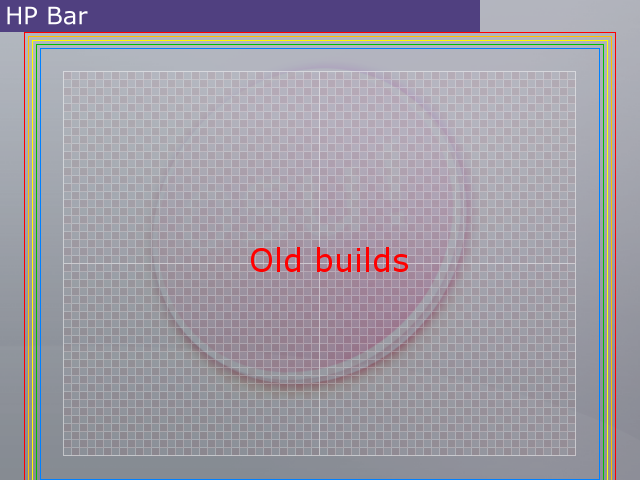
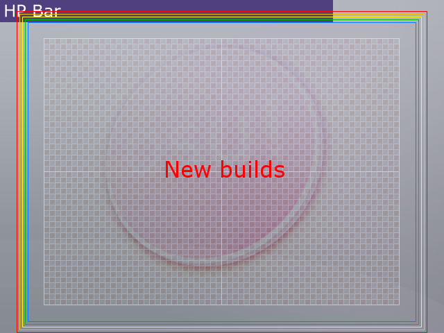
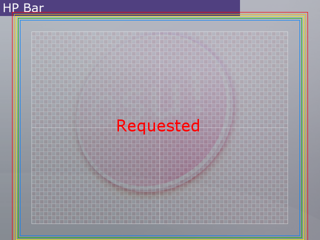
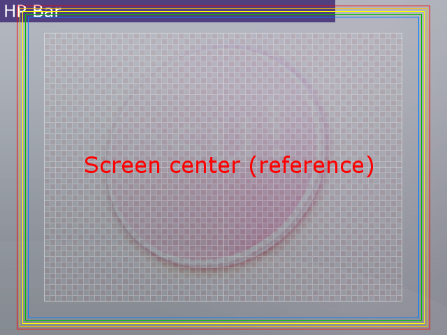
To communicate more clearly what I'm getting at, I've prepared these reference drawings:
Old field placement
New field placement
Requested field placement
Screen center field placement (and why it's a TERRIBLE idea!)
The five rainbow boxes represent the furthest out a note of each circle size can be placed.
Note that in all three examples (I'm not counting screen center because it's ridiculous), we can place Size 3 (biggest) circles anywhere we want vertically. So for all you Size 3 circle users, ability to place a note makes no difference.
The field in its new position, however, makes it impossible to reach the bottom with any circle size less than the biggest, while introducing all sorts of undesirable overlap with the HP bar at the top of the screen. This is wasted space which could be better put to use allowing placement of circles further down.
And most importantly, when making vertically symmetric patterns, the line of reflection should be the field center axis, shouldn't it? At present, if I place a note near/at the bottom of the screen, its partner note in symmetry would collide with the HP bar! So in effect, the unusable field area at the top gets doubled by an unusable field area at the bottom for purposes of symmetry. Even if you don't care about symmetry, the Hard Rock mod will cause the very same effect when it flips your map. My suggested field placement optimizes this usable field area for all circle sizes. It makes these forbidden zones their smallest.
So again, taking a note which fits within the field, I should be able to Ctrl+J that note and get a note which fits within the field.
Wait woah woah woah woah..
When did we establish that HP Bar notes were "illegal"?
When did we establish that HP Bar notes were "illegal"?
Topic Starter
Is this a discussion still worth having or are the notes gonna stay where they are? Sure notes that overlap the HP bar are playable, but really, they don't look nice =/
However, seeing as there are now maps that would have offscreen notes if the grid were shifted down a grid, we would have to tag these maps to keep the old grid shift. Though I can't see this being the issue with TOO many maps..
However, seeing as there are now maps that would have offscreen notes if the grid were shifted down a grid, we would have to tag these maps to keep the old grid shift. Though I can't see this being the issue with TOO many maps..
I'd still like to see symmetry; that is- if peppy is up to moving the grid/spinner/etc. one more time. :]
Why don't we move half the HP bar onto the bottom of the screen, too?Derekku Chan wrote:
I'd still like to see symmetry; that is- if peppy is up to moving the grid/spinner/etc. one more time. :]
The circles DON'T COVER THE HP PART OF THE HP BAR. Circles MIGHT look better if they take priority over the HP Bar. Then again, I'm not peppy, and I wouldn't know what problem COULD arise from that.
Also wtf the grid is fine where it is.
Also wtf the grid is fine where it is.