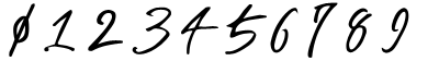
I don't mind the current hitcircles in your screenshot, but perhaps you could add some shine effect to them to make them similar to the pins. They look a bit flat at the moment.
forum
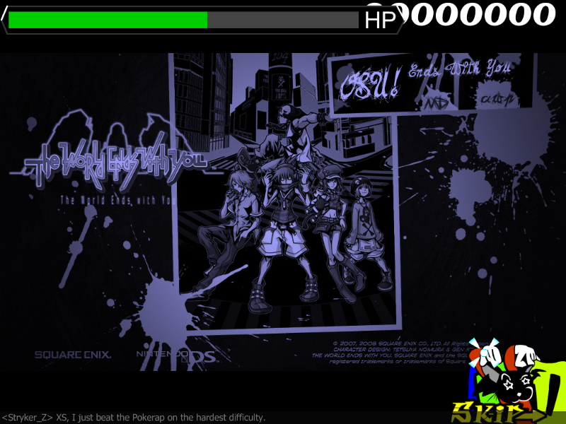
osu! Ends With You (v1.23)
posted
Total Posts
227
Is there a way to make the HP bar drain from both sides? :/
BTW, I think I'm going to finish Emptiness And, but with a ton of storyboarding, and I'm going to implement this skin for a final touch, when it's finished. :>
BTW, I think I'm going to finish Emptiness And, but with a ton of storyboarding, and I'm going to implement this skin for a final touch, when it's finished. :>
Would be SO win <3Loginer wrote:
Is there a way to make the HP bar drain from both sides? :/
Looks amazing so far, really wish there was a way to have several different hitcircles... is there a way to make each color in the Color menu correspond to different circles? Several pins would be sexy
Topic Starter
I could shine them, but the idea behind this is that they're the Noise symbols visible when scanning an area with the player pin (the black and blue in the screenshot) - when you poke them to engage a battle, they have a white bubble around them, which is effectively what it's supposed to look like.LuigiHann wrote:
I don't mind the current hitcircles in your screenshot, but perhaps you could add some shine effect to them to make them similar to the pins. They look a bit flat at the moment.
It looks nice so far. I'm not sure if you should take away the text block on the bottom and 12+. Probably not. No, I say leave it.
[s]Osu! Ends With You[/s] The World Ends With Osu!
[s]Osu! Ends With You[/s] The World Ends With Osu!
Topic Starter
I think I'll take the 12+ out, but leave the text then. Will do some updates tonight~
Topic Starter
new happy little preview.
Scorebar bg may look a little weird to you based on that screenshot, just because of the darkness of the playfield. I'll tweak it later. It's already midnight wtf that reaper took longer than I thought it would
Posting old and new version of the lifebar. The one with the slight grey border is not as accurate a representation, but imo looks better so fukkit
Which of the lifebars looks better: the one with the Reaper, or the one with the Skip button?
ps: CAT represent, yo.
[Deleted screenshot3 to free up space]
top one is far better in my opinion
Yeah, top life bar looks a bit better. I like the idea of the reaper, but it's incredibly distracting. Maybe you could replace the Countdown with it and some other stuff?
Topic Starter
The Reaper is the countdown =3XSarustaX wrote:
Yeah, top life bar looks a bit better. I like the idea of the reaper, but it's incredibly distracting. Maybe you could replace the Countdown with it and some other stuff?
Also did a bunch of updates, and I want to thank Lolginer for providing me with an epic library of audio files. Below is a sample of the current state of the skin - obviously not done, obviously in need of tweaks, but so damn epic.
Screenshots just don't do the trick.
http://up.ppy.sh/files/skindemov.5.avi (14mb)
and yes I'm going to fix the ranking audio right now, but I'm not making another video
Go 2 Hell =(
Badass.
Yeah! What he said!Saturos wrote:
Badass.
This map has been deleted on the request of its creator. It is no longer available.
Topic Starter
It's a direct rip from the game, so bleh.Vic wrote:
Hahahaha, I love the spinner XD And... That the miss sound sounds liek "Pickitup Phones", while its not like that in the gaem (its too fast). Dunno, maybe its just me.
Topic Starter
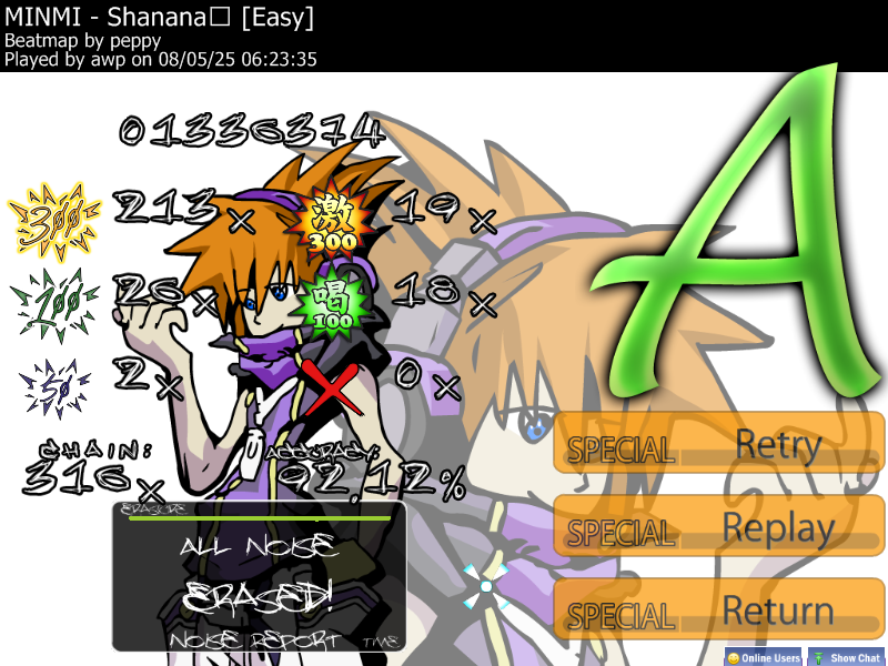
That's how it's done. (updated)
NEKU FTW!awp wrote:
That's how it's done.
Topic Starter
To rest Sinistro's soul:
redid the fonts using a simple temporary font until MD sexifies them.
redid the fonts using a simple temporary font until MD sexifies them.
I got the numbers done, vectoring the Noise Erased... then I'll vector the Get Ready and Reduction... TWEWY's letters are proving to be very fancy. o.O;
Will post them in a bit. >_<;
Will post them in a bit. >_<;
Topic Starter
oh fucking yes
so...
for The S-Ranks,
will it be replaced with the stars in TWEWY?
for The S-Ranks,
will it be replaced with the stars in TWEWY?
Topic Starter
Of course. TWEWY already has a ranking system, so I don't even need to be creative for that.
WHEW!
Done... Enjoy!
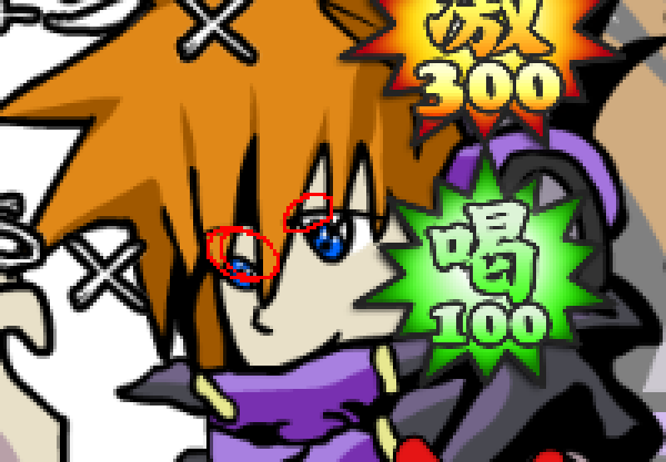
And 300 was fixed because the 3 looked very crooked. :/
EDIT: Get ready had a little error >_>...fixing. Fixed.


Done... Enjoy!
And 300 was fixed because the 3 looked very crooked. :/
EDIT: Get ready had a little error >_>...
And more files...


Last one. >_>;
I really should crack Winzip soon. XD

I really should crack Winzip soon. XD
the image of Neku on the ranking screen looks wrong to me. I haven't played the game, but it seems to clash with the style of the art that I've seen.
I didn't look yet, but I'm pretty sure it's the eyes that are what's throwing Neku off.
Topic Starter
Eyes and lines. I'll work on correcting it tonight while I implement MD's sexy numbers.
Also for MD: numbers look great but could I get a % , . and x in that style as well?
=3
I will probably leave the ranking graph as is to save you some trouble though, lalala
Also for MD: numbers look great but could I get a % , . and x in that style as well?
=3
I will probably leave the ranking graph as is to save you some trouble though, lalala
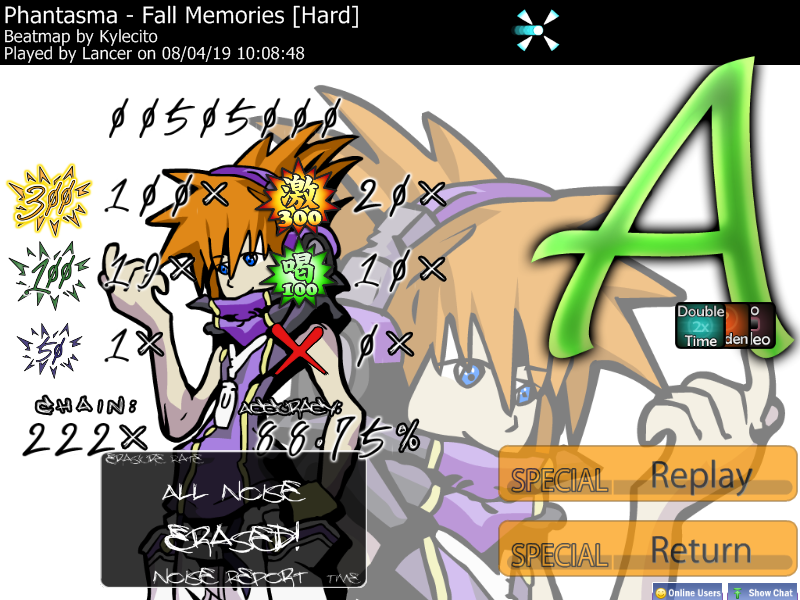
Posting for the hell of it. I compared it to the DS version:
-His right eye (our left) seems to lack a ridge line.
-His left eye's ridge line seems to end too high up, giving the eye an odd shape.
If I was any sort of artist, I'd link a proper image, but you'll have to put up with red circles MSPaint stylez.
This was all I could find odd about it, though. ;x
-His right eye (our left) seems to lack a ridge line.
-His left eye's ridge line seems to end too high up, giving the eye an odd shape.
If I was any sort of artist, I'd link a proper image, but you'll have to put up with red circles MSPaint stylez.
This was all I could find odd about it, though. ;x
I am going to fix up the Noise Erased, Get Ready!, and Reduction tomorrow. It looks a bit messy.
Topic Starter
Well, the Noise Reduction stuff is specific only to the storyboards I'll be doing so if you're strapped for time or energy, don't worry about those yet.
EDIT: New Neku =3 ???
Double Edit another new Neku
EDIT: New Neku =3 ???
Double Edit another new Neku
... all I can say is "That's Good!"awp wrote:
Well, the Noise Reduction stuff is specific only to the storyboards I'll be doing so if you're strapped for time or energy, don't worry about those yet.
EDIT: New Neku =3 ???
I approve of the newly sexified Neku.
Neku still looks a bit too soft, especially his eyes and limbs.
Topic Starter
Note to me: Change slider ball to Sexy D
because skin is Sexy Dammit
because skin is Sexy Dammit
The lines on Neku are too soft. D:
Topic Starter
It's the head/hair, isn't itLoginer wrote:
The lines on Neku are too soft. D:
I might be able to quickfix it otherwise =(
Wow, awesome skin so far! :3
That's a pretty good vector of Neku, but the lines are too round and smooth, in my opinion. The outline needs to be a bit sharper, especially for his hair, and the fingers look a little bit stubby. Then it'd look like the official HQ versions of the art. Though it's already really good!
If you want to know what I mean by sharp lines:
Here's a vector I did a few weeks ago of Minamimoto.
Also, warning: HUGE image.
Anyways, can't wait 'till the skin is done! ^___^
EDIT:
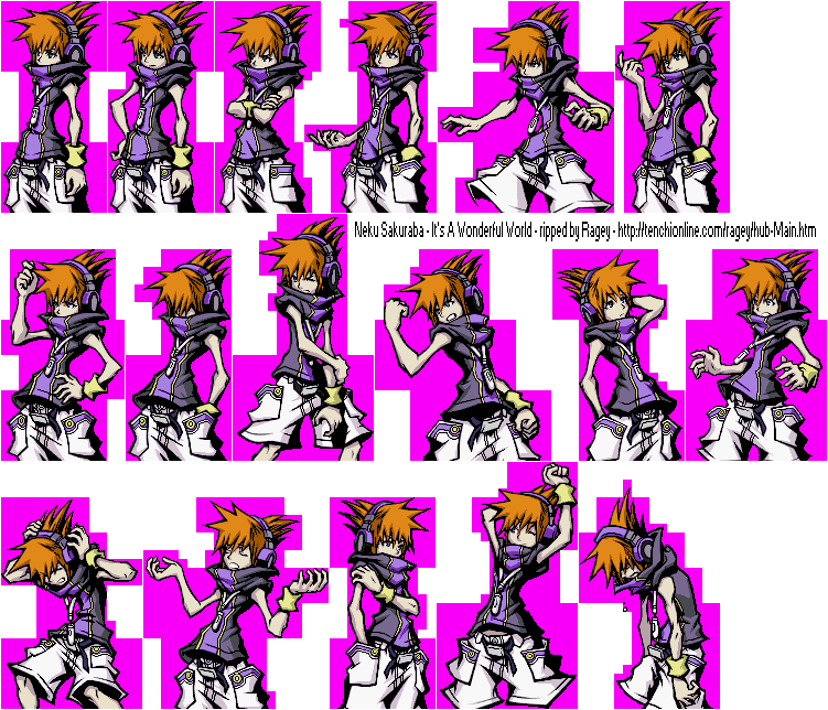
What did you use to make the vector? And did you use a sprite to trace the image?
If not, here's a sprite sheet by Ragey, taken from the Spriter's Resource. The pose vectored in the skin is in the upper right, try comparing the two.
That's a pretty good vector of Neku, but the lines are too round and smooth, in my opinion. The outline needs to be a bit sharper, especially for his hair, and the fingers look a little bit stubby. Then it'd look like the official HQ versions of the art. Though it's already really good!
If you want to know what I mean by sharp lines:
Here's a vector I did a few weeks ago of Minamimoto.
Also, warning: HUGE image.
Anyways, can't wait 'till the skin is done! ^___^
EDIT:
What did you use to make the vector? And did you use a sprite to trace the image?
If not, here's a sprite sheet by Ragey, taken from the Spriter's Resource. The pose vectored in the skin is in the upper right, try comparing the two.
Topic Starter
Yup, that's the exact ref I used I think. I will have to sharpen the lines since a handful of people have already pointed them out, ho hum.
Seeing if awp is okay with this design... a small preview, I guess. 
I am just wondering if the transparency would work okay with this.
And also the fixed Get Ready! and Noise Erased!... Reduction didn't need any fix apparently.


I am just wondering if the transparency would work okay with this.
And also the fixed Get Ready! and Noise Erased!... Reduction didn't need any fix apparently.
... Yep...
The official stuff unless awp got any changes he wants to make. >_>;
EDIT: Ack, forgot transparency... fixed. :3


The official stuff unless awp got any changes he wants to make. >_>;
EDIT: Ack, forgot transparency... fixed. :3
Topic Starter
THAT LOOKS SO FUCKING AWESAAAAAAAA
brb
brb
Topic Starter
arrrrrgh revision eight
posting in awesome thread.
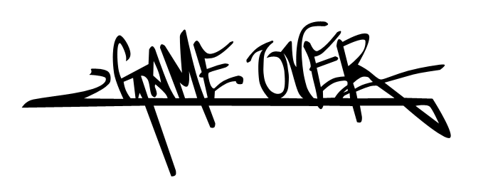
Game over vector. >_>;
Topic Starter
REVISION NINE DAMN YOU ALL
note that this will also likely not be the final revision, the official art is a temp (and pixelly) so I'll have to vectorize that.
Are we happy with this yet =x
note that this will also likely not be the final revision, the official art is a temp (and pixelly) so I'll have to vectorize that.
Are we happy with this yet =x
Yes.awp wrote:
Are we happy with this yet =x
seems too plain for me, or maybe its just me.
It's not just you, it seems to smooth, lacking detail.James wrote:
seems too plain for me, or maybe its just me.
But that's alright

You can always re-do/touch up the vector some other time, too. It doesn't have to be perfect for releasing the skin, take your time on it until it's perfect in your opinion.awp wrote:
REVISION NINE DAMN YOU ALL
note that this will also likely not be the final revision, the official art is a temp (and pixelly) so I'll have to vectorize that.
Are we happy with this yet =x
Last elite beat revision... with numbers added on then. :X


i like it except the ranking letter looks to plain....but w/e its still great cant wait to download!!!
Looking great so far.
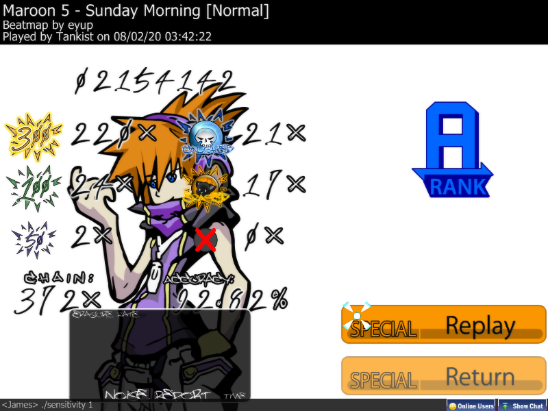
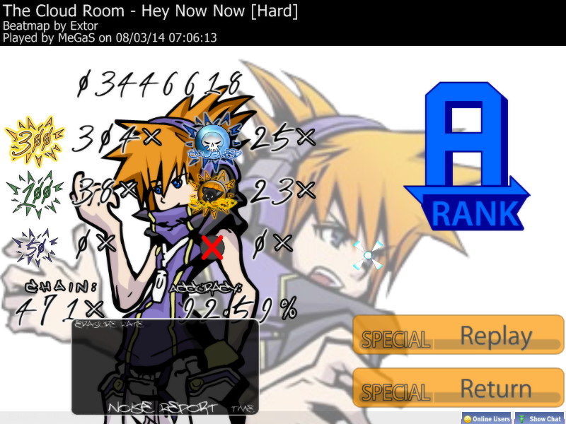
Two things for the ranking screen though: add a background (the white is killing me) and make the letter grades larger (but not too large). That's all that I can think of for now.
Two things for the ranking screen though: add a background (the white is killing me) and make the letter grades larger (but not too large). That's all that I can think of for now.
Topic Starter
buraimaster1234 wrote:
Looking great so far.
1 - NEVERRRRRRRburaimaster1234 wrote:
Two things for the ranking screen though: add a background (the white is killing me) and make the letter grades larger (but not too large). That's all that I can think of for now.
2 - what, again? I mean, I could make them a bit larger, but aren't they easy enough to read =x I'll consult the game for a size-up.
Maybe I could do something to spice up the ranking letters, but still keep the original design? :S
im with this guy >.> <.<MaxwellDemon wrote:
Maybe I could do something to spice up the ranking letters, but still keep the original design? :S
Yes, but there's all that empty space to fill in.awp wrote:
2 - what, again? I mean, I could make them a bit larger, but aren't they easy enough to read =x I'll consult the game for a size-up.
NEED BG!!
Topic Starter
That's what Neku's there for
BG's white because it's a reproduction of the rank screen in-game, y'know?
BG's white because it's a reproduction of the rank screen in-game, y'know?
I had a dangerous thought.awp wrote:
That's what Neku's there for
BG's white because it's a reproduction of the rank screen in-game, y'know?
You referred to one of Neku's poses as "S-rank Neku." Does that imply that he has a different pose for each rank? If so, is it possible that you could incorporate those poses into the ranking images? Perhaps move the faded closeup to the left, and place the rank-based portrait on the right alongside the rank itself?
Maybe you could try filling the bg with neku and all of his partners in the white bg.
It's only a thought that I came up with.
It's only a thought that I came up with.
Partially true.awp wrote:
BG's white because it's a reproduction of the rank screen in-game, y'know?
The stats portion (bottom screen) is laid out on a blue file folder basically, which could actually translate into osu!'s ranking screen quite well. The tab that reads 'Results' could display your overall score, for example. Doing this would also make the awesome font used for the hit counts easier to read.
And I just noticed this, but the score graph covers combo/accuracy partially, and now I can't unnotice it. D:
Topic Starter
This map has been deleted on the request of its creator. It is no longer available.
Some revisions. :X


Topic Starter
Check the OP for download instructions yay~
THIS IS SO FUCKING AWESOME.
Gonna throw away my EBAOsu! skin for this one.
TWEWY HERE I COMEEEEEE
Gonna throw away my EBAOsu! skin for this one.
TWEWY HERE I COMEEEEEE
LuigiHann cries a single tearShush wrote:
THIS IS SO FUCKING AWESOME.
Gonna throw away my EBAOsu! skin for this one.
TWEWY HERE I COMEEEEEE
Looks pretty good so far, dude.
SWEET!! I'm going to go try it out right now.
edit: lol@spinner WIN
enlarge SH rank?
I'm still unsure about the ranking screen. Broaden the line of Neku's jacket (it almost looks like he's chewing on it, me and my weird mind... ). Hmm... I was sure the ranking screen for The World Ends With You wasn't completely white. Didn't it have horizontal stripes; like a blueish green, I guess. I must be seeing things. Then again, I haven't played for like 2 days?
I say lower the opacity for the cursortrail. Kind of distracting.
Other than that, it's great.
He's revamping it since he forgot to include the file-folder styleish stats portion. That would be what you're thinking of. ;xburaimaster1234 wrote:
I was sure the ranking screen for The World Ends With You wasn't completely white. Didn't it have horizontal stripes; like a blueish green, I guess. I must be seeing things. Then again, I haven't played for like 2 days?
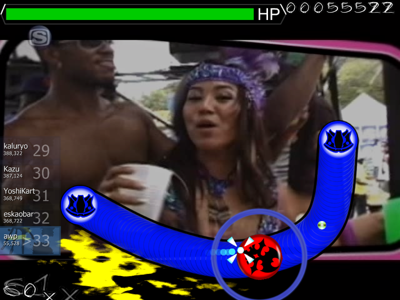
This skin kicks ass! but I can't see the damn sliderball!
Topic Starter
I knew I shouldn't have released a sneak preview.Dark Deception wrote:
This skin kicks ass! but I can't see the damn sliderball!
Read the OP. It explains why you can't see the slider ball. If you can't be arsed, I'll reiterate here.
You downloaded the Test Release version, instead of the Public version. osu! Ends With You uses brand new skinning techniques that are not yet available to the public client. Notice how the follow point (Light puck) doesn't animate, either? Delete the current copy you have and download the (nerfed) public version at the bottom of the post.
Seriously guys read the damn OP D=
Topic Starter
[16:56] <MaxwellDemon> http://up.ppy.sh/files/rips.zip
for later
EDIT: http://s214.photobucket.com/albums/cc15 ... =Ryuta.jpg
this too
for later
EDIT: http://s214.photobucket.com/albums/cc15 ... =Ryuta.jpg
this too
Topic Starter
Updated OP with some "Official" screenshots (one's already MILDLY out of date)
Also for those running the proper test skin - I found a PAINFUL bug in the skin where veering away from the slider ball (which causes you to miss ticks) causes the slider ball to disappear entirely. Add these two files to the skin and set SliderBallFrames: 2
lol oops


Also for those running the proper test skin - I found a PAINFUL bug in the skin where veering away from the slider ball (which causes you to miss ticks) causes the slider ball to disappear entirely. Add these two files to the skin and set SliderBallFrames: 2
lol oops
In future revisions, you could make it so that the slider ball is the cone, and the followcircle is that vortex... I was surprised to notice that the the followcircle is behind the ball, but that's how sprites are layered, apparently, and having the cone rotate a bit might give the animation some more variety.
Uhh... never mind about that. It took a few plays to get used to, but all is great (much better) now!buraimaster1234 wrote:
I say lower the opacity for the cursortrail. Kind of distracting.

Topic Starter
Yeah, I should really do that actually.LuigiHann wrote:
In future revisions, you could make it so that the slider ball is the cone, and the followcircle is that vortex...
having the cone rotate a bit might give the animation some more variety.Had it originally spinning a full 360 with a bit of z rotation as well (more than what's in the final version) and it looked terrible so I thought fuck it. Stuff doesn't rotate in TWEWY either, and it just looked terrible, so I had it float kinda. I like how it is now, but I should fix the layering issue tomorrow.
Also@burai yeah I didn't intend to change it =x I actually wanted to increase the draw rate so it had more of an in-battle feel to it, but I think it's fine as is as well.
Yeah, I wouldn't make it spin or anything, but the natural rotation of the slider ball on curved sliders would probably be perfect.
Topic Starter
Right, I just remembered...
atm the sliderball animates unreasonably fast for this purpose, so either I make it ~36 frames (repitition) or I leave it as is. I imagine the sliderball's animation will be configurable at SOME point, but until it is, we'll go with what we have.
atm the sliderball animates unreasonably fast for this purpose, so either I make it ~36 frames (repitition) or I leave it as is. I imagine the sliderball's animation will be configurable at SOME point, but until it is, we'll go with what we have.
I just checked the updated screenshots on the first page.
The ranking screen looks great, now! And everything else is also awesome. :3
The ranking screen looks great, now! And everything else is also awesome. :3
Topic Starter
ty
Skin's pretty much done (it will be upgraded in the future but for all intents and purposes is done) and final submittal has been made to the Lounge where it will hopefully be bundled with osume on new public build where the skin will actually work correctly for you underprivileged civvies.
Skin's pretty much done (it will be upgraded in the future but for all intents and purposes is done) and final submittal has been made to the Lounge where it will hopefully be bundled with osume on new public build where the skin will actually work correctly for you underprivileged civvies.
Topic Starter
Hahahahahahahaha this skin is being delayed
=(
because peppy just added more shit into osu!, so I need to make the partner system even better than it already is. Come on, MD, let's see if we can hit the undisclosed June patch on those fusion pins~
=(
because peppy just added more shit into osu!, so I need to make the partner system even better than it already is. Come on, MD, let's see if we can hit the undisclosed June patch on those fusion pins~
As soon as I get out of the airport, I'll jump into it.
Topic Starter
You are the MAN, dood
Skins coming out soon right? Preview looks great.
Topic Starter
I'm uppying v1.0 as we speak.
It'll be out in around 3 minutes.
It'll be out in around 3 minutes.
SWEET!! Downloading right away.
Either this is awesome, or this is awesome.
Seriously, nice (10x) job, awp. =D
Seriously, nice (10x) job, awp. =D
i LOVE AWP!!!!!!!!!!!!!!!!!!!!!!!!!!!!!!!!!
lol...
lol...
Topic Starter
22 downloads in the first ten minutes
55 downloads in less than 24 hours
you guys rock <3
55 downloads in less than 24 hours
you guys rock <3
Wow... that's insane... o.oawp wrote:
22 downloads in the first ten minutes
55 downloads in less than 24 hours
you guys rock <3
And thanks for the skin awp and Maxwell Demon!
This map has been deleted on the request of its creator. It is no longer available.
Great skin
Though it might be just me but whenever I finish a song and get my statistics I don't see my accuracy, points ect box. It's just the Main character and what not, and I extracted the parter into the Skin folder, but nothing happens. :X
Am I doing it wrong? Also, it made the noise/hit sounds back to original. Normal? Or fixable?
Did you extract the partner pack while you had the skin already selected? If so, a simple reselection at the skin menu should cure that up, or closing/reopening osu.
That's all I can think of at the moment. ;x
That's all I can think of at the moment. ;x
Topic Starter
For the partner switch, make sure you're not extracting it as a folder. You should be overwriting the old files.
As for the ranking panel, what the hell? If you downloaded the "leaked" beta skin, you might be best off deleting and replacing the folder entirely. There's no reason why it should not be displaying.
As for the ranking panel, what the hell? If you downloaded the "leaked" beta skin, you might be best off deleting and replacing the folder entirely. There's no reason why it should not be displaying.
I take that back, great Beatmap.
I got everything working, my only complaint is everytime you make a mistake you hear them get disappointed at you and your lameness :C makes me sad looool jk, theres some things in there that can seem somewhat annoying. Other than that its good.
I got everything working, my only complaint is everytime you make a mistake you hear them get disappointed at you and your lameness :C makes me sad looool jk, theres some things in there that can seem somewhat annoying. Other than that its good.
Topic Starter
Some of the somewhat annoyings will be addressed as peppy further sexifies skinning potential.
But yeah hearing my partners chastise me for breaking a combo makes me want to throttle them as well. All the more motivation to full-combo everything you encounter, right?
But yeah hearing my partners chastise me for breaking a combo makes me want to throttle them as well. All the more motivation to full-combo everything you encounter, right?
The partners talk WAY too often during gameplay, they should say stuff only during the breaks where the circles and Xs appear to tell you whether you did good or not.
Hearing, "Keep it up, Neku" every 30 seconds is getting kinda annoying. O_o
Hearing, "Keep it up, Neku" every 30 seconds is getting kinda annoying. O_o