forum

Kamex - Kyanite Cave

posted
Total Posts
9
Topic Starter
DeletedUser_10209520
This beatmap was submitted using in-game submission on 18 October 2017 at 21:58:12

Artist: Kamex
Title: Kyanite Cave
Tags: kamex, pokemon, orchestral, instrumental, mysterytale
BPM: 130
Filesize: 3511kb
Play Time: 01:39
Difficulties Available:
  1. Crystal (3.22 stars, 184 notes)
  2. Easy (1.42 stars, 83 notes)
  3. Normal (1.91 stars, 124 notes)
  4. Victor's Advanced (2.31 stars, 150 notes)
Download: Kamex - Kyanite Cave
Information: Scores/Beatmap Listing
---------------
A breeze runs through the cavern, howling past the crystals embedded in the walls, sending a chill of thunder down your spine...

Somehow, though, you feel at home here...

Easy - 99%
Normal - 99%
Victor's Advanced - 99%
Crystal - 99%

Thanks victorfernando for the GD and hitsounds!

Mods appreciated, kudosu always given!

Changes Made:

15/10/17 - Fixed incorrect difficulty settings for Crystal + combo colours on Easy.
15/10/17 - Fixed issues as per seselis1's mod! Thanks!
16/10/17 - Fixed issues related to victorfernando's mod! Thanks!
17/10/17 - Fixed issues related to UniqueBlock11's insane mod! Thanks so much!
18/10/17 - Added Victor's Advanced and hitsounds. Thanks!
(todo: add victor's advanced + j a c k's large mod)
mantasu
o/ from my modding q
So I'll be doing easy and hard
easy
00:06:923 (1,1) - according to ranking criteria, spinner recovery time should be at least 4 beats in easy diff
00:13:615 (1) - such sliders look too much curved. make them less curved or straight
00:13:615 (1) - remove NC
00:16:615 (1,1,1) - seriously too many NCs :D so
00:17:538 (1) - remove NC
00:18:923 (1) - ^
00:27:230 (1) - ^ etc
00:30:461 (1,2) - blanket better
00:30:461 (1,2) - don't make them touch
00:38:307 (4,1) - path can be misleading to new players. I suggest something like this

00:57:692 (4) - imao a repeated slider would fit better
01:04:384 (5) - it's really misleading since it's only one object on the red line. Mb try this

01:07:153 (2) - ^
01:25:846 (5) - make this one circle or double click slider tail and remove whistle sound
01:37:384 - you could do the end
Hard
00:14:307 (1) - you shouldn't place it together with 00:13:615 (1,2) - these. It's confusing
00:14:538 (2) - passive sound, so jump shouldn't be big
00:22:153 (8) - NC
00:27:230 (3) - breaks the flow
00:32:307 (5) - NC due to sv change
00:35:769 (1,2) - jump is too straightforward
00:43:384 (1) - almost same spaced as 1/2 rhythm. It should be placed further or stacked
01:07:846 (4) - overlap. Place it a bit up
01:08:769 (2,3) - don't make them touch
01:10:615 (3,1) - also should be stacked or placed further
01:12:923 (2,3) - fix overlap
01:33:923 (3,4) - jump is too straightforward
01:35:538 (5) - lift it up
01:38:307 (7) - NC
01:41:076 (7) - ^ etc
GL with mapset :)
Topic Starter
DeletedUser_10209520

seselis1 wrote:

o/ from my modding q Thanks for the mod!
So I'll be doing easy and hard
easy
00:06:923 (1,1) - according to ranking criteria, spinner recovery time should be at least 4 beats in easy diff Fixed
00:13:615 (1) - such sliders look too much curved. make them less curved or straight Agreed, fixed
00:13:615 (1) - remove NC don't map late at night, kids
[snip]
00:30:461 (1,2) - blanket better Fixed
00:30:461 (1,2) - don't make them touch Fixed
00:38:307 (4,1) - path can be misleading to new players. I suggest something like this Fixed

00:57:692 (4) - imao a repeated slider would fit better Fixed
01:04:384 (5) - it's really misleading since it's only one object on the red line. Mb try this Fixed, with a different solution to avoid overmapping.

01:07:153 (2) - ^ Fixed
01:25:846 (5) - make this one circle or double click slider tail and remove whistle sound Fixed
01:37:384 - you could do the end Ending is too fast to realistically map for an easy diff.
Hard
00:14:307 (1) - you shouldn't place it together with 00:13:615 (1,2) - these. It's confusing Fixed, but I kinda liked it the other way...
00:14:538 (2) - passive sound, so jump shouldn't be big Fixed, but again, meh...
00:22:153 (8) - NC Fixed
00:27:230 (3) - breaks the flow Fixed
00:32:307 (5) - NC due to sv change Fixed
00:35:769 (1,2) - jump is too straightforward Fixed
00:43:384 (1) - almost same spaced as 1/2 rhythm. It should be placed further or stacked Fixed, I think
01:07:846 (4) - overlap. Place it a bit up Fixed
01:08:769 (2,3) - don't make them touch Fixed
01:10:615 (3,1) - also should be stacked or placed further Fixed, I think
01:12:923 (2,3) - fix overlap Fixed
01:33:923 (3,4) - jump is too straightforward Fixed
01:35:538 (5) - lift it up Fixed
01:38:307 (7) - NC Not really a major downbeat.
GL with mapset :) Thanks! Kudosu given!
victorfernando
Crystal
  • Use medium grid snap use G to change
    00:11:999 create a new green line here and put audio volume 20%, because here it's the calm part, don't make sense 100% volume :)
  1. 00:16:615 missed whistle
  2. 00:17:999 ^
  3. 00:18:923 ^
  4. 00:19:384 ^
  5. 00:54:461 ^
  6. 00:37:846 these green line sections which one reduce the Slider speed, can be faster, I think this one is not following the music, don't have an important sound here, use 0,75x it's more than necessary
  7. 00:43:384 ^
  8. 00:46:153 ^
  9. 01:17:538 reduce audio here for 20%
    Has an audio and audio copy, maybe this is unreankeable
  10. maybe do a square here : 00:39:230
  11. 01:03:230 move this note to X:235 Y:216
  12. 01:03:461 move this note to X:128 Y:88
  13. 01:03:692 move this one to X:176 Y:272
UniqueBlock11
Hey there, M4M from your queue

general

The timing of the map is 3/4, not 4/4. Click on the Timing drop at the top of the editor and select 3/4 in the time signature.
The background image size needs to be at most 1366x768. Currently it is 1920x975 which doesn't follow the ranking criteria.
Bitrate of the audio mp3 is 320 kb/s, it needs to be 192 kb/s.
You have a redundant storyboard folder in your map folder. Remove them to save file space.
Disable Widescreen Support in the map settings.

I suggest disabling the countdown, it makes the map feel modern imo.
Can you change the dark blue combo colors to be slightly more light; I'm slightly colorblind and it's hard for me to see them against a blue background.
Add some tags!

easy

AIMod reports distance snapping issues, fix those as distance snapping issues shouldn't appear in easy difficulties.

00:06:923 (1) - From the start the spinner is way too loud. This introduction is very calm; use volume 25% or so here instead of 43%.
00:17:538 (2,3) - This pattern flows really weirdly; make a simple flow for new players to easily follow. This is sufficient enough:

00:22:153 (1,2,1) - I think placing claps instead of whistles on the sliderends sound a lot better.
00:27:230 (4,1) - Blanket these for visual appeal:

00:29:076 (2,1) - ^
00:30:461 (1,2) - ^
00:38:307 (4,1,2) - Blanket (1) with (4) and (2).
00:39:692 (2) - This should not be a slider since the sliderend lands on a strong drum sound. Change this slider to two circles instead. You also missed a clap hitsound on the drum as well.
00:41:999 (4) - I think this rhythm sounds better:

00:44:769 (2) - This should be a repeat slider considering the amount of repeat sliders you use following this slider.
01:04:615 (5) - Missed a clap on the sliderend.
01:07:384 (2) - ^
01:19:846 (3) - This part of the song is really powerful, convert this slider to two circles to help carry the piano chords in the song.
01:22:384 (1) - This slider sounds awkward as it is, and it feels like an area where someone might break their combo since the objects are close to each other. Perhaps adding a repeat would make a better rhythm.
01:30:923 (3) - Convert this slider to two circles for the reason on 01:19:846 (3).
01:33:461 (1) - Add a repeat to this slider for the reason on 01:22:384 (1).
01:35:999 (4) - Use the rhythm that I showed you for 00:41:999 (4) because the sliderend lands on a piano chord which should be clickable.

normal

AIMod reports distance snapping issues again, fix those as distance snapping issues shouldn't appear in normal difficulties.

00:06:923 (1) - From the start the spinner is way too loud. This introduction is very calm; use volume 25% or so here instead of 43%.
00:13:615 (2,3,4,5,6) - I feel you could rework this rhythm to be more neat. (2) and (3) don't feel like they should be stacked, a slider instead would be OK. (5) and (6) should be a slider as despite overlaps start making their way into normal difficulties, at least make the rhythms more understandable, this would technically be a stream and probably has no business being in a normal difficulty.
00:20:538 (7,8) - ^
00:22:153 - What's with the finish hitsounds here? The easy difficulty contains clap hitsounds, which sound better in my opinion.
00:24:923 (1,2) - Blanket for visual appeal.
00:26:769 (2,3) - ^
00:29:076 (1,2) - ^
00:37:153 (6) - Missing a clap hitsound on the sliderend.
00:53:076 (1) - ^
00:57:692 (2,3,4) - You should avoid direct stacking in normal difficulties. They feel too hard for normal difficulties tbh.
00:48:461 (3,4) - Swap the hitsounds on these notes.
01:22:384 (1,2,3) - Why not use a repeat slider instead of three circles, this helps emphasize the calmness of this section of the song.
01:31:384 (5) - This should not be a slider, a circle is a better representative here.
01:33:461 (1,2,3,4,1,2,3,4,1,2,3) - Yeah, most likely too hard for normal, convert the triplet streams to a single repeat slider for ease of play.

crystal

00:06:923 (1) - Change volume to 25%!1!11!!11
00:14:307 (3,4,5,6,7) - Convert this jump pattern to a neat one, this looks like a jumbo on the side of the playfield. Why not make the players click in a circle?
00:19:846 (3,4,5,6,7) - You already seemed to make a shape here, but the spacing between (6) and (7) poorly emphasizes the fact that they are part of a quintuplet stream. Space the notes similarly.
00:22:153 - What's with the finish hitsounds here? The easy difficulty contains clap hitsounds, which sound better in my opinion.
00:23:999 (2,3) - These notes overlap but not in a neat way. Move them so that they don't touch.
00:27:230 (3) - I'll question your use of SV changes here; 2x is way too surprising and is a huge jump from 1x. Lighten the SV changes because hard difficulties are still not suitable for extreme SV changes.
00:29:538 (2,3) - These notes overlap but not in a neat way. Move them so that they don't touch.
00:30:461 (1,2,3,4) - Uneven spacing here, please keep them consistent especially since they have even time between them.
00:32:307 (1) - Whoa, this is a perfect spot for losing an FC chance. The SV is so little that it appears that this is a quick click slider, and that's what I thought too. These sliders are way too hard for this difficulty, increase the SV to 0.75x or so for ease of play.
00:36:461 (3,4,5,6) - Please make this overlaps have more stack leniency so that the circle borders can be seen, you're going to hurt colorblind people like me.
00:37:846 (1,2) - Increase the SV here as this is not appropriate for this difficulty.
00:35:769 (1,2) - Random 1.5x snap in the middle of 2.0x, keep the distance snapping the same unless if you're going for jumps or some sort.
00:40:846 (5,1,2) - This is so confusing, while testplaying I went from (5) to (2), completely missing (1). I'd advise not using overlaps here as this pattern is approaching the edge of the playfield.
00:43:384 (1,2) - See 00:37:846 (1,2).
00:46:153 (1,2) - ^
00:47:538 (4,5) - ^
00:48:923 (2,3) - What's going on here? (2) has a low SV, but the slider before it sounds similar to (2) but has regular SV. Then, (3) is spaced 6x away from 92) and has a 2x SV, which I did not expect at all. Increase the SV on (2), then space (3) an appropriate space from (2) and lighten the SV change on (3).
00:50:307 (1,2) - See 00:37:846 (1,2).
00:51:692 (1) - ^
00:53:076 - I'm not sure why you're spacing these notes 0.5x all of a sudden, the song's 'attitude' didn't change at all so there's no reason to use 0.5x now.
00:58:615 (2,3,4) - This blanket isn't perfect.
01:02:769 (3,4,5,6,7) - Uneven spacing again from (6) to (7). Also this pattern should be in a shape, similar to what I told you before (making a star)
01:10:615 (3,1) - What's with the sudden imperfect stacking? Since you've been making perfect note stacking up until this point, stack these notes perfectly as well.
01:11:076 (1,2) - Blanket isn't perfect.
01:12:461 (1,2,3) - Move (3) further away from (2) so that (2) doesn't touch (1) or (3).
01:13:846 (1,2,3) - ^
01:22:384 (1,2,3,4) - Place (4) so that it forms a triangle with (2) and (3). No need for jumps in a calm pattern.
01:38:307 (7,8,9,10,11) - This pattern is way too confusing... please make this pattern easy to read. This is an outro however you still use difficult patterns that should belong in the Kiai time earlier. Also, correct the distance between (10) and (11).
01:39:461 (12,1) - Correct the distance snapping, even though these are different combos the jump between them poorly represents the outro.
01:42:230 (12,1) - ^
01:44:999 (12,1) - ^
Topic Starter
DeletedUser_10209520

victorfernando wrote:

Crystal

  • Thanks for the mod!
    Use medium grid snap use G to change Grid snapping isn't used at all - it's on small to irritate me so I turn it off!
    00:11:999 create a new green line here and put audio volume 20%, because here it's the calm part, don't make sense 100% volume :) Fixed
  1. 00:16:615 missed whistle
    [snip] Whistles fixed
  2. 00:37:846 these green line sections which one reduce the Slider speed, can be faster, I think this one is not following the music, don't have an important sound here, use 0,75x it's more than necessary
    [snip] Slow SVs fixed!
  3. 01:17:538 reduce audio here for 20% Fixed
    Has an audio and audio copy, maybe this is unreankeable Fixed, this is why you double-check before uploading...
  4. maybe do a square here : 00:39:230 Changed
  5. 01:03:230 move this note to X:235 Y:216
  6. 01:03:461 move this note to X:128 Y:88
  7. 01:03:692 move this one to X:176 Y:272 All changed
    Thanks a lot for the mod, kudosu given!
Topic Starter
DeletedUser_10209520
I'll update this mod as I work through it because it's so crazy long I can't do it in one sitting.

UniqueBlock11 wrote:

Hey there, M4M from your queue You're insane man, never expected a mod of this much effort on one of my maps <3

general

The timing of the map is 3/4, not 4/4. Click on the Timing drop at the top of the editor and select 3/4 in the time signature. Fixed, although it doesn't appear to effect my timings too much.
The background image size needs to be at most 1366x768. Currently it is 1920x975 which doesn't follow the ranking criteria. I don't see this anywhere in the ranking criteria, but fixed anyway to save file space.
Bitrate of the audio mp3 is 320 kb/s, it needs to be 192 kb/s. Bitrate of the audio mp3 is 190kbps, so it should be fine.
You have a redundant storyboard folder in your map folder. Remove them to save file space.Fixed
Disable Widescreen Support in the map settings. Fixed

I suggest disabling the countdown, it makes the map feel modern imo. Fixed
Can you change the dark blue combo colors to be slightly more light; I'm slightly colorblind and it's hard for me to see them against a blue background.Fixed
Add some tags! Added!

easy

AIMod reports distance snapping issues, fix those as distance snapping issues shouldn't appear in easy difficulties. Fixed, most of them were just a few pixels out.

00:06:923 (1) - From the start the spinner is way too loud. This introduction is very calm; use volume 25% or so here instead of 43%. Fixed
00:17:538 (2,3) - This pattern flows really weirdly; make a simple flow for new players to easily follow. This is sufficient enough: Fixed
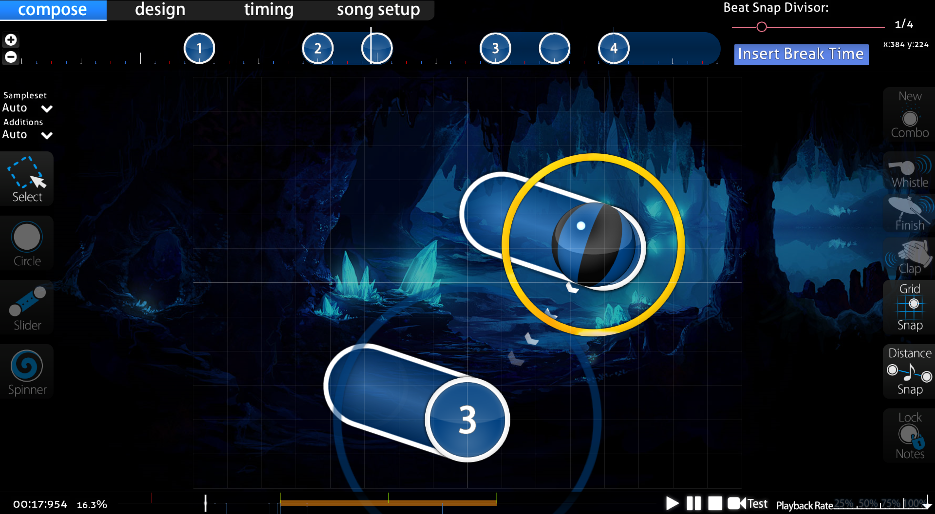
00:22:153 (1,2,1) - I think placing claps instead of whistles on the sliderends sound a lot better. Claps are being reserved mostly for drums -
although this brung up the issue that I'd used the wrong hitsound on the slider I used! All fixed... ish...

00:27:230 (4,1) - Blanket these for visual appeal: Fixed, though not as cleanly as you managed it...
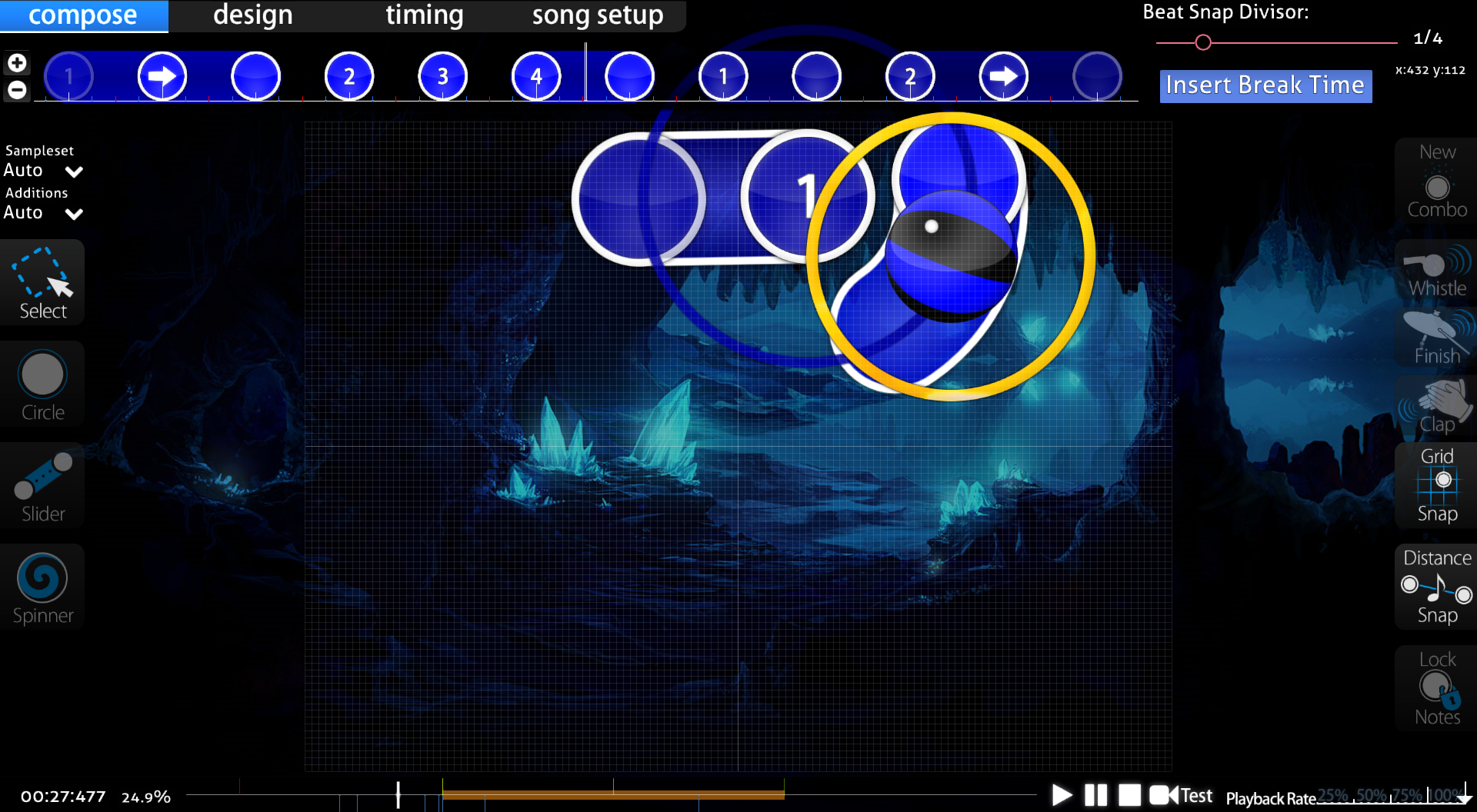
00:29:076 (2,1) - ^ Fixed
00:30:461 (1,2) - ^ Fixed
00:38:307 (4,1,2) - Blanket (1) with (4) and (2). Fixed
00:39:692 (2) - This should not be a slider since the sliderend lands on a strong drum sound. Change this slider to two circles instead. You also missed a clap hitsound on the drum as well. Fixed
00:41:999 (4) - I think this rhythm sounds better: Agreed, fixed

00:44:769 (2) - This should be a repeat slider considering the amount of repeat sliders you use following this slider. Changed
01:04:615 (5) - Missed a clap on the sliderend. Changed
01:07:384 (2) - ^ Changed
01:19:846 (3) - This part of the song is really powerful, convert this slider to two circles to help carry the piano chords in the song. Changed
01:22:384 (1) - This slider sounds awkward as it is, and it feels like an area where someone might break their combo since the objects are close to each other. Perhaps adding a repeat would make a better rhythm. I agree with the problem, but I don't really have a different solution. Your solution leaves an unrankable 1/2 gap, and most other solutions maintain an awkward rhythm, or end up with an unrankable 2x repeat slider.
01:30:923 (3) - Convert this slider to two circles for the reason on 01:19:846 (3). Changed
01:33:461 (1) - Add a repeat to this slider for the reason on 01:22:384 (1). Same issue.
01:35:999 (4) - Use the rhythm that I showed you for 00:41:999 (4) because the sliderend lands on a piano chord which should be clickable. Changed

normal

AIMod reports distance snapping issues again, fix those as distance snapping issues shouldn't appear in normal difficulties. Fixed, although I'm still getting 2 that, even though distance snap is on and consistent with the rest of the map, won't go away. Weird.

00:06:923 (1) - From the start the spinner is way too loud. This introduction is very calm; use volume 25% or so here instead of 43%. Fixed
00:13:615 (2,3,4,5,6) - I feel you could rework this rhythm to be more neat. (2) and (3) don't feel like they should be stacked, a slider instead would be OK. (5) and (6) should be a slider as despite overlaps start making their way into normal difficulties, at least make the rhythms more understandable, this would technically be a stream and probably has no business being in a normal difficulty. Changed
00:20:538 (7,8) - ^ Changed, although kept first 2 notes separate due to a full beat gap.
00:22:153 - What's with the finish hitsounds here? The easy difficulty contains clap hitsounds, which sound better in my opinion. Claps reserved for drums, plus personally the finish fits better. Maybe if someone else comments on it.
00:24:923 (1,2) - Blanket for visual appeal. Blanketed.
00:26:769 (2,3) - ^ Blanketed.
00:29:076 (1,2) - ^ Blanketed.
00:37:153 (6) - Missing a clap hitsound on the sliderend. Fixed.
00:53:076 (1) - ^ Corrected.
00:57:692 (2,3,4) - You should avoid direct stacking in normal difficulties. They feel too hard for normal difficulties tbh. Replaced with repeat slider.
00:48:461 (3,4) - Swap the hitsounds on these notes. Fixed.
01:22:384 (1,2,3) - Why not use a repeat slider instead of three circles, this helps emphasize the calmness of this section of the song. Changed.
01:31:384 (5) - This should not be a slider, a circle is a better representative here. Changed.
01:33:461 (1,2,3,4,1,2,3,4,1,2,3) - Yeah, most likely too hard for normal, convert the triplet streams to a single repeat slider for ease of play. Changed.

crystal

00:06:923 (1) - Change volume to 25%!1!11!!11 Fixed!1!11!!11
00:14:307 (3,4,5,6,7) - Convert this jump pattern to a neat one, this looks like a jumbo on the side of the playfield. Why not make the players click in a circle? Fixed, replaced with a diamond shape.
00:19:846 (3,4,5,6,7) - You already seemed to make a shape here, but the spacing between (6) and (7) poorly emphasizes the fact that they are part of a quintuplet stream. Space the notes similarly. Changed, but I liked the note emphasis...
00:22:153 - What's with the finish hitsounds here? The easy difficulty contains clap hitsounds, which sound better in my opinion. Claps reserved for drums, plus personally the finish fits better. Maybe if someone else comments on it.
00:23:999 (2,3) - These notes overlap but not in a neat way. Move them so that they don't touch. Fixed.
00:27:230 (3) - I'll question your use of SV changes here; 2x is way too surprising and is a huge jump from 1x. Lighten the SV changes because hard difficulties are still not suitable for extreme SV changes. Reduced.
00:29:538 (2,3) - These notes overlap but not in a neat way. Move them so that they don't touch. Fixed.
00:30:461 (1,2,3,4) - Uneven spacing here, please keep them consistent especially since they have even time between them. Fixed.
00:32:307 (1) - Whoa, this is a perfect spot for losing an FC chance. The SV is so little that it appears that this is a quick click slider, and that's what I thought too. These sliders are way too hard for this difficulty, increase the SV to 0.75x or so for ease of play. Fixed.
00:36:461 (3,4,5,6) - Please make this overlaps have more stack leniency so that the circle borders can be seen, you're going to hurt colorblind people like me. Fixed.
00:37:846 (1,2) - Increase the SV here as this is not appropriate for this difficulty. Fixed.
00:35:769 (1,2) - Random 1.5x snap in the middle of 2.0x, keep the distance snapping the same unless if you're going for jumps or some sort. Fixed.
00:40:846 (5,1,2) - This is so confusing, while testplaying I went from (5) to (2), completely missing (1). I'd advise not using overlaps here as this pattern is approaching the edge of the playfield. Fixed.
00:43:384 (1,2) - See 00:37:846 (1,2). Fixed.
00:46:153 (1,2) - ^ Fixed.
00:47:538 (4,5) - ^ Fixed.
00:48:923 (2,3) - What's going on here? (2) has a low SV, but the slider before it sounds similar to (2) but has regular SV. Then, (3) is spaced 6x away from 92) and has a 2x SV, which I did not expect at all. Increase the SV on (2), then space (3) an appropriate space from (2) and lighten the SV change on (3). Fixed.
00:50:307 (1,2) - See 00:37:846 (1,2). Fixed.
00:51:692 (1) - ^ Fixed.
00:53:076 - I'm not sure why you're spacing these notes 0.5x all of a sudden, the song's 'attitude' didn't change at all so there's no reason to use 0.5x now. Fixed.
00:58:615 (2,3,4) - This blanket isn't perfect. Fixed.
01:02:769 (3,4,5,6,7) - Uneven spacing again from (6) to (7). Also this pattern should be in a shape, similar to what I told you before (making a star) Fixed.
01:10:615 (3,1) - What's with the sudden imperfect stacking? Since you've been making perfect note stacking up until this point, stack these notes perfectly as well. Fixed.
01:11:076 (1,2) - Blanket isn't perfect. Fixed.
01:12:461 (1,2,3) - Move (3) further away from (2) so that (2) doesn't touch (1) or (3). Fixed.
01:13:846 (1,2,3) - ^ Fixed.
01:22:384 (1,2,3,4) - Place (4) so that it forms a triangle with (2) and (3). No need for jumps in a calm pattern. Fixed.
01:38:307 (7,8,9,10,11) - This pattern is way too confusing... please make this pattern easy to read. This is an outro however you still use difficult patterns that should belong in the Kiai time earlier. Also, correct the distance between (10) and (11).
01:39:461 (12,1) - Correct the distance snapping, even though these are different combos the jump between them poorly represents the outro.
01:42:230 (12,1) - ^
01:44:999 (12,1) - ^ Ending replaced with spinner, since all other difficulties missed the end it felt strange adding it here. Plus it was way too hard.
Thanks so much for this insane mod dude, really helps :)
Serizawa Haruki
Hi, M4M from your queue

General
  1. Kiai time isn't snapped according to Ai Mod
Easy
  1. 00:22:153 (1,2,1) - Arrange them so that they form an equilateral triangle
  2. 00:24:923 (1,2,3,4) - It would look better if these were all aligned
  3. 00:27:230 (4,1) - This blanket is off, use the approach circle of 00:28:153 (1) - to make it perfect
  4. 00:29:076 (2,1,2) - ^
  5. 00:30:923 (2,3,4) - The triangle is not perfect here either, the distances between the circles and the sliderend should be the same
  6. 00:38:307 (4,1) - Fix Blanket
  7. 00:41:076 (4,5,6) - I would give them the same curve that the other sliders have and move them a little so it looks better in my opinion.
    Something like this
  8. 00:42:923 (6,1) - The fact that these are so close to each other might be confusing for new players
  9. 00:44:307 (1,2) - Fix Blanket
  10. 01:12:461 (3,1) - Move the circle so that it's aligned with the slider
  11. 01:22:384 (1,2) - Change these into a 1/2 slider with 2 reverse arrows
  12. 01:33:461 (1,2,3) - Same as above and fix blanket
Normal
  1. 00:24:923 (1,2) - Fix Blanket
  2. 00:26:769 (2,3) - ^
  3. 00:29:076 (1,2) - ^
  4. 00:45:461 (5) - Rotate by -10° (Selection Center)
  5. 00:47:076 (1) - Move down and left a little
  6. 00:56:307 (2) - Move up a little
  7. 01:00:923 (2) - Move right
  8. 01:02:307 (4) - Move left and down
  9. 01:09:230 (2) - Move left and make it align with 01:09:692 (1) - if possible
  10. 01:10:615 (2) - Move down
Crystal
  1. 00:13:615 (1,2) - Why are they stacked?
  2. 00:14:999 (6,7) - This jump should be approximately as big as the previous ones
  3. 00:20:538 (6,7) - ^
  4. 00:23:999 (2,3) - Don't make them overlap, it looks better if they don't touch in my opinion
  5. 00:26:769 (2) - Rotate by -45° (Selection Center)
  6. 00:29:538 (2,3) - Don't make them overlap
  7. 00:34:615 (6) - Rotate by -45° (Selection Center) and move 00:35:076 (1,2,3) - accordingly so that 00:35:538 (3) - and the sliderend of 00:34:615 (6) - stack
  8. 00:35:999 (2) - Move to x:368 y:324
  9. 00:37:846 (1,2) - Don't change slider velocity here
  10. 00:38:769 (1) - Move right
  11. 00:41:999 (4,5,6,7,8) - Move left
  12. 00:43:384 (1,2) - Don't change slider velocity
  13. 00:44:307 (1) - Move down a little
  14. 00:44:769 (2,3,4,5,6) - Move left, arrange 00:44:999 (3,4,5,6) - so that they form a perfect square by using Ctrl + Shift + D and then move 00:44:769 (2) - to the same position of 00:45:230 (4) -
  15. 00:45:692 (6,1) - Too close to each other
  16. 00:46:153 (1,2) - Don't change slider velocity
  17. 00:47:076 (3) - Ctrl + G. move up and rotate by -25° (Selection Center)
  18. 00:47:538 (4) - Delete the slider, select 00:47:076 (3) - and press Ctrl + C, then Ctrl +V where 00:47:538 (4) - is and then Ctrl + G and Ctrl + H, then move 00:47:538 (4) - down
  19. 00:47:538 (4,5) - Don't change slider velocity
  20. 00:48:461 (1,2,3) - Align them
  21. 00:48:923 (2) - Don't change slider velocity
  22. 00:50:768 (2,3) - ^
  23. 00:51:692 (1) - Don't change slider velocity
  24. 00:51:692 (1) - Why did you use this kind of slider if you used only short sliders in the previous section which sounded the same?
  25. 00:53:076 (1) - From this point onwards your map starts getting less structured. Try mapping parts of the song that sound the same with the same circles/sliders, for example: 01:12:461 (1,2,3,1,2,3) - sounds the same as 01:15:230 (1,2,3,4,1) - so you should use the same pattern. Make the distances between objects more or less the same, for example: 00:53:999 (3,1) - are way more apart than 00:55:384 (1,2) -, unless there is a very strong sound that you want to emphasize. Also, try to map both the instruments and the drums and try to avoid having too many gaps that are longer than 1/2 beat, like here: 00:59:538 (4,1) - or here: 01:00:923 (4,1) -. You can fill those gaps by using 1/2 sliders.
  26. 00:55:384 (1) - Don't change slider velocity
  27. 00:58:615 (2,3,4) - Fix Blanket
  28. 01:00:692 (3,4) - This jump should be approximately as big as the previous ones
  29. 01:03:692 (7,1) - Try to avoid this kind of overlaps
  30. 01:10:615 (3,1) - These 2 stack weirdly
  31. 01:14:307 (2,3) - Try to avoid this kind of overlaps
  32. 01:22:846 (3,4) - This jump should be approximately as big as the previous ones
  33. 01:38:307 (7,8,9,10) - Such patterns are really confusing, don't make the circles stack
  34. 01:39:230 (11,12) - Keep the distance between the circles the same
  35. 01:40:846 (6,7,8,9) - Confusing
  36. 01:43:153 (4,5,6,7,8,9) - ^
Topic Starter
DeletedUser_10209520
Another mod I'll update as I complete it, since it's so massive.

J a c k wrote:

Hi, M4M from your queue Thanks for the huge mod! <3

General
  1. Kiai time isn't snapped according to Ai Mod I wanted to keep the kiai running but add another fountain, so there's a millisecond gap where kiai is toggled to do this - AImod complains, but it doesn't effect gameplay at all.

Easy
  1. 00:22:153 (1,2,1) - Arrange them so that they form an equilateral triangle Fixed.
  2. 00:24:923 (1,2,3,4) - It would look better if these were all aligned Fixed.
  3. 00:27:230 (4,1) - This blanket is off, use the approach circle of 00:28:153 (1) - to make it perfect Fixed.
  4. 00:29:076 (2,1,2) - ^ Fixed.
  5. 00:30:923 (2,3,4) - The triangle is not perfect here either, the distances between the circles and the sliderend should be the same Fixed.
  6. 00:38:307 (4,1) - Fix Blanket Fixed.
  7. 00:41:076 (4,5,6) - I would give them the same curve that the other sliders have and move them a little so it looks better in my opinion. Fixed.
    Something like this
  8. 00:42:923 (6,1) - The fact that these are so close to each other might be confusing for new players Fixed.
  9. 00:44:307 (1,2) - Fix Blanket R.I.P. Blanket 2017-2017
  10. 01:12:461 (3,1) - Move the circle so that it's aligned with the slider Fixed.
  11. 01:22:384 (1,2) - Change these into a 1/2 slider with 2 reverse arrows Changed, but I think this is unrankable now...
  12. 01:33:461 (1,2,3) - Same as above and fix blanket Fixed.

Normal
  1. 00:24:923 (1,2) - Fix Blanket
  2. 00:26:769 (2,3) - ^
  3. 00:29:076 (1,2) - ^
  4. 00:45:461 (5) - Rotate by -10° (Selection Center)
  5. 00:47:076 (1) - Move down and left a little
  6. 00:56:307 (2) - Move up a little
  7. 01:00:923 (2) - Move right
  8. 01:02:307 (4) - Move left and down
  9. 01:09:230 (2) - Move left and make it align with 01:09:692 (1) - if possible
  10. 01:10:615 (2) - Move down

Crystal
  1. 00:13:615 (1,2) - Why are they stacked?
  2. 00:14:999 (6,7) - This jump should be approximately as big as the previous ones
  3. 00:20:538 (6,7) - ^
  4. 00:23:999 (2,3) - Don't make them overlap, it looks better if they don't touch in my opinion
  5. 00:26:769 (2) - Rotate by -45° (Selection Center)
  6. 00:29:538 (2,3) - Don't make them overlap
  7. 00:34:615 (6) - Rotate by -45° (Selection Center) and move 00:35:076 (1,2,3) - accordingly so that 00:35:538 (3) - and the sliderend of 00:34:615 (6) - stack
  8. 00:35:999 (2) - Move to x:368 y:324
  9. 00:37:846 (1,2) - Don't change slider velocity here
  10. 00:38:769 (1) - Move right
  11. 00:41:999 (4,5,6,7,8) - Move left
  12. 00:43:384 (1,2) - Don't change slider velocity
  13. 00:44:307 (1) - Move down a little
  14. 00:44:769 (2,3,4,5,6) - Move left, arrange 00:44:999 (3,4,5,6) - so that they form a perfect square by using Ctrl + Shift + D and then move 00:44:769 (2) - to the same position of 00:45:230 (4) -
  15. 00:45:692 (6,1) - Too close to each other
  16. 00:46:153 (1,2) - Don't change slider velocity
  17. 00:47:076 (3) - Ctrl + G. move up and rotate by -25° (Selection Center)
  18. 00:47:538 (4) - Delete the slider, select 00:47:076 (3) - and press Ctrl + C, then Ctrl +V where 00:47:538 (4) - is and then Ctrl + G and Ctrl + H, then move 00:47:538 (4) - down
  19. 00:47:538 (4,5) - Don't change slider velocity
  20. 00:48:461 (1,2,3) - Align them
  21. 00:48:923 (2) - Don't change slider velocity
  22. 00:50:768 (2,3) - ^
  23. 00:51:692 (1) - Don't change slider velocity
  24. 00:51:692 (1) - Why did you use this kind of slider if you used only short sliders in the previous section which sounded the same?
  25. 00:53:076 (1) - From this point onwards your map starts getting less structured. Try mapping parts of the song that sound the same with the same circles/sliders, for example: 01:12:461 (1,2,3,1,2,3) - sounds the same as 01:15:230 (1,2,3,4,1) - so you should use the same pattern. Make the distances between objects more or less the same, for example: 00:53:999 (3,1) - are way more apart than 00:55:384 (1,2) -, unless there is a very strong sound that you want to emphasize. Also, try to map both the instruments and the drums and try to avoid having too many gaps that are longer than 1/2 beat, like here: 00:59:538 (4,1) - or here: 01:00:923 (4,1) -. You can fill those gaps by using 1/2 sliders.
  26. 00:55:384 (1) - Don't change slider velocity
  27. 00:58:615 (2,3,4) - Fix Blanket
  28. 01:00:692 (3,4) - This jump should be approximately as big as the previous ones
  29. 01:03:692 (7,1) - Try to avoid this kind of overlaps
  30. 01:10:615 (3,1) - These 2 stack weirdly
  31. 01:14:307 (2,3) - Try to avoid this kind of overlaps
  32. 01:22:846 (3,4) - This jump should be approximately as big as the previous ones
  33. 01:38:307 (7,8,9,10) - Such patterns are really confusing, don't make the circles stack
  34. 01:39:230 (11,12) - Keep the distance between the circles the same
  35. 01:40:846 (6,7,8,9) - Confusing
  36. 01:43:153 (4,5,6,7,8,9) - ^
BanchoBot
This modding thread has been migrated to the new "modding discussions" system. Please make sure to re-post any existing (and unresolved) efforts to the new system as required.
Please sign in to reply.

New reply