forum

Tapimiru - Hakkensha wa Watashi (Full ver.)

posted
Total Posts
4
Topic Starter
Stack
This beatmap was submitted using in-game submission on dinsdag 30 mei 2017 at 18:40:58

Artist: Tapimiru
Title: Hakkensha wa Watashi (Full ver.)
Source: ゼロから始める魔法の書
Tags: Grimoire of Zero OP Zero kara Hajimeru Mahou no Sho
BPM: 175
Filesize: 7038kb
Play Time: 04:34
Difficulties Available:
  1. Grimoire (6,13 stars, 1034 notes)
Download: Tapimiru - Hakkensha wa Watashi (Full ver.)
Information: Scores/Beatmap Listing
---------------
Well, It's finished
and it's stupidly overjumped

This is just a training map I made to improve on consistency rhythm and structure
If anyone wants this diff for their set then pm me

not making any other diffs as 4:30 is way too long to map (neveragain)
fourth map
Electoz
Did an IRC mod, we discussed a bit on how structures and et cetera stuff were executed.
chatlog
19:11 gottagof4ast: hi
19:11 Electoz: hi
19:11 gottagof4ast: Would have a bit of time to quickly check if my new map is an improvement over the previous one?
19:11 gottagof4ast: I don't need a mod
19:12 gottagof4ast: I just want to know if structure etc improved
19:14 *Electoz is editing [https://osu.ppy.sh/b/1304736 Tapimiru - Hakkensha wa Watashi (Full ver.) [Grimoire]]
19:14 Electoz: this one, yes?
19:14 gottagof4ast: yes
19:14 Electoz: the song feels somewhat similar hmm
19:15 gottagof4ast: to what?
19:15 Electoz: no I just felt like
19:15 Electoz: I have modded this song before
19:15 Electoz: somewhere
19:15 gottagof4ast: lol
19:16 Electoz: improvement, yes
19:16 Electoz: but not to the extent where it's obviously rankable
19:16 gottagof4ast: but where is the problem now?
19:16 Electoz: so
19:17 Electoz: ughh I'm about ask a question but can't find words for it
19:17 gottagof4ast: :P
19:18 Electoz: 00:17:987 (6,1) - 00:23:472 (1) - inconsistent rhythm btw
19:18 gottagof4ast: oops
19:18 Electoz: like, what do you consider when you're mapping each section
19:18 gottagof4ast: the first should have been a 1/1 slider
19:18 Electoz: placements? flows? rhythms?
19:19 gottagof4ast: first rhythm
19:19 gottagof4ast: what do I want to follow up to the following downbeat
19:19 gottagof4ast: drums/guitar/vocal?
19:19 gottagof4ast: then placement
19:19 gottagof4ast: and lastly flow
19:20 Electoz: like
19:20 Electoz: 00:42:844 (1,2,3,4,1,2,3,4) - is pretty much circular flow
19:20 Electoz: yes?
19:21 gottagof4ast: yes
19:21 Electoz: 00:31:701 (1,2,3,4,1,2,3,4,5) - but the same thing didn't happen here
19:21 Electoz: regardless whether you have an intention on flows or not
19:21 Electoz: they shouldn't be too different
19:21 gottagof4ast: 00:44:044 (1) - there is an extra instrument here
19:22 Electoz: so your flow is based on instruments?
19:22 gottagof4ast: so I wanted to emphasize it having a larger impact by using 1/1
19:22 Electoz: uh no
19:22 Electoz: I mean
19:22 gottagof4ast: it is there beacause they felt more important than vocals
19:22 Electoz: 1/1 or whatever rhythm doesn't have anything to do
19:22 Electoz: with I'm pointing out
19:23 Electoz: 00:42:844 (1,2,3,4,1,2,3,4,5) - the flow here, is going clockwise, for 2 measures
19:23 gottagof4ast: yeah
19:23 Electoz: 00:31:701 (1,2,3,4,1,2,3,4,5) - the flow here didn't seem to have any ideas, or anything obvious to be recognized compared to 00:42:844 (1,2,3,4,1,2,3,4,5) -
19:24 gottagof4ast: isnt the flow there countercloackwise
19:24 gottagof4ast: should I make the flow more distinctly circular then?
19:24 Electoz: hmm
19:24 gottagof4ast: to be consistent
19:24 Electoz: yeah probably
19:24 Electoz: I just noticed
19:24 Electoz: the first one is counter-clockwise
19:24 Electoz: :gun:
19:25 gottagof4ast: owo
19:26 Electoz: 00:56:558 (1) - this part seems a bit repetitive
19:26 Electoz: could apply some ideas like
19:26 Electoz: gradually increase the spacing as the patterns go on
19:26 Electoz: or something
19:26 Electoz: or if you're already doing that then it should be more visually obvious
19:27 gottagof4ast: I didn't really pay attention to variation here so I'll change it
19:27 gottagof4ast: the part felt quite monotone
19:28 Electoz: 01:04:787 (1,2,3,1,2,3,1,2,1,2,3,4) - what are your NCs based on
19:28 Electoz: on these jumps
19:28 gottagof4ast: new shapes
19:28 gottagof4ast: well, new triangle
19:28 gottagof4ast: sound is repetetive 3 notes
19:29 Electoz: then 01:06:158 (1,2) - should be swapped?
19:29 Electoz: I mean NC
19:29 gottagof4ast: oops
19:29 gottagof4ast: yeah they should
19:30 Electoz: your jumps seem uh pretty unorganized
19:30 Electoz: how do you placed circles between jumps?
19:30 gottagof4ast: they aren't well dsed yet
19:30 Electoz: do you put instinctively where do you think it flows best?
19:30 Electoz: or do you have any other ideas of doing it
19:30 gottagof4ast: I wanted a short jump from vocal to circle
19:31 gottagof4ast: like at 01:08:901 (1,2) -
19:31 gottagof4ast: and then a longer jump for more emphasis like at 01:09:415 (2,3) -
19:31 Electoz: uh no I don't mean it that way
19:32 Electoz: I'm referring to
19:32 Electoz: 01:02:387 (2,3,4,5,6,7,1,2,3,4,5) - 01:04:787 (1,2,3,1,2,3,1,2,3,1,2,3) -
19:32 gottagof4ast: first one is what flows best as no notes stand out
19:33 gottagof4ast: in the second one the sounds were asking for a 123 pattern
19:33 Electoz: yeah but like
19:34 Electoz: 01:02:387 (2,3,4,5) - if the overlaps or whatever are intentional, then 01:03:072 (6,7) - should be as well
19:34 Electoz: considering they're in the same measure
19:34 gottagof4ast: yep they should
19:34 Electoz: so that you can switch to something different when the new measure comes 01:03:415 (1) -
19:34 gottagof4ast: my bad
19:34 Electoz: also 01:03:415 (1) - doesn't look visually appealing
19:34 Electoz: the most obvious thing is that
19:34 Electoz: 01:06:330 (1,3) - somehows overlapped and you didn't do this anywhere else
19:35 Electoz: 01:04:787 (1,2,3,1,2,3,1,2,3,1,2,3) - also this looks like
19:35 Electoz: ok the 3 objects thing are recognizable
19:35 gottagof4ast: The sounds at 01:06:158 (3,1,2,3) - are different and have that snare so I wanted to make them feel more similar by making a sharper angle
19:35 Electoz: but considering the music is consistently intensed up, there should be some connections between these jump patterns as well
19:36 gottagof4ast: 01:06:672 (3) - this shouldn't be overlapping then
19:36 Electoz: sec brb got something urgent
19:36 Electoz: gonna be back like idk 15 mins or so
19:36 gottagof4ast: ok
19:54 Electoz: yeah shouldn't be overlapped
19:54 Electoz: actually
19:54 Electoz: 01:06:501 - is stronger than stuff like 01:04:958 (2,2,2) -
19:54 gottagof4ast: yeah
19:55 gottagof4ast: more spacing?
19:55 Electoz: so it shouldn't be a triangle pattern
19:55 Electoz: to begin with
19:55 Electoz: triangle pattern is made to emphasize either the first or last object
19:55 Electoz: of the triangle
19:55 Electoz: and
19:55 Electoz: 01:06:844 (5,6) - could actually be a stream here
19:56 gottagof4ast: what if I made the triangle very pointy
19:56 Electoz: using 2 sliders kind of declimax the build up
19:56 Electoz: mmm
19:56 Electoz: might work
19:56 gottagof4ast: I'll make it into a stream
19:56 Electoz: overlapping like what you did is an okay-ish way to reflect something different
19:56 Electoz: but there could be a number of better ways
19:56 Electoz: to do it
19:56 Electoz: instead of overlapping
19:56 Electoz: (like pointy triangle thing could also work?)
19:57 gottagof4ast: I'll change it to that
19:57 Electoz: 01:07:530 (1) - any reason for not doing an artistic shape or whatever like other slider with vocals?
19:57 Electoz: like 01:13:015 (1) -
19:58 gottagof4ast: nope, I should use a more comlex shape then
19:59 Electoz: 00:17:472 (3,5) - could be overlapped or something
19:59 Electoz: like 00:17:644 (4,6) - 00:22:615 (2,4) - 00:22:787 (3,5) -
20:00 gottagof4ast: Was actually planning on changing the way I do that sound as I don't really like the way it is now
20:00 Electoz: mm
20:00 Electoz: 00:22:101 (1) - is inconsistent with other 1/1 sliders in that section
20:00 Electoz: cuz the shape is different
20:00 Electoz: like, pointing out the shape would be too nitpicky but this one inconsistently stood out
20:00 Electoz: for no reason
20:01 gottagof4ast: It was the other shape but it was too damn ugly
20:01 gottagof4ast: I'll try to make it more consistent
20:02 Electoz: that's it for now I think
20:02 Electoz: my point is like
20:02 Electoz: you should be more consistent on whatever you're doing
20:02 Electoz: and whatever you do, should be consistent to the song
20:02 gottagof4ast: ok
20:02 Electoz: almost everything I just pointed out are basically that lol
20:02 Electoz: try to take everything into account
20:02 Electoz: like
20:03 Electoz: flows, rhythms, placements, etc
20:03 Electoz: by consistent, I mean
20:03 Electoz: it doesn't have to be *exactly* consistent
20:03 gottagof4ast: but at least similar
20:03 Electoz: some variations are ok, as long as they didn't show different interpretation on the song
20:03 Electoz: compared to the places where you variated
20:04 gottagof4ast: I'll try and fcous on that a bit more then
JeZag
hey, m4m thingie
most of these things i only have a feeling about. i hope this helps, even if a bit!

just in general, 100% hitsound volume gets a bit obnoxious, maybe try something less like 60% ?
00:21:930 (7,1) - something like this feels like bad flow because the body of 00:22:101 (1) is pretty much perpendicular to the incoming direction from 00:21:930 (7) . stuff like this could work better with circular flow, but is worsened because 00:21:758 (6,7,1) is back and forth and opposite of circular.
00:23:130 (5,1) - spacing-wise, this is not good emphasis because of distance (obviously). but what makes this worse is that due to slider leniency, it feels like this distance is even shorter than it actually is (because the mouse strays off of the sliderball towards the direction of the next object in most cases)
00:26:387 (1) - for this calm section in general, you can see even in harder maps mappers tend to use a constant DS for ANYTHING that is not a jump. so for example, 00:26:387 (1,2) - 00:29:130 (1,2) - 00:29:644 (3,4) - 00:30:330 (1,2) - should all try to have DS. the incentive for doing this is that it reallllly really makes any jumps you put in stand out, which as a result makes for great emphasis when you want it, and when the music requires it. it will also make your map look a lot more organized if things like these are consistent.
00:36:501 (4) - due to this sounding similar to 00:35:815 (1) , it would make for much better playing experience if this were somehow a slider
00:45:415 (5,1) - i feel like these should be a jump (or at least some movement) rather than stack
00:56:215 (5,6,7,1) - this feels weird because 00:56:387 (7) - is the pickup in the vocals to 00:56:558 (1) - and feels like it should be part of the pattern starting at 00:56:558 (1). if you want to go for the drums, add 00:56:472 too (unless my ears suck). finally, currently it also plays a bit weird, let me try to illustrate why:
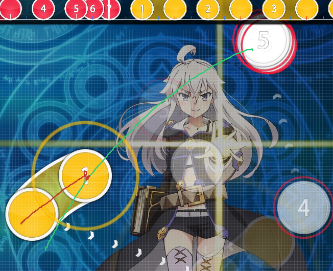
it seems very very minor, but this deviation from expectation (especially since the slider shape goes counter-clock-wise and then circular flow) makes it feel weird to snap to
01:03:072 (6,7) - why is this patterned with the next 4 jumps rather than the previous 4 jumps? both combo and the big tick suggest otherwise.
01:07:530 (1,2,3,4,1,2,3) - in general, for this whole section, try mapping this with a lot less circular flow and a lot more anti-circular flow. imo, it feels a lot nicer to play in context with the music, really emphasizing every lyrical beat. some examples below.
01:08:044 (2,3) - jumps like this feel awkward because you have to accelerate in the direction that you're moving in, which is hard to do for most people who snap when they aim. (snapping when hitting jumps makes your movement want to go the other way, hence why triangle jumps are easier than square jumps, etc etc). i mean, this can be really good for emphasizing certain things when done right, but i dont think you want this, since none of the other jumps in this section are like this one.
01:13:015 (1,2,3) - my attempt of better anti-circular flow alternative
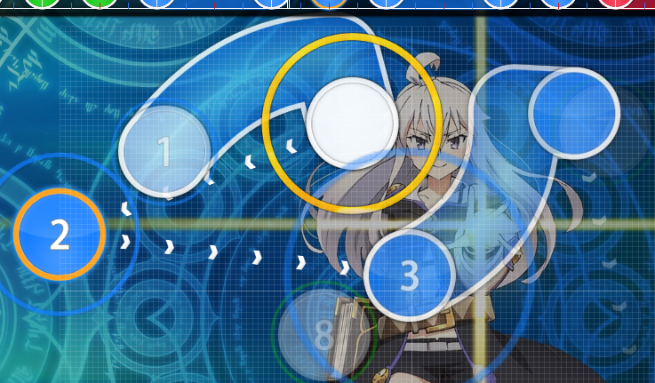
01:14:901 (2) - better to play like this imo (due to anti-circular flow)
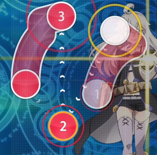
01:20:558 (3,4,5) - try using the actual vocal rhythm instead of this watered down version somehow
01:29:472 (1) - this feels bad as a slider simply because its tail doesnt feel like it belongs
01:31:530 (7,8,9) - i feel like these should be grouped together instead of the current way you're doing it. in fact, for 01:31:015 (2,3,4,5,6,7,8,9) - try using a kickslider and then grouping it 4 4 like this (NC for grouping):

01:39:930 (5,1) - this feels awkward to play imo because coming from 01:39:930 (5) - the expectation is to go down right instead of pretty much straight down (and on top of that up right due to slider body)
02:10:444 (1) - this should definitely be 2 hitcircles because the tail is too important and deserves a click
02:21:587 (1,2,3,1,2,3,1,2,3,1,2) - ive wanted to say something about every time you do this, but it applies lots more for this part; the problem with your emphasis here is that if i removed the NC, its impossible how you grouped these jumps. can you do some patterning to make the groups of 3 much more distinct, and thus play better too? (the ds doesnt have to be constant and growing, you can toy around a bit)
02:24:330 (1) - same thing applies here as the previous kiai time. while this isnt same exact, the same ideas apply and stuff
02:43:530 (1,2,3,1,2,3,1,2,1,2,3) - it would be really cool if your jumps could capture the sorta swing thats expressed by the vocal and drums rather than the constant bassline (which is more boring to play)
03:01:015 (3) - try to make this a slider + hitcircle or hitcircle + slider; both of which have better emphasis than just slider + repeat
03:05:472 (1) - in general, when making curves after using red anchors, try to make the curves actual circular curves rather than these weird curves. its hard to do but easy once you get used to it, so try to practice. to start off, always have the red anchor in the middle of red ticks / head / tail.
03:16:444 (1,2,3,4,5,1,2,3) - very very good anti-circular motion, but it would help your emphasis if everything werent soooo far apart. try to put things that are related closer together. (e.g. try making 03:16:787 (2) close to 03:16:444 (1), 03:17:301 (4) close to 03:16:958 (3) . also, not everything has to be going down, because distance emphasis is much more important than direction imo)
03:22:272 (2) - make this jumps to preserve the pattern of only piano being sliders
03:55:358 (2,3) - right now you're missing click on 03:55:701 which is both a drum and vocal beat. so try one of these two:

^ better if you want to emphasize vocals

^ better if you want to emphasize drums
03:56:730 (2) - this is bad because the white tick is actually very important and deserves a click. (at this bpm you dont have to worry about object density too much, but rather spacing instead)
04:02:730 (9) - is this supposed to be 1/2? it doesnt make sense as 1/4
04:03:072 (1,2,3,1,2,3,1,2) - same thing as i said before about literally not being able to see your groups of 3 if you had no NCs.
04:07:701 (3) - this should be 2 clicks, not slider cause tail too important imo
04:33:244 (1) - this feels much better as 1/1 not 1/2
04:34:444 (1) - use some more red anchors cause right now this looks lumpy and not very well defined

PM me if i need to clarify anything, im not good at expressing my thoughts well in my mods x_x
good luck, dont stress yourself too much, and have fun mapping!
Topic Starter
Stack
mod reply in box as I don't like walls of text

JeZag wrote:

hey, m4m thingie
most of these things i only have a feeling about. i hope this helps, even if a bit!

just in general, 100% hitsound volume gets a bit obnoxious, maybe try something less like 60% ? k fixed
00:21:930 (7,1) - something like this feels like bad flow because the body of 00:22:101 (1) is pretty much perpendicular to the incoming direction from 00:21:930 (7) . stuff like this could work better with circular flow, but is worsened because 00:21:758 (6,7,1) is back and forth and opposite of circular. made some better flow into the slider by decreasing the angle you have to make
00:23:130 (5,1) - spacing-wise, this is not good emphasis because of distance (obviously). but what makes this worse is that due to slider leniency, it feels like this distance is even shorter than it actually is (because the mouse strays off of the sliderball towards the direction of the next object in most cases) yup, although I don't see an easy fix, I look for swomething
00:26:387 (1) - for this calm section in general, you can see even in harder maps mappers tend to use a constant DS for ANYTHING that is not a jump. so for example, 00:26:387 (1,2) - 00:29:130 (1,2) - 00:29:644 (3,4) - 00:30:330 (1,2) - should all try to have DS. the incentive for doing this is that it reallllly really makes any jumps you put in stand out, which as a result makes for great emphasis when you want it, and when the music requires it. it will also make your map look a lot more organized if things like these are consistent. I try to apply ds often but sometimes it just feels to constraining, I prob should though
00:36:501 (4) - due to this sounding similar to 00:35:815 (1) , it would make for much better playing experience if this were somehow a slider Probably but don't see a way to make to 1/8 slider not awkward that way
00:45:415 (5,1) - i feel like these should be a jump (or at least some movement) rather than stack These vocals feel pretty similar so I wanted to stack them
00:56:215 (5,6,7,1) - this feels weird because 00:56:387 (7) - is the pickup in the vocals to 00:56:558 (1) - and feels like it should be part of the pattern starting at 00:56:558 (1). if you want to go for the drums, add 00:56:472 too (unless my ears suck). finally, currently it also plays a bit weird, let me try to illustrate why:

it seems very very minor, but this deviation from expectation (especially since the slider shape goes counter-clock-wise and then circular flow) makes it feel weird to snap to
Wouldn't say the flow was a minor issue, it flowed pretty bad. Also added note on blue tick
01:03:072 (6,7) - why is this patterned with the next 4 jumps rather than the previous 4 jumps? both combo and the big tick suggest otherwise. 01:03:072 (6) - felt different to the rest if only by a tiny bit (or my ears are bad), as for the NC, I wanted to keep that pretrty consistent so I just nput them on the downbeat or if really needed
01:07:530 (1,2,3,4,1,2,3) - in general, for this whole section, try mapping this with a lot less circular flow and a lot more anti-circular flow. imo, it feels a lot nicer to play in context with the music, really emphasizing every lyrical beat. some examples below. I should probably remap it with different flow but I really don't want to remap the entire kiai q_q
01:08:044 (2,3) - jumps like this feel awkward because you have to accelerate in the direction that you're moving in, which is hard to do for most people who snap when they aim. (snapping when hitting jumps makes your movement want to go the other way, hence why triangle jumps are easier than square jumps, etc etc). i mean, this can be really good for emphasizing certain things when done right, but i dont think you want this, since none of the other jumps in this section are like this one. I actually meant them to be kinda awkward as I used 1.7x ds for every jump from an awkward slider and then increased it after
01:13:015 (1,2,3) - my attempt of better anti-circular flow alternative
01:14:901 (2) - better to play like this imo (due to anti-circular flow)
01:20:558 (3,4,5) - try using the actual vocal rhythm instead of this watered down version somehow I'll pm you if I see you online as I don't see many alternatives
01:29:472 (1) - this feels bad as a slider simply because its tail doesnt feel like it belongs I still wanted to emphasize the vocal that keeps going as a normal circle doesn't really do that
01:31:530 (7,8,9) - i feel like these should be grouped together instead of the current way you're doing it. in fact, for 01:31:015 (2,3,4,5,6,7,8,9) - try using a kickslider and then grouping it 4 4 like this (NC for grouping):

I used to have a pretty normal stream here but decided against it as it did not feel fitting, probably depends form person to person
01:39:930 (5,1) - this feels awkward to play imo because coming from 01:39:930 (5) - the expectation is to go down right instead of pretty much straight down (and on top of that up right due to slider body) I wanted it to be similar to 00:23:130 (5,1) - so I mapped it the same, it doesn't really feel like it flows weird as the slider points to the next place where you are going and then the loud guitar comes in and goes the other way for emphasis
02:10:444 (1) - this should definitely be 2 hitcircles because the tail is too important and deserves a click made 2 circles, flow may be a bit messed up now
02:21:587 (1,2,3,1,2,3,1,2,3,1,2) - ive wanted to say something about every time you do this, but it applies lots more for this part; the problem with your emphasis here is that if i removed the NC, its impossible how you grouped these jumps. can you do some patterning to make the groups of 3 much more distinct, and thus play better too? (the ds doesnt have to be constant and growing, you can toy around a bit) and I really liked the triangles q_q, also I don't really understand what you mean with "its impossible how you grouped these jumps. can you do some patterning to make the groups of 3 much more distinct" as I made them into the same triangle with NC on each first note so they are pretty distinct
02:24:330 (1) - same thing applies here as the previous kiai time. while this isnt same exact, the same ideas apply and stuff yup, got it
02:43:530 (1,2,3,1,2,3,1,2,1,2,3) - it would be really cool if your jumps could capture the sorta swing thats expressed by the vocal and drums rather than the constant bassline (which is more boring to play) Would be cool but difficult to pull of right
03:01:015 (3) - try to make this a slider + hitcircle or hitcircle + slider; both of which have better emphasis than just slider + repeat went for option 1
03:05:472 (1) - in general, when making curves after using red anchors, try to make the curves actual circular curves rather than these weird curves. its hard to do but easy once you get used to it, so try to practice. to start off, always have the red anchor in the middle of red ticks / head / tail. I normally avoided red anchors as much as possible but I wanted to learn how to use them so I included a lot in this map, thanks for the tips
03:16:444 (1,2,3,4,5,1,2,3) - very very good anti-circular motion, but it would help your emphasis if everything werent soooo far apart. try to put things that are related closer together. (e.g. try making 03:16:787 (2) close to 03:16:444 (1), 03:17:301 (4) close to 03:16:958 (3) . also, not everything has to be going down, because distance emphasis is much more important than direction imo) The piano sounds were similar so I wanted to express them with the same kind of movement (going down at a slight angle) I do agree with your first point that I should tone down on the spacing though
03:22:272 (2) - make this jumps to preserve the pattern of only piano being slidersk willl fix later
03:55:358 (2,3) - right now you're missing click on 03:55:701 which is both a drum and vocal beat. so try one of these two:

^ better if you want to emphasize vocals

^ better if you want to emphasize drums
03:56:730 (2) - this is bad because the white tick is actually very important and deserves a click. (at this bpm you dont have to worry about object density too much, but rather spacing instead) fixed, made it into a cirlce with a slider stacked to make it cliackable
04:02:730 (9) - is this supposed to be 1/2? it doesnt make sense as 1/4 oops yeah it should
04:03:072 (1,2,3,1,2,3,1,2) - same thing as i said before about literally not being able to see your groups of 3 if you had no NCs. I should try and make more distinct patterns, I was too focused on the flow
04:07:701 (3) - this should be 2 clicks, not slider cause tail too important imo probaly, but now I have to find a way to map it without ruining flow
04:33:244 (1) - this feels much better as 1/1 not 1/2 quick fix
04:34:444 (1) - use some more red anchors cause right now this looks lumpy and not very well defined wave shapy thing now

PM me if i need to clarify anything, im not good at expressing my thoughts well in my mods x_x
good luck, dont stress yourself too much, and have fun mapping!

Didn't apply last few things yet as I someone wants to IRC really badly atm, will fix later
Thanks alot for the mods, it was really helpful

PS:put those images in boxes or something
BanchoBot
This modding thread has been migrated to the new "modding discussions" system. Please make sure to re-post any existing (and unresolved) efforts to the new system as required.
Please sign in to reply.

New reply