forum

osu! Release (20120904/05)

posted
Total Posts
149
Topic Starter
peppy
Adds the ability to skin the main menu background (supporters only) and taiko widescreen support, amongst many bug fixes. Read on for further details.

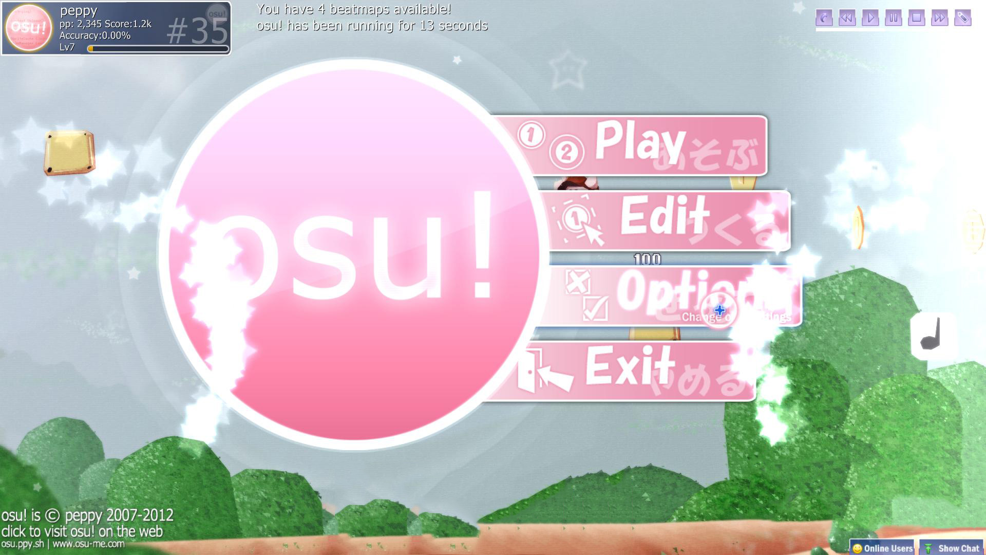
Regarding main menu backgrounds (Discussion here):

UPDATE: You can now set a background by dragging an image file into the osu! window while at the main menu .

Please note this feature is only be available to supporters. I know many may not agree with this, but I find it a perfect example of a way to thank those who support this game – which I am always looking to do – without having any effect on gameplay.

Add the file menu-background.jpg to your skin. It scales based on height first, then width if it cannot fill up the whole screen. The optimal resolution is 1366x768, supporting all widescreen resolutions. You *can* use higher than this, but please refrain from going higher than 1600x on publicly distributed skins, as it will impact performance of menu loading on lower-end machines.


Regarding taiko widescreen support:

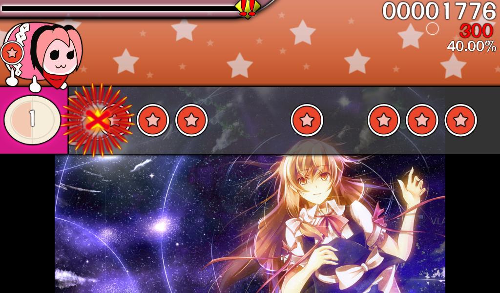
Tested as much as I could, but there may still be minor issues. For those who believe this causes an imbalance, please use widescreen mode while playing (even if you need to run windowed). The taiko play-bar has always been too limited, and this is not just a visual fix but a balance fix too. If for any reason you are unable to use widescreen, please voice your opinion.


I'm trying to knock off a few of the top requested features now that I have finally got through my back-list of bugs and fixes. Expect more awesome :).
Horo
Oh my god thank you so much, these are both so great.
Miya
Wow, i'm really waiting for this feature of background. Nice work xD
Luna
I approve ;D
ueshu
wow great !
[Zappy]
Wow! This is really great! :)
Fai-Chii

Miya wrote:

Wow, i'm really waiting for this feature of background. Nice work xD
^
[CSGA]Ar3sgice
First page (?
flow
Amazing. Was waiting a long time for this!

Thanks peppy.
Cristian
This is with all my NNNNHHHHHHGGGGGG.
My body is more ready now.
EDIT: and oh, don't forget about this t/85607 would really appreciated, for more awesomenes.
Ty if you do that.
Topic Starter
peppy
That one is on my list, but requires a bit of optimisation first.
Scorpiour
it's great ! thanx ppy =v=

and i got another idea: could osu allow menu-background changes in-game automatically depends on which map is playing? that is, use mapsets' background as menu-background and switch them like some other players do.
markchantal
wow its amazing!!
like like like :D
UnderminE
Oh god best update ever. Thank you
mintong89
it a good update for taiko... :D :D :D

thanks peppy :) :) :)
Shirotaku
Can't believe this day have come xDDD
Thanks a lot peppy :D
zeroclover

peppy wrote:

Add the file menu-background.jpg to your skin. It scales based on height first, then width if it cannot fill up the whole screen. The optimal resolution is 1366x768, supporting all widescreen resolutions. You *can* use higher than this, but please refrain from going higher than 1600x on publicly distributed skins, as it will impact performance of menu loading on lower-end machines.
LOL

btw, nice work peppy
but it still silly to look osu icon bg is pink when i used black menu background -,-
Aoko
Thank you very much for approving these requests and for the bug fixes peppy! Thank you <'3
*w* Keep up the good work.
Bittersweet

zeroclover wrote:

but it still silly to look osu icon bg is pink when i used black menu background -,-
What are you talking about, it looks awesome this way xD


Nice one, peppy~
Jordan


Cool. Nice update
Tanomoshii Nekojou
WOW 8-) 8-) 8-) 8-) 8-) 8-) 8-) 8-) 8-) 8-) 8-) 8-)
Gorlum
Meh.
Cuvelia
I'm going to complain about this apdate about taiko.

I have some questions on this update.

1, Why wide screen resolution become spreaded a scorp range.
As a result. Hidden and Hardrock mod are treated well.

2, If it was only for widescreen user privilege, this is not fair.

3, The previous taiko specification,widescreen's scorp range is the same standard screen,why suddenly change specification?

This is the all that I'd like to claim.

If you want me to ask any question,please reply !!
These are the ordinally complanation, but I would like to claim you.
CaCtus112
i WAS supporter, am i also able to use another menu background?
zeroclover

Bittersweet wrote:

zeroclover wrote:

but it still silly to look osu icon bg is pink when i used black menu background -,-
What are you talking about, it looks awesome this way xD


Nice one, peppy~
better this one
ychao

UnderminE wrote:

Oh god best update ever.
Thank you peppy, for never allowing me to even once regret being a supporter!
Topic Starter
peppy

Cuvelia wrote:

As a result. Hidden and Hardrock mod are treated well.
I am open to feedback on Hidden (should it be blocked out further than it is currently? is it too easy?)
HardRock and normal are fine, in my opinion.

Cuvelia wrote:

If it was only for widescreen user privilege, this is not fair.
As per my original post, anyone can play in widescreen mode. You can run windowed if your monitor does not support widescreen. This is intended.

Cuvelia wrote:

why suddenly change specification?
As per my original post, the original taiko bar was too zoomed (there has always been a consensus on this). It is more zoomed than any TnT game, and really doesn't let you see enough hit objects. This is a balance fix to address that.

I urge more taiko pro players to chime in with their opinions as well, since I am only judging off my little experience with the mod/game.
HakuNoKaemi
for Easy, less AR reduction, please
It should be written in a post in feature request anyway
kegukegukegu
Great! :) Nice Updateeee :D
Eyenine

CaCtus112 wrote:

i WAS supporter, am i also able to use another menu background?
boat
I'd appreciate a toggle for widescreen support, as its really a drastic change.
Topic Starter
peppy
I'm not sure I understand.
boat
Being able to use a widescreen resolution to still have space for everything else, but with the taiko gamemode itself being in the old 4:3 format.

I don't see why a toggle like this wouldn't be perfectly fair, too.
Topic Starter
peppy
Not going to happen. Use a 4:3 resolution if you want a limited field of view.
pota-row
日本語でいいと言われたので日本語で・・・
I am not speak english
やっぱり、HD+HR modがあそこまで簡単にできるのはさすがに反対です
このアップデートが来る前にHD+HRが可能だったのはDS(デュアルスクリーン 2画面or2PC、動画を同時再生の不正)や、覚えることでしか無理でしたから

いまやこのゲームは世界中のいろいろな人がやっています
そして、そのいろいろな人たちが使っているパソコンのスペック等もさまざまで、自分はワイドスクリーンでプレイすることができますが、まだワイドスクリーンができない解像度4:3限定のパソコンを使っている人たちもいるわけです
というかワイドスクリーンにしてもパソコンが重くなりすぎてなにもできないという人もいると思います

その人たちはHD+HRができないのに、ぼくたちはHD+HRができる
これはnice yeahhhhhhhhhhh FOOOOOOOOOOOとは言えない状況ではあります

peppyさんも臨時でアップデートして、アップデート直後よりも状況は改善されましたが、未だにHD+HRはできる状況ではあります
もう本当にギリギリ見える程度ですが・・・

この問題を直さなければ、いままでの記録はすべて過去の記録となり、すべての譜面が新しくHD+HR or HD + HR + DT で記録を塗り替えられることになります


ぼくからの提案ですが、HDで隠れる範囲をもう少しだけ広くしてもらえば、状況は改善されると思われます
4:3画面とほぼ同じ仕様にしてもらえたらぼくとしてはベストです

とにかく、このままではやはりPCスペックの有利不利が出て不満が出ると思うので、早めの修正をお願いします


ちなみにぼくは16:9のレーン拡大は賛成です :)
Topic Starter
peppy
Reply in Japanese:

PCスペック考えずに変えました。フルスクでワイド対応してなくても、ウィンドウで起動出来るし良いかと思いました。
ウィンドウでの4:3と16:9のパフォーマンスがほぼ変わりません
今時期のパソコンがせめてワイドのウィンドウで60hzパーフェクトで動かないことは珍しいと思います。

HRといったらほぼ問題ないですよね?速度が画面サイズに関わらず変更されますから
HDは今夜勉強して、4:3=16:9にしておきたいと思っています。

こういう説明というか、行動で安心することが出来るでしょうか?
GoldenWolf
I don't know if it was intended or not. I just wanted to point out, just in case.
pota-row

peppy wrote:

Reply in Japanese:

PCスペック考えずに変えました。フルスクでワイド対応してなくても、ウィンドウで起動出来るし良いかと思いました。
ウィンドウでの4:3と16:9のパフォーマンスがほぼ変わりません
今時期のパソコンがせめてワイドのウィンドウで60hzパーフェクトで動かないことは珍しいと思います。

HRといったらほぼ問題ないですよね?速度が画面サイズに関わらず変更されますから
HDは今夜勉強して、4:3=16:9にしておきたいと思っています。

こういう説明というか、行動で安心することが出来るでしょうか?
thx peppy
ウィンドウでの4:3と16:9のパフォーマンスがほぼ変わりません
それは知りませんでした
他人の意見を聞いて、勝手に判断してました sorry

HDは今夜勉強して、4:3=16:9にしておきたいと思っています。
すいませんがお願いします
自分には意見を言うことしかできません。変えれるのはpeppyさんだけです
お願いします


皆さんからいろいろ意見が出ていてもうひとつお願いしたいのが、HRの件です

HRの速度が変わってないから問題がない、というわけでもないんですよね

解像度4:3と比べ、16:9はかなり長い時間noteが見えます
これだと明らかに16:9のほうが有利です
なので、少しむずかしいかもしれませんが、4:3と同じ時間noteが見えるように、noteの速さを調節してほしいです

例ですが、いまのままじゃosu!standardのARが8の譜面にHRをつけてARが10になるところが、AR9になって見えるようになってるのと同じようなものです

なのでそこもよかったら変えてほしいです
すいませんがお願いします
Jinyan
nice update, but i i add that the update for taiko is not really good, well it's my opinion and that's all, but i don't like the new style of taiko ^^'
[Luanny]
Now playing taiko with Hidden is a bit harder than before... wow
RBRat3
Man theres only so much you can do with the background, No wonder you had it as a gradient XD

RadioNoise
:P Great. Maybe add a "menu-foreground" in the same way?

after that, We'll be able to make the menu buttons look like semitransparent

( or just give us an option to set the transparency of foreground items?)

PS: why just limited to ".jpg" ? maybe support ".png" (now we can just rename a .png file into .jpg and it works fine.)
Topic Starter
peppy
So pink... so bright...

jpg load faster than png. please use jpg in public distributable skins. there is no reason to use png.

an overlay will not be added.
[Luanny]

WOW
Loved it
Tsukimi Luna
This is one of my favourite update EVER!!!!!!!
RBRat3

peppy wrote:

So pink... so bright...
Kinda like it that way it separates the menu pink from the bg's pink... Saturation fixes all XD
Stefan
@Yuu-Chii: Nice background

I really love this update. But it's a pity that only-support are able to use it.
[Luanny]
Something I wanted to ask..
what happens when you're a supporter, changes the title and your supporter expires?
It turn to default again?
Fumika
so awesome peppy :D
BrokenArrow
I start to like this new widescreen-taiko.
Anyway, the new bugfix in testbuild "Fix taiko approach speed changing depending on resolution." destroyed it again. It's like playing a map on EasyMode now o.o
OnosakiHito
First of all, it is really a nice widescreen update because I played all the time with this resolution but never had the full scrollsize/scrollbar view, until now.
But this new change keeps not just benefits which I will come later to. It has also disadvantages (some are even player and score based).

I can't understand everything what Chinpota said, but with some points he is right.
We have there some problems with HD+HR, especially when HD stands as mod alone. Playing a map on HD is now way harder then before because the scrollbar is longer. But no, the problem itself is not that it has become harder. We could train that. The problem is that HD+HR are now together easier as when hidden is standing alone as choosen mod.

I will take here the experienced players as example which are playing the mods in a different way as beginners would do plus considering the changes which will appear after this update:

"Using HD before the change" is now mostly equal to "using HD+HR after the change"
*Before: Playing HD:
A smaller view on the notes which causes less focus on all notes. -> You are able to focus only at one part of the screen which makes it easier because you can count more on your reflex and 'timing-feeling' instead of visual view.
After: Playing HD:
Now with a bigger view which causes that player need to focus on more notes. -> You need to concentrade now really much because you see more patterns, which causes that you need to remember more notes. This confuses.

Before: Using HD+HR: Mostly you didn't saw anything.
*After: Using HD+HR: It has nearly the same effect as HD did without the widescreen option.
So now it is like: HD(harder) < HD+HR (easier) - HD less points, HD+HR more points

I think what this means is something you know. Influence to the rankings, pp points and etc.. Also not to forget Chinpotas said words about HD+HR+DT(I didn't checked it by myself yet, tbh.)

Resolution is a problem here as well, but Chinpota mentioned this.

Well, benefits... to be honest right now it is really interesting because it has a way other play feeling as before, beside that the scrollbar is now nearly as long as the original TNT(not that this is importand here in osu). Higher SV's are now possible as well since we have a bigger view.
The question is now... is it okay to leave it for now how it is with all these problems? This would need a rework of the mods in taiko. And if possible by asking some experienced players. There are some in the BAT/MAT team.

I kind of like this update, really.
But the problem here are the scores and logic of the mods.
[Luanny]
Have to agree. Even for me (noob player) hr + hd is VERY easy now but when playing with hd only I get very confused
I can see people getting #1s with hr hd easily soon
Furchtjoghurt
I think, the widescreenfunction is good, but for the people, which all time played with the other screen (like me), it is not good.
Because I have now big problems to play Taiko ^^'
It would be the best, when you can change it, so the people, who want the old back, can change it to that ._.
Otherwise I will fail deeply ;w;
Makimoke
I had a pretty stupid idea... How about making this widescreen thingy available as a mod? Shadowing it if you cannot use it (like 4:3 screens) and applying a x0.90 or so multiplier if you use it. That way it won't revamp Taiko mods' multipliers and everyone could use it without worrying about its fairness or not. That would more or less answer the problem of HD + HR + WS = normal HD (I know there are flaws with this, but I think we can get a nice thing out of it.). And of course, if you do not use it, back to the good ol' taiko playscreen. \o/

Well, pretty stupid idea, but I wanted to share it. Nice update overall, if we do not count that little problem.
Topic Starter
peppy
As for taiko adjustments, I am currently working with ChinPota to make changes to hidden and hard rock.

Hidden will display the same on 4:3 and 16:9.
Hard Rock will have higher SD at 16:9 to make up for the screen size increase.
Other modes will be unaffected.
statementreply
Topic Starter
peppy
For the time being, I am disabling HD and HR mods for Taiko mode until further adjustments have been made.
Apologies for any inconvenience, and thanks for understanding :).
kona x taros
thankyou peppy :)

Pheon

peppy wrote:

For the time being, I am disabling HD and HR mods for Taiko mode until further adjustments have been made.
Apologies for any inconvenience, and thanks for understanding :).
Thank you, and if possible, can you reroll the HD+HR-scores attained in this timespan? If anything, I'd like to see mine being deleted.
Big and Busty
widescreen taiko is too good to be true
Carlos
wait a second:


could it be more in the middle... please?

edit :P
Topic Starter
peppy
Obtained scores will be removed, yes.
Pheon

peppy wrote:

Obtained scores will be removed, yes.
Alright, thank you very much for the awesome update as well as the quick response to problems that arose because of it.
Xay
Can't we just keep it like it was before =w=

e: Or make something like this happen

statementreply wrote:

Carlos
http://osu.ppy.sh/forum/p/1765817

its still hapening, the non coloured don an kat

BeatofIke
Awesome update. Keep up with with the update ppy.
Aberyal Crisis
Can somebody help me ?
What does the icons under the avatar means ? Is it new ? I've never seen them before Oo
Sakura
They are the playstyle icons, you can set them if you play with mouse, keyboard or tablet (or multiple) to inform others of your playstyle if you like
Aberyal Crisis
Thank you ^^
But I only play with Touch-pad and Keyboard. I don't even have a mouse !
Sakura
Touch-pad as in a laptop's mouse-pad, or is it touch screen? or a tablet's touch pad?

In either case, i guess the first would be equivalent to mouse, and a touch screen icon may be added later (i saw RBRat3 provide some art for it)
Aberyal Crisis
It's a touch-pad like that :
But in play, it's very different to a mouse... Is it possible in the future to ad a specific icon for that ?

Oh, and for the tablet icon : I draw a lot by computer, and sometimes I let my tablet connected while I'm doing something else (like playing osu!). But I never play with my tablet. Is there a way to remove the tablet icon ?
[Kanzaki Ranko]
It's not visible to other people unless you "select" it.

That's how it shows for me.
Aberyal Crisis
Oh, I didn't know that =O
Thank you Maav <3

EDIT : How do we know the icon is selected ? Oo
(Yeah, all the questions I have... Sorry >w<)
Topic Starter
peppy
The taiko issues are fixed in the b20120905 bugfix release.
Thanks for your patience guys :).
Sakura

Aberyal Crisis wrote:

EDIT : How do we know the icon is selected ? Oo
(Yeah, all the questions I have... Sorry >w<)
the others appear translucent
Aberyal Crisis
I had a doubt and just went to see with google chrome, and yes, you're right xD Thanks !
Actually it doesn't works with IE ^^
Zak
Please make an option to change Taiko back without having to leave fullscreen or widescreen?
Suddenly having such a wider reading area makes it harder x.x
awp

Zakvvv666 wrote:

Please make an option to change Taiko back without having to leave fullscreen or widescreen?
Suddenly having such a wider reading area makes it harder x.x
you're probably just going to have an adjustment phase is all. Give it a week of practice and see if you haven't gotten the hang of it yet, rather than attempting to discount it immediately
Carlos
hey peppy, I admire your dedication and patience but this continues to happen.
I recently updated osu!, but playing, the damn colorless notes appeared. i can wait...


also good job 2012 build... joasjoasjoasjoas
OnosakiHito

peppy wrote:

The taiko issues are fixed in the b20120905 bugfix release.
Thanks for your patience guys :).
Hm, I admit HD+HR problem is solved. Nice.
But now HD has become once again unplayable. It was not a bad idea just to cut a part of the scroll, but now you can't see anything anymore, especially in over 200 BPM songs.


Also I must say, HR is really high now... after a certain BPM it is hard as hell to play HR(but maybe here it's just me).
Topic Starter
peppy
The fact it is unplayable is a completely separate issues which I'm willing to look at on another day (if you were watching my stream earlier you'd know my thoughts on this). This bug-fix release was just to bring everything back into relative sanity - as in what we were used to before this last widescreen patch.
Makar
Aw and I was getting happy that HD+HR was possible orz oh well

peppy wrote:

Hidden will display the same on 4:3 and 16:9.\
But... doesn't this mean the player will have to remember what notes are there longer? I mean, if its the same visibility as 4:3, that means the notes spend more time in the "invisible" phase, which makes it harder than 4:3 (unless you planned to make it fade in and fade out)
Doodley
Nice! This is a feature I've wanted for a while.
OnosakiHito
Well actually it is not anymore as before. Also not before or after the widescreen patch.
But sure, I think waiting is no problem here.
Big and Busty
Repair HD please, most of the maps are unreadable.
Ca Calne

Big and Busty wrote:

Repair HD please, most of the maps are unreadable.
i will wait until the taiko bug and HD insanity will Fix
Kynan
why do you delete my posts peppy ?
Aurele
I love the background costumation.
Good job peppy.
OnosakiHito
Okay, talked to some taiko guys in #taiko.

*HR + HD should be like one update before, 0,3s more visible time as Tasha said.
-> Problem here is, that many scores would be overwritten.
HR should have a bit more visible time as well because the scrollspeed is a bit too fast.
*HD is right now unplayable. We thought about to set it how it was before for now.
-> Problem would be that people with no wide screen couldn't play it anymore.

aabc271 said most points worked at version osu! b20120904

*Right now I'm not sure, probably HD and HD+HR would become somehow the same difficulty.

Well, these are for now informations about the current situation. Tasha is going to write a concept for it.

Edit: Aha. As some people said before, HD works on 4:3 perfectly.
Edit2: Played the screwed Hidden mode in multiplayer. It is kind of really fun! Maybe we could at this a new Blink-mod? Activating it in the same way Nightcore. lol
Makar
Uhm... I just updated to 05 and HD is pefectly playable to me lol it just looks weird
XEPCOH
can you add widescreen support for ctb?
some maps have sliders which can't be passed perfectly because slider ticks or other parts of them are beyond of the ryuuta movement zone and widescreen support will make them passable.
show more
Please sign in to reply.

New reply