This map has been deleted on the request of its creator. It is no longer available.
forum
Calen - Prism
posted
Total Posts
16
mtmcl
Now that this has been taken care of, fill in the Source fields if this song if from Touhou like I think you told me. There are a few points where the approach circles of black hit objects partly overlap the black bands on the top and bottom of the background- you'll have to move these around so that the approach circles are visible at all times. The slider shapes, particularly in Hard, are not very elegant; try not to make them pass over themselves so much.
I like the offset of 66~
I may be wrong though. XD XD
Let's now see this. It seems like your difficulties are very similar to each other, so whatever I mention on the previous difficulties, do follow it up, if applicable.
Easy
02:33:52 (1) - Start 1/2 earlier
03:02:75 (3) - Move this 1/2 earlier and add a beat at 03:03142
03:28:14 (x) - Remove the break.
Normal
00:31:60 (2) - Hitsound sounds weird here
02:01:21 (3) - Sounds like a really boring way to end a sudden increase of pitch.
02:09:29 (6) - If possible, please try to bring your starting hit circle away from the track.
02:26:79 (1) - Since this is normal now, maybe you can do something a bit more interesting to the spinner? Since the whole area the spinner covers isn't one phrase in a song
Hard
00:12:37 (1) - Sounds really unnatural with the clap. o.o;
00:28:71 (2,3,4,5,6,7,1) - Not sure if the claps are that great here either. XD
Easier to say, it seems a bit too clap-overload here.
01:02:75 (5) - Eh, you don't HAVE TO fix it, but a lot of BATs would pick on this ugly slider.
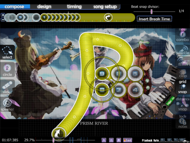
01:07:75 (9) - Same thing with a slider in normal
02:04:29 (5) - ^
02:09:29 (9) - Whoa, WTF slider? PLEASE untangle this! D:
02:58:52 (2) - Same thing with all the other sliders
Basically, watch your sliders, they seem to come in really tangled mess in Hard. D:
Anyway, I hope you aren't discouraged by my criticism. I really like how you placed your beats, I think once these errors are fixed, your map would be a good addition to the ranked beatmaps. So, keep up the good work! The score in Hard shouldn't be too much of a concern, it's difficulty justifies for it and it isn't above 10 mil. :3
I may be wrong though. XD XD
Let's now see this. It seems like your difficulties are very similar to each other, so whatever I mention on the previous difficulties, do follow it up, if applicable.
Easy
02:33:52 (1) - Start 1/2 earlier
03:02:75 (3) - Move this 1/2 earlier and add a beat at 03:03142
03:28:14 (x) - Remove the break.
Normal
00:31:60 (2) - Hitsound sounds weird here
02:01:21 (3) - Sounds like a really boring way to end a sudden increase of pitch.

02:09:29 (6) - If possible, please try to bring your starting hit circle away from the track.
02:26:79 (1) - Since this is normal now, maybe you can do something a bit more interesting to the spinner? Since the whole area the spinner covers isn't one phrase in a song
Hard
00:12:37 (1) - Sounds really unnatural with the clap. o.o;
00:28:71 (2,3,4,5,6,7,1) - Not sure if the claps are that great here either. XD
Easier to say, it seems a bit too clap-overload here.
01:02:75 (5) - Eh, you don't HAVE TO fix it, but a lot of BATs would pick on this ugly slider.

01:07:75 (9) - Same thing with a slider in normal
02:04:29 (5) - ^
02:09:29 (9) - Whoa, WTF slider? PLEASE untangle this! D:
02:58:52 (2) - Same thing with all the other sliders
Basically, watch your sliders, they seem to come in really tangled mess in Hard. D:
Anyway, I hope you aren't discouraged by my criticism. I really like how you placed your beats, I think once these errors are fixed, your map would be a good addition to the ranked beatmaps. So, keep up the good work! The score in Hard shouldn't be too much of a concern, it's difficulty justifies for it and it isn't above 10 mil. :3
Topic Starter
Thanks for the check, Max  I apreciated it a lot
  I tried to fix everything according to what you said, but some I did not, namely:
01:07:75 (9) - Same thing with a slider in normal
02:04:29 (5) - ^
02:09:29 (9) - Whoa, WTF slider? PLEASE untangle this! D:
Because:
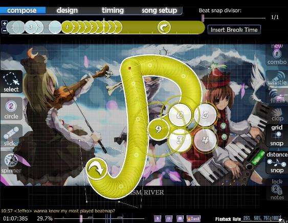
01:07:75 (9) - It's supposed to look like a P, which stands for "Prismriver", being a recurrent theme of the song, I don't know what's wrong with being the same as Normal. Unless you mean it's a little ugly? I could agree on that, but I don't know how I could make another kind of "P" that doesn't look as "melodic".
02:09:29 (9) - It's supposed to be a musical note, ( >_> ). I'm not "untangling" it, it's exactly as I wanted it to be. :s or do you mean something else?
as for the timing... hum, I'm leaving it as it is. I did spend a lot of time checking it after all. but, if more people say I'm wrong, I'll change it. ^^;
thanks again!
 I apreciated it a lot
  I tried to fix everything according to what you said, but some I did not, namely:
01:07:75 (9) - Same thing with a slider in normal
02:04:29 (5) - ^
02:09:29 (9) - Whoa, WTF slider? PLEASE untangle this! D:
Because:
01:07:75 (9) - It's supposed to look like a P, which stands for "Prismriver", being a recurrent theme of the song, I don't know what's wrong with being the same as Normal. Unless you mean it's a little ugly? I could agree on that, but I don't know how I could make another kind of "P" that doesn't look as "melodic".
02:09:29 (9) - It's supposed to be a musical note, ( >_> ). I'm not "untangling" it, it's exactly as I wanted it to be. :s or do you mean something else?
as for the timing... hum, I'm leaving it as it is. I did spend a lot of time checking it after all. but, if more people say I'm wrong, I'll change it. ^^;
thanks again!
About the sliders, like I said, I don't think I am actually being extremely picky about them... but there are BATs out there that will demand it changed. But if you really want to keep them that way, that's fine. :3
And timing, well, if you say so, since I am not all that certain either. But in that case, I want you to change the offset to 78. Technically the same thing and same timing, but it brings the offset to the start, before the notes come in for Hard.
And timing, well, if you say so, since I am not all that certain either.
 But in that case, I want you to change the offset to 78. Technically the same thing and same timing, but it brings the offset to the start, before the notes come in for Hard.
Topic Starter
consider the timing done. 
As for the sliders, aww, come on. -.-' that DOES look like a musical note.

As for the sliders, aww, come on. -.-' that DOES look like a musical note.
Topic Starter
This map has been deleted on the request of its creator. It is no longer available.
This map has been deleted on the request of its creator. It is no longer available.
This map has been deleted on the request of its creator. It is no longer available.
Topic Starter
thanks cyclone.
You were really helpful; although I did not change some things.
Such as:
(Normal)
(Hard)
Thanks again.
Oh, and by the way:
You were really helpful; although I did not change some things.
Such as:
(Normal)
01:38:15 (1,2) - I've never been a fan of putting a note exactly on top of an endpoint of a slider that's right after it. Could potentially be incredibly difficult to read.It's just one, and will not screw people over and over again. Does it really need to be changed?
02:09:30 (6) - Ew overlapping sliders (this goes for any other slider i haven't mentioned actually. It's just the smaller ones aren't as big a deal).... Is it really being overlapped? O_o (unless my definition of overlapping is not the same as what's supposed to be (apparently that's the case)) and I tried to make sure these type of sldiers were easy to read. Could you specify?
(Hard)
01:07:77 (9) - Please take the start point off the slider track.Why? It's easy enough to read and doing it would ruin its intent to make it look like a P. If possible, could you provide me with a better explanation or how I should take it off of the slider? I don't know if I'm making myself clear, but if you could give me an idea of how it should look like, that'd be great.
Thanks again.
Oh, and by the way:
03:12:38 (3,4) - You broke osu! (delete 4)Oh, wow. O_o How did I miss that?!
This map has been deleted on the request of its creator. It is no longer available.

Topic Starter
Well, I changed the overlapping slider.
And also that P slider:
anyway, I've uploaded the map like that.
And also that P slider:
anyway, I've uploaded the map like that.
Not a fan of so many notes overlapping themselves at where that slider is, but oh well. Here you go.
Alright, let's take a looook at this agaaaain.
No problem here at all now. This is getting checked out.
*ranks*
No problem here at all now. This is getting checked out.

*ranks*