forum

Billain - Specialist

posted
Total Posts
27
Topic Starter
[-CeMAqpOP-]kee
This beatmap was submitted using in-game submission on Friday, December 14, 2018 at 4:15:14

Artist: Billain
Title: Specialist
Tags: aethek glados ep bad taste records dnb d&b drum and n bass neurofunk dubstep wubs technical marathon sliders sliderart nanomortis specijalista stručnjak
BPM: 173
Filesize: 11103kb
Play Time: 05:50
Difficulties Available:
  1. Dance (5.25 stars, 1373 notes)
Download: Billain - Specialist
Information: Scores/Beatmap Listing
---------------

redoing new combos and obviously bad patterns, might go for rank too (again)
thanx 2 ppl Whom help me w/ map
Mods: timemon, Okinami, [Nemesis], Yusomi, Metronome, Lince Cosmico, osuskrub, Naxess, Nerova Riuz GX (no kds boye)
Test: Fser, Yusomi, VINXIS, Nerova Riuz GX, Others...
Tags: Seni
Silkyy
मज़ेदार नक्शा
1/8 तस्वीर का उपयोग करने पर विचार करें

i give you this suggestion because i believe that the map in its current state feels kinda blocky and choppy and maybe it could fit to the music nicer with a snap change. 1/8 timing would allow you to fit the objects to the music more closely to the music than ordinary 1/4 snap.

at least in my opinion loolxd
timemon
Mod w

[Dance]
01:07:506 (4,5) - the circle and the slider end have the important sound here. They're audible and you will want to emphasize on them and make them clickable.
the (5) slider ends on a strong sound which will not provide good feedback to players as you will rather want to click them.
My suggestion to this issue:
Simply switch their order on the timeline and relocate the object accordingly. This will make both sounds clickable and and provide better audio feedback.
01:10:021 (1,2,3,4,5) - similar issue

01:08:894 (4,5) - these are different so might as well make them a normal stream to make them all clickables

01:33:691 (2,3) - switch their order on the timeline (and relocate them obv) as the kickslider ends on a strong sound.

01:53:547 (4) - I suggest you extend this slider all the way to the red tick as there is a sound there.

02:01:871 (7) - mmmm overlap you could stack this under 02:01:177 (3) - if you want

02:37:940 (7) - this slider looks a bit out of place; I like something like this much better 02:42:102 (2) -

02:54:587 (5) - this slider should start at the blue tick at 02:54:674 - imo just add a circle on top of it and cut it a bit shorter
02:55:975 (1) - similar

02:56:321 (2) - the sliderend should be clickable
02:54:934 (1) - ^

03:07:246 (2) - move the slider to the left a bit the angle is a bit awkward.

03:18:865 (1) - holding a single repeat slider for so long can be boring, why not split them up to 3 seperate sliders like this http://i.imgur.com/Y1Acvd9.png
you can even use the Slider Velocity trick and increase it to reflect the increased intensity here.

04:27:882 (2) - this slider looks too weird, doesn't seem to fit with the rest of the folks here

04:52:767 (3,1) - the angle is a bit off and the slider bodies are touching each other move it up a bit.

Overall I think the map could be more intense as you skip a bit of the sounds, but it can make the map too difficult I guess.

Good luck
Topic Starter
[-CeMAqpOP-]kee

timemon wrote:

Mod w

[Dance]
Mod Reply
01:07:506 (4,5) - the circle and the slider end have the important sound here. They're audible and you will want to emphasize on them and make them clickable.
the (5) slider ends on a strong sound which will not provide good feedback to players as you will rather want to click them.
My suggestion to this issue:
Simply switch their order on the timeline and relocate the object accordingly. This will make both sounds clickable and and provide better audio feedback. i just made it 3 notes and then a repeating slider cuz the 2 ticks before (5) arent rly that important i think
01:10:021 (1,2,3,4,5) - similar issue ^

01:08:894 (4,5) - these are different so might as well make them a normal stream to make them all clickables theres not much difference so i'm just gonna make it the same as the other 2..

01:33:691 (2,3) - switch their order on the timeline (and relocate them obv) as the kickslider ends on a strong sound. good stuff

01:53:547 (4) - I suggest you extend this slider all the way to the red tick as there is a sound there. HOW TF DID THAT EVN HAPPEN ASDF

02:01:871 (7) - mmmm overlap you could stack this under 02:01:177 (3) - if you want yes

02:37:940 (7) - this slider looks a bit out of place; I like something like this much better 02:42:102 (2) - gona have 2 disagree there fam if its not unrankable idk if im gonna change it xd

02:54:587 (5) - this slider should start at the blue tick at 02:54:674 - imo just add a circle on top of it and cut it a bit shorter na the stronger sound is the white tick and 5-burst is more playable
02:55:975 (1) - similar ^ meh

02:56:321 (2) - the sliderend should be clickable yah
02:54:934 (1) - ^ yah yah mang

03:07:246 (2) - move the slider to the left a bit the angle is a bit awkward. got u

03:18:865 (1) - holding a single repeat slider for so long can be boring, why not split them up to 3 seperate sliders like this http://i.imgur.com/Y1Acvd9.png
you can even use the Slider Velocity trick and increase it to reflect the increased intensity here. smart

04:27:882 (2) - this slider looks too weird, doesn't seem to fit with the rest of the folks here ok i tried something else hope it works

04:52:767 (3,1) - the angle is a bit off and the slider bodies are touching each other move it up a bit. kk

Overall I think the map could be more intense as you skip a bit of the sounds, but it can make the map too difficult I guess. fuk i try not 2 xd i hate skipping sounds lol

Good luck
thank u brother
Ali-
from my queue, i like the storyboard

[dance]

01:07:506 (4) - this looks a little off. maybe rotate it by -6 degrees clockwise so it doesnt overlap weird with the last bursts
01:08:894 (4) - same here, looks copy pasted so just rinse and repeat
01:09:847 (3) - im not sure about you but i would much rather have these be sliders rather than circles on the tail of a slider
01:13:836 (2,5) - fix overlap
01:21:639 (7) - all of the other back and forths have a distance spacing of 1.62x, although the difference is small its still noticeable.
01:23:027 (7) - ^
01:28:923 (1) - i dont really like something like this appearing as a straight slider. its a gnarly ass wub, should have a weird slider to compliment it
01:30:310 (1) - perhaps lower this a bit on the playing field, so it doesnt overlap so messy. under the head of 01:29:963 (3) - would work well
01:30:917 (2) - spacing is icky, i dont really like the way you decided to overlap the 01:30:917 (2) - anyways
01:31:610 (2) - spacing is off again
01:38:634 (1) - consider fixing this, i see the idea behind it though
01:40:541 (4) - maybe you could overlap this with the tail of 01:39:327 (5) -
01:34:819 (5,3) - these two slider patterns are drastically different, it kinda sets off a feeling of complete difference, but its essentially the same
01:37:246 (3,5) - here too
01:38:634 (1,6) - fix overlap
01:45:310 - ignored a rather prominent beat here
01:57:709 (1) - try moving this to 368,35
01:57:882 (2) - this sound is very different than the last. i think a more varied slider is needed
01:58:402 (3,1) - set the 3 on the red anchor, its too messy as is
02:01:177 (3,4,5,6,7) - very very different noises here. i think fast, spaced kick sliders would suit the music much better
02:04:472 (1,2) - nice
02:13:316 (1) - i feel like the hype calls for much more intensity than a slow curved slider. should be a lot faster
02:14:356 (1) - elbow sliders look bad to me, consider straightening it (and the other copy-pastes of it)
02:15:483 (1,2,3,4) - i dont like this stacked. should be a bit spaced
02:34:819 (1) - this is actually a 1/3 rhythm. like this instead
02:35:512 (1,2,3,4,1,2,1,2,3) - nice job
02:40:194 (4,5) - overlap
this section is rather neat, i couldnt find any notable problems with it
02:52:680 (4,5,6,7) - this is a bit much
03:02:651 (4,5,6,7,1) - rotate the burst a little so it fits better
03:08:460 (1) - ctrl+g?
03:09:501 (6) - this is on a white tick, has no new combo and is in a completely contradictory placement. you should add an NC and move it to the head of the next slider
03:09:674 - undermapped sound
03:11:235 (2,3) - these two sliders are the same, implying the music is being consistent. however, the sound on 3 is very different
03:19:558 (3) - the rhythm is more like this
03:25:108 (4) - weird stack
03:23:720 (3,4,5,6) - this would look a lot cooler imo if it was a very low spaced burst. like this
03:26:495 (1,2,3,4) - ^
03:33:171 (6,7,8) - ^
03:36:900 (3) - why did you lower SV?
03:42:102 (1) - this is the only slider i dont like here, your loop is really really tight
04:10:541 (1) - this should be a very fast repeat imo (goes for all of these sliders)
04:20:252 (6) - i think doing something like this would be cooler
04:22:680 - undermapped
04:24:067 (2) - deserves to be ctrl+h'd tbh
04:33:431 (1,2) - love this slider pattern <3
04:51:813 (1,2,3,4) - you need to stack a lot less in this map tbh, it looks rather bad
04:59:530 - this is actually the most emphasized note here, you could do some cool stuff if you find anyway to map it accurately
05:15:050 (1,2) - not the same slider?
05:20:772 (2,3) - this nest needs a bit of optimizing
05:32:738 (1) - try this instead, and mess around with the hitsounds
05:50:252 (3) - i think this would feel better if you did [img=http://i.imgur.com/HJLjEN8.png]this[/img]

good shit. you should work on emphasis with sliders and your spacing a tad, otherwise a really good tech map for a rookie
[Nemesis]
Mod from my queue.

Dance

Who made that storyboard btw I want him to sb my map too lol

00:44:530 (1,1) - I really like this slider, however 00:47:304 (1) - 's tail isn't completely stacked on 00:44:530 (1) - 's body making it really really annoying to look at
00:58:402 (1,1) - no connection between these? Kind of a disappointment
01:19:212 (1) - sv increase comparing to 01:17:824 (1) - maybe?
01:28:923 - I suggest using really short kiai bursts from this moment on, I suggest you can insert them at every shake of the storyboard for about 1/4 of a beat
01:32:651 (2,3) - even though they are not touching, stack leniency makes them look like they are, I think you should move them further away from each other to avoid unaesthetic stacks
01:37:767 (6) - move it down a little bit so that it fully blankets 01:37:940 (1) - 's tail
02:13:836 (1,2,3,4) - why don't you just make 4 stick to the rest of the objects? it would look neater imo (applies to all)
02:14:356 (1,2) - I think this should be mapped as one slider, there's no distinct sound to indicate the need for the second slider
02:25:454 (5,6) - same thing applies, besides NC would be neat here
02:54:241 (1,2,3,4) - in the previous patterns all such patterns were treated as two circles attached to each other and divided by a bigger spacing, here this isn't as emphasized however. I know that intensity increases in this part but for me you should at least space 2 and 3 more so that it resembles the previous idea a bit better and transitions into a more emphasized version of it
03:19:558 (3) - at the exact half of the slider the music starts to fade, how about you end the slider at 03:19:645 - and then add another one with less sv?
03:25:108 (4) - same thing applies there, except I'd expect a higher sv there
03:38:720 (6,7,8,9) - even if you're gonna keep the pattern you've established before, this one has way WAY lesser spacing between 8 and 9, I guess if you want to be consistent you should either increase the ds or simply decrease ds between the circles
03:51:900 - why don't you add a curve there so it blankets 03:52:680 - ?
04:02:911 - my gf on period LOL
04:11:928 (1) how about you just make the slider repeat a couple of times? I mean the song supports it so why not? \:D/
04:21:726 - unmapped sound there, I'd just put a triple there instead of a slider
04:22:680 - again unmapped sound
05:30:657 (1) - two 1/4 sliders would fit in better imo
05:49:212 - my gf on her period when I try talking to her LOL

Alright all from me, good luck!
Yusomi
irc modded
19:53 Fser: hey dudes do u feel like testplaying a map right now
19:53 Yusomi: is it streamy?
19:53 Fser: hmm idk
19:53 Fser: do u think that billain is streamy? ;/
19:53 Yusomi: no
19:53 Fser: ok ok cool
19:53 Yusomi: yeah sure il testplay
19:55 Fser: just a few min im waiting on result for this one guy xdxd
20:00 Fser: ok its done
20:00 *Fser is listening to [https://osu.ppy.sh/b/1314755 Billain - Specialist]
20:00 Yusomi: oki
20:06 Fser: wot do u think ;0
20:06 Yusomi: pretty fun map, sorry for bad play
20:07 Yusomi: nice touch with sb
20:07 Fser: i just want 2 know what u think feels weird to play so i can fix xdxd
20:07 Yusomi: hmm lemme see
20:07 Fser: thx
20:07 Fser: never even finished it
20:07 Fser: ingame editor is such a pain ;/
20:08 Fser: im currently working on hitsounds for the last section and som other parts
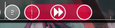
20:08 Yusomi: 01:42:015 (1,2,3,4,5,1) - this is super weird to play
20:09 Fser: rly? ;0
20:09 Fser: what should it be
20:09 Yusomi: maybe nc 01:42:102 (2) -
20:09 Yusomi: yeah its unexpected to start on blue tick
20:10 Fser: i duno it playd fine 4 me
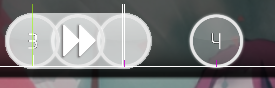
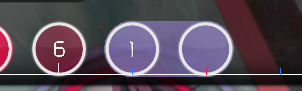
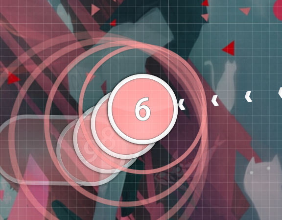
20:10 Yusomi: 01:42:102 (1) -
20:10 Yusomi: try to make this obvious to the player that this is the note on the white tick
20:10 Yusomi: https://osu.ppy.sh/ss/8461180
20:11 Yusomi: just for example
20:11 Fser: hmm
20:11 Fser: maybe on #2 i can just make it a slider repeating twice
20:11 Fser: so its clickable and emphasized still
20:11 Yusomi: hmm maybe
20:11 Yusomi: also NCing a blue tick is a little weird
20:12 Yusomi: 01:42:535 (1) - here it makes sense cus sv change tho
20:13 Fser: i could prob just not NC at all
20:13 Fser: xd
20:13 Fser: otherwise it looks weird
20:13 Yusomi: yeah thats probly fine x
20:13 Yusomi: cx
20:13 Yusomi: 05:05:686 (3,4,5,6,7) - this is weird to read
20:14 Fser: eeeh idk about the slider thing tho
20:14 Fser: i should probably leave it until some bn says its not rankable
20:14 Fser: lolol
20:14 Yusomi: wut slider thing
20:14 Fser: now its hard to read the slider under
20:14 Fser: replace the stream with a circle and then slider
20:14 Fser: no NC
20:15 Yusomi: did you keep the NC on the slider under?
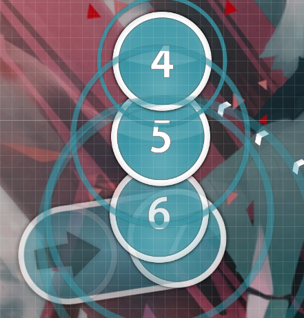
20:15 Fser: https://osu.ppy.sh/ss/8461202
20:15 Fser: yea
20:15 Fser: im gonna have to play it tho and see
20:15 Yusomi: try spacing that bottom slider a little more
20:15 Yusomi: since it is a 1/2 beat away
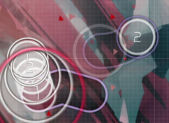
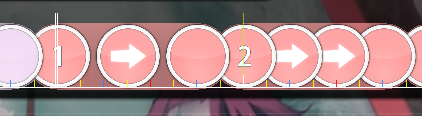
20:17 Fser: https://osu.ppy.sh/ss/8461219 maybe this is good
20:17 Fser: since its close enough for the next slider being only 1/4 away
20:17 Fser: orrrr
20:18 Fser: actually i think this is the best way
20:18 Fser: https://osu.ppy.sh/ss/8461229
20:18 Yusomi: yeah i think thats good
20:18 Yusomi: first screenshot looked pretty randomly placed
20:19 Fser: yeh
20:19 Fser: aww i like 05:05:686 (3,4,5,6,7) -
20:20 Fser: maybe i could just stack it though
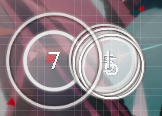
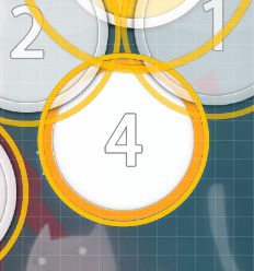
20:20 Yusomi: how about moving 05:05:686 (3,4) - to https://osu.ppy.sh/ss/8461246
20:20 Fser: no cuz it pauses too long in comparison to the rest
20:20 Fser: ;//// awkward
20:21 Yusomi: the patterns just awkward to read, just needs to be made more clear
20:21 Fser: idk its too spcaed everyuone gonna break there
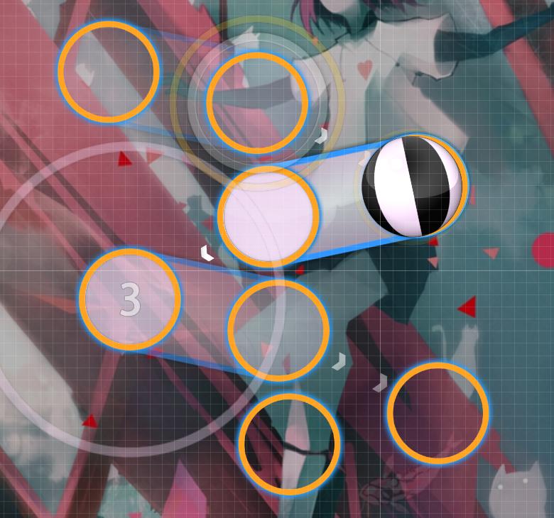
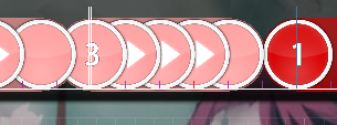
20:21 Fser: https://osu.ppy.sh/ss/8461253
20:21 Fser: maybe stack (3) on (7)
20:21 Fser: just an idea
20:22 Fser: at least really like this its not like a jumpstream
20:22 Fser: just have to move your cursor in a circle a bit
20:22 Yusomi: i mean it's only 137bpm
20:22 Yusomi: there are maps with full screen jumps at this bpm
20:22 Yusomi: you have alot of room to breath where spacing is concerned
20:23 Yusomi: and yeah i think the 3 - 7 stack is a step in the right direction for sure
20:24 Fser: prolly just gonna leave it until someone knows its unrankable xd
20:24 Fser: i like it for now
20:24 Yusomi: well it's definitely not unrankable if you can justify why you changed the spacing for that particular pattern
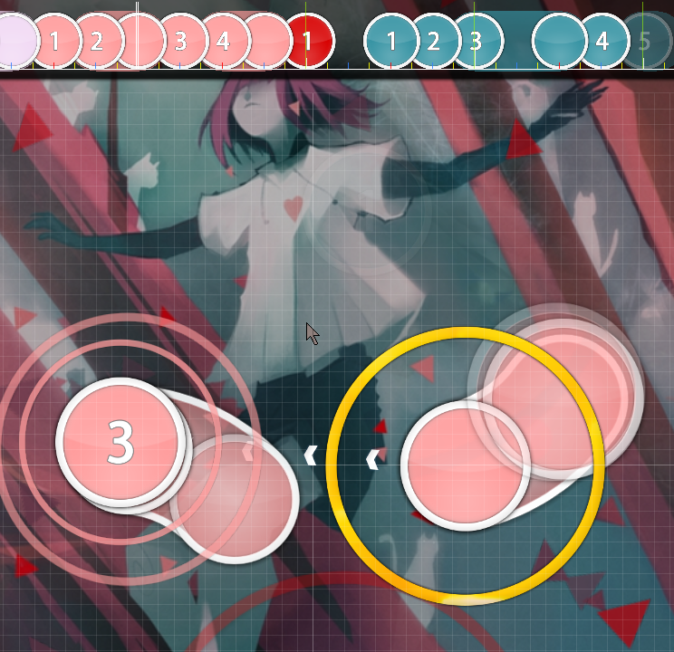
20:26 Yusomi: 02:52:680 (4,5,6,7,1) - this is probably the only other thing that felt weird
20:26 Yusomi: not even sure why, looks like it should flow well
20:27 Fser: o lol
20:27 Fser: i stole that from fizz on boogie xdxddxd
20:27 Yusomi: hm i think you've emphasised the wrong notes on it
20:28 Yusomi: actually no you did it well
20:28 Fser: hm idk seems fine 2 me
20:28 Yusomi: but
20:29 Fser: (6) on white tick
20:29 Yusomi: 02:53:027 (1) - this should have same spacing as 02:52:767 (5,6) -
20:29 Yusomi: strong beats aren't on the white ticks here
20:29 Yusomi: 02:52:680 (4,5) - 02:52:940 (7,1) - strong beats are on these
20:30 Fser: oh wow ur right
20:30 Fser: -_-
20:30 Fser: dam
Topic Starter
[-CeMAqpOP-]kee

Okinami wrote:

from my queue, i like the storyboard

big big mod thank u x)))
[dance]

01:07:506 (4) - this looks a little off. maybe rotate it by -6 degrees clockwise so it doesnt overlap weird with the last bursts
01:08:894 (4) - same here, looks copy pasted so just rinse and repeat
01:09:847 (3) - im not sure about you but i would much rather have these be sliders rather than circles on the tail of a slider
01:13:836 (2,5) - fix overlap
01:21:639 (7) - all of the other back and forths have a distance spacing of 1.62x, although the difference is small its still noticeable.
01:23:027 (7) - ^
01:28:923 (1) - i dont really like something like this appearing as a straight slider. its a gnarly ass wub, should have a weird slider to compliment it
01:30:310 (1) - perhaps lower this a bit on the playing field, so it doesnt overlap so messy. under the head of 01:29:963 (3) - would work well
01:30:917 (2) - spacing is icky, i dont really like the way you decided to overlap the 01:30:917 (2) - anyways
01:31:610 (2) - spacing is off again
01:38:634 (1) - consider fixing this, i see the idea behind it though
01:40:541 (4) - maybe you could overlap this with the tail of 01:39:327 (5) -
01:34:819 (5,3) - these two slider patterns are drastically different, it kinda sets off a feeling of complete difference, but its essentially the same
01:37:246 (3,5) - here too
01:38:634 (1,6) - fix overlap
01:45:310 - ignored a rather prominent beat here
01:57:709 (1) - try moving this to 368,35
01:57:882 (2) - this sound is very different than the last. i think a more varied slider is needed
01:58:402 (3,1) - set the 3 on the red anchor, its too messy as is
02:01:177 (3,4,5,6,7) - very very different noises here. i think fast, spaced kick sliders would suit the music much better
02:04:472 (1,2) - nice
02:13:316 (1) - i feel like the hype calls for much more intensity than a slow curved slider. should be a lot faster
02:14:356 (1) - elbow sliders look bad to me, consider straightening it (and the other copy-pastes of it)
02:15:483 (1,2,3,4) - i dont like this stacked. should be a bit spaced
02:34:819 (1) - this is actually a 1/3 rhythm. like this instead
02:35:512 (1,2,3,4,1,2,1,2,3) - nice job
02:40:194 (4,5) - overlap
this section is rather neat, i couldnt find any notable problems with it
02:52:680 (4,5,6,7) - this is a bit much
03:02:651 (4,5,6,7,1) - rotate the burst a little so it fits better
03:08:460 (1) - ctrl+g?
03:09:501 (6) - this is on a white tick, has no new combo and is in a completely contradictory placement. you should add an NC and move it to the head of the next slider
03:09:674 - undermapped sound
03:11:235 (2,3) - these two sliders are the same, implying the music is being consistent. however, the sound on 3 is very different
03:19:558 (3) - the rhythm is more like this
03:25:108 (4) - weird stack
03:23:720 (3,4,5,6) - this would look a lot cooler imo if it was a very low spaced burst. like this
03:26:495 (1,2,3,4) - ^
03:33:171 (6,7,8) - ^
03:36:900 (3) - why did you lower SV?
03:42:102 (1) - this is the only slider i dont like here, your loop is really really tight
04:10:541 (1) - this should be a very fast repeat imo (goes for all of these sliders)
04:20:252 (6) - i think doing something like this would be cooler
04:22:680 - undermapped
04:24:067 (2) - deserves to be ctrl+h'd tbh
04:33:431 (1,2) - love this slider pattern <3
04:51:813 (1,2,3,4) - you need to stack a lot less in this map tbh, it looks rather bad
04:59:530 - this is actually the most emphasized note here, you could do some cool stuff if you find anyway to map it accurately
05:15:050 (1,2) - not the same slider?
05:20:772 (2,3) - this nest needs a bit of optimizing
05:32:738 (1) - try this instead, and mess around with the hitsounds
05:50:252 (3) - i think this would feel better if you did [img=http://i.imgur.com/HJLjEN8.png]this[/img]

good shit. you should work on emphasis with sliders and your spacing a tad, otherwise a really good tech map for a rookie
wow pretty awkward but i was writing my response to this for like an hour but i was logged out so it removed all my changes
i changed most of the stuff u recommended anyway so no worries LOL : ////////
thanks man
Topic Starter
[-CeMAqpOP-]kee

[Nemesis] wrote:

Mod from my queue.

Dance

Who made that storyboard btw I want him to sb my map too lol

Mod Reply
00:44:530 (1,1) - I really like this slider, however 00:47:304 (1) - 's tail isn't completely stacked on 00:44:530 (1) - 's body making it really really annoying to look at tried to fix as good as i could ;/
00:58:402 (1,1) - no connection between these? Kind of a disappointment wat it goes into it like a blanket
01:19:212 (1) - sv increase comparing to 01:17:824 (1) - maybe? meh i consider the jumps the next part of the buildup
01:28:923 - I suggest using really short kiai bursts from this moment on, I suggest you can insert them at every shake of the storyboard for about 1/4 of a beat pretty sure thats unrankable xd idk doesn't feel right to be anyway
01:32:651 (2,3) - even though they are not touching, stack leniency makes them look like they are, I think you should move them further away from each other to avoid unaesthetic stacks stack gud fam
01:37:767 (6) - move it down a little bit so that it fully blankets 01:37:940 (1) - 's tail fixed
02:13:836 (1,2,3,4) - why don't you just make 4 stick to the rest of the objects? it would look neater imo (applies to all) just an aesthetic thing tbh lol xd
02:14:356 (1,2) - I think this should be mapped as one slider, there's no distinct sound to indicate the need for the second slider i mapped thos 2 the hi-hat sounding thingy in the background
02:25:454 (5,6) - same thing applies, besides NC would be neat here same as above
02:54:241 (1,2,3,4) - in the previous patterns all such patterns were treated as two circles attached to each other and divided by a bigger spacing, here this isn't as emphasized however. I know that intensity increases in this part but for me you should at least space 2 and 3 more so that it resembles the previous idea a bit better and transitions into a more emphasized version of it but i have to rip off byfar
03:19:558 (3) - at the exact half of the slider the music starts to fade, how about you end the slider at 03:19:645 - and then add another one with less sv? eh i would probably do this but it's much more of a matter of playability than it is to exactly represent the music perfectly (in this case)
03:25:108 (4) - same thing applies there, except I'd expect a higher sv there not really a big deal at this part
03:38:720 (6,7,8,9) - even if you're gonna keep the pattern you've established before, this one has way WAY lesser spacing between 8 and 9, I guess if you want to be consistent you should either increase the ds or simply decrease ds between the circles ur rite i tried to make it look a bit nicer
03:51:900 - why don't you add a curve there so it blankets 03:52:680 - ? i would want to make the sliders "cooler" but i was just keeping reading/playability in mind...(rrtyui)
04:02:911 - my gf on period LOL modding prodigfy +3kds
04:11:928 (1) how about you just make the slider repeat a couple of times? I mean the song supports it so why not? \:D/ actually i would map more of this part but i'm just not sure if the sound is worth putting in the effort to find something that's comfortable to play :/
04:21:726 - unmapped sound there, I'd just put a triple there instead of a slider damn ur rite but i just put a repeating slider and now it looks like asphyjxia on boogie
04:22:680 - again unmapped sound not anymore must have been spotted by previous mod.. 8-)
05:30:657 (1) - two 1/4 sliders would fit in better imo 2 1/4 sliders would seem like a bit much considering theres nothing else like that around that part.. : L
05:49:212 - my gf on her period when I try talking to her LOL modding legend +5kds

Alright all from me, good luck!
ty for the mod, i know a lot of it may be subjective but you did pull up some good ideas and some things i was stupidly blind to xdxd
wilup
fser said he would mutual me if i modded Her map

[dance]
01:06:726 (1,2,3) - different spacing as to 01:08:113 (1,2,3) - for the same rhythm and musical context, if you're going to change the spacing like that, make it emphasize something in the music e.g the "vocals" beginning a new verse
01:28:923 (1) - i'm not sure if it's even worth modding sliders in wub maps but this one isn't reused for the same context e.g 01:30:310 (1) - is much less boring of a slider yet with the same noise
01:37:246 (3) - relating to above statement, this is an odd one out as well. these two sliders don't seem to be indicating a new section in the music but i'm probably just too dumb to understand neurofunk
01:42:102 (5) - weird hitsound, doesn't really correspond
01:54:587 (1,3) - gross overlap that isn't repeated
01:58:316 (2,3,4,5) - and 02:03:952 (1,2,3,4) - seem to be making the same sound but it's slider/circle/slider/circle for the second as opposed to the first?
02:05:686 (1,2) - people who blanket mod are really stupid and i am one of them.
02:11:928 (1,2,1,2) - spacing feels awkward here with these kind of angles
02:18:518 (2,3) - this pattern is not seen again
02:28:923 (3,6) - editor overlap feels nasty
02:29:963 (1,2) - why this antiflow where normal flow is used in the same context e.g 02:31:350 (1,2) -
02:46:264 (2) - the node for the slidertail on this is going offscreen, idk if that's allowed? have you tested this with hr?
02:47:131 (4,5,6,1) - weird spacing
also what sound is 02:47:304 (6) - representing
02:49:905 (1,2,3,4) - You Are Not Hanzer
02:53:200 (1,1) - and 02:54:587 (5,1) - anti flow vs normal flow again why
02:54:241 (1,2,4) - i understand the spacing here but i think 1 should be evenly spaced between 2 and 4 (not a triangle, just like this kinda
02:54:587 (5) - a lot of sounds are getting ignored by this slider
02:58:229 (1,2,3,4) - 02:59:876 (6,7,8,9) - same rhythm same music different spacing
03:02:131 (2,1) - blanket please
03:03:952 (6,7) - in the same context you've had this weird spacing but this one seems especially close
03:30:310 (1,2,3,4,5) - increase in spacing doesnt really correspond to song intensity
03:40:715 (3,1) - if you're not gonna map between these two points at least do something with the sb
04:01:524 (1) - i like the sb change on the end of this
04:04:645 (3,4) - the spacing here feels extreme
04:33:431 (1,2) - 04:38:980 (2,3,1,2) - same sounds different rhythm? also cool blanket good job
04:56:582 (1,2) - this antiflow compared to 04:55:888 (1,3) -
05:01:871 (1,2) - Blanket Mod
05:10:541 (1,1) - again, do some cool sb stuff here or something if you're not gonna map this

i dont understand neurofunk
Topic Starter
[-CeMAqpOP-]kee

Metronome wrote:

fser said he would mutual me if i modded Her map

[dance]
Mod Reply
01:06:726 (1,2,3) - different spacing as to 01:08:113 (1,2,3) - for the same rhythm and musical context, if you're going to change the spacing like that, make it emphasize something in the music e.g the "vocals" beginning a new verse stacked on 01:07:767 (5) -
01:28:923 (1) - i'm not sure if it's even worth modding sliders in wub maps but this one isn't reused for the same context e.g 01:30:310 (1) - is much less boring of a slider yet with the same noise the first is a BBBZRRRRR and the second one is a BOOm
01:37:246 (3) - relating to above statement, this is an odd one out as well. these two sliders don't seem to be indicating a new section in the music but i'm probably just too dumb to understand neurofunk idk i wanted an edgy slider for the wub while making it close to the 2 sliders ahead
01:42:102 (5) - weird hitsound, doesn't really correspond u rite
01:54:587 (1,3) - gross overlap that isn't repeated it plays fine tho ???? /? ?
01:58:316 (2,3,4,5) - and 02:03:952 (1,2,3,4) - seem to be making the same sound but it's slider/circle/slider/circle for the second as opposed to the first? i place the slider on the same sound in both parts but if ur talking about the spacing shit idk manm
02:05:686 (1,2) - people who blanket mod are really stupid and i am one of them. ok moved by 1 pixe;
02:11:928 (1,2,1,2) - spacing feels awkward here with these kind of angles its a circol idk how else to map this?????
02:18:518 (2,3) - this pattern is not seen again ok i fix
02:28:923 (3,6) - editor overlap feels nasty idk wot u mean
02:29:963 (1,2) - why this antiflow where normal flow is used in the same context e.g 02:31:350 (1,2) - k its fixed i dont like it but i guess its objectively better
02:46:264 (2) - the node for the slidertail on this is going offscreen, idk if that's allowed? have you tested this with hr? HR does not affect this but i changed it anyway
02:47:131 (4,5,6,1) - weird spacing im not gonna say it isnt strange but its just aesthetics
also what sound is 02:47:304 (6) - representing theres a hihat sounding thing
02:49:905 (1,2,3,4) - You Are Not Hanzer ok i replaced it with my AESTHETIC quad
02:53:200 (1,1) - and 02:54:587 (5,1) - anti flow vs normal flow again why meh
02:54:241 (1,2,4) - i understand the spacing here but i think 1 should be evenly spaced between 2 and 4 (not a triangle, just like this kinda fixed but because of spacing i moved (1) down instead
02:54:587 (5) - a lot of sounds are getting ignored by this slider uhhhh idk theyr e not really as emphasized as on (5) and its at the end of a section anyway so the mapping is a bit weirder
02:58:229 (1,2,3,4) - 02:59:876 (6,7,8,9) - same rhythm same music different spacing the first one has wubs and the second is just boring rhythm
03:02:131 (2,1) - blanket please kk
03:03:952 (6,7) - in the same context you've had this weird spacing but this one seems especially close ye i jus copy and paste now to be consistent
03:30:310 (1,2,3,4,5) - increase in spacing doesnt really correspond to song intensity ok i made it smaller so it gradualyl increases throughout this section
03:40:715 (3,1) - if you're not gonna map between these two points at least do something with the sb i have no fucking idea bro im garbage at SBing
04:01:524 (1) - i like the sb change on the end of this thanks i dont know if its sarcasm but i like it too
04:04:645 (3,4) - the spacing here feels extreme muh angle (moved it closer a bit)
04:33:431 (1,2) - 04:38:980 (2,3,1,2) - same sounds different rhythm? also cool blanket good job the second one is not so much of an emphasized WOOOOob so yeh
04:56:582 (1,2) - this antiflow compared to 04:55:888 (1,3) - what both are antiflow i think
05:01:871 (1,2) - Blanket Mod what am i SUPPOSED to do its a sharp slider but i fixed it a bit i guess
05:10:541 (1,1) - again, do some cool sb stuff here or something if you're not gonna map this ok i gues that gud enuf


i dont understand neurofunk
me either
wilup
mod from Lince, posting in his stead cause his account's disabled right now

Lince Cosmico wrote:

Lince is here :p , as promised to Metronome im modding u xd
Specialist


01:03:952 (1) - Feels like you should start putting circles from here
01:17:824 (1,2,3,4) - Why dont you repeat this 4 in 01:19:212 (1,2,3,4) - ? its actually the same thing imo
01:34:298 (1,2,3) - You could move thiis a it lower so it doesnt make a weird overlap with 01:33:865 (3,4) -
01:34:472 (3) - I think that a curve would emphasize better
01:39:501 (6) - Stack with 01:38:634 (1) -
01:47:998 (7,1) - Isn't spacing too low? Feels like its really close compared to the difference of time between both notes
02:04:472 (1,2) - Switch NC's i guess, with the NC on the SV change it would be more predictable
02:09:067 (2,3) - You should stack this with 02:10:194 (1) - sliderhead imo
02:12:535 - Maybe a triple would fit better
02:14:356 (1) - Reducing the curve here would seems better i guess, blanketing the slider with 02:13:836 (1) - is actually not a bad option
02:23:807 (2) - This slider... seems to be starting in 1/6 (02:24:009 - ), since it would be weird to play i guess you can add 2 circles on 02:23:807 - and 02:23:894 - so the beginning of the slider would be closer to the actual start of the sound you're trying to emphasize
02:36:032 (3) - You could stack the sliderend of this with 02:35:859 (2) - and make a cool effect like you did here 00:44:530 (1,1) -
02:36:639 (2) - What about making this a slow slider? i think it calls for it and the emphasis would be such great
You could do that or instead of it you can make this one slower 02:36:900 (1) -
02:37:680 (6) - Make the slider fit the followpoint
02:38:287 (1) - This doesnt really feel like an 1/2 slider, feels more like a kickslider, reasons are obvious, you could do a stream there with not too much spacing and it would fit
I wont complain if you reject, since there are other similar situations that are hard to change like this 02:41:061 (1) -
02:54:241 (1,2,3,4) - EDGY AS HELL
02:56:842 (3) - I hear a sound here 02:57:275 - , maybe finishing it there would fit better
03:19:905 - This is not that important, but what about putting here a 1-tic kiai? (yes it sounds stupid but the effect of the kiai would actually work, when a kiai starts it gets bright and some... stars? appear, just check a kiai start with default skin)
I suggest this because as a player, you're just ending such a cool part (03:17:131 - /// 03:19:819 - ) and it feels like you're getting on the OP part and you also used more spacing on the part that is right after what i mentioned, so even more cool!
03:40:801 - Unnecesary green line right here
04:04:298 - Same 1-tic kiai thing here
04:11:928 - You could end this with a circle and add a cool slider right 04:12:102 - here (but since the sound that you're representing isnt too high i dont know if this is really a good idea)
04:21:639 (2) - This feels like the only reverse slider on the part lmao
04:33:431 (1) - I think that this slider should be reversed, the circular part should be at the beginning and the curvy part should be at the end (obvious reasons as well, the curvy part clearly represents better the sound of the end of the slider)
05:01:871 (1,2) - The circle 2 feels ugly since its too close to the slider, maybe you should move it a bit to the left
05:10:281 (4) - NC? the sliderchange is actually unnoticeable atm since that slider is also similar than those you used on parts from before (01:57:449 (4) - for example)
05:31:437 (2) - Move this a bit far, i guess it would seems better than now
05:50:252 (3) - What about making a curvy slider here instead of a red anchor one? like this http://puu.sh/wA1Nw/993f0812ae.jpg

Sorry i couldnt find too much things about emphasis (that is what i always try to focus and i think its the most important thing on this kind of maps)
but here's all i got
gl
Topic Starter
[-CeMAqpOP-]kee

Metronome wrote:

mod from Lince, posting in his stead cause his account's disabled right now

Lince Cosmico wrote:

Lince is here :p , as promised to Metronome im modding u xd
Specialist


Mod Reply
01:03:952 (1) - Feels like you should start putting circles from here meh i don't want to make a billain map too jumpy, and if i don't map jumps it might just look weird
01:17:824 (1,2,3,4) - Why dont you repeat this 4 in 01:19:212 (1,2,3,4) - ? its actually the same thing imo im not sure what you're saying but if you're talking about the way i flipped them it just makes the spacing more even
01:34:298 (1,2,3) - You could move thiis a it lower so it doesnt make a weird overlap with 01:33:865 (3,4) - u Rite
01:34:472 (3) - I think that a curve would emphasize better actually im gonna just replace it with the wub slider at 01:28:923 (1) - for all sounds that match
01:39:501 (6) - Stack with 01:38:634 (1) - yes
01:47:998 (7,1) - Isn't spacing too low? Feels like its really close compared to the difference of time between both notes shiet....
02:04:472 (1,2) - Switch NC's i guess, with the NC on the SV change it would be more predictable smart
02:09:067 (2,3) - You should stack this with 02:10:194 (1) - sliderhead imo good eye
02:12:535 - Maybe a triple would fit better meh theres no strong enough sound to put an object on
02:14:356 (1) - Reducing the curve here would seems better i guess, blanketing the slider with 02:13:836 (1) - is actually not a bad option Shiet it was my aesthetic but i gues its good thisd way
02:23:807 (2) - This slider... seems to be starting in 1/6 (02:24:009 - ), since it would be weird to play i guess you can add 2 circles on 02:23:807 - and 02:23:894 - so the beginning of the slider would be closer to the actual start of the sound you're trying to emphasize 1/6 sounds too fast for this sound
02:36:032 (3) - You could stack the sliderend of this with 02:35:859 (2) - and make a cool effect like you did here 00:44:530 (1,1) - meh the point is that im blanketing around 02:36:553 (1) -
02:36:639 (2) - What about making this a slow slider? i think it calls for it and the emphasis would be such great too much hype on that section, and the next slider is slow so it gives the song a better punch
You could do that or instead of it you can make this one slower 02:36:900 (1) - fine how it is imo
02:37:680 (6) - Make the slider fit the followpoint meh i would if i could make all the spacing even and not have too diagonal sliders but it;s a good idea
02:38:287 (1) - This doesnt really feel like an 1/2 slider, feels more like a kickslider, reasons are obvious, you could do a stream there with not too much spacing and it would fit neither does this --> 02:43:836 (1) - but omitting such sounds isn't a sin ;p
I wont complain if you reject, since there are other similar situations that are hard to change like this 02:41:061 (1) -
02:54:241 (1,2,3,4) - EDGY AS HELL byFAr <,,<<<<333333
02:56:842 (3) - I hear a sound here 02:57:275 - , maybe finishing it there would fit better yeh
03:19:905 - This is not that important, but what about putting here a 1-tic kiai? (yes it sounds stupid but the effect of the kiai would actually work, when a kiai starts it gets bright and some... stars? appear, just check a kiai start with default skin) idk the music isnt strong emough there imo
I suggest this because as a player, you're just ending such a cool part (03:17:131 - /// 03:19:819 - ) and it feels like you're getting on the OP part and you also used more spacing on the part that is right after what i mentioned, so even more cool! i would have done it but this --> 03:18:865 (1,2,3) - creates too much of a buffer and the song/map calms down there ;/
03:40:801 - Unnecesary green line right here kk
04:04:298 - Same 1-tic kiai thing here not here, but i decided to do it for this --> 04:26:495 (1) -
04:11:928 - You could end this with a circle and add a cool slider right 04:12:102 - here (but since the sound that you're representing isnt too high i dont know if this is really a good idea) i wanted to stack this 04:12:622 (1) - on that so it felt like a short halt while the weirdass sound plays, idk just a concept. and besides in my eyes i don't want to map that because it would feel too messy compared to the rest of this part
04:21:639 (2) - This feels like the only reverse slider on the part lmao there are not many sounds that support this but i changed a quad to this 04:24:414 (4) - because it felt messy the way i had it before.
04:33:431 (1) - I think that this slider should be reversed, the circular part should be at the beginning and the curvy part should be at the end (obvious reasons as well, the curvy part clearly represents better the sound of the end of the slider) good god the slider matches the sound so much better but it's difficult trying to get everything to fit up now
05:01:871 (1,2) - The circle 2 feels ugly since its too close to the slider, maybe you should move it a bit to the left blanket mod #2
05:10:281 (4) - NC? the sliderchange is actually unnoticeable atm since that slider is also similar than those you used on parts from before (01:57:449 (4) - for example) ok and i also removed the new combo on 05:10:541 (2) - because no sv change
05:31:437 (2) - Move this a bit far, i guess it would seems better than now uhh i dont wanna move it too far because sliderend but i moved it left a bit
05:50:252 (3) - What about making a curvy slider here instead of a red anchor one? like this http://puu.sh/wA1Nw/993f0812ae.jpg its a gnarly sound so red anchor fits better

Sorry i couldnt find too much things about emphasis (that is what i always try to focus and i think its the most important thing on this kind of maps)
but here's all i got
gl
thnaks
defiance
helo


[General]

  • add a soft-sliderslide into your folder so no one can hear the sliderball make noise during the slide art parts.

[Dance]
  1. 01:06:032 (1,2,3,4,5,6,7,8) - stacking this on the end of the slider is a lot more predictable and what you currently have is quite unexpected and a bit harsh when you are trying to introduce the song,
  2. 01:09:154 (5,1) - more distance on these would create more emphasis because as it is now there is literally none 01:11:928 (5,1) - is a good example of good emphasis
  3. 01:24:067 (1,2,3,4) - this sort of arrangement is quite off considering that you are more explicit on patterning something like would be better structurally and still flow nicely into the next slider
  4. 01:32:217 (6,1,2,3,4) - nazi; move 6 so that it is a bit more aligned in the middle of 3 and 4, would look a lot cleaner
  5. 01:36:553 (5,6) - not sure as to why you made the sliders different when you've been pairing them for this pattern throughout the whole seciton
  6. 01:37:073 (1,2,3) - watch your stacking here
  7. 01:39:241 (4,5,6) - you could increase the distance to emphasize the difference in music here
  8. 01:39:847 (2) - this slider uses very low emphasis considering how you've transitioned into the 1/2 slider, increase the distance
  9. 01:42:535 (1) - a more interesting slider is needed tbh, better to try and emphasize the n eur ofuk here
  10. 01:48:605 (4,5) - same thing about stacking
  11. 01:56:928 (3,4) - could you move this somewhere else to try and avoid the overlap somewhere around x:164 y:234
  12. 02:01:697 (6,7) - angle is fairly harsh and you haven't really done it this harsh, would consider reducing the distance unless you want to keep the patterning
  13. 02:14:356 (1,2) - why don't you switch the arrangement of 1 and 2? the way you have it now is very confusing because you put 2 where it seems to flow right off of 4 and can be easily misread.
  14. 02:34:472 (1) - maybe just move this a little closer to the next pattern, you are abusing slider leinency very heavily right here and it's fairly difficult to hit
  15. 03:00:137 (9) - i wouldn't ever recommend doing a slider that reverses and ends on the opposite end. something like would be better because it gets the drum sound and the neurowhateverthefuck sound in there as well.
  16. 03:01:871 (1,2,1) - this is ridiculously difficult to hit because of the distance between 1,2. consider reworking the pattern so that this is quite playable.
  17. 03:09:327 (4,5,1,2) - you don't do this anywhere else in the map, it's nice to keep your ideas consistent, so probably making a pattern you did before would be better.
    the rest from here until the next point is fairly consistent
  18. 04:22:767 (2,3,4) - watch your stacking
  19. 04:26:755 (2,3) - ^
  20. 04:27:882 (2) - do something similar to what you did 04:33:431 (1) - what you have doesn't really match the song
  21. 05:10:021 (1,2,3) - i was hoping for more irregular spacing here
  22. 05:12:622 - add a note here

    not much else to say, ideas are mostly consistent, aesthetics are pretty much on point, just work on your emphasis a bit more

gl
Topic Starter
[-CeMAqpOP-]kee

osuskrub wrote:

helo


[General]

  • add a soft-sliderslide into your folder so no one can hear the sliderball make noise during the slide art parts.yeh

[Dance]

  • Mod Reply
    1. 01:06:032 (1,2,3,4,5,6,7,8) - stacking this on the end of the slider is a lot more predictable and what you currently have is quite unexpected and a bit harsh when you are trying to introduce the song, restructure everhthing
    2. 01:09:154 (5,1) - more distance on these would create more emphasis because as it is now there is literally none 01:11:928 (5,1) - is a good example of good emphasis i made a blanket thing
    3. 01:24:067 (1,2,3,4) - this sort of arrangement is quite off considering that you are more explicit on patterning something like would be better structurally and still flow nicely into the next slider meh i dnot want to deal with weird overlaps x d
    4. 01:32:217 (6,1,2,3,4) - nazi; move 6 so that it is a bit more aligned in the middle of 3 and 4, would look a lot cleaner yes sir
    5. 01:36:553 (5,6) - not sure as to why you made the sliders different when you've been pairing them for this pattern throughout the whole seciton autism
    6. 01:37:073 (1,2,3) - watch your stacking here hey im deetz
    7. 01:39:241 (4,5,6) - you could increase the distance to emphasize the difference in music here ye
    8. 01:39:847 (2) - this slider uses very low emphasis considering how you've transitioned into the 1/2 slider, increase the distance ok man
    9. 01:42:535 (1) - a more interesting slider is needed tbh, better to try and emphasize the n eur ofuk here nah i emphasize the next slider enuf, i dont want evrything to look too messy
    10. 01:48:605 (4,5) - same thing about stacking Yes/
    11. 01:56:928 (3,4) - could you move this somewhere else to try and avoid the overlap somewhere around x:164 y:234 or jus overlap it xdxd
    12. 02:01:697 (6,7) - angle is fairly harsh and you haven't really done it this harsh, would consider reducing the distance unless you want to keep the patterning spacing is higher cuz the weird sound xd
    13. 02:14:356 (1,2) - why don't you switch the arrangement of 1 and 2? the way you have it now is very confusing because you put 2 where it seems to flow right off of 4 and can be easily misread. godmode
    14. 02:34:472 (1) - maybe just move this a little closer to the next pattern, you are abusing slider leinency very heavily right here and it's fairly difficult to hit ur rite tbh
    15. 03:00:137 (9) - i wouldn't ever recommend doing a slider that reverses and ends on the opposite end. something like would be better because it gets the drum sound and the neurowhateverthefuck sound in there as well. i dunno i never had problems with it. i think its dumb to add a slider right after the most prominent sound and the slider flows directly into the next
    16. 03:01:871 (1,2,1) - this is ridiculously difficult to hit because of the distance between 1,2. consider reworking the pattern so that this is quite playable. i tried making it flow bettr lets hope it works
    17. 03:09:327 (4,5,1,2) - you don't do this anywhere else in the map, it's nice to keep your ideas consistent, so probably making a pattern you did before would be better. sliderend wasnt even snapped wtf
      the rest from here until the next point is fairly consistent
    18. 04:22:767 (2,3,4) - watch your stacking no excuse
    19. 04:26:755 (2,3) - ^ again
    20. 04:27:882 (2) - do something similar to what you did 04:33:431 (1) - what you have doesn't really match the song kk
    21. 05:10:021 (1,2,3) - i was hoping for more irregular spacing here idk how you mean, i would need an example of what it should be cuz i dont wanna make iy too ugly
    22. 05:12:622 - add a note here there is no music ther,
      what u hear is the sound at 05:33:084

    not much else to say, ideas are mostly consistent, aesthetics are pretty much on point, just work on your emphasis a bit more

gl
thank u
Naxess
Greetings

what is that drum-hitwhistle lmao


  • [General]
  1. Hitsounds are very quiet, would recommend something more towards 100% volume. I put everything on 100% and it seemed to work pretty well.
  2. Seems like sb\particles\t1.png is unused. Guessing you were planning to add individual particles but instead went with triangles.png? Anyway I'd suggest removing unused files from the final version.

    [Dance]
  3. 01:13:056 (4,5) - 01:14:443 (4,5) - 01:15:830 (4,5) - Spacing could probably be kept consistent since it's pretty noticeable. Compare them to 01:17:217 (4,5) - 01:07:506 (4,5) - 01:08:894 (4,5) - 01:10:281 (4,5) - , for example.
  4. 01:17:824 (1,2,3,4,1,2,3,4) - Intensity is differing quite a lot between this and 01:20:599 (1,2,3,4,5,6,7,8,1,2,3,4,5,6,7,8) - , yet the song just changes pitch. Would try just continuing the same rhythm density with different patterns, for instance like this. You can build it up a bit, but how it is currently is a bit much imo, despite the buildup.
  5. 01:30:830 (1,2,3,4) - Sound at 01:31:090 - could probably be reflected better with a rhythm like this. Same applies to 01:36:466 (4,5,6) - 01:39:241 (4,5,6) - 01:44:790 (4,5,6) - etc. Would be a nice introduction to the following part, which has similar rhythms.
  6. 01:28:923 - 01:30:310 - 01:31:697 - etc. All these are consistent, but the concept sort of changes randomly at 01:35:859 - when every other is now a circle instead, 01:38:634 - 01:41:408 - 01:44:183 - . Would probably feel more coherent if circles were part of the whole thing from the beginning. That'd allow you to vary it while keeping consistency and without it implying that the song changes.
  7. 01:55:281 - Looking at the above and the ones around this, seems like an SV change was forgotten. Goes for 02:06:379 - as well.
  8. 02:00:830 - This is the only circle that happens on a downbeat in this part. Can probably keep that concept to the previous part instead, as this one seems more appropriate for SV changes.
  9. 02:12:275 - Don't see why this one should have NC and not 02:12:622 - . Wouldn't latter make more sense both pattern-wise and musically?
  10. 02:19:212 (3) - Would save the unique shapes for actually unique sounds instead. That way they'll stand out more in correlation with the song.
  11. 02:30:483 (4,1) - Probably a good idea to maintain the stream thing here like 02:27:709 (1,2,3) - 02:24:934 (1,2,3) - 02:22:160 (1,2,3) - etc does it. Additionally, could try arranging 02:19:385 (1,2,3) - in the same way as the others to make it more recognizable.
  12. 02:45:743 (1,2,3) - 02:48:518 (1,2,3) - Try keeping consistency in spacing between things like this. The increase in spacing might be following pitch, but it's inconsistent with similar parts. Compare 02:45:743 (1,2,3) - , 02:47:131 (4,5,6) - and 02:48:518 (1,2,3) - with each other, for example. Would suggest just keeping all of them the same low spacing.
  13. 02:42:969 - Regarding the above concept, try introducing it as the section starts, from 02:36:900 - , rather than in the middle of the section. Feels a bit weird how the rhythm suddenly becomes more stable without the song changing much. Song does change, but 02:47:998 - is same as 02:36:900 - and the latter has said concept unlike the former. The more consistent you keep your ideas, the more defined and familiar they become.
  14. 02:54:241 (1,2,3,4) - This is a bit of a spike in difficulty, and isn't similar to 02:54:934 (1,2,3) - 02:55:628 (1,2) - 02:56:321 (2,3,1) - in that regard. Generally you'd want to keep same parts in the song same in difficulty as well.
  15. 03:05:426 (6,7,8) - Refrain from having parts that aren't part of a concept similar to it. Causes a bit of ambiguity and breaks the potential contrast it would otherwise have. Better to only reflect 03:06:553 (4,5,6) - 03:03:778 (1,2,3) - etc with that sort of idea. Maybe try something like this instead so it looks different.
  16. 03:12:102 (4,5,6) - Same concept as above again, apply it here for consistency with the others. Suddenly changing without warrant isn't really a good idea. Could do it like this, for example.
  17. 03:18:865 - For this part you could try following the sounds a bit closer and express it in the map. Make (1) repeat on 1/8 like this, keep (2) as is and make (3) into a 1/6 repeating slider. It won't follow it perfectly but it will at least be more accurate. Maybe accompany these snappings with SV changes as well, making (1) slower and (3) faster or other way around.
  18. 04:04:992 (1) - 04:07:767 (1) - 04:10:541 (1) - 04:13:316 (1) - etc. These sorts of sounds would be better reflected like 04:21:639 (2) - and/or 04:24:414 (4) - . That way you still keep the density break whilst covering the drums. Same goes for 04:27:189 (1) - 04:41:061 (1) - 04:57:709 (1) - etc, you get the idea. The reason why adding kinks like 04:57:709 (1) - won't work well, is that there are other shapes that are similar but don't express the same things, 04:58:142 (1,1) - for instance, which means it'll get ambiguous.
  19. 04:06:553 (3,4) - Doesn't really feel like it belongs in the map. 04:07:333 (2) - I can understand, but these are going a bit too far imo.
  20. 04:46:264 (3,1) - Looks pretty messy visually, probably better to avoid them touching like that, as it doesn't look very intentional.
  21. 04:49:168 - This is 1/8. Probably best if you ignored the regular 1/4 here to cover this instead, as it's pretty distinct. Otherwise you risk the rhythm being unrepresentative of the song here, since following other layers would seem as it's mapped to silence in comparison.
  22. 04:49:645 - This is inaudible as far as I can hear. Would either remove it or give it some hitsound so it has feedback. Very likely applies elsewhere around here. Make sure things are audible and if not, try raising volume or adding hitsounds or whatnot. Slider tails don't matter, but clickable things must be audible according to the ranking criteria. By audible they don't mean technically audible, so 5% wouldn't work, they mean practically.
  23. 04:49:819 - Feels like a lot of drum beats are skipped but then others are covered. How about moving 04:49:732 (2) - forwards by 1/4 and removing 04:49:992 (3) - ? Could then move 04:49:645 (1) - to 04:49:689 - , where it's more supported by the song. Anyway be very careful about snapping around this part. Sounds like some things land on 1/8 in the transitions.

    Alright so basically make sure hitsounding is alright and notes fit the song where they can. The stuff around 04:48:691 - is especially worrying. For the most part concepts are kept consistent, but there's always some parts where they stray from their pattern without the song changing accordingly. Again, the more you keep to your ideas within each section, the more defined and recognizable they'll become. Song is a bit repetitive so yes variety is fine, but generally the variations are built into the pattern as well, for example having every other one different; not just a few randomly.
Seems pretty cool tbh, I'll probably return in a week or two to see how things have been going. Feel free to gather more mods in the meantime as per usual.
Topic Starter
[-CeMAqpOP-]kee

Naxess wrote:

Greetings

what is that drum-hitwhistle lmao end of second section


  • [General]
  1. Hitsounds are very quiet, would recommend something more towards 100% volume. I put everything on 100% and it seemed to work pretty well. i agree they needed to be turned up but im not sure it should be all the way to 100%, ill try 90
  2. Seems like sb\particles\t1.png is unused. Guessing you were planning to add individual particles but instead went with triangles.png? Anyway I'd suggest removing unused files from the final version. storybrew lol xd

    [Dance]
  3. 01:13:056 (4,5) - 01:14:443 (4,5) - 01:15:830 (4,5) - Spacing could probably be kept consistent since it's pretty noticeable. Compare them to 01:17:217 (4,5) - 01:07:506 (4,5) - 01:08:894 (4,5) - 01:10:281 (4,5) - , for example. ok thumbs up i think
  4. 01:17:824 (1,2,3,4,1,2,3,4) - Intensity is differing quite a lot between this and 01:20:599 (1,2,3,4,5,6,7,8,1,2,3,4,5,6,7,8) - , yet the song just changes pitch. Would try just continuing the same rhythm density with different patterns, for instance like this. You can build it up a bit, but how it is currently is a bit much imo, despite the buildup. i tried ; /
  5. 01:30:830 (1,2,3,4) - Sound at 01:31:090 - could probably be reflected better with a rhythm like this. Same applies to 01:36:466 (4,5,6) - 01:39:241 (4,5,6) - 01:44:790 (4,5,6) - etc. Would be a nice introduction to the following part, which has similar rhythms. good ear
  6. 01:28:923 - 01:30:310 - 01:31:697 - etc. All these are consistent, but the concept sort of changes randomly at 01:35:859 - when every other is now a circle instead, 01:38:634 - 01:41:408 - 01:44:183 - . Would probably feel more coherent if circles were part of the whole thing from the beginning. That'd allow you to vary it while keeping consistency and without it implying that the song changes. yeah i was gonna change those to sliders like in 01:28:923 (1) - but i realized there's not a good enough sound to justify something like that so
  7. 01:55:281 - Looking at the above and the ones around this, seems like an SV change was forgotten. Goes for 02:06:379 - as well. i think it fits like that so it matches the "pewpewpewpew"-ish sound in the background
  8. 02:00:830 - This is the only circle that happens on a downbeat in this part. Can probably keep that concept to the previous part instead, as this one seems more appropriate for SV changes. i couldn't find many parts that would be appropriate to change but i fixed some of these
  9. 02:12:275 - Don't see why this one should have NC and not 02:12:622 - . Wouldn't latter make more sense both pattern-wise and musically? yea i guess youre right
  10. 02:19:212 (3) - Would save the unique shapes for actually unique sounds instead. That way they'll stand out more in correlation with the song. fair
  11. 02:30:483 (4,1) - Probably a good idea to maintain the stream thing here like 02:27:709 (1,2,3) - 02:24:934 (1,2,3) - 02:22:160 (1,2,3) - etc does it. Additionally, could try arranging 02:19:385 (1,2,3) - in the same way as the others to make it more recognizable. fixed, looks way better now, not sure how im gonna pull off what you suggested at 02:19:385 (1,2,3) - tho
  12. 02:45:743 (1,2,3) - 02:48:518 (1,2,3) - Try keeping consistency in spacing between things like this. The increase in spacing might be following pitch, but it's inconsistent with similar parts. Compare 02:45:743 (1,2,3) - , 02:47:131 (4,5,6) - and 02:48:518 (1,2,3) - with each other, for example. Would suggest just keeping all of them the same low spacing.
  13. 02:42:969 - Regarding the above concept, try introducing it as the section starts, from 02:36:900 - , rather than in the middle of the section. Feels a bit weird how the rhythm suddenly becomes more stable without the song changing much. Song does change, but 02:47:998 - is same as 02:36:900 - and the latter has said concept unlike the former. The more consistent you keep your ideas, the more defined and familiar they become. i tried fixing the consistency for this but it ended up looking a bit messy imo, but i'll need more comments on this
  14. 02:54:241 (1,2,3,4) - This is a bit of a spike in difficulty, and isn't similar to 02:54:934 (1,2,3) - 02:55:628 (1,2) - 02:56:321 (2,3,1) - in that regard. Generally you'd want to keep same parts in the song same in difficulty as well. well this is the buildup to the next section, but since i always have trouble playing this pattern i decided to change it to something a bit more simple (i knew someone would roast this eventually)
  15. 03:05:426 (6,7,8) - Refrain from having parts that aren't part of a concept similar to it. Causes a bit of ambiguity and breaks the potential contrast it would otherwise have. Better to only reflect 03:06:553 (4,5,6) - 03:03:778 (1,2,3) - etc with that sort of idea. Maybe try something like this instead so it looks different. yea i agree it looks sort of ugly and it keeps the spacing consistent for the sound at that part
  16. 03:12:102 (4,5,6) - Same concept as above again, apply it here for consistency with the others. Suddenly changing without warrant isn't really a good idea. Could do it like this, for example. i had to change some stuff around this part but u were right about the consistency
  17. 03:18:865 - For this part you could try following the sounds a bit closer and express it in the map. Make (1) repeat on 1/8 like this, keep (2) as is and make (3) into a 1/6 repeating slider. It won't follow it perfectly but it will at least be more accurate. Maybe accompany these snappings with SV changes as well, making (1) slower and (3) faster or other way around. eh i would rather keep it simple since this isnt really mandatory to map as accurate as possible, imo it would make it feel messier
  18. 04:04:992 (1) - 04:07:767 (1) - 04:10:541 (1) - 04:13:316 (1) - etc. These sorts of sounds would be better reflected like 04:21:639 (2) - and/or 04:24:414 (4) - . That way you still keep the density break whilst covering the drums. Same goes for 04:27:189 (1) - 04:41:061 (1) - 04:57:709 (1) - etc, you get the idea. The reason why adding kinks like 04:57:709 (1) - won't work well, is that there are other shapes that are similar but don't express the same things, 04:58:142 (1,1) - for instance, which means it'll get ambiguous. i'm not sure about changing this just yet, i know i'm ignoring a really prominent sound on these parts but when i change it all to 1/4 sliders it just starts feeling/looking messy, i would rather keep the map as playable as possible,
    i'm actually not even sure about 04:21:639 (2) - being a repeated slider. it used to be a wave (flipped against 04:22:333 (1) - ) and i liked it better that way so i might actually change it back... imo skipping these sounds isn't a bad thing

  19. 04:06:553 (3,4) - Doesn't really feel like it belongs in the map. 04:07:333 (2) - I can understand, but these are going a bit too far imo. i removed the 2 circles and changed this 04:06:379 (2) - into a slider at 0.75x, seems good to me x)
  20. 04:46:264 (3,1) - Looks pretty messy visually, probably better to avoid them touching like that, as it doesn't look very intentional. indeed
  21. 04:49:168 - This is 1/8. Probably best if you ignored the regular 1/4 here to cover this instead, as it's pretty distinct. Otherwise you risk the rhythm being unrepresentative of the song here, since following other layers would seem as it's mapped to silence in comparison. i tried making it match the music as much as possible but it looks like the playability is being risked here, i will try to get more comments about this part
  22. 04:49:645 - This is inaudible as far as I can hear. Would either remove it or give it some hitsound so it has feedback. Very likely applies elsewhere around here. Make sure things are audible and if not, try raising volume or adding hitsounds or whatnot. Slider tails don't matter, but clickable things must be audible according to the ranking criteria. By audible they don't mean technically audible, so 5% wouldn't work, they mean practically. good ear,
    i tried improving the mapping around here too

  23. 04:49:819 - Feels like a lot of drum beats are skipped but then others are covered. How about moving 04:49:732 (2) - forwards by 1/4 and removing 04:49:992 (3) - ? Could then move 04:49:645 (1) - to 04:49:689 - , where it's more supported by the song. Anyway be very careful about snapping around this part. Sounds like some things land on 1/8 in the transitions. not sure what you're trying to get at but i already touched up on this stuff after your last point so it probably makes less sense to me, i tried making it match the music better

    Alright so basically make sure hitsounding is alright and notes fit the song where they can. The stuff around 04:48:691 - is especially worrying. For the most part concepts are kept consistent, but there's always some parts where they stray from their pattern without the song changing accordingly. Again, the more you keep to your ideas within each section, the more defined and recognizable they'll become. Song is a bit repetitive so yes variety is fine, but generally the variations are built into the pattern as well, for example having every other one different; not just a few randomly.
Seems pretty cool tbh, I'll probably return in a week or two to see how things have been going. Feel free to gather more mods in the meantime as per usual.
good deal, thank you x)
Topic Starter
[-CeMAqpOP-]kee
dang completely messed up the bbcode in last post and now i can't edit it -______-
thanks osu website
Topic Starter
[-CeMAqpOP-]kee
welp nobody is modding it
dead map
alkalde
dead map w
lcfc
rank this map
Topic Starter
[-CeMAqpOP-]kee

LowComboFC wrote:

rank this map
nooberdog
Vivyanne
lol dead map
bait post cuz im not gonna mod LOl
Topic Starter
[-CeMAqpOP-]kee

HighTec wrote:

lol dead map
bait post cuz im not gonna mod LOl
thanks for mod
Lilynn
ok bye
Xinnoh
dead map
Topic Starter
[-CeMAqpOP-]kee
Ok now i get a bn im killing myself
Dab

Fser wrote:

Ok now i get a bn im killing myself


(spoiler he didn't do it)
BanchoBot
This modding thread has been migrated to the new "modding discussions" system. Please make sure to re-post any existing (and unresolved) efforts to the new system as required.
Please sign in to reply.

New reply