Also, SP doesn't really matter, especially when I was the one shooting stars lolMaxylan wrote:
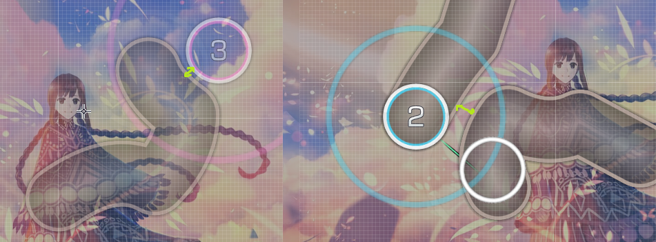
Your M4M~Modding time00:19:375 (1,2) - Fix the blanket, also cool sliderarts bro. fixed (also I don't think i'm a sliderart pro, but thanks!)
01:10:937 (2,1) - Would add a little distance here, because the sound is so different. fixed
01:23:125 (2,4) - Played these back with 25% speed and sounds like offset is off by around -2ms or -4ms fixed
01:58:125 (4) - NC Or replace with Slider? nah
02:13:125 (3,4) - Would replace these with a slider, or make the previous slider longer to cover this, or have nothing there at all. nah
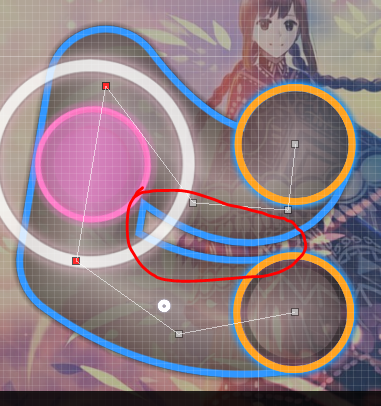
02:13:125 (3,4) - Overlap. fixed
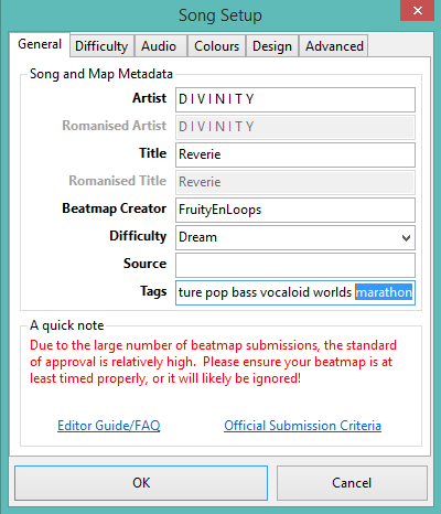
Sidenote: Consider adding "Marathon" to your songs tags. fixed
02:55:625 (2) - Blanket? fixed
03:28:125 (4,1) - Overlap again. fixed
03:46:250 (1) - 03:56:250 (1) - I think it's a shame nothing is on the white tick here. i've been using this pattern the whole song so nah
04:31:250 (2,1) - Almost overlap, still aesthetically could look better fixed.
Nice map and nice song man! Couldn't find much (maybe it's quz it has 30+ SP >.<) but hope this helps! It did!
Just a tip, gyazo is really slow and uses a lot of bandwidth ; you should use imgur instead (download ShareX, there's an integration for imgur)
