forum

Minimal (All modes, HD/SD)

posted
Total Posts
149
Topic Starter
Geroyuni

Minimal gets its name from looking like a pretty clean minimal skin compared to your usual osu! skin. It also gets that name because I’m not good at naming things. This skin is made to work out of the box, regardless of your screen size, while still improving on osu!'s general UI look. You can however tweak some of the skin for your liking below.

Main stuff:
Customization
Download (ZIP, 850KB)
All of the types listed below are available in this zip file.

General:
-Cursor colors: 8 choices, PSD provided (preview)
-Stable fallback fix

osu!standard:
-Followpoint (preview)
-Disabled fading when hitting circles (preview)
-Playfield border (preview)
-Numbered hitcircles (doesn't match my vision of the skin IMO but use if you can't live without numbers)

osu!mania:
-Note and key colors: 8 choices, PSD provided (preview)
-Centered play area

osu!taiko:
-Visible slider tick

Changelog
Minimal 1.4 Final - Update changelog
This final update contains some small changes to wrap things up. As I barely dedicate my time to playing this game anymore, and also as osu!lazer comes closer and closer to completion, I feel that it's about time to call it a day. Thanks for using my skin, it was a lot of fun to make it and I learned quite a bit from it.

Post-final changes of 1/19/19:
-Lossless size reduction (4.73MB to 3.85MB)
-Added ranking-perfect which I wish I had added in the true final

General changes:
-Removed yellow section in mode button with skin information (not made to be a permanent thing, only as a mild nudge for people to check the forum for updates while the skin wasn't completed)
-Reduced skin size considerably without quality loss (from 12MB to 6MB, extracted)
-Added very slight variation to background of the 'song cards'
-There might be other changes I made in the past and forgot

osu!standard:
-Slightly decreased slider outline's brightness to not mix with hitcircle's outline as much
-Slider ball is now colored by combo color (can be turned off in skin section of osu!'s settings if you want)
-Reduced slider ball's size to go along with the change above
-Changed default combo colors (had no idea so many people kept the default ones, I highly recommend enabling the custom ones from each map for more variety)


Versions history

Versions:
03/01/17: 1.0 release
04/18/17: 1.1 update (~50 file changes)
05/24/17: 1.2 update (~25 file changes)
08/09/17: 1.3 minor update (~8 file changes)
05/26/18: Final (~8 file changes)
01/19/19: Post-final minor update

Customizations:
03/03/17: Added Disabled fading when hitting hitcircles
03/03/17: Added Slider tick
04/08/17: Added Numbered hitcircles
06/10/17: Added Followpoints
06/10/17: Added WIP Stable fallback fix
06/22/17: Updated Numbered hitcircles
06/27/17: Added Playfield border (16:9, 16:10, 21:9)
06/27/17: Added Cursor colors
08/09/17: Added mania note colors
08/09/17: Added mania key colors
06/02/18: Fixed some issues with customization zip
08/07/18: Reorganized zip file
08/11/18: Further minor reorganization changes to zip file
08/15/18: Added mania centered play area
01/19/19: Minor changes and lossless size reduction (1.46MB to 851KB)

License
Everything I made is provided under CC0, so go ham and do whatever! Credit is optional but appreciated. Sound files by unknown creator.

Note for publishing skins with these assets: This license won't stop your skin from getting removed from websites that demand only original skins be posted. Make sure to check this subforum's skinning rules or whatever site's rules you plan to publish your skin on.


Screenshots:
osu!standard
(note: screenshots were taken with 'Ignore all beatmap skins' turned off, which enables the custom combo colors from each map for more variety. I highly recommend that you do so as well and disable in a per map basis if they use other skin assets)
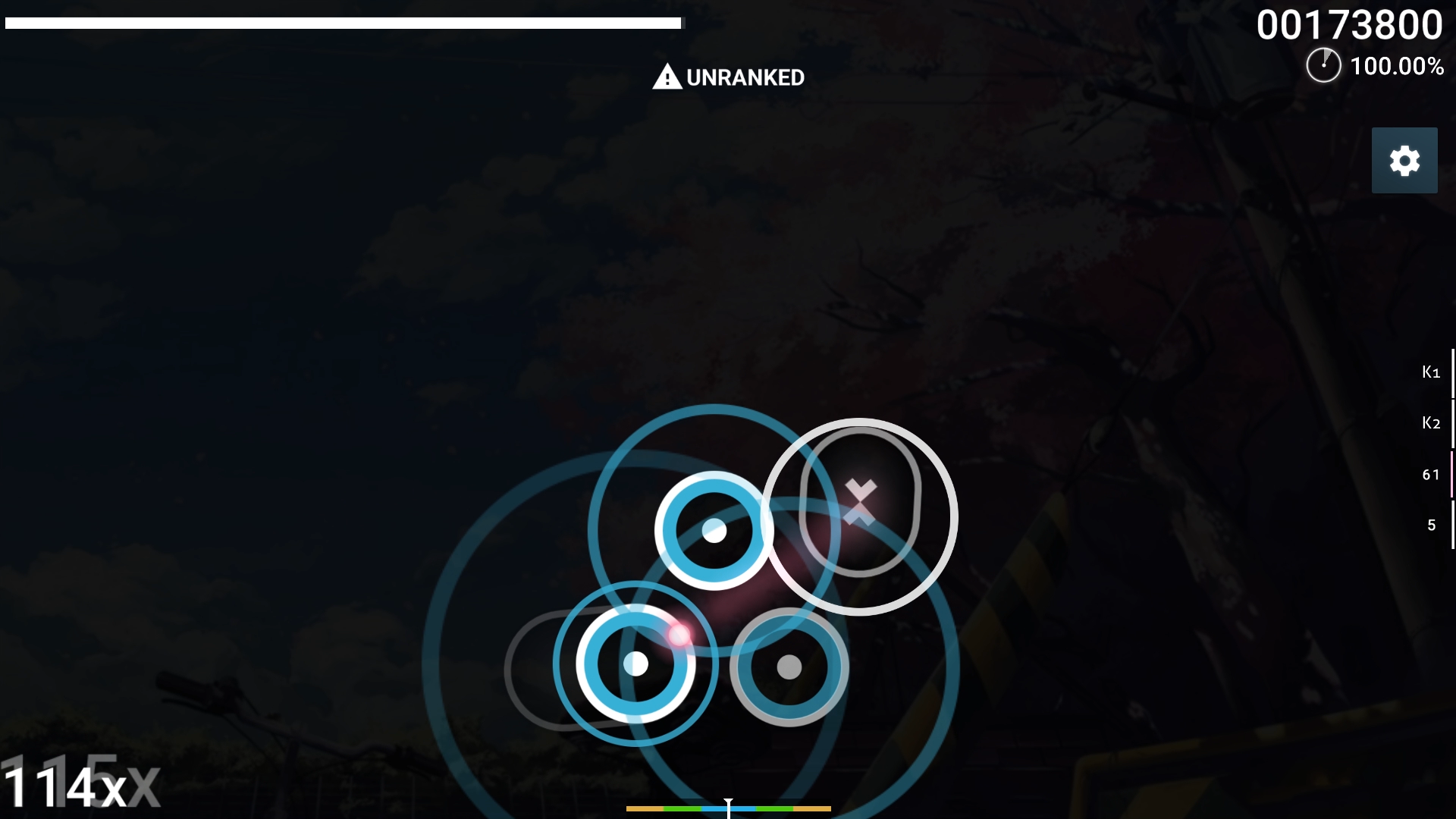
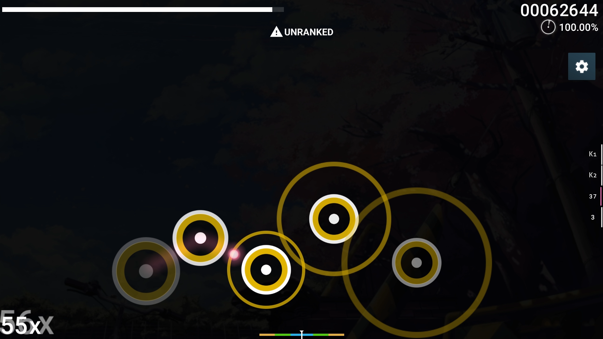
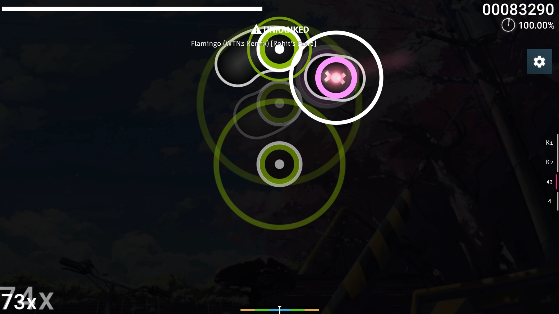
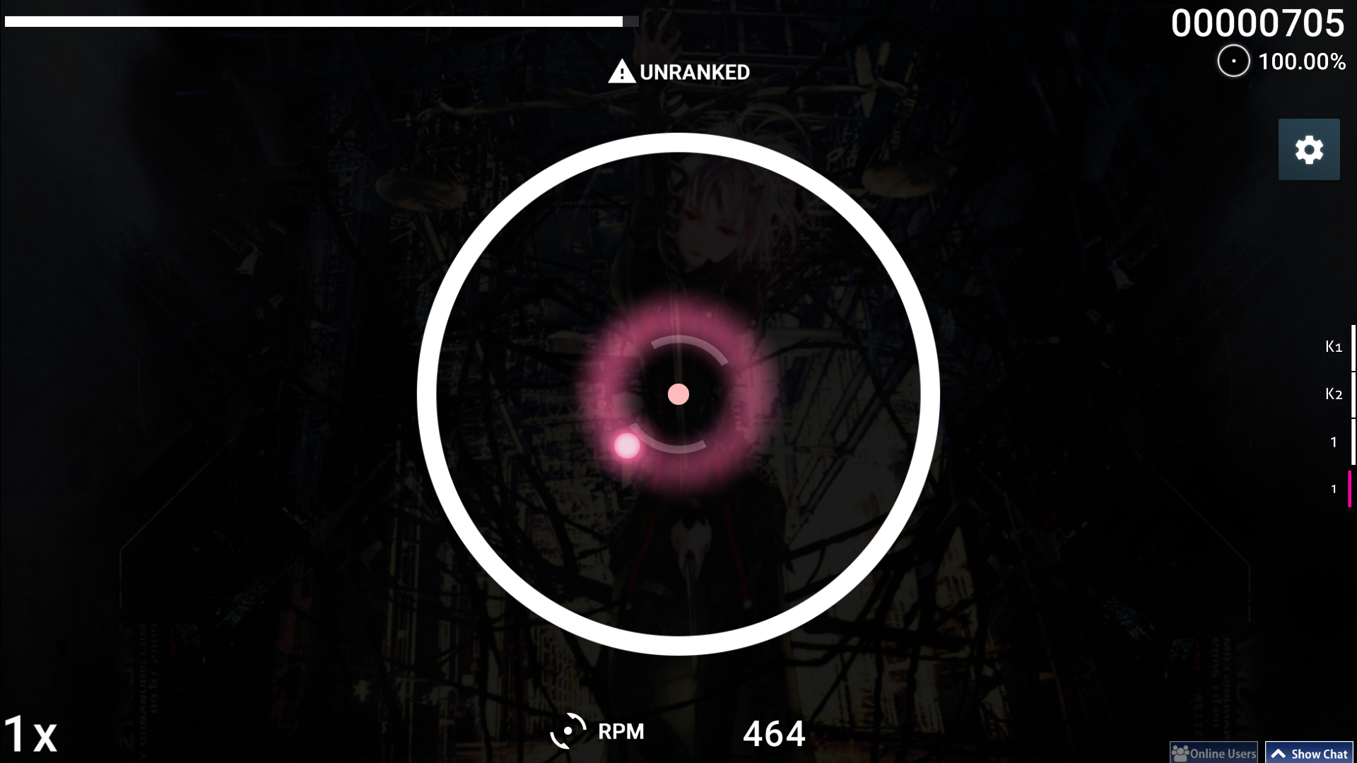


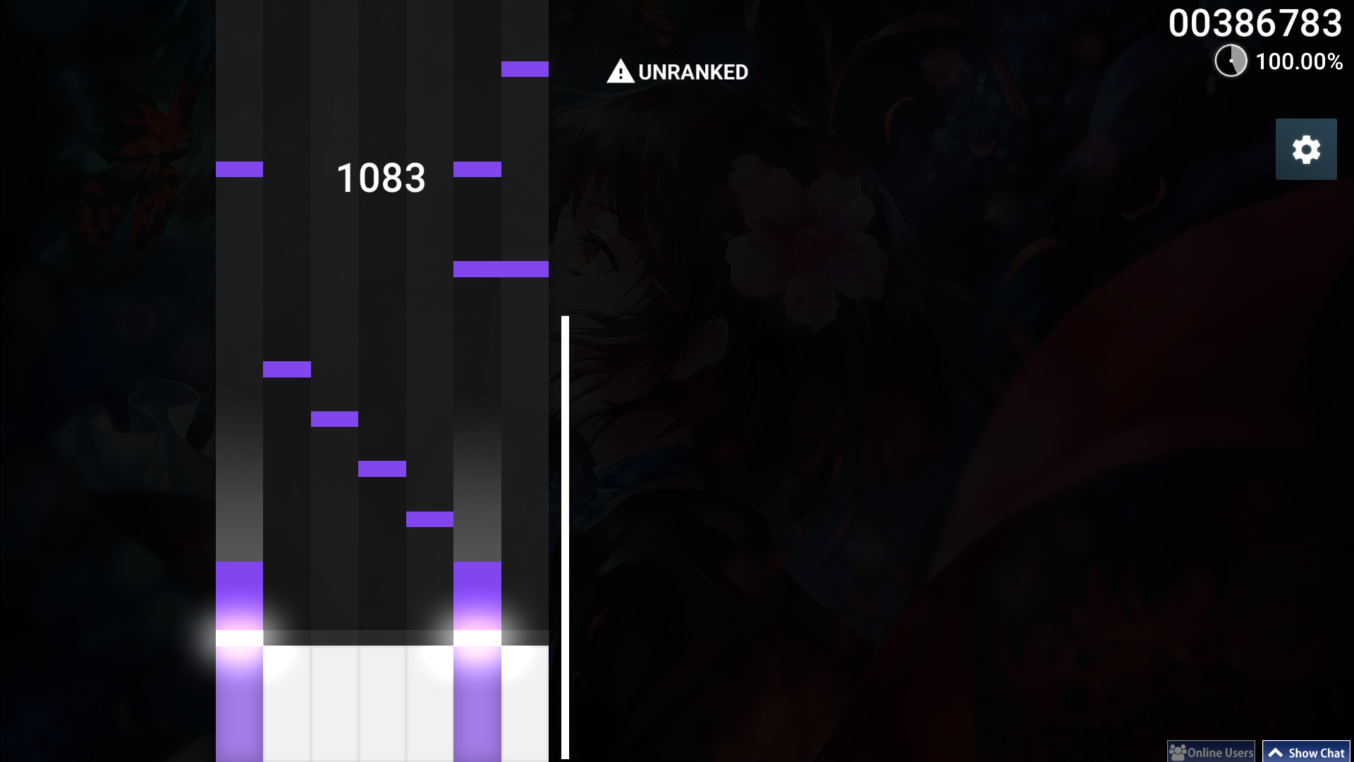
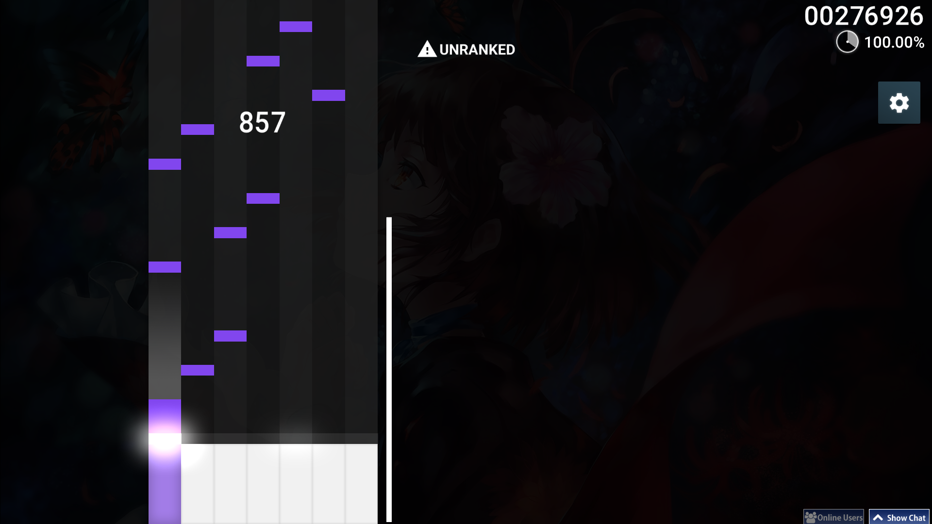
osu!mania
(note: if you want another color for the notes and key, check out the customization section in the top of the thread for 8 other color choices)


Azuren
The download link isn't working, wrong link :?
Other than that looks pretty clean, looking foward to testing it
Topic Starter
Geroyuni
Uh weird. It's fixed now
[ Fix3d ]
I really like the skin! Great job! But I would like to disable the fading effect of the hitcircles when click them, there's a way to do it?
Topic Starter
Geroyuni

[ Fix3d ] wrote:

I would like to disable the fading effect of the hitcircles when click them, there's a way to do it?


Yes, but unfortunately can't be done without also getting rid of combo colors. If you want it anyways, get this file, unpack it and paste the files on the skin's folder.

To keep the approach circle with that one color, you'll need to go to enable the ingame option "Ignore all beatmap skins", and change in skin.ini Combo1 to "73,193,172". Also, under [Fonts] in skin.ini, add the line "HitCircleOverlap: 150" to prevent double circles when it reaches double number digits (quick edit I forgot that)

I also included a .psd and a .py file for color customization. You can find more information in the info.txt file.

Edit: I'll keep that file in the main post under the customization box too
[ Fix3d ]

Geroyuni wrote:

Yes, but unfortunately can't be done without also getting rid of combo colors. If you want it anyways, get this file, unpack it and paste the files on the skin's folder.

To keep the approach circle with that one color, you'll need to go to enable the ingame option "Ignore all beatmap skins", and change in skin.ini Combo1 to "73,193,172". Also, under [Fonts] in skin.ini, add the line "HitCircleOverlap: 150" to prevent double circles when it reaches double number digits.
I did it and works perfectly, thank you so much!
Shino Inuzuka
100% made by you, but mode buttons are from osu skinner?
Topic Starter
Geroyuni

Shino Inuzuka wrote:

100% made by you, but mode buttons are from osu skinner?


Nah, mode buttons were also made by me. They're inspired from a skin made by a user called Ruk.
Shino Inuzuka
Osu skinner
Topic Starter
Geroyuni

Shino Inuzuka wrote:

Osu skinner

Oh, that's just osu's design on the icons. You can see that in new.ppy.sh (beatmap listing) or even in flyte's next.ppy.sh project. That's how the icons are supposed to look for the modes in the redesign of osu. I remade all of the icons in Photoshop for use in the skin.
DeletedUser_7932812
Nice! I'll be using it for a while.
nyathil
my man gero made an entire skin. noice
Did
Really well made skin, looks very clean. The only thing I don't like is how every column in mania is the same color.

I don't play mania that often so i'm not sure if this is a problem for high rank players.
Topic Starter
Geroyuni

Did wrote:

Really well made skin, looks very clean. The only thing I don't like is how every column in mania is the same color.
I don't play mania that often so i'm not sure if this is a problem for high rank players.


Yea I'm not sure either if high rank players have a problem with that, so had I decided to keep it one color for now and change it if someone reported that different colors were actually important for gameplay. I'll start trying out some stuff and maybe different colors will be in the next update
Etherious
Really impressive job, perfect in all aspects...sooo...IT'S FUCKING AMAZING SADOII91230412934I0219IASCKJDLKASJD09123K1LKMLKXZCMLMC

yaaaaaaaaaaay ECKS DEE
Alsatorec
my only complaint is how small the reverse arrow is, other than that i say excellent work!
Topic Starter
Geroyuni

champion64 wrote:

my only complaint is how small the reverse arrow is, other than that i say excellent work!


Thanks for the feedback.
SakuraMotion
I really love this skin! However, I was wondering if you could possibly make a version with numbers instead of white dots in the middle?
Topic Starter
Geroyuni

NepsterNep wrote:

I really love this skin! However, I was wondering if you could possibly make a version with numbers instead of white dots in the middle?


To be honest, it doesn't really go with the style of the skin in my view, but I'll make it available in the customization box. I'll add it along with the release of the next version, which should be out soon.
SakuraMotion

Geroyuni wrote:

NepsterNep wrote:

I really love this skin! However, I was wondering if you could possibly make a version with numbers instead of white dots in the middle?
To be honest, it doesn't really go with the style of the skin in my view, but I'll make it available in the customization box. I'll add it along with the release of the next version, which should be out soon.
Thank you!
Topic Starter
Geroyuni
Just released the 1.1 update, changelog available in the main post as well as the download link.
mocaccino
I don't normally use minimalistic skins, but damn, this skin it's great
Even when the theme is over-used, you got the exact point of minimalistic, the ranking panel is lovely and score numbers too.
Nice skin!
AirmanNeko
Could you have a pure .osk link? I cant download .zip
Topic Starter
Geroyuni

AirmanNeko wrote:

Could you have a pure .osk link? I cant download .zip

That is a .osk file, straight up from the "Export as .osk" button ingame
Topic Starter
Geroyuni
Released the 1.2 update. Changelog and download available in the main post.
tomokias_
One problem, on Stable (fallback) the ends of the sliders are the same as the hitcircles, and it makes the reverse arrows almost non-visible. also its hard playing with it on Hidden. other then that, great skin!
Topic Starter
Geroyuni

tomokias_ wrote:

One problem, on Stable (fallback) the ends of the sliders are the same as the hitcircles, and it makes the reverse arrows almost non-visible. also its hard playing with it on Hidden. other then that, great skin!


Thanks for pointing that out, I never played on stable fallback. I went to test it, and it's severely out of date for a "stable fallback" version. It seems to not have been updated since 2015 aside from bug fixes, so it lacks support for sliderendcircle.png (which allows for me to just completely remove the slider end circle).

The version also lacks support for scoreentry-%s.png (used in key overlay and ingame scoreboard), has some weird alignment/size/placement issues and lacks support for newer skin.ini customizations (breaks osu!mania with this skin).

Sliders in stable fallback behave very weirdly as well, the entire body + both hitcircles stay visible until the slider is finished, while in stable latest everything starts fading out before you even start using the slider.

If you plan to keep using stable fallback, here's the fix for the whole slider end thing (late edit for other users seeing: this is provided in the first post's customization ZIP). It's not exactly what it's supposed to look like (here's a comparison between latest / fallback fix) but it's the best that can be done. I'll be making further fixes and optimizations for fallback in the future.
h3oCharles
oh geez, I'm in need of follow points
Topic Starter
Geroyuni

h3oCharles wrote:

oh geez, I'm in need of follow points


How about this? I personally don't use follow points at all, so I'd like to hear what you think.
h3oCharles

Geroyuni wrote:

h3oCharles wrote:

oh geez, I'm in need of follow points
How about this? I personally don't use follow points at all, so I'd like to hear what you think.
I like it, you can add them to Customization
Topic Starter
Geroyuni
Followpoints and WIP stable fallback fix added into customizations in main post, mania mode will be fixed later (stable fallback version). Depending on what's causing it, I can just eliminate the need to download a customization and have it all work in the main download.
tomokias_

Geroyuni wrote:

tomokias_ wrote:

One problem, on Stable (fallback) the ends of the sliders are the same as the hitcircles, and it makes the reverse arrows almost non-visible. also its hard playing with it on Hidden. other then that, great skin!
Thanks for pointing that out, I never played on stable fallback. I went to test it, and it's severely out of date for a "stable fallback" version. It seems to not have been updated since 2015 aside from bug fixes, so it lacks support for sliderendcircle.png (which allows for me to just completely remove the slider end circle).

The version also lacks support for scoreentry-%s.png (used in key overlay and ingame scoreboard), has some weird alignment/size/placement issues and lacks support for newer skin.ini customizations (breaks osu!mania with this skin).

Sliders in stable fallback behave very weirdly as well, the entire body + both hitcircles stay visible until the slider is finished, while in stable latest everything starts fading out before you even start using the slider.

If you plan to keep using stable fallback, here's the fix for the whole slider end thing. It's not exactly what it's supposed to look like (here's a comparison between latest / fallback fix) but it's the best that can be done. I'll be making further fixes and optimizations for fallback in the future.
Thank you so much!
Topic Starter
Geroyuni

tomokias_ wrote:

Thank you so much!

No problem, let me know if you find any other issues
Topic Starter
Geroyuni
Updated the thread a little bit. Numbered hitcircles customization has been updated and there's now a link for all the customization files in a ZIP file instead of making the user download multiple ZIP files for mixing customizations.

I'm working on expanding the list of customizations now, if any of you have a suggestion feel free to post it (no promises if I'm adding it though).
h3oCharles
scorebar with playfield box/lines, more reverse arrows (ring, semiring, circle with arrow, full arrow, etc), pass/fail, good/bad, bigger follow circ

and wuts the font used?
Topic Starter
Geroyuni

h3oCharles wrote:

scorebar with playfield box/lines, more reverse arrows (ring, semiring, circle with arrow, full arrow, etc), pass/fail, good/bad, bigger follow circ
and wuts the font used?


Playfield seems like an interesting one, I'll try some things out and add it later.
The font is Roboto.
softhusky
oh...

it's another roboto skin...


it's better than the BRAND NEW MINIMALIST PACKED SKIN I'M WORKING ON! though
Topic Starter
Geroyuni
Added the customizations Playfield (16:9, 16:10, 21:9 ratios) and Cursor colors (8 choices) - Made changes to customization section that I'm too lazy to talk about

I was thinking about making further updates to the skin itself, but it's getting clearer and clearer that I don't really have anything else left to do. The next update will possibly be the final update, and I will then move onto doing something else. Thanks everyone for all the feedback and support.
ricochet890

How about designing icons for song selection buttons like above? I feel the current ones are a little bit bland.

Overall your skin is solid, I love it.
johnmedina999
I noticed that both mania-hit300-0.png and mania-hit300g-0.png are transparent and aren't visible. Is this intentional?
autoteleology
Man, have you seen this review that was written about your skin on this big skinning channel?

https://www.youtube.com/watch?v=rdyNoZlVceA

What the hell? In context to the ratings that many other skins receive on this channel I felt that this was brutally unfair and borderline ridiculous. Disregarding my own opinion on your skin, the fact that they would give you a 1 (a rating which I have only seen on one other skin which was an absolute wreck in every area) despite not being able to point out any substantial/objective flaws was, in my opinion, very thoughtless and disrespectful. If they want to trash your skin like that they should at least be able to support that ranking with some kind of comprehensive objection.

As a fellow skinner who shares a similar style to you, I kind of felt like this sort of blatant bias against minimal skins was by proxy an attack on me, and therefore irritating enough to write a pretty scathing comment on their channel. I understand that all the same their review is still beneficial to you as it it's free advertising to a relatively large audience, but damn it got under my "skin".

Asses on blast
This review's scoring methodology is so utterly preposterous it borders on insulting. One star/two stars for something that you can't even illustrate a single strong objective flaw about is absurd, and completely devalues what the impact of getting one star is supposed to represent in the scale - a complete failure. This is supposed to be comparable to something that is totally broken? I feel as though you really just decided to compromise the system and sandbag all the other element points just so you could give the gameplay a 5 and the skin overall a 3 so you wouldn't have to endorse something you subjectively dislike. The fact that you had to cop out that scores of the same value aren't comparable to each other just exemplifies how arbitrary and meaningless your numbers are. If the numbers aren't comparable then why are you putting them into numbers in the first place? Isn't the whole point of numerical ratings to simplify and objectify the complex and subjective for easy comparison to other things?

I usually like your reviews and I am a subscriber but you 100% dropped the ball here. This is not about your opinion on the skin, which is irrelevant. It is about your total failure to justify the numbers you provide through your words in the review. If all you can offer in the place of damning criticism is a flaccid meh, how have you justified giving your lowest score?
johnmedina999
^I also like how this is an all-modes skin but failed to review any other mode. The skin is nice and clean in all its aspects, really.
Topic Starter
Geroyuni

ricochet890 wrote:

https://imgur-archive.ppy.sh/kdIZo42.png
How about designing icons for song selection buttons like above? I feel the current ones are a little bit bland.

Overall your skin is solid, I love it.
I may have tried out something like that before, not sure what happened that made me abandon the idea. I'll try out a few things later, thanks for the suggestion.


johnmedina999 wrote:

I noticed that both mania-hit300-0.png and mania-hit300g-0.png are transparent and aren't visible. Is this intentional?
Yes, I did something similar with osu!standard which I thought would also have worked with osu!mania. The thought process is that there's no need to display anything if you're doing just fine (getting 300s). I only have doubts if pro mania players would find it necessary to display 300 while still keeping 300g invisible, or the other way around. Considering that getting either one still keeps you at 100% accuracy, I decided to keep both invisible until I got feedback that told me it's better to do otherwise. I rarely get anyone talking about modes that aren't osu!standard though.


Philosofikal wrote:

Man, have you seen this review that was written about your skin on this big skinning channel?
https://www.youtube.com/watch?v=rdyNoZlVceA
What the hell? In context to the ratings that many other skins receive on this channel I felt that this was brutally unfair and borderline ridiculous. Disregarding my own opinion on your skin, the fact that they would give you a 1 (a rating which I have only seen on one other skin which was an absolute wreck in every area) despite not being able to point out any substantial/objective flaws was, in my opinion, very thoughtless and disrespectful. If they want to trash your skin like that they should at least be able to support that ranking with some kind of comprehensive objection.
As a fellow skinner who shares a similar style to you, I kind of felt like this sort of blatant bias against minimal skins was by proxy an attack on me, and therefore irritating enough to write a pretty scathing comment on their channel. I understand that all the same their review is still beneficial to you as it it's free advertising to a relatively large audience, but damn it got under my "skin".
Asses on blast
This review's scoring methodology is so utterly preposterous it borders on insulting. One star/two stars for something that you can't even illustrate a single strong objective flaw about is absurd, and completely devalues what the impact of getting one star is supposed to represent in the scale - a complete failure. This is supposed to be comparable to something that is totally broken? I feel as though you really just decided to compromise the system and sandbag all the other element points just so you could give the gameplay a 5 and the skin overall a 3 so you wouldn't have to endorse something you subjectively dislike. The fact that you had to cop out that scores of the same value aren't comparable to each other just exemplifies how arbitrary and meaningless your numbers are. If the numbers aren't comparable then why are you putting them into numbers in the first place? Isn't the whole point of numerical ratings to simplify and objectify the complex and subjective for easy comparison to other things?
I usually like your reviews and I am a subscriber but you 100% dropped the ball here. This is not about your opinion on the skin, which is irrelevant. It is about your total failure to justify the numbers you provide through your words in the review. If all you can offer in the place of damning criticism is a flaccid meh, how have you justified giving your lowest score?
I have seen it. I do remember talking to the reviewer but I didn't really get his point, I'm not sure what I thought but I ended up deciding to just deal with it and move on.

I do agree with you and I think that the review is quite an insult, considering that this skin gets called "low effort" while other skins with clear misalignments and poor font/color choices don't even get called out on it and get high ratings. After that I just chose to stop taking the channel seriously, as if the previous reviews from other skins weren't enough.

They either fail to notice problems that are usually glaringly obvious to a graphic designer or fail to praise the skins when it does things correctly - they seem to rely mostly on a "this is just my opinion" rather than also having a good amount of objective explanations as to why something looks good or bad.


johnmedina999 wrote:

^I also like how this is an all-modes skin but failed to review any other mode. The skin is nice and clean in all its aspects, really.
I found that weird as well. Instead of waiting for reviewers that played the other modes, they only talked about standard. Apparently someone else submited the skin to be reviewed in their website, they keep a list with the submited skins in there and I saw that the person did ask to have all the 4 modes be reviewed. I also find it weird that they would review the skin without asking the creator or waiting for the final version of the skin.
johnmedina999

Geroyuni wrote:

Yes, I did something similar with osu!standard which I thought would also have worked with osu!mania. The thought process is that there's no need to display anything if you're doing just fine (getting 300s). I only have doubts if pro mania players would find it necessary to display 300 while still keeping 300g invisible, or the other way around. Considering that getting either one still keeps you at 100% accuracy, I decided to keep both invisible until I got feedback that told me it's better to do otherwise. I rarely get anyone talking about modes that aren't osu!standard though.
Well, personally I find it important to see whether I'm getting 300 or 300g repeatedly so if I'm not getting 300g I can do my best to correct my timing; however, it's really hard to do that if there is no distinction between the two. They do both give 100% accuracy, but not the same score, which is also important. Also, in the future, Score v2 will roll out, and they won't both give 100% accuracy anymore. Having a distinction is really important in mania, I find.

Everything else is great, though!
Topic Starter
Geroyuni

johnmedina999 wrote:

Well, personally I find it important to see whether I'm getting 300 or 300g repeatedly so if I'm not getting 300g I can do my best to correct my timing; however, it's really hard to do that if there is no distinction between the two. They do both give 100% accuracy, but not the same score, which is also important. Also, in the future, Score v2 will roll out, and they won't both give 100% accuracy anymore. Having a distinction is really important in mania, I find.
Everything else is great, though!
I see, I'll add that on my to-do list then. Thanks for the feedback.
epsilon

Geroyuni wrote:

Did wrote:

Really well made skin, looks very clean. The only thing I don't like is how every column in mania is the same color.
I don't play mania that often so i'm not sure if this is a problem for high rank players.
Yea I'm not sure either if high rank players have a problem with that, so had I decided to keep it one color for now and change it if someone reported that different colors were actually important for gameplay. I'll start trying out some stuff and maybe different colors will be in the next update
I think it would be great to have different colours for mania. Perhaps add a customisation which lists good colours to use for each column that match the skin.
username298_old
Would love a version with numbers!
johnmedina999

username298 wrote:

Would love a version with numbers!
There are already numbers, I believe. They're in the customization folder.
Topic Starter
Geroyuni

eps0003 wrote:

I think it would be great to have different colours for mania. Perhaps add a customisation which lists good colours to use for each column that match the skin.

Will add to my to-do list, may take quite a while to add that one.
epsilon
In multiplayer, the accuracy symbols which pop up for everyone on the scoreboard uses the symbols from the results screen. I'm not sure if there's a way to sprite these differently.
show more
Please sign in to reply.

New reply