Gokateigo
[quote="Gokateigo"]Hello from Carpal tunnel q o/
[box=mod]
[box=mod]
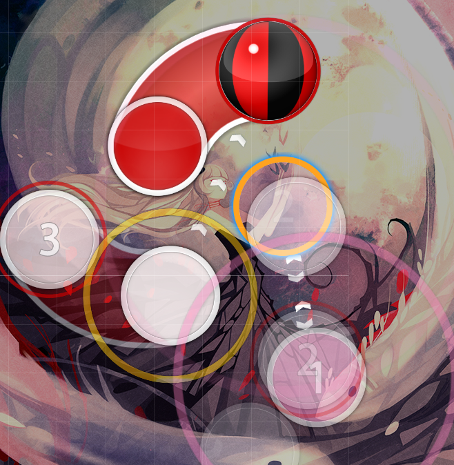
- 00:10:354 (1,2,3) - This angle isn't comfortable to play, it can be better tried to fix
- 00:13:354 (7,8,9) - Why the 7 and the 9 are overlapped ? the other jumps of this part aren't overlapped i think the sound calls for it here
- 00:13:640 (9,1) - The angle is hard to aim at this speed, make it sharper no testplayers have really ever had trouble with this angle particularly, i think its allright
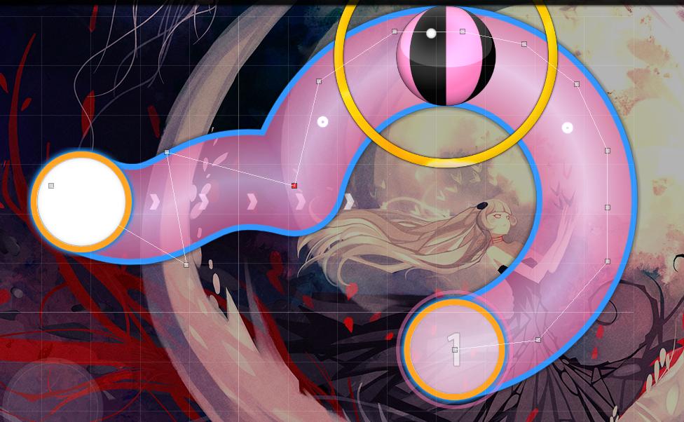
- 00:17:211 (1,2,3,4,5,6,7,8,1,2,3,4,5,6,7,8) - This stream isn't good, it's the same sound but the spacing change...what its totally a different sound here 00:17:783 (1,2) - the guitar starts here which I think is best represented by lower spacing (the guitar sounds very condensed, so the circles should be condensed imo)
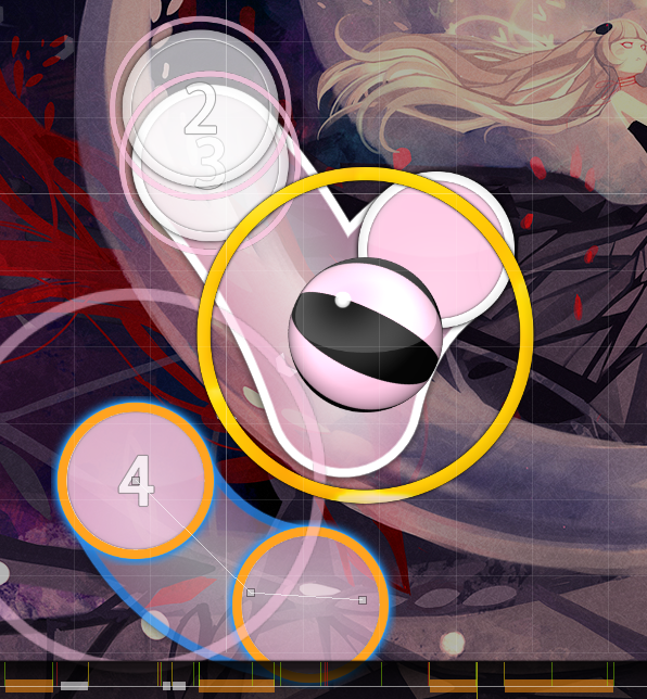
- 00:40:069 (1,2,3,4,5,6,7,8) - The spacing/ placement is little bit too much, it's the beggining of the map and the jumps are hard af ive already established this kind of spacing earlier in the map
 but I think you're actually right, the spacing is kind of really inconsistent with the other patterns I put in this section, so fixed!
 - 01:01:783 (1,2,3,4,5,1,2,3,4) - Don't map hte vocals in songs like this, the intsruments are more important debatable to be honest, i personally view ICDD's vocals as the most important part of their music, it separates them from other metal groups.
- 01:27:497 (1,2,3,4) - Spacing is too much here i dont think so when compared to the rest of the section here, his vocals are very fast and high pitched and the instruments back them too
- 01:53:926 (2,3) - ^ i dont think so, this is a climax in the first two minutes before the guitar section, I think it fits rly well
- 03:23:069 (1) - You can map something after this I could, but the spinner covers the fading out vocal and I don't think players should jump right into the slow section without getting a feel for the bpm (by the break) and also.. like.. its a 210bpm song theres gotta be a break somewhere lol
- 04:02:702 (1) - ^ the break does more justice for the song than mapping it would, for tensity's sake
- 04:11:844 (1) - Don't use long buzzsliders here, it's a insane part + kiai deathstreams are so much better here it fits with the music + makes it still playable lol, I like the sliders there
- 05:09:143 (7,8,9,1,2,3,4,5) - this looks bad thats ok its an ugly song at parts
tyvm!
 the song and map are pretty hardcore so ignoring beats like this is kinda off for me. What's more is there's a stronger beat on the end of the slider than the start which putting a triple on would fix. (guitar and drum both spike on white)