forum

Flat Surroundings [SD/HD] [STD, Taiko]

posted
Total Posts
21
Topic Starter
Haskorion


(click the images to download the skins)
__________________________________________________________________________________________


(doubleclick and osu! will extract automatically)


(for those having problems with .osk-files)


Dark Theme
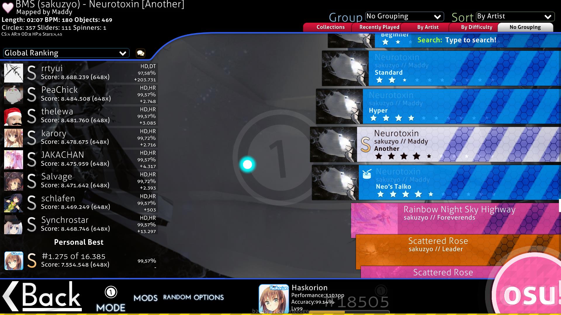
Song Select
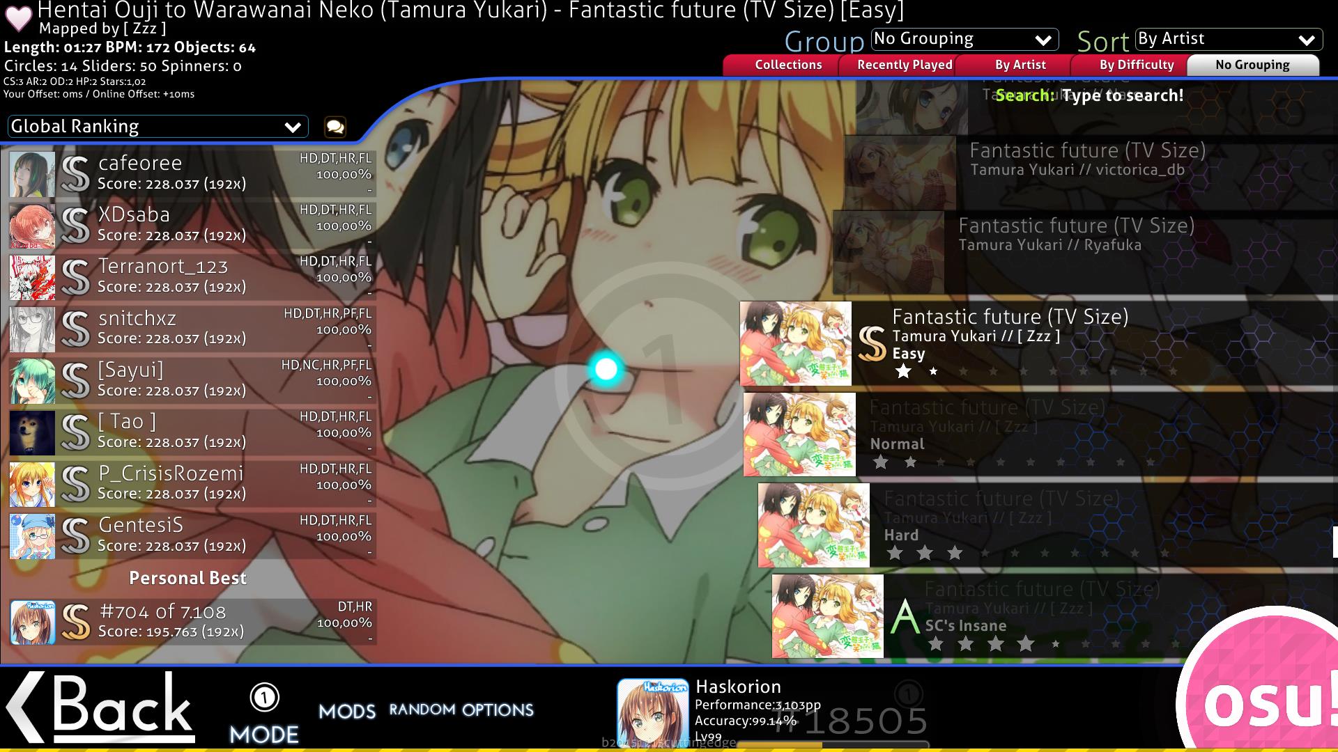

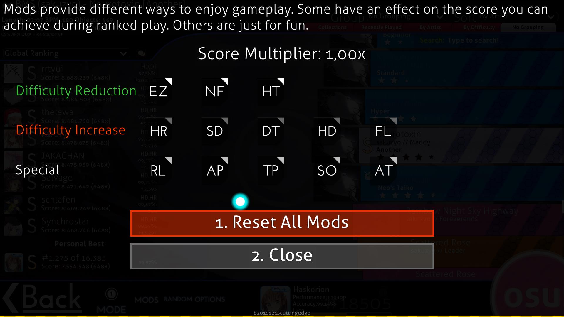
Mods
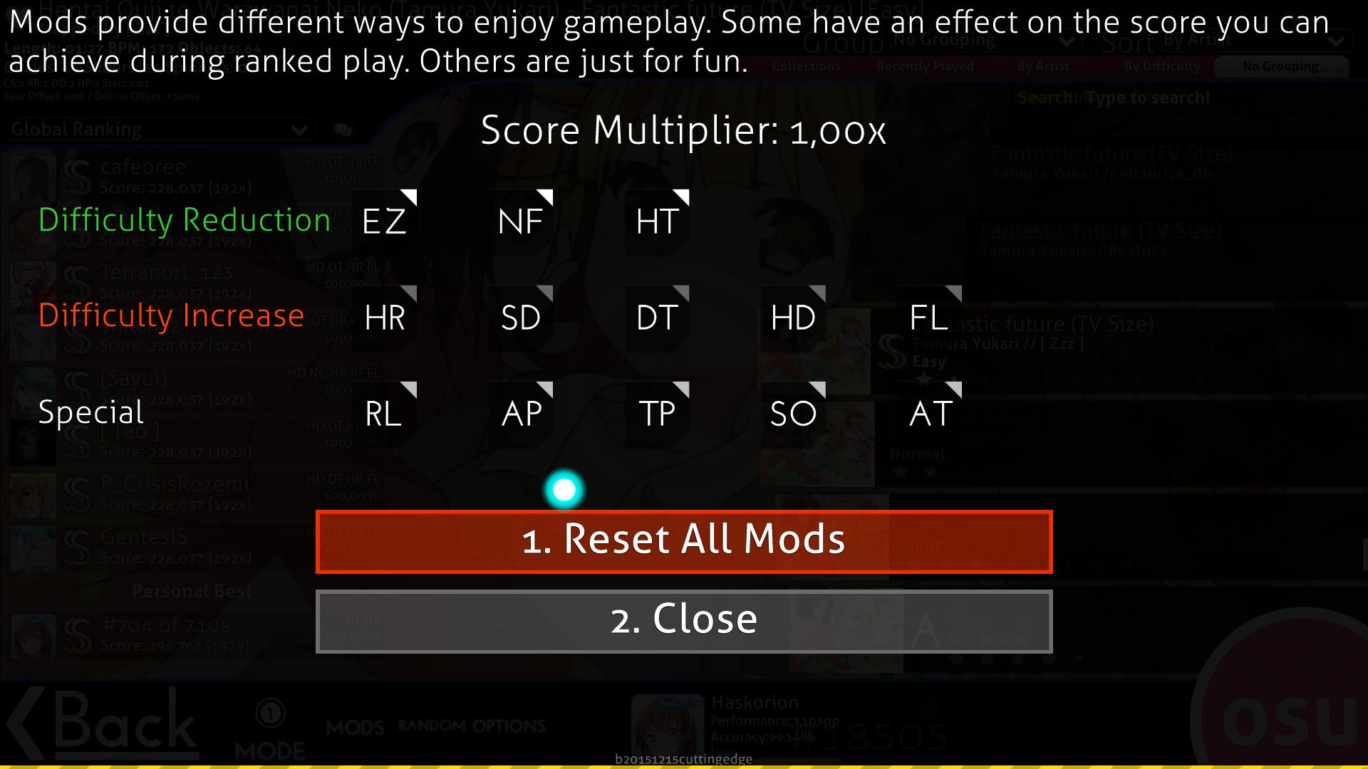

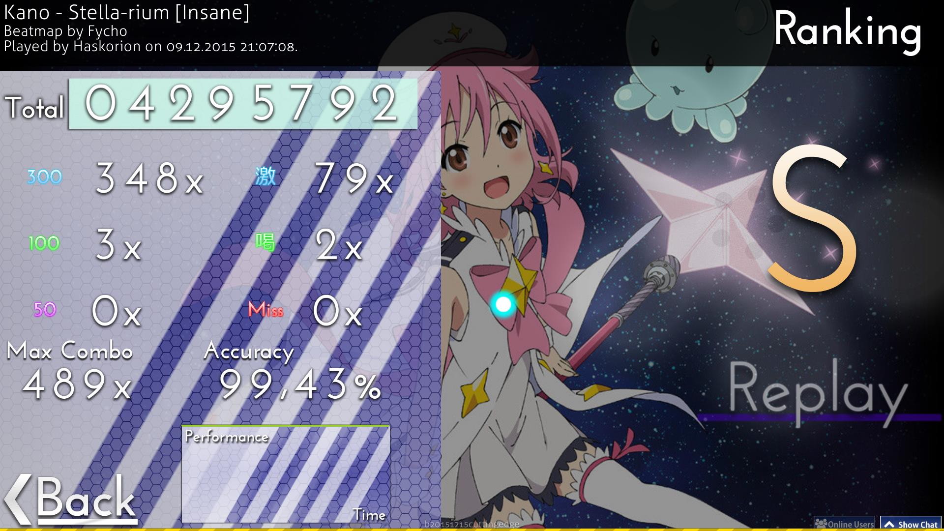
Result screen
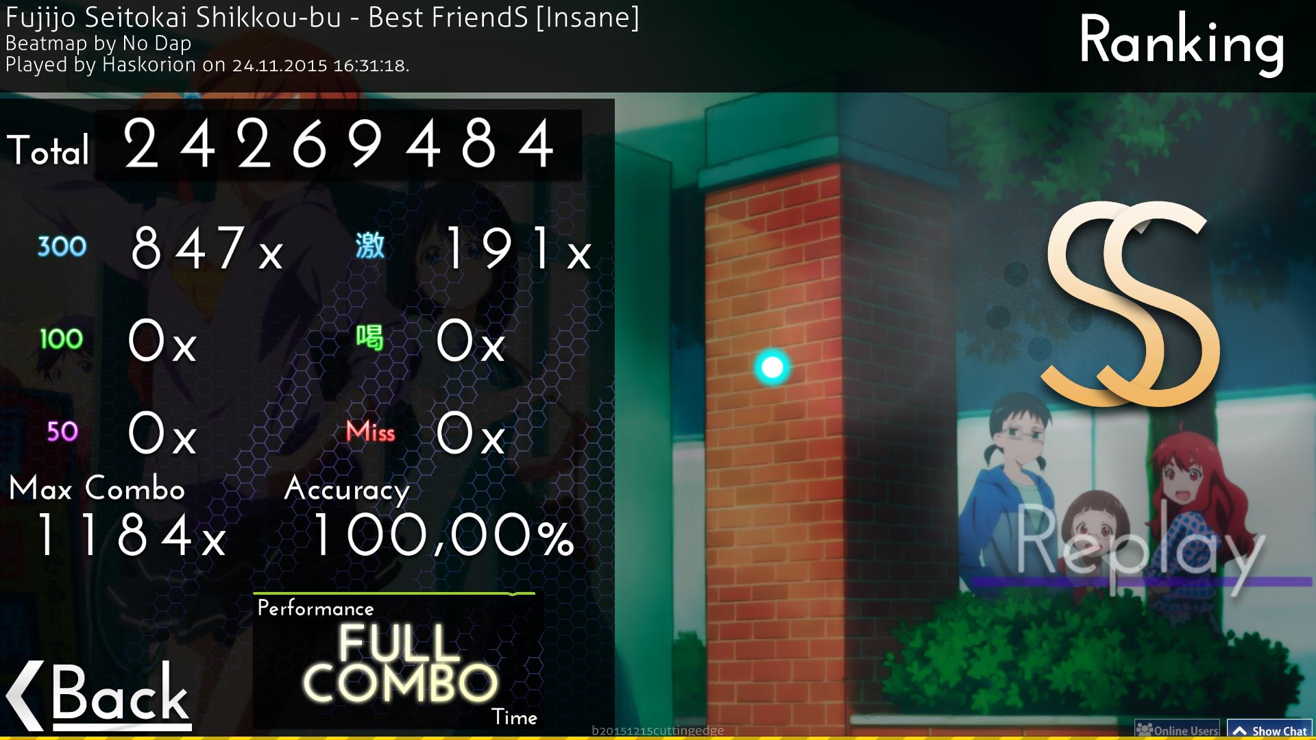

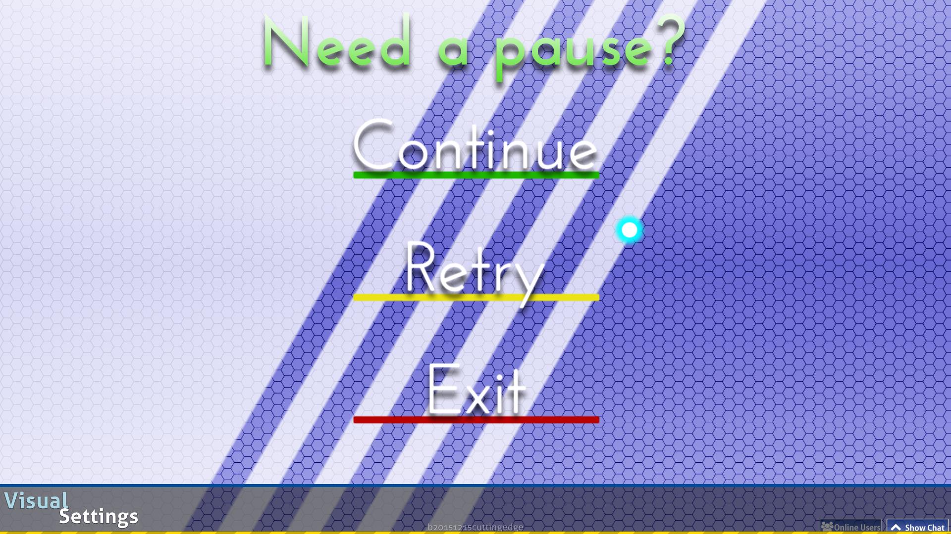
Pause screen
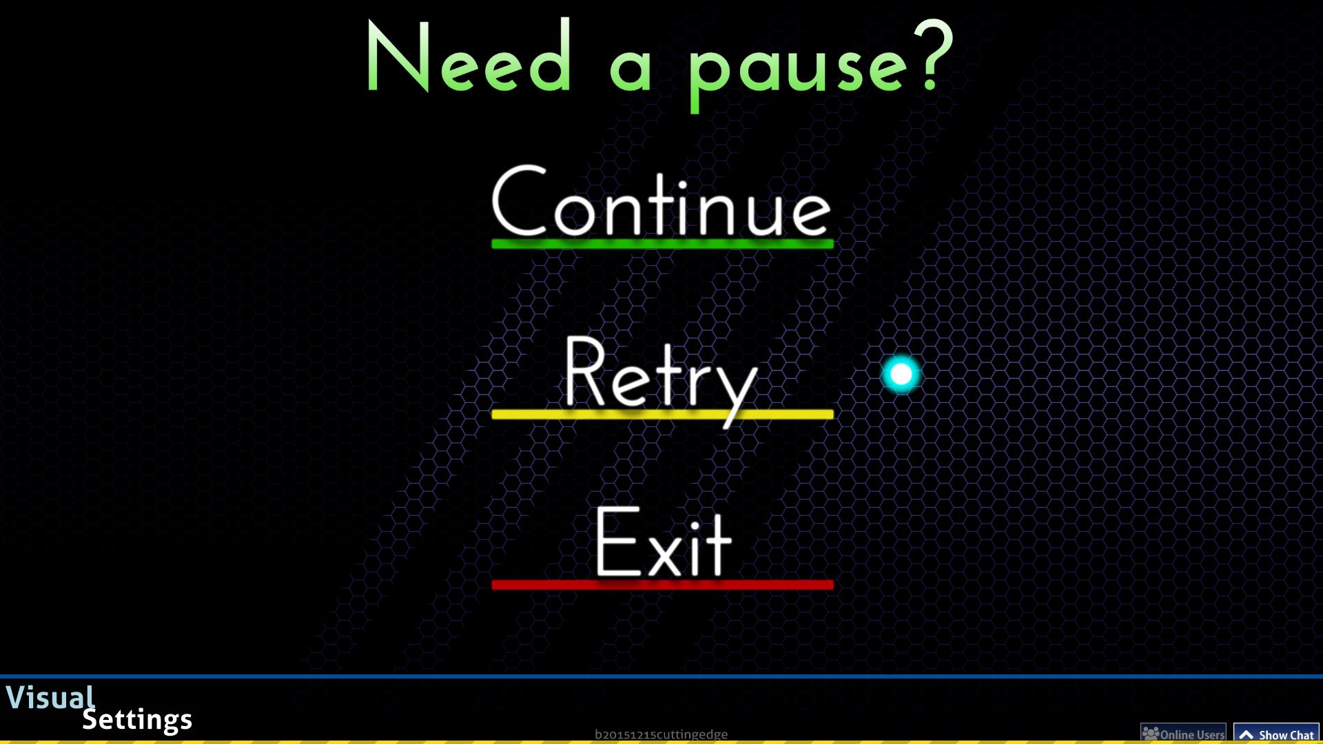

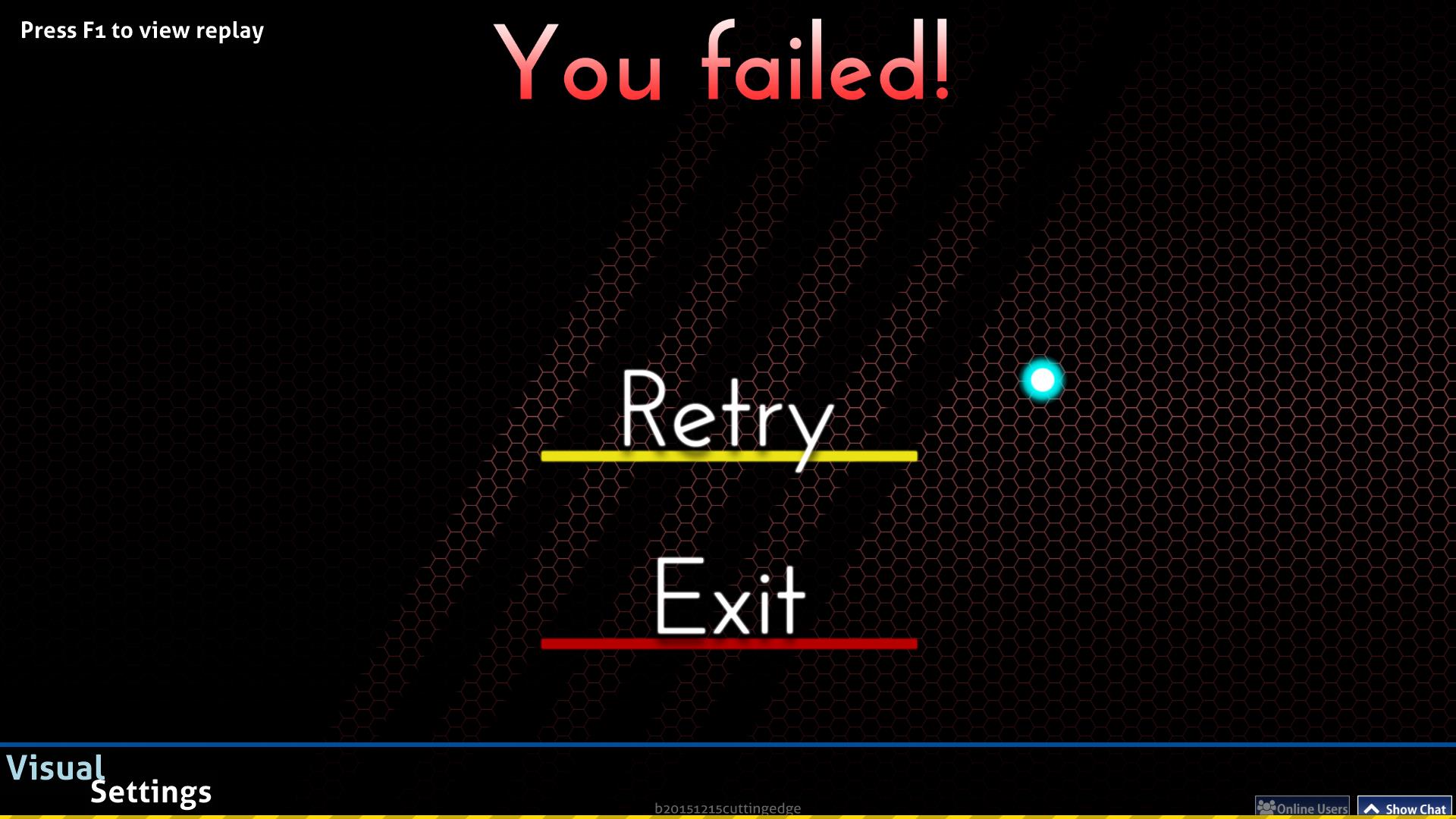
Fail screen

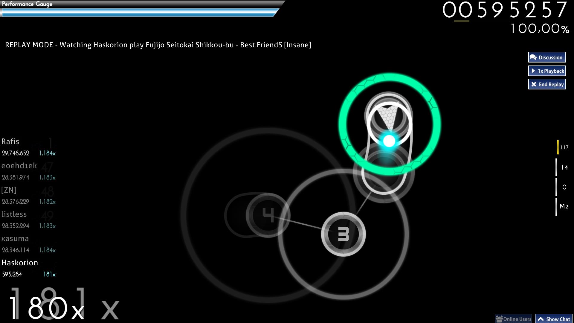
Standard Gameplay

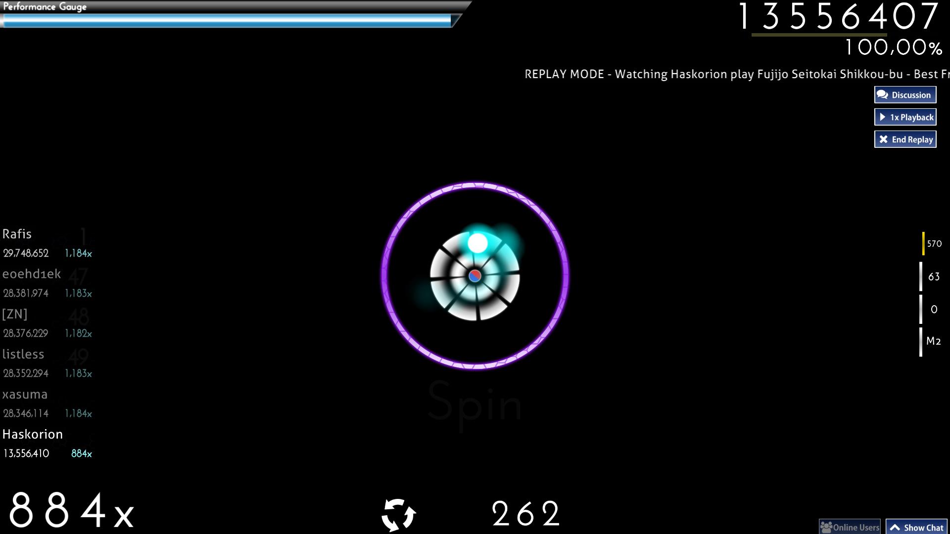
Spinner

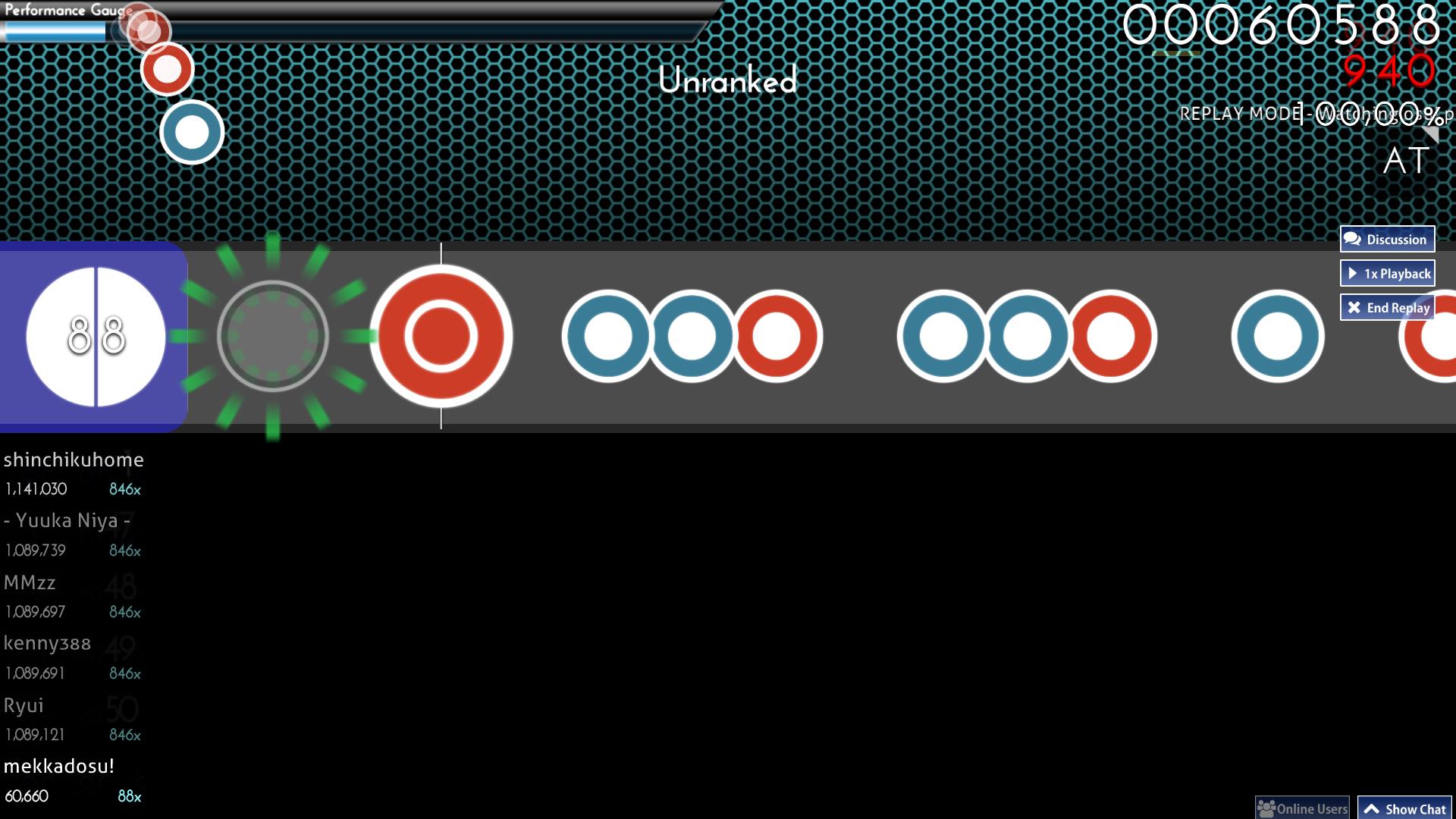
Taiko Gameplay
Light Theme
Song Select

Mods

Result screen

Pause screen

Fail screen
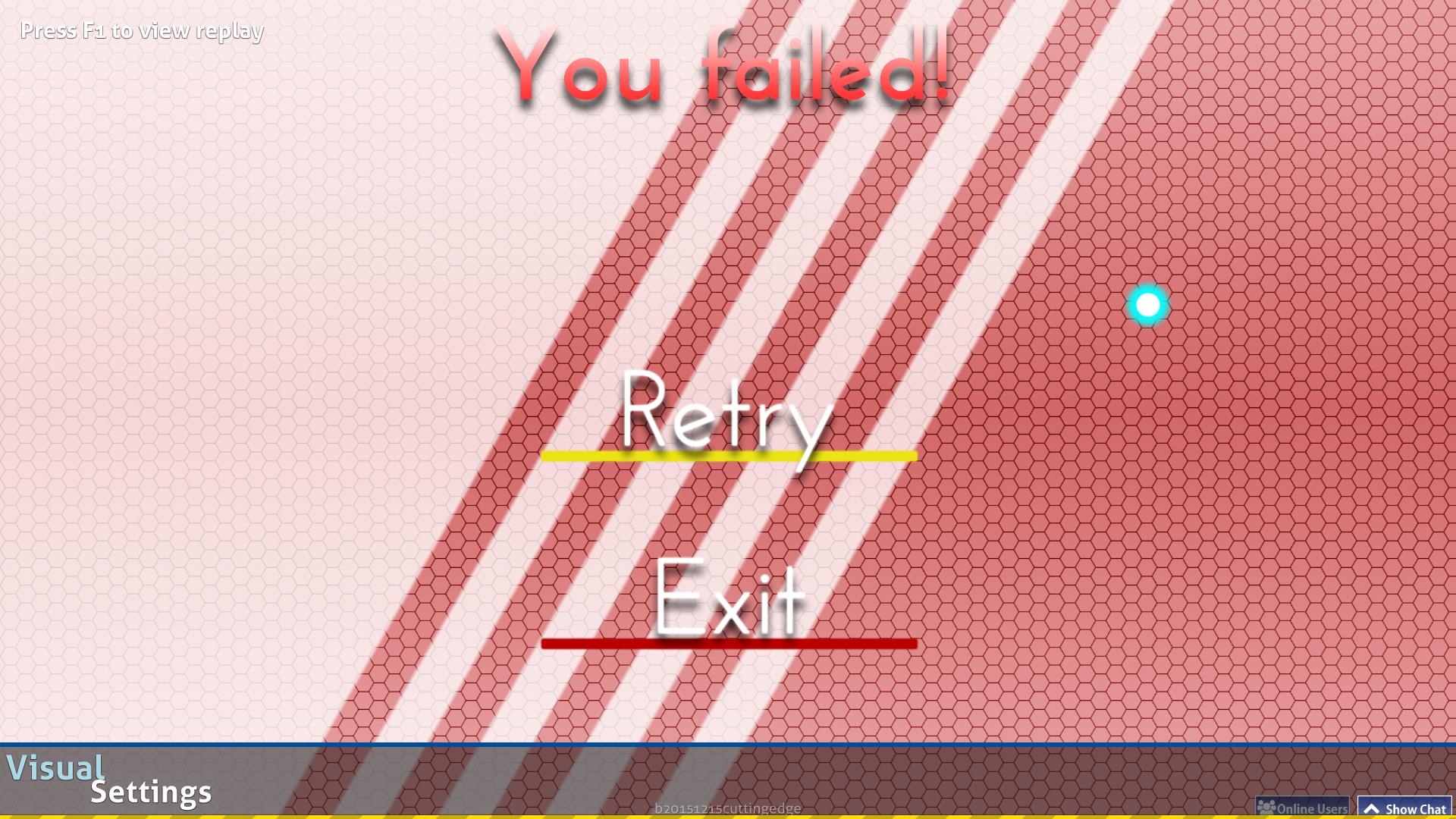

Standard Gameplay
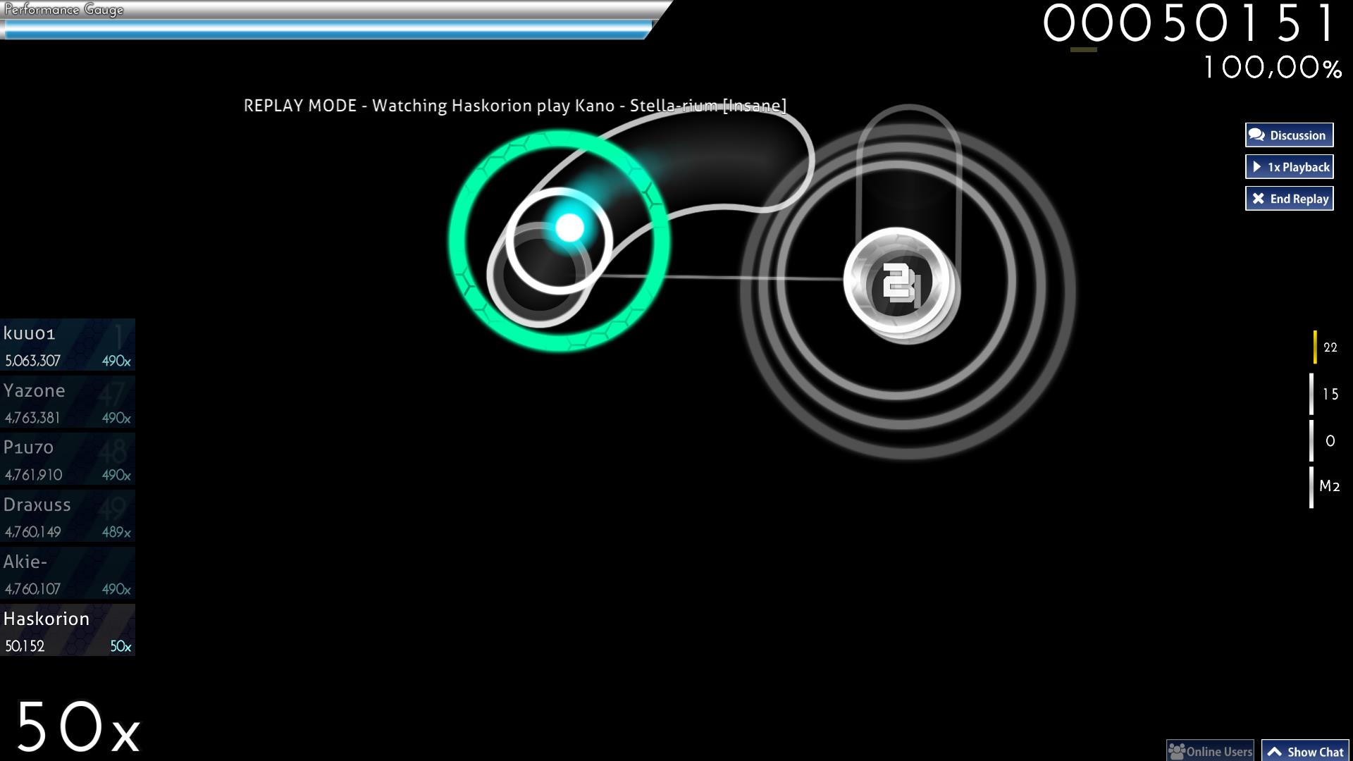

Spinner
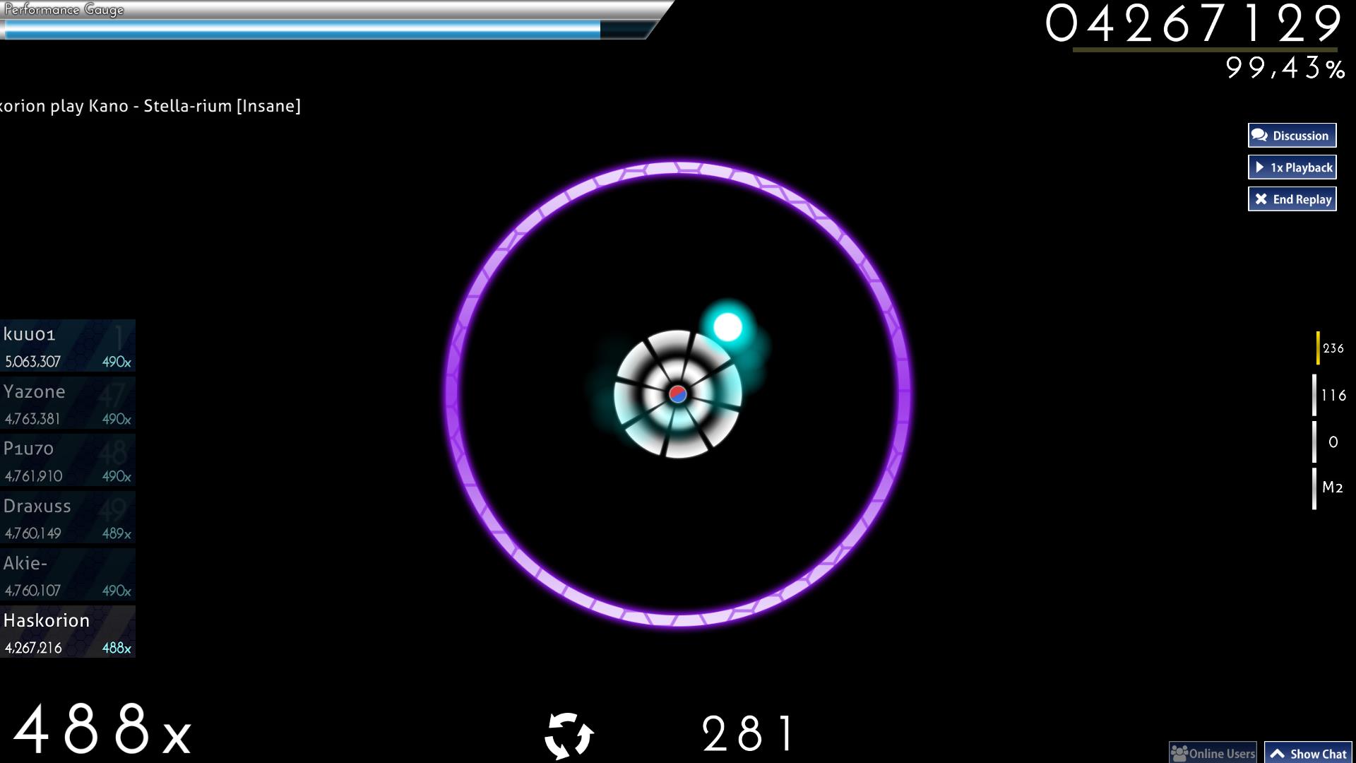

Taiko Gameplay
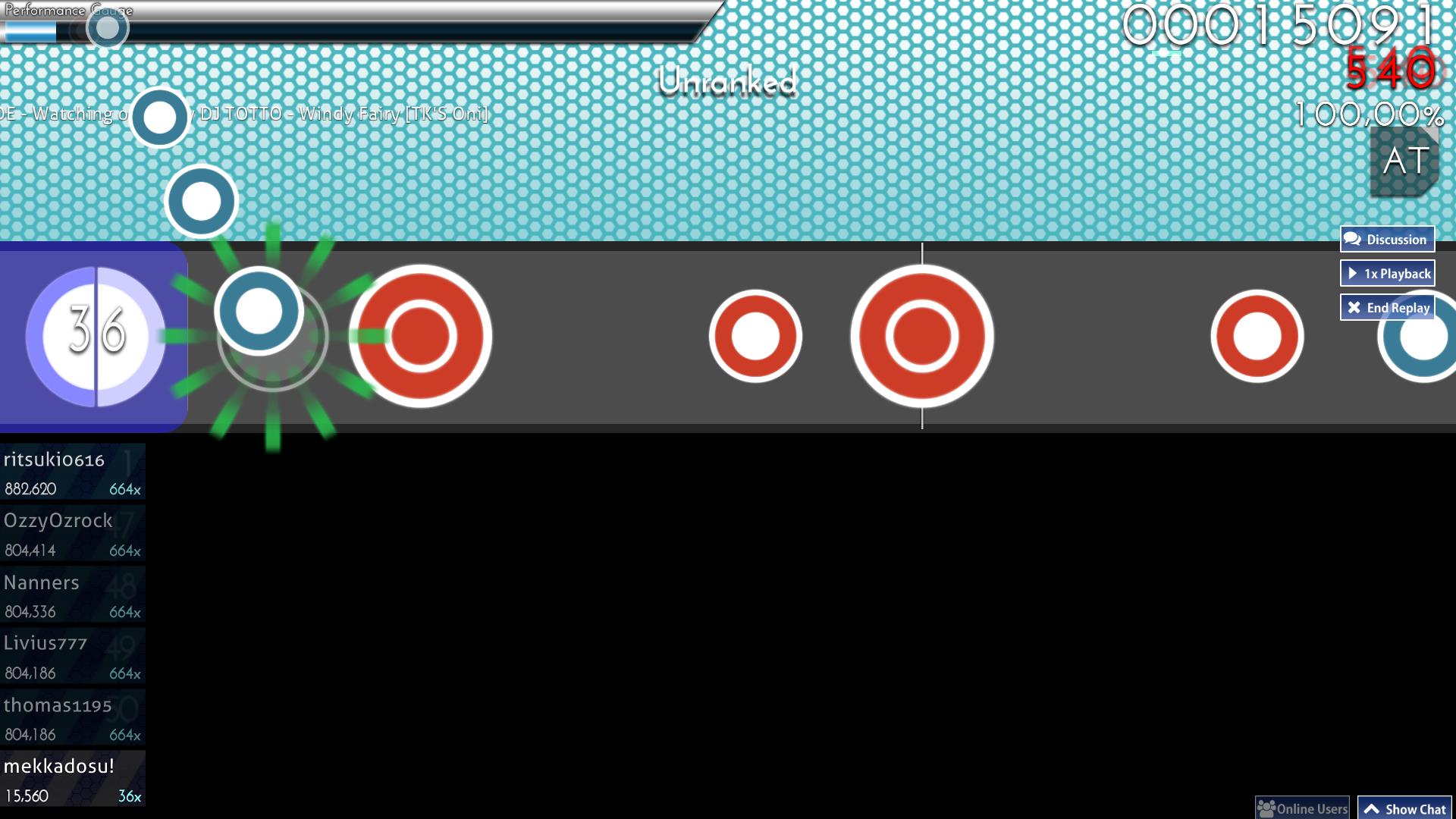

Welcome to my fourth skin.
This skin is an almost minimalistic flat skin with some gradients to hightlight some stuff.
I took a lot of inspiration from other skins, so that might be why it does look like a lot of other skins.

Extras include colour variants for the cursor (4; cyan, red, green, yellow) and sliderfollowcircle (2; turquoise, orange), hitburst sets for gameplay needs (3; characters, numbers, invisible), and sliderendcircle variants (2; semi-transparent, invisible )

This skin is best suited for full background dim and use of the newer release streams other than stable (fallback).

Fonts: Josefin Sans & Loaded (hitcircle numbers).

Hitsounds are from Redon's Aesthetic HD Skin, which I also used in my previous skin, so I hope he doesn't mind me re-using them in a new skin.

Have fun while playing with this skin!


16 dec 15
  1. made hitcircles thinner
  2. change followpoint to a thinner and semi-transparent line
  3. small edit of the spinner
  4. new spinner-approachcircle with pattern
  5. made sliderscorepoint smaller
  6. changed sliderendcircleoverlay to be semi-transparent (added invisible sliderendcircle files in extra folder)
  7. edited sliderfollowcircle and now in turquoise (orange circle moved to extra folder)
  8. added 2 more cursor colour variants (green, yellow, along with red, and cyan as default)
  9. edited menu-back and play-skip (now with small bars below the text
  10. changed outlines of small ranking letters for better contrast
  11. added 2 additional hitburst sets for gameplay (set with geki/katu, set with numbers only, set with invisible 300s as default)
  12. added second skin with a light theme and changed following elements (mainly UI edits)
    1. menu-button-background with white scheme (unchanged in dark theme)
    2. added menu-backgrounds
    3. ranking-panel + -graph (pattern has been added dark theme)
    4. ranking-perfect with dark outlines (unchanged in dark theme)
    5. pause and fail backgrounds (changed to full screen graphics resembling menu-background)
    6. scorebar-bg in white (unchanged in dark theme)
    7. taiko sliders in white (unchanged in dark theme)
  13. reworked topic assets
27 dec 15: added Dropbox mirrors
2 nov 15
  1. added scoreentry numbers set (custom numbers for scoreboard and inputoverlay)
  2. added an extra cursor (red)
  3. adjusted drop shadows (for both number fonts, arrows, section images, etc.)
  4. added drop shadow to hitcircleoverlay ( for better readable stacks)
13 aug 15
  1. new mod icons
  2. reduced ranking-perfect glow
  3. new selection-x-over effects
  4. changed combo colours using 2 new colours
  5. added HD screenshots
ProjectTrash
well done senpai, looks pretty nice so far °^° But the mods bother me though. I thought you have an "own" idea how you can make the mods look like, also thought of something black and white mhh. Otherwise, wirklich schöne skin :D
OsuMe65
Drop shadow @ 100% abuse is real

ANYWAY, try reducing "FULL COMBO"'s glow size a little bit. If ugly, then don't do it. = w=b
Topic Starter
Haskorion

OsuMe65 wrote:

Drop shadow @ 100% abuse is real

ANYWAY, try reducing "FULL COMBO"'s glow size a little bit. If ugly, then don't do it. = w=b
I like this better than thin solid outlines.

About full combo: next update, just wait a bit.

ProjectTrash wrote:

well done senpai, looks pretty nice so far °^° But the mods bother me though. I thought you have an "own" idea how you can make the mods look like, also thought of something black and white mhh. Otherwise, wirklich schöne skin :D
They were sitting on my drive since six months in their current form, so why not include them? Some may like to see them remade in HD.
I just thought a topic alone for them would get forgotten pretty fast.
I might change that when I get an idea for new ones and create a topic for the nightcore mod icons remake.
Topic Starter
Haskorion
Update:
  1. new mod icons
  2. reduced ranking-perfect glow
  3. new selection-x-over effects
  4. changed combo colours using 2 new colours
  5. added HD screenshots
Maybe ready for completed skins. Don't feel like skinning CtB or mania for this.
deadbeat
i think it's good. man, i need to take less breaks when doing this :<
Topic Starter
Haskorion
<3

Yeah, there are several threads that would need some closing too.
Topic Starter
Haskorion
New update with
  1. small changes to some drop shadows,
  2. an extra cursor in red,
  3. scoreentry numbers (for custom scoreboard and inputoverlay numbers),
  4. and lastly added a drop shadow to the hitcircleoverlay to make stacks more readable.
Topic Starter
Haskorion

UPDATE


Update that adds a second skin with alternative color scheme mainly for UI.
Look into the changelog at the opening to see what has changed.

(sry deadbeat for making this update after it was already moved since months, but I'm certain it adds more to the skin)
Vignette
update is so nice. this is my main skin now, thanks a bunch!
klaaus
Download doesnt work :x
Chiraux
Hello Haskorion! I was looking for a skin to use in a selective beatmap, and yours popped out to me. I'd like to use some parts in the Light Theme skin. Thank you for at least reading this, and I love this skin! Make more! (/^-^)/ I need mooore!
Locked_Dream
Is it fine with you if I use this skin for a beatmap that I'm working on? (with slightly edited hitbursts to make them transparent)
Topic Starter
Haskorion

Neglection wrote:

Hello Haskorion! I was looking for a skin to use in a selective beatmap, and yours popped out to me. I'd like to use some parts in the Light Theme skin. Thank you for at least reading this, and I love this skin! Make more! (/^-^)/ I need mooore!

Locked_Dream wrote:

Is it fine with you if I use this skin for a beatmap that I'm working on? (with slightly edited hitbursts to make them transparent)
I don't think this skin would fit on a beatmap skin in any way. Flat or minimal skins generally aren't fit as beatmap skins in my eyes.

So, no.
Locked_Dream

Haskorion wrote:

I don't think this skin would fit on a beatmap skin in any way. Flat or minimal skins generally aren't fit as beatmap skins in my eyes.

So, no.
Aw, bummer.

But thanks anyways :3
atturbo555
This skin look like professional skin style. :D
autoteleology
Was this created from a competition to see how many different fonts you could fit into the same skin or something?

At least when I reuse skin elements, it's because it still fits together well with all the new pieces...
Topic Starter
Haskorion

Philosofikal wrote:

Was this created from a competition to see how many different fonts you could fit into the same skin or something?

At least when I reuse skin elements, it's because it still fits together well with all the new pieces...
I only use 2 fonts here to seperate the hitcircle number set from the rest of the skin, not dozens.
Using an uniform font may seem neater but the font I used doesn't go well with the hitcircle design, even the bold font variant still looks to small for me.

What would you do if a font doesn't fit with the element but the rest of the skin? Rework the complete skin, change the design for one element, or introduce a new font?
In this skin's case I introduced a new font for this one aspect which hightlights that element even more.
autoteleology

Haskorion wrote:

What would you do if a font doesn't fit with the element but the rest of the skin? Rework the complete skin, change the design for one element, or introduce a new font?
In this skin's case I introduced a new font for this one aspect which highlights that element even more.
Why not? I did all of those things in my latest edition of my skin.
DarkGamerMLG
wow is too beautifful *-* pd:im sorry for the error of ortografy i speack spanish and not inglish :c
Hue_old_1
Amazing skin but I have one thing I wanna change about it but cant seem to find the name of it.

What is the after circle file called after you clicked on the hit circle?

Thats the only thing thats bothering me about it but other than it, its my favorite overall.
Please sign in to reply.

New reply