Hello, I would first like to say that you will need access to Imgur to view the following pictures for this topic, I personally find Imgur reliable and easy to use, although I know that it is blocked in some countries.
Okay, so I have been playing osu for almost a year now and I've noticed that the interface has changed quite a bit. I think that the interface is nice and sleek (easy to use of course). But sometimes when viewing osu, when I go through menu's and such, I get distracted very easily from what's going on in the background. So my idea is to make an option where you can blur the background whilst browsing through menus. I first got this idea when I was looking around the settings for osu.
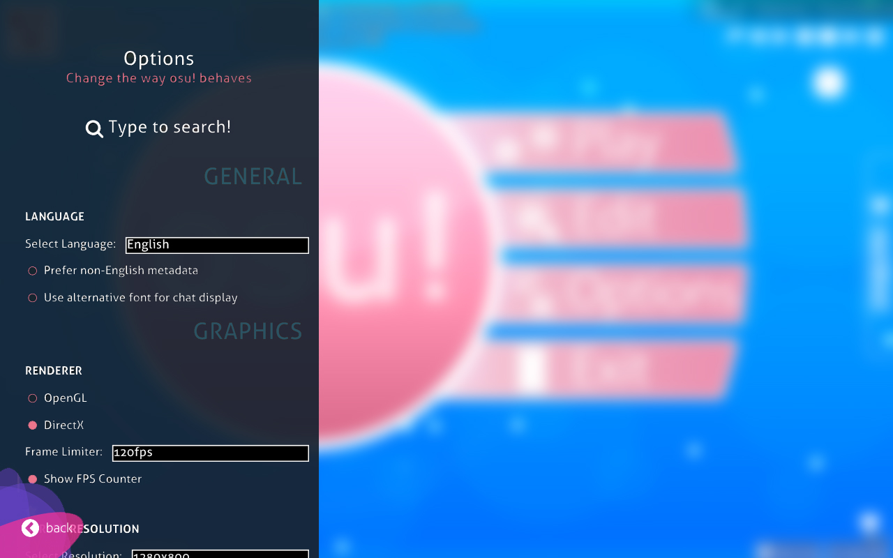
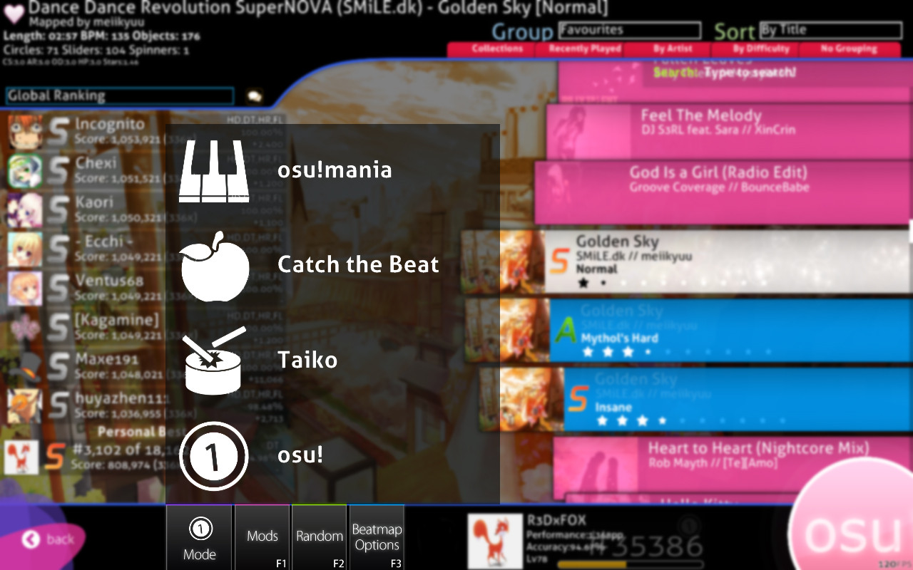
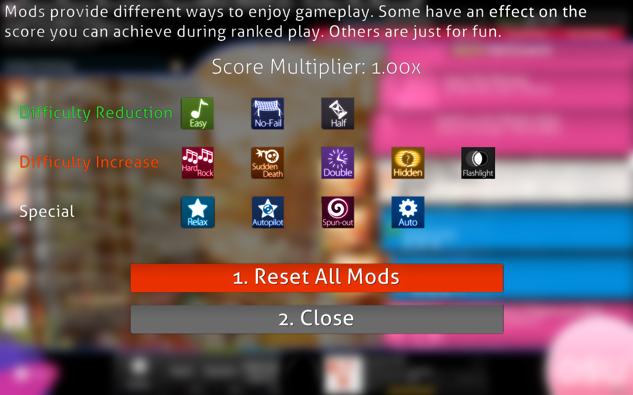
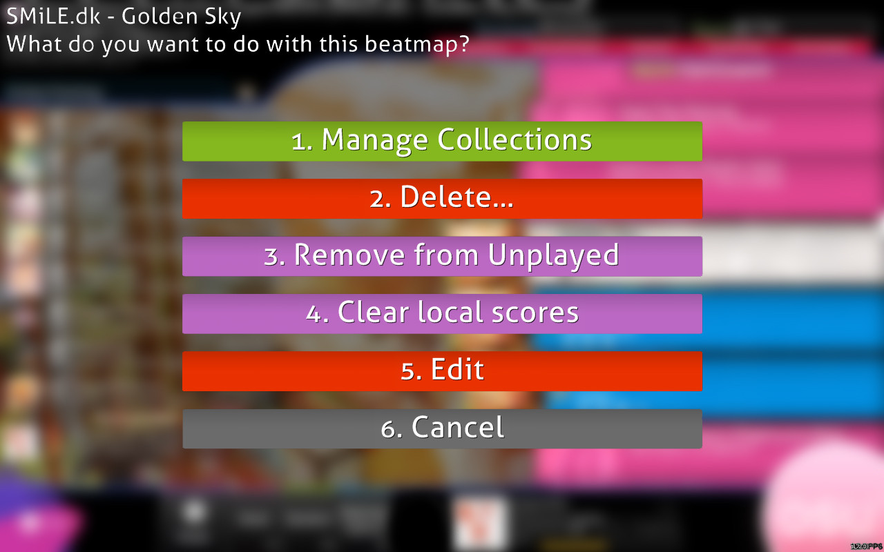
I call this osu! Focus. An optional interface modification. The aim of this idea is to make the user have an easier time focusing in-between menus and loading screens. Think about it as a filter, or a milk-glass window. You have your osu screen on the bottom - The filter in the middle - and the menu on top. A basic sandwich idea.
The way I set it up is; I used Gaussian blur in photoshop to determine that amount of focus(if you will). The lowest amount of focus would be 0x (focus disabled) and the highest would be 10x. The radius of the Gaussian blur is converted into the Focus multiplier - pixel(s) to times(x).
Here are some pictures at 1280x800 resolution (please excuse my bad photoshopping skills )
)
I personally think that this looks kind of cool compared to without it, but the whole point of this feature is just an additional preference for ones who want it.
If you do like this idea, just let me know. It's just been on my mind for a bit.
- R3D
Okay, so I have been playing osu for almost a year now and I've noticed that the interface has changed quite a bit. I think that the interface is nice and sleek (easy to use of course). But sometimes when viewing osu, when I go through menu's and such, I get distracted very easily from what's going on in the background. So my idea is to make an option where you can blur the background whilst browsing through menus. I first got this idea when I was looking around the settings for osu.
I call this osu! Focus. An optional interface modification. The aim of this idea is to make the user have an easier time focusing in-between menus and loading screens. Think about it as a filter, or a milk-glass window. You have your osu screen on the bottom - The filter in the middle - and the menu on top. A basic sandwich idea.
The way I set it up is; I used Gaussian blur in photoshop to determine that amount of focus(if you will). The lowest amount of focus would be 0x (focus disabled) and the highest would be 10x. The radius of the Gaussian blur is converted into the Focus multiplier - pixel(s) to times(x).
if Gaussian Radius = 10 pixels then Focus = 10x
Here are some pictures at 1280x800 resolution (please excuse my bad photoshopping skills
SPOILER
Album with all below
Settings Menu
Game-mode Menu
Mod Menu (Needs work - looks kind of weird, but the idea is there )
)
Beatmap Options Menu
Loading Screen
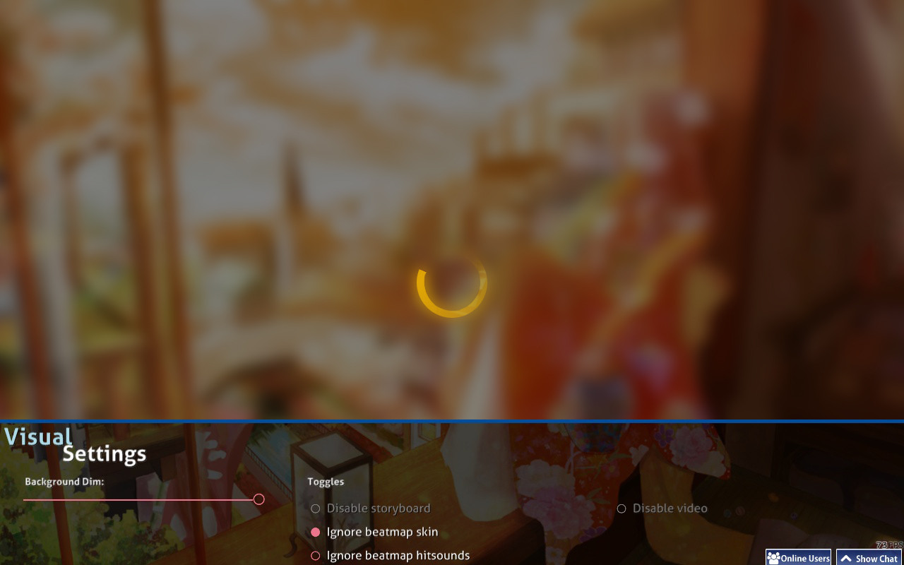
Pause Screen
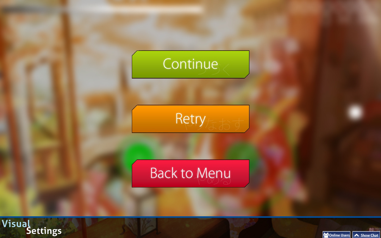
Settings Menu
Game-mode Menu
Mod Menu (Needs work - looks kind of weird, but the idea is there
 )
)Beatmap Options Menu
Loading Screen
Pause Screen
I personally think that this looks kind of cool compared to without it, but the whole point of this feature is just an additional preference for ones who want it.
If you do like this idea, just let me know. It's just been on my mind for a bit.
- R3D
