forum

Redd Glass HD [All Modes]

posted
Total Posts
116
Topic Starter
Haskorion


___________________________________________________________________________


Puush Mirror
Dropbox Mirror

Simply double click the file and osu! should import it automatically.


Puush Mirror
Dropbox Mirror

For those having problems with .osk-files.

Redd Glass V2.3
(made in GIMP)


You can also check this channel to see some interesting collages made using this skin as a base.


click this to show
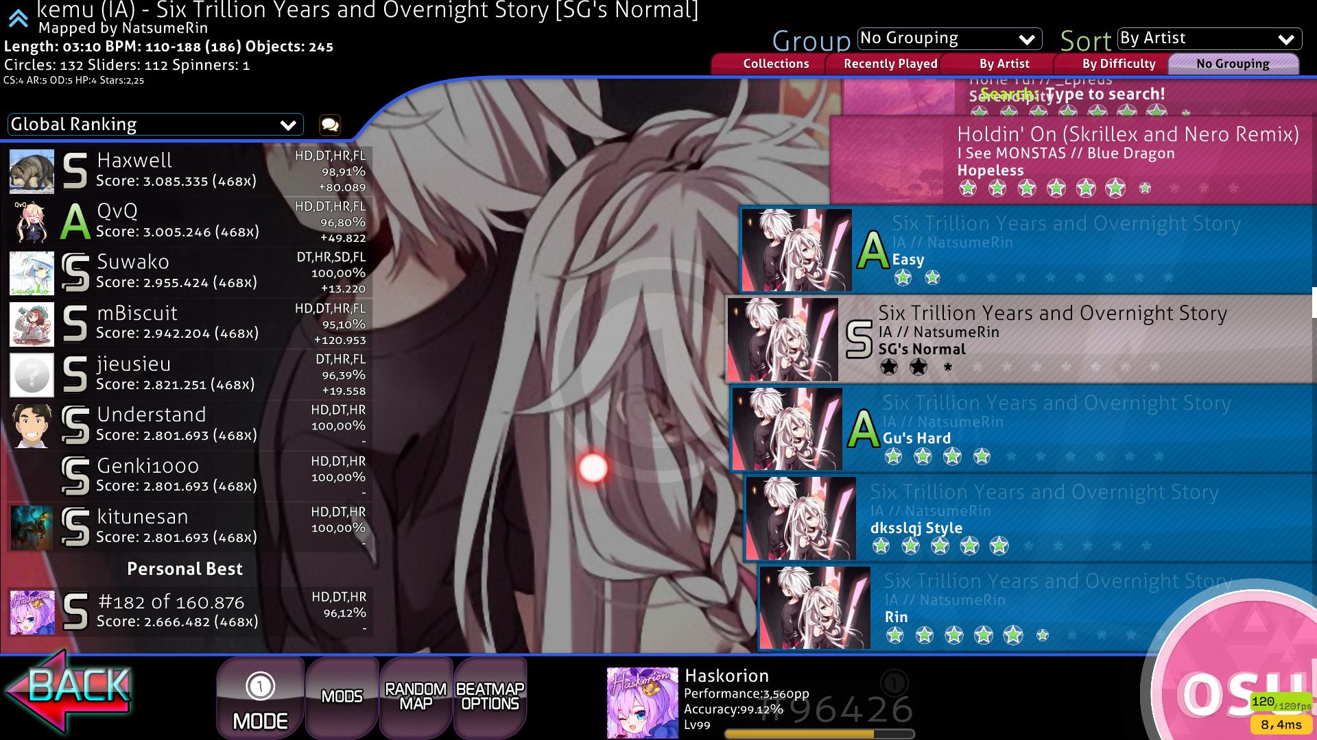
Song Select


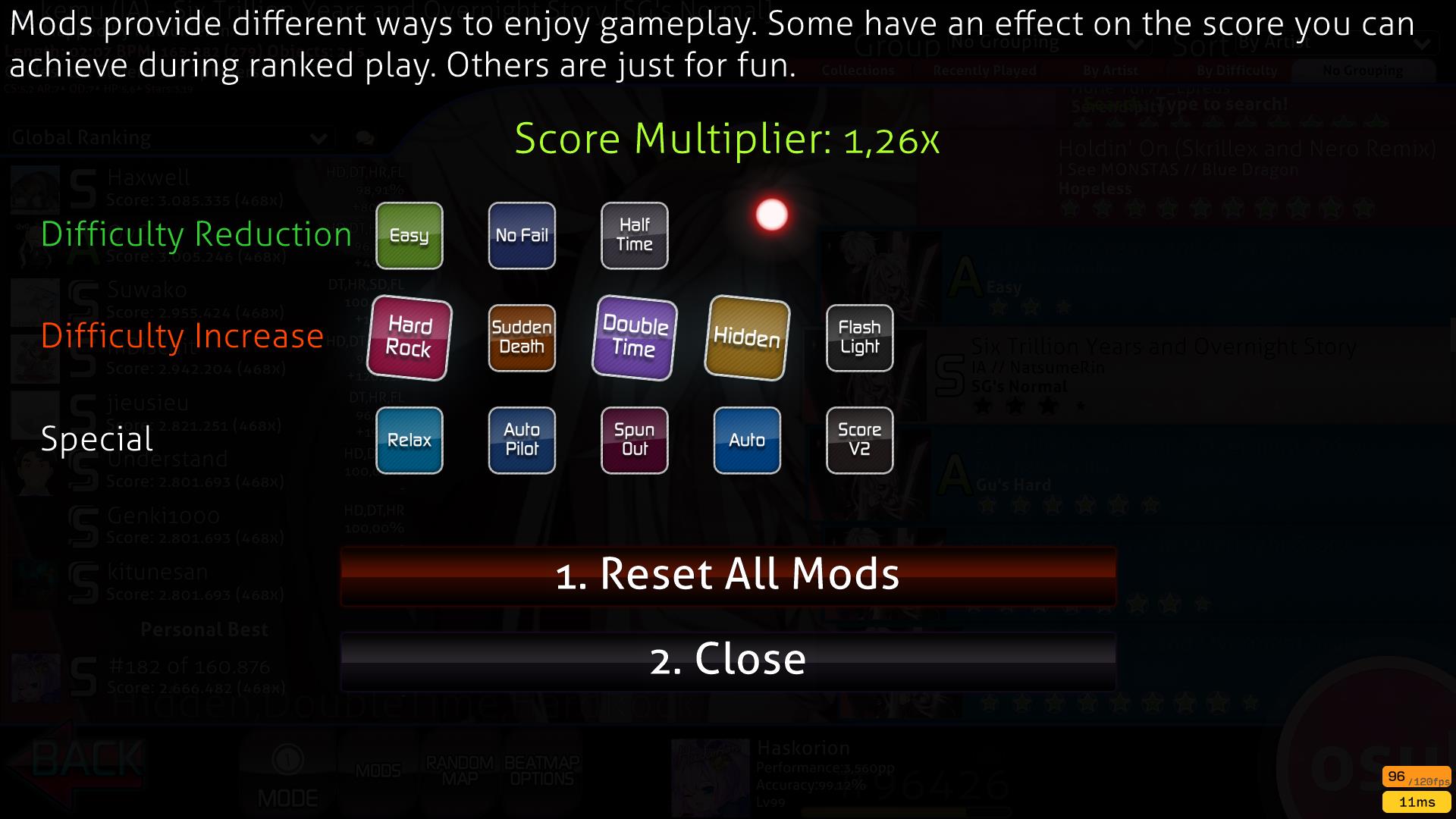
Mods


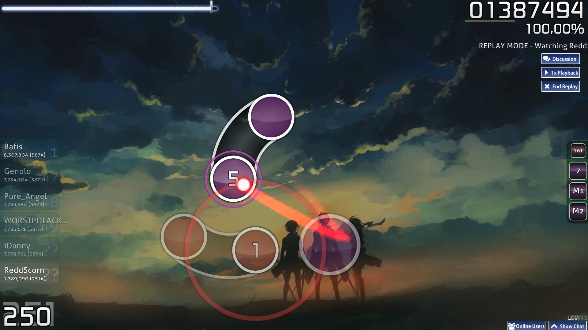
Standard Gameplay

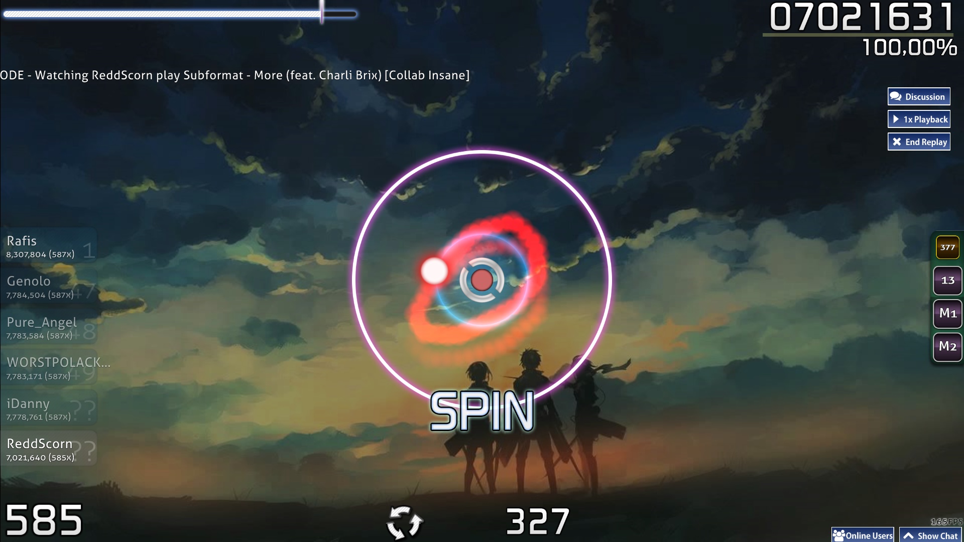
Standard Spinner

Ranking screen
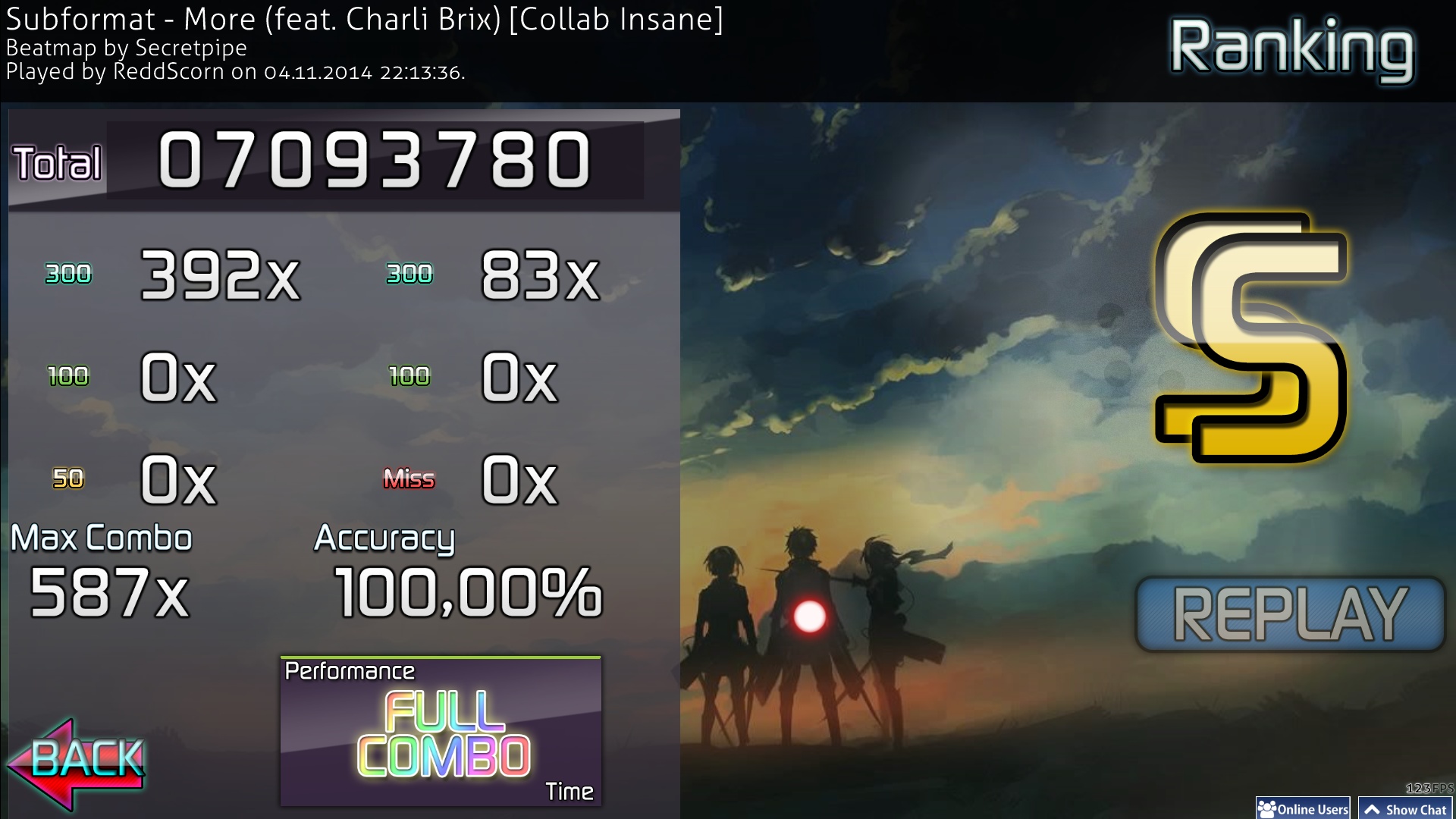

Taiko Gameplay
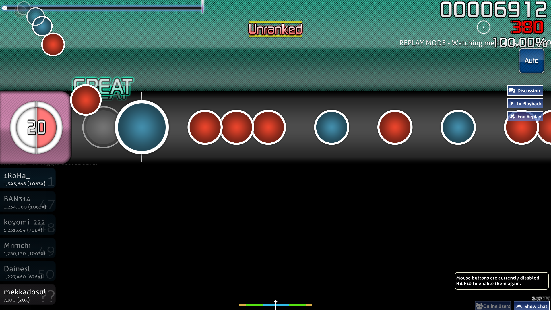

Catch the Beat Gameplay
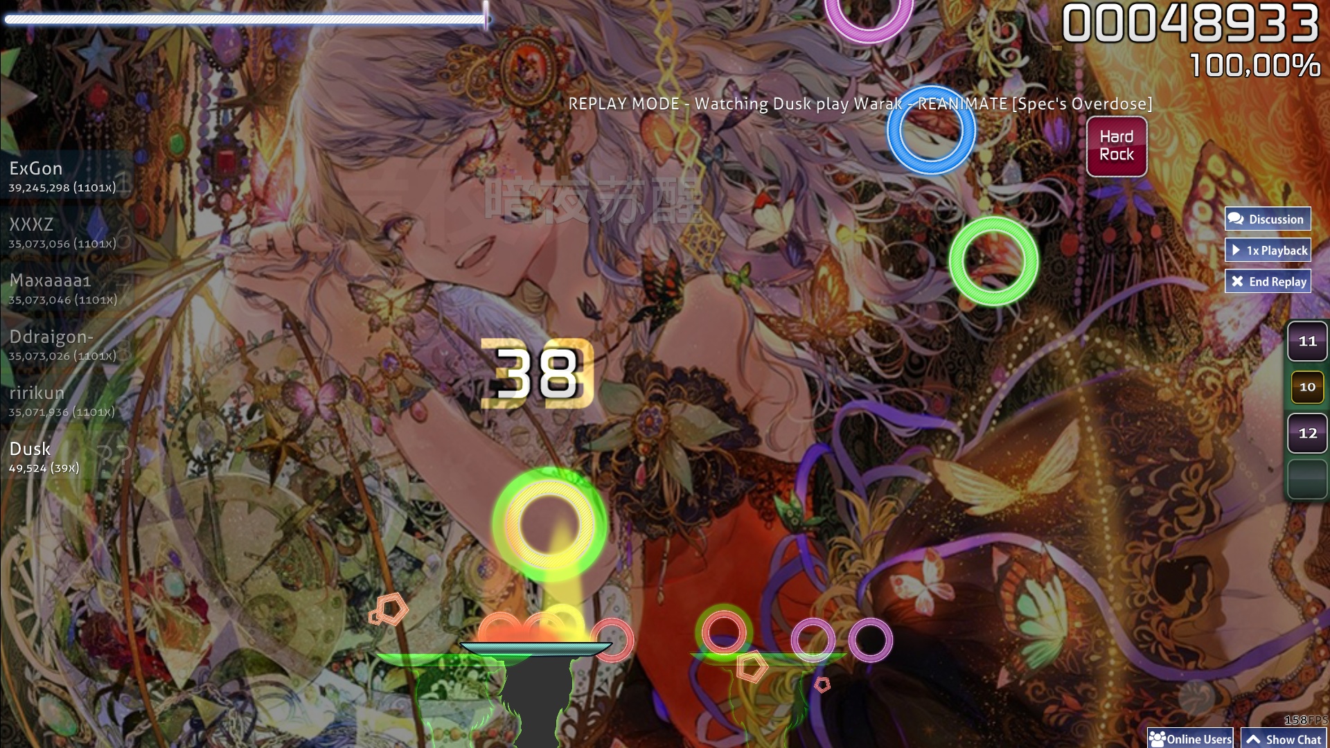

osu!mania Gameplay
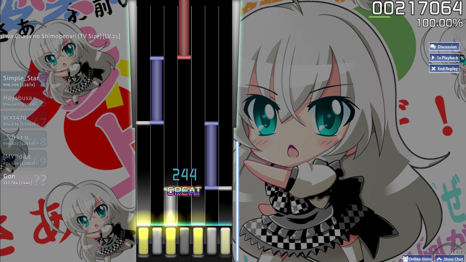

Well thank you for having interest in my first skin and I hope you downloaded it.

I present to you a fully skinned somewhat minimalistic "Pro" skin, unlike other half-completed skins or "alpha and beta" skins.
Skinned for all game modes with alternative extras for standard.
The skin is optimized for full background dim, 16:9 resolutions and mostly distractionfree.

preview of some extras
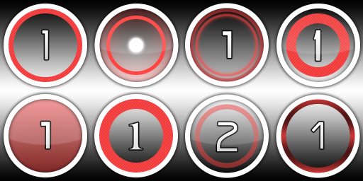
Hitcircle + number variants:

Sliderball in 6 colours + white:
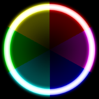

Sliderfollowcircle glow in 6 colours:
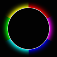

Sliderfollowcircle neon ring in 6 colours:
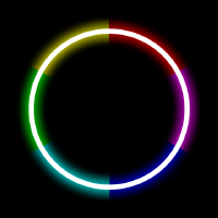

Cursors in 6 colours:


Followpoints in 4 colours + white + black:

You may say: "Hey, aren't these well known elements?" and I say: "Yes, but not them."
They are simply similar to them if they appear like this but this was my intention with this skin.
I thought why not make your first skin using designs you like or had an easy time playing with but also having small details, so this is somewhat a "Pro minimalistic" skin.
They appear in a lot of older or private skins where you can't really find any credits.
So I can't take credits for every design except my recreations or original designs by myself.

Hitsounds are from the Aesthetic HD Skin by Redon.
Thanks and credits to him for letting me use them.
They give off a more accurate feeling since they are mostly drum sounds and accompany the music well.

Also thanks to Liar- who made the video.

Elements were made in Adobe Photoshop.
If you're doubting I made any element myself, I will provide the .psd-files on request to show they are based on layers and not simple recolours / copypastes.

Choice in fonts is simple. WHY SHOULD I USE 3 OR MORE FOR AN UI?? So I'm sticking to one font for the UI.
The font I'm using for the UI is Digital Sans which you should know as the font of the scorenumbers from the default osu!-skin.
The extra fonts for numbers are: Agency, Bangle, Eurostile, Jubeat saucer (a font recreation).

(Almost the end, few last words.)
Again thanks for reading this wall and downloading the skin. I hope you could follow my reasoning and enjoy playing with my skin.


26 aug 17
  1. added scorev2 mod icon
  2. added taiko hitbursts for ranking panel (set for gameplay is untouched))
18 sep 16
  1. I dropped the version number in title and downloads, I honestly think this will be the final update for this skin
  2. I made a stealth update at one time that removed the cursormiddle in the rootfolder, but since too many players are apparently unable to scroll through pages I just re-added it
  3. I added a blank sliderendcircle and made ctb and mania combobursts blank aswell to bring it up to date
  4. before V3 I used a different hitcircle design, now I remade that hitcircle some time ago and included it
19 aug 15 (V3.4)
  1. removed particles (caused major frame drops)
  2. fixed mania hold note body being repeated instead of stretched
  3. added taiko-slider and taiko-slider-fail (also caused some major frame drops)
22 feb 15 (V3.3)
  1. now supports skin version 2.5
  2. added selection-mod-keycoop
  3. added mania-warningarrow
  4. added 12K, 14K, 16K, 18K support
  5. put SpecialStyle for left column as default on 6K, 8K, 12K, 16K
  6. disable split stages for 9K and below
  7. centered mania stages
  8. enlarged sliderfollowcircle neon rings
3 february 15 (V3.2)
  1. added HD screenshots
  2. redesigned mania keys
  3. added ranking-title
  4. added CTB section to skin.ini and fixed ColumnWidth not working
  5. added options for split mania stage for 10K
22 december (v3.1)
  1. update to skin version 2.4 (features new mania configuration and seperate Combo numbers for ALL game modes)
  2. reverted back to using animated hitbursts for gameplay and static for ranking
  3. added selection-mod-key1 to k3 and k9+k10 (ignore for now, these mods are in work and might take a very long time until they are fully working, since I don't want to wait and assets were mentioned in the changelog I just added them)
  4. added font dot for default only
16 december (v3)
  1. removed mode-x, mode-x-med. mode-x-small (scanline pattern is used too much)
  2. removed scorebar animation and hit300 animations
  3. completely reworked gameplay and UI elements
  4. countless new extras
  5. added small drop shadow to approachcircle
  6. redesigned cursor with trail and cursormiddle in 6 colours
  7. changed glass effect from hitcircle only to glass effect on the overlay
  8. redesigned sliderball to a glow ring with transparent inner filling
  9. scrapped old followcircle design and included 2 new designs on smaller ring (outer glow, neon ring)
  10. reduced new style spinner to only show middle parts and glow (no top / bottom)
  11. redesigned mod icons and fully written (Hard Rock instead of HR)
  12. redesigned fruits and fruit-catcher based on Yuzu (credits to ztrot + Daru for Yuzu design)
  13. taikocircleoverlays without any fillings (might change them on demand)
  14. redesigned mania design to resemble colour scheme of L2R / IIDX
9 july (v2.3)
  1. added fruit-catcher sprites support for Version: 2.3
  2. added Skin Database download mirror
13 june (v2.2)
  1. changed fruits a bit
  2. fix star and menu-button-bg, redesigned selection bar
  3. thinner outline on score and default numbers
2 june (v2.1)
  1. replaced Niko's hitsounds with Redon's Aesthetic hitsounds (got permission)
  2. redesigned pause buttons and overlays
  3. reworked menu-back and play-skip
31 may (v2)
  1. skinned all game modes
  2. redesigned spinner, so it won't overlap with bonus and also reducing glow
  3. redesigned selection bar, more readable
  4. redesigned mod icons, they were a little big and didn't look good
  5. new combo colours, brightened up and added a 5th
  6. designed buttons, they were just the menu-button-background scaled down with re-adjusting the scanlines
  7. added extras and moved hitsounds to the extra folder
26 may (v1.2)
  1. changed menu-back
  2. added larger hitbursts on ranking screen but still use small ones for gameplay
  3. redesigned star
  4. realigned ranking-accuracy and maxcombo
25 may (v1.1)
  1. added transparent spinner-approachcircle
  2. fixed section images (named them "sectionpass" instead of "section-pass")
  3. reworked ranking screen (was one of the first things I skinned, now with some glossy glass effects)
  4. added Niko's hitsounds with drum hitsounds (normal-hitclap2 to drum-hitclap, fixed the slidersounds)
Ayesha Altugle
It's the person who created a thread that helped skinners!
_sparky_
.osk works, just tested

its a really nice skin! one of those good pro skins out there :3
Topic Starter
Haskorion
Thanks for confirming I packed it correctly.

I'm gonna post a update real soon because of the spinner-approachcircle.

I hoped for the toggle being implemented soon but they only reverted the fix.
Claim in the threads was that it will only display if included in the skin but the default circle showed up on mine after latest update. So I'm gonna include a transparent approachcirlcle for now and add a missing word in my notes:
I'm using small hitbursts with transparent to not cover the hitcircles.
This should be:
I'm using small hitbursts with transparent particles to not cover the hitcircles.
I will also add a cursor variant using the cursormiddle in an Extra folder.
Update will be pushed after I receive a certain PM regarding certain hitsounds. They are soo good and don't want to steal or include them without permission.
[ Pingu ]
Amaze
Topic Starter
Haskorion
I pushed a update.

New things are
  1. a reworked ranking screen,
  2. spinner fix,
  3. hitsounds from Niko,
  4. and the extras,
  5. aswell some new graphics for the post.
New links in the OP.

Or click me for v1.1.
hehe
looks pretty sweet from the screenshots, will test out ingame and report back. no scorenumbers?

here's my opinions, one thing though, i don't think you're allowed to use other people's hitsounds...?

like
mod icons, rank icons, scanline design, good take on the scorenumbers.

critique
  • - larger hit300.png etc, in the ranking panel its too small right now. non-hitburst

    - not a fan of star.png, shouldnt it be red at least? owo

    - spinner-middle.png too small, overlaps the bonus points from getting spin score

    - menu-button-background.png too small, this happens http://puu.sh/90rVZ.jpg

    - score numbers are cramped, max combo and accuracy can be shifted down a little http://puu.sh/90s10.jpg

800x600 problems

  • - menu-back.png button too large, overlaps mud buttons in 800x600

    - 1px stroke in general look bad in 800x600
Topic Starter
Haskorion

tastystew wrote:

here's my opinions, one thing though, i don't think you're allowed to use other people's hitsounds...?

critique
  • - larger hit300.png etc, in the ranking panel its too small right now. non-hitburst

    - not a fan of star.png, shouldnt it be red at least? owo

    - spinner-middle.png too small, overlaps the bonus points from getting spin score

    - menu-button-background.png too small, this happens http://puu.sh/90rVZ.jpg

    - score numbers are cramped, max combo and accuracy can be shifted down a little http://puu.sh/90s10.jpg

800x600 problems

  • - menu-back.png button too large, overlaps mud buttons in 800x600

    - 1px stroke in general look bad in 800x600
Regarding the hitsounds, these are fairly known and in lots of private skins that are even given out. Conclusion: Niko gave out these hitsounds and they spread, so why not include them here if you can get them anywhere else. Of course I can't get a real permission from him since he's not online anymore (atm). They also fit the sub theme "Pro" since they come from a pro.

Redon's hitsounds are also in Luminance and Urouki gave permission to use his skin elements anywhere so I could include them right away, but I don't know if only he has the permission or if others can also use elements from Aesthetic in their skins. I read through the thread and didn't find any statement reagarding that. I could also just include them and give him credit and remove by request if he doesn't want that.

In short, Niko's sounds are spread out wide, fitting the theme and Redon's are only in Aesthetic and Luminance with no clear written permission anywhere.

At the 800x600 problems, this skin is not designed for this resolution so these aren't serious valid points. But the overlap and my selectionbar made me make a new menu-back. It's an arrow now.

Other stuff:
  1. Yeah, they are kinda small for the ranking screen but I wanted small ones primarly focused on gameplay. I made some larger hitbursts but still have the smaller ones for gameplay.
  2. I chose green for contrast with the colours the button background gets tinted to and red is not really a focus element. Redd is reference to my name and not the colour, also you see few elements being red. But thanks for mentioning, they didn't really fit in the end and made this one, turned out to look better but still having same design.
  3. The spinner is designed for spinning itself without overlapping elements. I don't find the bonus score distracting since you focus on the middle of the spinner and not around it.
  4. Blame the template for that and not me, it is so minor not worth fixing. Also why should that be distracting?
  5. Scorenumbers are focused on white and the black is just an outline. Some like them this way, some like a bigger gap. If I had to make changes for that I would need to re-adjust the ranking panel and that's a ton of work I don't want to do again. Regarding maxcombo and accuracy, of course I put them a bit lower. Should look better now.
Update tomorrow or later. Don't want to push out 2 updates in rapid succession.
Kevs
Nice skin it looks very fresh, Going to try it out tomorrow.

oh and keep up the good work!
Topic Starter
Haskorion
New update including all gamemodes and fully skinned (apart from sounds).

Also some redesigns on selection bar, spinner and mod icons.
Ayesha Altugle
Topic Starter
Haskorion
k, last update for now.

I got permission from Redon to include his hitsounds. So here's another thanks to him.

I also redesigned the pause screen a bit, reworked menu-back and play-skip,so it should be ready for the completed skins check.
Topic Starter
Haskorion
Hating double posts somehow.
New update supporting beatmap thumbnails with slightly changed fruits, fixed star and menu-button-bg new selection bar.
Topic Starter
Haskorion
Latest or last update. added fruit catcher sprites and download mirror on the Skins Database (see OP).

Still waiting for the move to completed skins.
Topic Starter
Haskorion
HUGE UPDATE:

I remade this skin in HD and wanted to originally wait for the new mania / skinning changes to go live on public build.
Since these changes can involve more time than I thought and I don't want to wait I release the update now.

Changes are:
  1. fully remade in HD
  2. redesigned UI
  3. more cursors
  4. more followpoints
  5. new slider stuff (ball, 2 followcircle designs)
  6. removal of animations (visible hit300s in extra folders)
  7. 5 different number fonts
  8. etc.
Since I can't delete files from the older version in the database I made a new listing and still offer download links to the v2.3 skin, also to show people the vast improvement in quality switching from GIMP to PS.

I would like feedback on the other game modes skinned since my main mode is standard and I don't know if my design choices are fitting for higher gameplay level on the other modes.
deadbeat
i'm not late i swear
Topic Starter
Haskorion
<3
Topic Starter
Haskorion
Update to support skin version 2.4 (mania integration) + dots for hitcircle numbers in extras.
FuZ
I really love this skin, visual and sounds are nice and smooth, keep up the good work.
BaBydnT
I have a error on skin.ini


Topic Starter
Haskorion

BaBydnT wrote:

I have a error on skin.ini

have you downloaded it from the database?
Try to delete the #K.ini files from the folder and redownload only the skin.ini.
Avensies
Hey I just found almost the perfect skin I wanted. I was like TT_TT when I heard "YOU SUCK" when I failed a song. But this skin is really nice. It's a nice color too. :D :P
Topic Starter
Haskorion

FuZ38100 wrote:

I really love this skin, visual and sounds are nice and smooth, keep up the good work.

Avensies wrote:

Hey I just found almost the perfect skin I wanted. I was like TT_TT when I heard "YOU SUCK" when I failed a song. But this skin is really nice. It's a nice color too. :D :P
<3

Small update with redesigned mania keys and fix for columnwidth not working as it should, added CTb section to skin.ini and lastly HD Screenshots.
Pirat3P4tch
Good work!
Cytoskeleton
My favorite skin so far! Keep up the good work.
rawrneru
I really like this style. Makes ma want to make a video for it :3
Topic Starter
Haskorion

Liar- wrote:

I really like this style. Makes ma want to make a video for it :3
Feel free to do one if you like, I will embed it then and credit.
rawrneru
Shh :3

Topic Starter
Haskorion

Liar- wrote:

Shh :3
TYVM!! <3


A1-K0
-
Mr Mecha
noice
Cosmic Energy
love it.
Perplexion
awesome skin bro 8-)
Litagotyv
Love the graphical texture on osu! standard and osu!Mania o:
zedrux1
Is amazing this skin i love it :33
ManiacStar

Perplexion wrote:

awesome skin bro 8-)
PlzDontScrewUp
I love how that TF2 Spy say "You Suck" when u fail. very funny
xasuma
Cool skin!
Hallowa
.
Nanase
Awesome skin _(•̀ω•́ 」∠)_ ₎₎…
nightmasterv4
tested in 17/august/2015
working perfectly in .osk
the .zip manual install still works perfectly
wood work with the skin, one of my favorites :3
Topic Starter
Haskorion
Just a small performance update.
Removed particles, changed hold note bodies to be stretched and added taiko-slider (and -fail).

<3 for the comments.
logitechf1f4
very good skinn. Thank you :)
nazzinoz
The best skin I've played ever
Mackencheez
I might be a little late to the party, but this is an AMAZING skin. It's incredibly easy to see the pointer, and it's just plain old amazing. Great work! ;)
pekora fumes
How did you make the cursor trail have no spaces? Other skins like Shigetora's have lots and lots of spaces.
CashGamer
i like this skin :DD love <3
Topic Starter
Haskorion

gamzpro52 wrote:

How did you make the cursor trail have no spaces? Other skins like Shigetora's have lots and lots of spaces.
There are two things that can reduce the space:
  1. Cropping the trail so it has a smaller area.
  2. Adding a cursormiddle that causes the trail to be drawn more frequently. There is an extra folder inside the skin where I included cursormiddles.
Sry for late reply.
brookie
Late reply :/ srry

But love the skin!
Ycx_007
perfect
show more
Please sign in to reply.

New reply