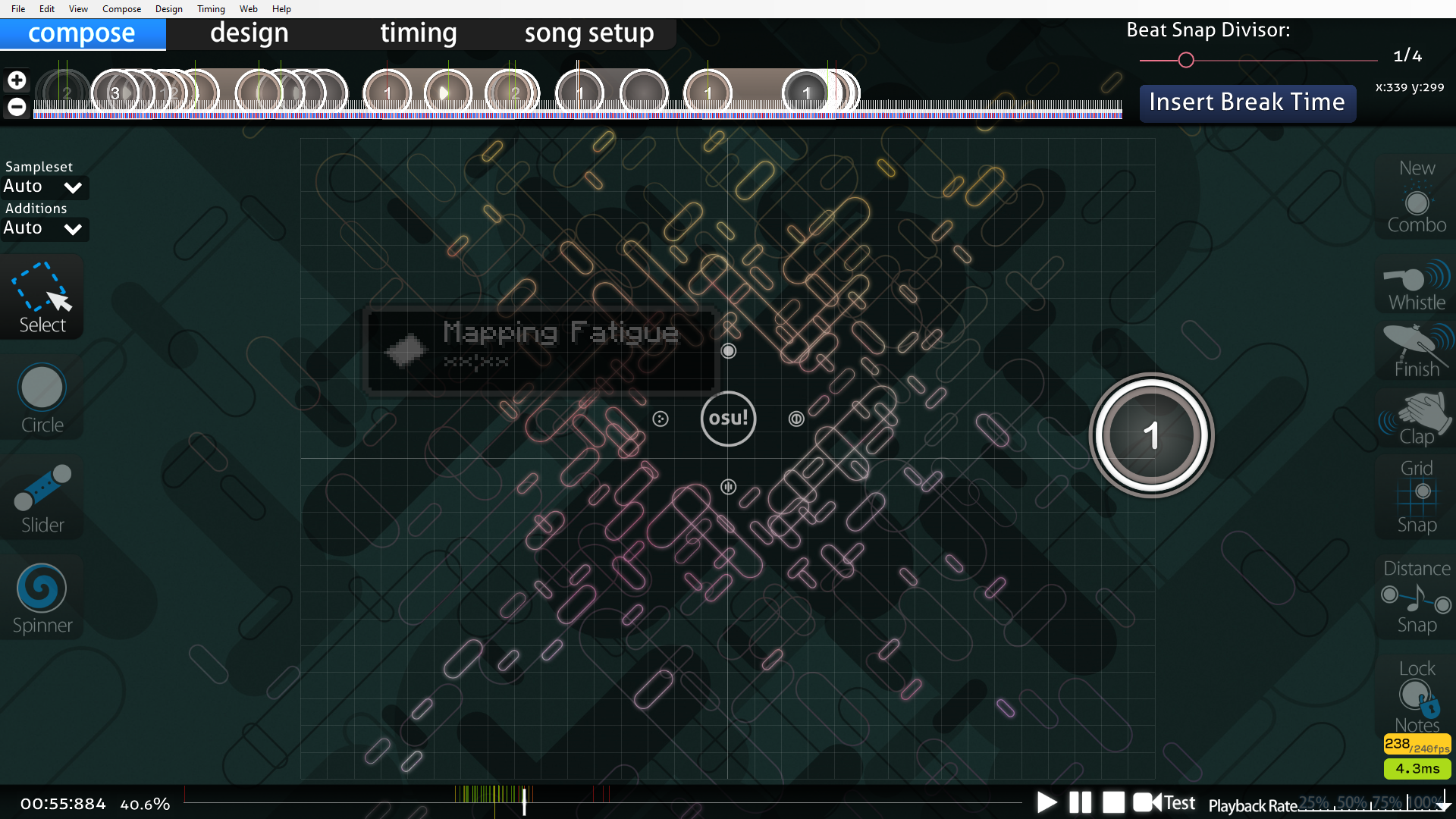
hi. this is the coolest (aspire) technique i've ever seen. you should see it too. here it is now.
I really don't know what to say regarding this. This is wild stuff. As far as i know, it is totally unique. There is no information as to how this is done that isn't from its creator, and even that is very vague; just a passing note saying how its very painstaking and was done entirely by hand, which brings more questions than answers.
The sliders entirely consists of white points, yet their .osu curveType is linear, which would make it almost impossible to manipulate in the editor (adding another white point would change its curveType to bézier). Did Karoo13 start with red ticks, then painstakingly changed all of them to white ticks to mitigate lag? Is that even a thing? Is he just lying, and he has a program that edits the .osu? Is Karoo13 an actual witch? We may never know.
Does anyone know how this is done? It is very cool. I would like to try it out.
onumi - Succubi (Karoo13)
great news. this image embed broke! thats awesome. well, you can download this very cool thing here. you're just going to have to trust me, its coolhttps://osu.ppy.sh/users/1882522
great news. this image embed broke! thats awesome. well, you can download this very cool thing here. you're just going to have to trust me, its coolhttps://osu.ppy.sh/users/1882522
I really don't know what to say regarding this. This is wild stuff. As far as i know, it is totally unique. There is no information as to how this is done that isn't from its creator, and even that is very vague; just a passing note saying how its very painstaking and was done entirely by hand, which brings more questions than answers.
The sliders entirely consists of white points, yet their .osu curveType is linear, which would make it almost impossible to manipulate in the editor (adding another white point would change its curveType to bézier). Did Karoo13 start with red ticks, then painstakingly changed all of them to white ticks to mitigate lag? Is that even a thing? Is he just lying, and he has a program that edits the .osu? Is Karoo13 an actual witch? We may never know.
Does anyone know how this is done? It is very cool. I would like to try it out.
Don't even get me started on this
that's not the background. it is the slider.
yeah. actual witch.
yeah. actual witch.